KRAIPOL JAYANETRA FROM ALKHEMIST ARCHITECTS EXAMINES EVERY ASPECT OF NENDO’S CULVERT GUESTHOUSE WHICH IS DEFINED AS AN ENLARGED PRODUCT DESIGN TO FIND OUT THE INTENTION BEHIND THE DESIGN
TEXT: KRAIPOL JAYANETRA
PHOTO CREDIT AS NOTED
(For Thai, press here)
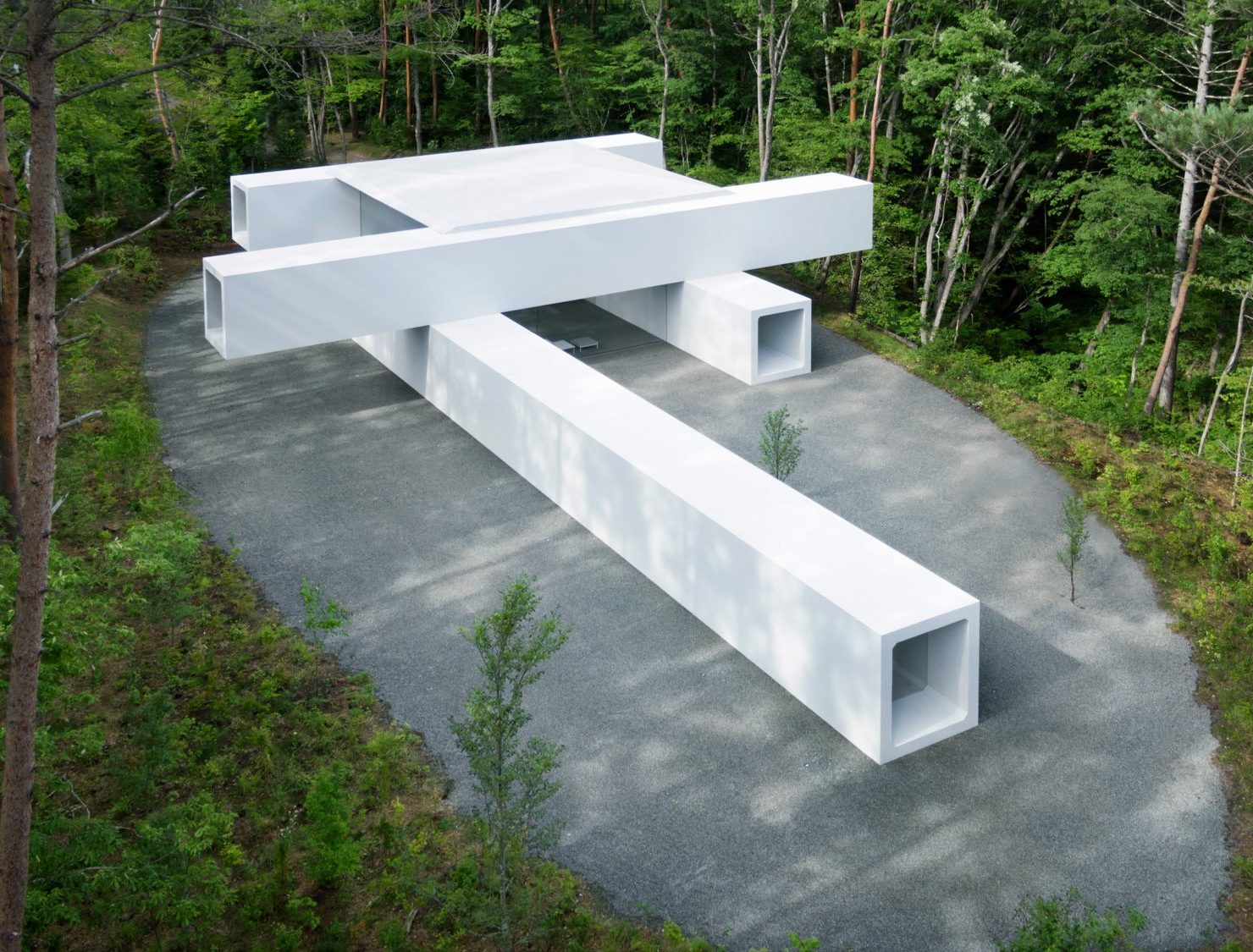
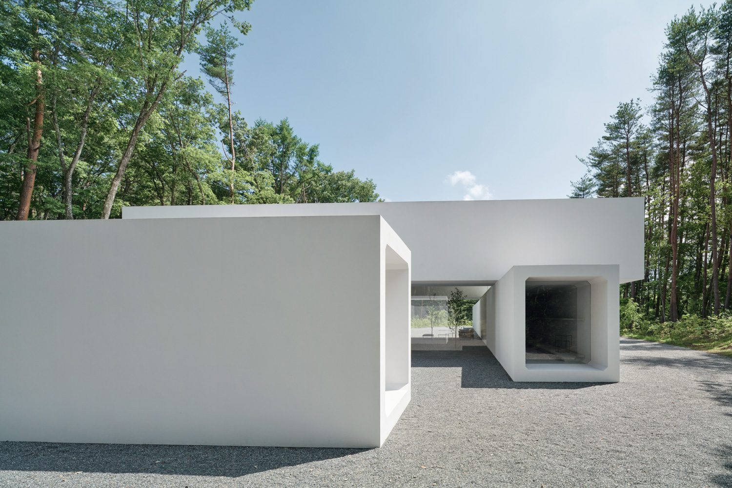
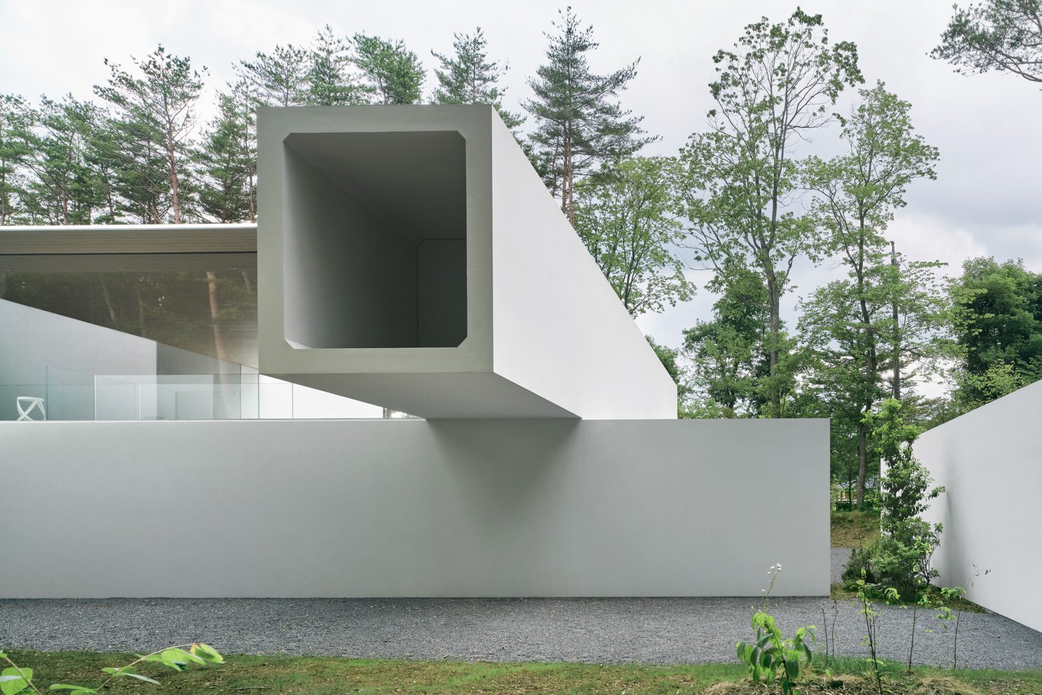
In early August 2022, Japanese multidisciplinary design firm nendo unveiled Culvert Guest-house, a highly conceptual architectural/ product design project. The work, which functions as a showroom for the studio’s own product design collection, is divided into two sections: the archive and the guesthouse. The piece aims to represent the studio’s unique personality, which is known for its inventive applications and interpretations of everyday, mundane things. As a result, a design work with distinct ambiguity that falls between familiarity and unconventional-looking objects has been created. Culvert Guesthouse is no exception. nendo opts for pre-stressed concrete, a building technique commonly utilized in infrastructure and public utility systems but rarely seen in residential projects, with a pipe-like form as the primary element of the design.
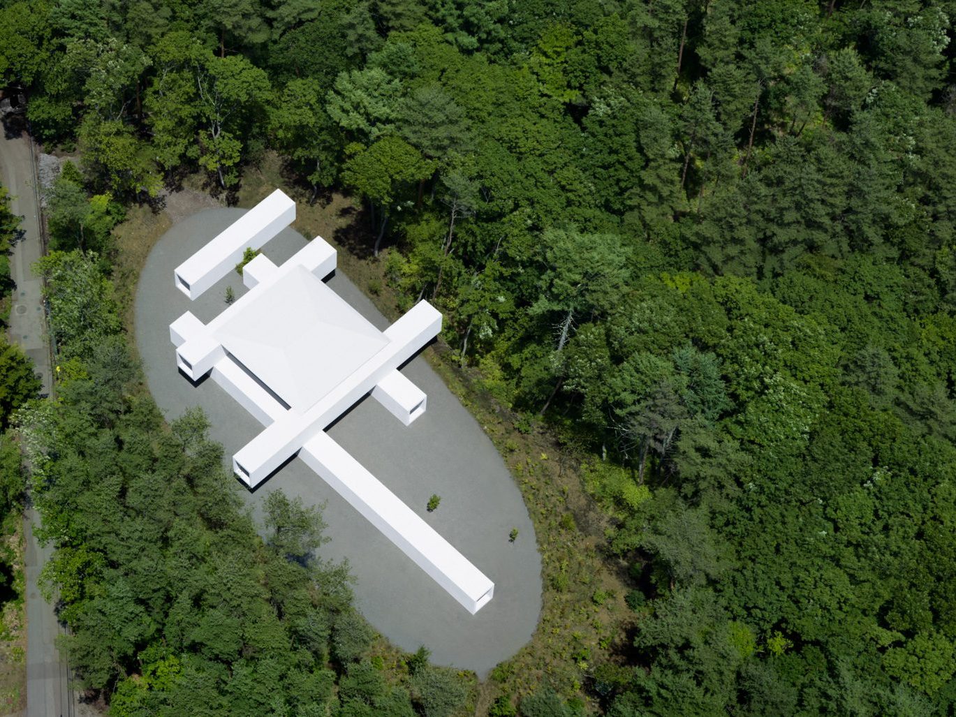
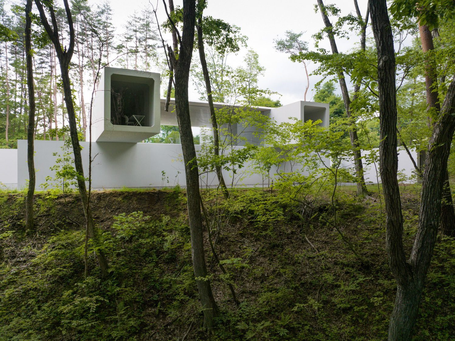
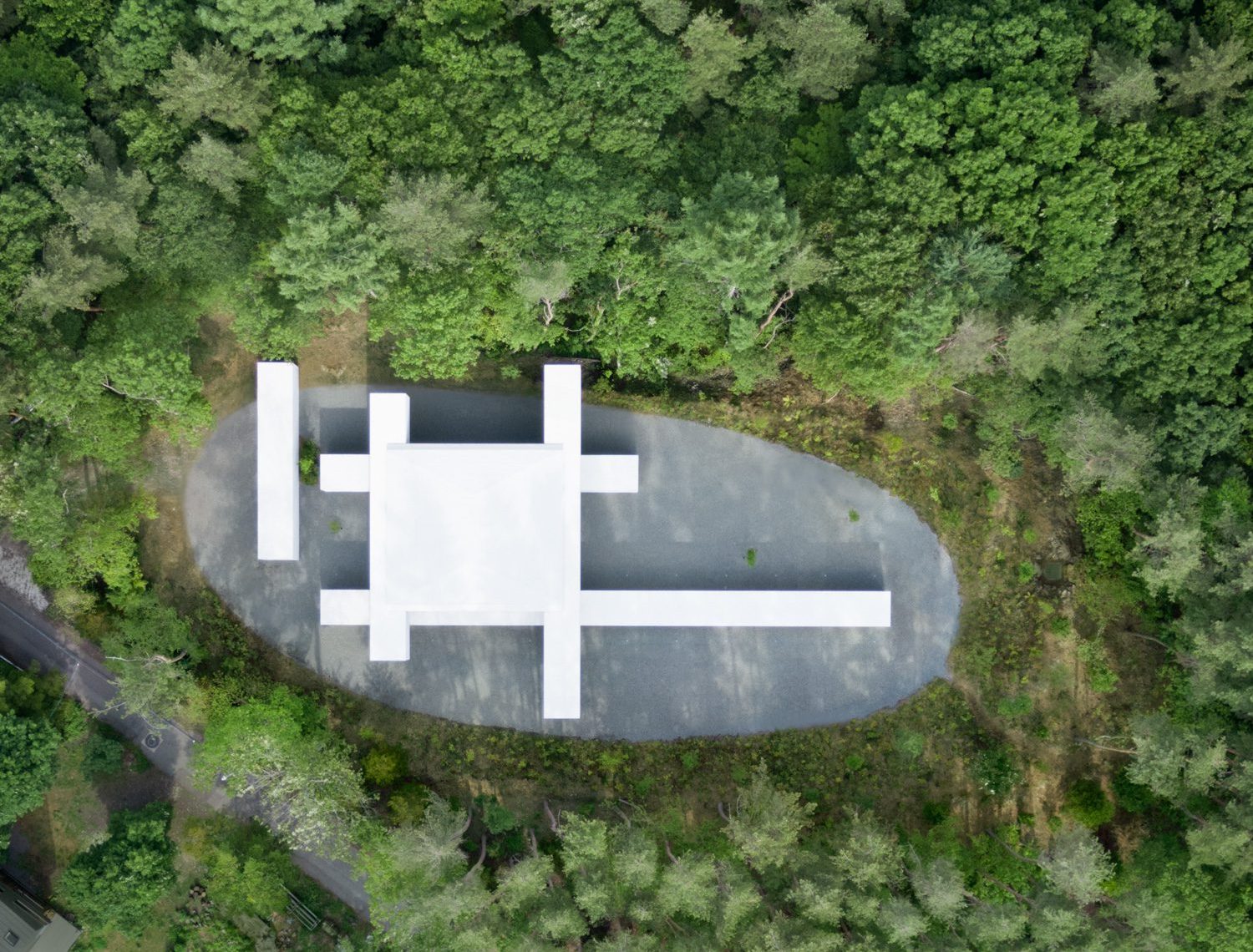
Sketch
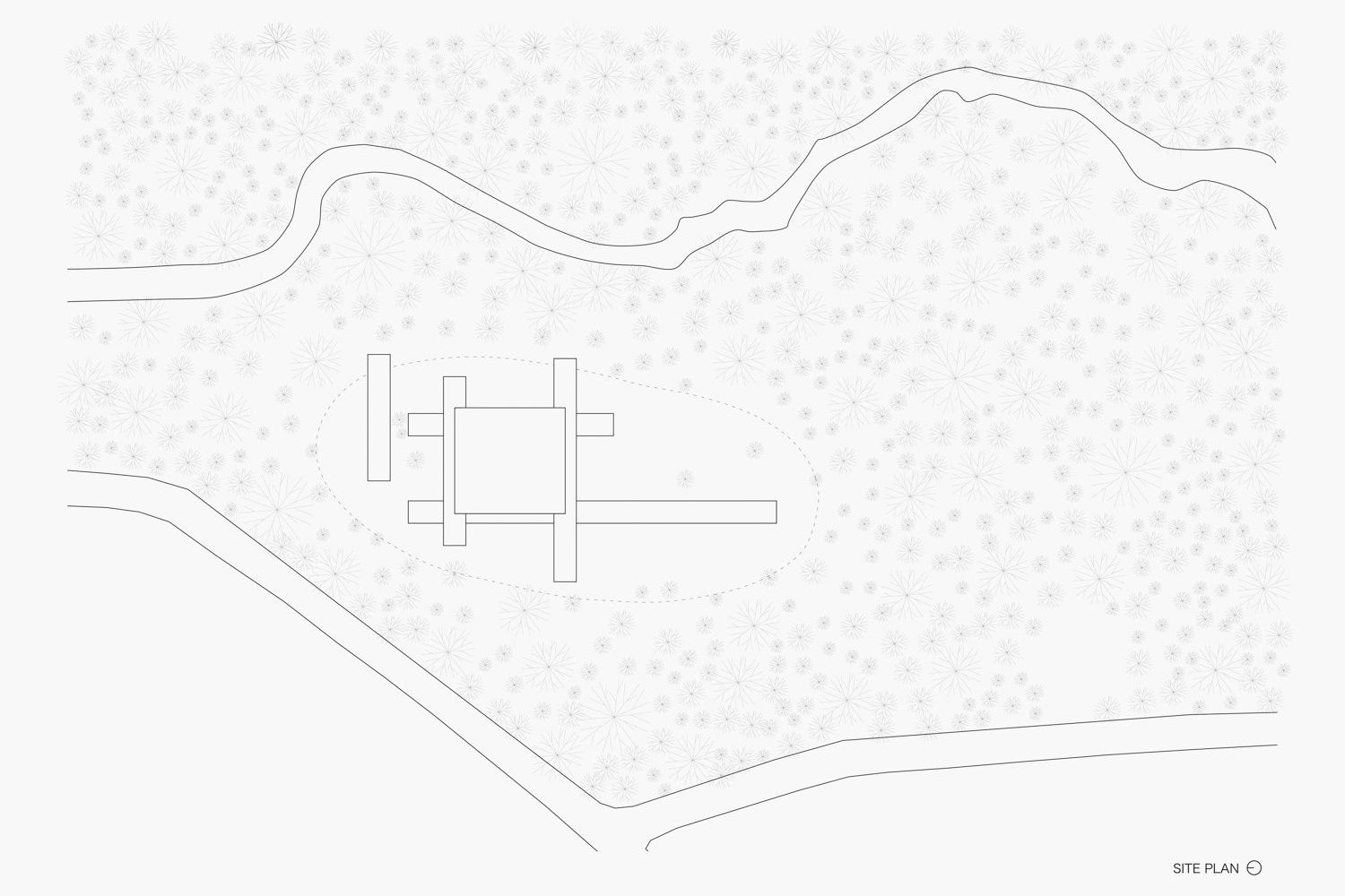
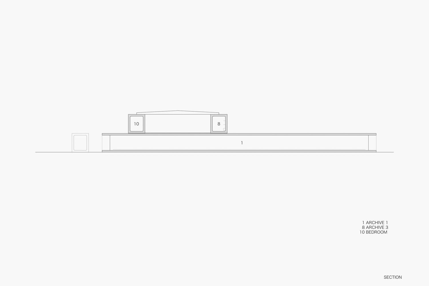
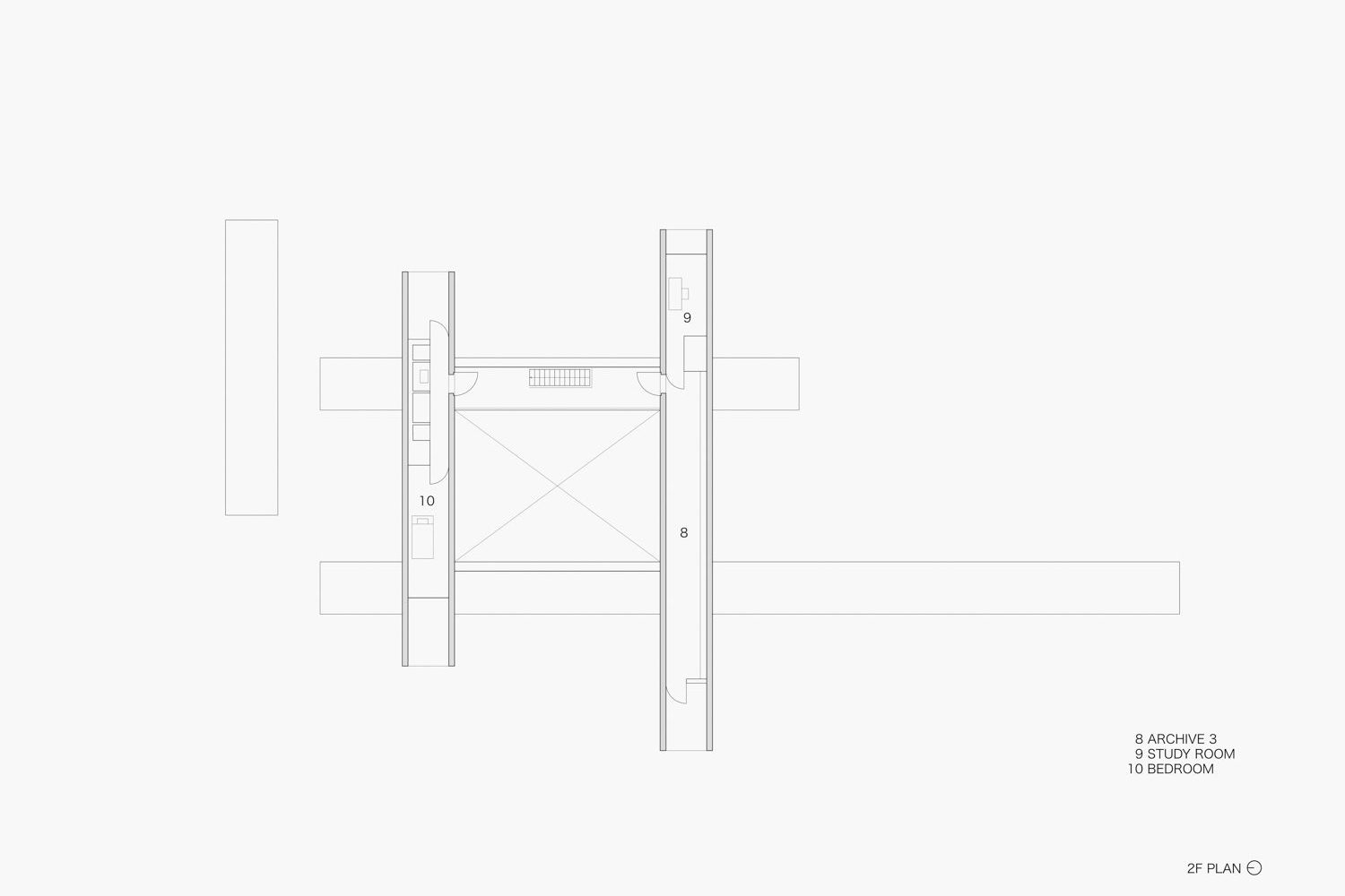
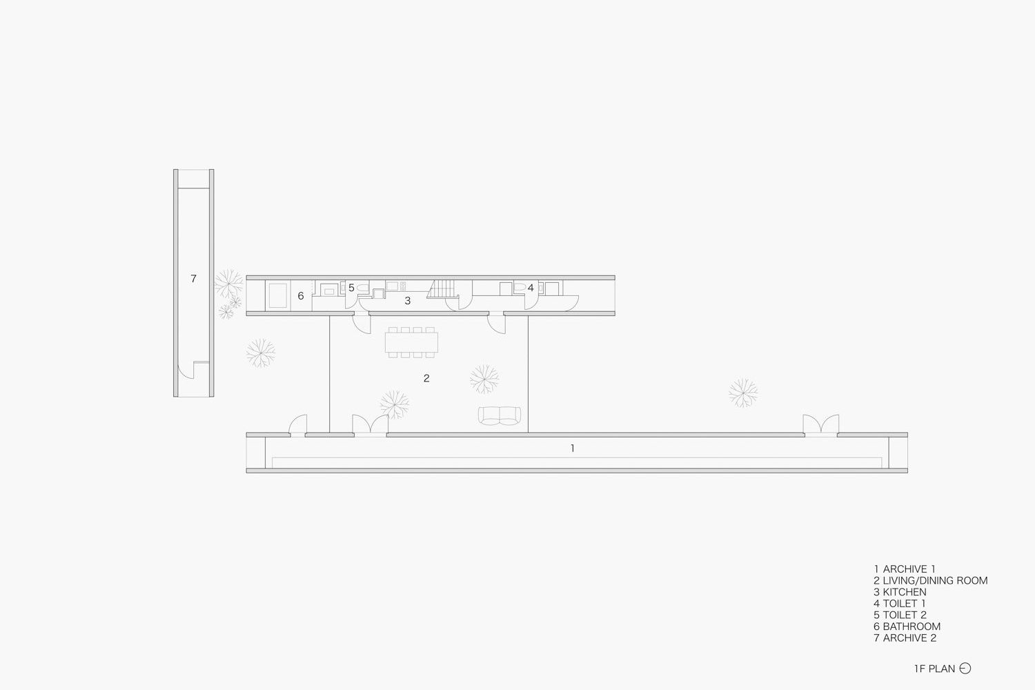
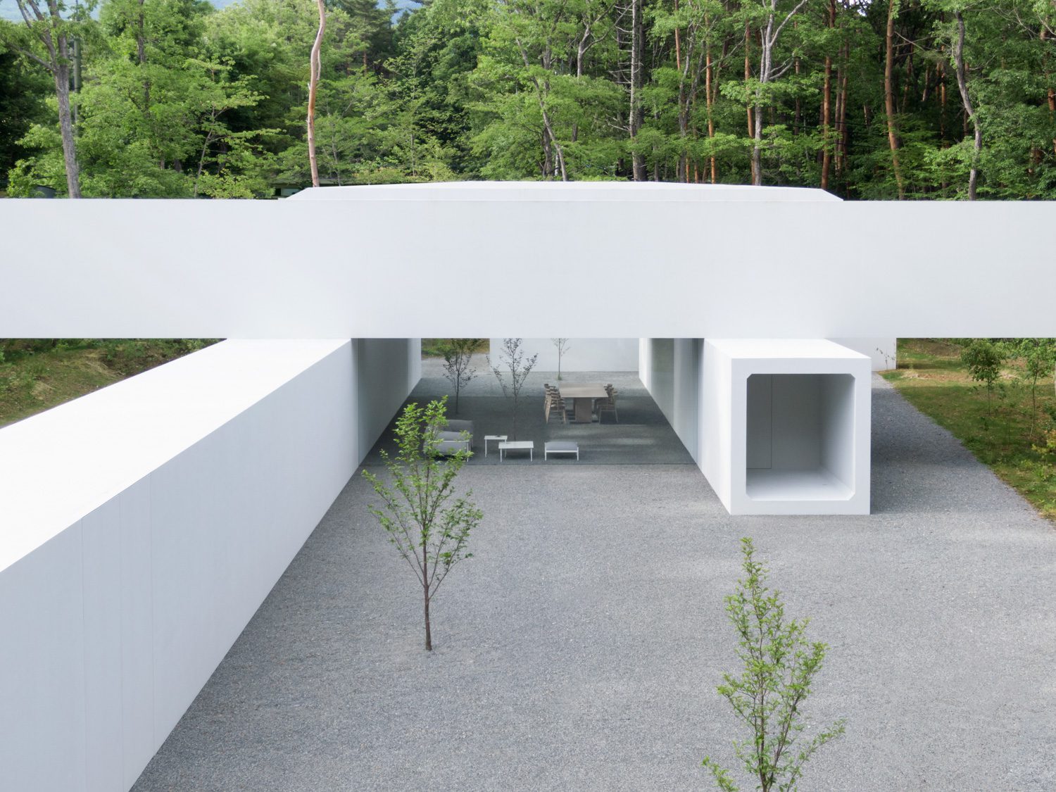
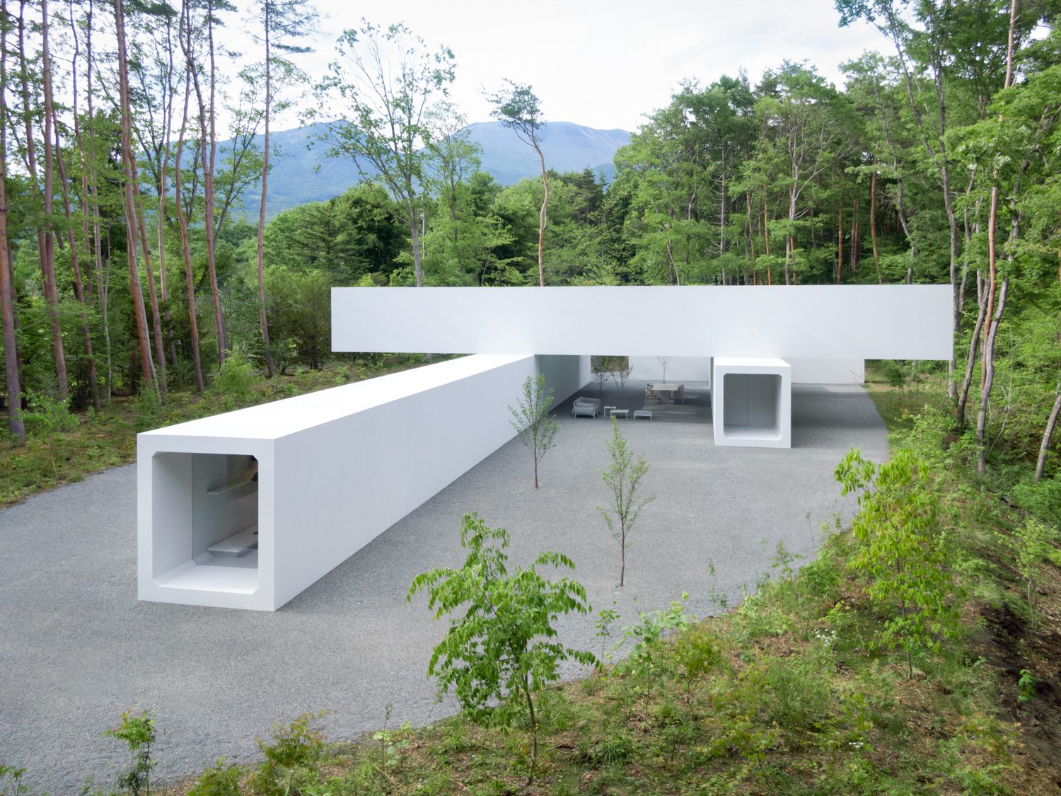
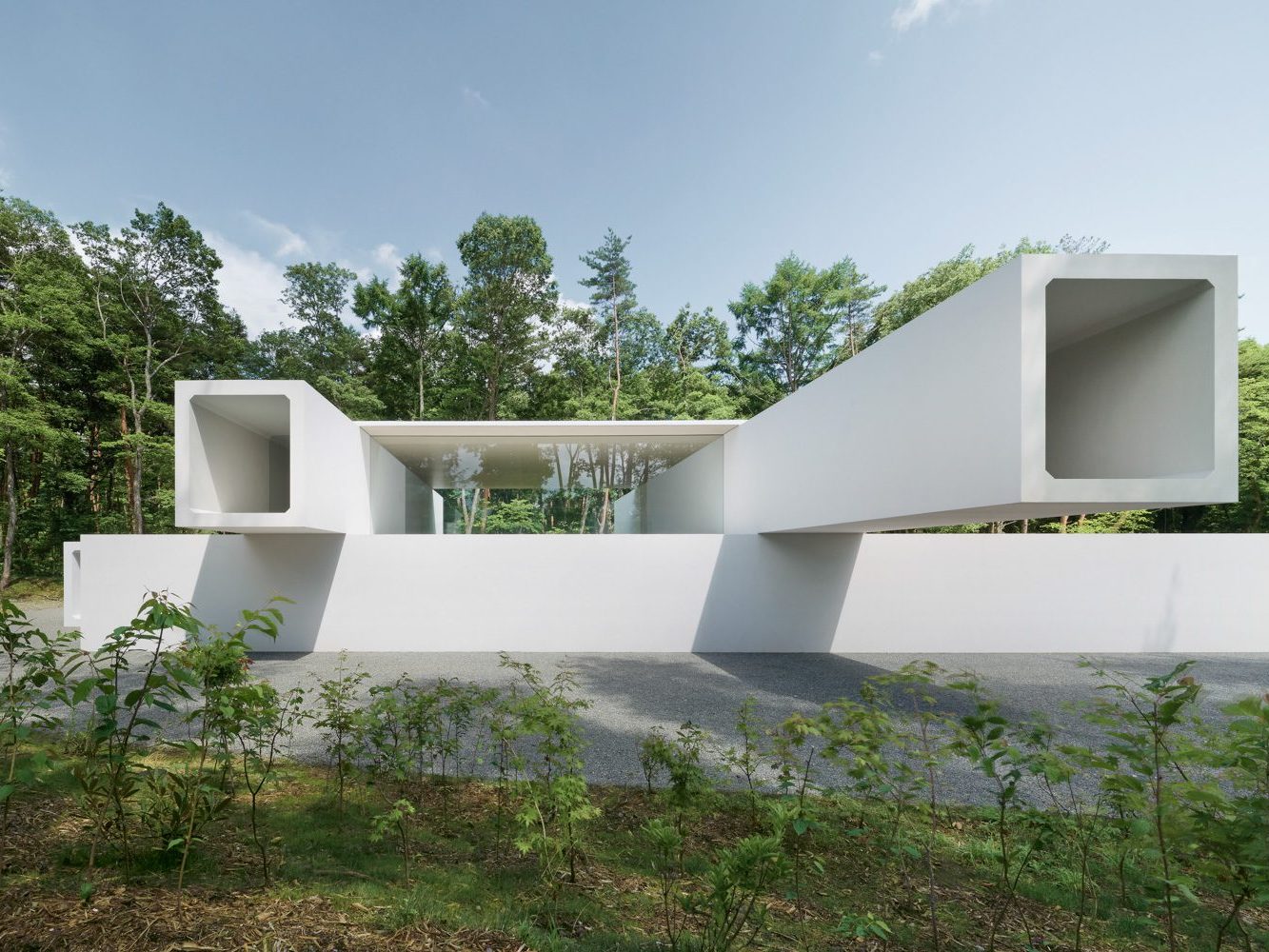
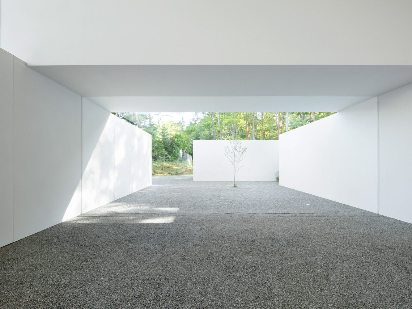
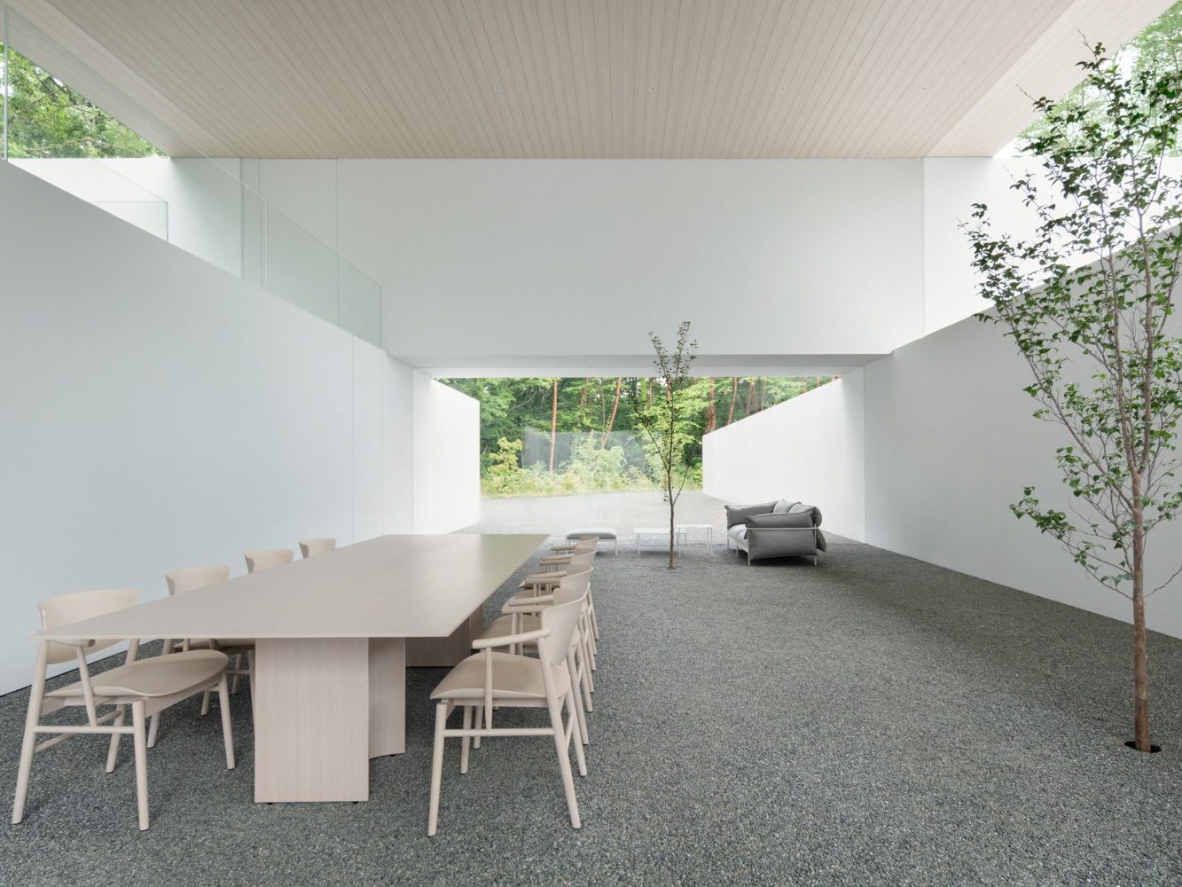
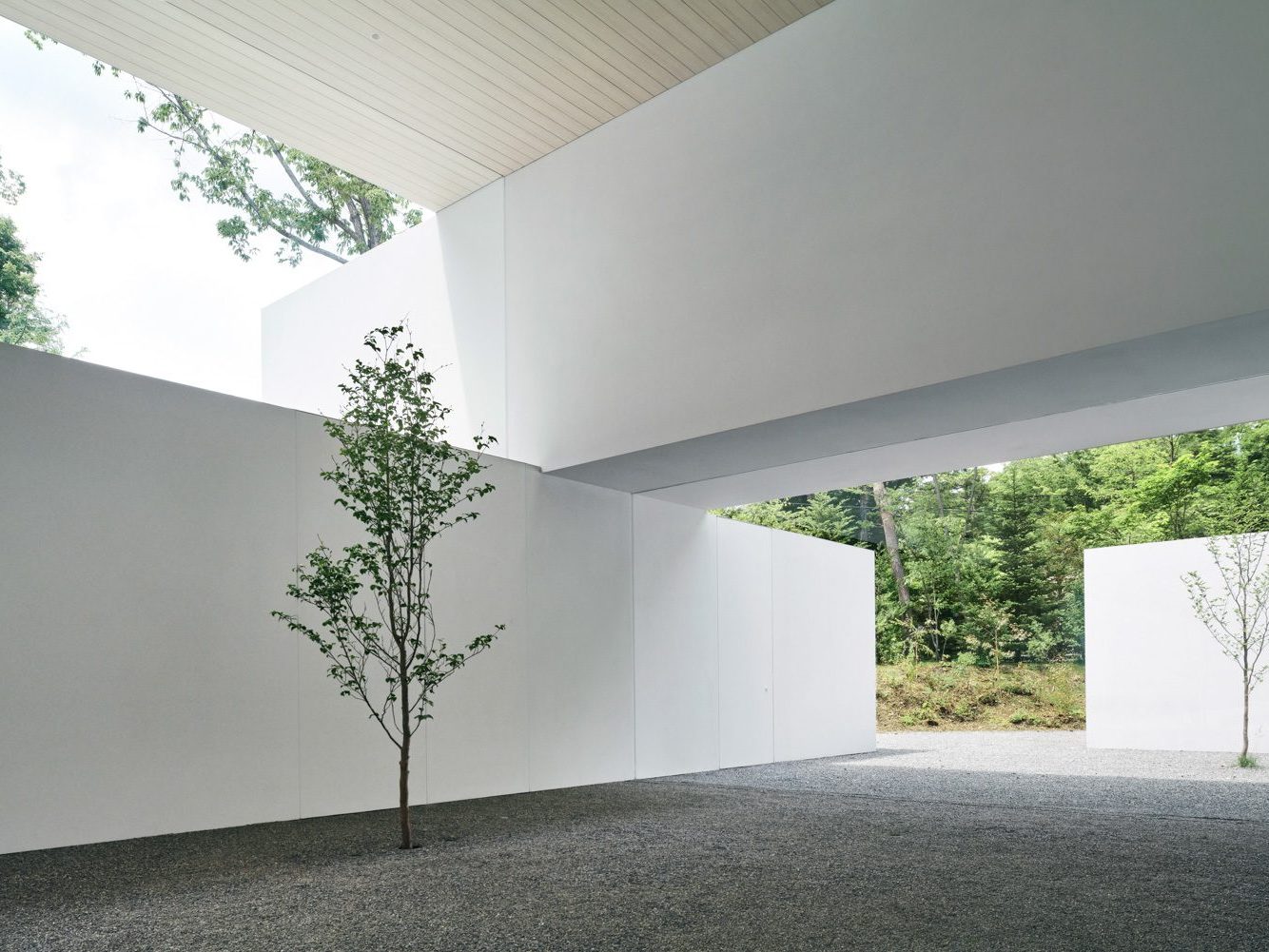
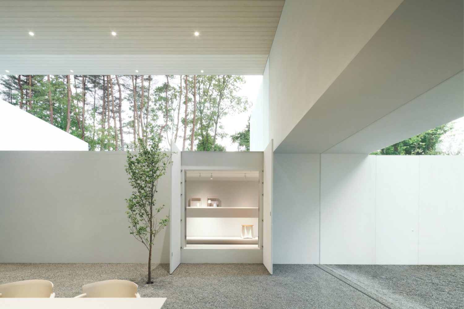
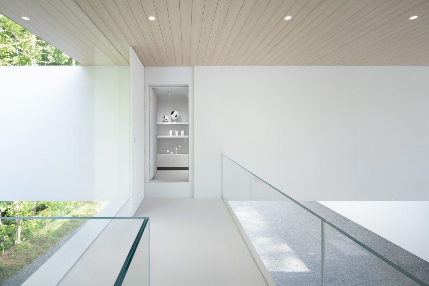
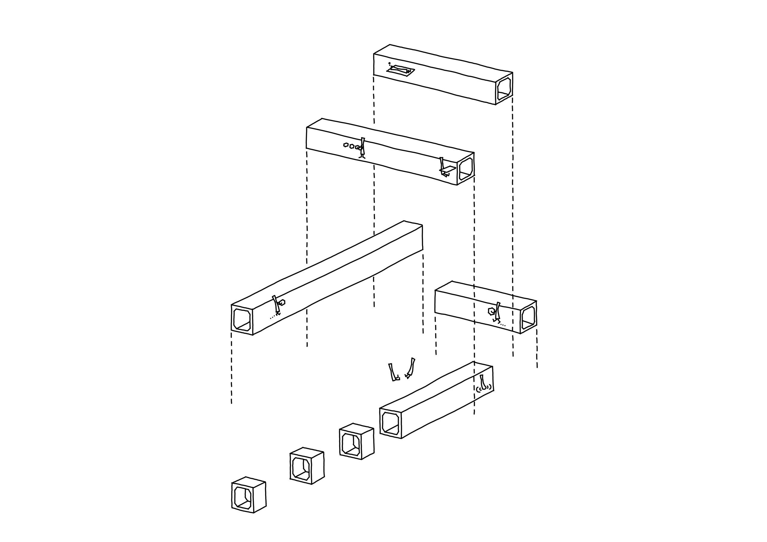
The concrete pipes with 2×2.3-meter sections were chosen by the design team and built into a series of units, each with five elongated pipes. The three long pipes are installed at the bottom, while the other two are erected perpendicular to the first three horizontal pipes on the second floor of the building. A flat roof closes the openings generated by the connecting components. These fea-tures combine to form a courtyard. Since the structure is intended to be a showroom rather than a guesthouse, nendo chose to place the pocket space between the archive zone and the guesthouse section to be arranged in a seemingly randomized arrangement with no specific order while the par-titioning of private spaces of each program is clearly recognizable.
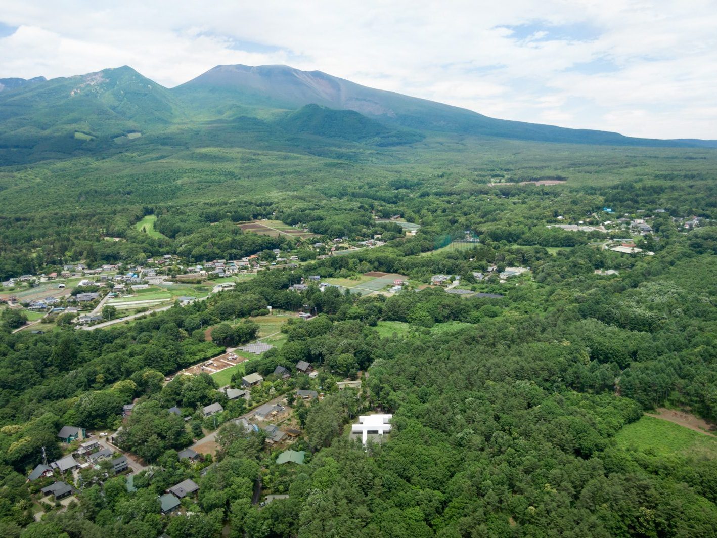
I must admit that my first encounter with the work, with its massive minimalistic, monolithic, and intimidating components that appears somewhat visually delicate in the center of the red pine forest, was both perplexing and overpowering. Looking up the project’s description, the final sen-tence reads,
“The resulting space is less architectural, but rather a project that combines civil engineering concepts with product design details.”
It was clear in nendo’s attempt to depict the work as a product design project rather than an architectural undertaking. However, I find it contradictory to identify this built structure as such since it borrows a physical shape that is undeniably architectural in scale. Many of the characters in the piece are reminiscent of several works of architecture, such as Herzog & de Meuron’s Vit-raHaus, with its deviated and stacked pitched-roof structures, or Ensemble Studio’s Hemeroscopium House, which sees an application of materials and components used in the construction of bridge structures to create something on a residential scale. There’s also something about the work that reminds me of Go Hasegawa’s Pilotis in a Forest House, in which the architect creates a courtyard in the middle of a woodland. These projects, in my opinion, belong to the high-concept genre of ar-chitecture, whose success is based on the commonality of ideas, creative use of technology, and masterful manipulation of the “quality” of places. It is this feature that gives birth to works with ex-tremely distinct personalities while still retaining enough clarity to convey the aims of their design and construction, as well as why they picked such a path and approach.
Based on such contradictions, I believe that comparing Culvert Guesthouse to the previously mentioned works will help us develop an important question: if nendo refuses to define this work as architecture, can we still comprehend why it is designed and built in such a form and manner?
To me, one of the most vital essences that might help us grasp the purpose of a work’s exist-ence is the quality of space. Program wise, VitraHause by Herzog & de Meuron is a project whose program and linear form are elements that Culvert Guesthause shares, as well as the layered archi-tectural masses. With the exception of the slightly different sizes of the functional space, what dis-tinguishes the two works is how Herzog & de Meuron focused on the use of simple and house-like forms, such as the box-like shape with a gable roof. Together, these elements work as a tool to fa-cilitate the relationship between users and the program, with the primary objective of serving as Vit-ra’s flagship store. The use of a gable roof with a wide section creates a place that resembles the living space of a house, allowing people to imagine the look and feel of Vitra products inside an ac-tual living environment. Herzog & de Meuron did not use prefabrication to create a unified section for the building’s stacked volumes. Instead, they chose cast-in concrete, for it enables them to arrange, cut through, or position the gabled-shape volumes into a variety of architectural compositions, such as the seating area, staircases, platforms, all the way to the window frames, and so on. These ele-ments are the tools used to generate movement or to persuade visitors to pause, take a seat, and remain still in order to appreciate the space and its fun little gimmicks. The displayed goods bring a positive experience and impression.
On the contrary, while the archive and guesthouse program are the most intriguing aspects of Culvert Guesthouse, the decision to employ the structural members with a 2×2.3-meter section commonly used for the construction of a bridge to determine the overall design direction appears to make the work more difficult to understand. This is due to the proportion being physically similar to that of a shipping container rather than a living space or gallery. It’s an awkward proportion that leaves no opportunity for guests to take a step back and properly enjoy the displayed objects, while the pipes’ section makes it far from being suitably sized for a bedroom.
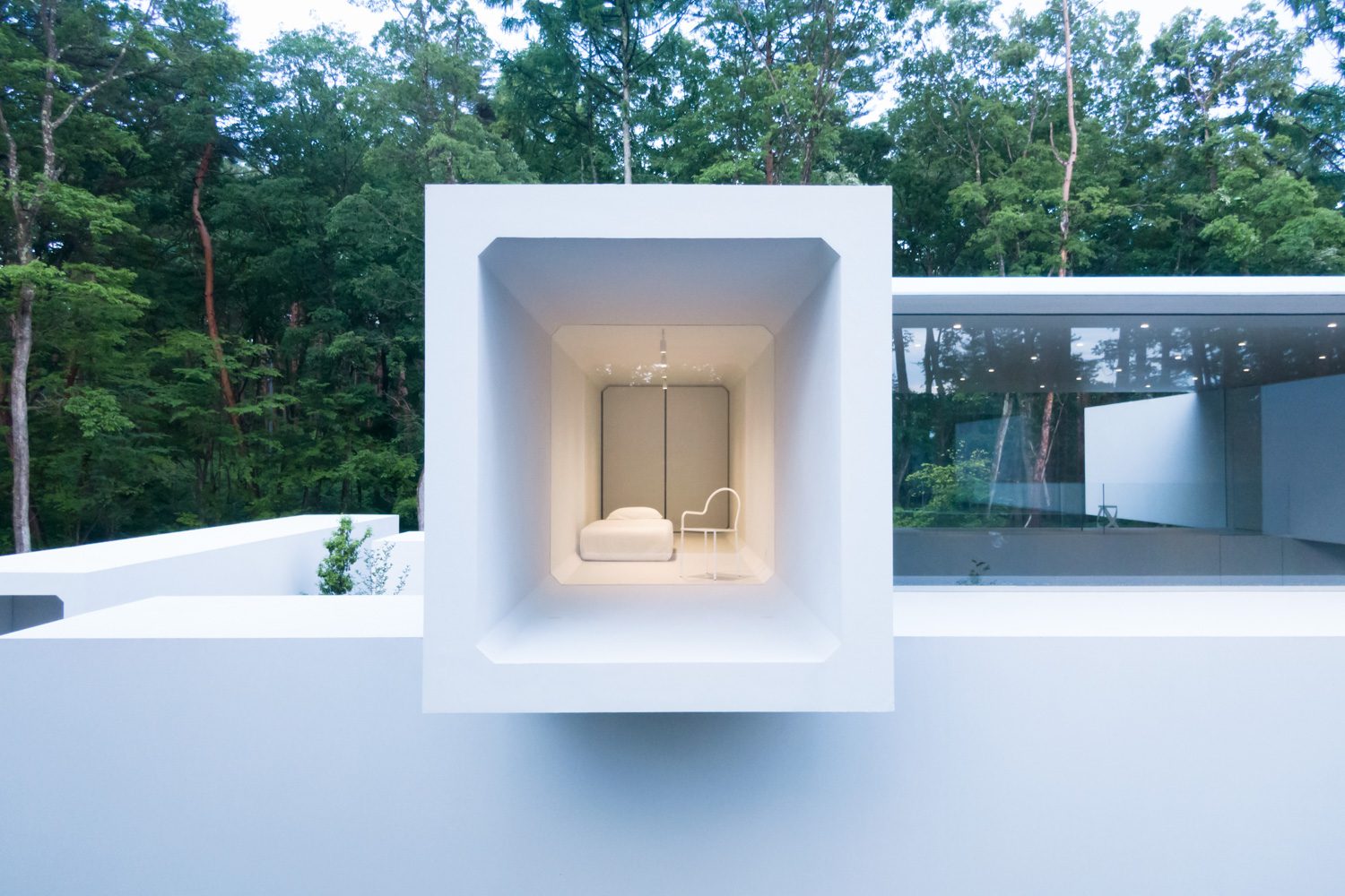
Photo: Takumi Ota
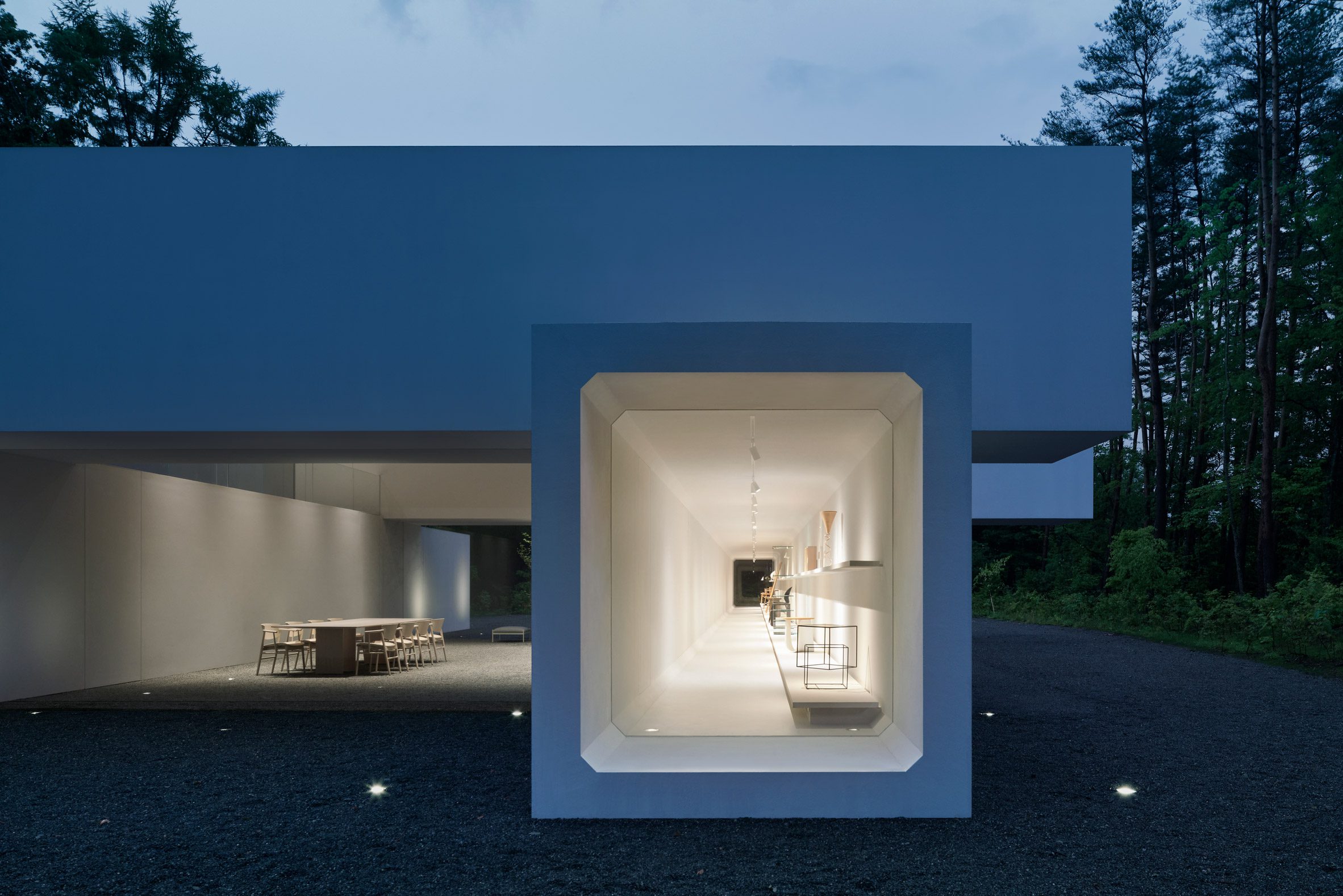
Photo: Daici Ano
If we compare the sculpture-like impressions granted by the two works, the VitraHaus appears to be more difficult to comprehend based just on its architectural form. However, once users step inside and experience and engage with the interior program, everything becomes clear, from the principles and rationales for the arrangement of the architectural masses to the outside appearance and the flow between interior and exterior spaces, both vertically and horizontally. The pipe ar-rangement at Culvert Guesthouse appears to be an attempt to create a frame for the courtyard. Each pipe seems to be separate from the others and has no spatial connectivity. The designer’s de-scription of this particular pipe arrangement and how it is based on the idea of improving the func-tional merit of the archive’s area does not sound particularly convincing. To believe that if all of the pipes are placed on the first floor without any being stacked, the quality of the archive section’s space or its relationship with other portions of the building will not be significantly different from how it is now.
From these two considerations, I’m left wondering why the designer felt the need to invest in developing such a difficult idea and building technique for this end result when arranging shipping container units may perhaps yield a comparable result. Another building approach could be devised to make the job more proportionally appropriate to its functions. The issue with having the pipe structure prefabricated, with the repeating form that offers the aesthetic benefit that is physically unanimous, is that it ends up limiting each room’s practical capabilities. It appears to be a minimalist approach that simplifies not to extend imagination and possibilities but rather to reduce functional options.
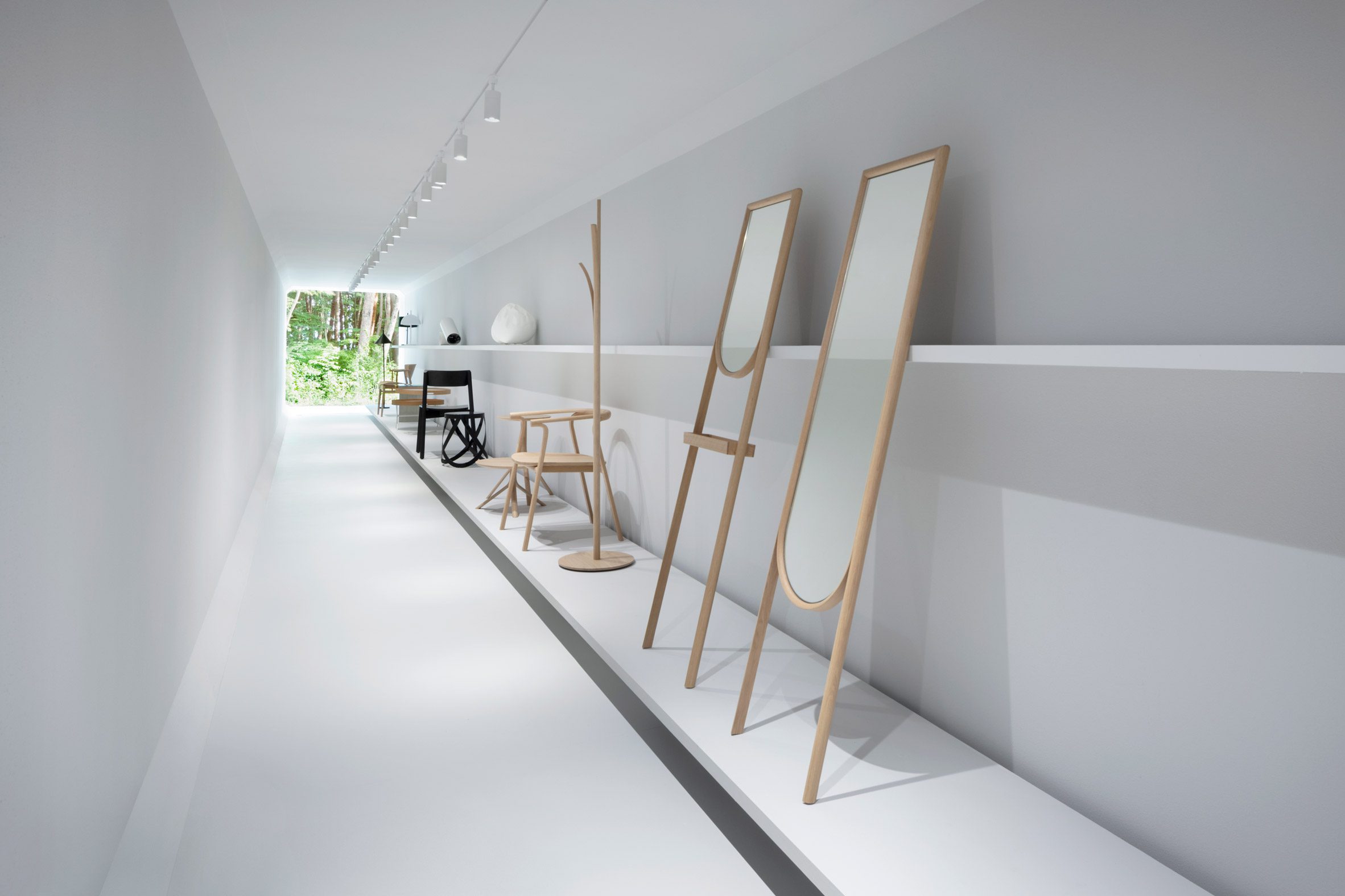
Photo: Takumi Ota
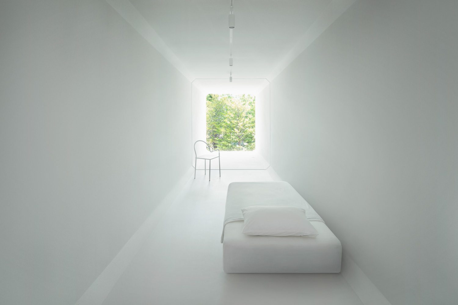
Photo: Takumi Ota
The next point I’d like to make is that if we consider the project’s priority to be the application and glorification of infrastructural elements on a residential scale, rather than the program, Ensem-ble Studio’s Hemeroscopium House is more successful and masterful in the sense that it can leave an impression about the extreme use of large-scale structure with a small scale structure of a house more efficiently with the use of a beam structure and large pipes commonly used in bridge construc-tion or piping system as the principal element of the work. The architect chose to arrange the i-beam structure to build a structural balance to manage the load of the u-beam members in the 2.4×1.7-meter section where the swimming pool is positioned with the mass that extends 8 meters in mid-air. Swimming out to the pool’s farthest edge is a mind-boggling experience due to this gravity-defying structure.
If we compare it to the Culvert Guesthouse, the design attempts to keep the pipes clean and white, but the overall effect is homogeneous and devoid of details that would indicate that such a form is the result of the same construction method and techniques as the prestressed concrete beams used in bridge construction. In my opinion, Culvert Guesthouse could have achieved the same look and feel by using a steel truss structure wrapped in white walls.

Photo: Daici Ano
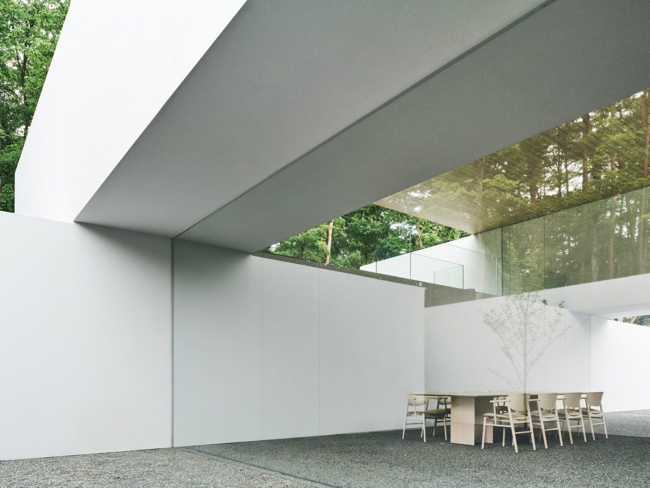
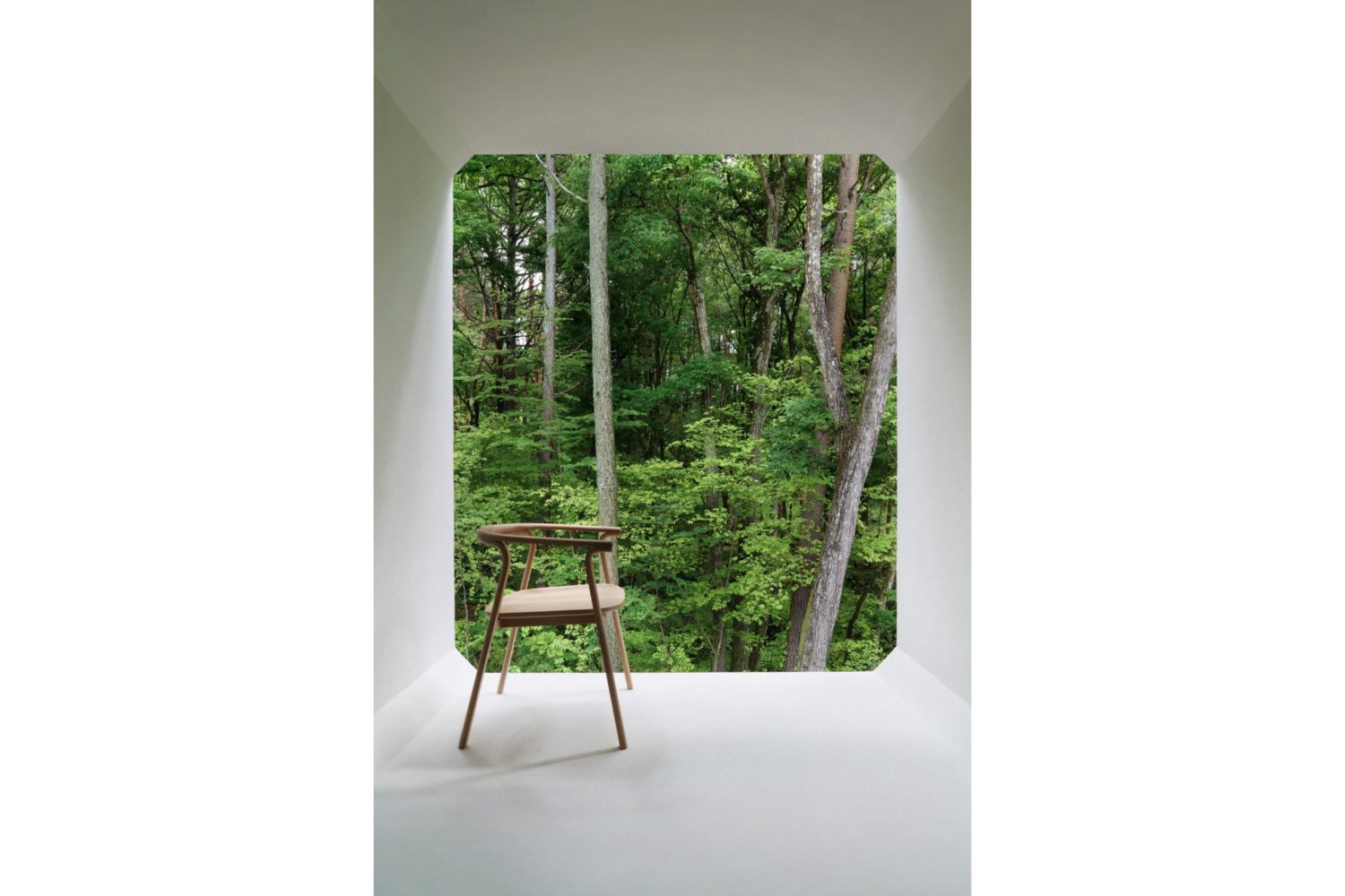
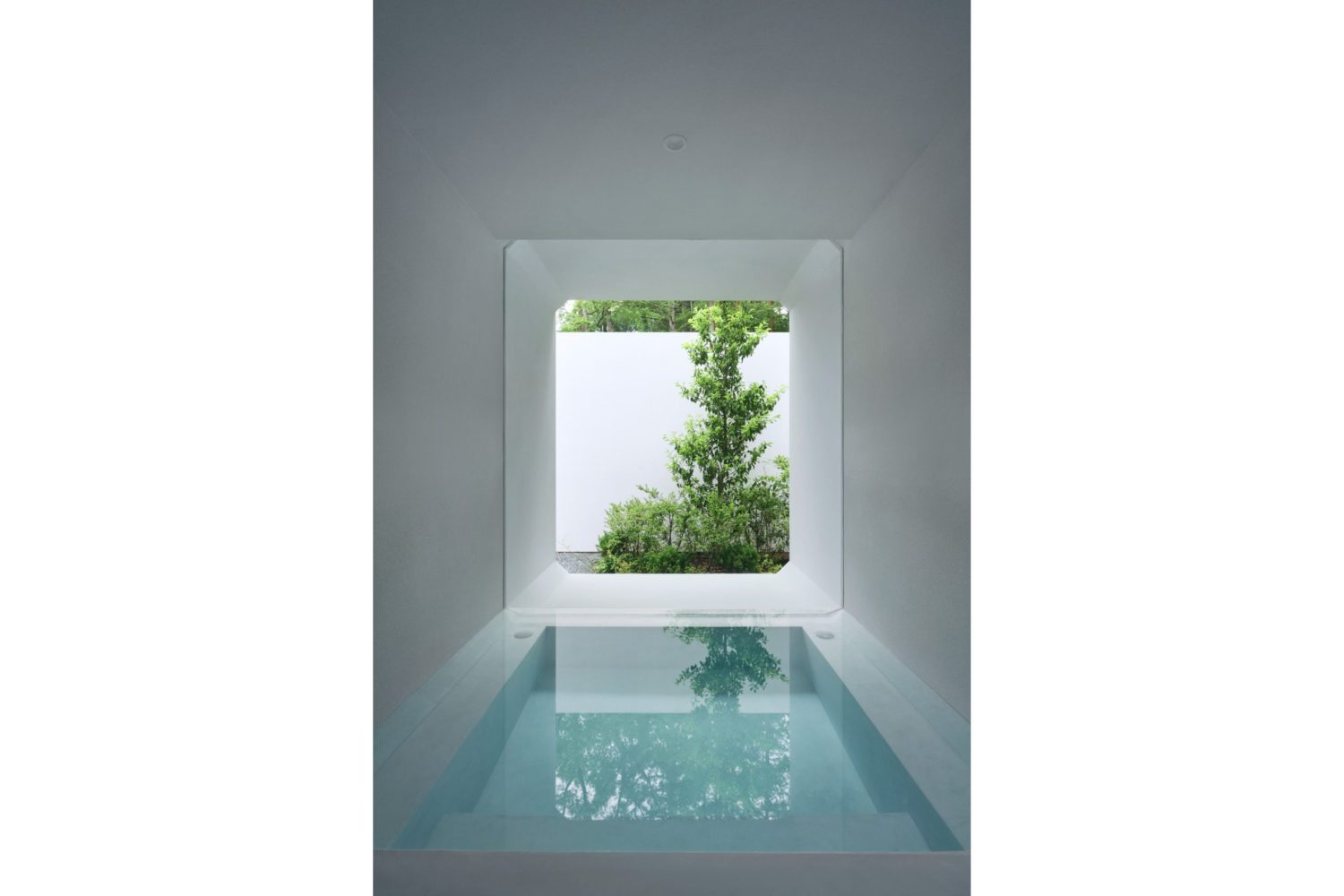
The courtyard, to me, is the most practical part of the work (apart from its intended functions and what it is meant to work with). In most situations, courtyards are employed in urban architec-ture, which is generally surrounded by walls. The opening at the top of a roofless courtyard adds openness and flow by facilitating connectivity between the interior space and the sky. However, nendo chose to add a fresh functional twist to this area by constructing a roof that cuts off the verti-cal connectivity as well as the passage inside the pipes. It refuses to connect the inner sections of the structure with the semi-outdoor courtyard. Instead, the semi-outdoor space was designed to in-teract horizontally with the outside world via the frame of the glass opening positioned between the pipes’ framework and the roof. The courtyard, in my opinion appears to be a montage of the clean white wall, the natural surroundings of the pine forest, and the reflection of the clashing elements of nature and built structures. Such a relationship results in unusual and interesting imagery of the courtyard that reminds me of Mies van der Rohe’s montage.
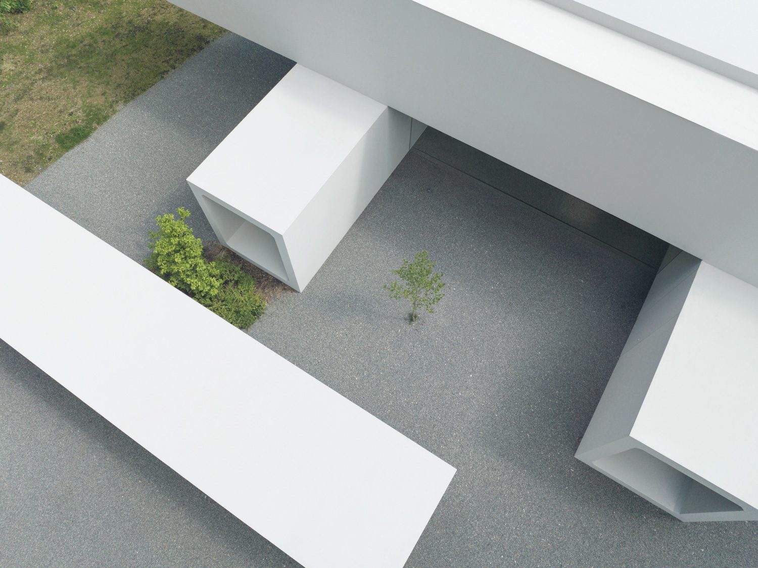
Photo: Daici Ano
I tried to imagine what the courtyard would have looked like if the design team had taken a dif-ferent approach and framed it with huge white walls instead of the pipes, whose spatial quality comes with management intricacy. The effect would have been the same. It appears that the chosen building techniques, the work’s focus on being a piece of sculpture, and the endeavor to create a great functional program do not work or complement each other very well.
Pilotis in a Forest House by Go Hasegawa is another fascinating comparison. The holiday home sits in the middle of the wilderness with a courtyard, forestland, and nature as part of the en-closure and border of the built structure, while serving as the fundamental design question. Haseg-awa is capable of creating and delivering a design that is realized as a house with a floor raised 6 meters above the ground. With wood and steel as the major structural components and materials, the elevation creates an open space devoid of any wall enclosure, while the cubical 10×10 meter residential structure can sit on relatively tiny columns. The reasons for the coexistence of the con-cept, building technologies, and space quality appear to make sense and complement each other, and if any of the materials or components were changed, neither the concept nor the space quality would have been as good as the original.

Photo: Takumi Ota

Photo: Takumi Ota
Although nendo stated that the work is an experimental approach to their development in prod-uct design rather than an architectural endeavor, and although I admire and appreciate the im-portance of cross disciplinary pursuits in the design, largely due to the fact that new and different perspectives have birthed new and interesting innovations, I do believe that works from every field of art and science in this world must have a core value; something that will set itself apart from works of other disciplines. Realizing a work as a functional art and paying attention to a human’s experience of a space are still considered vital tools in architecture, whether it’s an architectural pro-ject in general or works with a high concept that aim to question the discipline’s preexisting conven-tions. With such a tool, the existence of the work can be comprehended. If the designer had given significance to the architectural core value of the work itself with Culvert Guesthouse, the result could have been a conceptual architecture that is spectacular and challenges the existing definitions of architecture while delivering functional efficiency. And ultimately, this hybrid of a work would have been even more powerful and memorable than it already is.
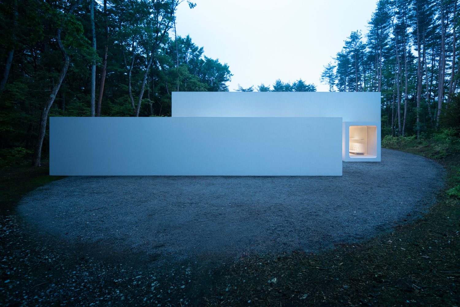
Photo: Takumi Ota

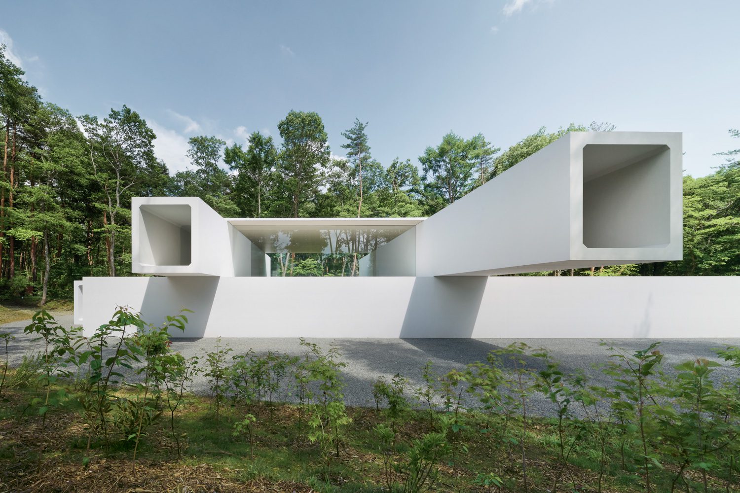 Photo: Daici Ano