 Image courtesy of macrovector | Freepik
 CONFLICTING PERSPECTIVES ON CORPORATE MEMPHIS BETWEEN CORPORATE OWNERS AND DESIGNERS
TEXT: NATHATAI TANGCHADAKORN
IMAGE CREDIT AS NOTED
(For Thai, press here)
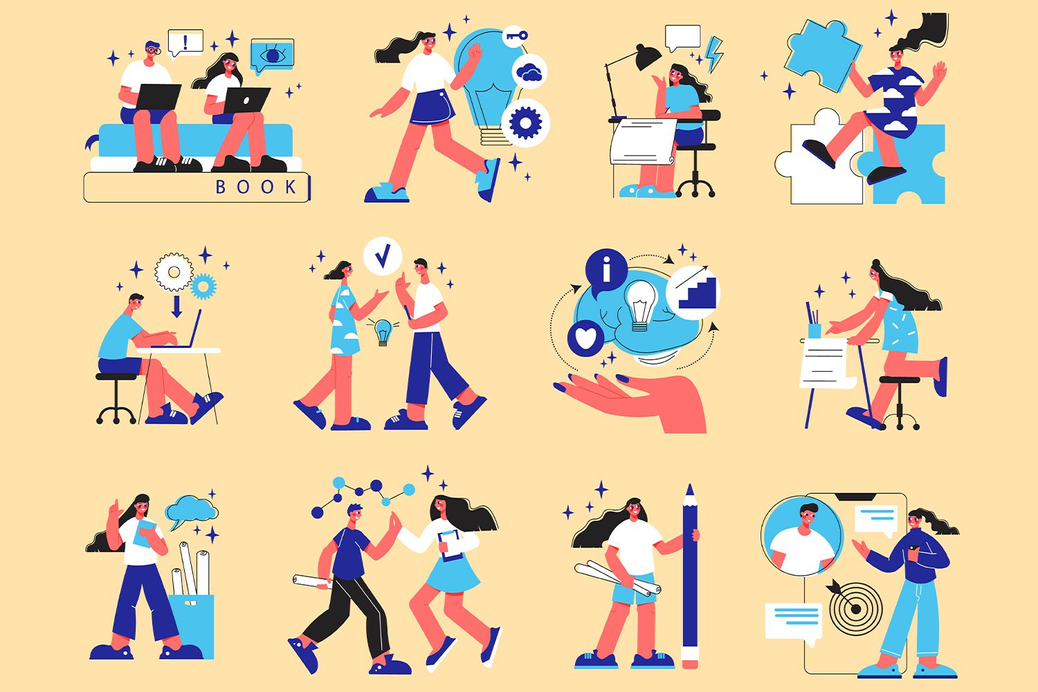
We’ve all seen them—those colorful, hyper-saturated graphics of people with exaggeratedly broad shoulders and noodle-like limbs bending in impossible ways, as if they were boneless. They often appear on Facebook and other online platforms, sometimes with heads so small that their faces are barely discernible. And yet, they are meant to represent everyone in the most generic, all-encompassing way possible. This is the hallmark of a style known as Corporate Memphis—a visual aesthetic that some graphic designers and illustrators on the internet have dismissed as being ‘featureless’ and utterly uninspiring.

Image courtesy of pikisuperstar | Freepik
The term Corporate Memphis comes from two distinct origins. The ‘Memphis’ part refers to its resemblance to the work of Memphis Milano, the Italian design studio that defined the 1980s with its bold colors and simple geometric forms—often more visually striking than functionally practical. The ‘Corporate’ part stems from the fact that this style was resurrected and popularized by Alegria, the illustration series introduced by Facebook in 2017, designed by BUCK and Xoana Herrera. From there, major tech giants—Silicon Valley’s Big Tech—adopted and adapted it for their own branding, solidifying this aesthetic as a corporate staple from that point onward and well into the early 2020s.
The real question is: why did Big Tech embrace this style so wholeheartedly, while many designers and illustrators found it so uninspiring? The answer lies in its inherent friendliness. It may sound counterintuitive, but here’s the key: despite its bright, eye-catching colors, Corporate Memphis is, in essence, devoid of identity. The figures it depicts lack defining characteristics—there’s no distinction between height, weight, or even race. No one is particularly tall, short, fat, or thin. Their bodies are thick, blocky shapes with unnatural skin tones, making it virtually impossible for anyone to accuse a company of bias or exclusion.
As one Reddit comment aptly put it:
“Let’s make all the people bland, happy colors and shapes that just resemble humans. Can’t imagine anyone being offended by that.”
Image courtesy of upklyak | Freepik
For corporations, Corporate Memphis is an excellent tool for cultivating a friendly and approachable brand image. By communicating through these graphics, companies can make users feel more at ease with their platforms. However, this is precisely where frustration has begun to brew among many creators who are repeatedly commissioned to produce these visuals. The charm of its ‘friendliness’ stems from an endless loop of playing it safe, which, over time, has led to a growing sense of creative fatigue and even outright disdain. Corporate Memphis feels like design without a real brief—something endlessly replicable, built from basic shapes, and easily mass-produced without requiring actual drawing. This has resulted in an overwhelming flood of bland, identity-less illustrations that have become visually exhausting.
Ultimately, while one can sympathize with designers and illustrators rolling their eyes at this trend, it’s also worth considering: hasn’t graphic simplicity always been around? Long before Corporate Memphis—which paradoxically represents everyone and no one at the same time—corporate graphics relied on stick figures and solid black silhouettes. The only real difference? No one was being paid to draw stick figures back then, so there was no reason to get sick of them and complain. (laughs)