Tag: graphic
NAT KUNYAPAT

Central 76th Anniversary
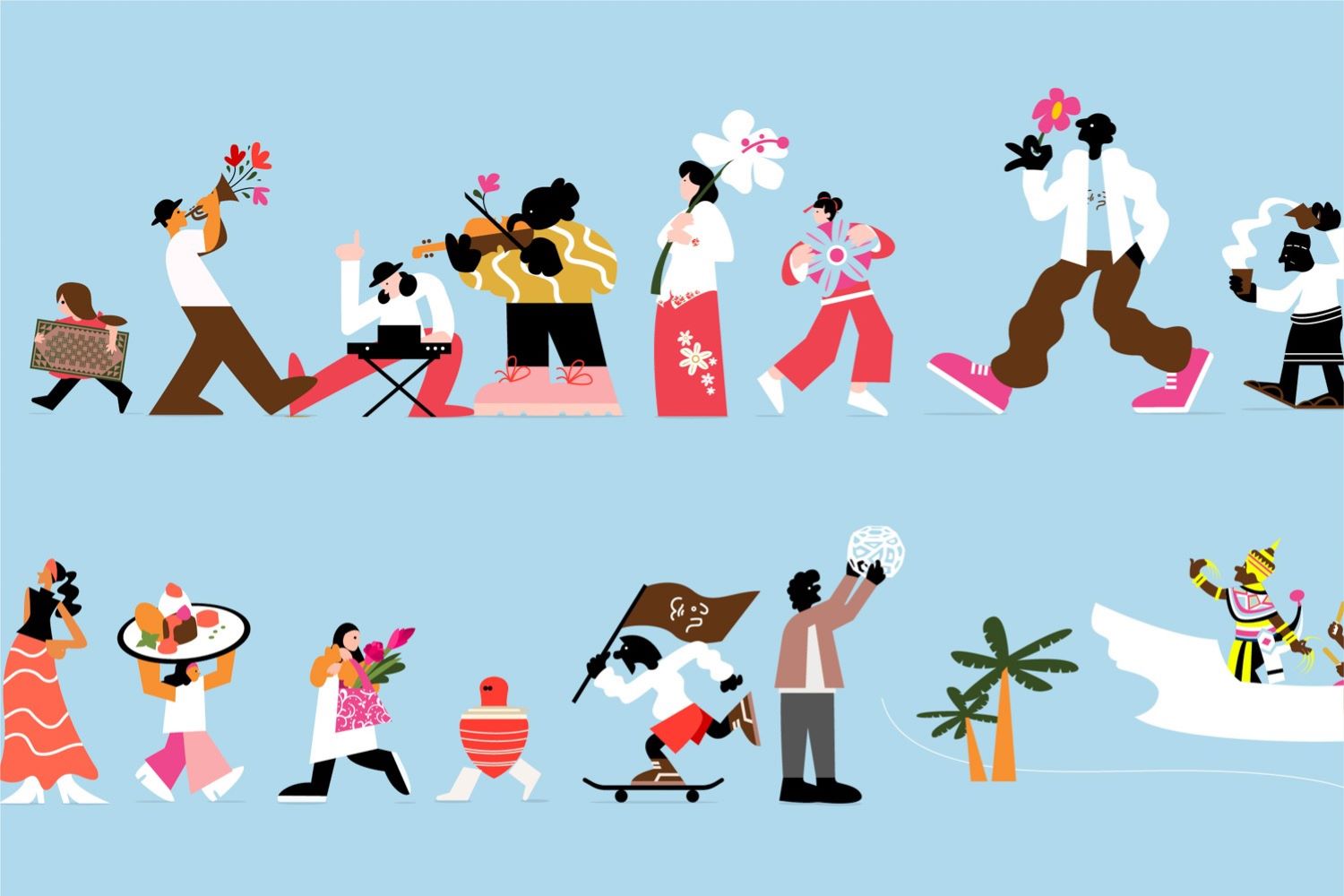
NAT KUNYAPAT IS AN ARTIST WHO COMBINES EMOTIONS AND NATURE WITH GRAPHICS IN EVERY PIECE OF WORK. HER WORK IS FULL OF COLORS AND DETAILS THAT REFLECT FEELINGS AND INSPIRATION FROM TRAVEL AND EVERYDAY LIFE Read More
SUBPER GRAPHIC
A GRAPHIC DESIGNER COMPANY LOCATED IN THE OLD TOWN OF PATTANI THAT WAS FORMED BY A GROUP OF GRAPHIC DESIGNERS IN THE AREA TO ENHANCE THE RECOGNITION OF THIS PROFESSION IN THE THREE SOUTHERN BORDER PROVINCES
TIME STRETCHED
TEXT & IMAGE: ANTON REPPONEN
(For Thai, press here)
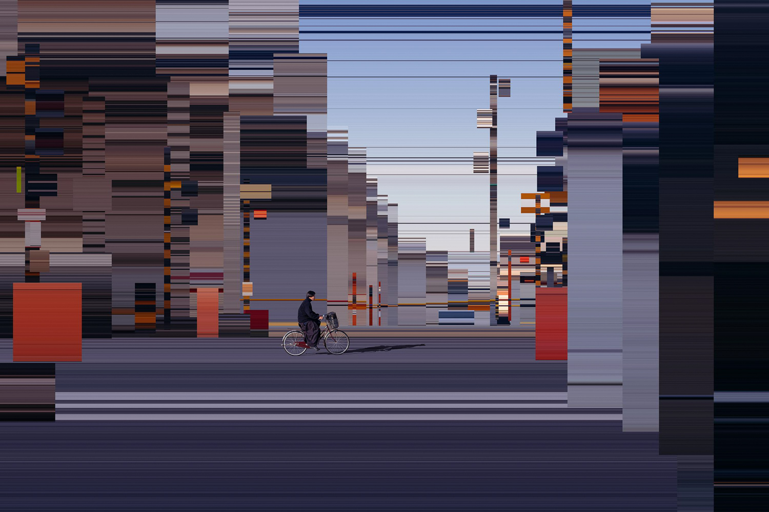
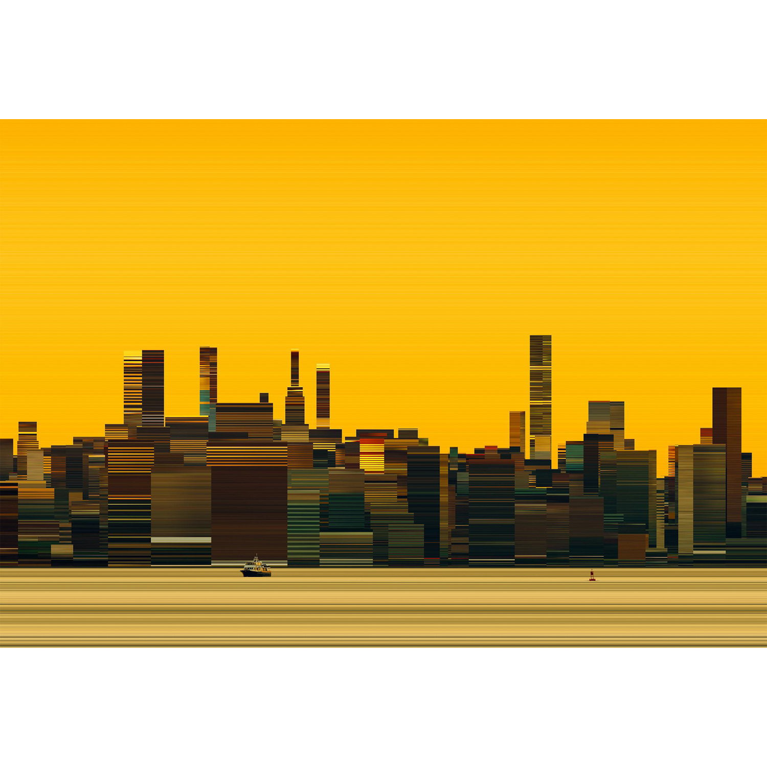
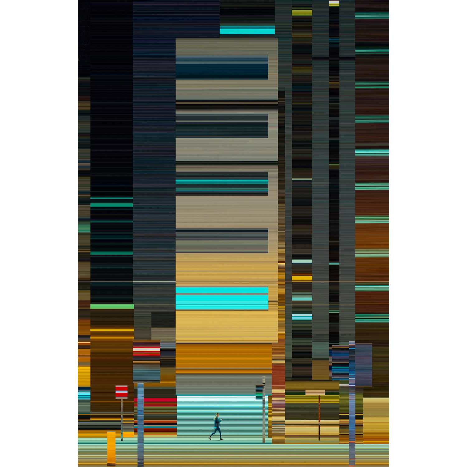
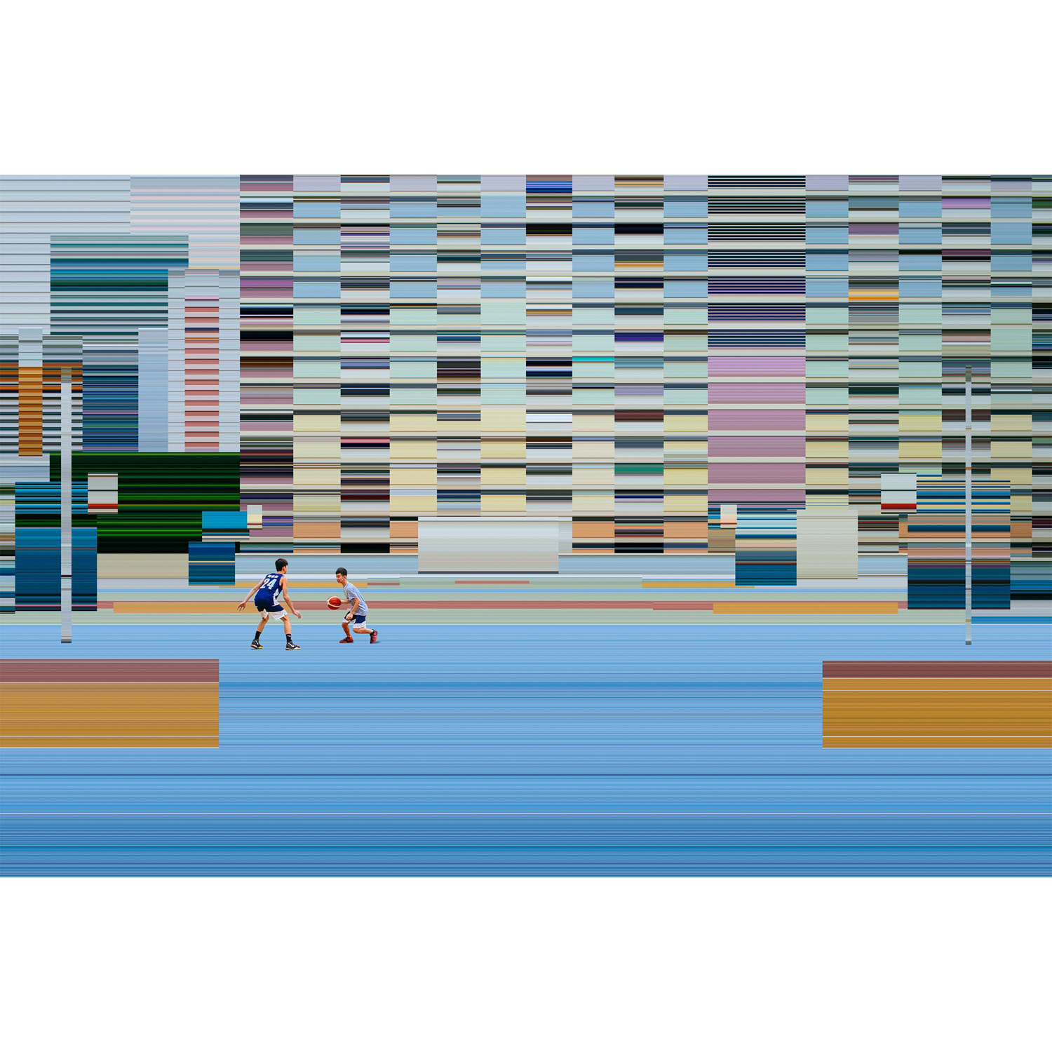
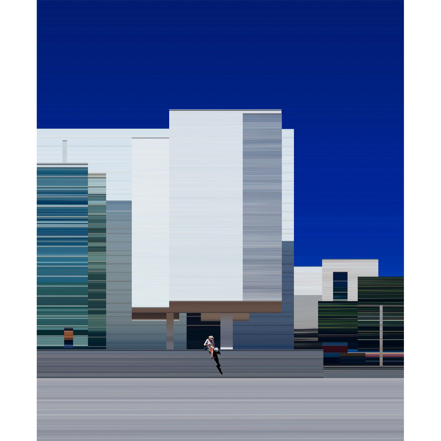
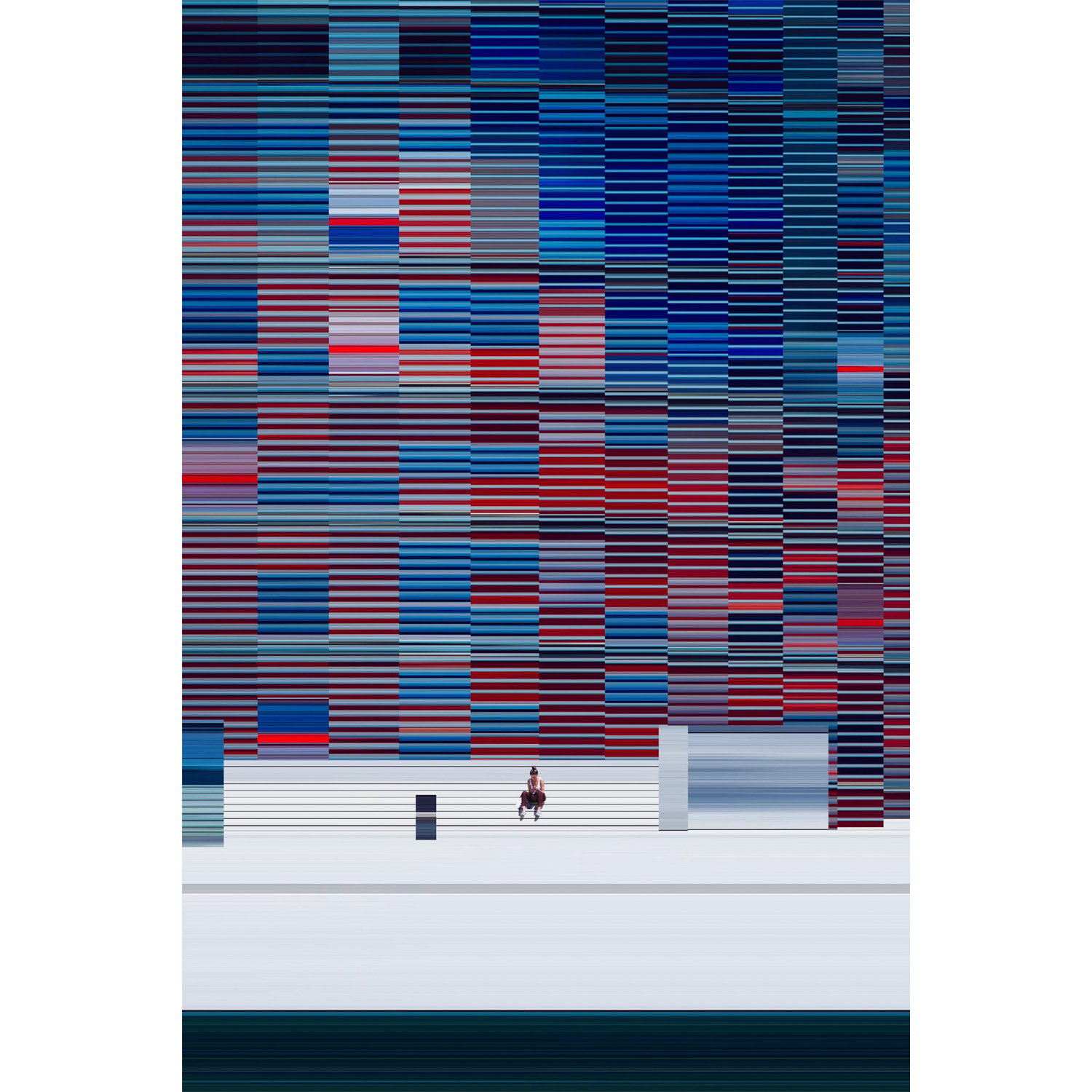
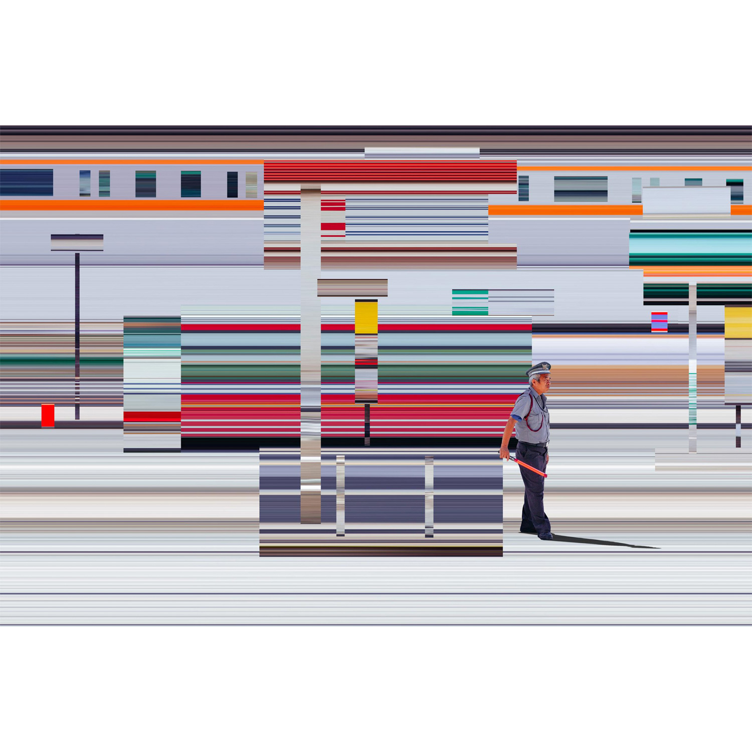
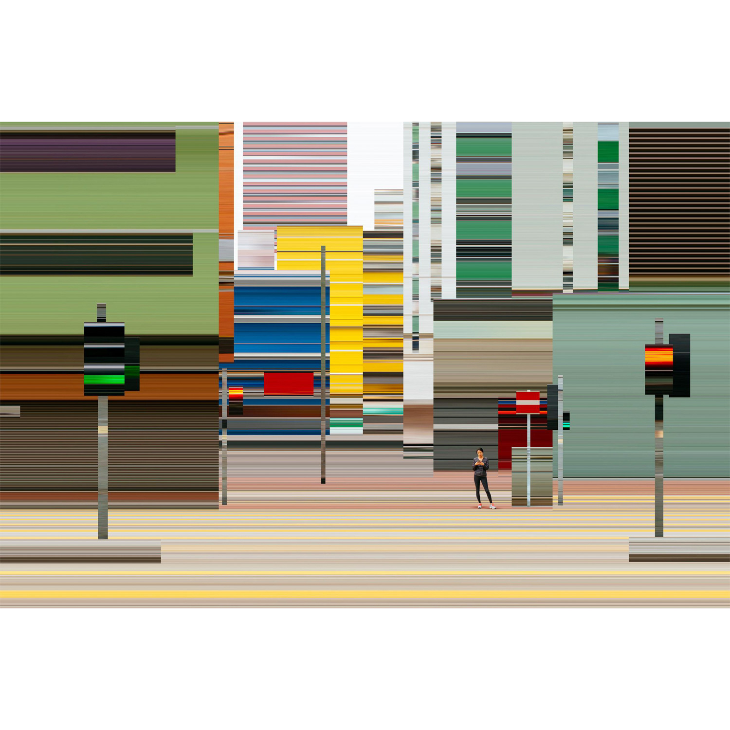
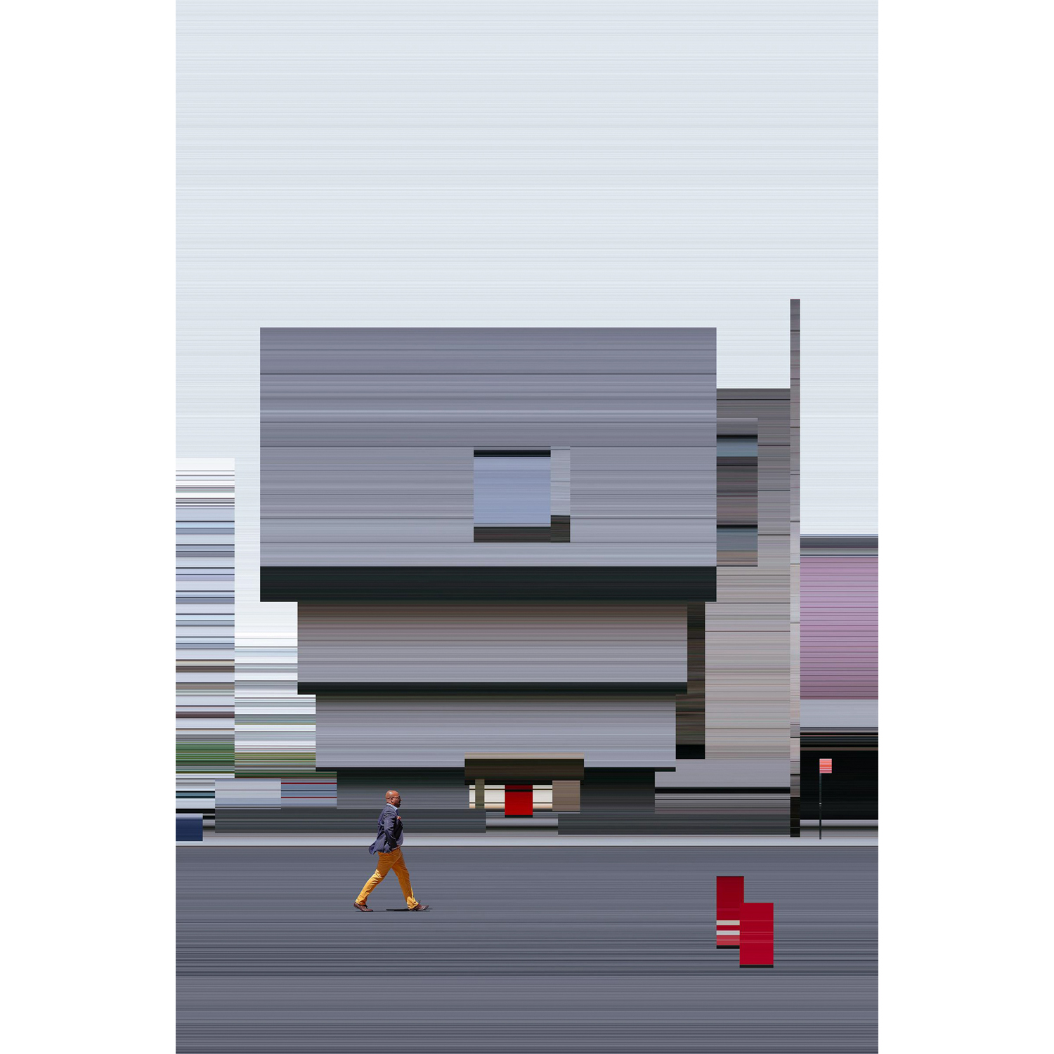
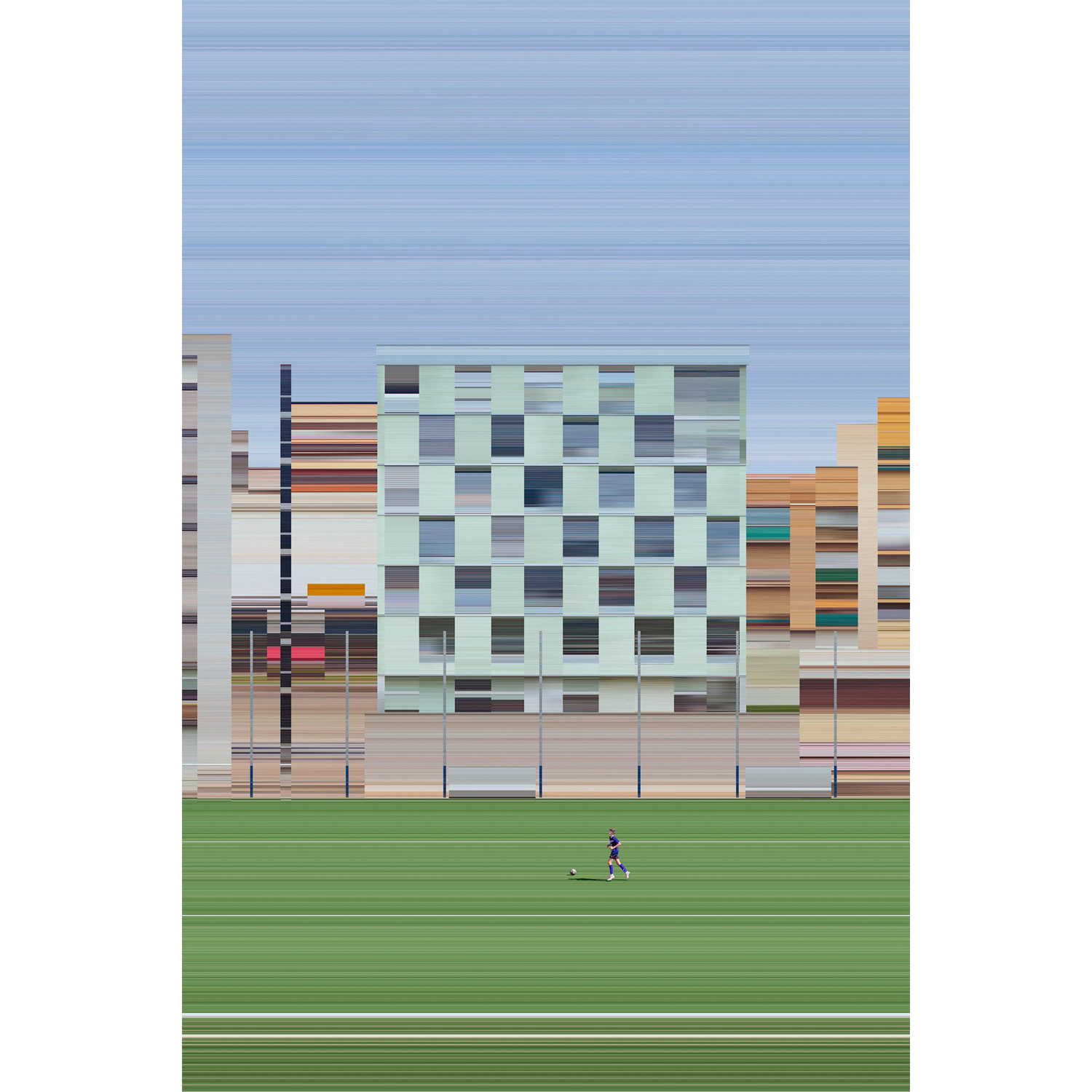
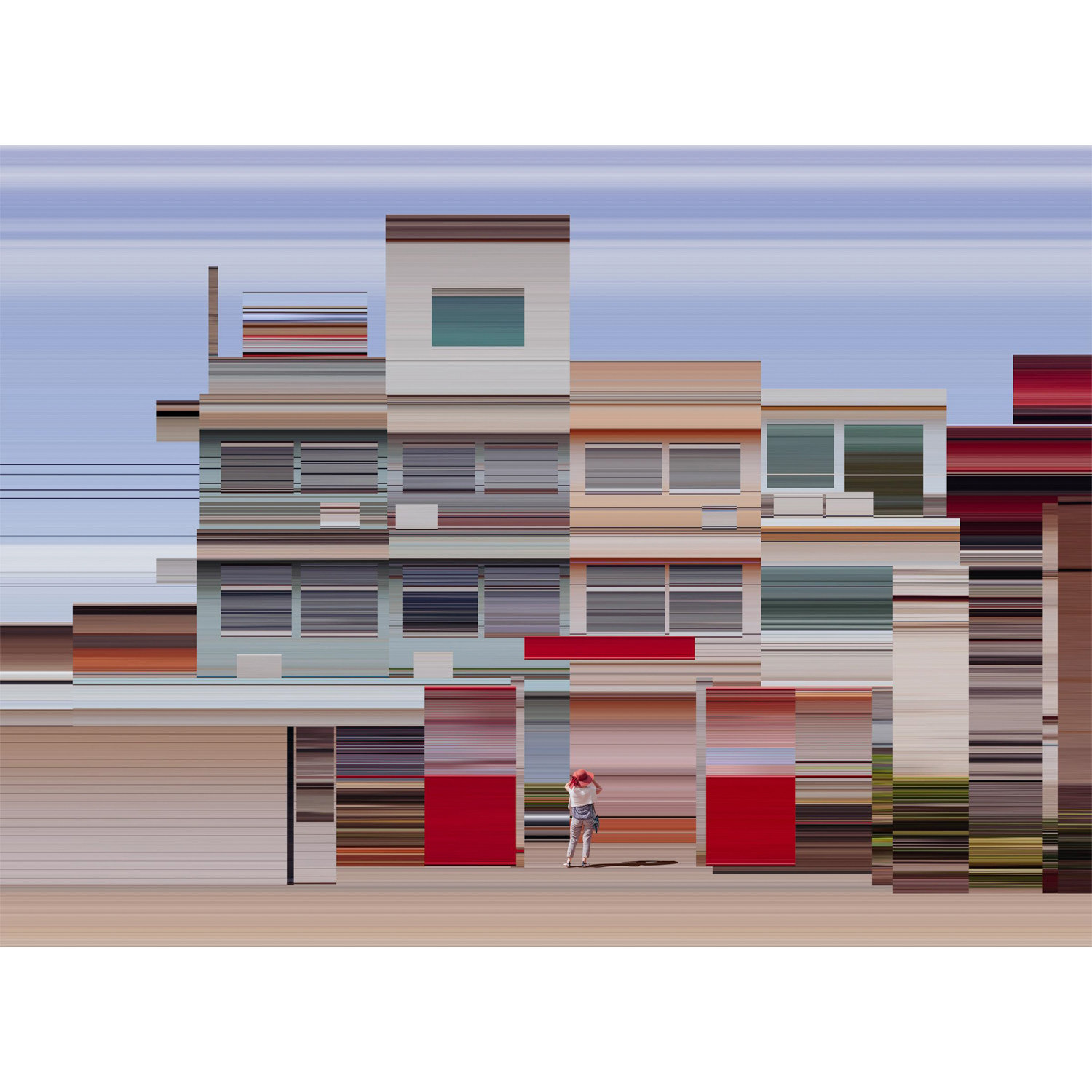
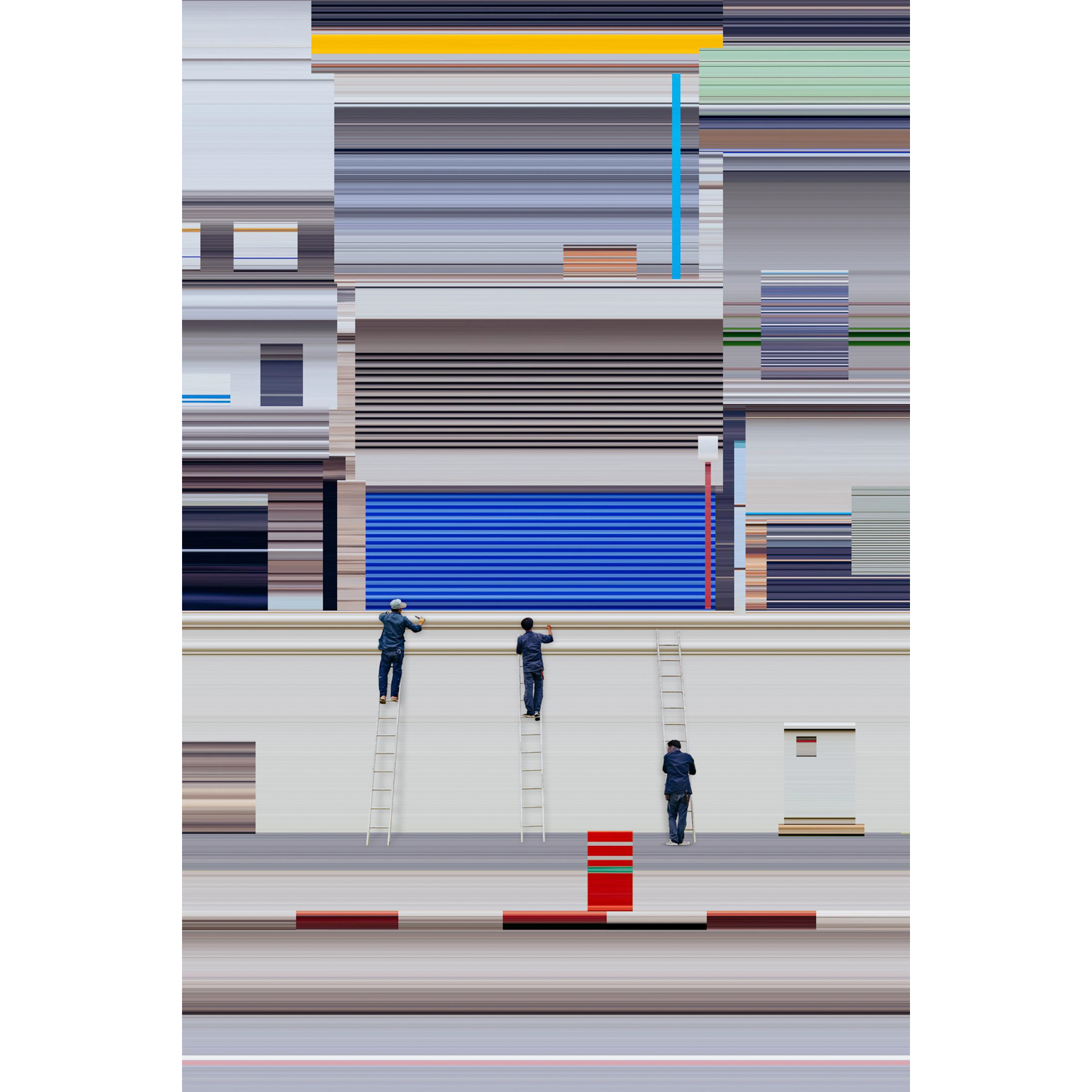
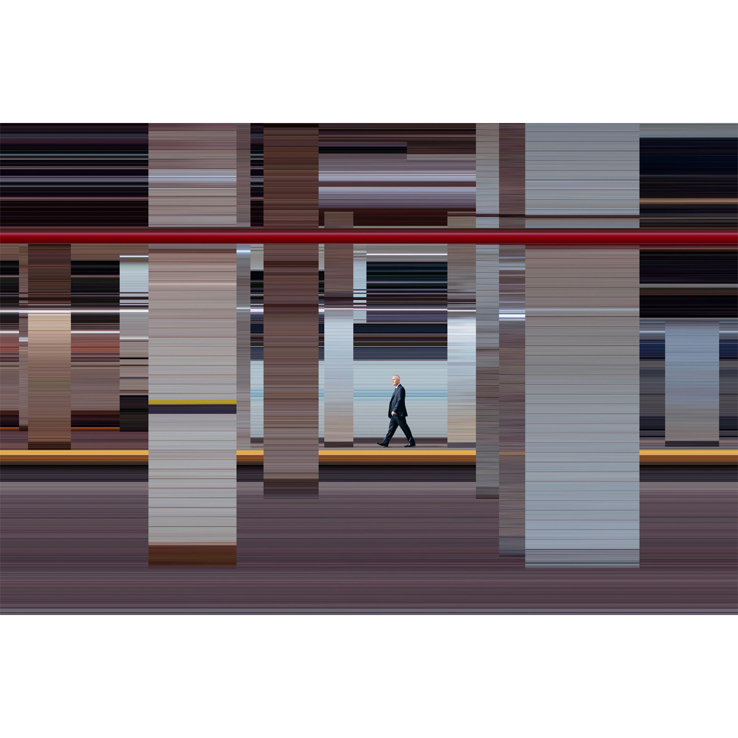
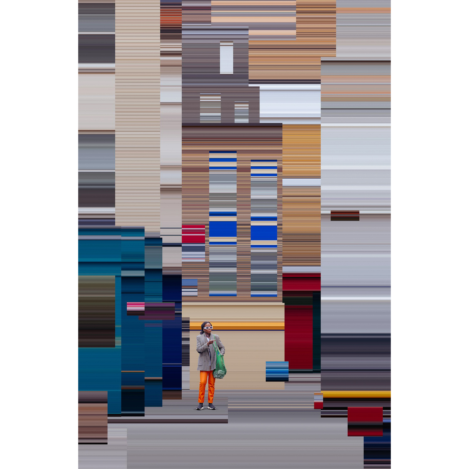
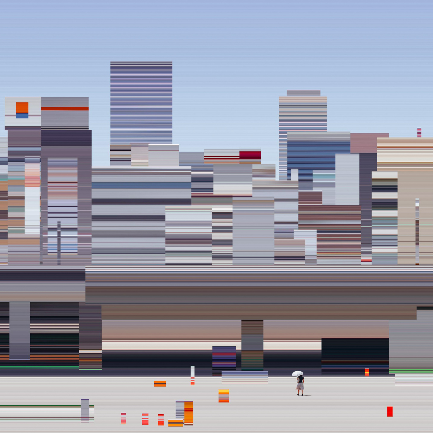
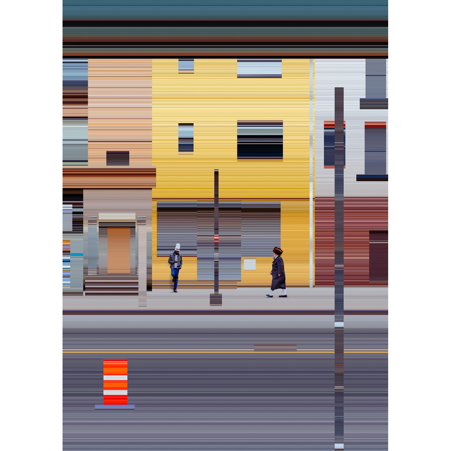
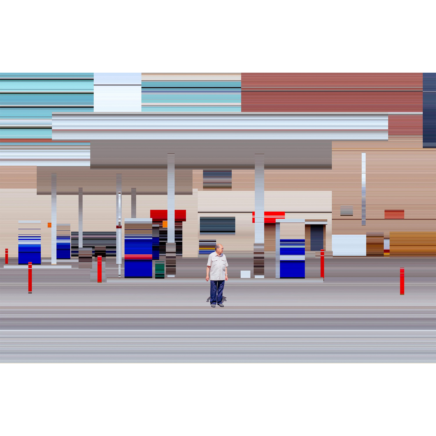
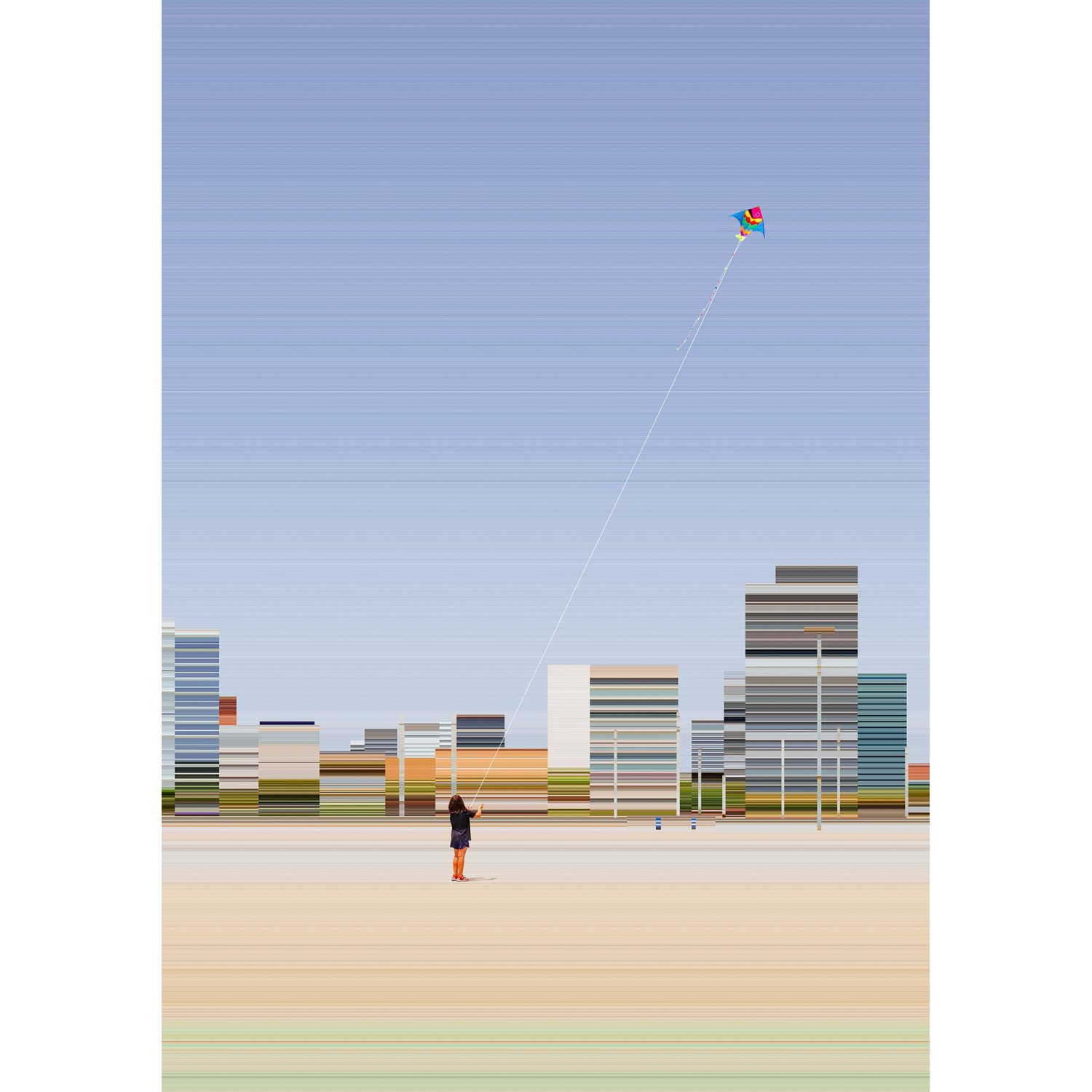
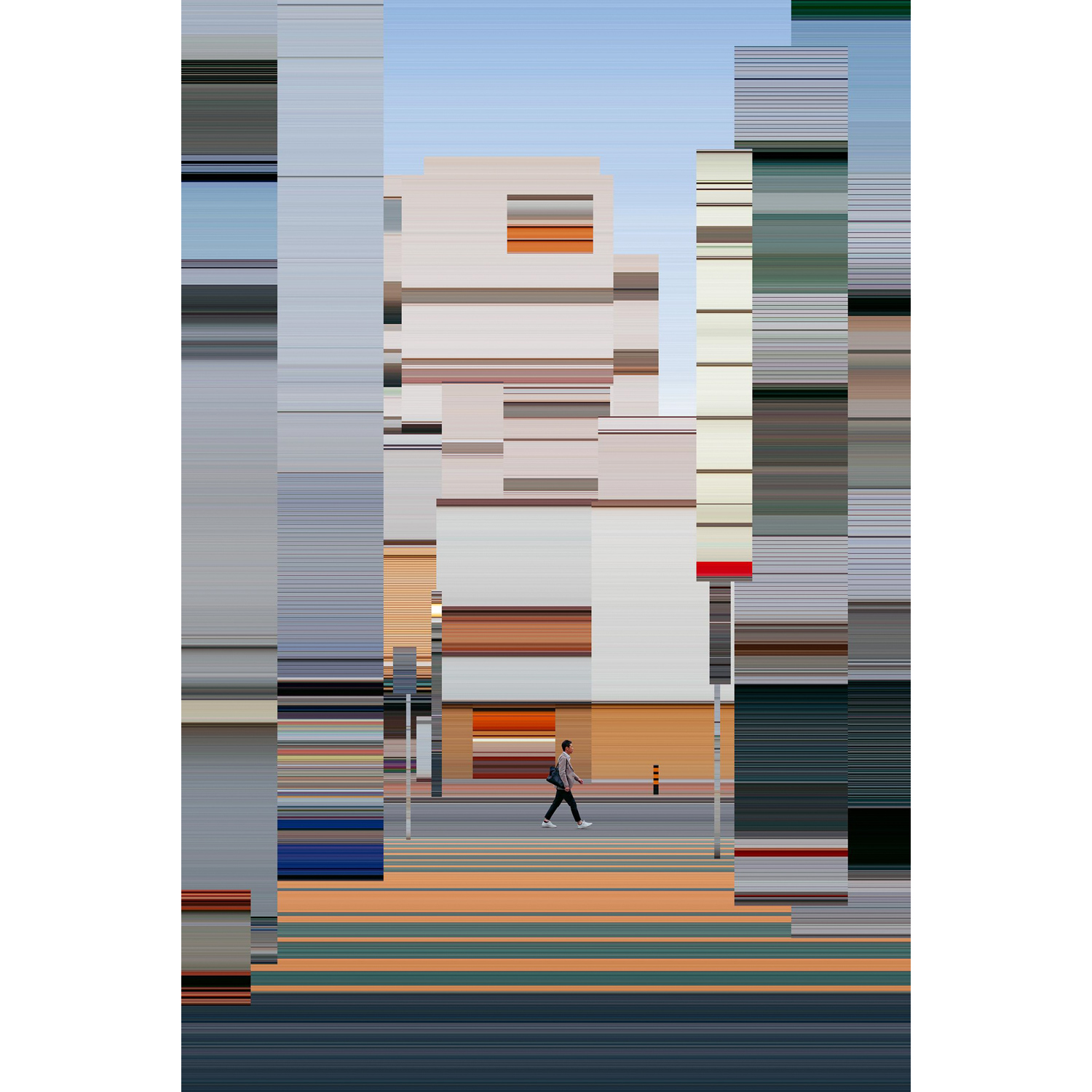
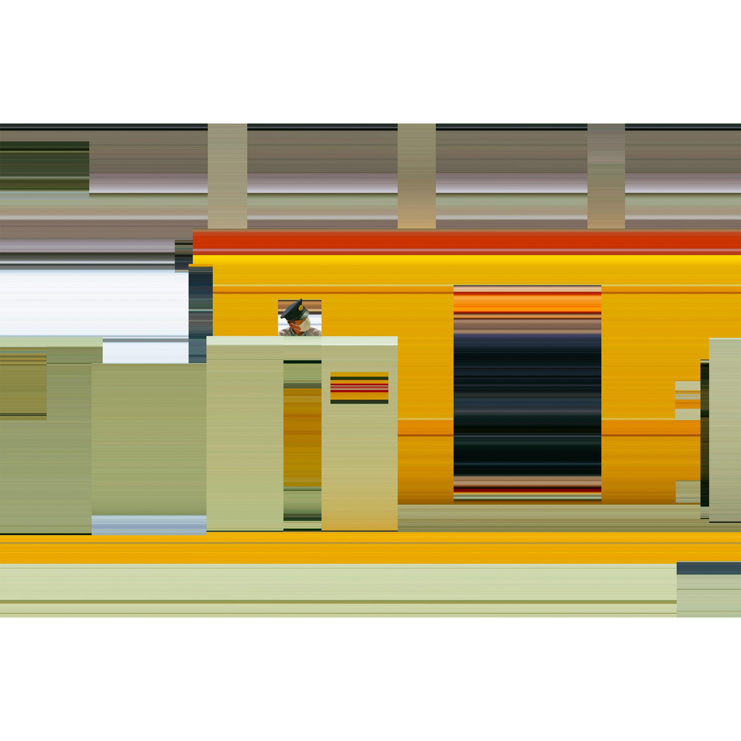
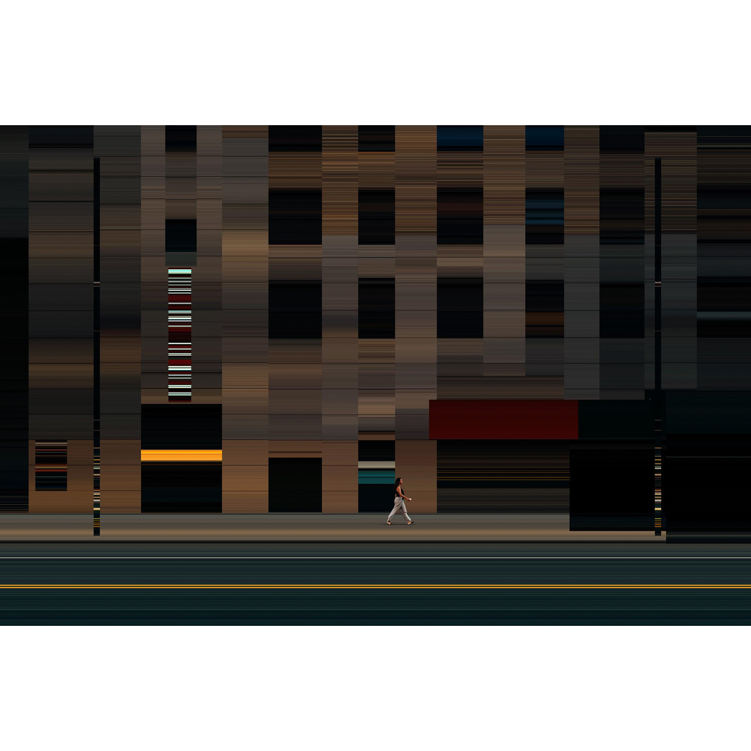
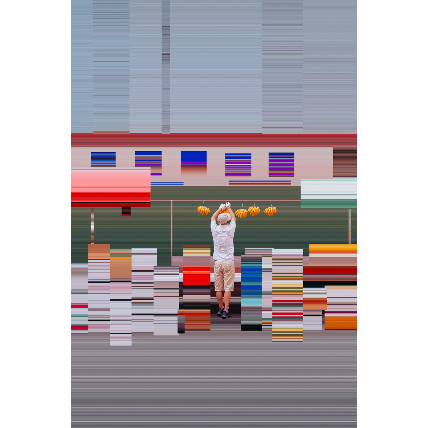
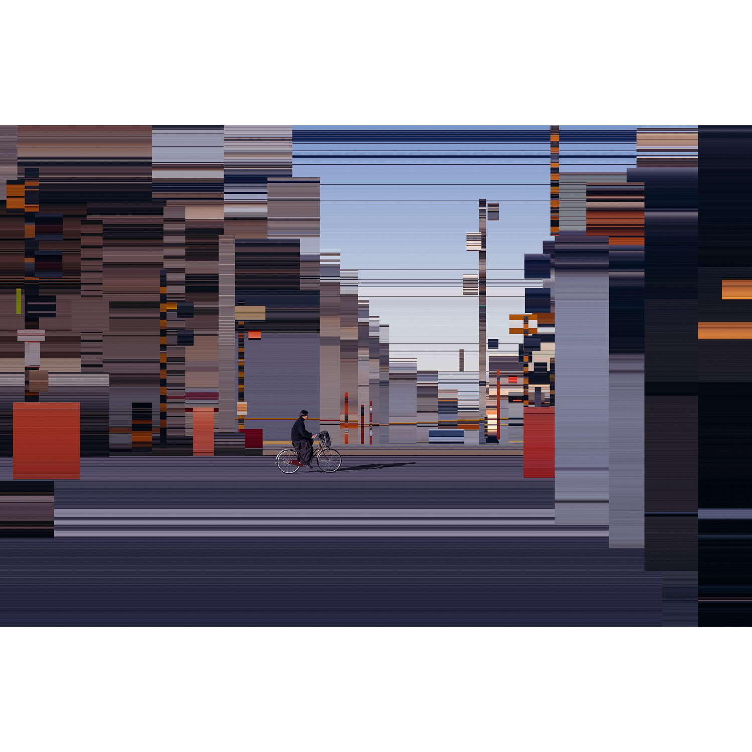
Time Stretched is a visual exploration that delves into the intricate interplay between time, motion and human perception. Each image in the series freezes a moment in a temporal paradox: the surroundings seem distorted in a chaotic stretch of time, while the central figure remains unchanged amidst the warped fabric of time. This results in elongated landscapes, distorted architecture, and surreal atmospheres, creating a captivating visual atmosphere.
Each image was captured in diverse locales spanning the globe, from the bustling streets of New York to the vibrant landscapes of Tokyo, Barcelona, Bangkok, and beyond. However, within the realm of Time Stretched, geographical distinctions fade into insignificance, as the viewer is transported into an abstract, distorted moment of time. Here, the central character appears alone and suspended in their own temporal bubble, detached from the constraints of place and immersed in the intriguing interplay of temporal paradoxes.
___________________
Anton Repponen is a New York-based interaction designer who co-leads the acclaimed ‘Anton & Irene’ design studio. Their diverse clientele includes renowned cultural institutions such as M+ Museum in Hong Kong and The Met Museum in New York, technological giants like Spotify, Netflix, and Google among many others. His design approach seamlessly blends architectural influences with interactive design expertise, reflecting his background in architecture and a human-centered design ethos.
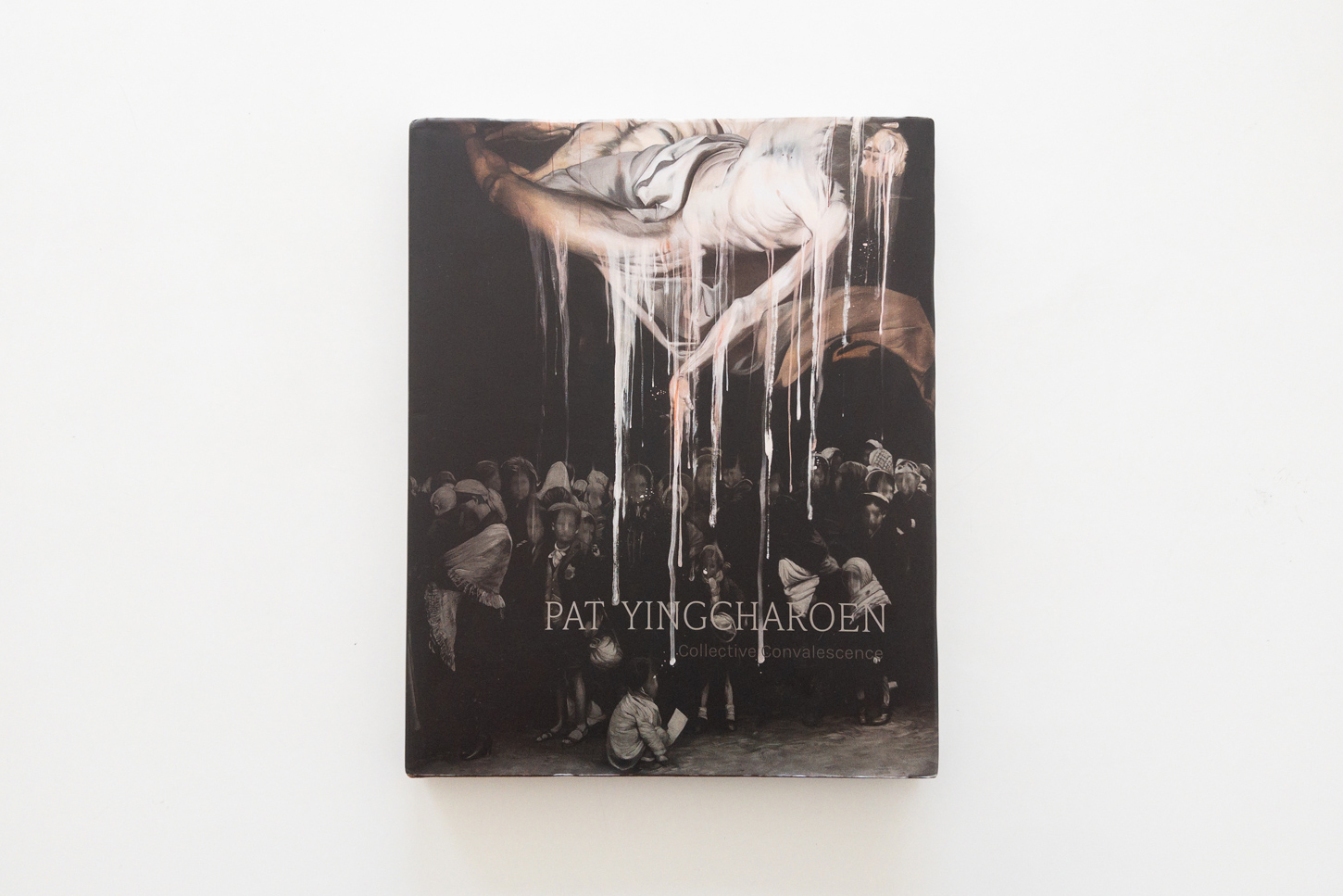
PAT YINGCHAROEN: COLLECTIVE CONVALESCENCE
‘COLLECTIVE CONVALESCENCE’ COLLECTS THE PAINTINGS OF PAT YINGCHAROEN WHO BROUGHT HIS WORKS TO BE REDEFINED BY MERGING WITH SOME PHOTOS FOR READERS’ PONDERING THE REALITIES OF HISTORICAL EVENTS
MODES AND CHARACTERS: POETICS OF GRAPHIC DESIGN
VISIT THE EXHIBITION ABOUT ‘MOJI-IMAGE-GRAPHIC’ AT 21_21 DESIGN SIGHT IN JAPAN WHICH GATHERS A DIVERSE COLLECTION OF CONTEMPORARY GRAPHIC DESIGN WORKS FROM THE 1980S TO EARLY 2000S
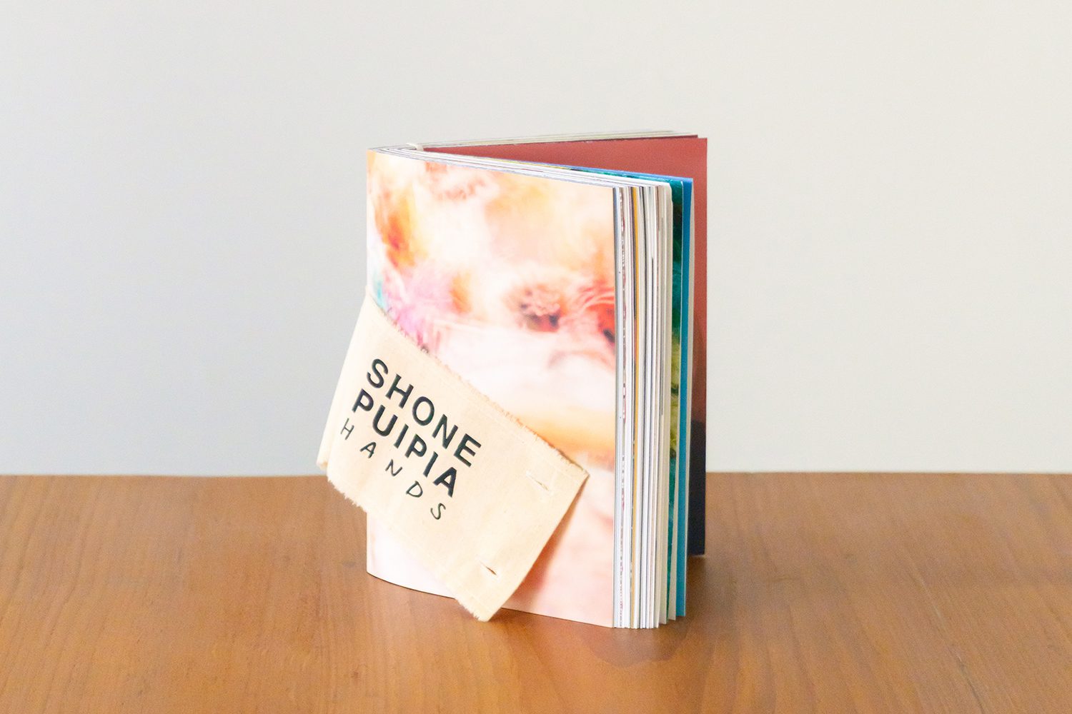
SHONE PUIPIA HANDS
THE PUBLICATION CELEBRATES THE FIFTH ANNIVERSARY OF SHONE PUIPIA, A THAI CLOTHING BRAND. DESIGNED BY NAPISA LEELASUPHAPONG, THE BOOK PRESENTS THE CONCEPT OF ‘HANDS’ INSPIRED BY THE CRAFTING PROCESS OF THE BRAND’S CLOTHING
THIS IS MY VOICE ONE DAY IN THAILAND
TEXT & IMAGE: PIRUTCH MOMEEPHET
(For Thai, press here)
This series of works arose from an idea and curiosity about the excitement one feels while traveling to a different country, a province, or even a new location. It tends to be difficult to pinpoint the precise reason for the pleasure or exhilarating feeling that people have when they visit different places. It’s presumably how all these new experiences we have all at once combine into a certain “mood” or “vibe.” There are times when one doesn’t even question whether such excitement stems from experiencing something truly new or whether it’s their own perception that makes something feel new despite the fact that it may not be.
If we are able to observe things from such a mentality or perspective, perhaps the things or locations that impress us do not have to be iconic or anything suggested or validated by others. It could be anyplace. It might be a location we walk past every morning or a building we see on the side of the road while stuck in traffic.
This work is an imagination of a person’s first impressions of Thailand. If we can see these sites from this point of view, then the question is, what is it that actually excites us?
_____________
Pirutch Momeephet : BBep.o (bep – po) is a Graphic Designer based in Bangkok, Thailand, who is Interested in Retro, Citypop Art Style and Contemporary architecture.
SUSPENDED HOUSE
FALA ATELIER COMPLETES A THREE-STORY RESIDENCE THAT LOOKS LIKE A COLLAGE OF GRAPHIC ELEMENTS. IN THE MIDDLE OF THE HOUSE IS A TRICKY FLOATING COLUMN THAT SERVES NO PURPOSE OTHER THAN BEING AN ELEMENT FOR THE STUDIO TO UNLEASH THEIR CREATIVE INSTINCT
TEXT: PRATCHAYAPOL LERTWICHA
PHOTO CREDIT AS NOTED
(For Thai, press here)
If one was asked to name an architectural studio with some wonderfully fresh and playful designs, Portuguese architectural practice Fala Atelier would most certainly be at the top of the list. The studio’s approach to architectural design utilizes the digital collage method to put various different components, shapes, and colors together, bound by no constraints but just creative instincts and imagination.
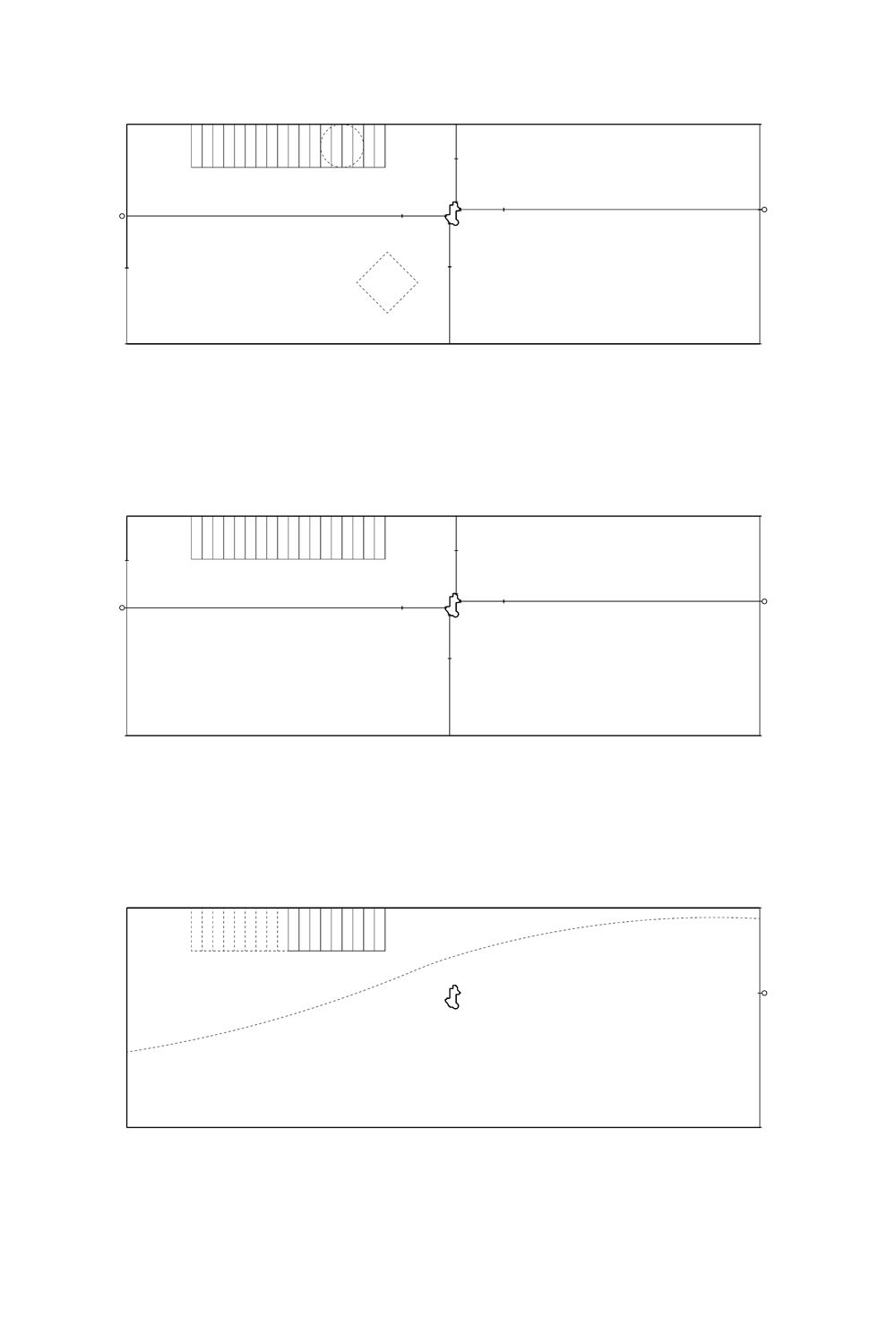
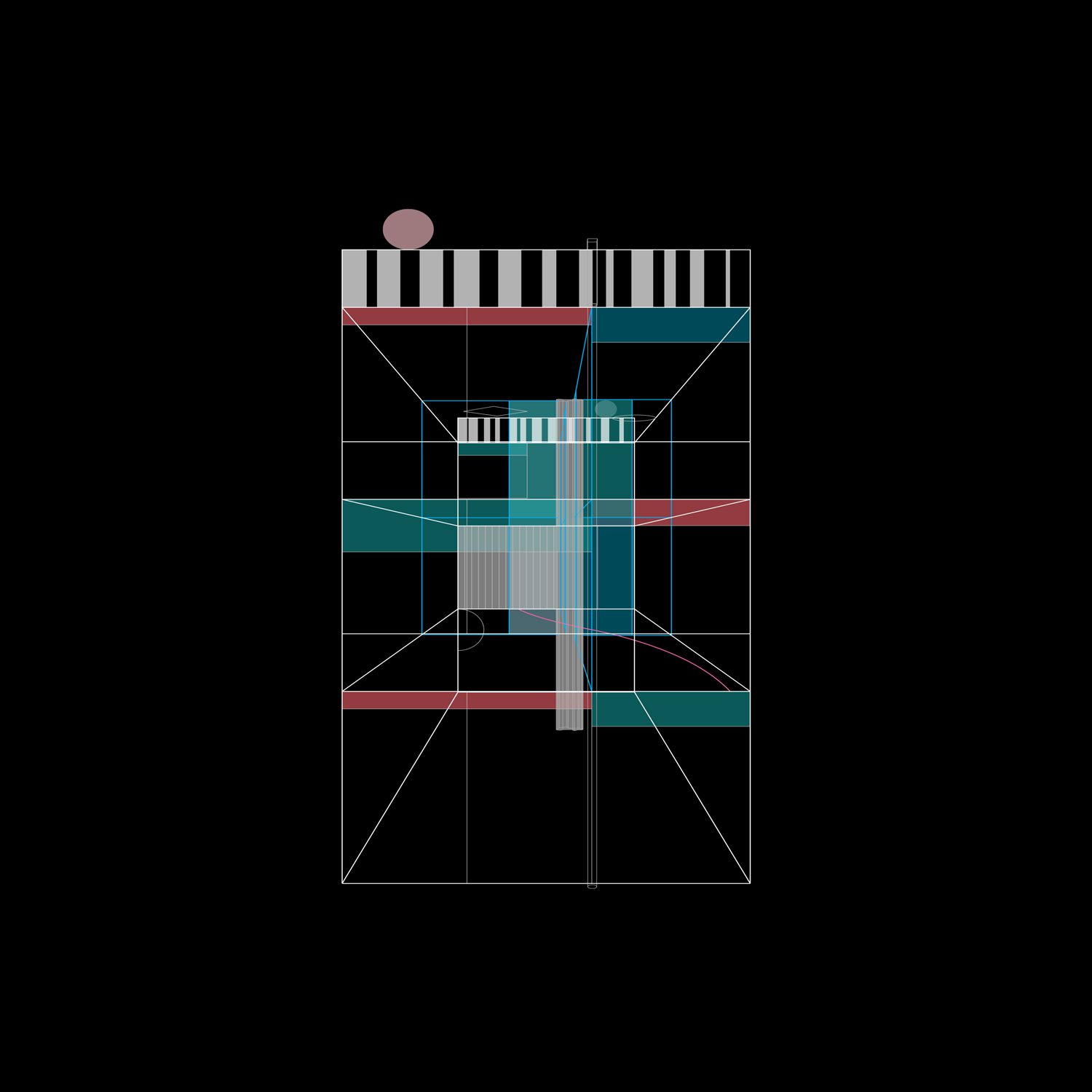
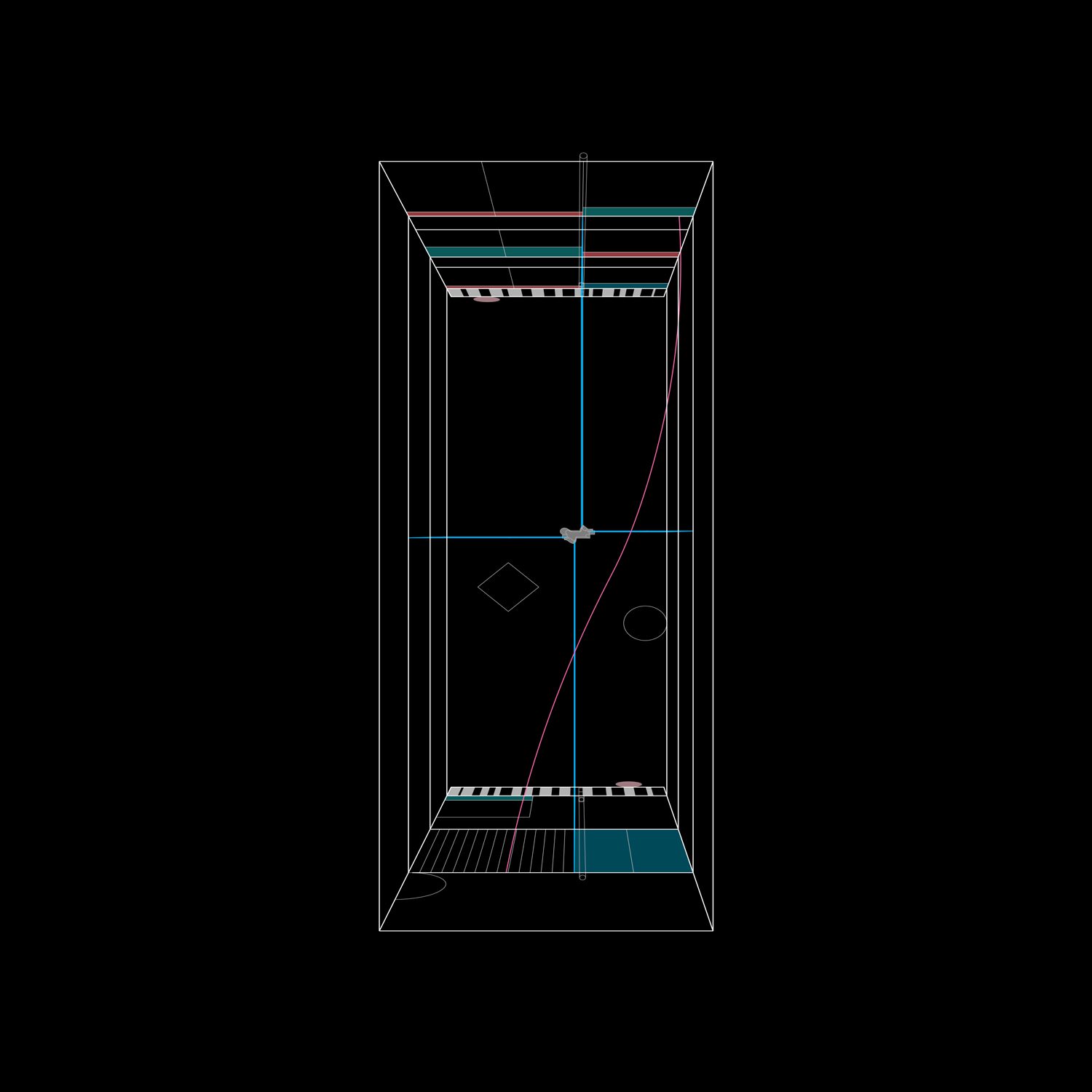
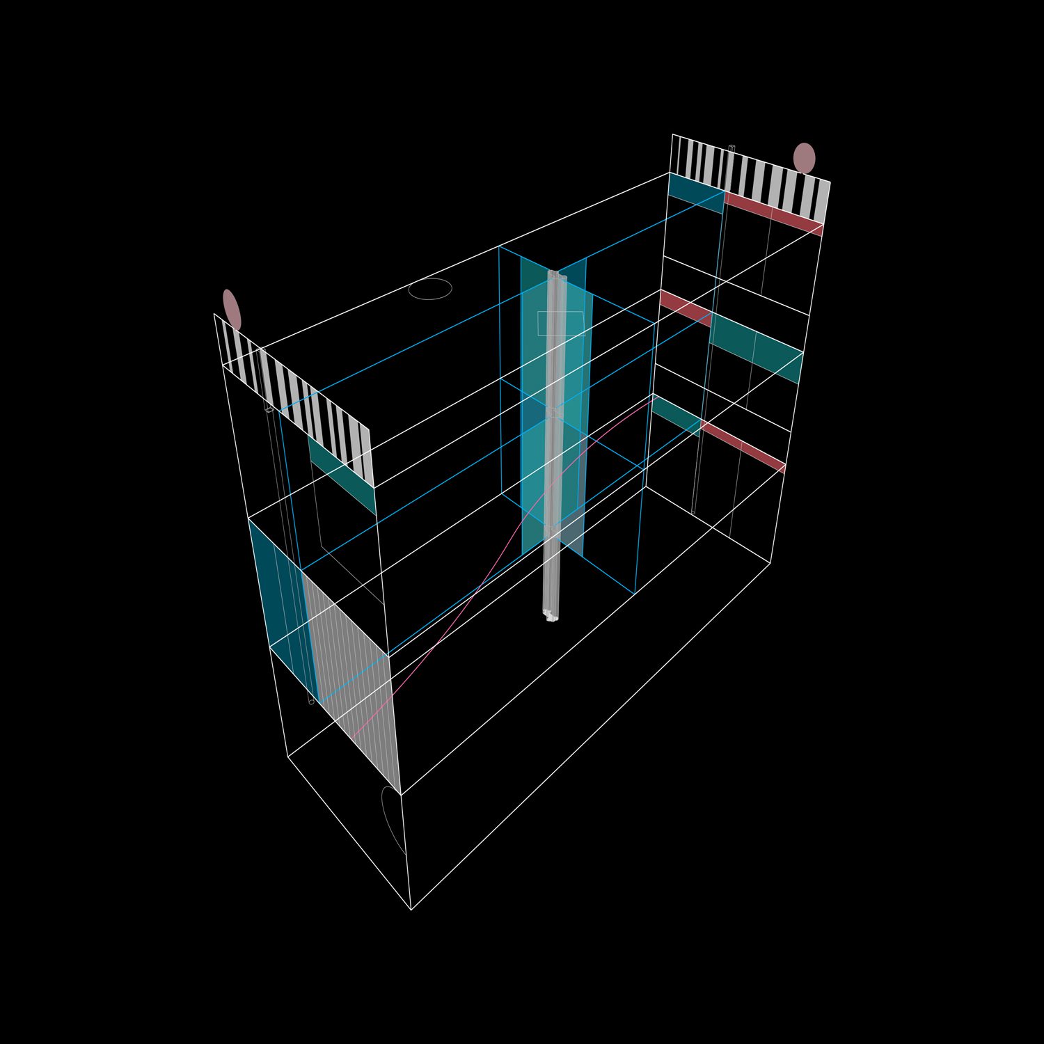
Fala Atelier takes their playful ingenuity to a new level with Suspended House, a residential project in Porto, Portugal. Inside, a strangely out-of-place concrete column positioned at the very center of the house has no weight-bearing obligation. While the column seems to be for purely decorative purposes, its presence functions like a hinge, dividing each level into four equal sections.
So, how can we know that this particular column has no structural burden? It’s because the columns on the lower level hover a few inches above the ground.
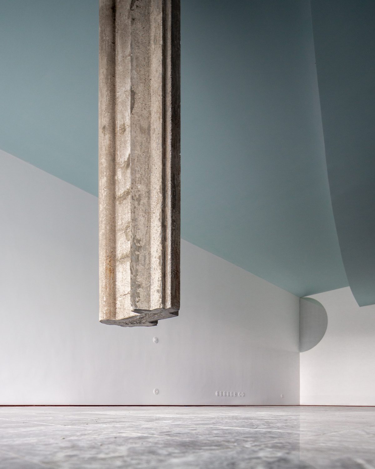
Photo: Fala Atelier
So, how can we know that this particular column has no structural burden? It’s because the columns on the lower level hover a few inches above the ground.
One can reasonably assume that the homeowner must be a design enthusiast who desires a unique and artsy home. But that is not the case here. The owner is a person who was searching for an architect to sign the working drawing in order to obtain the construction permit and get everything done and over with without even being that concerned about the design. The search for an architect was motivated mostly by necessity rather than a passion for design.
“This was a house designed for a friend who was not interested in architecture at all. Most of his requests were of little importance for the design, allowing us to be free in our intentions,” said Fala Atelier.
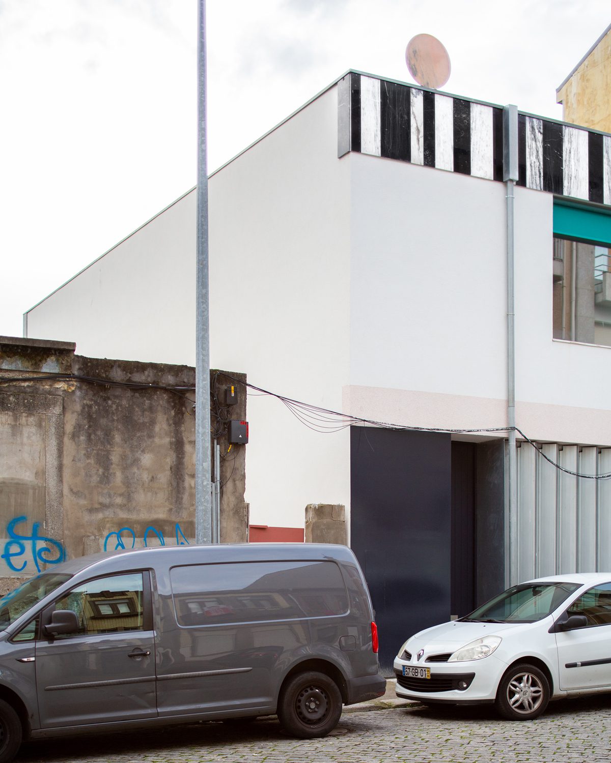
Photo: Fala Atelier
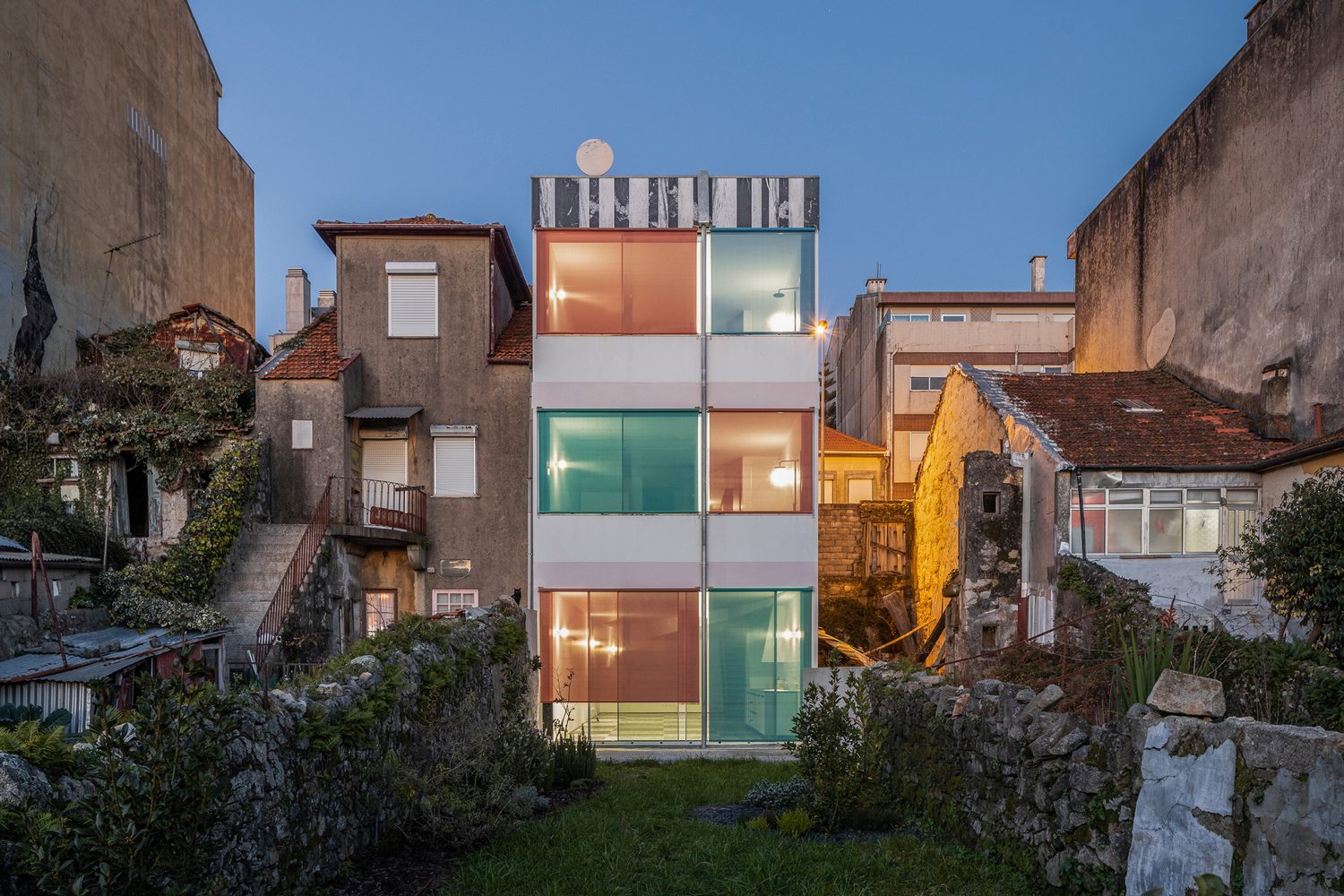
Suspended House is a three-story residence with the main entrance on the second floor, which corresponds to the road level in front of the house. The back façade has a strikingly looking and colorful sun protection tarp. A silver drainpipe appears boldly in the middle, splitting the façade in half. The upper trims of the window frames are clad in a black and white striped pattern that has no precise significance or reasoning behind it. The most bizarre aspect of the façade is the pink circular slab of marble that stands boldly at the top of the structure.
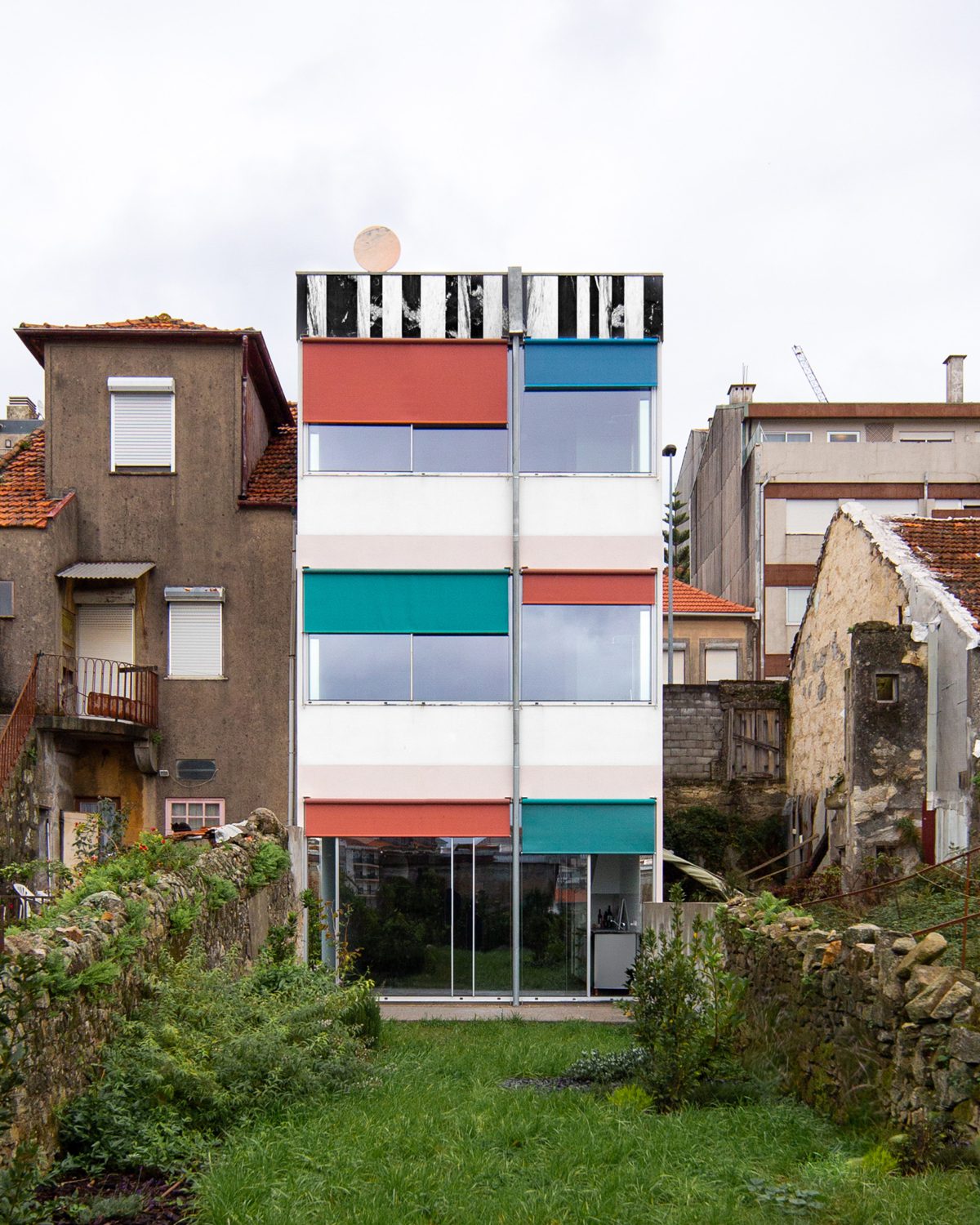
Photo: Fala Atelier
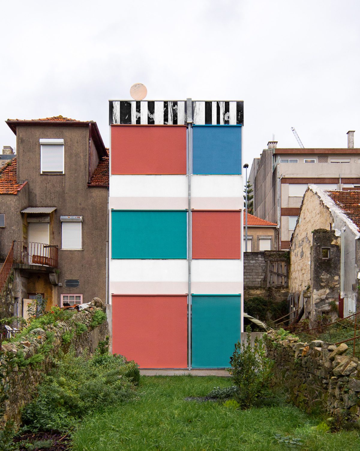
Photo: Fala Atelier
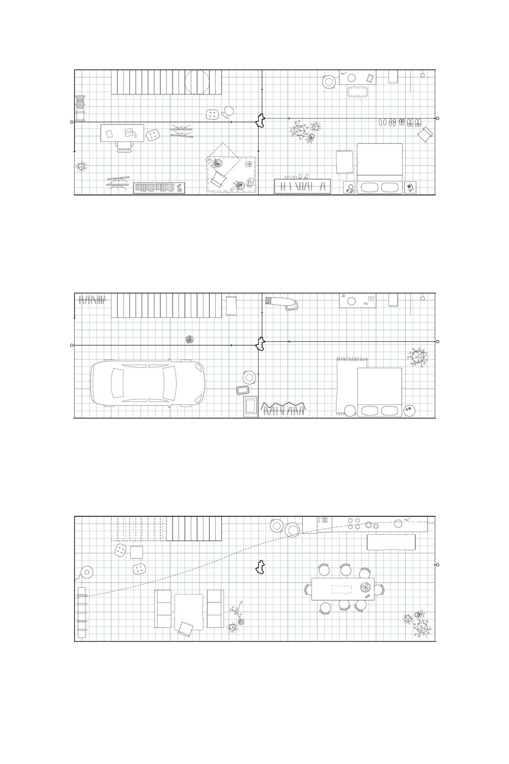
The walls that link to the centerpiece column divide the second and third floors of the home into four sections. The column serves as a frame for the dark blue doors that surround it. The architect did not specify the function of each space, leaving it up to the owner to bring the house to life. The first level lacks the partitioning walls found on the other floors of the home, but the column remains, suspended above the ground. The levitating concrete column was joined to the beam framework above. Initially, the concrete column was designed to stand on its own. But, once the concrete was set and dried, the architect removed the bottom portion of the column, transforming it into a mind-boggling floating mass. The ceiling on the first floor reveals a protruding portion, giving the area the appearance of a three-dimensional collage rather than a play on different elements on a flat plane.
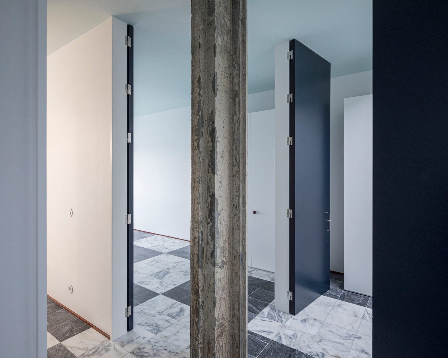
Photo: Laurian Ghinitoiu
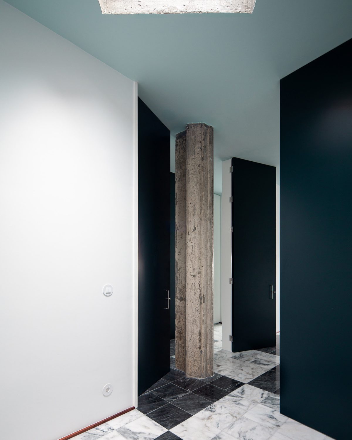
Photo: Fala Atelier
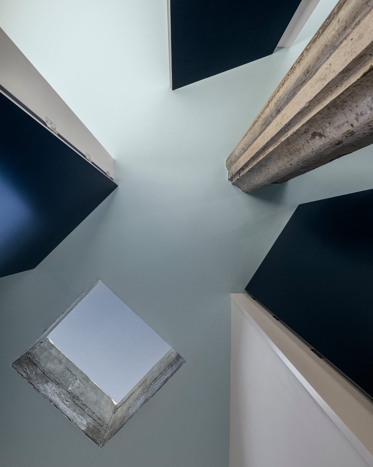
Photo: Ivo Tavares
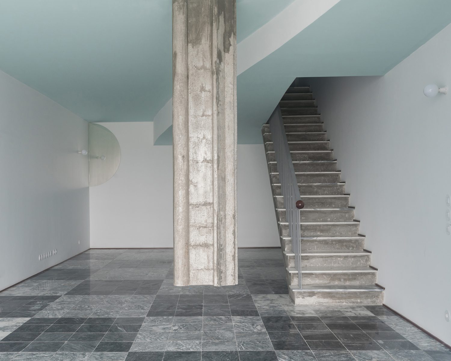
Photo: Frederico Martinho
The project is similar to other works done by Fala Atelier in that it began with a simple requirement, and the architect was brought in more out of necessity than anything else. It corresponds to the current period in which Portugal’s real estate business has been revitalized with the prospect of a glorious return after the 2008 global economic recession. A design with such a strong character is a way for the studio to unleash itself from the repetitive briefs and constraints it has seen over the past several years and to be completely free of any expectation for utilitarian objectives or even meaning.
Wireframes | © Fala Atelier
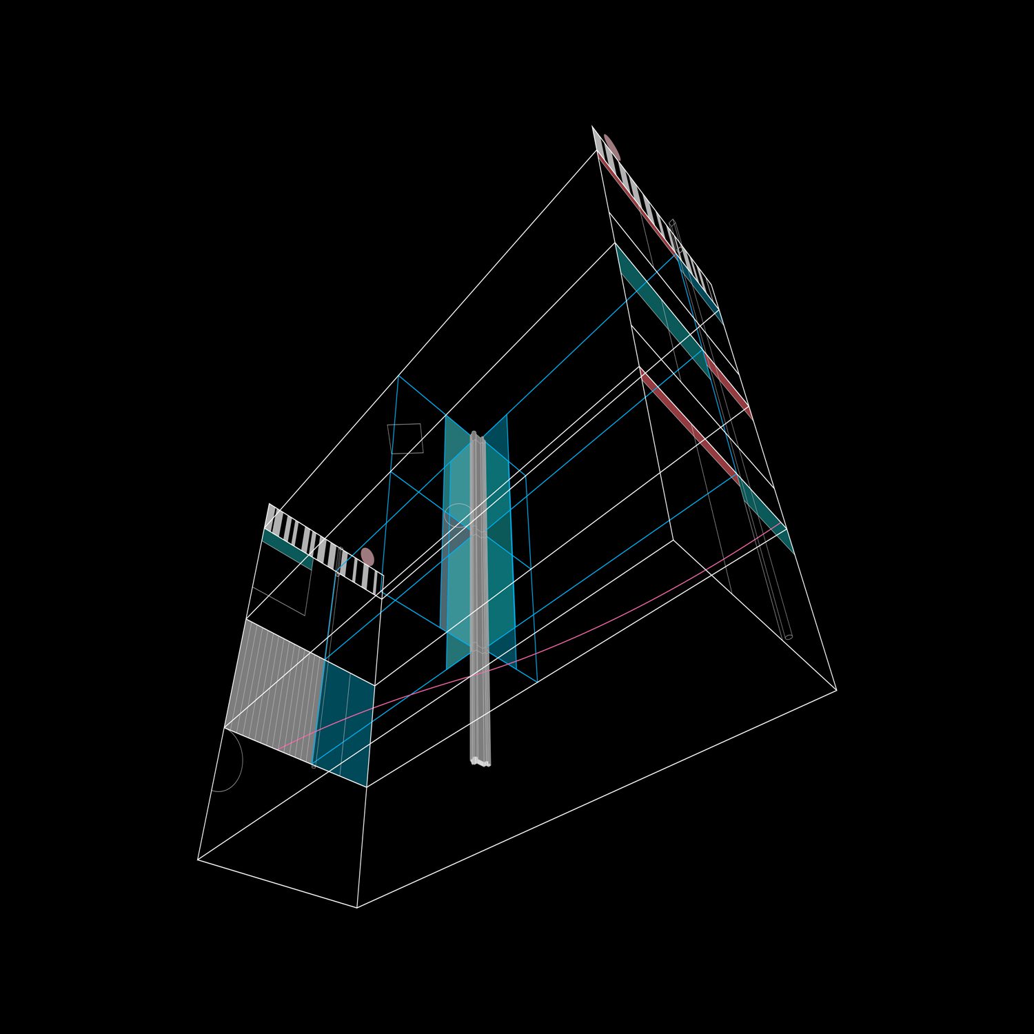
Wireframes | © Fala Atelier


