THE NEW ROOKIE ON THONGLOR OFFERS A BOLD AND SOLID PUBLIC SPACE, ENOUGH TO GET DRESSED AND GO OUT FOR
TEXT: KARJVIT RIRERMVANICH
PHOTO: KETSIREE WONGWAN
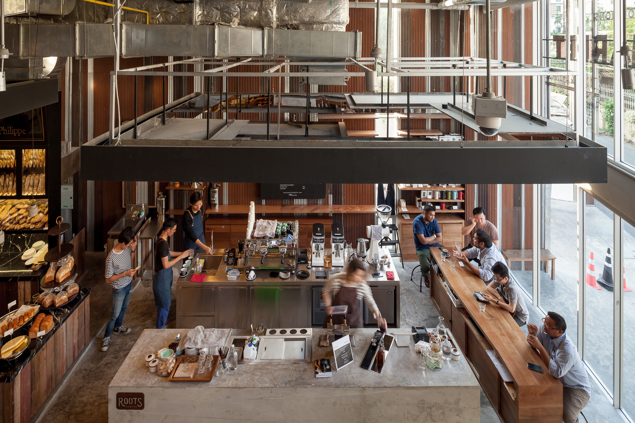
“Communal area – please keep clean and leave or return the utensils when you’re done with your meal.” A little sign on the counter bar on the ground floor of The Commons by Department of Architecture asks everyone for their cooperation.
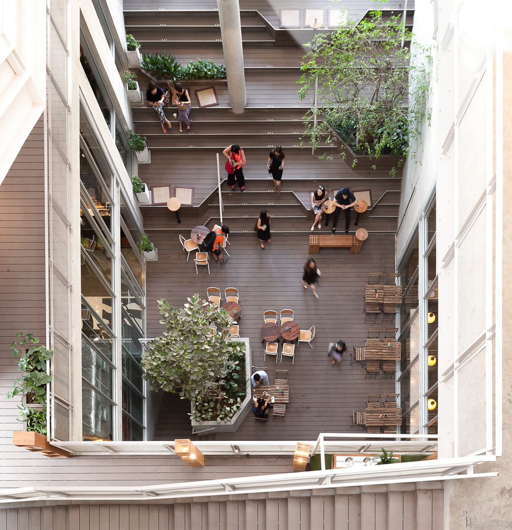
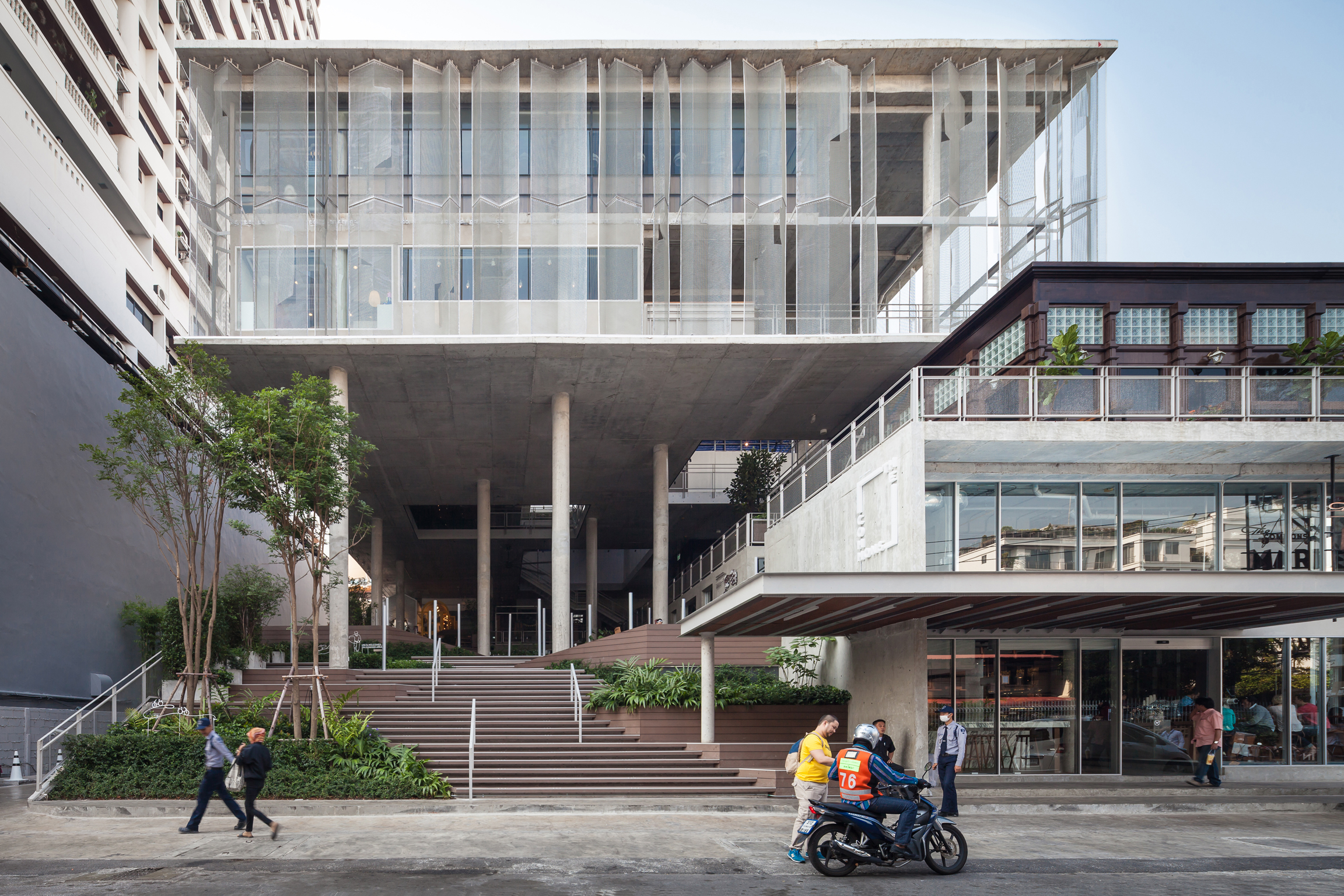
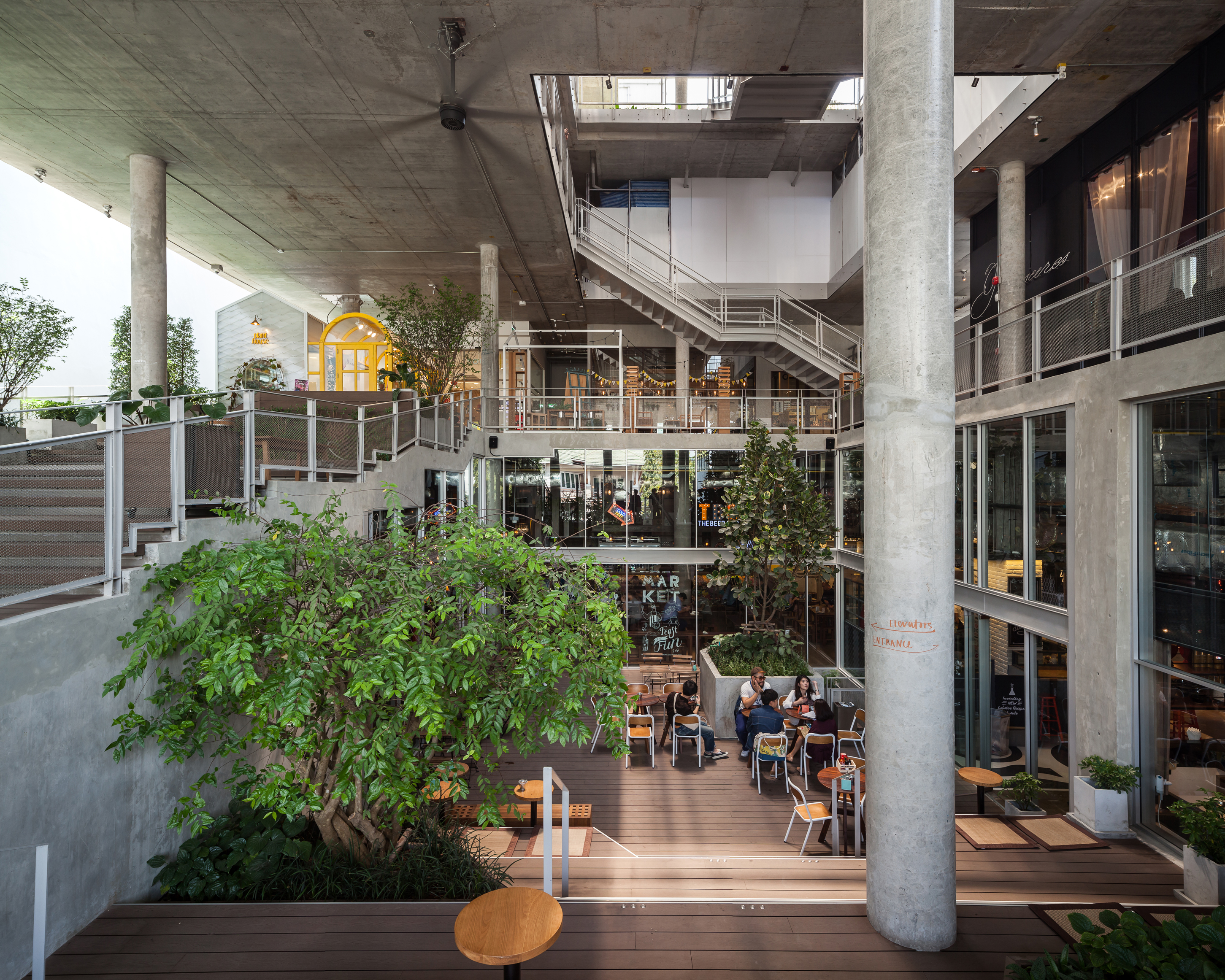
The message, at first, seems rather contradictory to the location it is placed in – an upscale neighborhood for the rich in the middle of the Thonglor district where people are asked to put away their own plates. But even without the sign, it’s very unbecoming here for someone to eat and throw away whatever they have left without any consideration for others. The main reason is probably that the ‘common ground’ of The Commons is designed to give off the impression of a place where ‘Community’ is prioritized over ‘Mall’ through its attempt to create a communal area rather than jamming the program with commercial spaces, which are replaced with a massive set of stairs, welcoming people into a large communal area. At the heart of the project, the space is created from elevation and descent of the ground. Rhythmically, the landscape is subdivided into courtyards, seats and terraces, inviting people to walk up and down as they are led to different spaces of the program. In a continual flow, the space gradually ascents from the first to the third floor with the communal ground as the starting point.
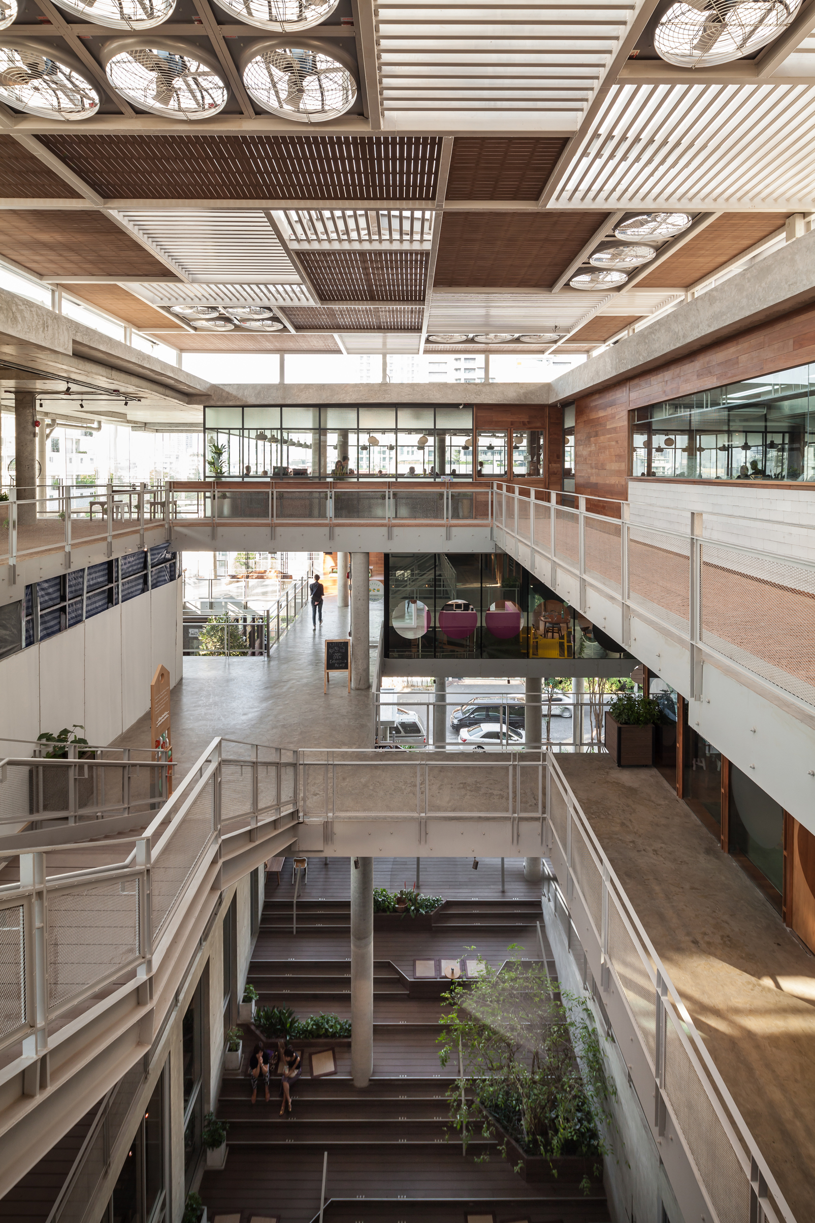
Another attempt to create a communal space is complemented by the elevated box-shaped mass of the 4th and 5th floors. Such mass also functions as the canopy protecting the area from sunlight and rain. More communal spaces such as half the space of the 5th floor that hosts the Show Kitchen and seats for tenants or interested vendors to organize workshops during the day with the ability to be adapted into an event bar for nighttime social events. The voids on the 4th and 5th floors are in different sizes and locations, bringing about a functional and visual flow to the communal space from the ground to the top floor. Such design solution intends to solve the problem found in most community mall projects where considerably less crowds visit the top floors…
Some of the most prominent features are the position of the columns from the 3rd floor’s ceiling that shies away from the grid convention, resulting in the flexibly divided space that flows along the spatial program. The unorganized finish of the exterior elevation commonly found in this type of building is reconciled by the second skin made of stainless steel wire mesh whose fully ventilated and translucent finish wraps around the mass of the 4th and 5th floors. This particular second skin is designed to possess a unique pattern and cool white tone lighting, which is different from the warm white tone used with the shops’ interior. This way, the design of each retail space and display window can show off its individuality while still being in the same visual frame with others. In addition, the exposure of the concrete structure and surface become a humble background for the window displays to stand out, ultimately boosting up the energy of the communal space.
As we walk around the mall, we sense certain disruptions from some of the details of the design, from the super high and spacious staircase that can be a bit nerve wracking or the way another staircase leads us directly to a vehicle lane in the parking lot, and so on. But all and all, we have a pretty delightful time listening to the sound of the Ukulele being played by a Eurasian girl on the ground floor. A bunch of students walk up and down the gigantic staircase while a couple of lovebirds spend their quality time on the bench underneath the stairs of the third floor. A floor down, a salesman is making his pitch to a customer. Moving up, our eyes meet two beautiful girls who attempt to capture the perfect selfie. These behaviors often take place in a nice café or restaurant in a community mall, but here at The Commons, they’re all happening on different corners of the same public ground. On this common ground, we have our own spot where we can sit back and observe dynamic interactions between people. Nevertheless, what we have learnt from projects such as The Commons is that the birth of a decent public space is rare and often comes from the intention of a private investor and an architect’s vision, not from the Government that should be using taxpayers’ money to provide the things we deserve.

