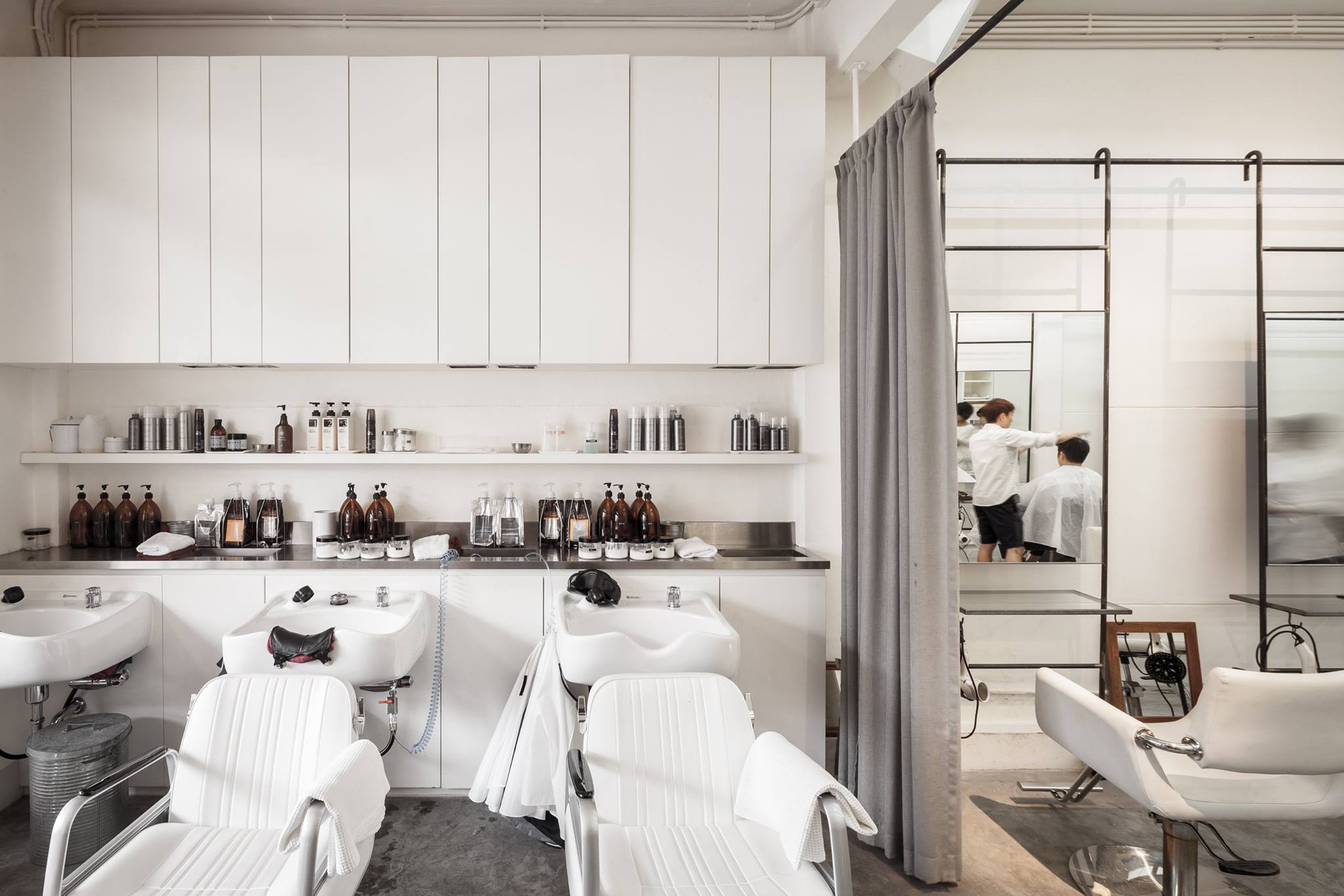
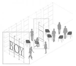
STU/D/O ARCHITECTS USED ‘VOID,’ BOTH PHYSICALLY AND VISUALLY, TO LINK SPACES IN BOY, A HAIR SALON WITH A CUT ABOVE AVERAGE CHARACTER
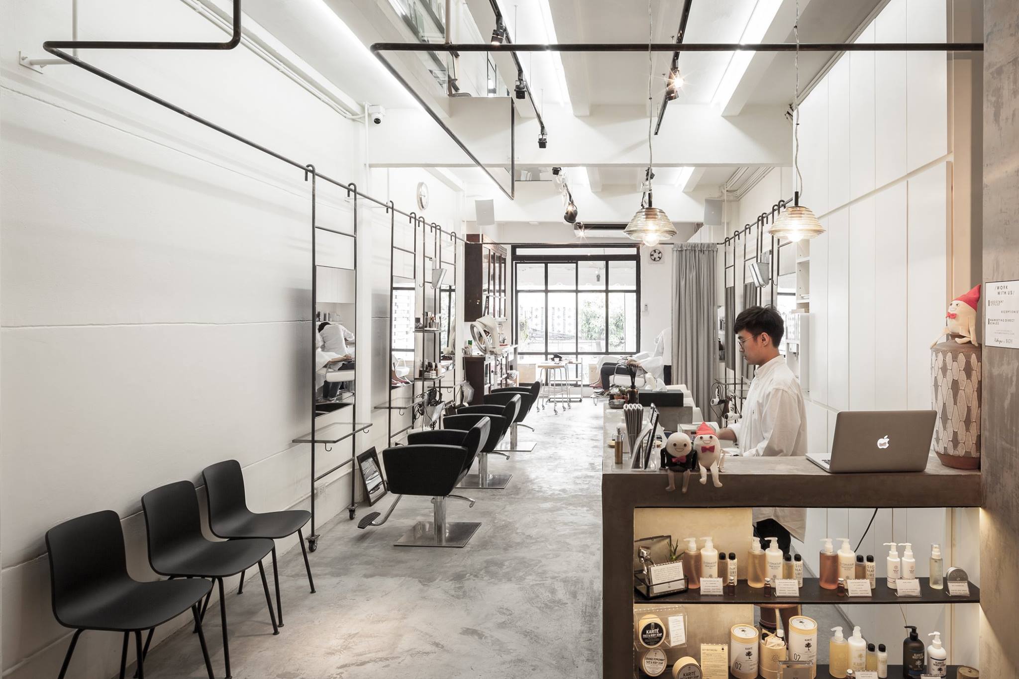
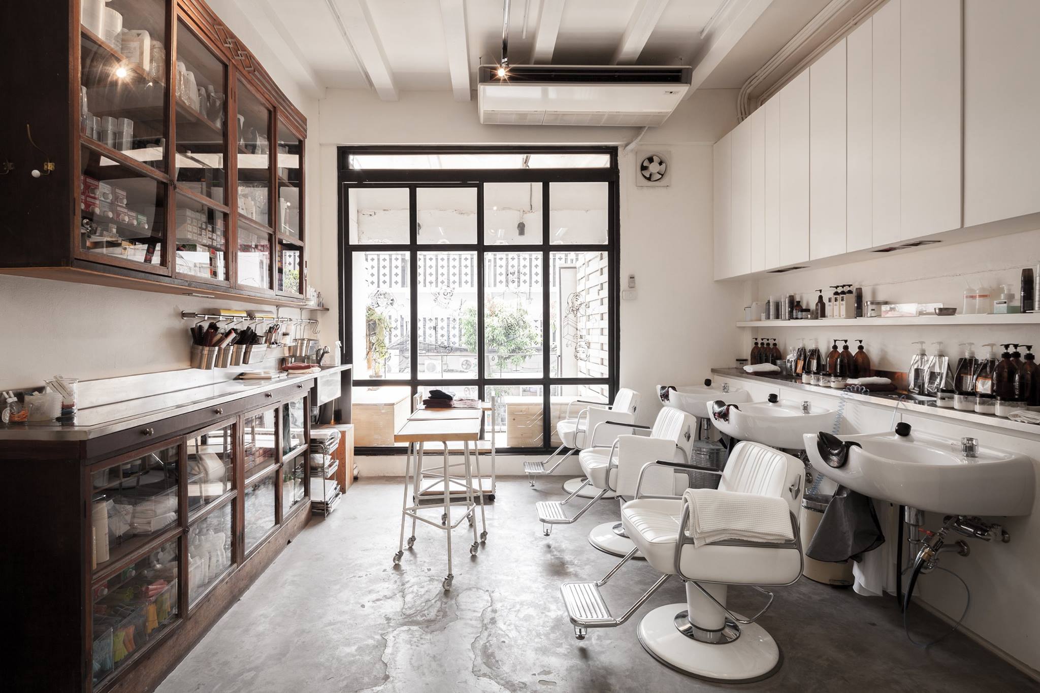
The light coming through a small shop on the second floor of SCALA Cineplex seems enticing for the passerby. One cannot help but look to see the movements going on inside. It houses the operation of BOY, a hair salon with an upbeat vibe whose presence is of great contrast with the quietness of the second floor alleyway it is located on. BOY is the second branch in Thailand of RIKYU, a Bangkok-based Japanese salon (the first branch of RIKYU was relocated from Sukhumvit 49 to Sukhumvit 24 but still uses the same name). This second and smaller division known as BOY has recently opened its second floor space with the team from Stu/D/O Architects handling the design. The brief was mainly to facilitate a connection between the first floor area where the salon is operated and the multifunctional space on the upper floor.
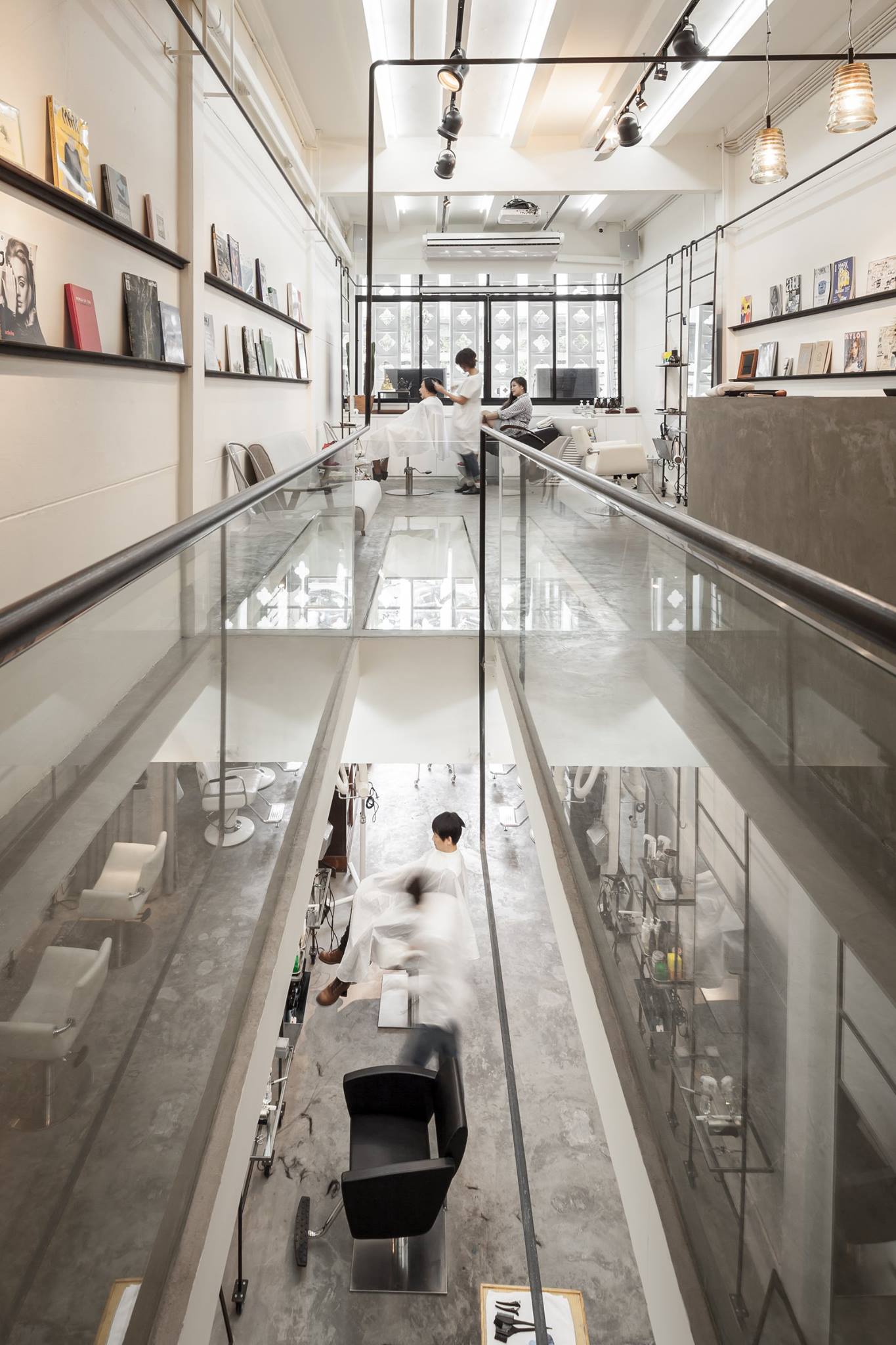
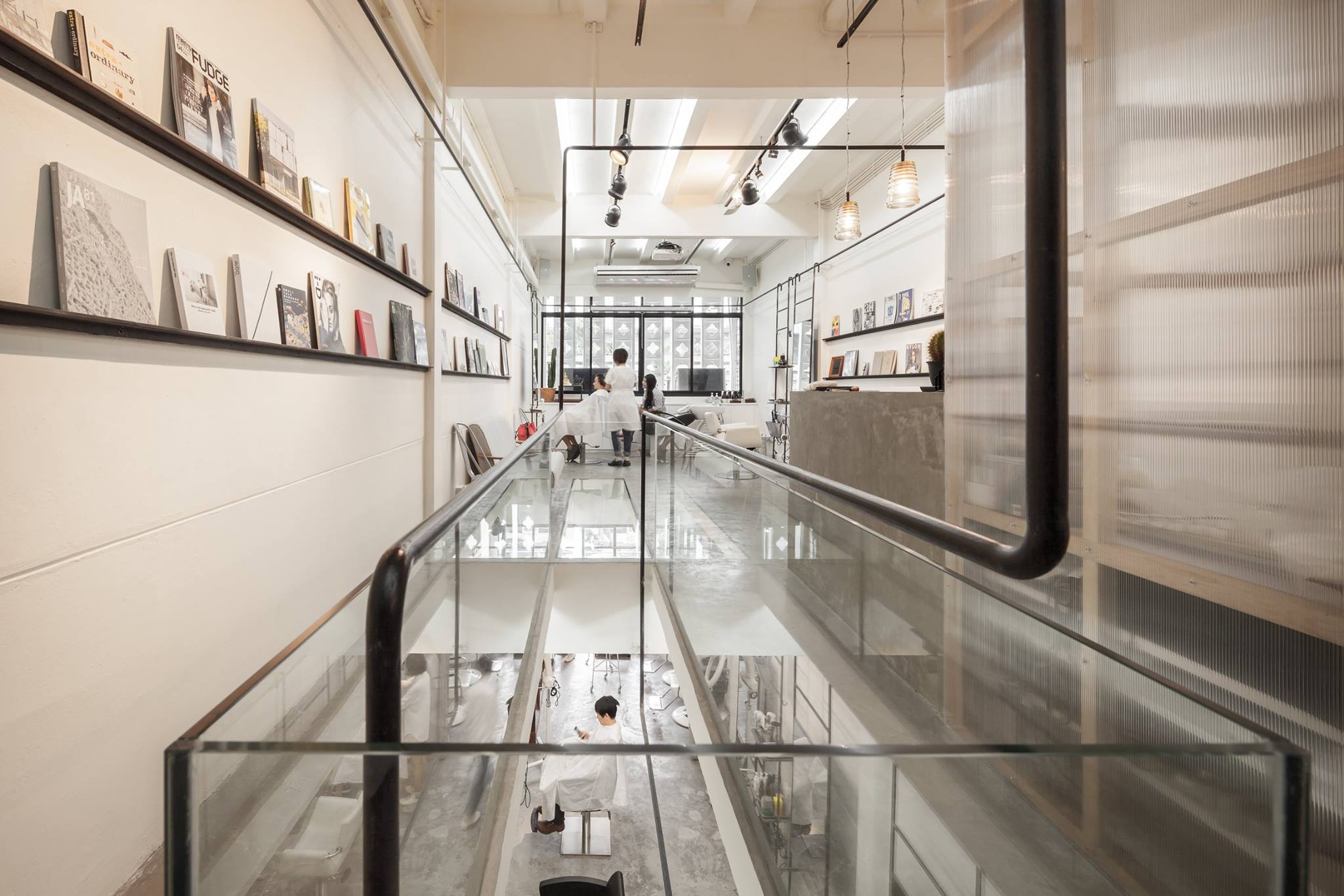
BOY, a hair salon and multifunctional space designed by Stu/D/O Architects. Photo by Ketsiree Wongwan
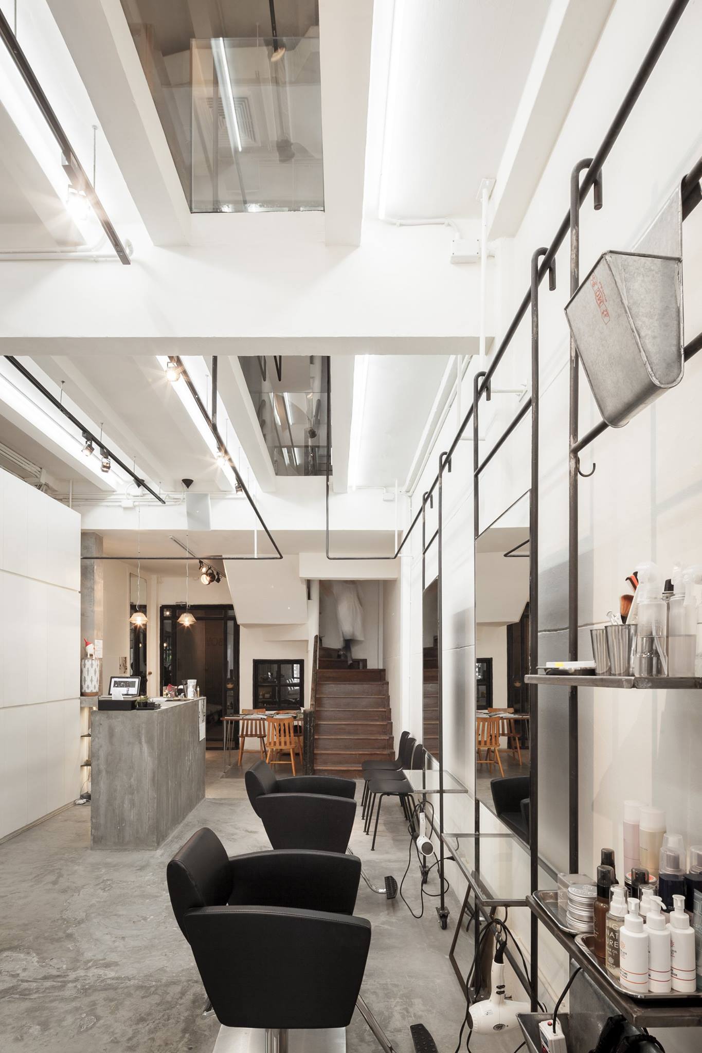
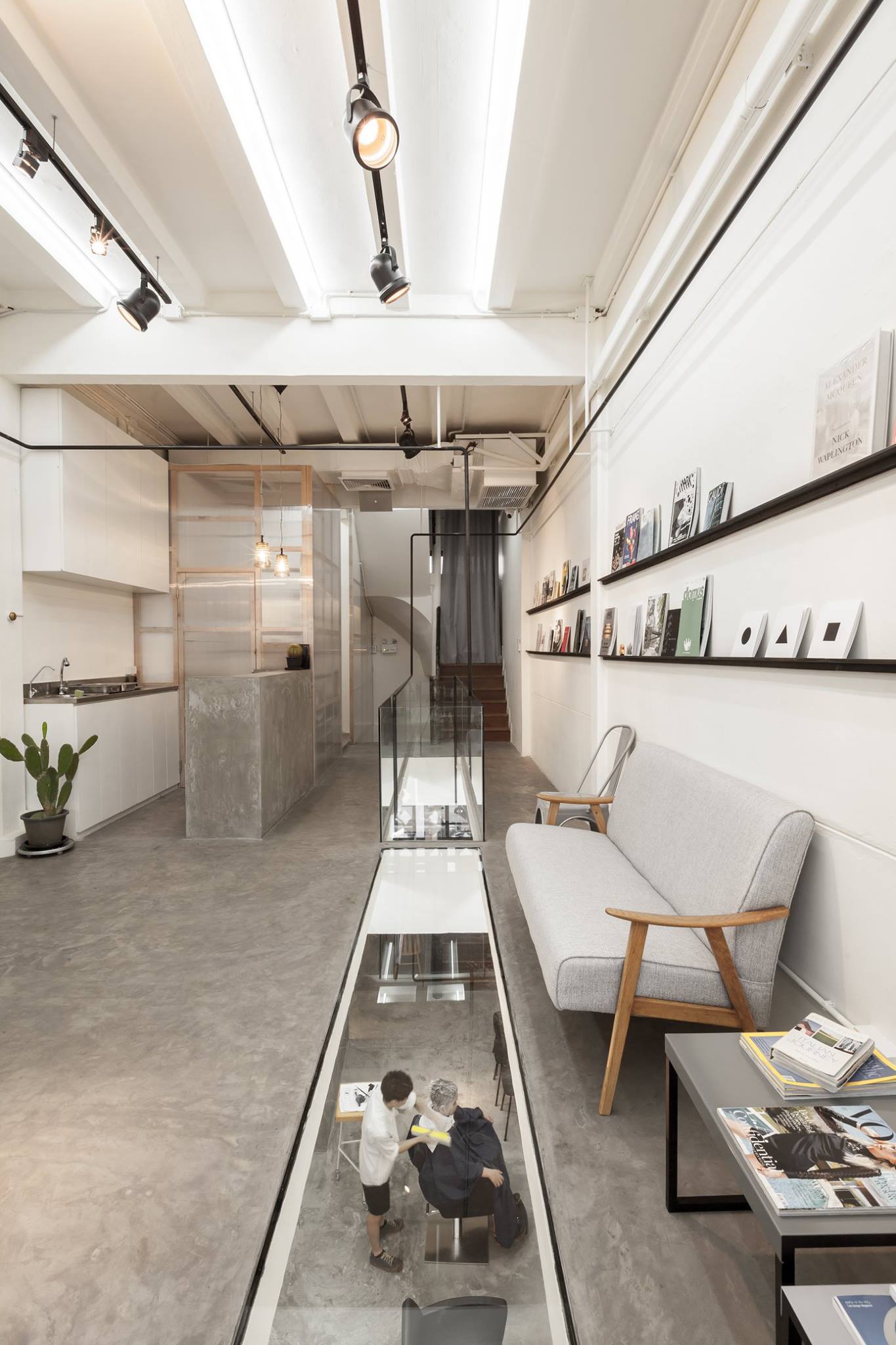
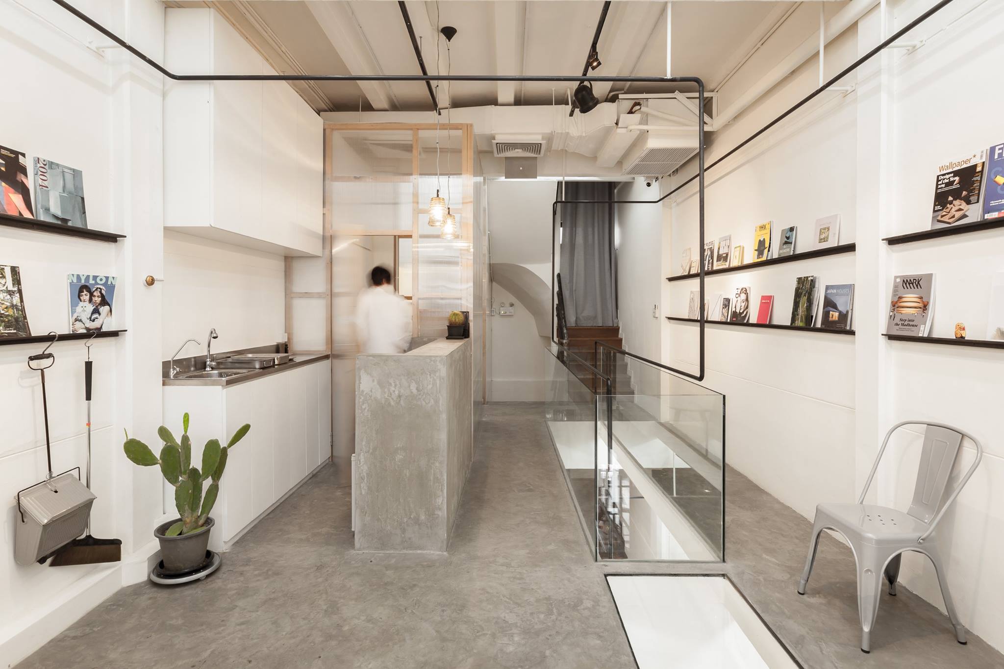
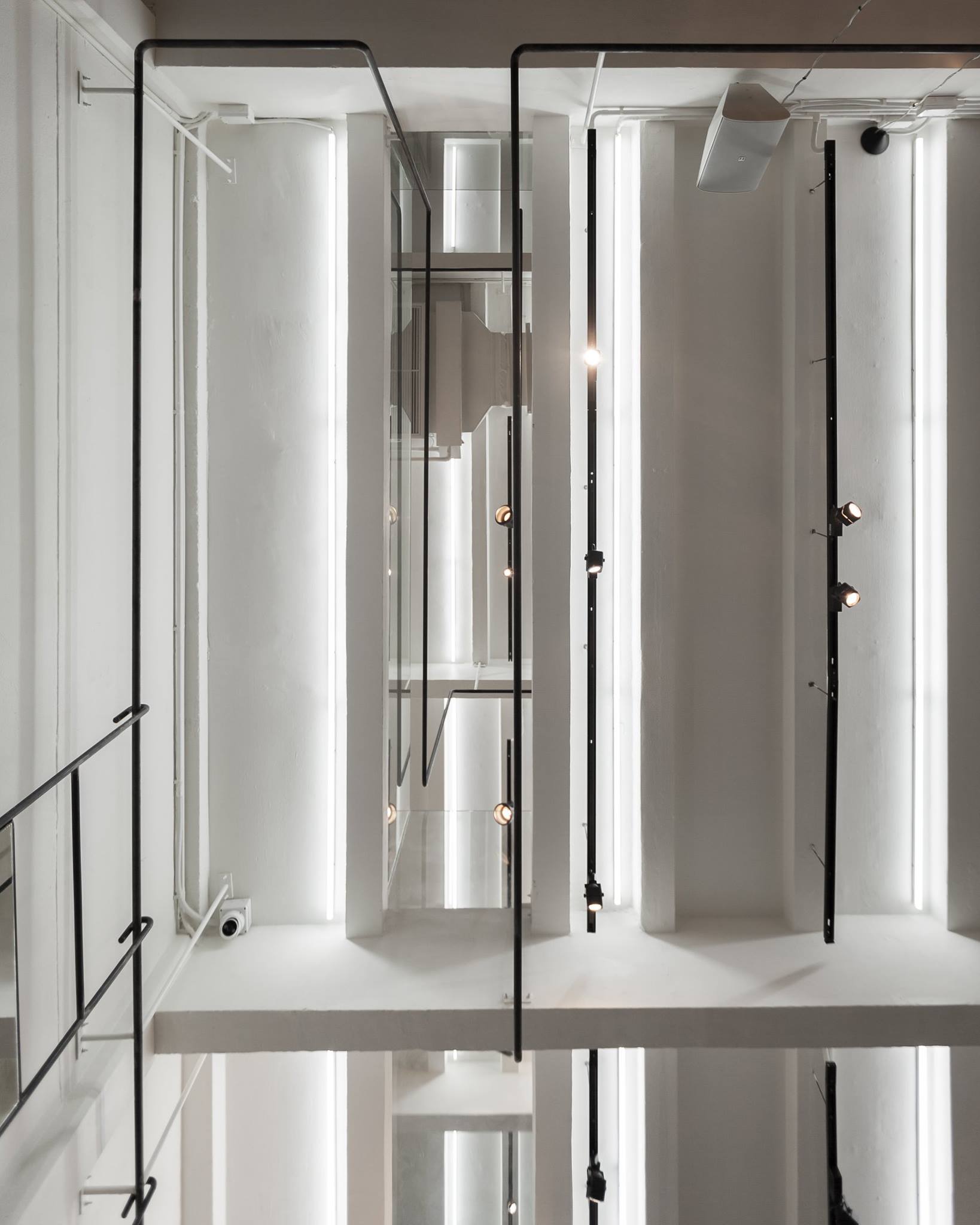
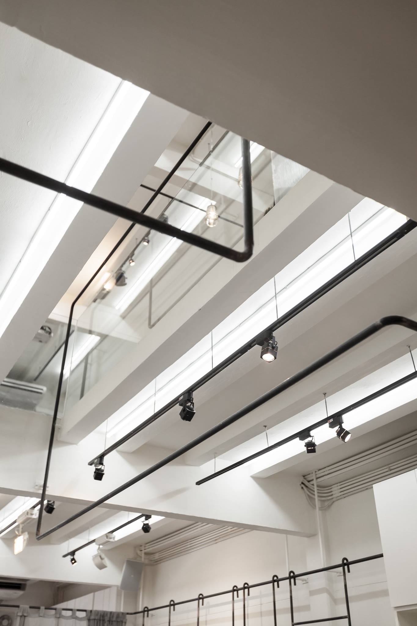
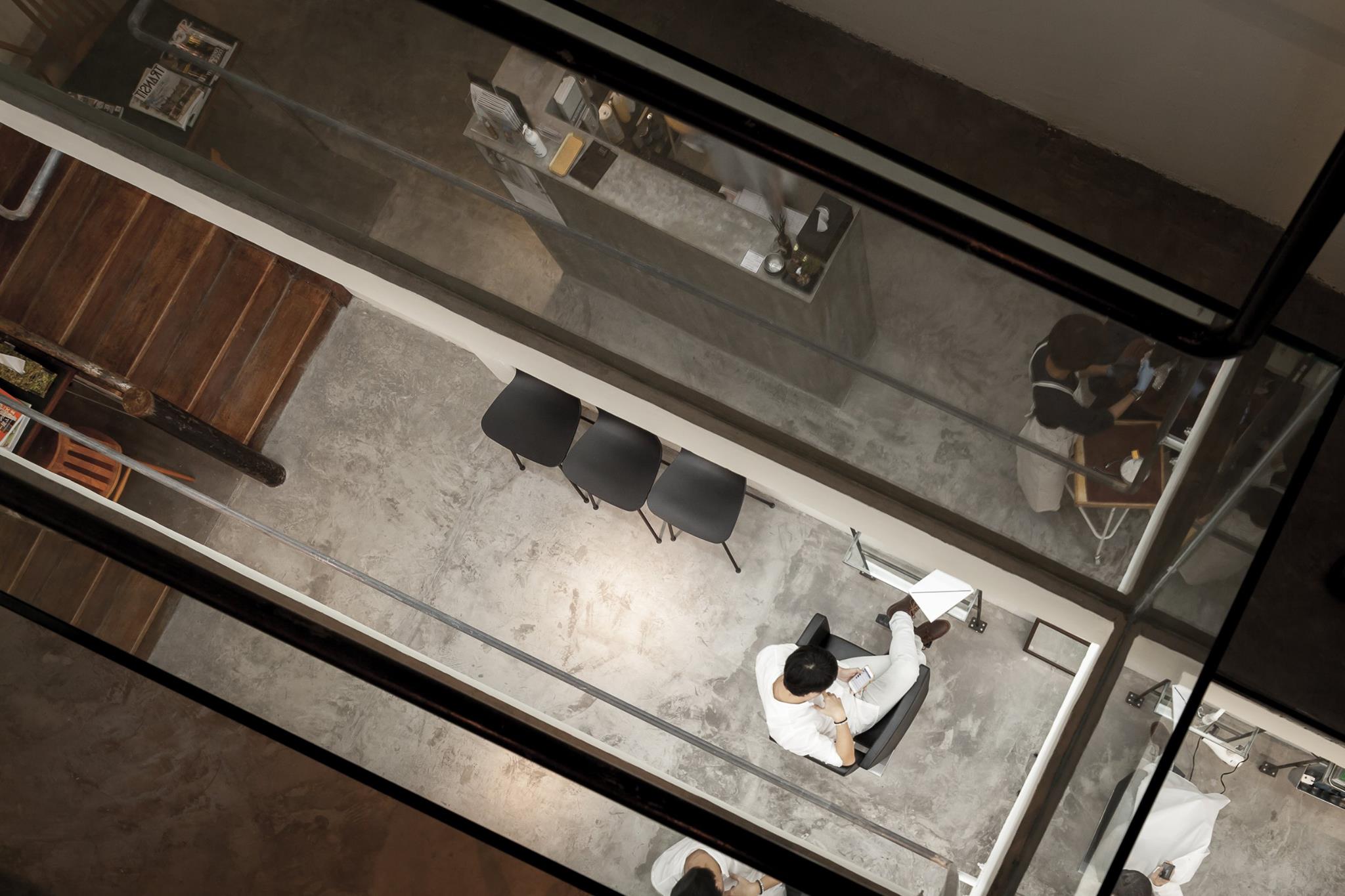
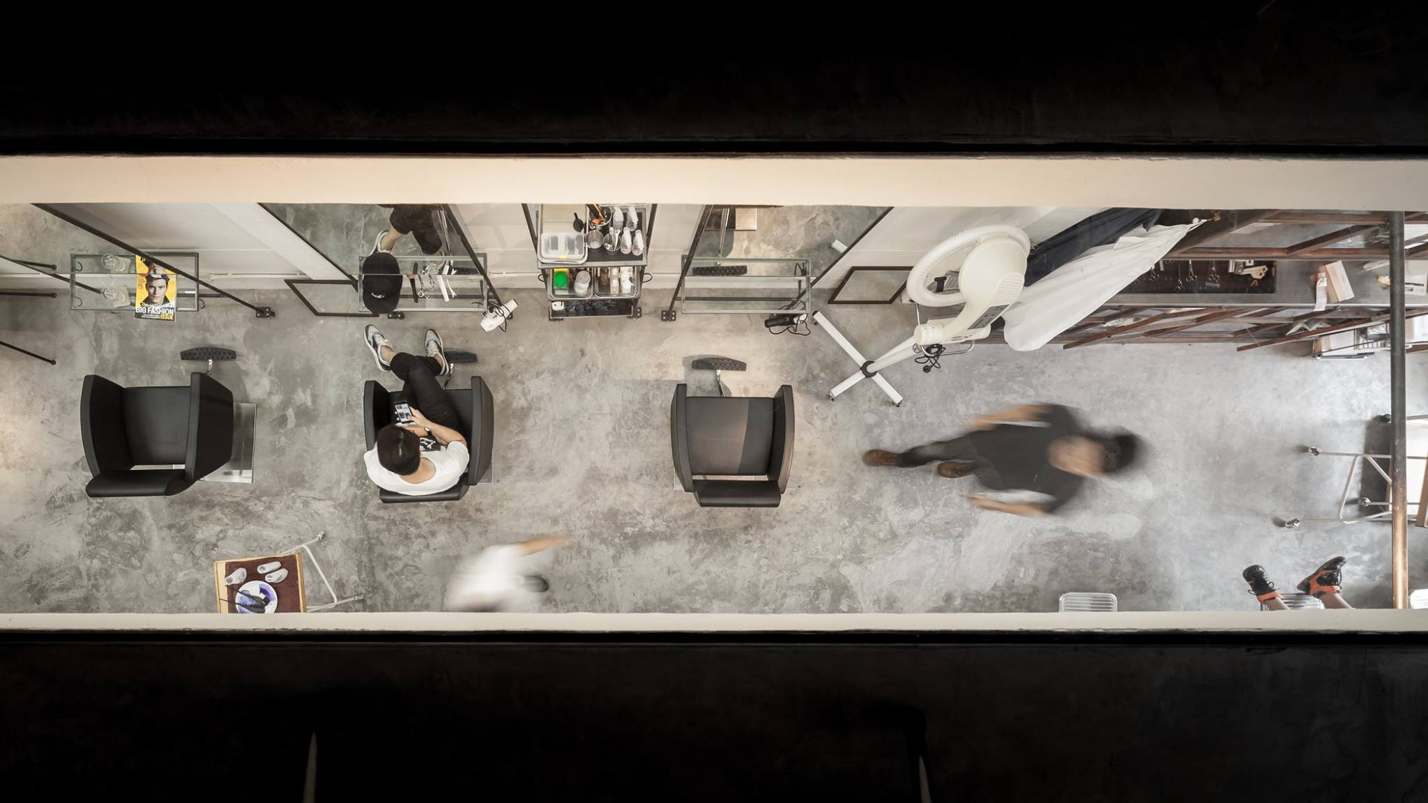
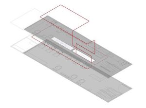
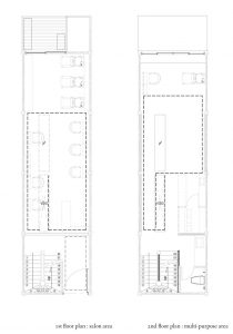
The key element the design team utilized to create a linkage between the two floors was ‘void,’ meaning both physical and visual. Its presence runs along the central axis of the second floor while the transparency of the glass openings becomes a composition that allows for users to see the activities going on downstairs. The noises of the shop’s ambience sneak into the second floor through another series of openings located on the same plane. Additionally, the structure has been configured for a series of glass panels to be installed. The black steel of the structure visually leads one from the first to the second floor, while the ends meet the beginning in one unified structural flow.
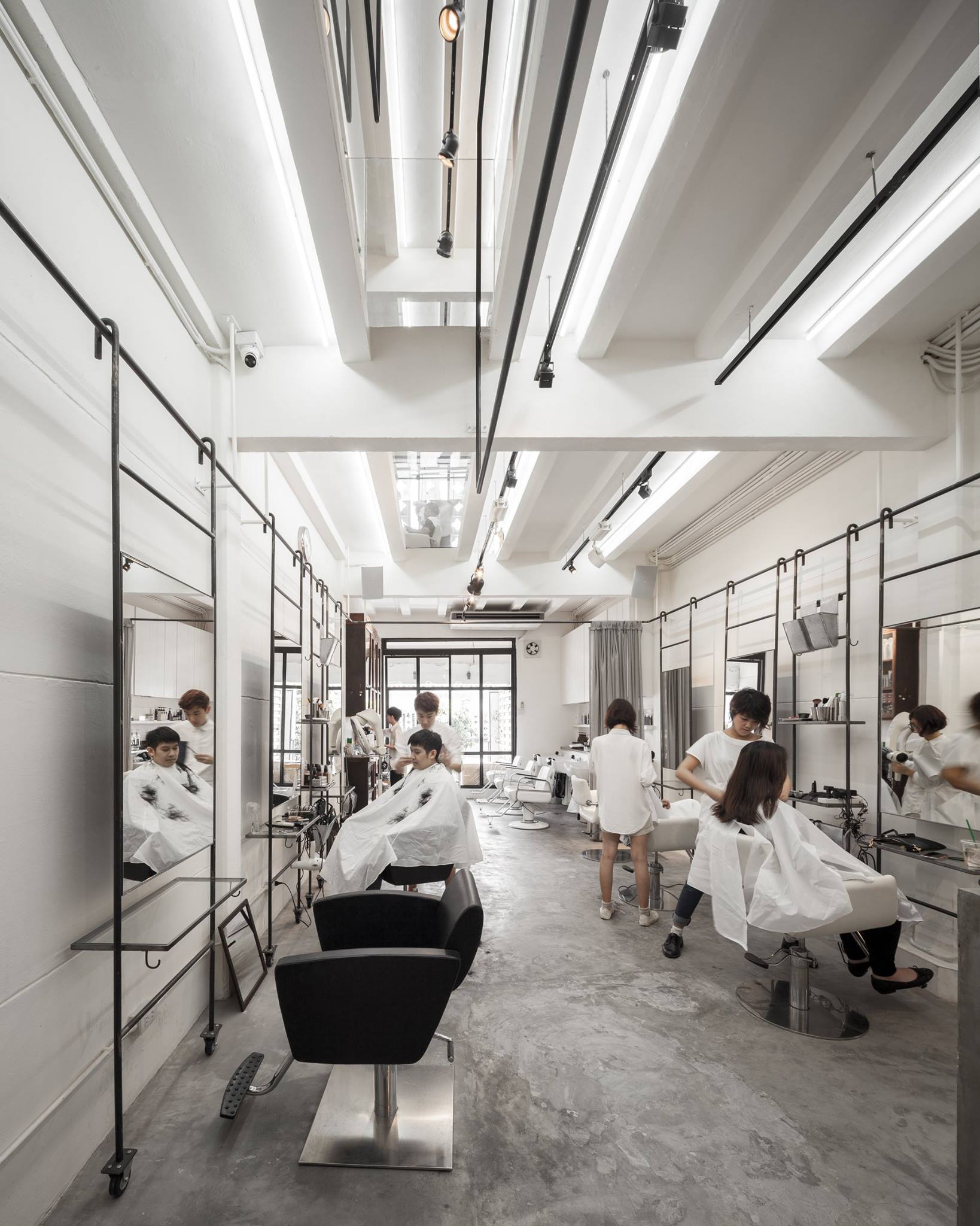
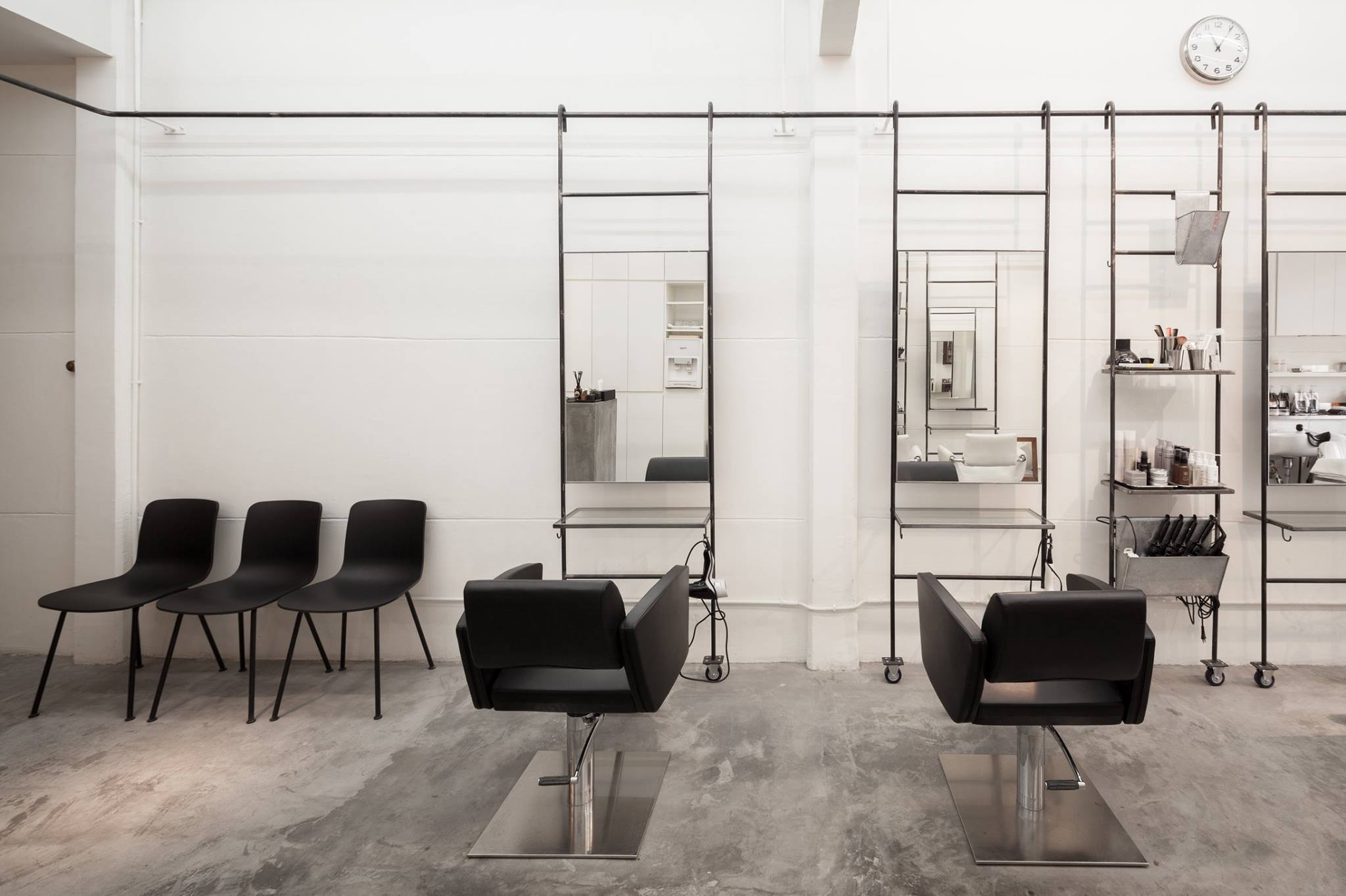
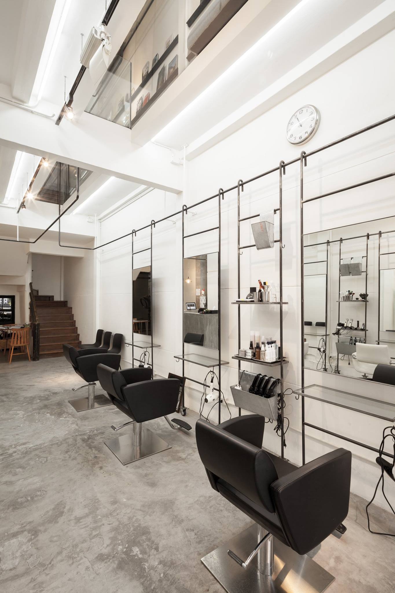
BOY, a hair salon and multifunctional space designed by Stu/D/O Architects. Photo by Ketsiree Wongwan
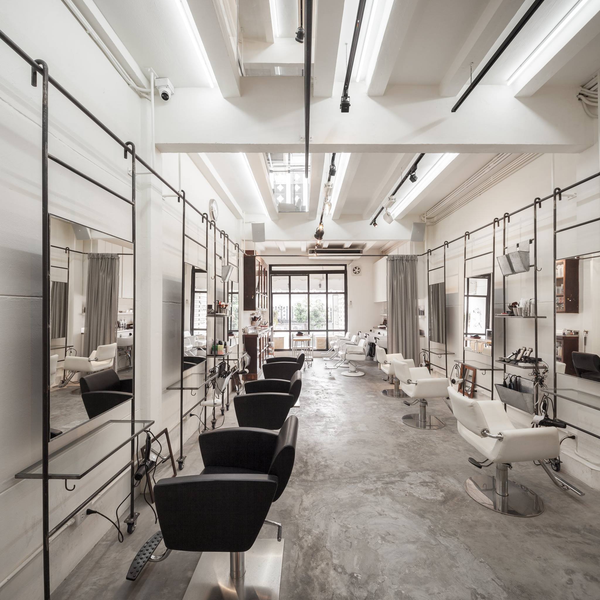
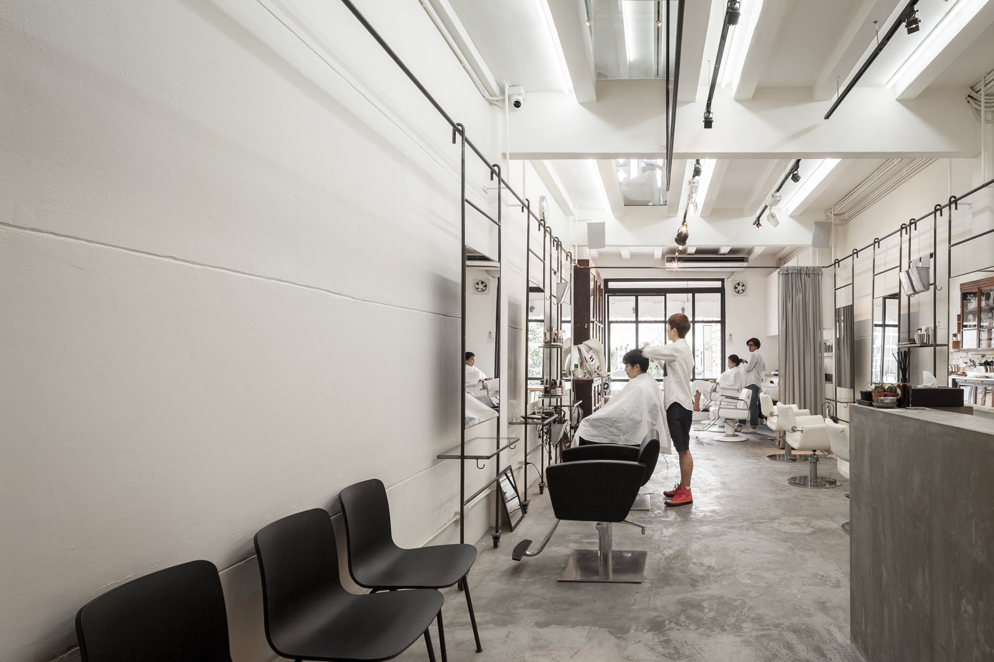
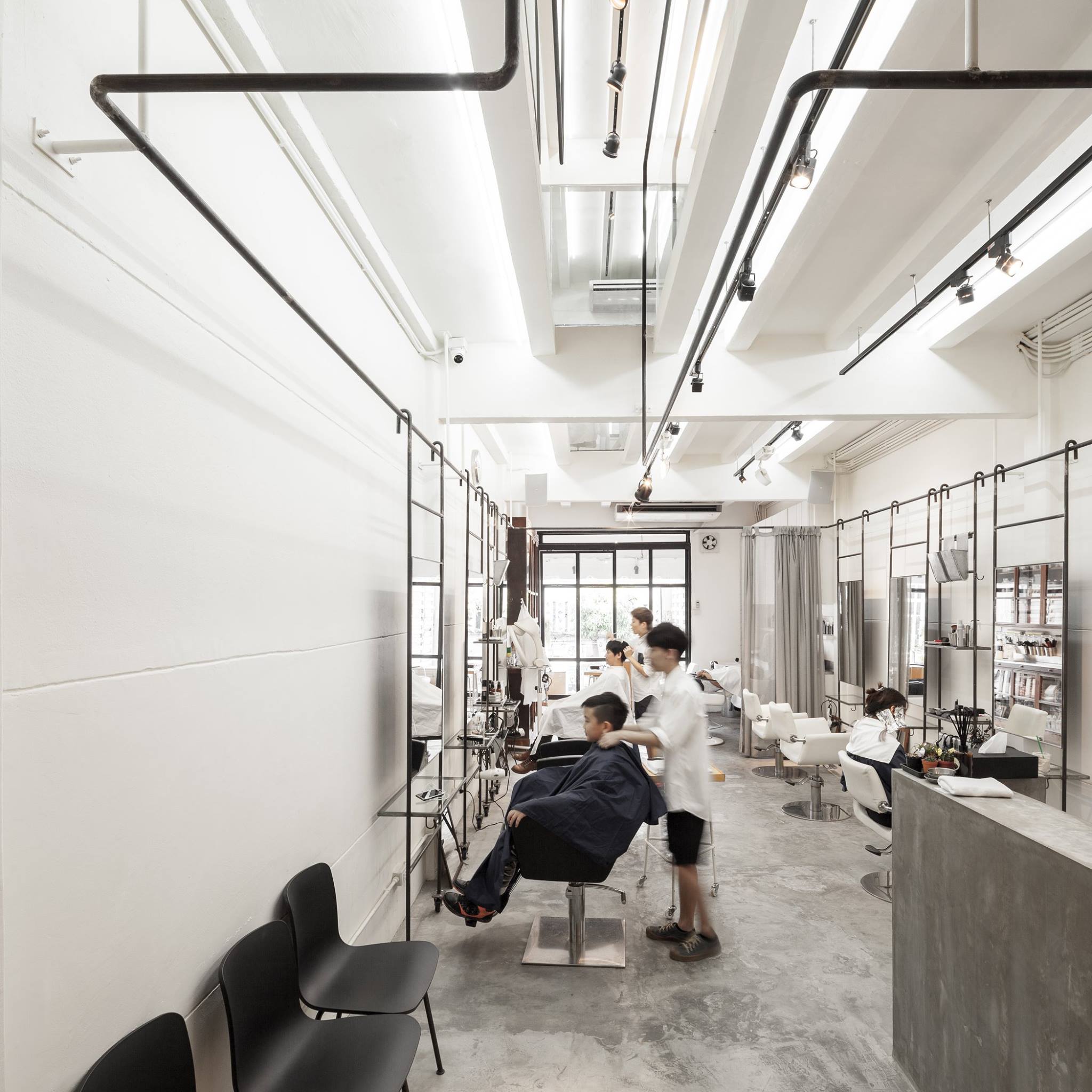
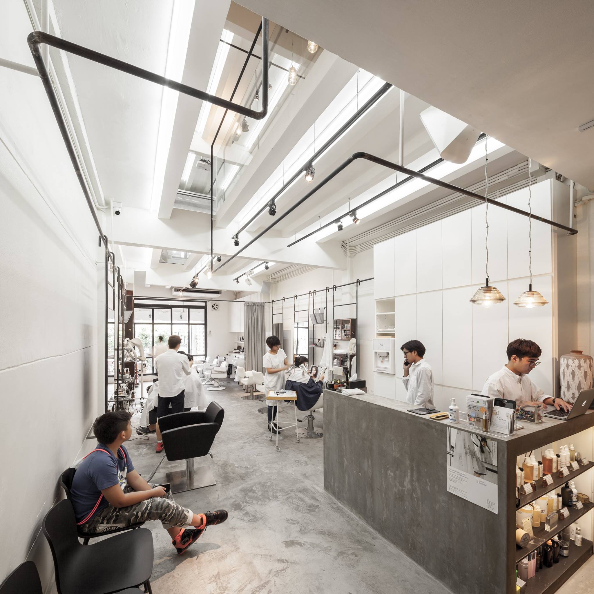
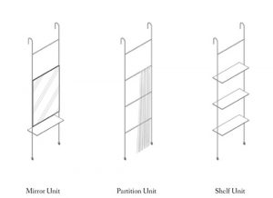
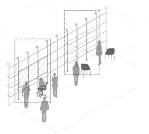
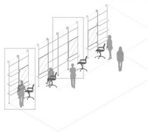
The conception of the shop’s steel railing is quite interesting with the design team’s personal impression in the service unit being designed by the owner of the Sukhumvit branch. One unit comprises two working stations and can accommodate two patrons. Included in each unit is a piece of mirror hung on the wheeled steel frame with the additional functionality of shelves and containers where essential equipment is stored. The hairdressers can move this particular unit to different areas of the shop according to their preferences in order to provide the needed services. The design and functionalities became inspiration for BOY with the outline and structure of the unit being kept and applied to better fit the space of the new branch, which is smaller and less flexible. The steel frame is secured to the wall and the building’s structure while the units are simplified to have only one mirror panel for one patron. The idea of a built-in rack and shelves is kept so that the necessary equipment can be placed within reach. The location can be adjusted by simply hanging the entire unit on the steel frame in the area of choice.
The attempt to maximize the adjustability and functionality of the unit is a response to BOY’s main concept, which encompasses not only hairstyling services but also facilitation of creative spaces and activities such as small-scale art exhibitions or workshops with the shop’s second floor area functioning as the main venue. As a result of that, having a space with high flexibility is a necessity whereas movable units and racks are developed to serve such requirements.
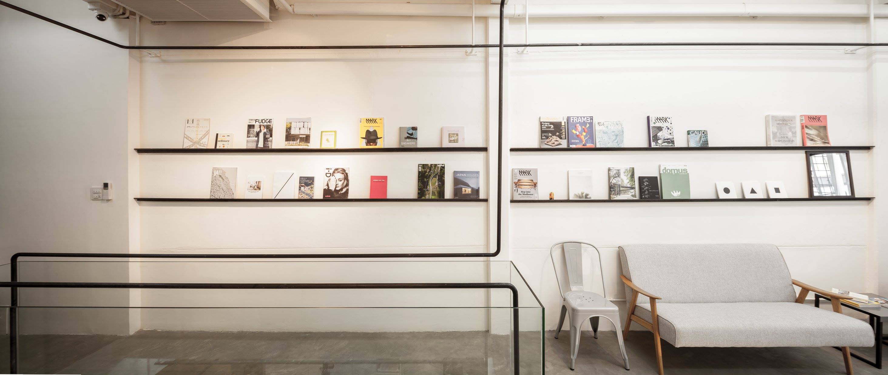
BOY, a hair salon and multifuncitonal space designed by Stu/D/O Architects. Photo by Ketsiree Wongwan
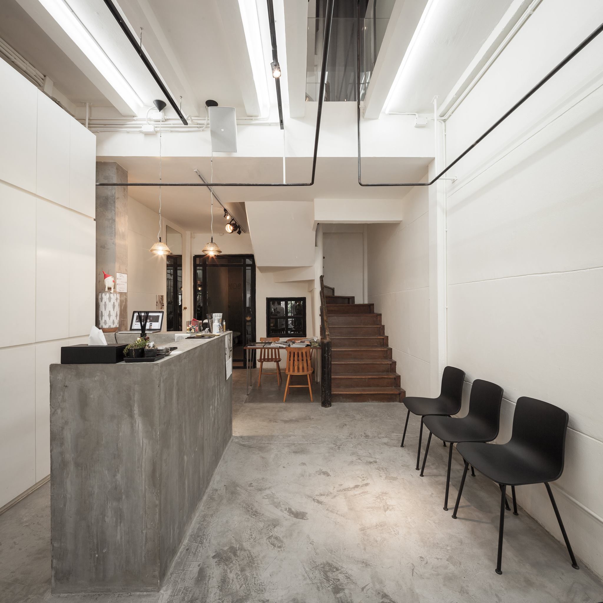
Providing a service may be time-consuming, and customers’ companions have to wait and find something to do to kill time. This reality became the reason behind the addition of the second-floor space, where a meaningful guest area engages users with a warm and friendly vibe and a coffee station is provided. The shop’s creative director, Dai Mogi (the son of Masayuki Mogi, BOY’s founder who was also the former Artistic Director of London’s Vidal Sassoon back in 1970s) incorporates his experience through photograph, debuting the space with a nice collection of art, design and photography books. It is also his intention to create a library where users can read, borrow or exchange their books with the shop. The open plan of the second floor is purposefully designed to accommodate future activities, as well as service units if needed. All the shop has to do is hang the unit on the steel railing system and a space for hair cutting, blow-drying and styling is simply created.
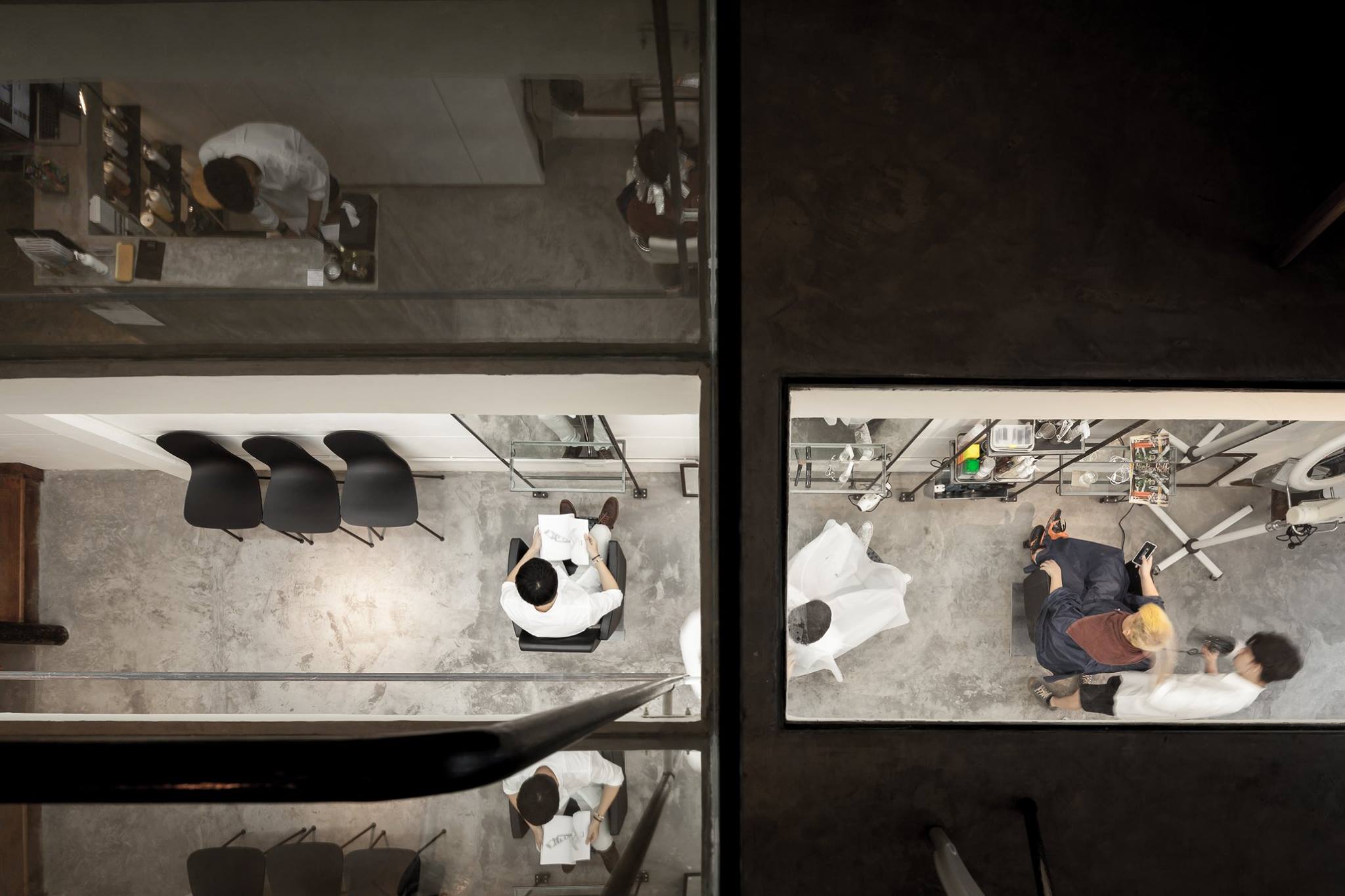
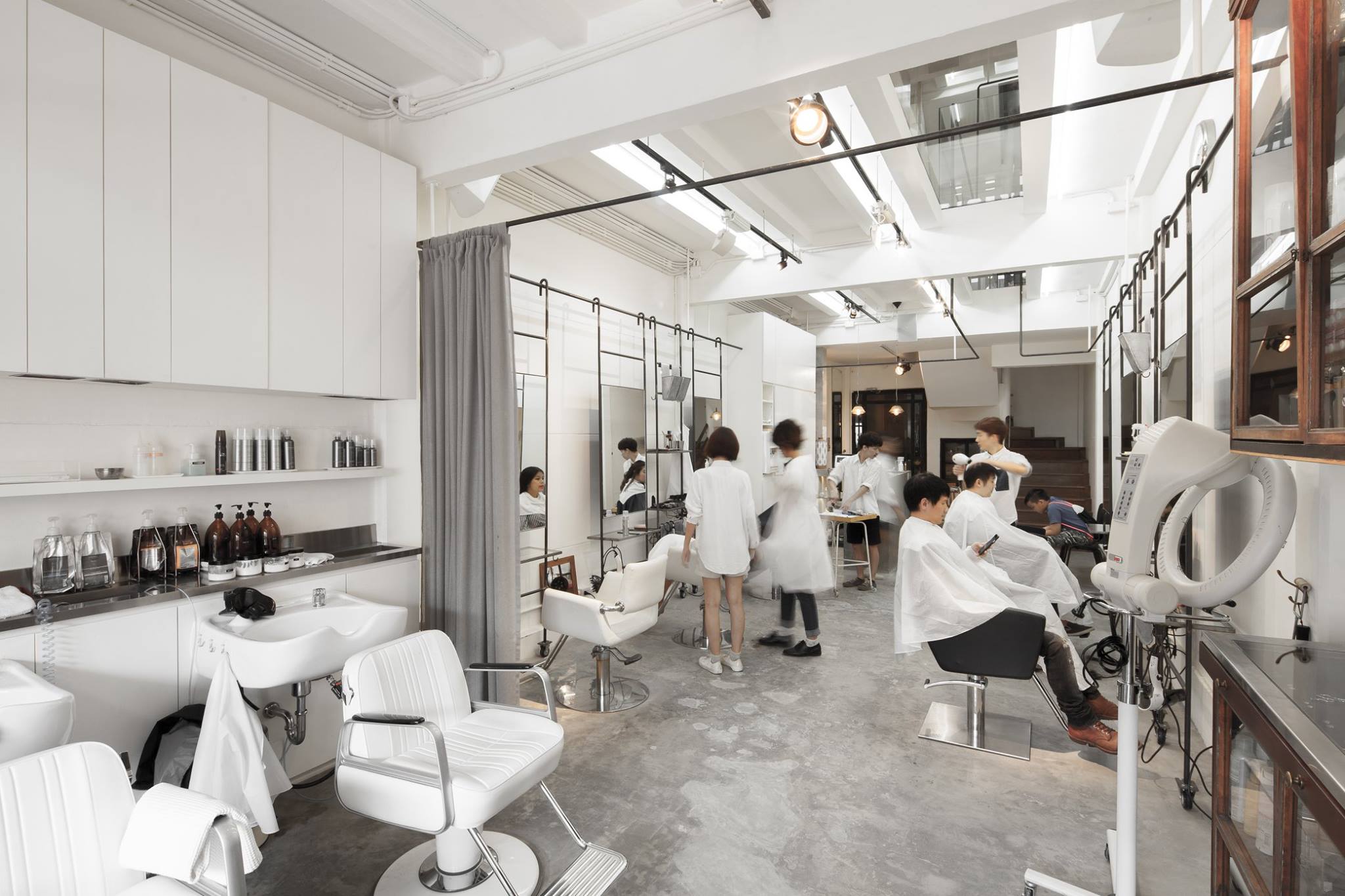
BOY, a hair salon and multifunctional space designed by Stu/D/O Architects. Photo by Ketsiree Wongwan
Apart from the core concept in which ‘perspective’ is conceived from a unique spatial allocation, what differentiates BOY from other hair salons is the raw and straightforward characteristic and details of materials be they steel, glass, mirror or white concrete walls. Collectively and amiably, they contribute to BOY’s personality as a friendly, cool and casual guy with an artistic sensibility.

