 Photo: Napat Pattrayanond
 MUSEUM OF BROKEN RELATIONSHIPS BY STA STUDIO WHO TRANSFORMED AN OLD BUILDING IN CHIANG MAI INTO A SPACE REFLECTING HUMAN FRAGILITY
TEXT: MONTHON PAOAROON
PHOTO CREDIT AS NOTED
(For Thai, press here)
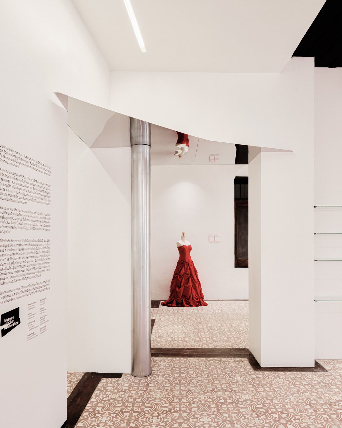
Photo: Napat Pattrayanond
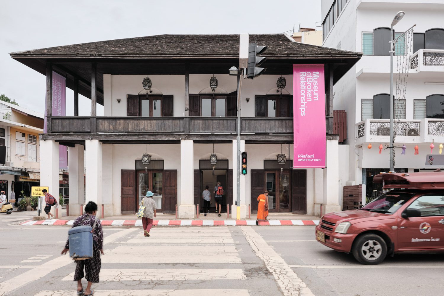
Anyone visiting Chiang Mai and passing through Thapae Road, one of the city’s oldest commercial thoroughfares, will likely recognize the Yong Chiang building. Originally constructed as a shophouse and warehouse, this preserved structure has taken on several identities over the years, serving at different times as a bank and a hostel. Its most recent transformation sees it reimagined as the Museum of Broken Relationships, marking the museum’s second branch following its original location in Croatia.
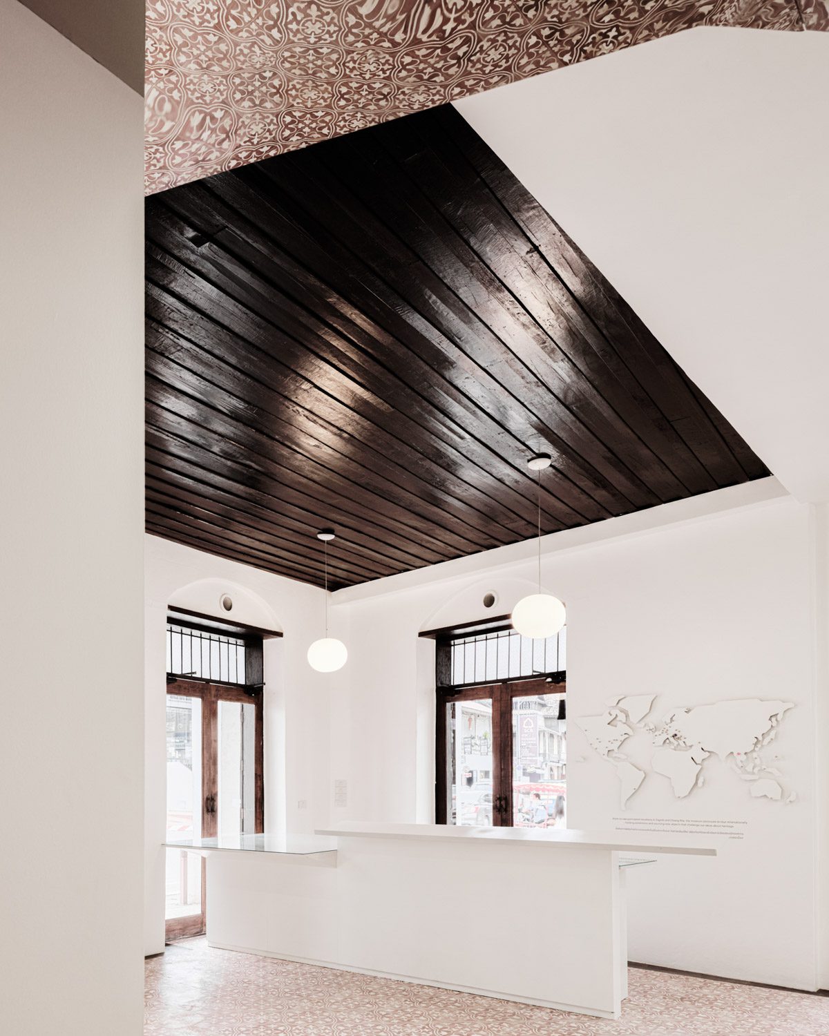
Photo: Napat Pattrayanond
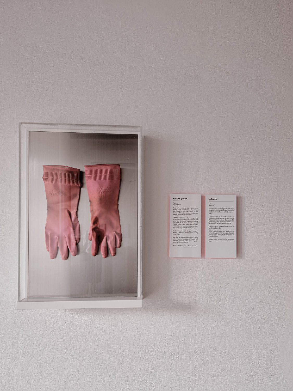
Photo: Napat Pattrayanond
The museum was founded by Olinka Vištica and Drazen Grubisic, a Croatian duo who, after ending their romantic relationship, found themselves surrounded by objects imbued with memories of their past. They began to wonder and ask themselves: should these items simply be thrown away, or could they become something more? What if these remnants of love were turned into art, telling stories of loss, change, and even beauty in life? The result is of that question became the seed of a concept: a museum that accepts donations of personal objects associated with heartbreak and separation from people around the world. These items, beyond their emotional narratives, also reflect the rich diversity of lifestyles, politics, cultures, and beliefs across different eras and geographies. The Museum of Broken Relationships began in 2006 as a traveling exhibition. In 2010, it found a permanent home in Zagreb, Croatia, where it quickly became the city’s most-visited museum. Most recently, it expanded to Chiang Mai with the opening of its second branch at the end of 2024.
 Photo: Napat Pattrayanond

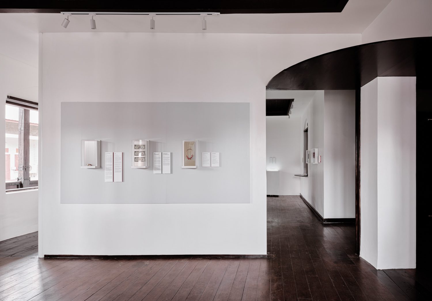
Photo: Napat Pattrayanond
But what led the Museum of Broken Relationships to choose Chiang Mai as the site of its second location? And how was the original building adapted to align with the museum’s unique curatorial vision? To find out, we sat down for a relaxed online conversation with Asrin Sanguanwongwan, a representative from STA Studio, an architecture practice based in Croatia. Joining him were his wife, Petra Tikulin, who led the architectural and exhibition design, and Nuphap Aunyauphap of Design Unit Studio, the graphic designer behind the project’s visual identity. Together, they walked us through the background and design approach that shaped the museum’s new home in Chiang Mai.
From Zagreb to Chiang Mai
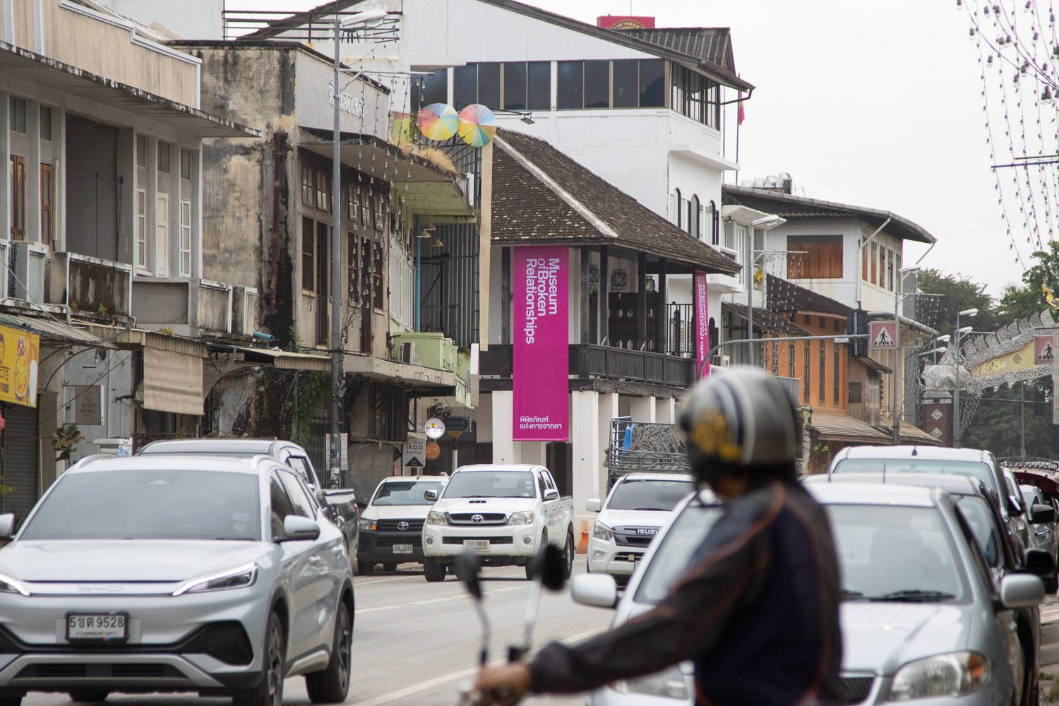
Photo: Nuphap Aunyauphap
“It actually started quite by chance,” Asrin began. “Back when I was studying in Milan, I used to travel frequently to Croatia because Petra is from there. One day, I visited the museum and thought it was just brilliant. The objects on display were incredibly ordinary—but somehow, we ended up spending a long time with them. It made me think of how, in art museums, we often pass by pieces quickly if the visuals don’t grab us. But here, the storytelling was so powerful that even something as simple as a pen or a doll could hold us for minutes. We connected with it. That was my first encounter with the museum.”
Asrin went on to recount how, one day, while dining at a Thai restaurant run by a friend (Nui) the conversation took an unexpected turn. Nui introduced Asrin and Petra to Olinka and Drazen, the museum’s founders, who, by coincidence, happened to be dining there that very day. During their conversation, Olinka and Drazen mentioned that they had just returned from a trip to Chiang Mai. They saw potential in the city and had already secured a building for the new branch, but didn’t know anyone locally who could help manage the project. That was the beginning.
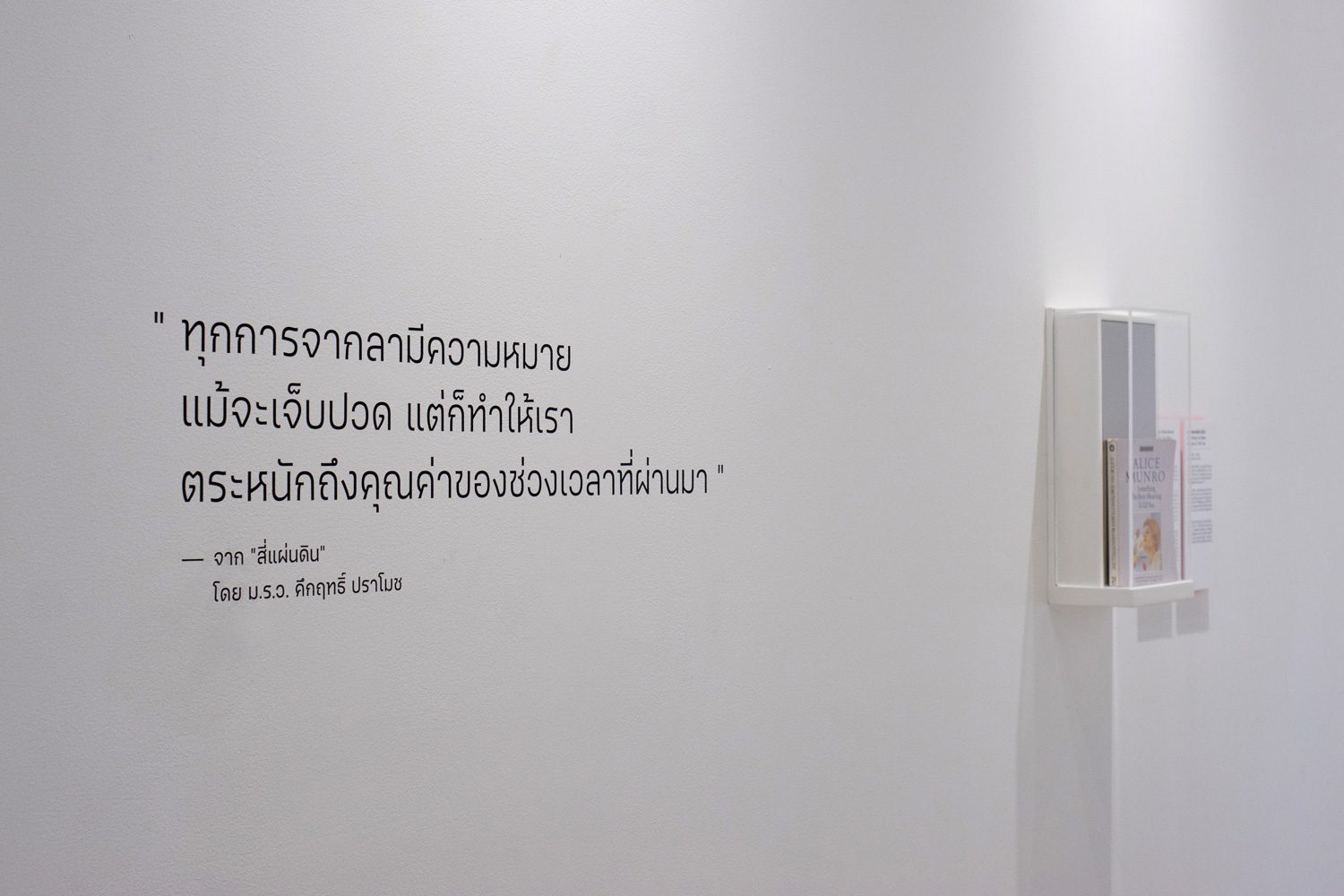
Photo: Nuphap Aunyauphap
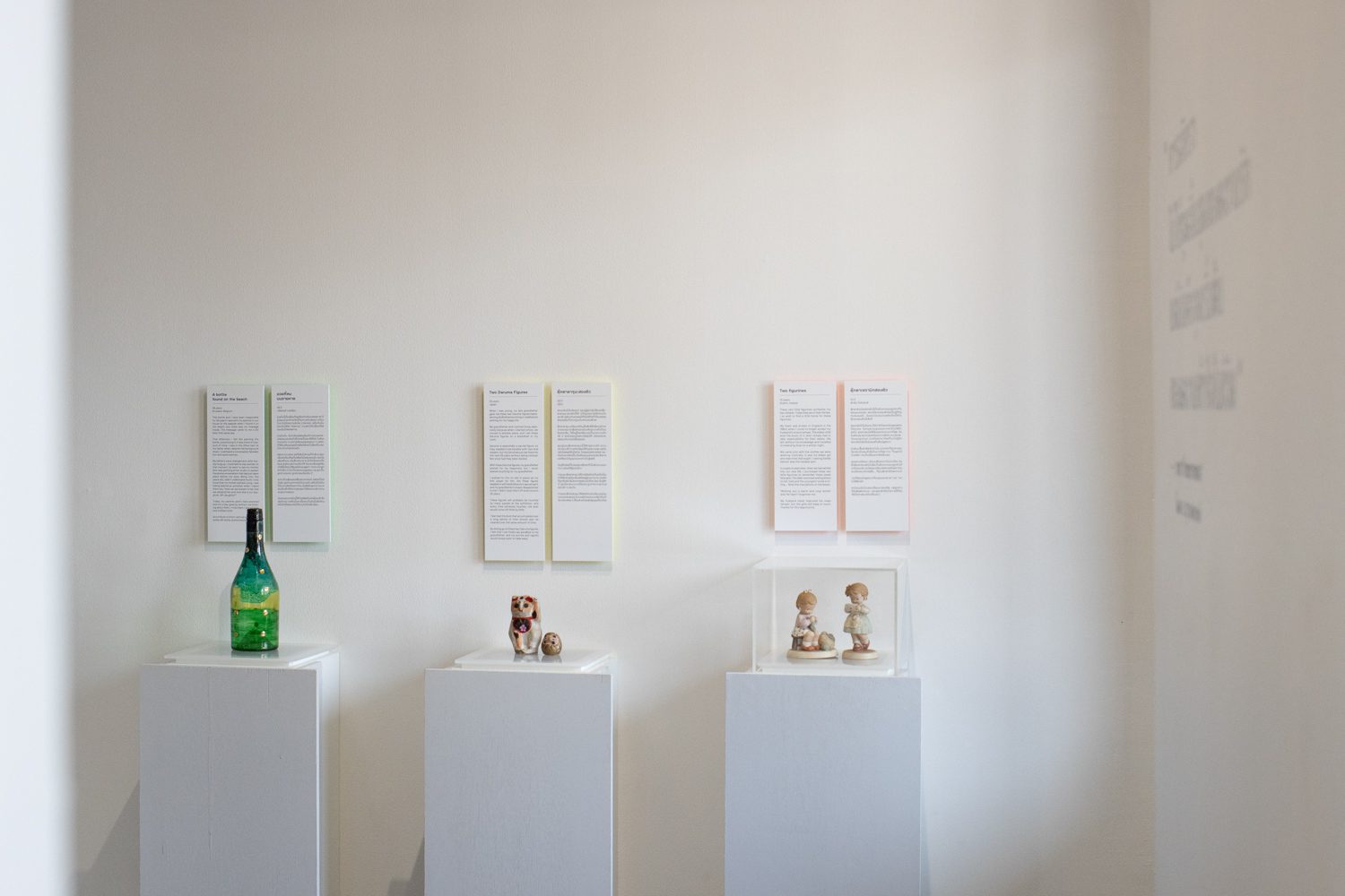
Photo: Nuphap Aunyauphap
Asrin, who had previously worked on exhibition designs in Thailand, offered to connect the two founders with people he knew, simply wanting to help because he admired the museum and thought it would be wonderful to see it take root in Thailand. Then came a question he hadn’t anticipated: “We heard you’re an architect—would you be interested in designing this project?” “Of course!” he replied with a smile. “Why wouldn’t I?”
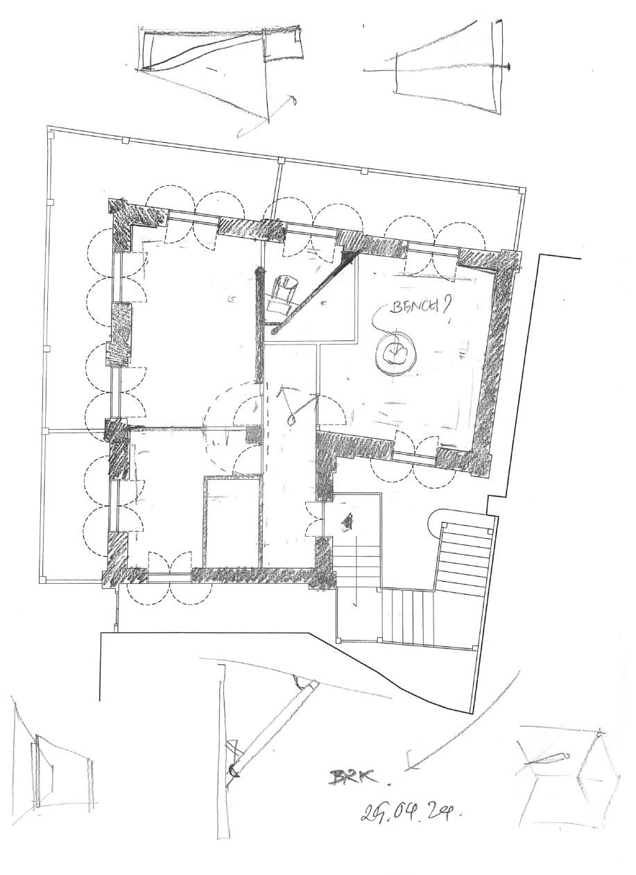
“When we first received the floor plan, I noticed the walls were incredibly thick—about 60 centimeters,” Asrin recalled. “It reminded me of working on buildings in Europe. In contrast, walls in most buildings in Thailand are usually just 10 centimeters. And the building itself feels very much embedded in the urban fabric, which again made it feel like designing in a European context. I thought it was a fascinating situation.” He continued, “They chose a building that really carries an institutional presence. I never asked them why, but I think it’s a brilliant decision. The objects in the museum are deeply personal and casual—everyday items with intimate stories. If you were to place them in an equally casual or ordinary setting, the seriousness of those stories might not come through. That’s why I felt they needed a space that carried a certain gravity. In Zagreb, the museum is housed in a stately classical building in the government quarter. That kind of gravity tells visitors walking in: this is serious. This isn’t a tourist trap. That weight gives the exhibits their proper frame.”
Designing Flow: A Space Where Objects and People Interact
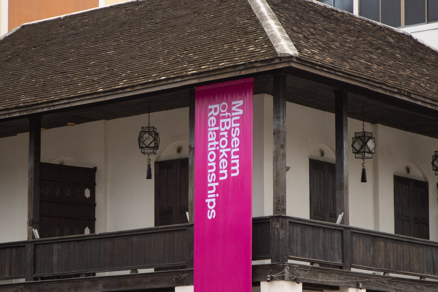
Photo: Nuphap Aunyauphap
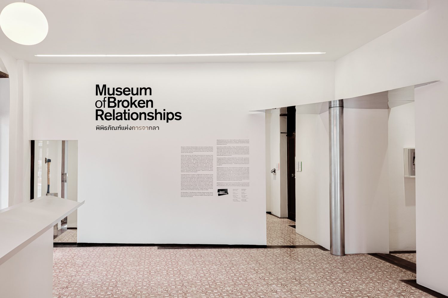
Photo: Napat Pattrayanond
“We began by looking at what architectural elements gave this building its character—what felt inherently valuable,” Asrin explained. “One of the first things we noticed was the contrast between the dark wood-framed doors and windows and the white plastered walls. We wondered what would happen if we echo those very materials and contrasts into the interior.” For him, the building was already beautiful as it was, and there was little desire to alter the exterior in any significant way.


When they first received the brief, the ground floor was to include both a museum shop and a lobby. “Given the building’s corner location, accessible from two streets, we thought—why not allow the lobby to open from both sides?” Asrin said. “At the same time, we had to manage an unusual circulation pattern. The layout forms an L-shape, and if you enter from the corner, you come in at the angle. We had to think about how to guide visitors into both ‘legs’ of the L without having them double back. We started exploring how to work with that corner—maybe opening it up, creating some kind of architectural intervention that clearly signals: this is the entrance.”
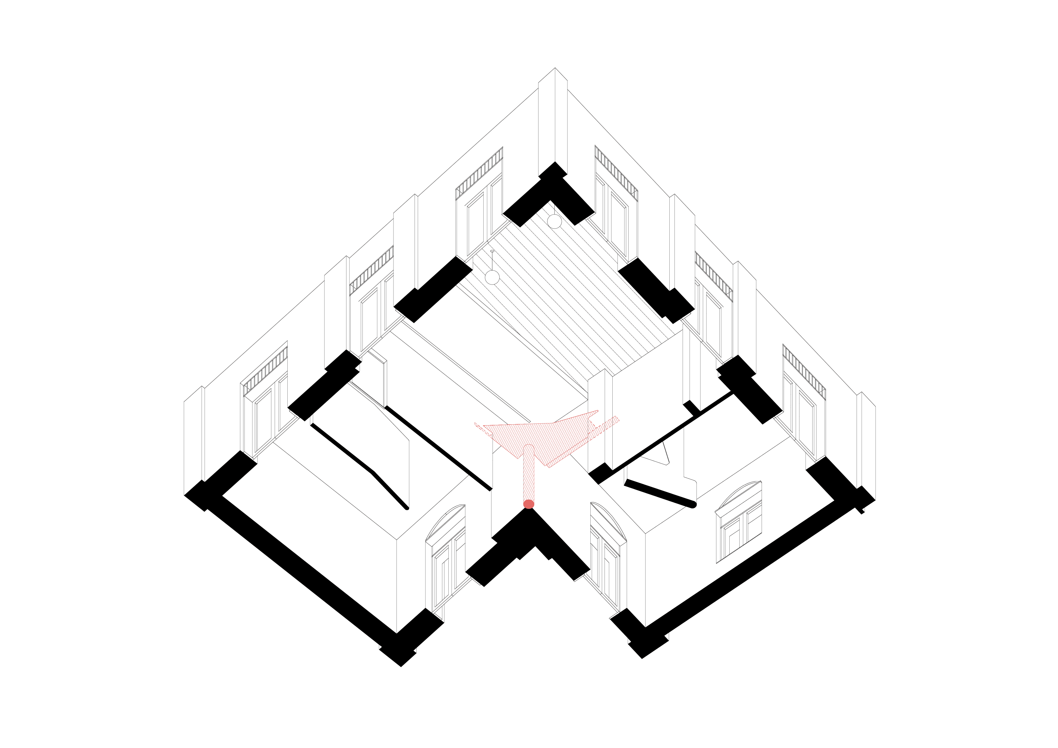
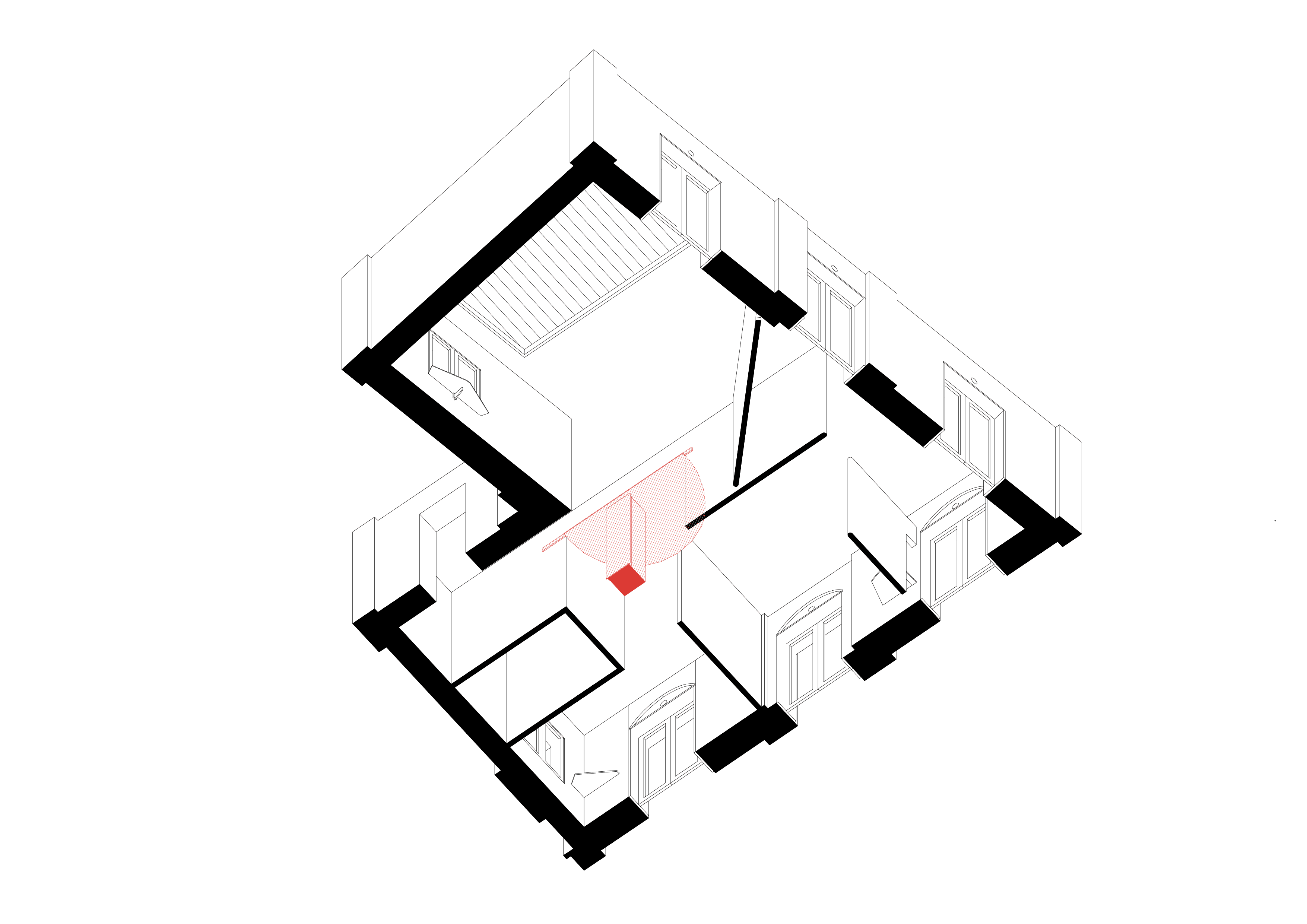


Once inside the exhibition area, visitors encounter a series of subtly angled walls that shift slightly off-axis. “That’s part of STA’s overall design concept,” Asrin explained. “We wanted to introduce a sense of layering within the space. When you walk into a room and can instantly see where the walls begin and end, it tends to feel small. What we tried to do was insert walls that either float or tilt slightly—first, to soften the rigidity of the room, and second, to create visual cues that suggest there’s more space beyond. When you look at a floating or angled wall, you begin to perceive another space behind it. That perception expands the room in your mind, making it feel larger than it actually is.”
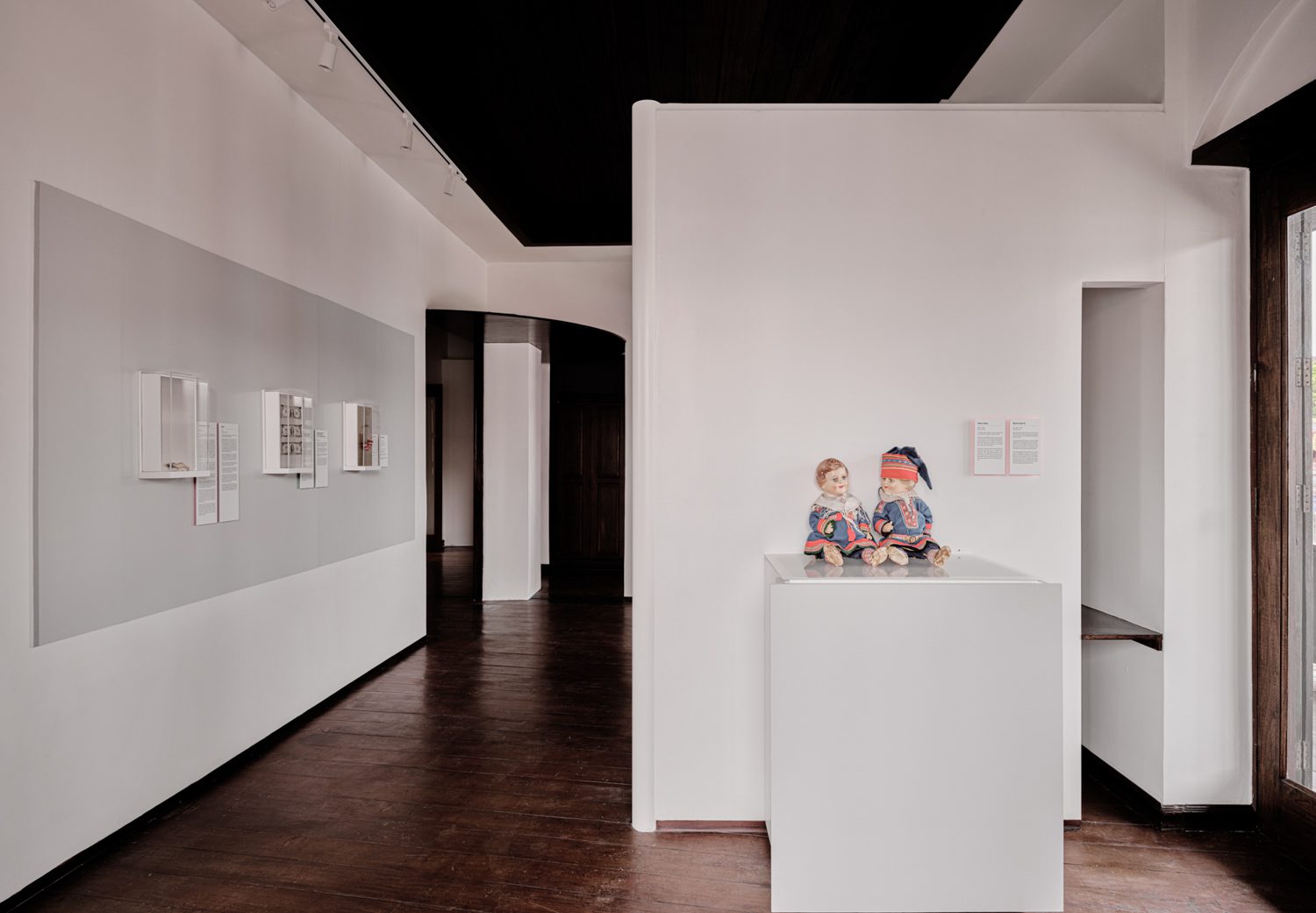
Photo: Napat Pattrayanond
 Photo: Napat Pattrayanond

“Previously, when the building functioned as a hostel, the second-floor rooms were divided into equally sized guest rooms,” Asrin explained. “We removed those internal walls to allow for varying room sizes, which helps create a more layered spatial experience. We applied the same techniques as we did on the ground floor—floating walls positioned in the middle of the space, and angled entry points into each room. But here, the connecting elements were done in wood, so they blend more naturally with the timber flooring on the second level. We also introduced circular forms to clearly mark what had been newly added.”
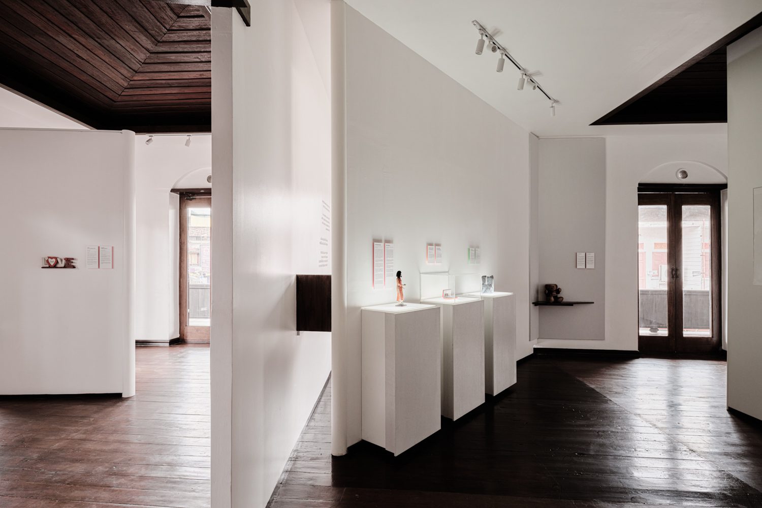
Photo: Napat Pattrayanond
 Photo: Napat Pattrayanond

“Our main focus was on creating a spatial flow. The space is compact, and the L-shaped layout poses its own constraints. But that’s where STA’s design approach really comes into play. This is something we apply to all our projects, and it works especially well in smaller spaces. In this case, the architecture becomes a vessel that amplifies the presence of the objects. It lets the emotional weight of the items take hold and connect with people. I believe these objects possess stories with strong enough power to hold people’s attention and invite them to stay present.”
Space & Graphics for “Ordinary Objects with Powerful Stories”
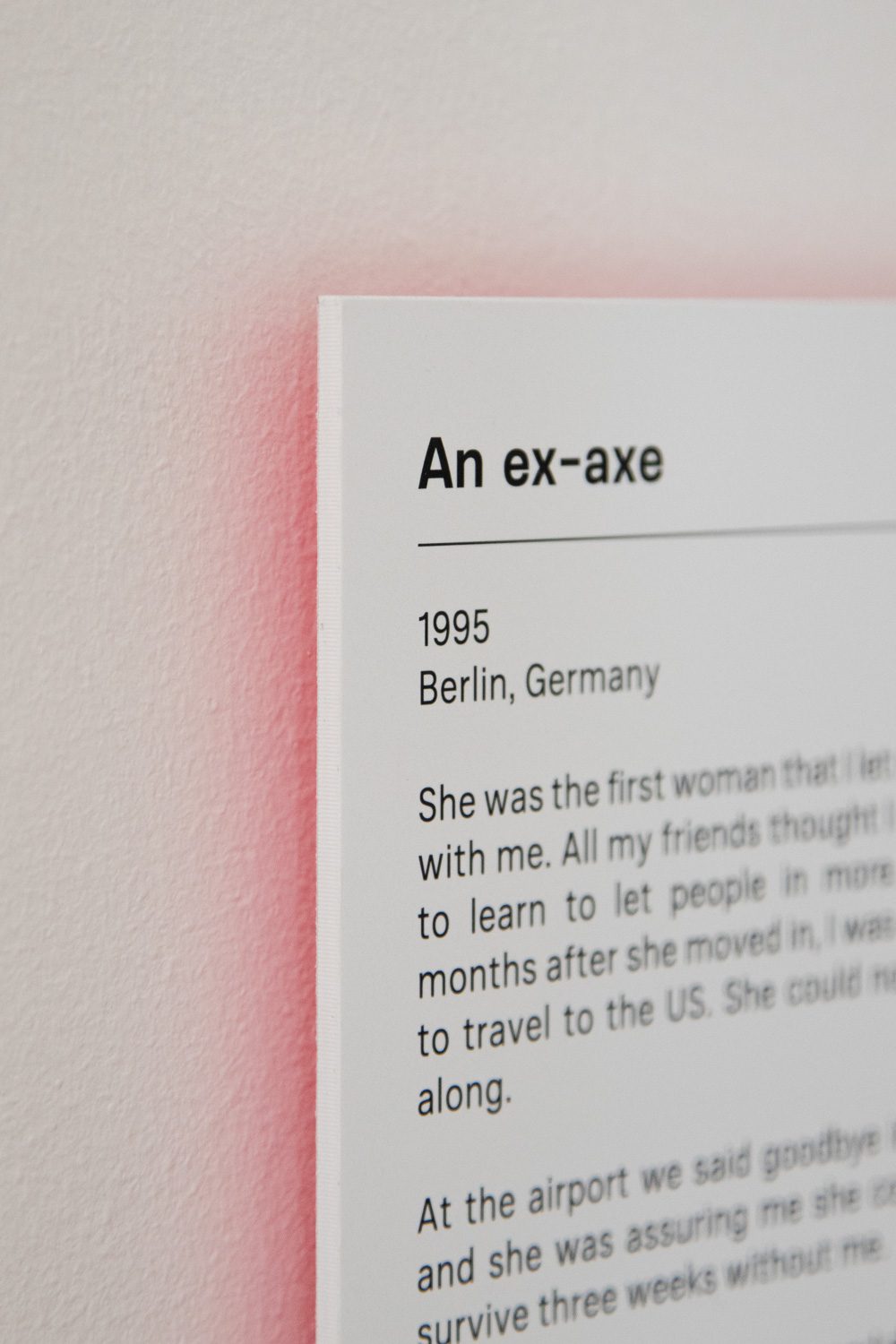
Photo: Nuphap Aunyauphap
") Photo: Nuphap Aunyauphap
Photo: Nuphap Aunyauphap

“In most art exhibitions, object labels are designed to be as discreet as possible, and placed in ways that almost make them invisible. Because the object should be the main focus,” explained Nuphap Aunyauphap, the graphic designer behind the project. “But in this museum, the story is central, so the tag needs to stand out. Still, I didn’t want the graphics to shout. I wanted them to support the space, not dominate it.”
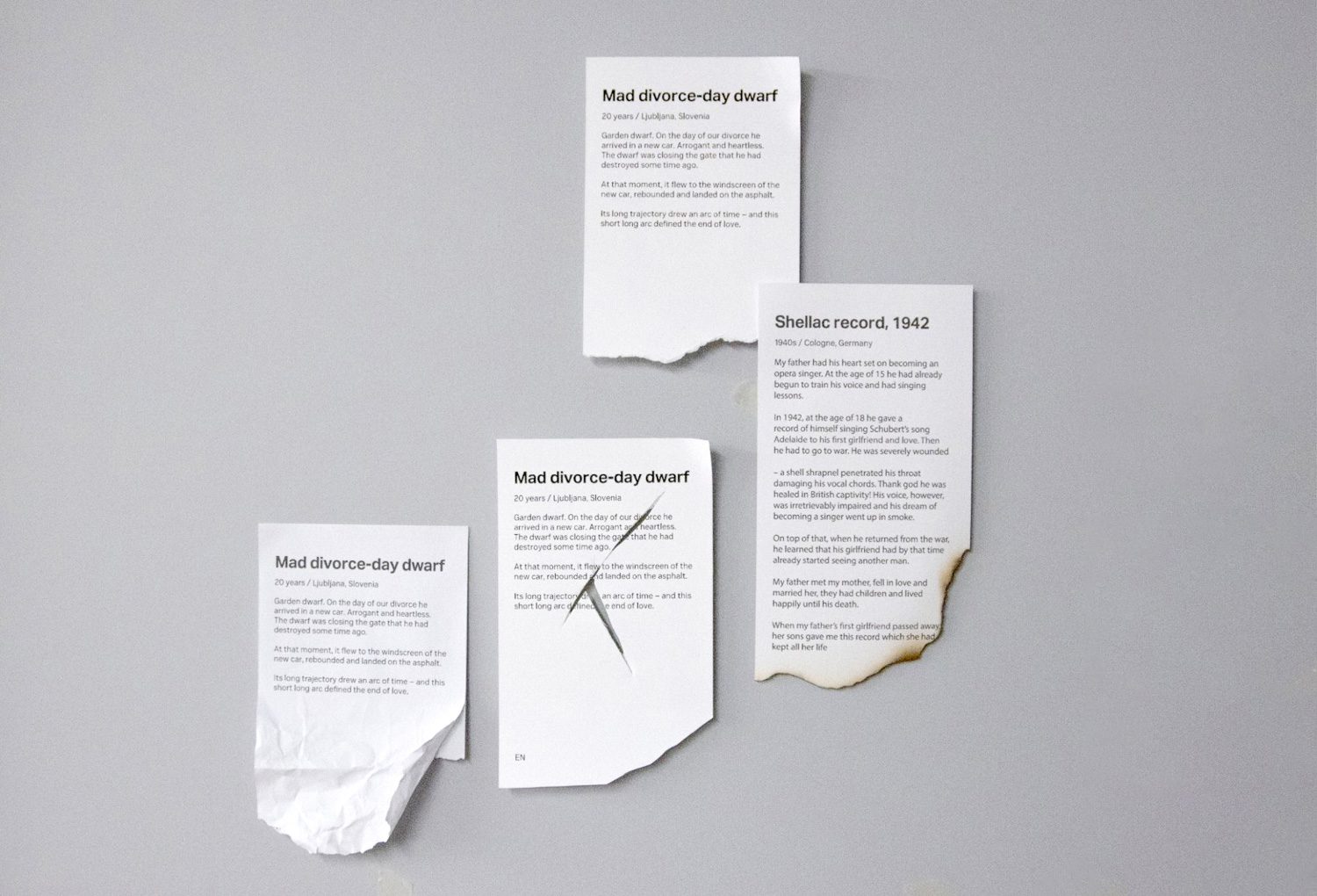
Photo: Nuphap Aunyauphap
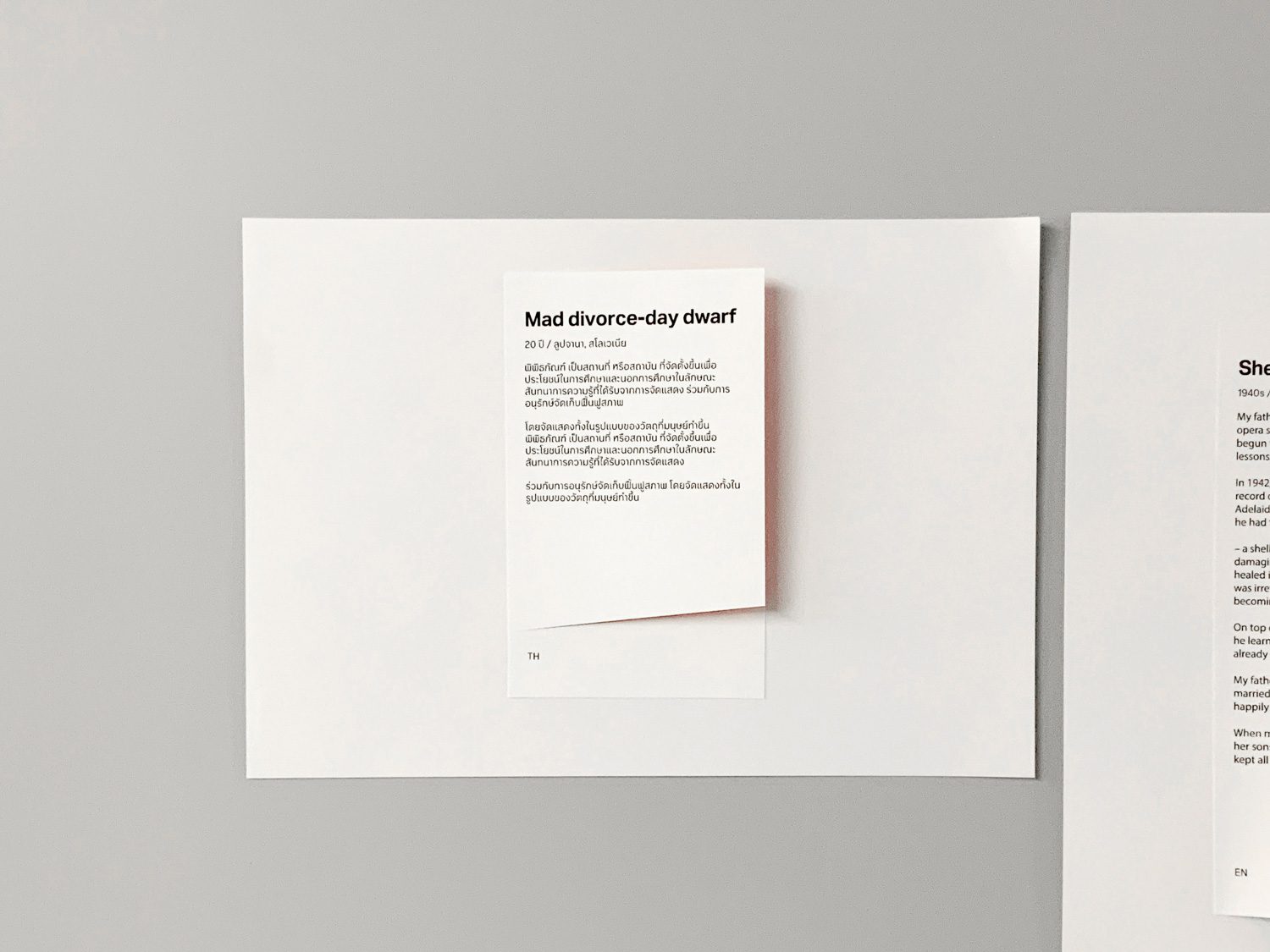
Photo: Nuphap Aunyauphap
In developing the exhibition’s visual language, Nuphap experimented with a range of label designs, some torn, some cut, before arriving at a more subtle solution. “At one point, I noticed the way light and shadow played off the tag on the wall. That led me to the idea of placing reflective paper behind each label, so the colors would bounce onto the white surface behind it,” he said. “It felt like the right balance, because the content of these stories carries such a range of emotions. Some are light and even joyful, others incredibly intense. The shifting hues become a kind of visual emotion—not as literal as a label with torn edges, but still expressive.”
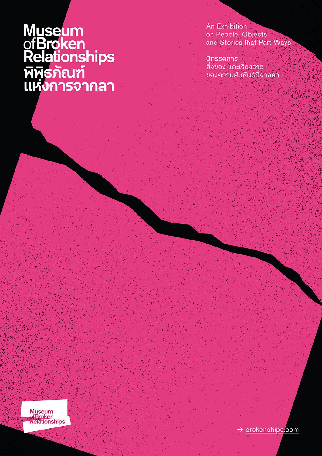
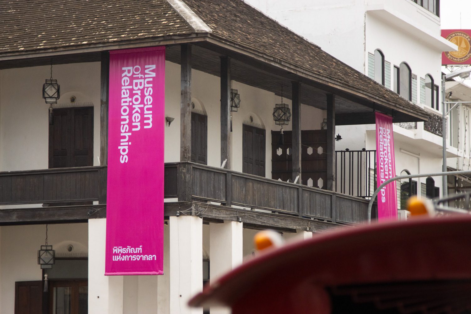
Photo: Nuphap Aunyauphap
As for the logo and the building’s front-facing banner, Nuphap shared, “We tried out several directions, but the original museum in Zagreb already has a strong visual identity. They wanted us to stay within that framework, allowing only slight modifications. Their primary color is purple. Through our research, we found that pink, which is a color often used in Thai pop culture and closely related to purple, resonated well with the local context. It also worked with the visual surroundings of the building, where temple rooftops and neighboring signage are often vivid and eye-catching. We did propose a more minimal, all-white version, but it completely disappeared against the building’s colorful backdrop,” he added. “In the end, using a pink banner made the façade feel more alive.”
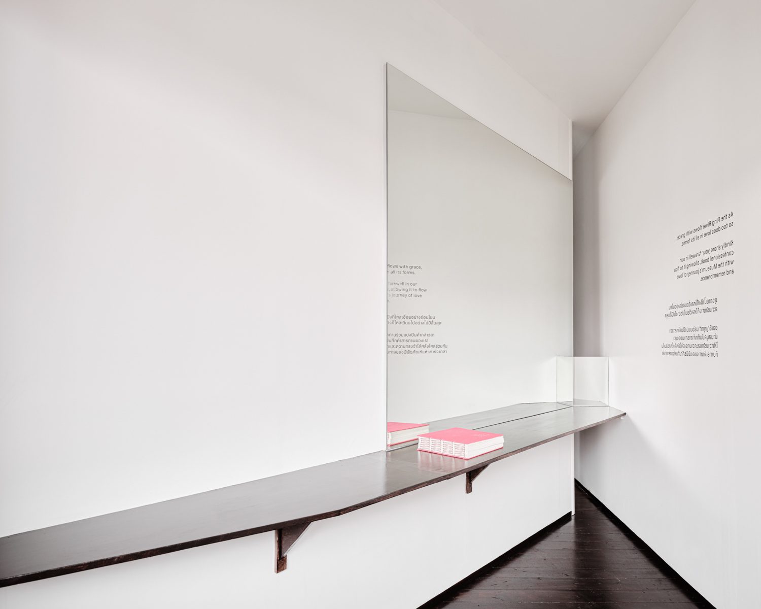
Photo: Napat Pattrayanond
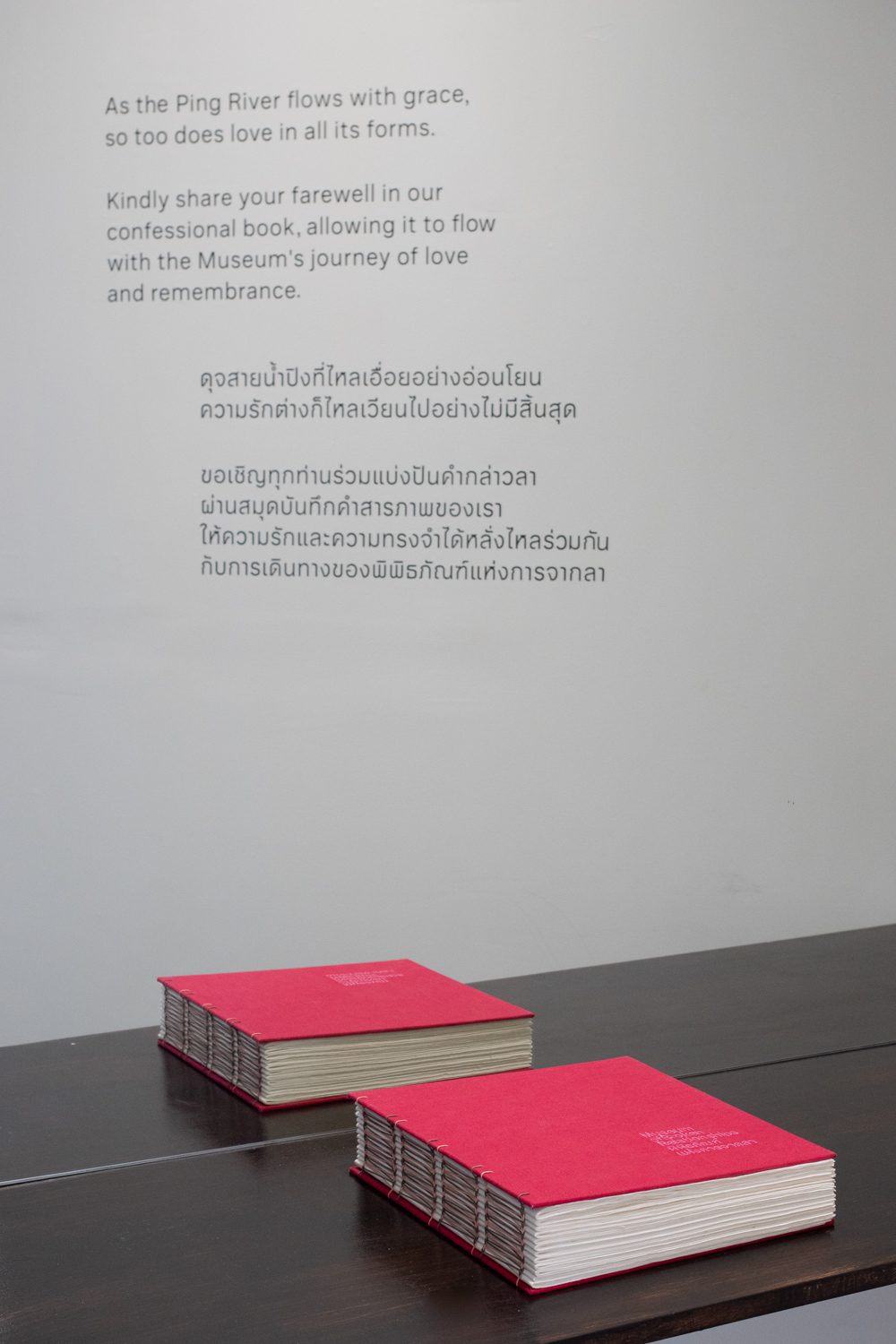
Photo: Nuphap Aunyauphap
Both Nuphap and Asrin noted that in exhibition design, content often comes together at the very last moment, making it difficult to ensure consistent graphic quality. “Fortunately, the founders already had a wealth of content prepared,” said Asrin. “That allowed our architecture and graphic teams to work in parallel from the start. And it paid off. The decision to experiment, and step away from the original Zagreb graphic format, was warmly welcomed. The founders were so pleased that they’ve actually begun incorporating Chiang Mai’s graphic system for use in the Zagreb museum as well.”
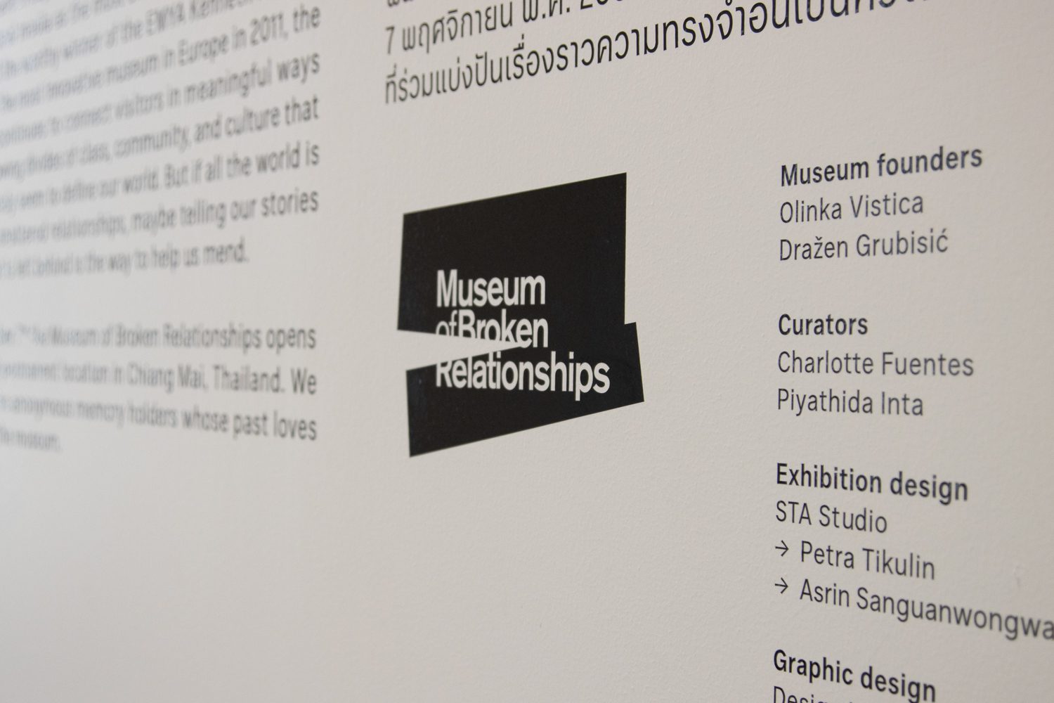
Photo: Nuphap Aunyauphap
As the writer of this piece, I can attest: no photo or article can compare to experiencing the museum in person. We hope this conversation inspires you to visit the Museum of Broken Relationships—to walk slowly, take in the space, and spend time with the stories each object carries. Let them work on you. Let yourself feel something unexpected.