IN 1999, PIRAK ANURAKYAWACHON GUIDED US TO NORMAN FOSTER’S METRO STATION AND SANTIAGO CALATRAVA’S FOOTBRIDGE IN BILBAO, SPAIN
TEXT: PIRAK ANURAKYAWACHON
PHOTO: SKYLINE STUDIO, PIRAK ANURAKYAWACHON
(For Thai, press here)
Besides the Netherlands, I also had the chance of visiting Spain. This time my destination was Bilbao – the city with the biggest museum in the world, which was designed by Frank 0. Gehry. Since art4d already did a special issue on that one (art4d No.49, May 1999) I chose to write about how Sir Norman Foster and Santiago Calatrava’s architectural works have added some other attractive wrinkles to the city’s changing face.
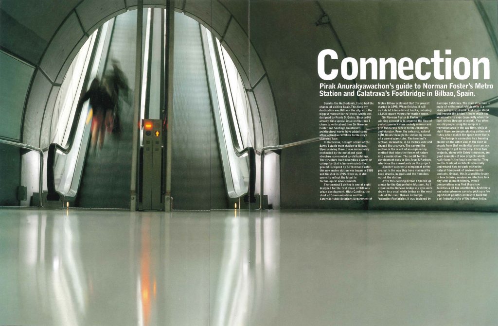
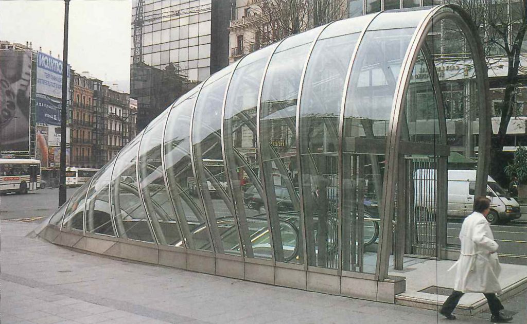
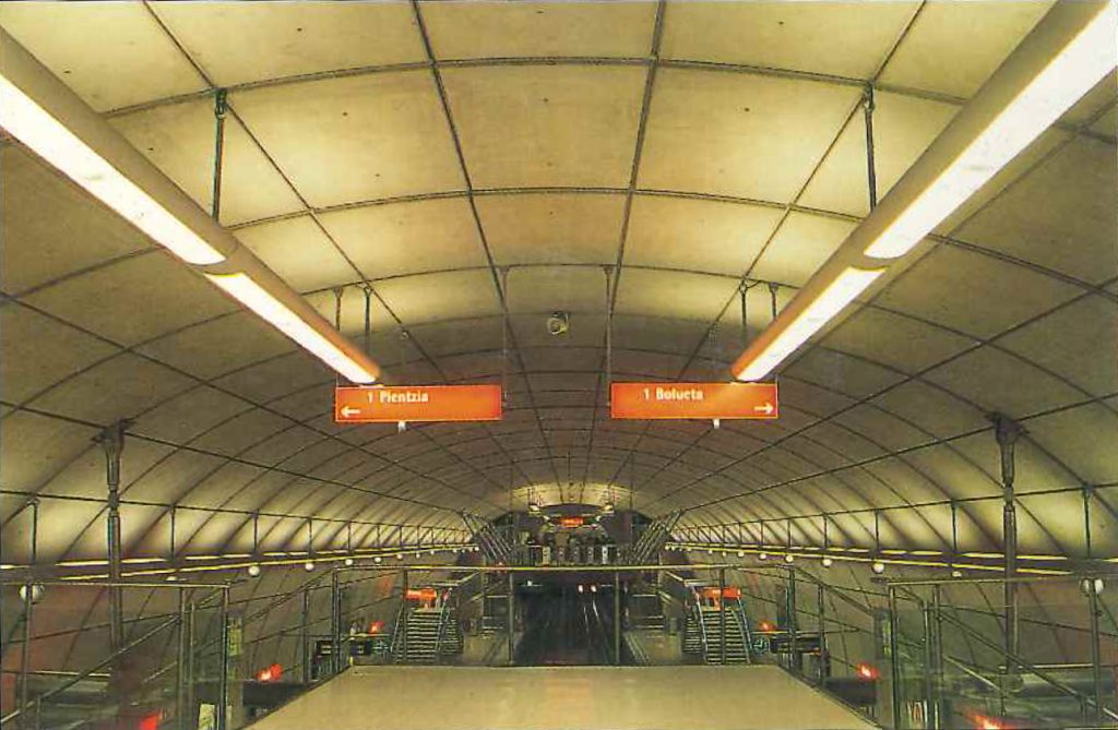
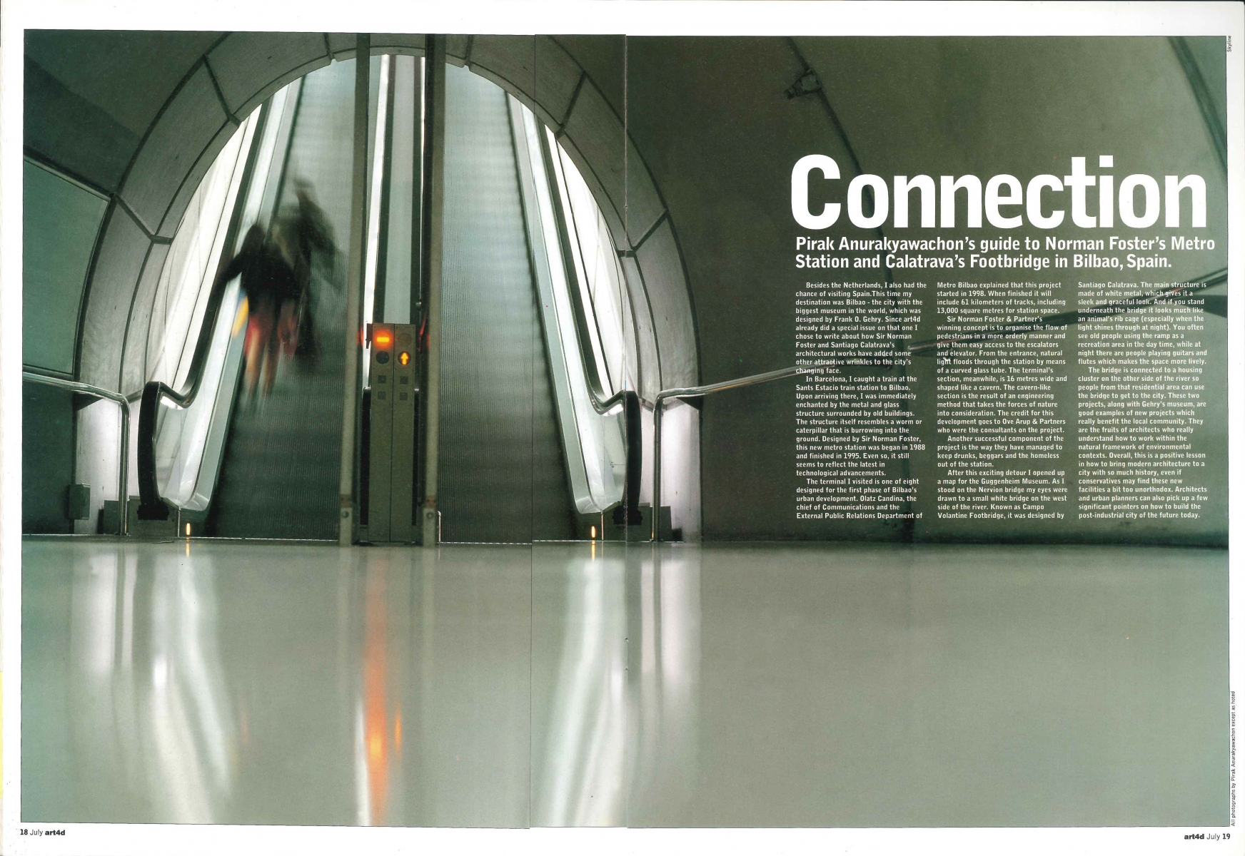
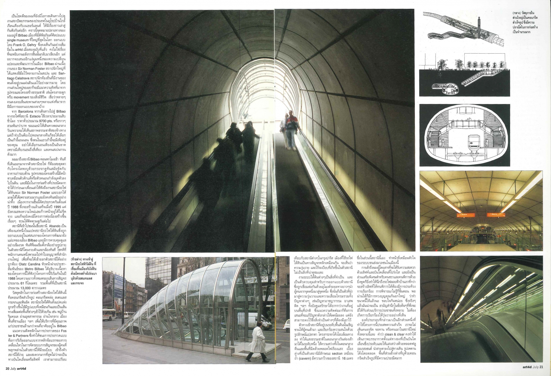
In Barcelona, I caught a train at the Sants Estacio train station to Bilbao. Upon arriving there, I was immediately enchanted by the metal and glass structure surrounded by old buildings. The structure itself resembles a worm or caterpillar that is burrowing into the ground. Designed by Sir Norman Foster, this new metro station was began in 1988 and finished in 1995. Even so, it still seems to reflect the latest in technological advancements.
The terminal I visited is one of eight designed for the first phase of Bilbao’s urban development. Olatz Candina, the chief of Communications and the External Public Relations Department of Metro Bilbao explained that this project started in 1998. When finished it will include 61 kilometers of tracks, including 13,000-square-metre for station space.
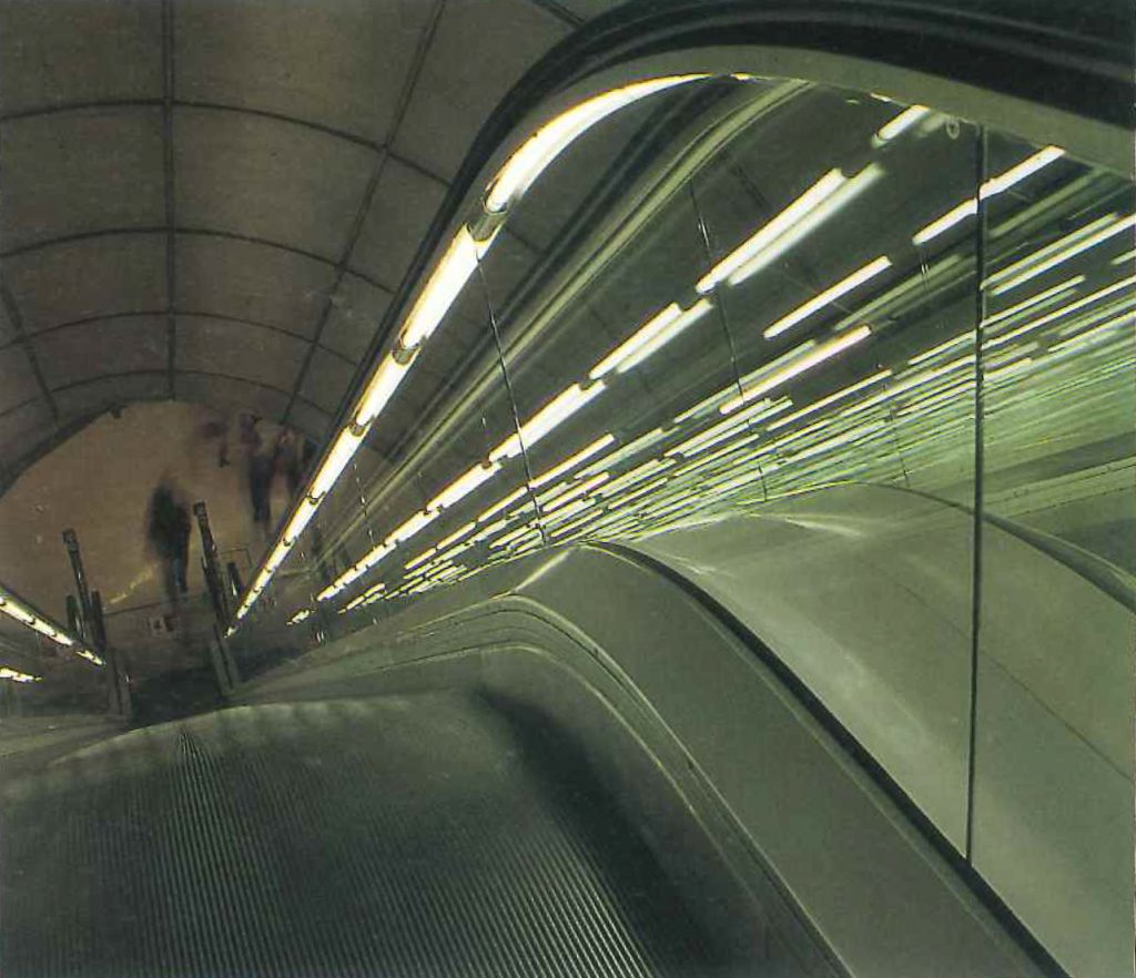
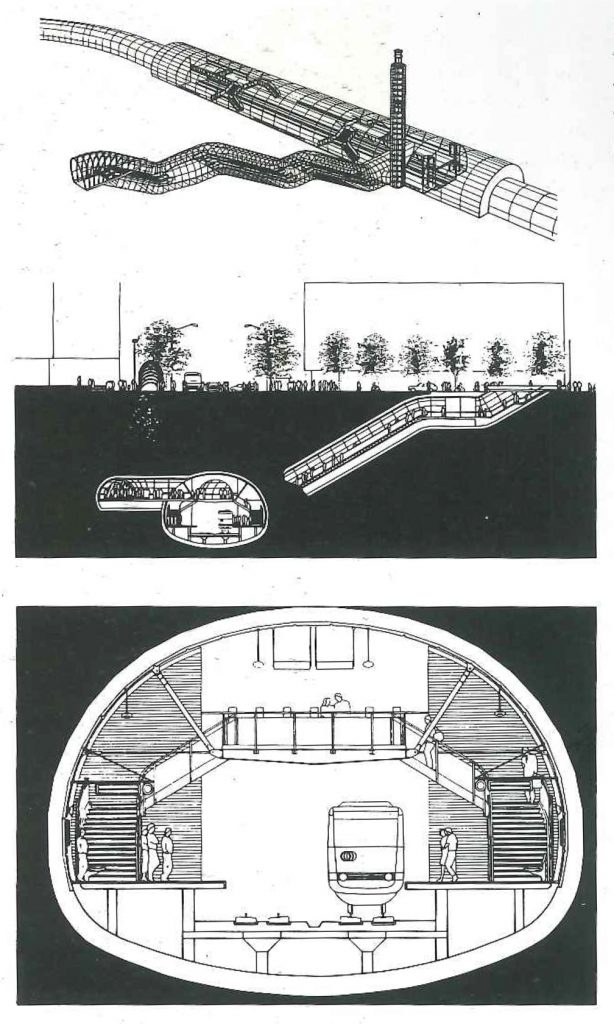
Sir Norman Foster & Partner’s winning concept is to organise the flow of pedestrians in a more orderly manner and give them easy access to the escalators and elevator. From the entrance, natural light floods through the station by means of a curved glass tube. The terminal’s section, meanwhile, is 16 metres wide and shaped like a cavern. The cavern-like section is the result of an engineering method that takes the forces of nature into consideration. The credit for this development goes to Ove Arup & Partners who were the consultants on the project.
Another successful component of the project is the way they have managed to keep drunks, beggars and the homeless out of the station.
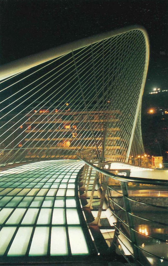
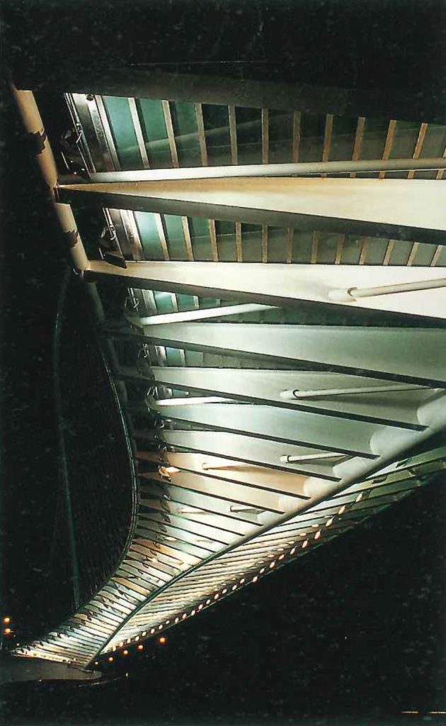
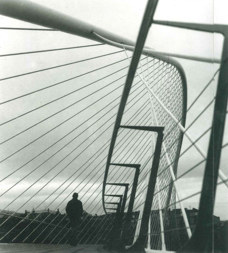
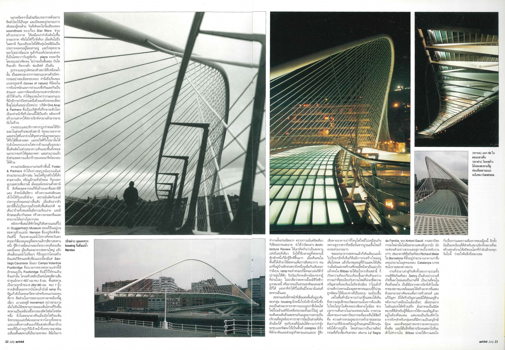
After this exciting detour, I opened up a map for the Guggenheim Museum. As I stood on the Nervion bridge my eyes were drawn to a small white bridge on the west side of the river. Known as Campo Volantine Footbridge, it was designed by Santiago Calatrava. The main structure is made of white metal, which gives it a sleek and graceful look. And if you stand underneath the bridge it looks much like an animal’s rib cage (especially when the light shines through at night). You often see old people using the ramp as a recreation area in the day time, while at night there are people playing guitars and flutes which makes the space more lively.
The bridge is connected to a housing cluster on the other side of the river so people from that residential area can use the bridge to get to the city. These two projects, along with Gehry’s museum, are good examples of new projects which really benefit the local community. They are the fruits of architects who really understand how to work within the natural framework of environmental contexts. Overall, this is a positive lesson in how to bring modern architecture to a city with so much history, even if conservatives may find these new facilities a bit too unorthodox. Architects and urban planners can also pick up a few significant pointers on how to build the post-industrial city of the future today.
Originally published in art4d No.51 (July, 1999)


