IN THE MIDDLE OF OCTOBER OF 2019, SANOOK.COM, ONE OF THE EARLIEST PORTAL AND NEWS WEBSITES THAT HAS BEEN WITH THAILAND SINCE THE DAWN OF THE COUNTRY’S INTERNET ERA, CELEBRATES ITS 21ST BIRTHDAY WITH ANOTHER MAJOR BRAND REVAMP
TEXT: WEE VIRAPORN
PHOTO COURTESY OF SANOOK
(For Thai, press here)
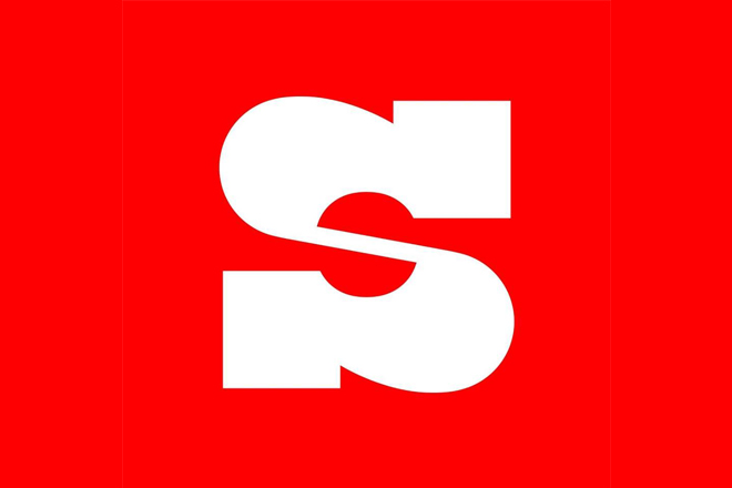
In the middle of October of 2019, sanook.com, one of the earliest portal and news websites that has been with Thailand since the dawn of the country’s Internet era, celebrates its 21st birthday with another major brand revamp. Sanook changes its signature ‘S’ logo with an exclamation mark on a red background into a white S on a square backdrop alongside the announcement of its objective to bring its users more socially responsible content.
In the last couple of years, we have witnessed a tendency in corporate rebranding where logos and corporate identities are simplified to have physical characteristics that are somewhat stylistically minimal. So far, we have seen the use of Sans Serif fonts by several fashion brands, resulting in logos with stable and solid lines and forms. Following are criticisms over such a trend that ends up causing the brands to lose their identities with the designs that are somewhat too neutralized. The Internet and technology-related organizations born in the relatively close time period have also seen some interesting evolutions in their corporate identities. From Google, eBay to Yahoo, we’ve seen initial use of fun, playful, bold and colorful designs that seem to reflect the spirit of the nerdy kids who had founded their companies two decades ago, change into something that is more refined, organized, and geometrically proportional. Even pioneering tech brands such as Microsoft and Apple (whose designs have always been minimal) are adjusting towards the same direction, which is perfectly understandable considering the fact that none of these tech nerds would have imagined their experimental garage- startups would evolve into institutions of such great cultural and financial significance they hold today.


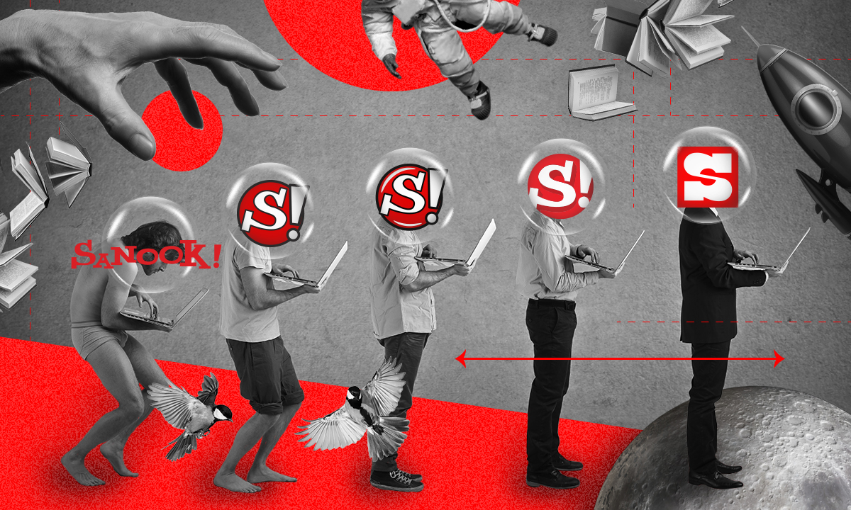
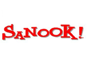
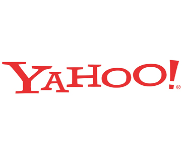
We cannot help but compare Sanook’s new logo designed by Slowmotion to that of Yahoo, which was recently rebranded by Pentagram and launched about one month prior, since both logos did share a great deal of similarities through each of their own evolutions. The resemblance between the Sanook! logo in its early years (1998-2002) and the red YAHOO! (1996) logo is more interestingly discernible. Sanook simplified the design down to the white S! in the red circle, and used it between 2002 to 2007. In 1997, Yahoo shortened their logo to the white Y letter inside the purple circle, moving the exclamation mark outside of the colored backdrop.
In 2009, Yahoo returned to its original 1996 design with YAHOO! but changing the color from red to purple. Using a sans serif font with rather slender line and striking visuals was first used in 2013 before the current design where the logo embraces a geometric form with a solid line along with only the exclamation mark in italic form is introduced. Sanook! has seen a more consistent transition, from the shiny effect on the red circle with the white negative space (2007-2017) to the design where the black outline was eliminated with the red of S! intensified into a darker shade (2017-2019). With its latest rebrand, the ‘!’ is now gone, leaving only the letter S that uses a different font on a square background instead of a circle.
From the animation video Sanook released as an introduction for its new logo, we see the brand’s interesting attempt to connect the missing ‘!’ to the new S. The vertical line and the circular shape of the exclamation mark are merged into the new S, creating a design that still possesses the original fundamental elements but with greater symmetrical characteristics, which enable 180-degree rotation. The logo is distinctive in character with the physical elements of the varying intensities of boldness used for the line. The brand explains that the new ‘S’ and the typeface used with the design of the ‘Sanook’ logo are hoping to convey its steadfastness and credibility of the country’s number one news and portal website.
Despite the new personality it embodies, functionality wise, the redesigned logo works well on all the operating platforms, whether it’s the website, the application and on other social media channels. The new ‘S’ logo does its job in representing the Sanook brand, used side by side with the news categories and sources (images and clips), and the bold ‘Sanook’ font without being too forceful. While the new logo shouldn’t have any problem earning users’ recognition, it still remains to be seen whether the steadfastness and credibility the brand hopes to convey will be successfully delivered. The truth of the matter is that these two qualities aren’t exactly coinciding with the nature of the content Sanook features and is known for, and it is probably not something that the new generation users, which is the group of users the brand targets at, are expecting to see from a website of such nature anyway.