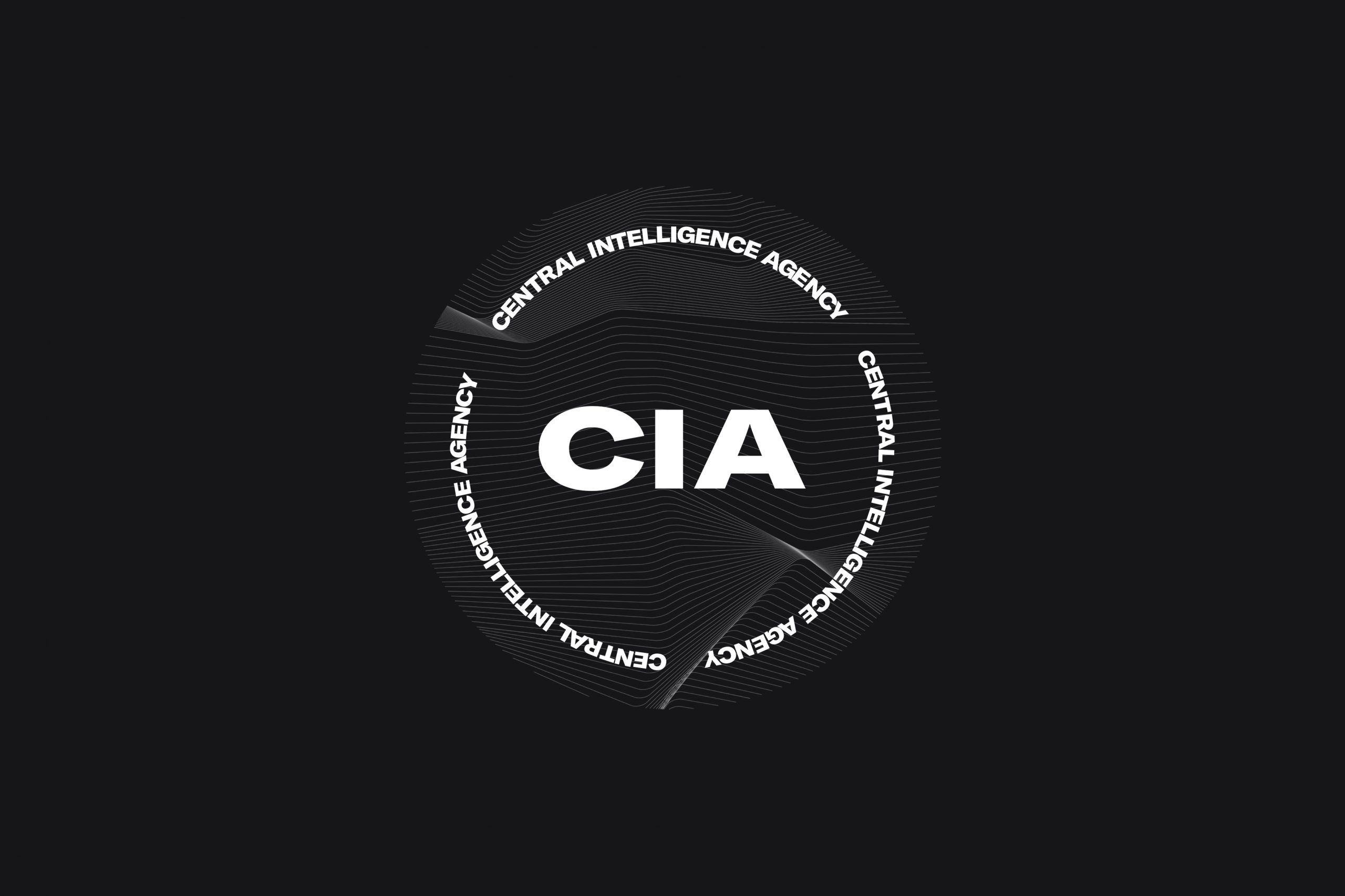
CIA REVEALS ITS NEW IDENTITY WHICH INTERNET SAY THAT IT LOOKS LIKE SOME EDM FESTIVAL LOGO
TEXT: WEE VIRAPORN
IMAGE COURTESY OF CENTRAL INTELLIGENCE AGENCY
(For Thai, press here)
A majority of the world’s population probably knows and has heard of the acronym CIA, including the meaning and organization for which it stands. Whether people realize it or not that the moniker are the initials for ‘Central Intelligence Agency’ of the United States of America, they must have heard about or seen it in Pop Culture’s depictions of the CIA activities and personnel, from exhilarating espionage, to thrilling secret missions to save the world (with the US always being the good guy). Meanwhile, Thai people who have recently been delving into the non-mainstream history are starting to apprehend the CIA’s roles and influences on the country’s politics and economy since the beginning of the Cold War.

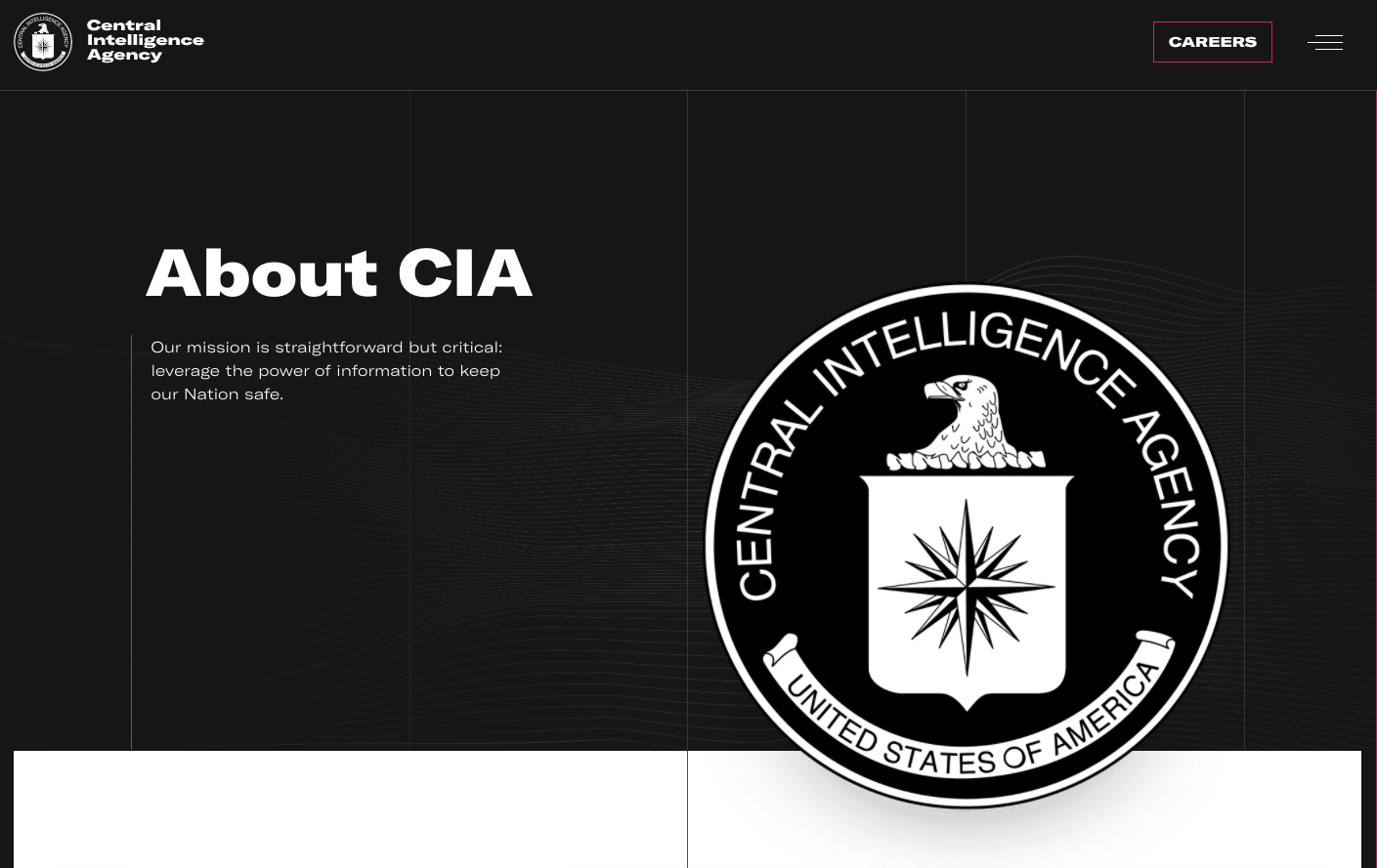
But regardless of the image the CIA holds through Pop Culture, its corporate identity on the CIA’s official website was nothing but conservative. The patriotic elements on the CIA seal come in the form of the American eagle in front of radiating spokes of the compass rose, symbolizing the convergence of intelligence data from all areas of the world and the agency’s duty to collect, analyze intelligence to further national security and preempt threats.

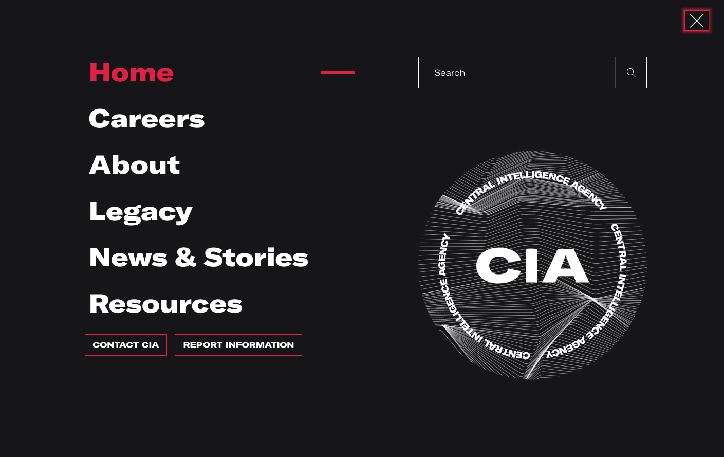
At the beginning of 2021, the CIA revealed its rebranded identity, intending to bring a more contemporary image to the agency. The cia.gov website has changed its colors to a monochromic tone, using primarily black and white colors highlighted with red. A clean, sans-serif typeface and bold headlines keep the overall style resolute but not too serious. What’s particularly interesting is the new logo where the CIA letters appear in front of the background of fractal lines framed with the words ‘Central Intelligence Agency’. The Internet went all out to mock the new design, saying that it looks like some EDM festival logo or a millennial pop-up shop’s logo.

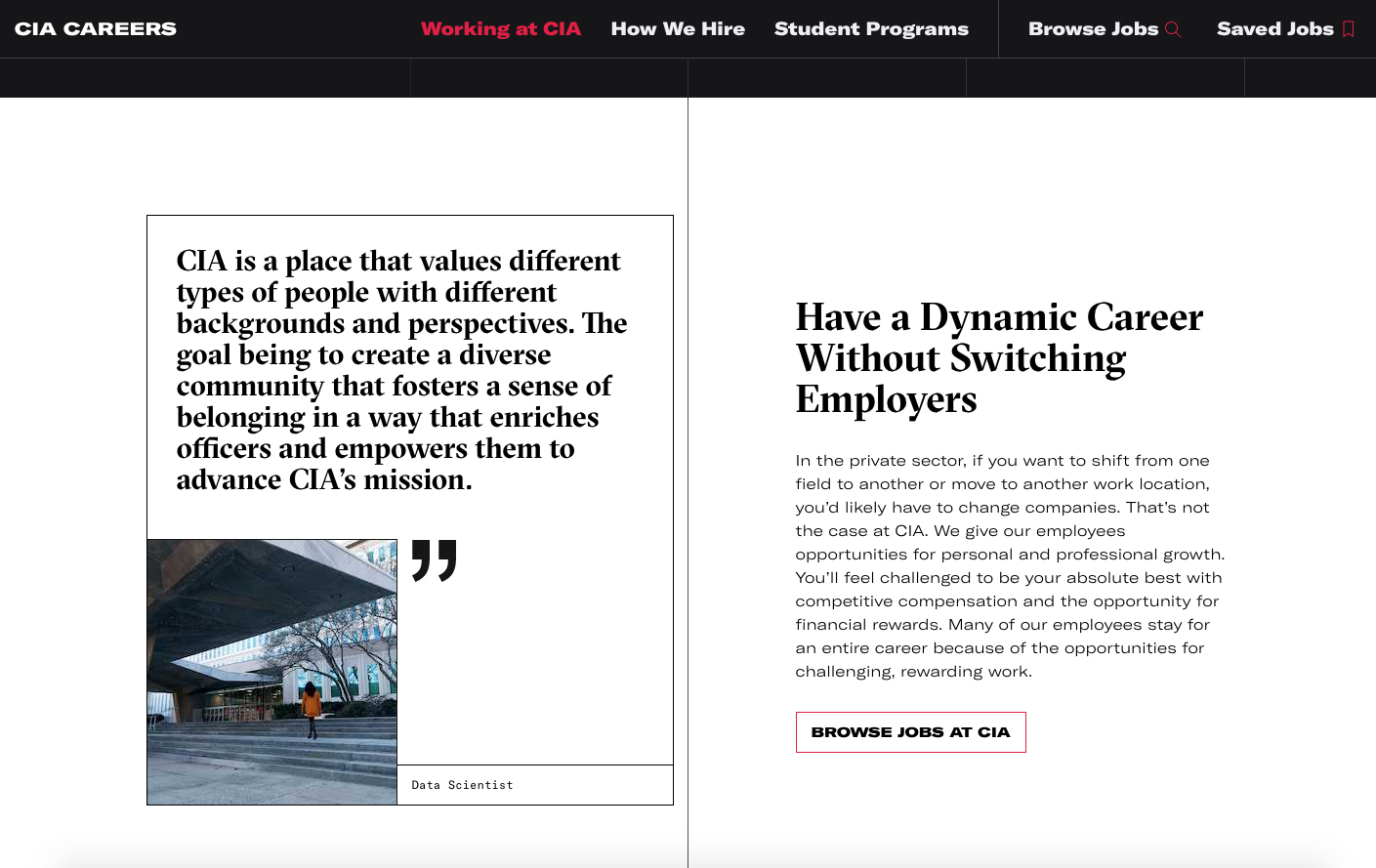
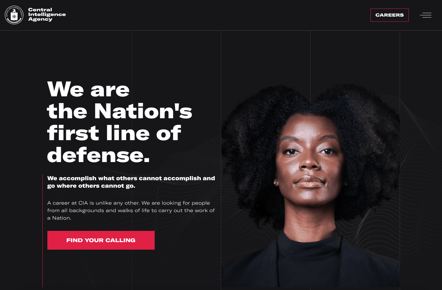
We believe that the new change introduces a new tone of American patriotism that is more in line with the global citizens’ new values. It also signifies the agency’s attempt to attract the younger generation to join the CIA with the new website’s particular emphasis on the ‘CAREERS’ section. Not only that, the images used on this specific part of the web’s content are those of young people from diverse nationalities, accompanied by short quotes about challenging responsibilities, collaborative efforts, the significance of different positions, and career advancements that the organization can offer.

Before having seen the rebranding, I used to hear one of my friends who works as a US government officer jokingly say, “The real CIA agents are not as cool as you see in Hollywood movies. The ones I came across were stout middle-aged men, wearing glasses and who were working in front of a computer.” Perhaps that’s the reality that the CIA is trying to change.

