MEET THE 10 NEW COLORS FROM TOA COLOR DECODING TRENDS 2021 WHICH ARE INSPIRED BY THE IN-SIGHT OF 10 THAI LEADING ARCHITECTURAL FIRMS
TEXT: NAPAT CHARITBUTRA
PHOTO COURTESY OF TOA PAINT
(For Thai, press here)
All designers know that the approaching New Year marks the time of Pantone’s color of the year announcement. The media would report about it and we find ourselves anticipating Pantone’s annual revelation. But what about Thailand’s design industry? What are our colors of the year? This vital question is both the key and the beginning of the TOA COLOR DECODING TRENDS 2021, the project where Thailand’s innovative paint brand works together with the country’s prominent and up-and-coming architects and designers.
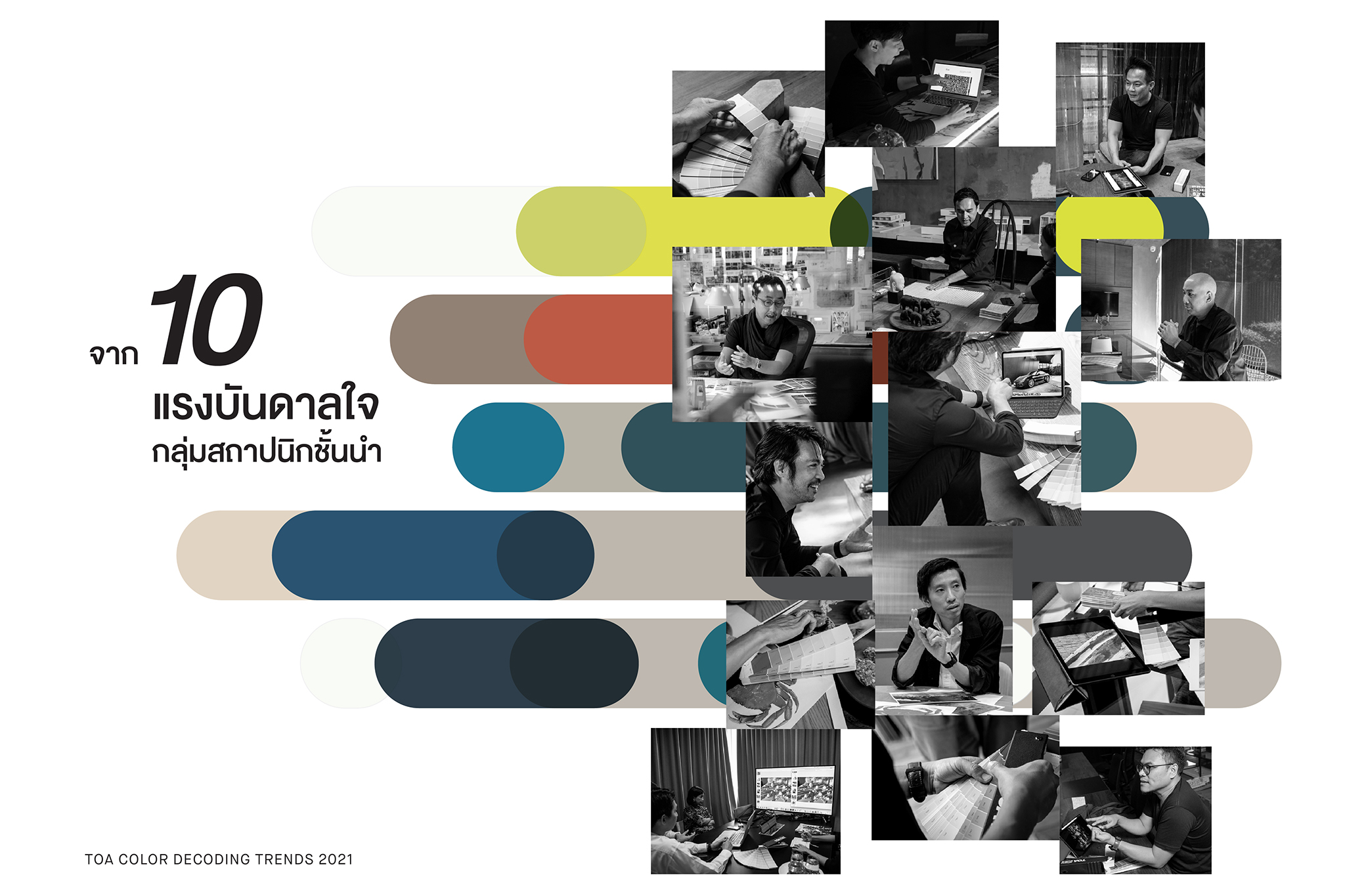
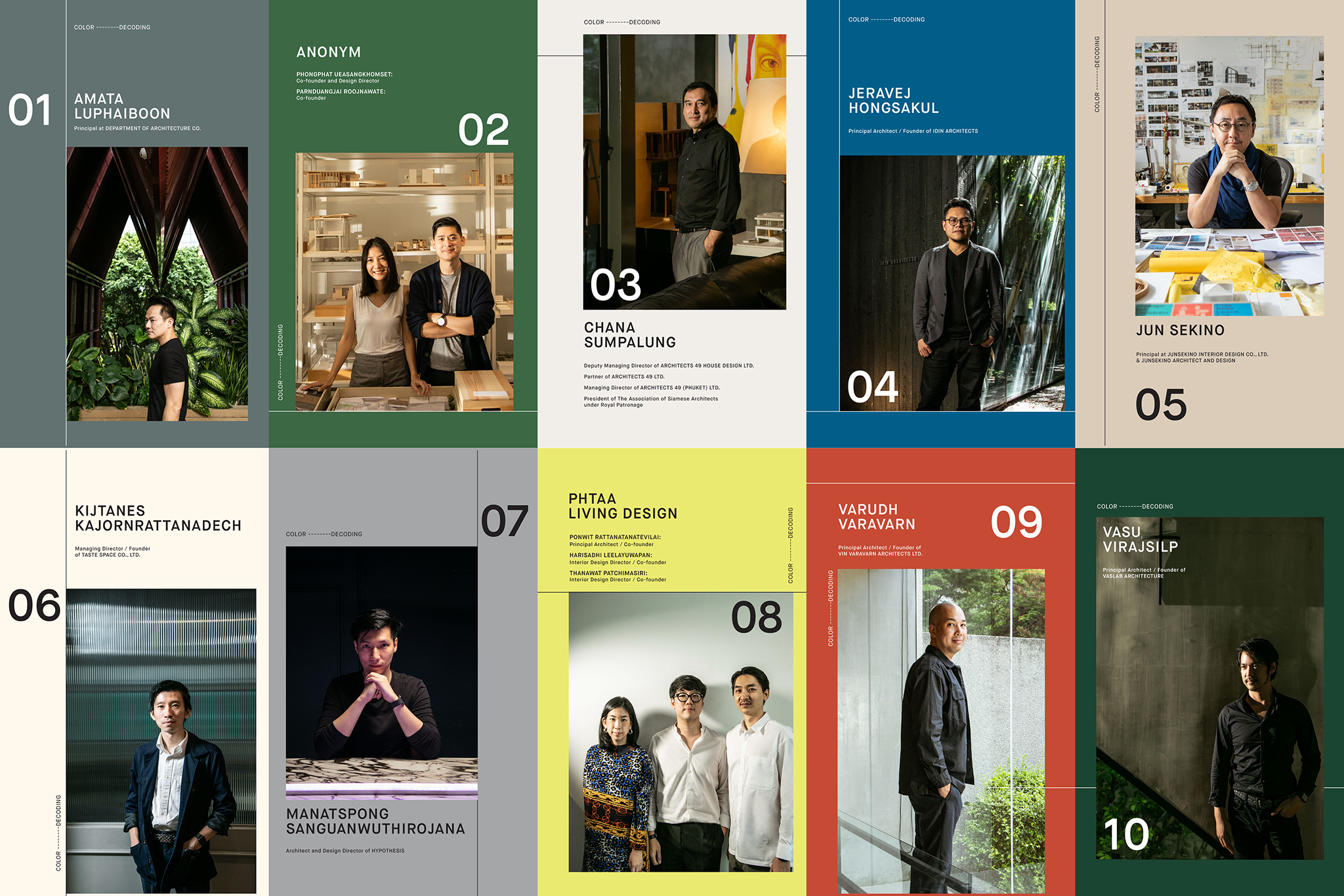
Amata Luphaiboon (Department of ARCHITECTURE Co.), Phongphat Ueasangkhomset and Parnduangjai Roojnawate (ANONYM), Chana Sumpalung (A49), Jeravej Hongsakul (IDIN Architects), Jun Sekino (Junsekino Architect and Design), Kijtanes Kajornrattanadech (Tastespace. co), Manatspong Sanguanwuthirojana (Hypothesis), Ponwit Ratanatanatevilai, Harisadhi Leelayuwapan, Thanawat Patchimasiri (PHTAA LIVING DESIGN), Varudh Varavarn (VIN VARAVARN ARCHITECTS LTD.) and Vasu Virajsilp (VaSLab Architecture) are the 10 studios invited to collaborate with TOA to find Thailand’s 2021 Color Trends. The list is impressive for two main reasons. Firstly, the 10 studios possess unique design identities for their specific use of colors in their architecture and design. The next reason is the diversity of their projects. By bringing together these 10 Studios, we see an incredibly diverse range of architects and designers whose works and expertise encompass practically all types of projects, from small (but highly detailed) residential and restaurant design to retail spaces and public buildings such as a libraries, shopping malls, learning centers all the way to a large national convention center.
The project’s ‘comprehensiveness’ made possible by the creative contributions from this talented group of architects and designers has eventually given birth to TOA’s 2021 color trends. But before we get into the ten new shades, the impressive process from which the project is made is also worth the mention.
To attain an exciting series of colors, the project’s development was undertaken, not through a simple question of ‘what are your favorite colors?” but by giving each studio the task of creating their own mood boards. Such openness allowed us to see the inspirations behind each studio’s use of colors, including the color schemes that define their design accents.
Amata Luphaiboon’s mood board is made up of scenes from his favorite movies. “Sometimes inspiration for my architecture comes from things that aren’t relevant to Architecture,” he mentioned in the catalog. Representing Tastespace Co., Kijtanes’ mood board comprised of various food ingredients, reflecting the studio’s expertise in restaurant design. The new generation studio, PHTAA Living Design, included 18 different images, possibly due to the studio’s three partners, which turned the mood board into their pool of personal interests. For those who are interested, can download the catalog here.
Flipping through the mood boards created by the 10 architecture studios, we saw certain common elements in their ideas, from the connection between materials and colors, the varying effects on material surfaces at different times of day, the emotions that arises from one’s interactions with colors and textures, and the connection between each architect’s personal interests and their design. One of the interesting sections of the catalog is the interview section with the architects of the 10 studios (this publication is basically a magazine at the point), particularly the session between TOA and Chana Sumpalung, ASA’s president and one of the executives of A49. Chana’s view on Bangkok’s changing colors during the Tom Yum Goong crisis (1997) when architects heavily used grey/ black for building exterior, creating as a result, the urban landscape that starkly contrasts Bangkok’s bright blue sky. “I guess there are many possible reasons behind the changing color code, and grey is one of the most popular colors buildings nowadays because it blends well with the surrounding environment while offering a fashionable appearance. We can see grey being used with many condominium buildings in Bangkok.”

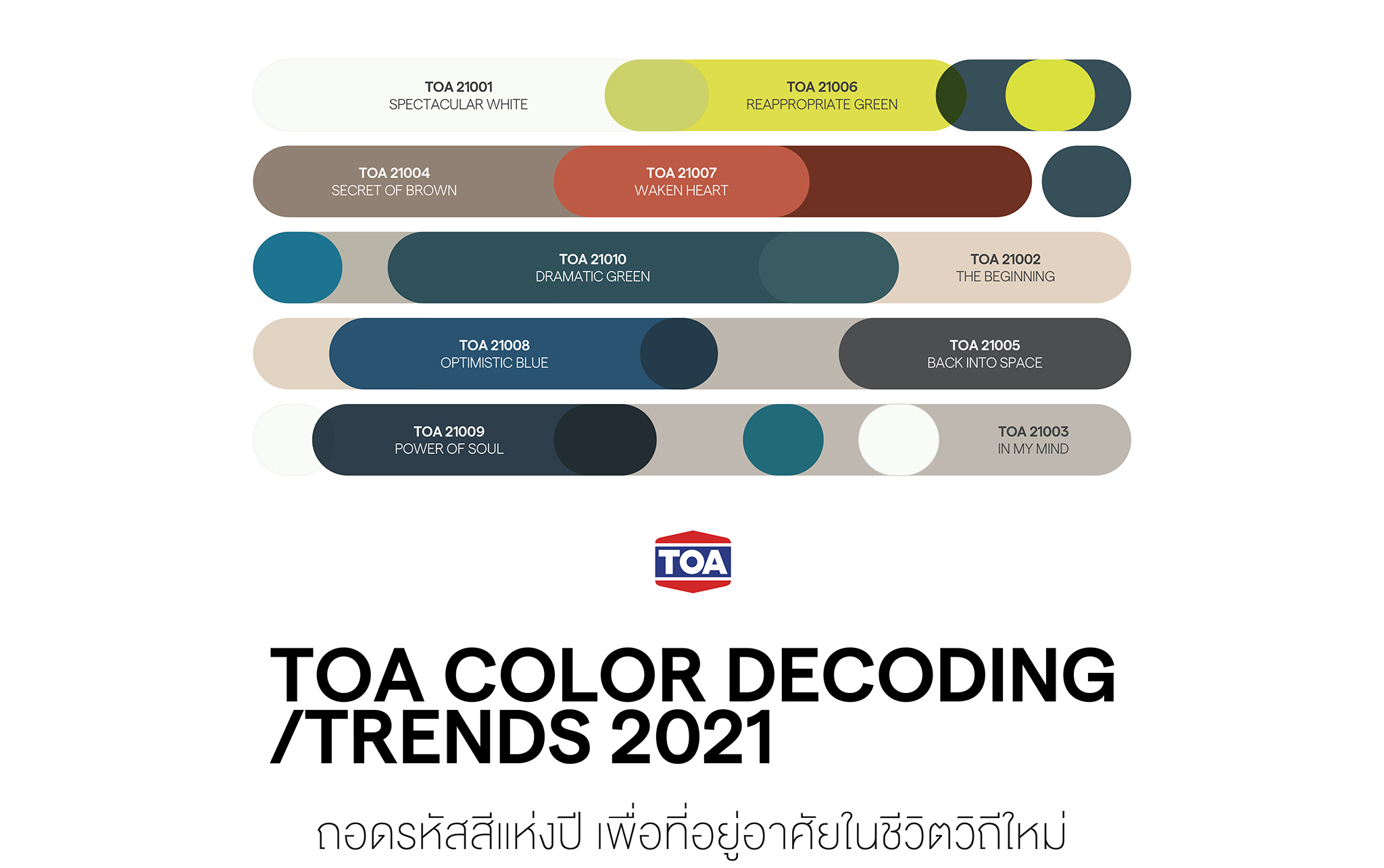
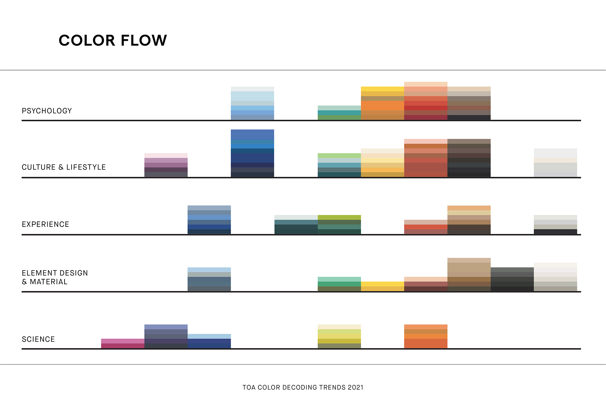
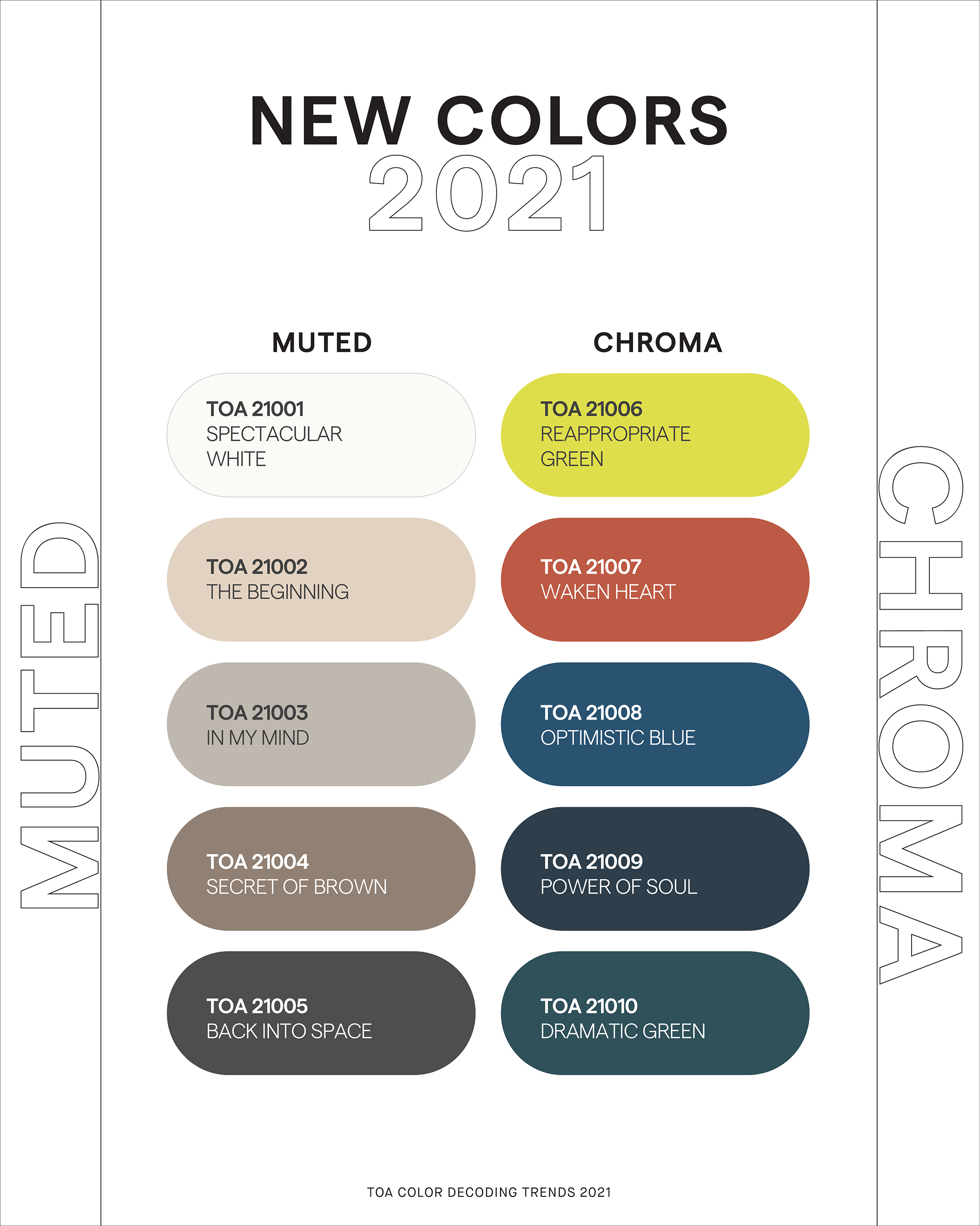
Hundreds of shades from the mood boards are the key ingredients of the 10 new colors of the 2021 living space. Experts from TOA decode the colors and categorize them into the color flows that show the color trends related to the attitudes, tastes and contexts of 2021’s living space. The five trend scopes range from ‘Psychology,’ representing the impacts of colors on human emotions, ‘Culture & Lifestyle,’ the art-inspired trend scope, ‘Experience,’ the color trend that takes inspiration from travel experiences. ‘Element Design’ derives from natural and synthetic materials, while ‘Science’ refers to new colors created from scientific experiments.
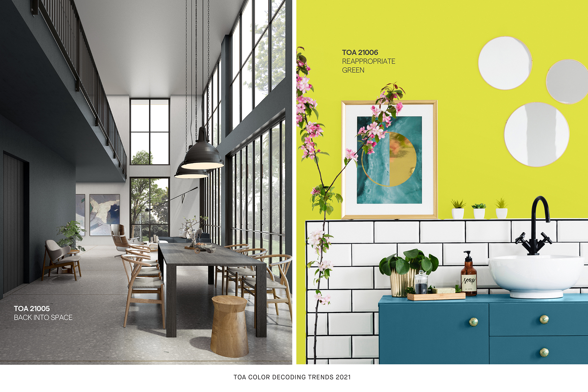
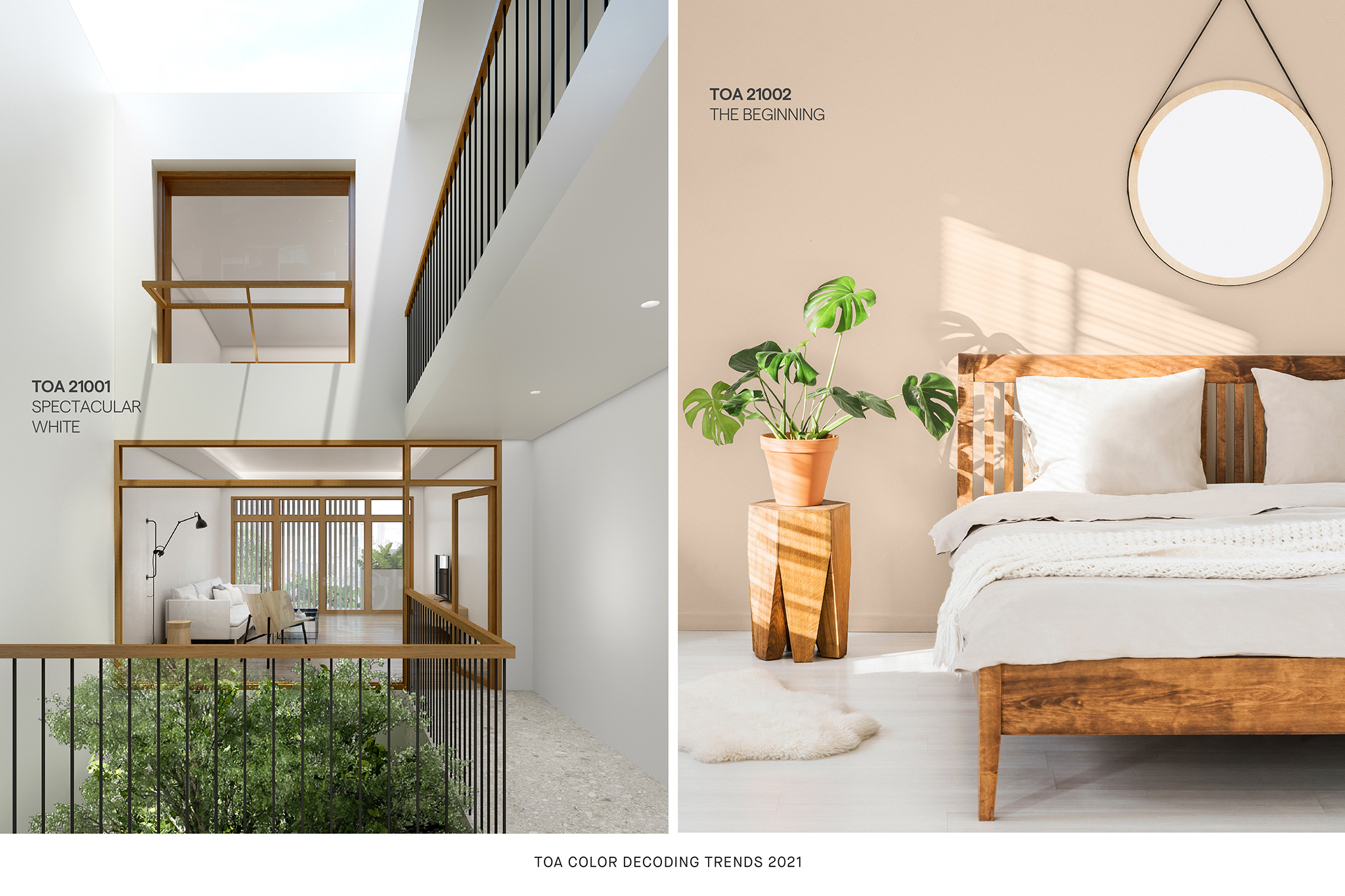
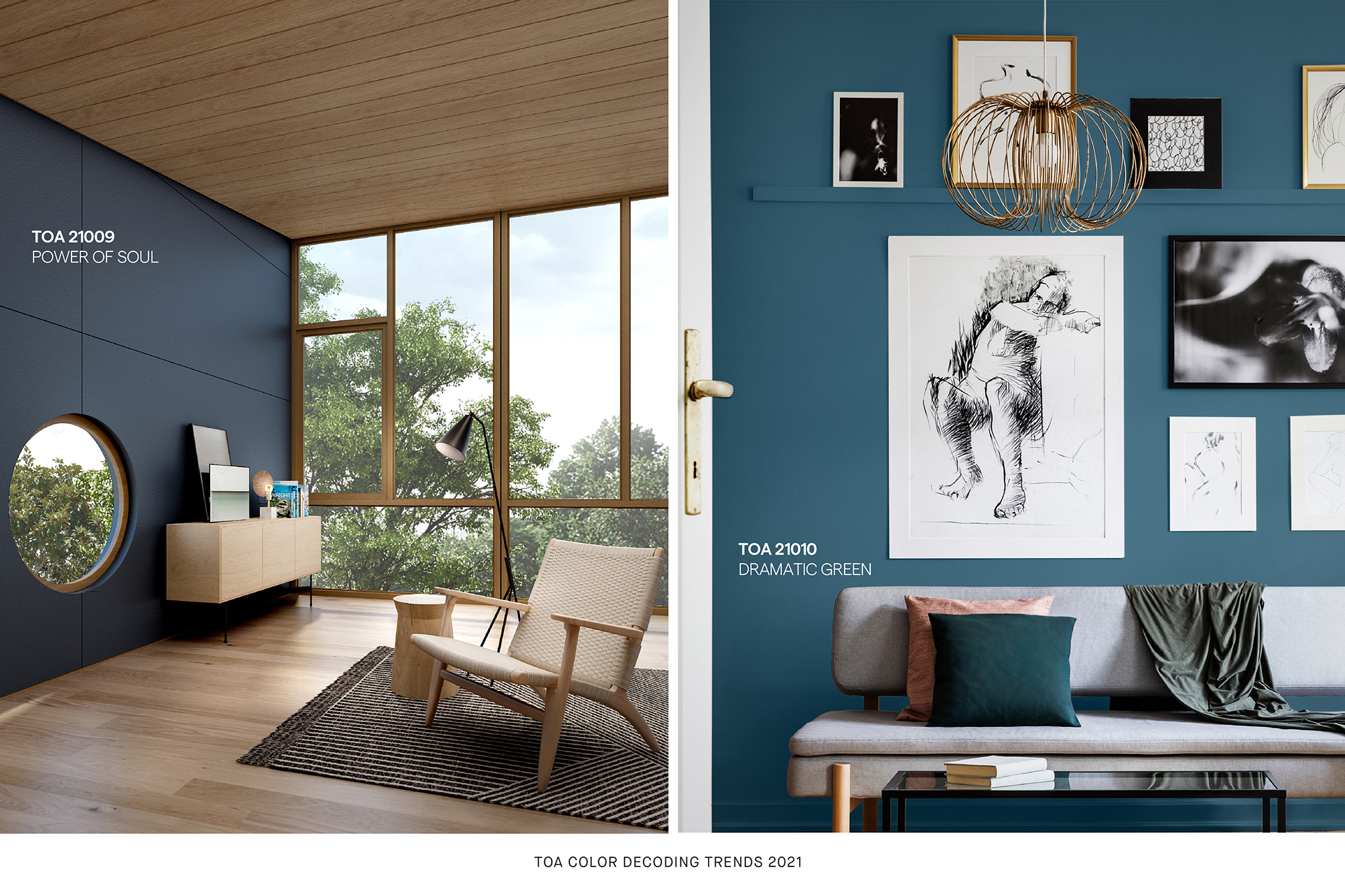
The process that searches for the 2021 color trends results in two color palettes, MUTED and CHROMA. While entirely rendering different feelings, MUTED consists of simple colors that are fundamental to design and can be mixed with other colors to create a calm and tranquil mood. Some of the colors in the MUTED palette are TOA 21001 Spectacular White with the white that serves as a large canvas for all shades of colors, generating the painted surface that changes through time and varying light temperatures, whereas TOA 21002, The Beginning, offers the cream tone that makes the morning light warmer and more appealing. TOA 21005 Back Into Space’s dark tone comes with a low reflective rate, bringing the peaceful stillness to space as well as keeping one’s focus on the task at hand.
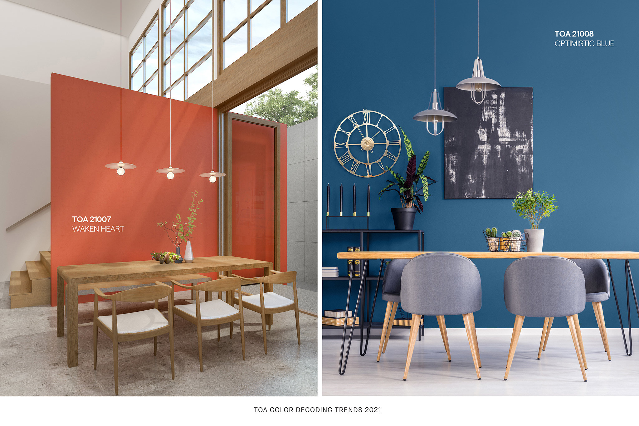
CHROMA proposes the opposite effects with colorful, lively shades. The TOA team told art4d how the trend is partially inspired by humans’ longing for the outside world. What’s particularly noteworthy about CHROMA is that they are COVID-19-inspired shades resulting from months of being under lockdown. The blue of TOA 21008 Optimistic Blue, TOA 21009 Power of Soul and TOA 21010 Dramatic Green are derived from the colors of nature, forest and skies and can be found in many of the mood boards. The orange tone of TOA 21007 Waken Heart reminds us of the sunset sky, implying the architects’ desires to be out and embraced by nature when working on their mood boards.
There are many other colors that we have not mentioned in this article. In the year 2021, when COVID-19 still hasn’t parted its way, we believe that the ten new color shades from TOA COLOR DECODING TRENDS 2021 will be a fresh alternative for our living space during this bizarre point in time when people are being forced to stay at home. Reading about these backstories, we can better appreciate the colors included in the color trends, simultaneously making color pairings more fun than ever.