PEZO VON ELLRICHSHAUSEN EXPERIMENTS WITH SPATIAL AMBIGUITY, HUMAN PERCEPTION, AND THE JUXTAPOSITION OF LONG-LASTING BUILDINGS WITH EVER-CHANGING LANDSCAPES IN THIS LATEST PROJECT
TEXT: BHUMIBHAT PROMBOOT
PHOTO: RORY GARDINER
(For Thai, press here)
The Pezo von Ellrichshausen art, design, and architecture studio was founded in 2002 in Concepción, a city in southern Chile. Under the direction of its founders, Mauricio Pezo and Sofia von Ellrichshausen, the studio’s portfolio encompasses a wide range of architectural and artistic projects, with the curation of the Chilean Pavilion at the 2008 Venice Biennale among their illustrious accomplishments. Their artistic output evolves in tandem with their architectural endeavors. Oftentimes, their works contain solid, balanced geometrical forms as an elemental component, varying in configurations and orientations that are contextually shaped by the conditions and limitations of each site. From conceptual drawings and sketches to artistic installations, their design is centered on experimental processes, creating works that straddle the line between architecture and sculpture.
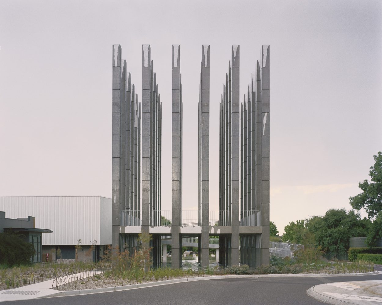
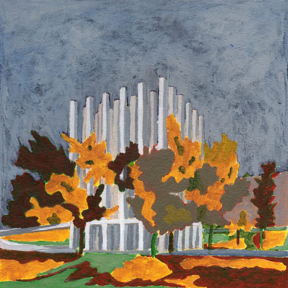
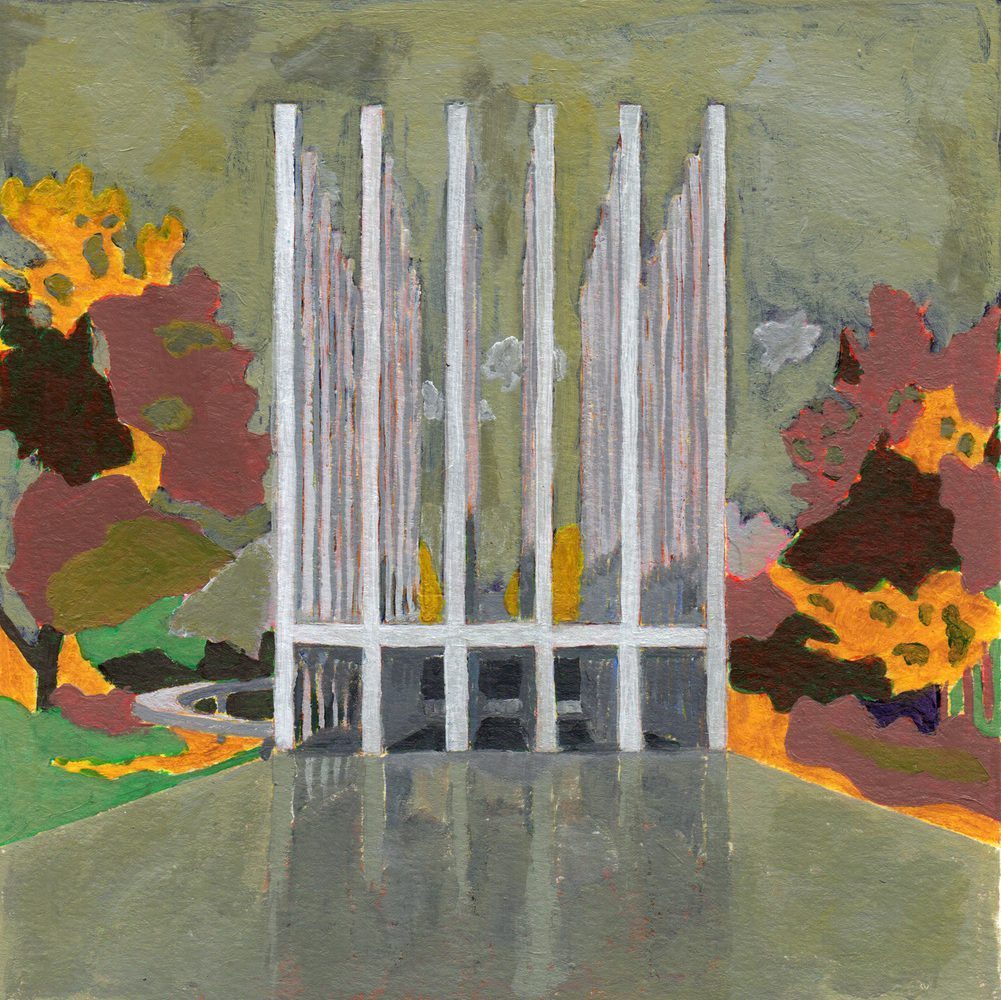
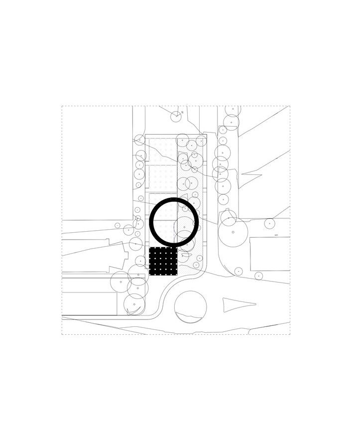
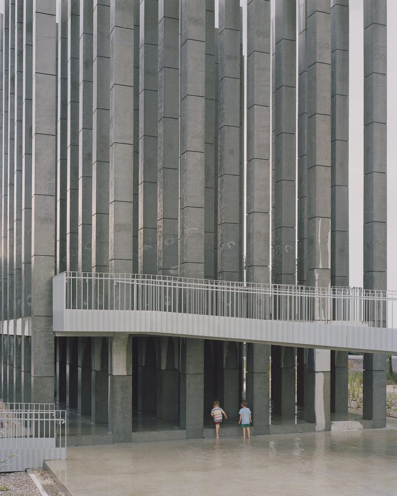
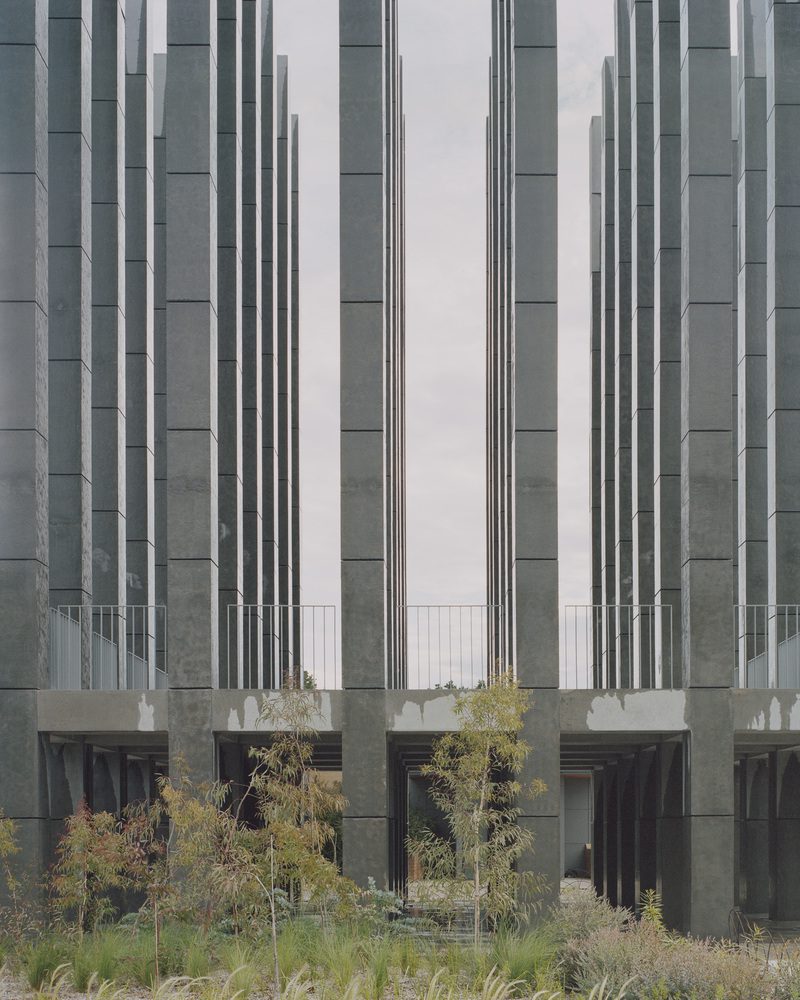
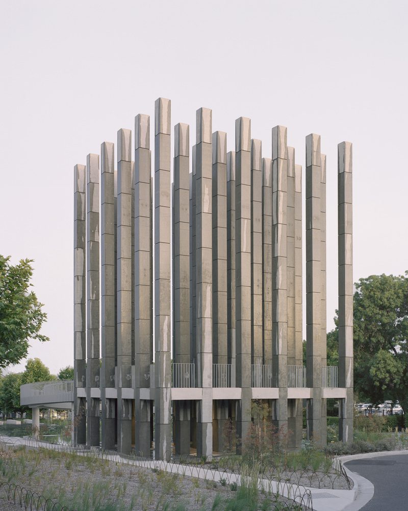
Less Pavillion is the architectural duo’s latest project. Sited on Dairy Road in Canberra, Australia’s capital city, and initiated by Molonglo, a local real-estate company, the project is intended to be a new public space for the city’s residential neighborhood development. The pavilion consists of column structures and concrete walkways whose functions and objectives remain unclear. The landscape is made up of more than 6,000 native plants from over 50 species, representing Canberra’s once-dominant natural environment prior to the British Empire’s colonization of Australia.
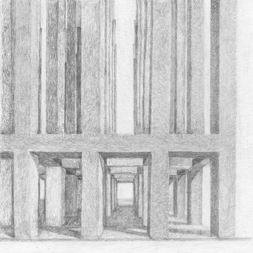
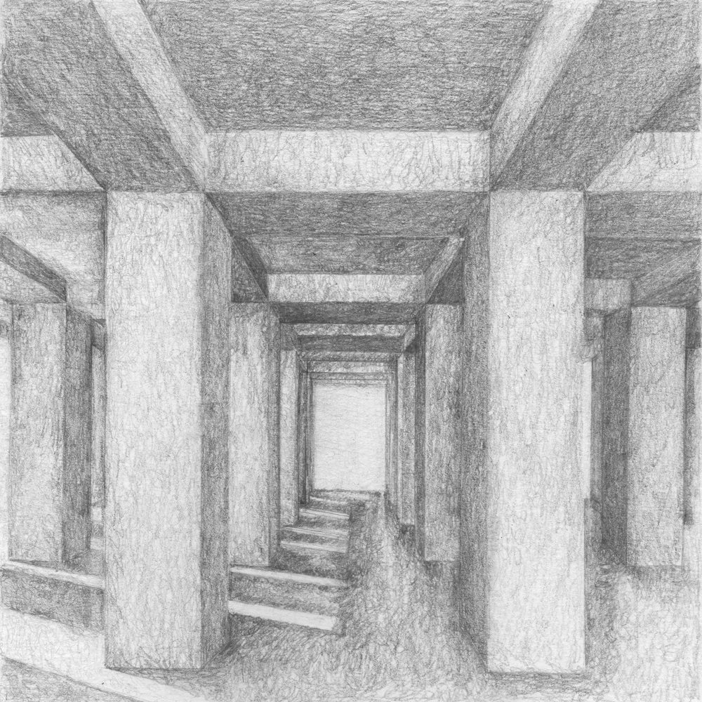
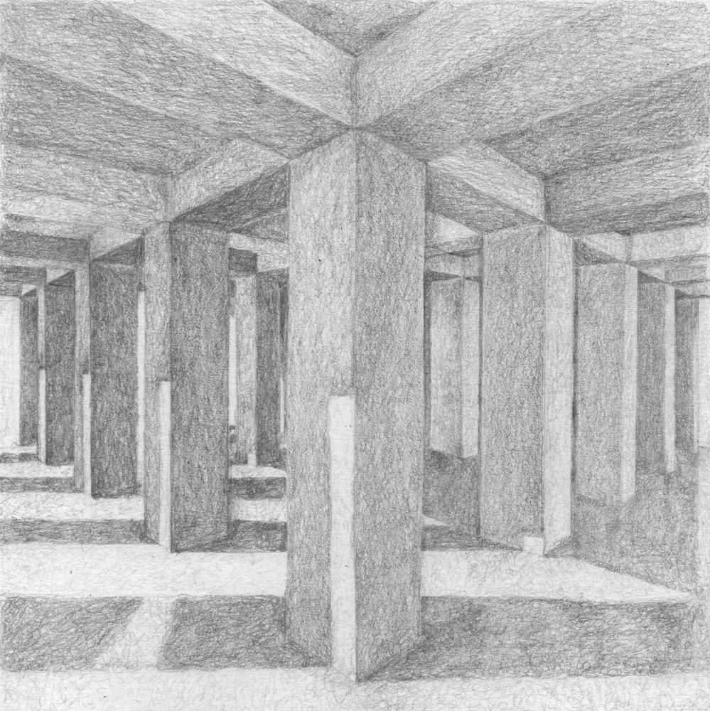
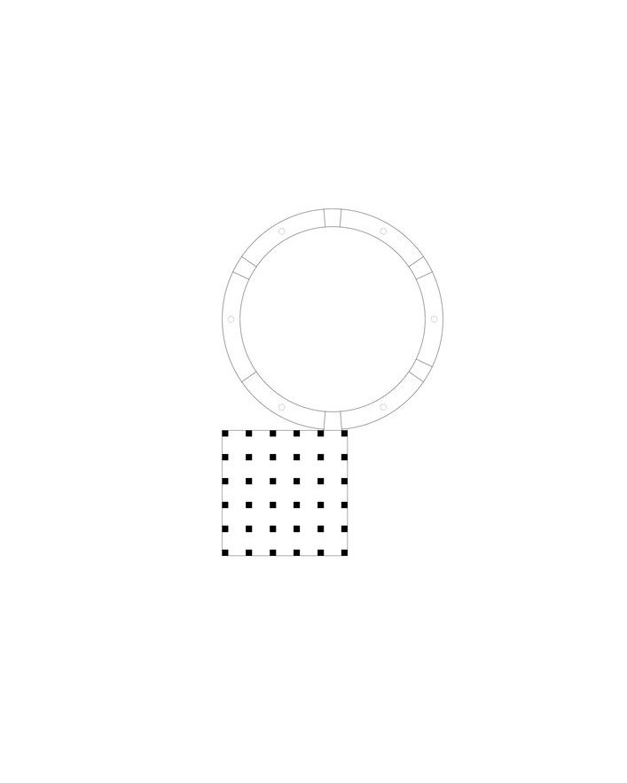
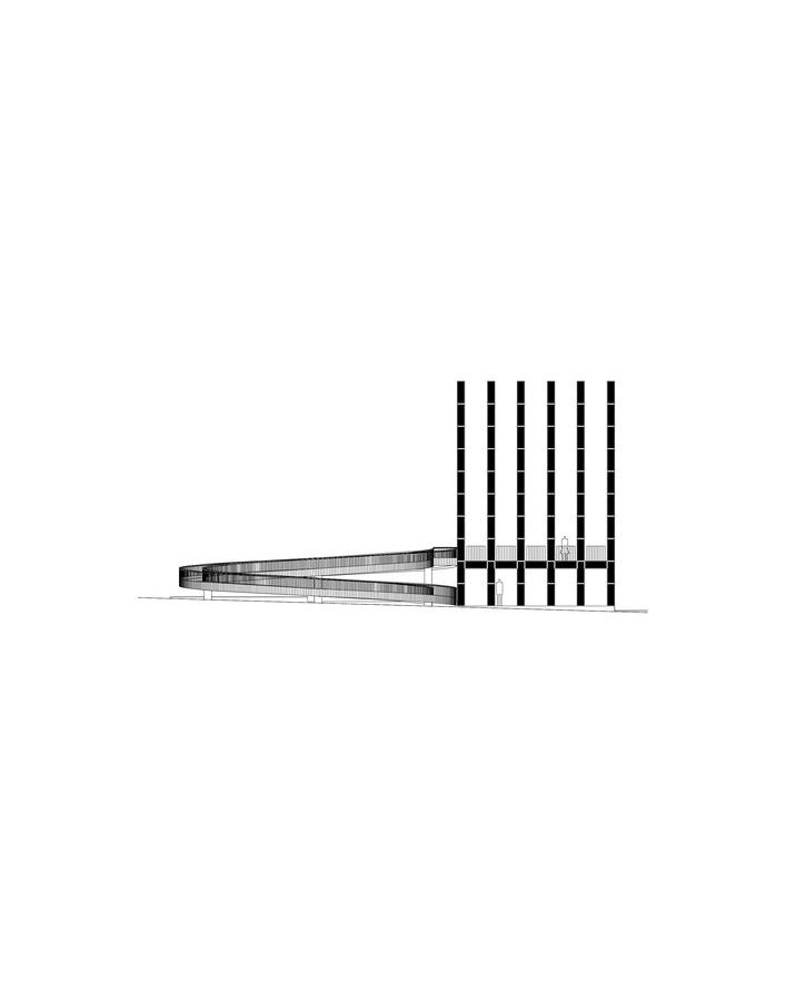
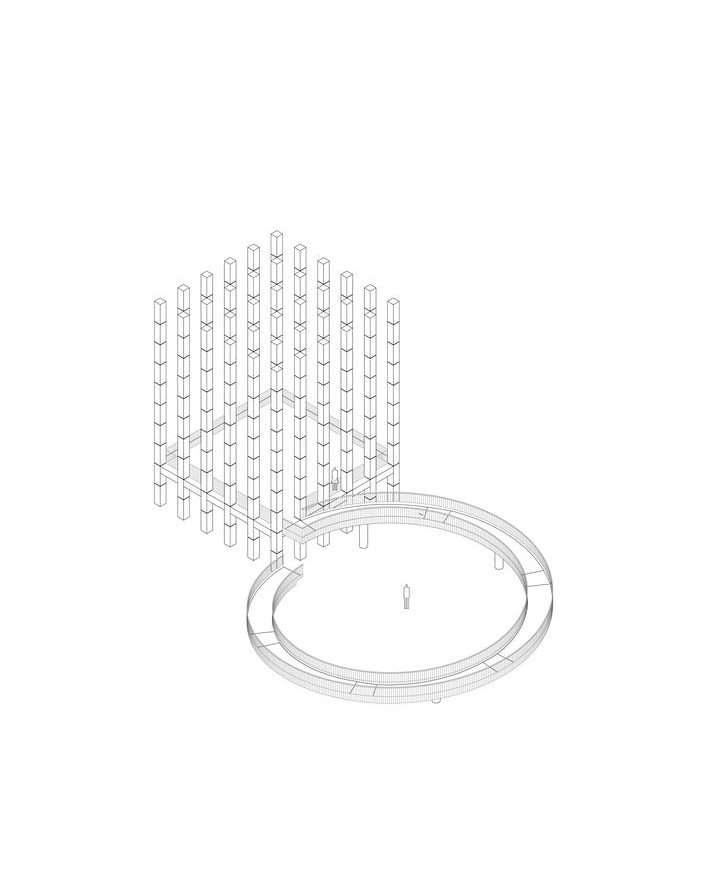
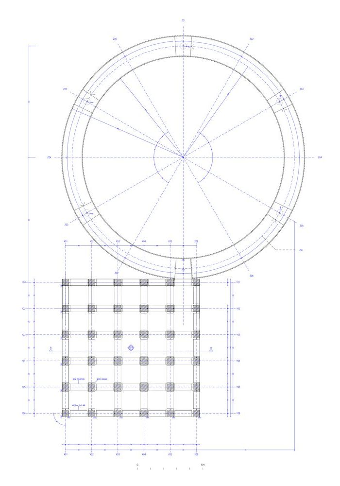
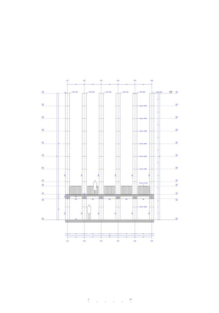
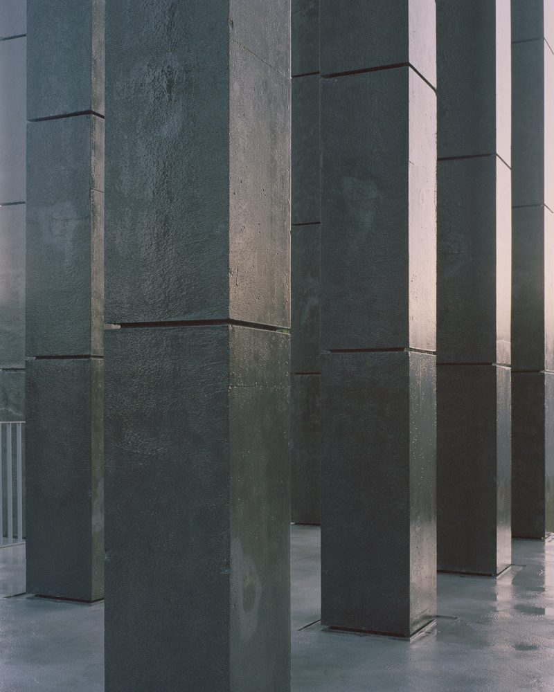
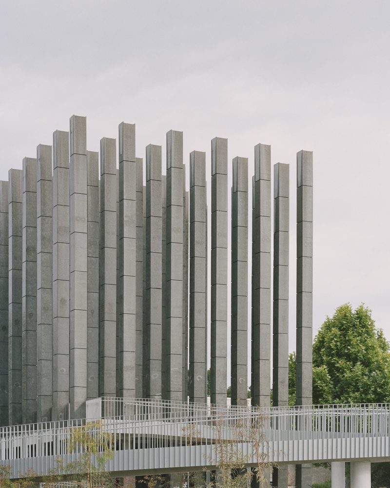
The architecture team utilizes the square and the circle as the elemental forms of the concrete structure. The large square-shaped floor is divided into a six-by-six grid with columns erected on the grid nodes. Each concrete column contains a square section with equal width and length, causing all the elements on the plane of the plan, including the scale of the concrete floor, the grid, and the section of the columns to have a 1:1 proportion. The architects, however, opted for a 2:3 proportion for the elevation, adding height as the third dimension, which, as a result, renders a rectangular shape with a height that is greater than its length.
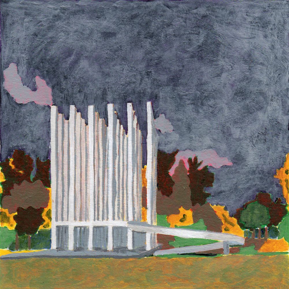
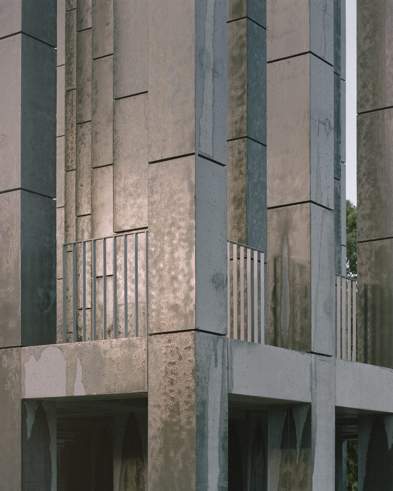
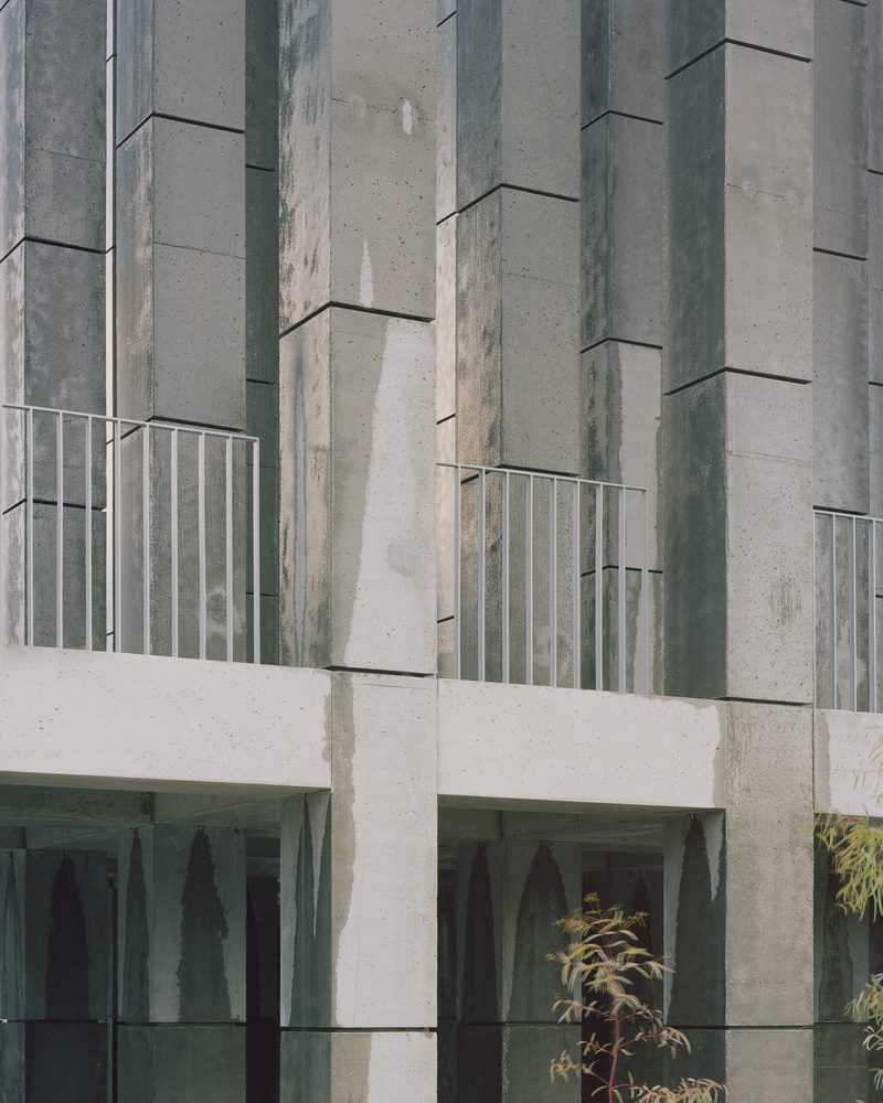
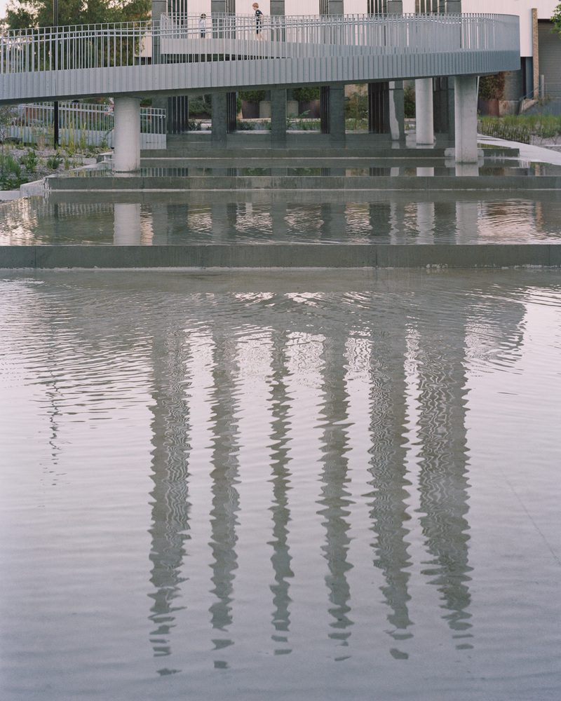
The circle serves as the sloping ramp connecting the upper and lower floors. The coordinates of the circular and rectangular forms are specified for the beginning and endpoints of the slope to meet once the user completes a walk around the circular walkway. The design also locates the meeting point to be on the same axis as the final grid of the side of the structure adjacent to Dairy Road. Meanwhile, the outer perimeter of the circular slope is parallel to the outer edge of the square structure, resulting in the radius of the circle having the same length as each side of the square. The calculated details can also be found in the way the sections of the columns and the concrete beams bearing the load of the second floor have identical measurements.
One could say that the use of geometric forms is an attempt to minimize control over how the identity or characteristics of the work can be formulated. It enables the surrounding context to do its job by taking over or introducing new possibilities, thereby bringing the work beyond the design team’s initial speculation and expectation. The work and its surrounding environment work together to curate perspective. They contribute to the ambiguity of the exterior, which bears no distinct entry points and functions. All of it is the result of the design team’s use of symmetrical circular and square shapes that are connected to the surroundings and permit the formation of continuous lines within the work. It explains why when observing the pavilion from the outside, the entrance, exit, ascent, or descent become indiscernible.
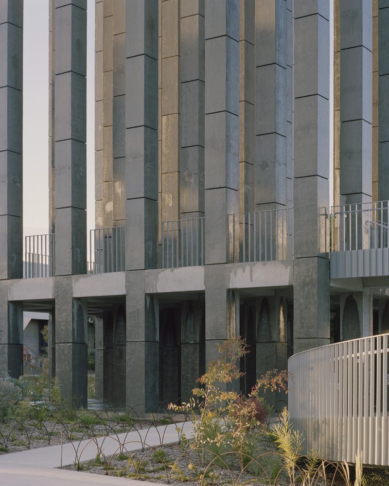
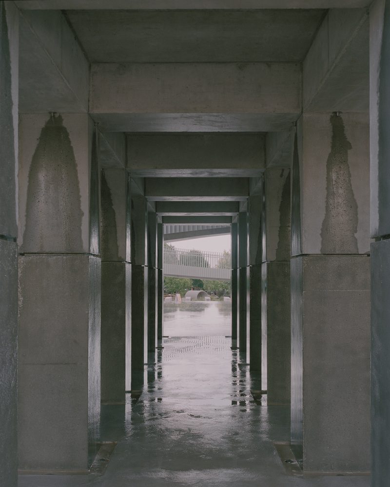
Like many of Pezo von Ellrichshausen previous works that incorporate concrete in various configurations, proportions, and shapes, this project sees the use of concrete with several components. Designed and built in a variety of shapes and forms, the elements collectively represent the stability and permanence of concrete, creating a pavilion that can be experienced through its spaces and structure. Concurrently, a dynamic energy circulates throughout the building’s engineering system. The architecture team builds the water piping system to release water onto the concrete columns, facilitating interactions between the work and the movements of the surrounding environment through the sounds of wind rushing through the tall pillars and the water coming in contact with the solid concrete mass. Within the curated space of the built structure, the project generates a stage of coexistence between a long-lasting artifact and the ever-changing conditions of things.


