
WHEN CULTURE BECOMES A SECRET CODE IN DESIGN, THREE DESIGNERS FROM THAILAND AND TAIWAN DECODE THE MEANING OF IDENTITY THROUGH DESIGN LANGUAGE AT GOLDEN PIN SALON BANGKOK 2025
TEXT: PRATCHAYAPOL LERTWICHA
PHOTO COURTESY OF art4d EXCEPT AS NOTED
(For Thai, press here)
In its 2001 Universal Declaration on Cultural Diversity, UNESCO defines culture as ‘the set of distinctive spiritual, material, intellectual and emotional features of society or a social group.’ While craftsmanship and technical skill undoubtedly influence design outcomes, the cultural foundations that shape the designer themselves are just as significant.
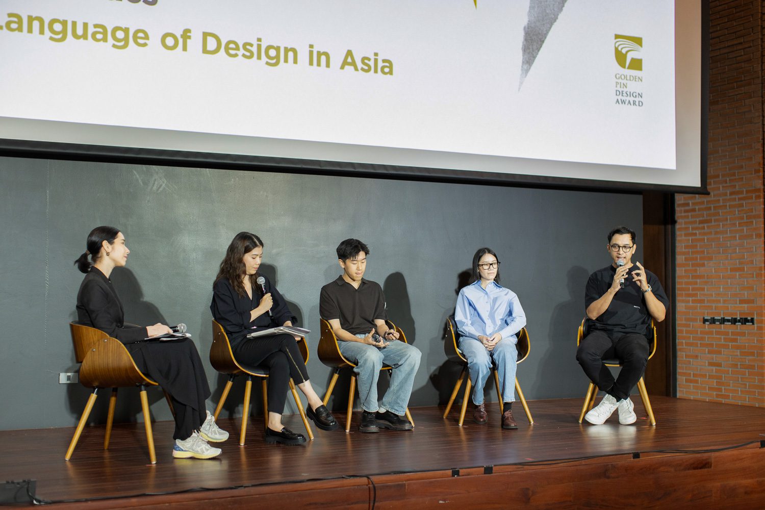
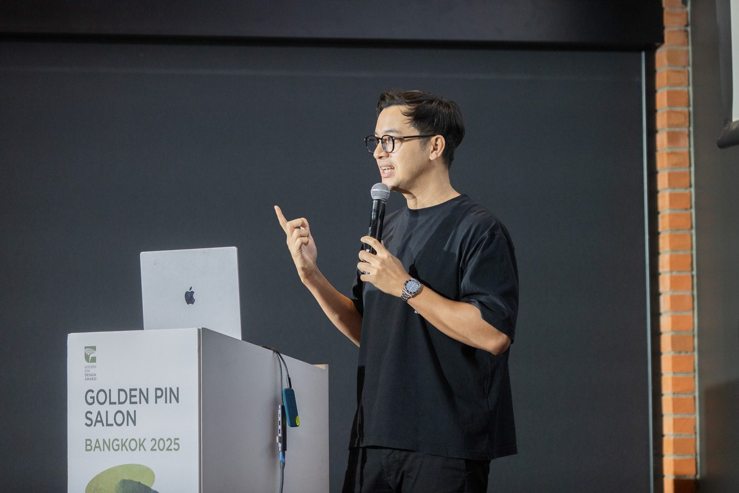
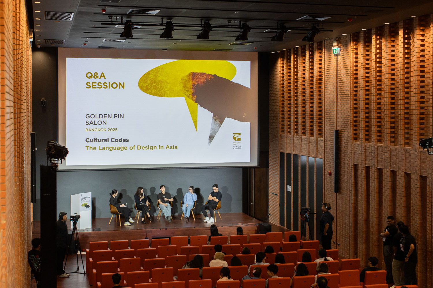
This idea took center stage in Cultural Codes – The Language of Design in Asia, a panel discussion held on April 27, 2025, as part of Design Perspectives x Golden Pin Salon Bangkok 2025. The session brought together three accomplished designers from Thailand and Taiwan to explore how culture informs and inspires their work. The speakers included Brian Liu, Founder and Creative Director of Local Remote; Doonyapol Srichan, Founder and Creative Director of PDM Brand; and renowned Thai graphic designer Manita Songserm.
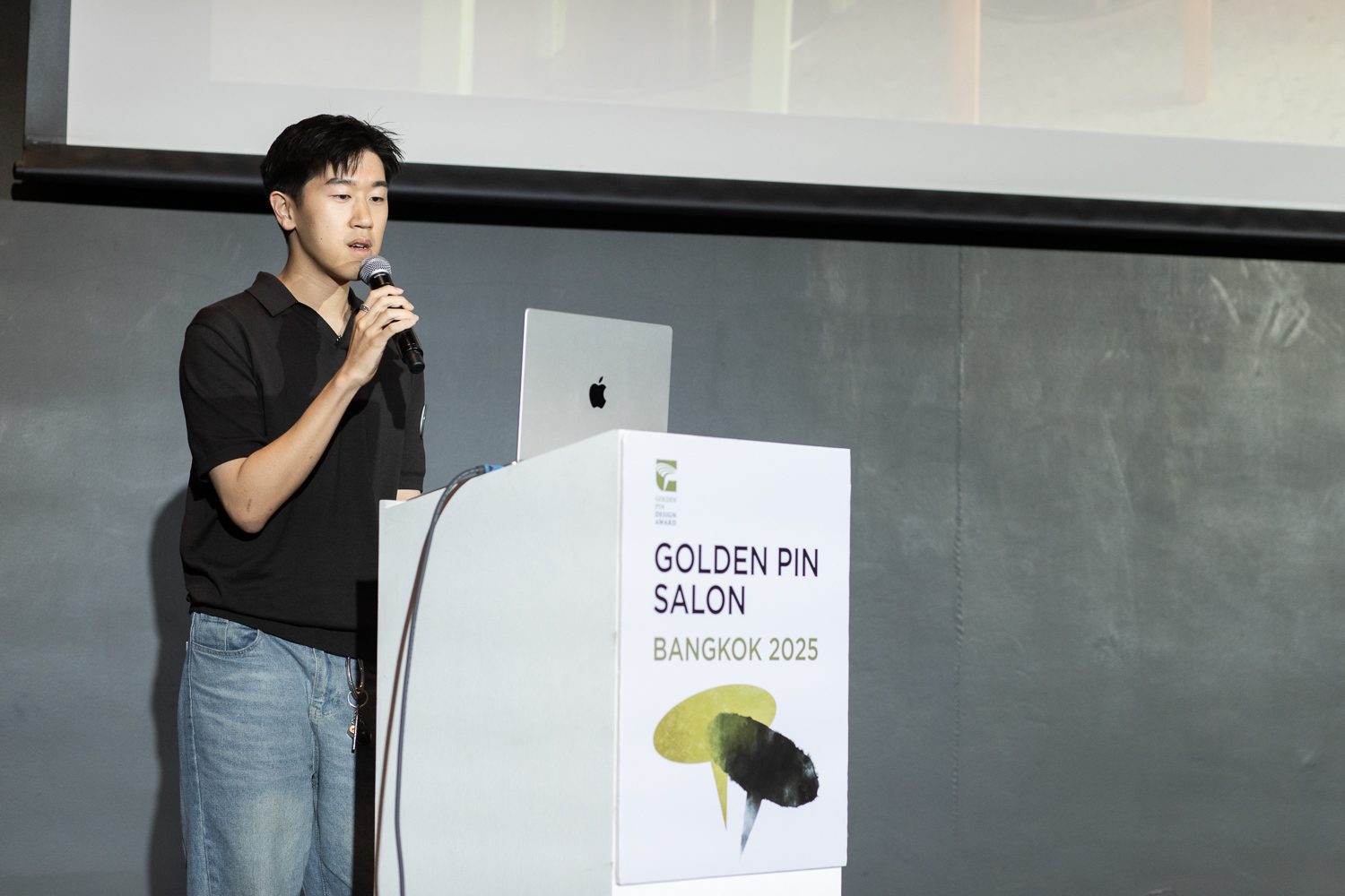
Brian Liu, the founder and creative director of Local Remote
Local Remote is a Taiwan-based brand strategy studio known for its wide-ranging portfolio, which spans everything from skincare labels to instant noodles. Brian Liu, the founder, shared that the name ‘Local Remote’ embodies their creative philosophy: the idea of bridging deeply rooted local identities with a globally connected, borderless mindset. As a result, their work acts as both a cultural conduit and a brand-building tool, helping clients craft identities that resonate on an international stage while remaining authentic to their origins.

TASA | Photo courtesy of Local Remote
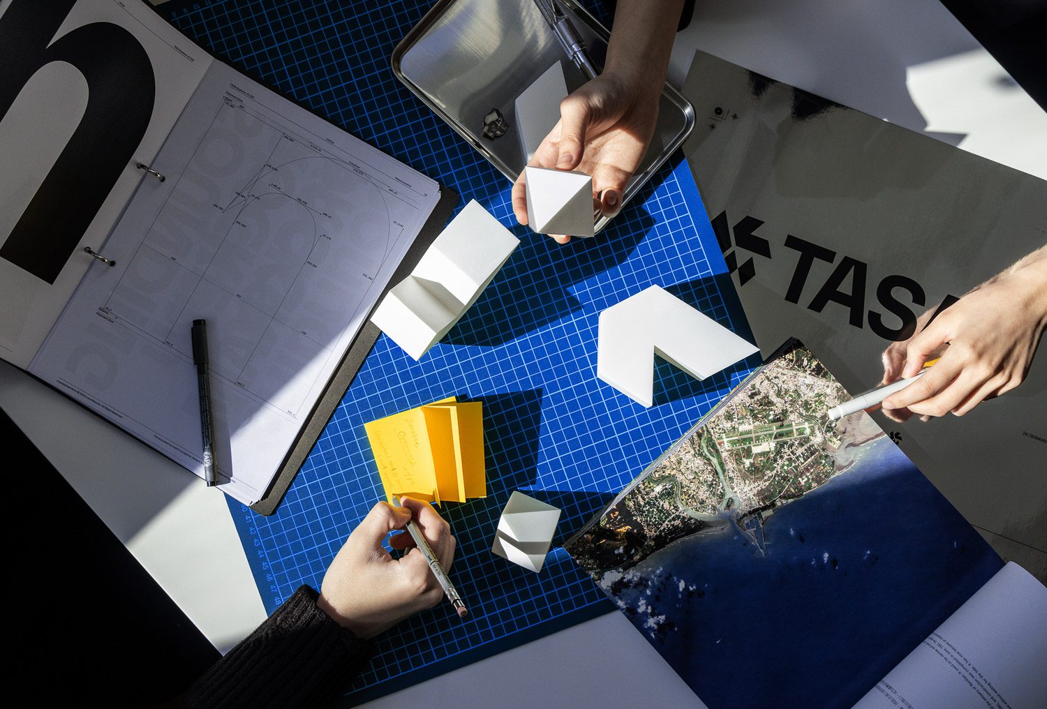
TASA | Photo courtesy of Local Remote
One of the standout projects highlighted in the talk that exemplifies Local Remote’s design ethos is their brand identity work for the Taiwan Space Agency (TASA). The challenge lay in how to represent ‘Taiwanese identity’ within the context of a national space agency. Rather than taking the obvious route, such as incorporating the silhouette of Taiwan’s island, Local Remote undertook a deeper cultural exploration to find a symbol that could more subtly convey a sense of place. They arrived at the diamond, a geometric motif commonly found in Taiwan’s indigenous cultures. The diamond carries layered meanings: it symbolizes guardianship and harmony, two concepts that were reconciled and became the starting point for the entire identity system. Notably, TASA also became the first brand in Taiwan to develop its own custom typeface, designed to further articulate a distinctive national voice and presence on the global stage.
Brian Liu, the founder and creative director of Local Remote
For Brian Liu, effective branding isn’t merely about meeting business goals. It’s also about shaping memorable, impactful perception and offering people new ways of seeing the world.
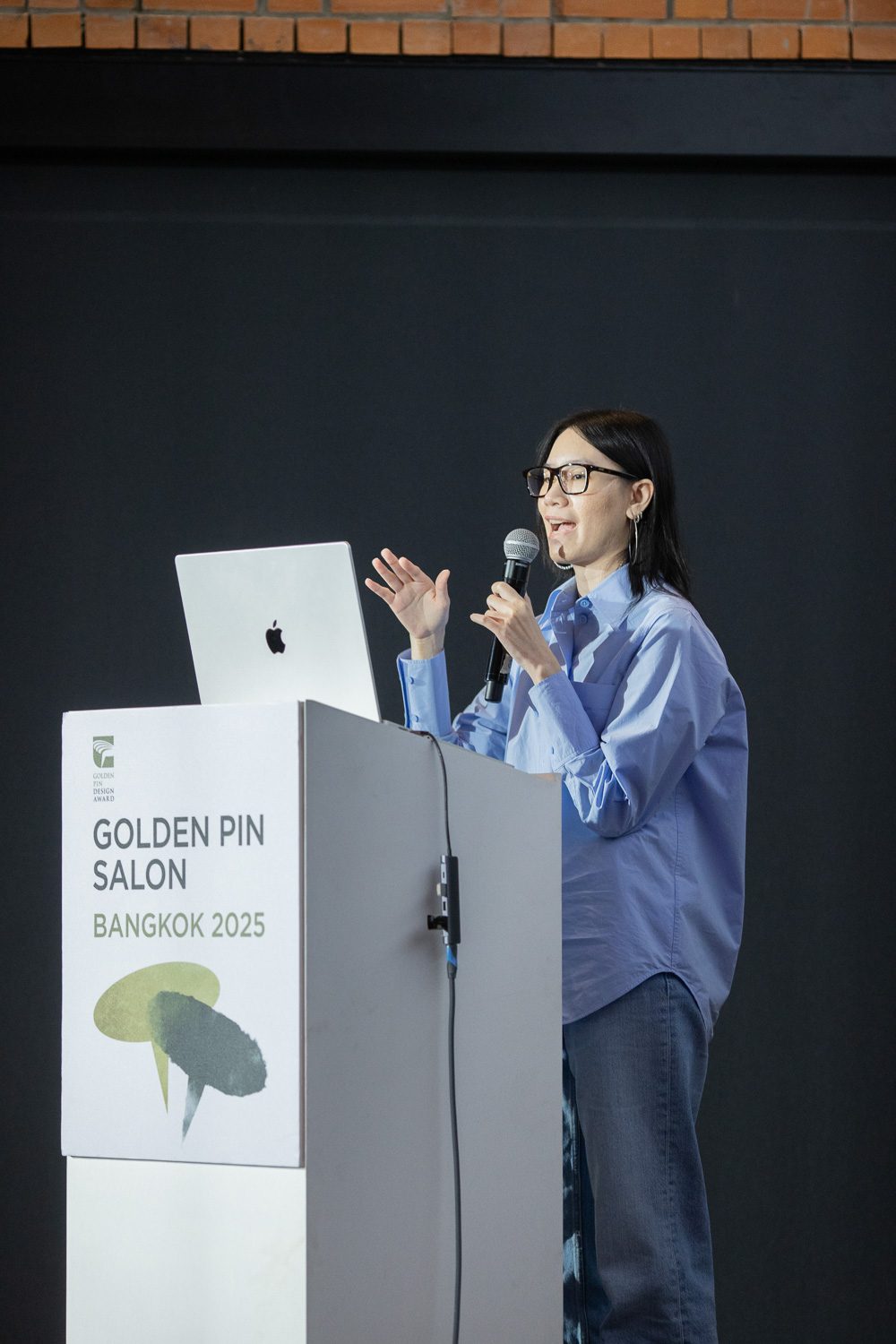
Doonyapol Srichan, the founder and creative director of PDM Brand
“Design a language that’s universal” was a phrase that Doonyapol Srichan casually offered early in his talk. It captures the essence of his approach at PDM Brand, a Thai product design studio known for its playful, inventive work. While the visual language of PDM’s designs often reads as international, there is an unmistakable undercurrent of Thai wittiness and humor woven throughout. “Furniture designed in the international style by a Thai designer will always carry a trace of Thai-ness,” Doonyapol remarked.
 Photo courtesy of PDM Brand


One of the projects that first brought PDM Brand into the spotlight was a floor mat made from recycled plastic, reimagined with beautiful, refreshingly striking patterns. The design challenged the everyday image of the commonplace mat seen throughout Thailand. Doonyapol didn’t just share the origin story of the mat, but also walked the audience through a range of other products that playfully reinterpret ordinary objects. He emphasized that at PDM, the design process doesn’t end with form-making. Storytelling and marketing are equally vital components – tools that help communicate the product’s essence and the brand’s signature sense of playfulness, allowing these objects to connect with people in an authentic and lasting way.
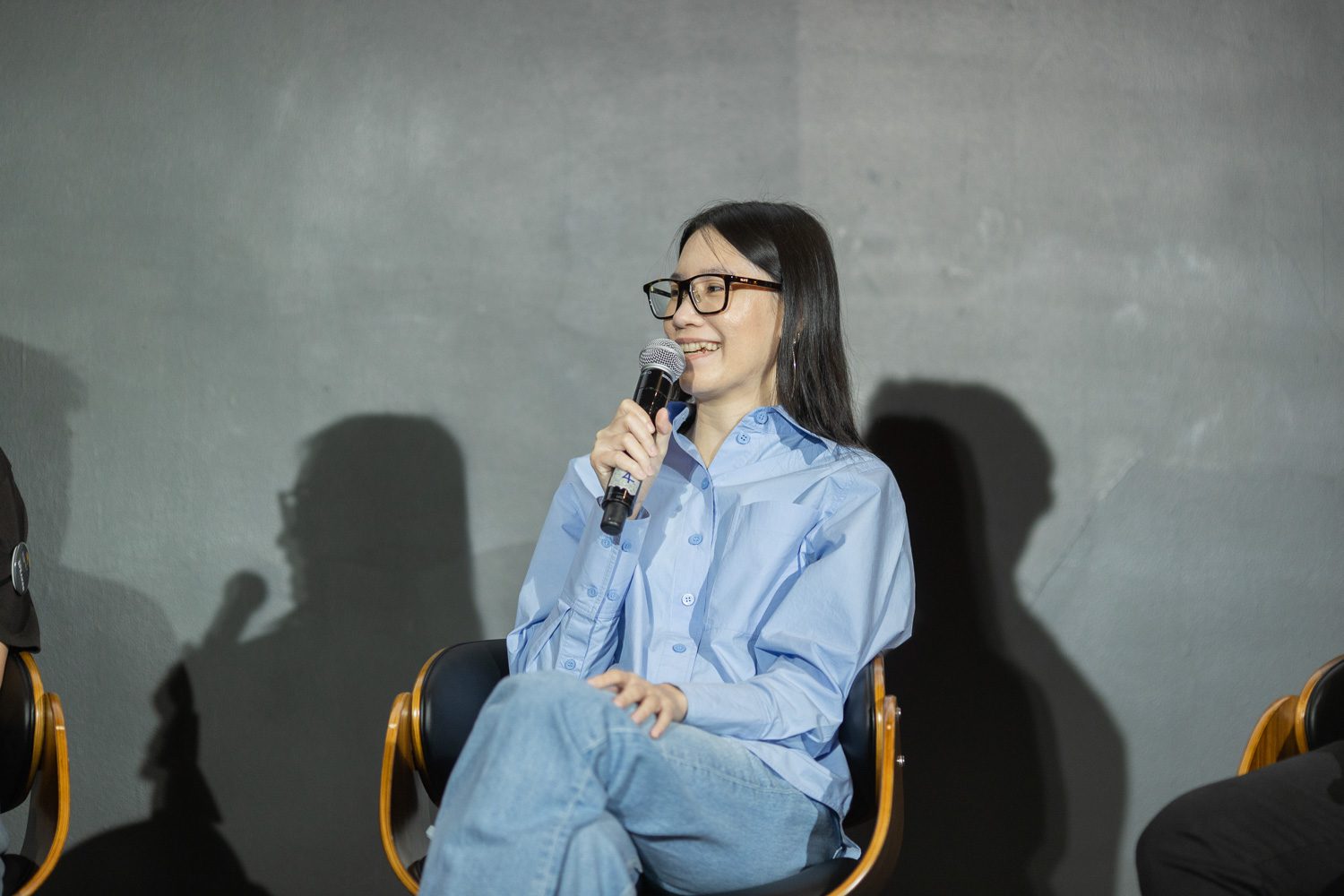
Manita Songserm
While most of the day’s presentations were delivered in English, Manita Songserm chose to speak in Thai. She explained that doing so would allow her to articulate her ideas with the greatest clarity and precision.
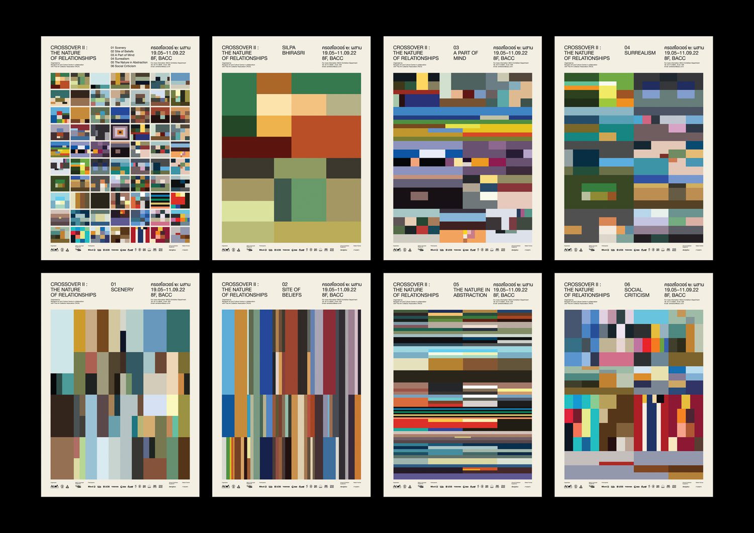
crossover | Image courtesy of Manita Songserm
A veteran graphic designer, Manita is widely recognized for her prolific book cover designs and her long-standing collaboration with the Bangkok Art and Culture Centre (BACC), where she has contributed for over 13 years. In this session, she offered a window into her creative process; one shaped by quiet inquiry, self-reflection, and the patient search for clarity.
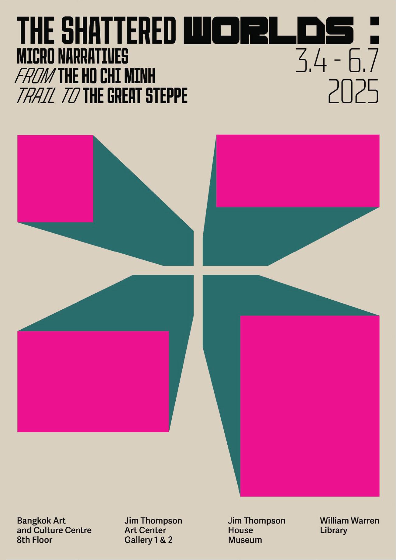
The Shattered Worlds: Micro Narratives from the Ho Chi Minh Trail to the Great Steppe | Image courtesy of The Jim Thompson Art Center
In her practice, Manita Songserm begins each project with research as her compass. Take, for example, her poster design for the exhibition ‘The Shattered Worlds: Micro Narratives from the Ho Chi Minh Trail to the Great Steppe,’ which explored themes surrounding the Cold War. To ground the work in its historical context, she researched the social shifts of the era, including typographic trends and graphic sensibilities of the time. Guided by information rather than a fixed visual style, Manita develops a portfolio so diverse that each piece could easily be mistaken for the work of a different designer.
Poster Urban in Progress TH | Image courtesy of Manita Songserm
At times, her designs are direct responses to her current emotional state. For ‘URBAN IN PROGRESS’, another exhibition at BACC, she created graphics that felt both chaotic and structured, echoing her own conflicted emotions from her own perspective as a Bangkok resident.
 ENSAIO SOBRE A CEGUEIRA | Photo courtesy of Manita Songserm


Translated book covers are among Manita’s favorite projects, as they allow her to serve as a bridge between cultures. She sees design as a vehicle for cultural translation, where each book, whether originally written in German or Japanese, carries a distinct visual identity rooted in its source culture. Unconventional layouts often represent Japanese design sensibilities, while bold, saturated colors might signal a German origin.
Manita Songserm
In reflecting on her own identity, Manita described herself as a fusion of Asian and Western influences. She draws from the richness and complexity of Asian visual traditions — layered, intricate, and deeply technical and expressive —while also embracing the minimalist clarity and concept-driven approach of Western design. These dual currents are clearly visible in her work.
While all three speakers share a common ground as designers rooted in Asia, each has charted a unique path; their journeys shaped by personal experiences, individual strengths, and the cultural foundations that run deep within them.