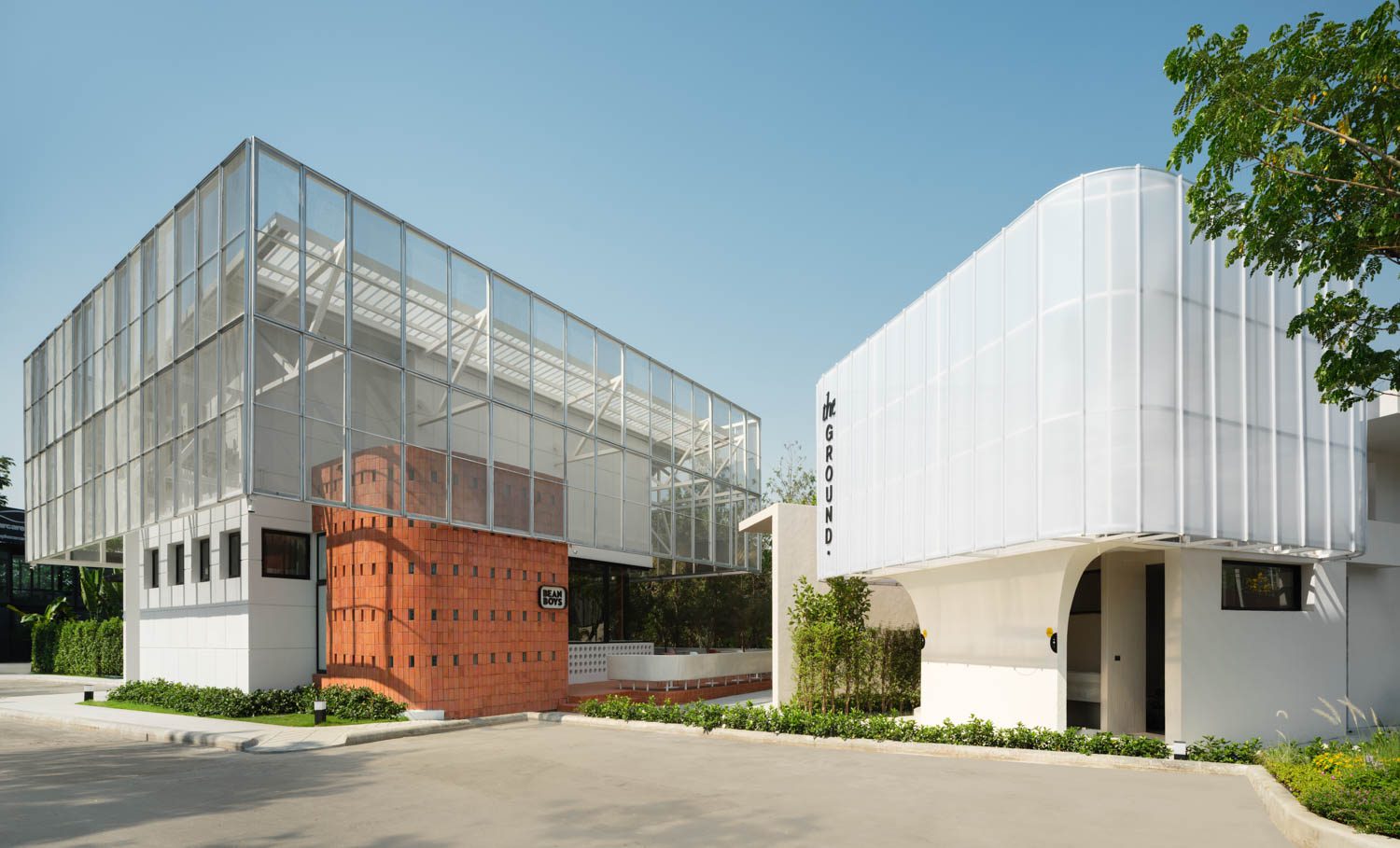
THE GROUND IS AN ARCHITECTURAL PROJECT DESIGNED BY FATTSTUDIO TO REFLECT A UNIQUE IDENTITY WITHOUT HAVING TO ADHERE TO A SINGLE CONCEPT
TEXT: NATHATAI TANGCHADAKORN
PHOTO: PANORAMIC STUDIO
(For Thai, press here)
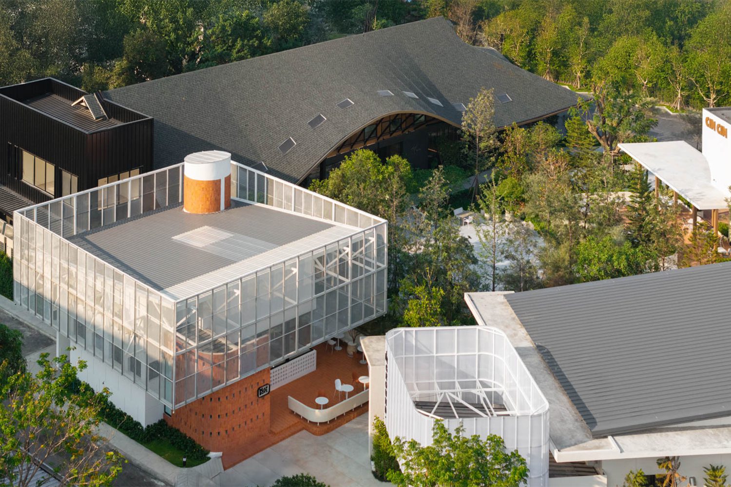
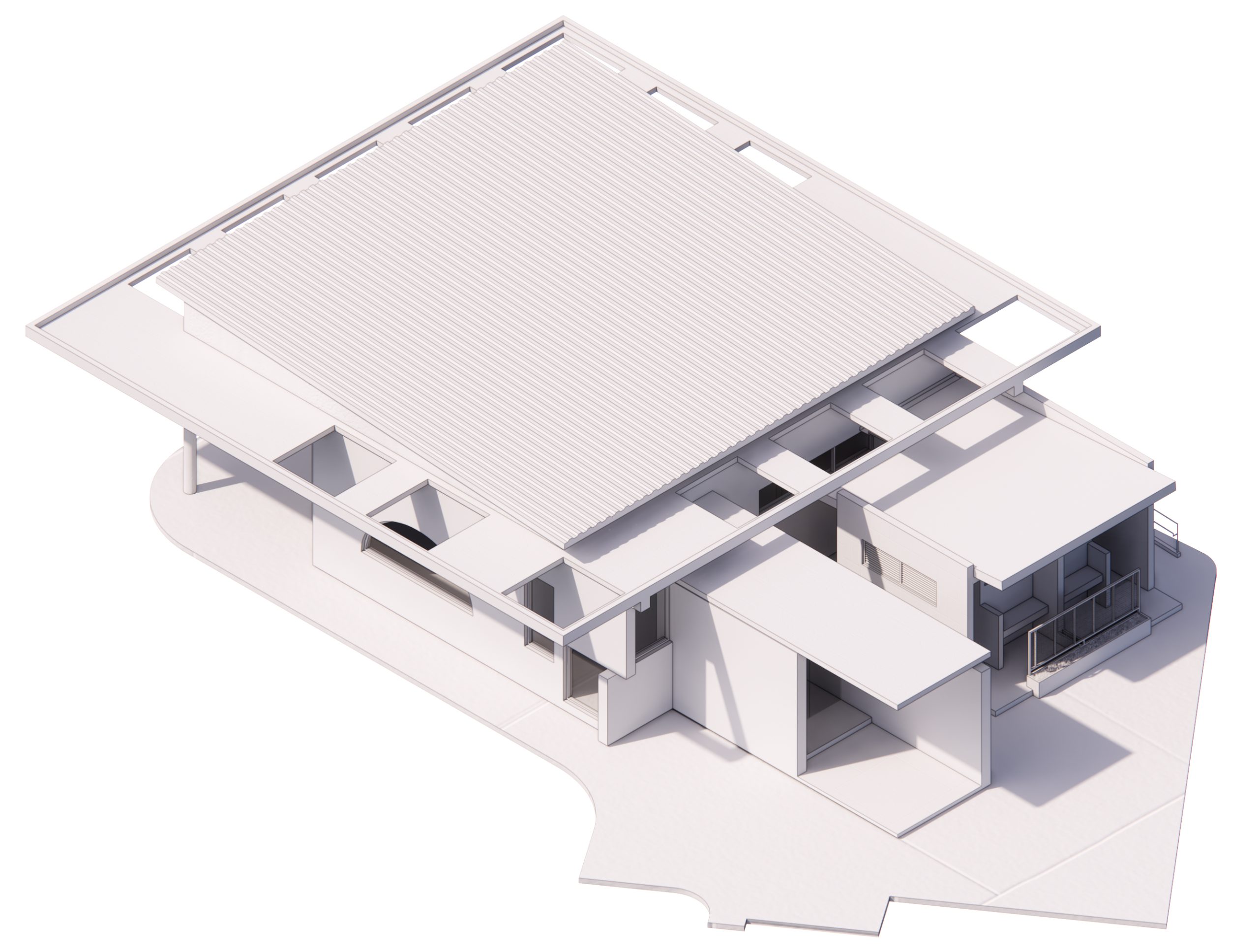
The Ground is a project located on Pradit Manutham Road, in a suburban Bangkok neighborhood widely known as ‘Liab Duan’ (the Expressway Strip). The development comprises four separate buildings, each with its own function. At the front are two restaurants with a combined capacity of 100 seats, one of which also features a compact bar. At the far end sits a small café with a semi-outdoor terrace designed for enjoying coffee in the open air. Beyond FATTSTUDIO’s role as the architectural designer, the project also brought in Paradigm Shift+ for the interiors, while Kernel Design was responsible for the landscape.
From the outside, the four buildings of The Ground each present a distinct character. Yet, in conversation with FATTSTUDIO, it became clear that this diversity was the result of considerable on-site ‘adventures,’ which is a familiar reality in architectural practice, though the outcomes depend largely on how each designer navigates them. A unique advantage of developing this pet-friendly project lies in the fact that the buildings were not conceived simultaneously under a single overarching concept.
“As long as The Ground doesn’t end up looking like an amusement park, I’ll consider the project a success,” FATTSTUDIO remarked, half in jest.
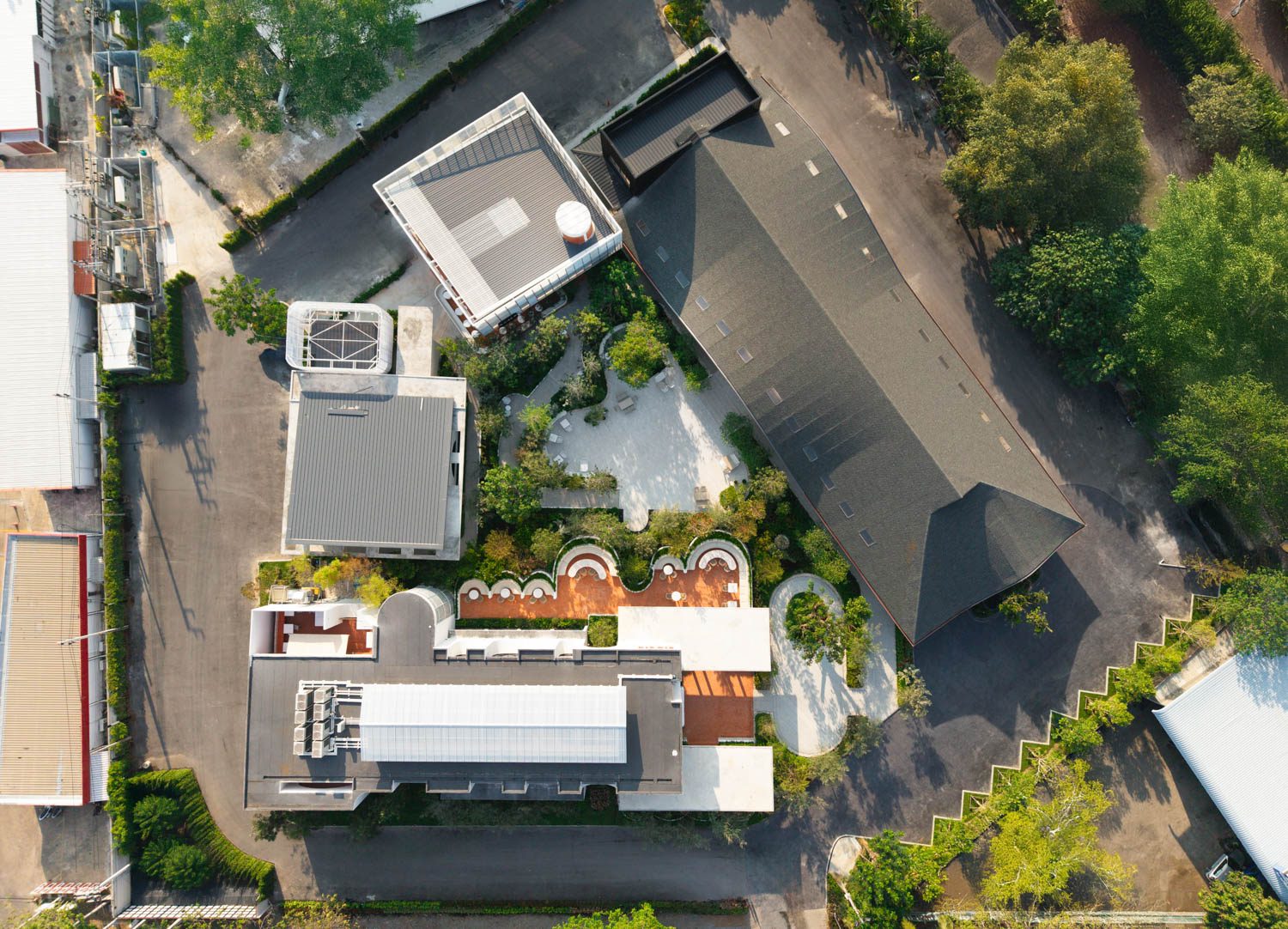
The design process began with two main buildings, restaurants of comparable size that operate primarily during the day. At the front sits Cin Cin, serving Italian-inspired fusion cuisine, while directly behind it, adjacent to the project’s main drop-off, is Mawari, specializing in Japanese-style shabu and barbecue.
drop-off in front of Mawari connects to Cin Cin.
The client already had a clear vision in mind: to establish the development as a destination for the local community, while ensuring it was Instagrammable enough to draw in casual visitors. The design team therefore worked in reverse, treating and interpreting the external appearance as the architectural essence. Although the two restaurants differ radically in style, they were both shaped by the same design logic. Discussions within the team centered on numbers, proportions, and the rhythm of the windows, rather than debates over aesthetics.
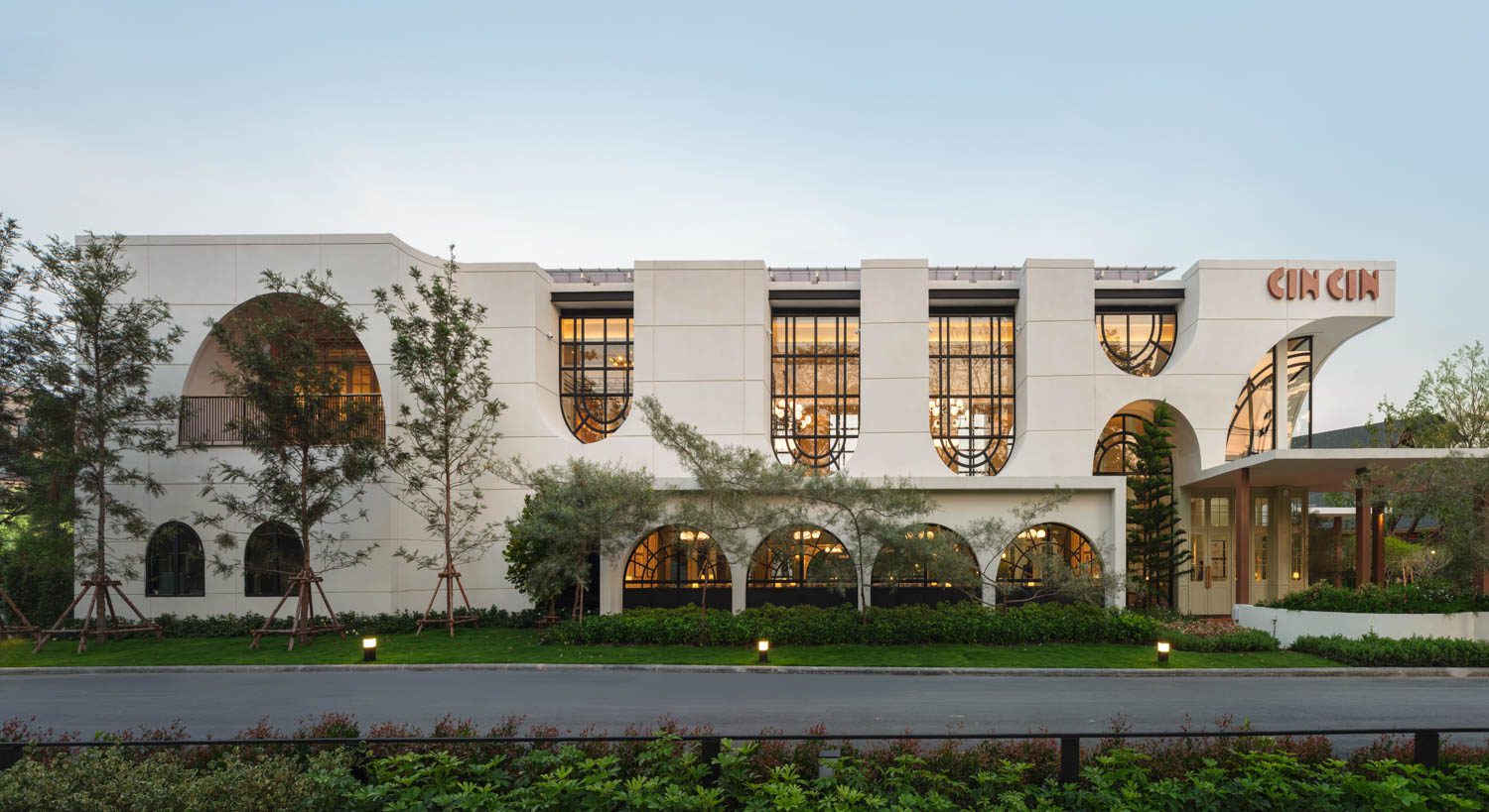
Cin Cin as seen from the road
 Cin Cin

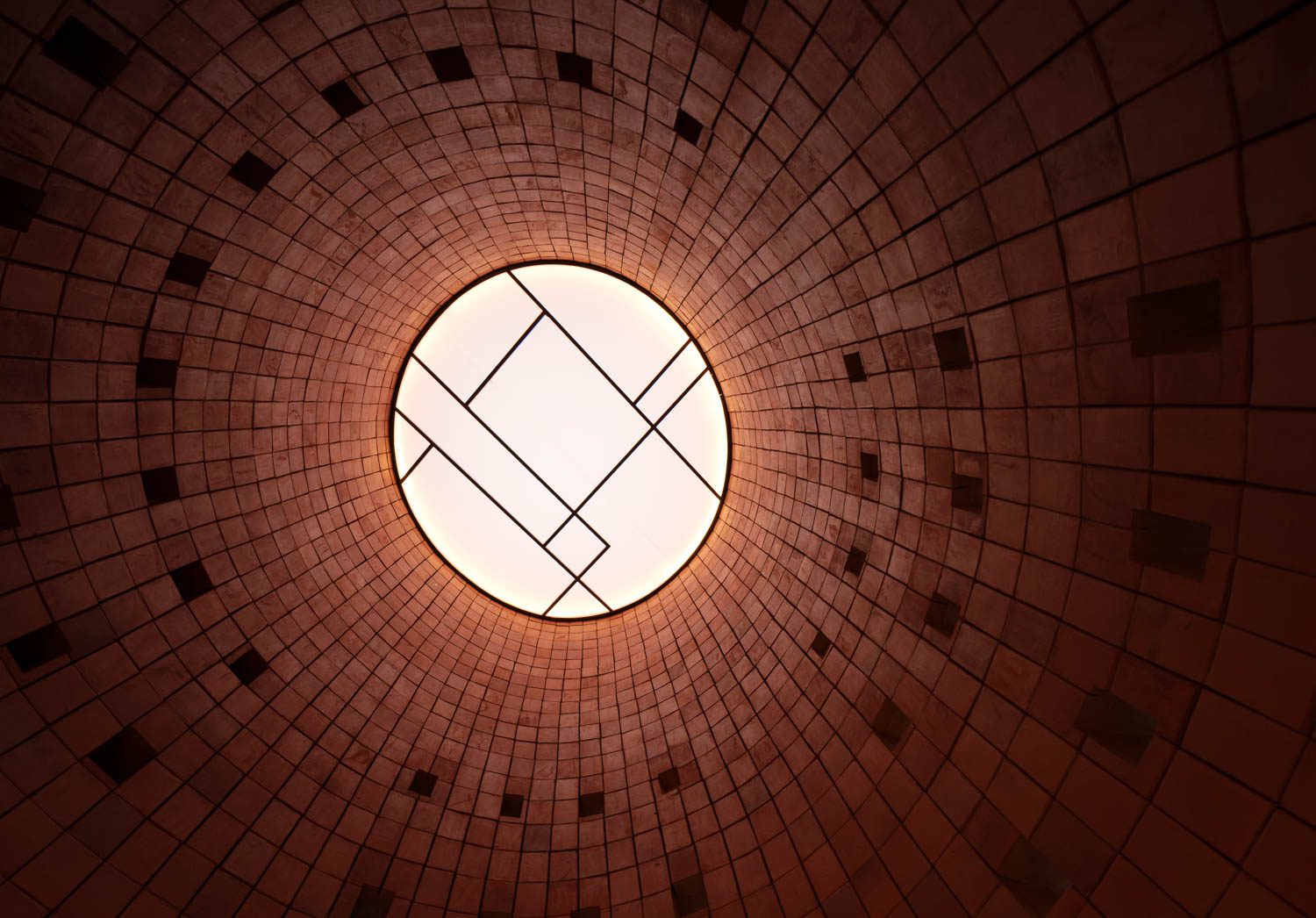
For Cin Cin, the starting point was the concept of a ‘hall,’ a large, light-filled dining space. The rectangular plan opens the entire first floor into a bright, airy dining area, with service functions such as the kitchen, restrooms, and staircases tucked at the far end. These stairs lead up to a more private second level. Externally, a white volume is punctured with arched voids that shift and flip across its surfaces, while grooves cut into the walls add depth and dimensionality, extending gracefully even to the rear of the building.
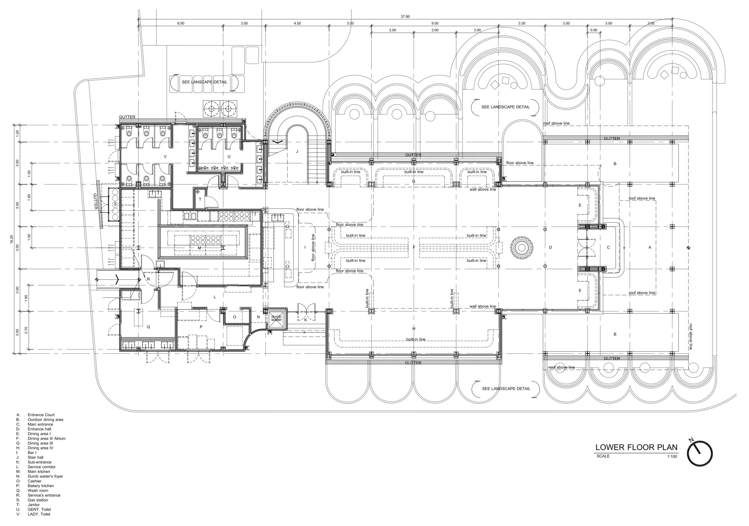
Image courtesy of FATTSTUDIO
 Cin Cin

Although the result may not fully demonstrate its intended performance, the design of Cin Cin was in fact conceived with the tropical climate in mind. The long axis of the building faces directly southwest to northeast, fully exposed to the sun. The flat-slab roof was initially designed not only to support a VRV system but also to incorporate a secondary ceiling to vent hot air. This, however, was later replaced with polycarbonate ventilation fins, which transformed the space into little more than a skylight, admitting both daylight and heat into the building. Despite being a box without eaves, the windows were all offset by 1.2 meters from the exterior wall to provide as much shade as possible.
 Cin Cin

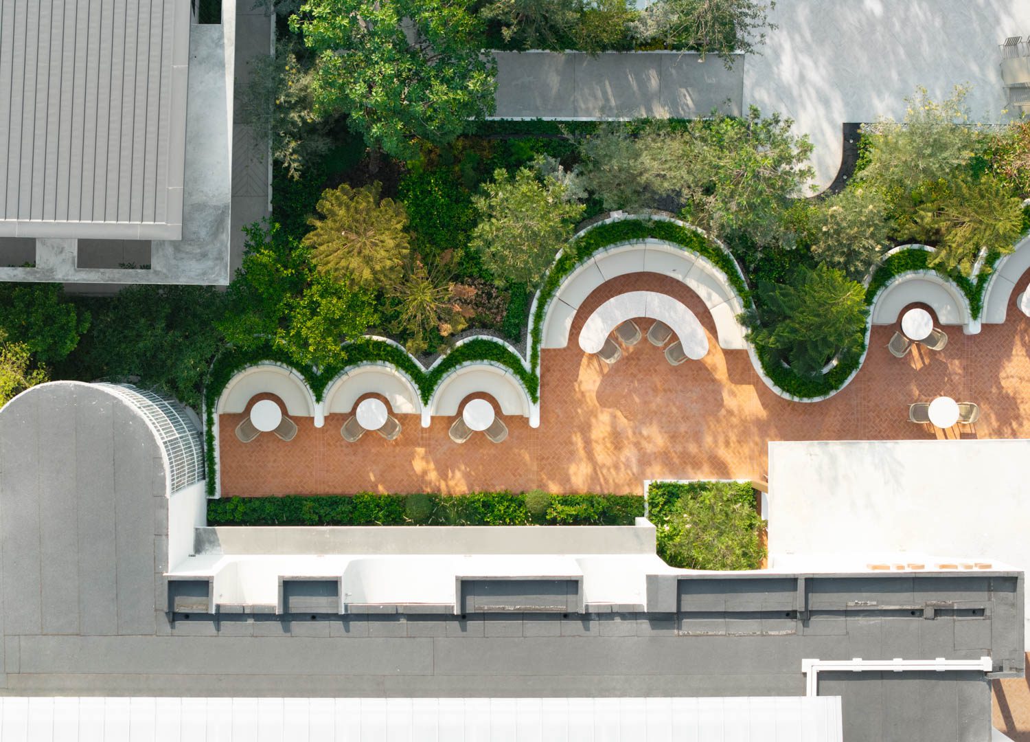
Mawari, by contrast, asserts its presence with a massive gabled roof, as if reclaiming what Cin Cin could not. The sweeping eaves extend like a skirt around the building, projecting more than four meters. Along this span runs a narrow seam of light, inspired by the stitching of a Japanese kimono sleeve. At key points the skirt lifts into arches, marking the highlights of the building: the main entrance, the drop-off zone, and the private dining room.
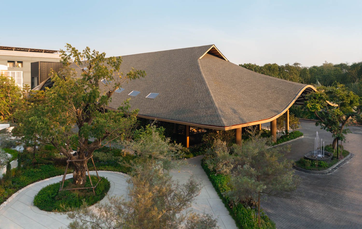
Mawari
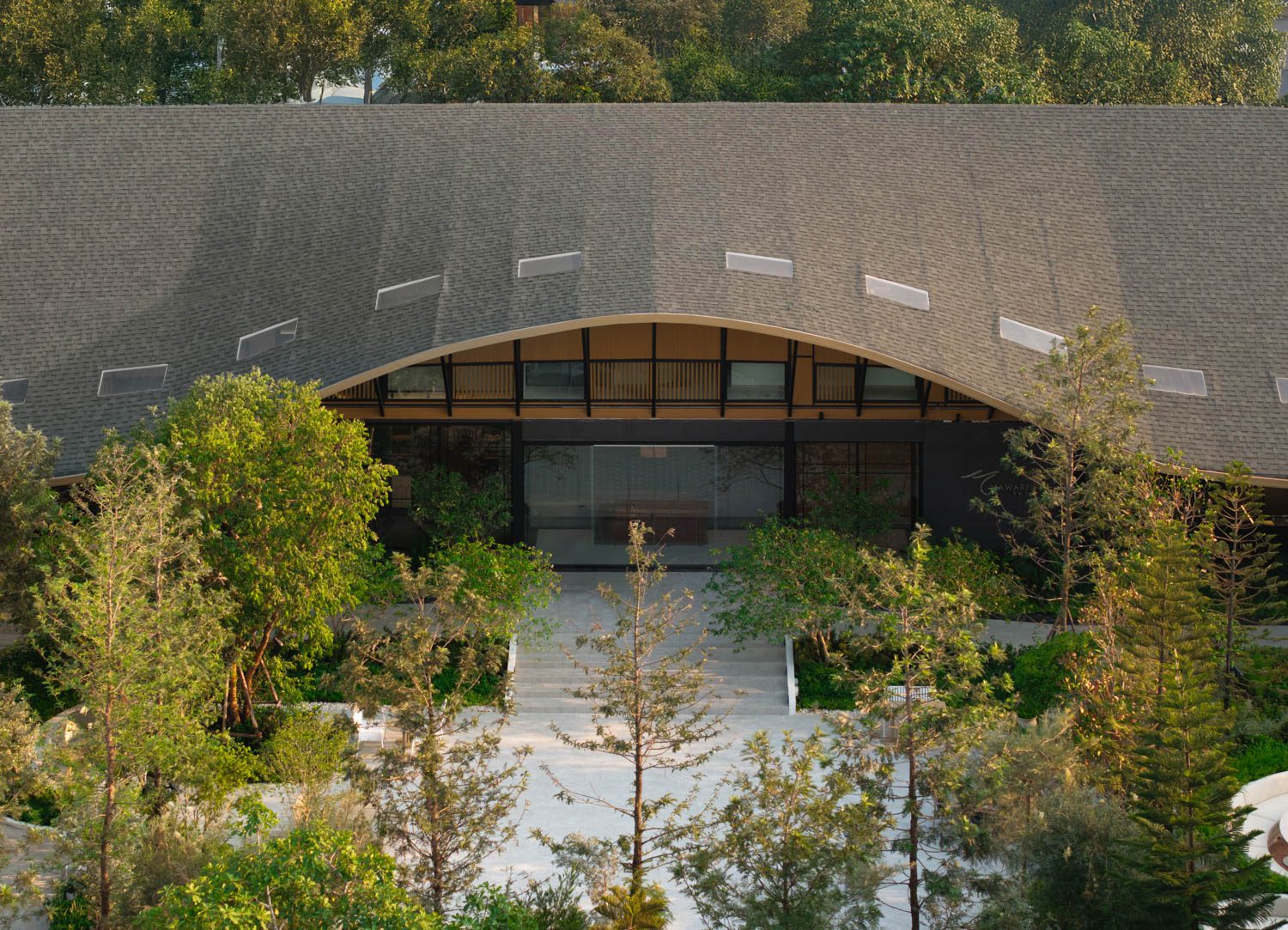
Mawari
In conversation with FATTSTUDIO, it became clear that both the arched motifs and the proportions of Mawari were drawn from temple architecture, whose sense of grandeur resonates with the scale of the restaurant. The elongated structure is divided into two wings connected by a central service core. On the barbecue side, the floor was raised to allow systems to be installed beneath. Overhead, pendant lights were suspended to recalibrate the spatial perception, ensuring diners would not feel overwhelmed by the soaring ceiling. The shabu side, however, employs a different strategy. Here, an open kitchen set against the wall becomes the main focal point, recalling the presence of the principal Buddha image in an ordination hall, its placement echoing the spatial composition.
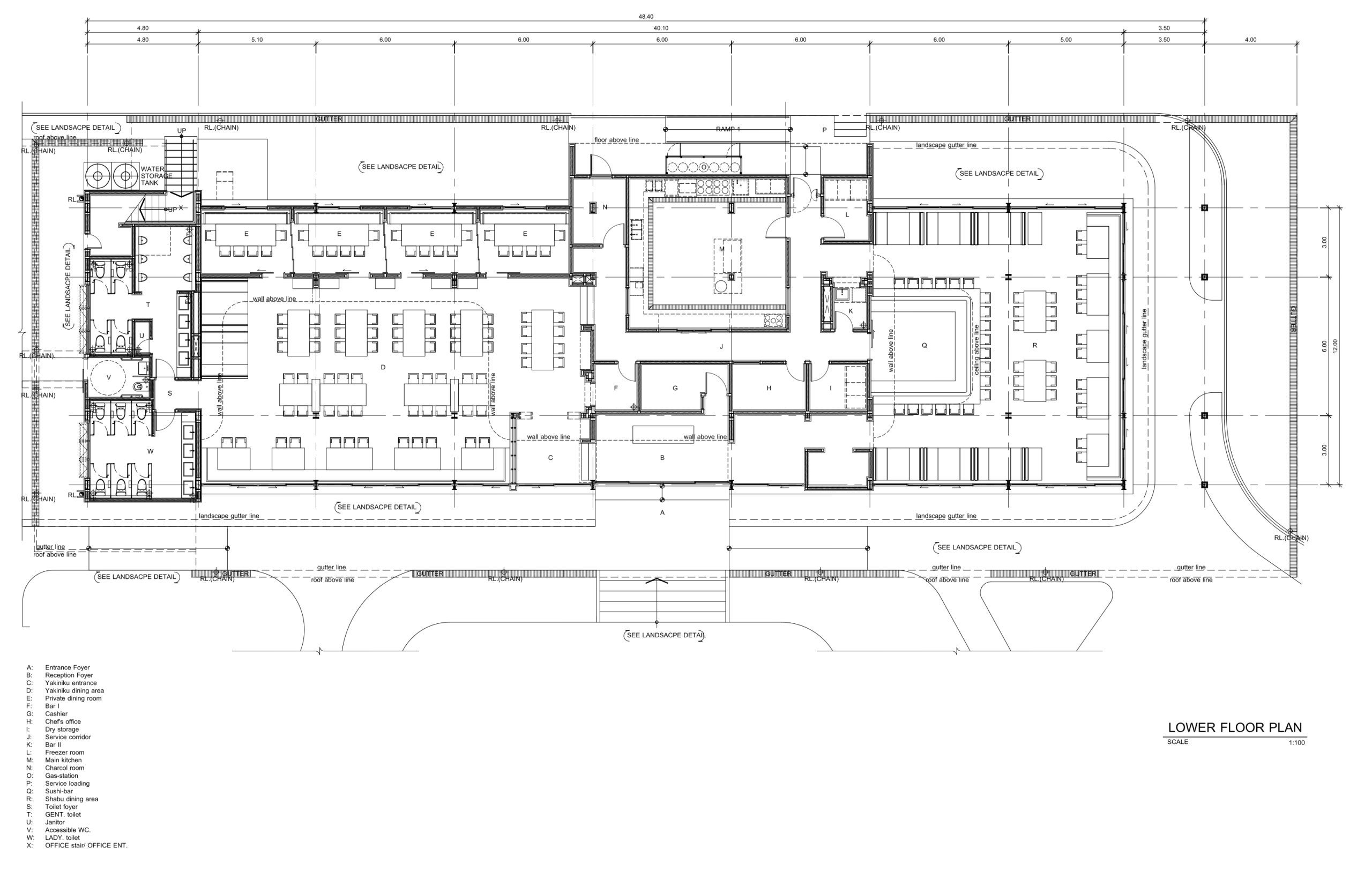
Image courtesy of FATTSTUDIO
 Mawari

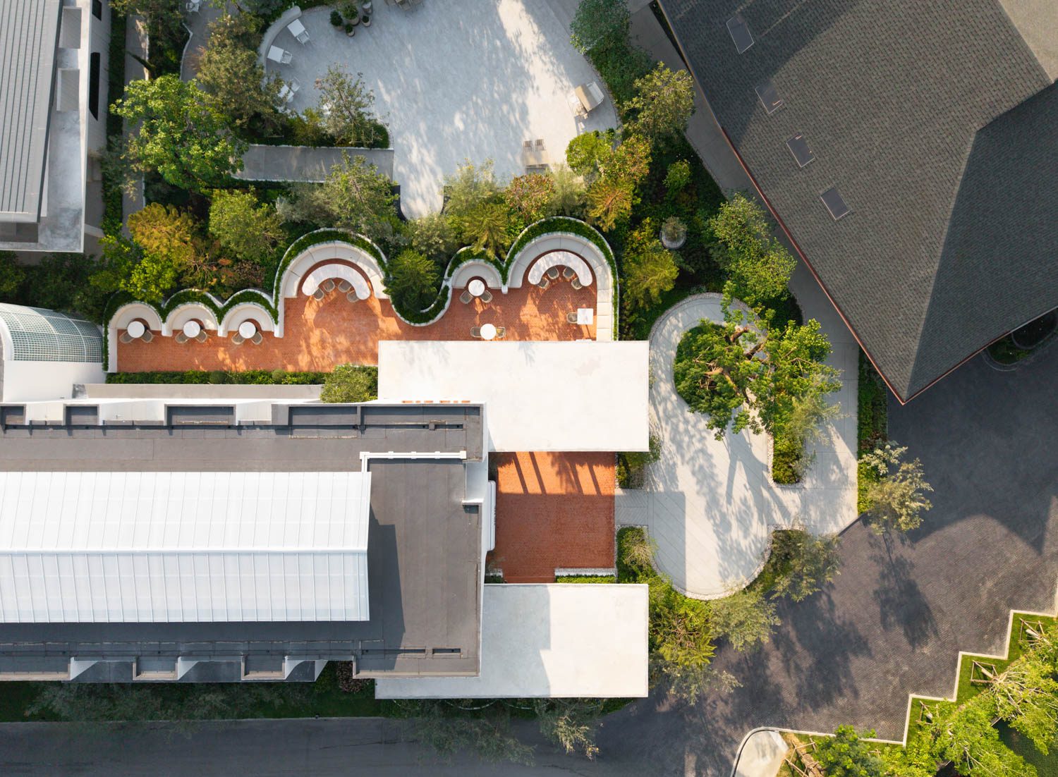
Just behind Cin Cin, tucked away, is the more intimate Turaz Bar. Compact and private by design, it was initially envisioned by FATTSTUDIO as a column-free volume, where a waffle slab roof supported by only four columns would create an uninterrupted space. This concept was later changed to a flat slab, and eventually resolved as a lean-to roof, familiar in its modest simplicity. A small fun fact emerged from this process: by the time the decision was made to switch to the lean-to, construction of the flat slab had already been completed. As a result, the building retains a hidden ‘frame’ beneath the true roof, a remnant of its earlier iteration.
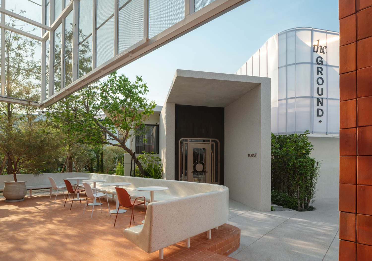
Turaz Bar
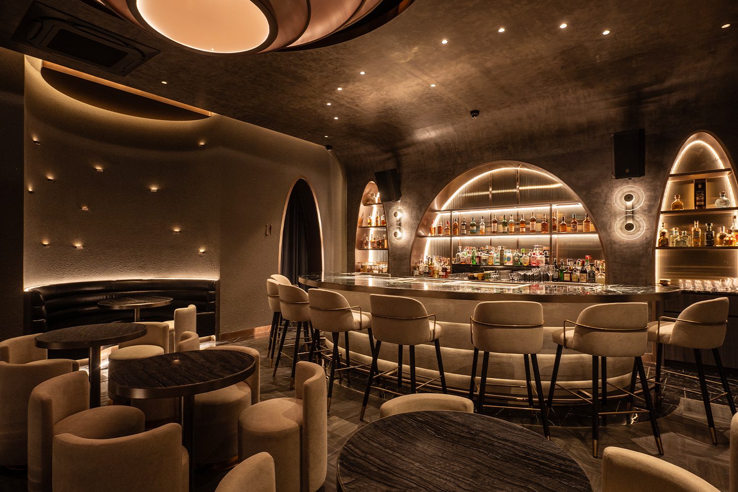
Turaz Bar
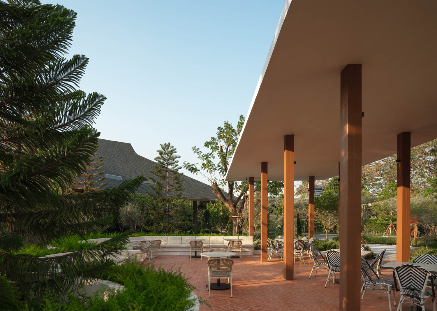
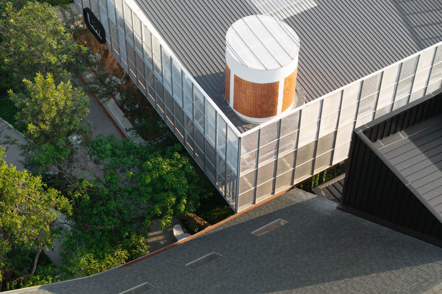
Next to Turaz, where evening visitors spill over to share the space, is BEANS BOY Café, the last venue to be added to the design brief. Positioned at the very end of the axis from the drop-off, the café stands precisely at the visual terminus of the project. Its height was therefore pushed up to match that of a two-storey building, ensuring the overall composition remained balanced rather than lopsided. A truss roof spans the structure, carrying deep overhangs on all four sides to shade the outdoor seating, which is nearly equal in number to the seats inside.
 BEANS BOY


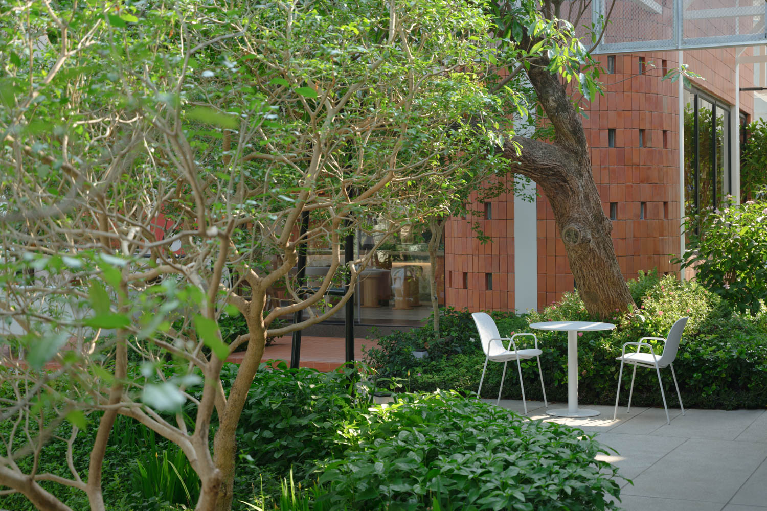
Two standout features of the café, both made of brick, emerged almost by chance. Originally, a curved brick wall was intended to enclose an outdoor seating area, while a tall brick shaft was planned to house the restrooms. Yet after several rounds of revision, these elements took on new roles, becoming the building’s signature features and popular photo backdrops for visitors.
From the perspective of the masterplan, the project faced numerous challenges of spacing and relationship. Each building was conceived at a different time, and the problems that arose could not be resolved as simply as a negotiation between two people. The gap between Cin Cin and Turaz, originally intended as a quiet spot for smokers, instead became a secondary entrance to the project. Likewise, the gap between Turaz and BEANS BOY, which would typically serve as a staff restroom area at the rear, had to be transformed into an alternate entrance. This was achieved by adding a striking façade at the last minute, completed in a whirlwind of work that felt almost like conjuring.
(left to right) BEANS BOY, Turaz and the bathroom with an extended façade as a secondary entrance.
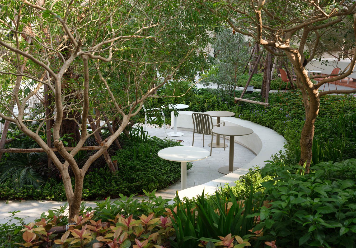
In the end, however, it is the users who will be the true judges of the project. The continuous walkways, shaded corners, and rational functions that invite people to linger all contribute to The Ground’s success as a community space. Constraints and the variety of programs posed challenges in bringing the architecture into a single direction, which, as the designers themselves noted, might even resemble an amusement park with eclectic styles overlapping one another. Yet from another perspective, The Ground tells its story through a multiplicity of identities. In their very diversity, these identities establish a middle ground, allowing each building to assert its individuality while ultimately sharing space and context as part of a collective whole.