AN INTERVIEW WITH AARON NIEH OF AARONNIEHWORKSHOP, SHARING HIS PERSPECTIVES ON GRAPHIC DESIGN—DRAWING ON OVER 20 YEARS OF EXPERIENCE—INCLUDING HOW TO DEFINE THE RIGHT SCOPE OF WORK AND EMBRACE NEW DESIGN POSSIBILITIES
TEXT: NATHATAI TANGCHADAKORN
PHOTO COURTESY OF AARONNIEHWORKSHOP
(For Thai, press here)
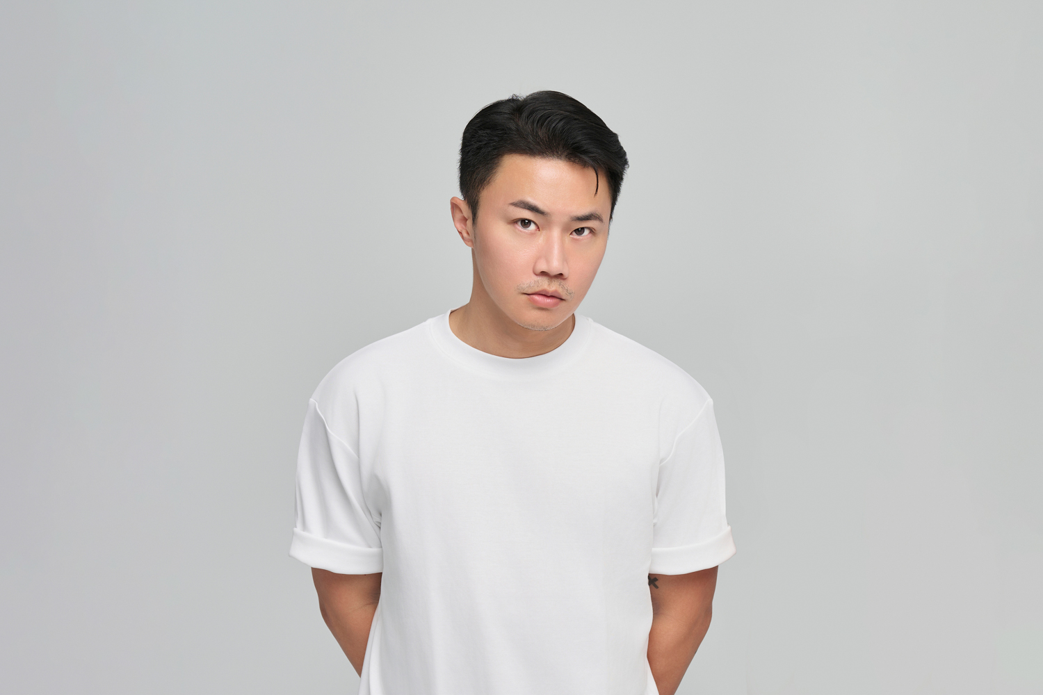
Aaron Nieh, a founder and art director of aaronniehworkshop was recognized as the first individual from Taiwan to join the Alliance Graphique Internationale (AGI) in 2012 and has since spent over a decade being lauded for his influence on the evolving graphic design market in the Chinese-speaking community.
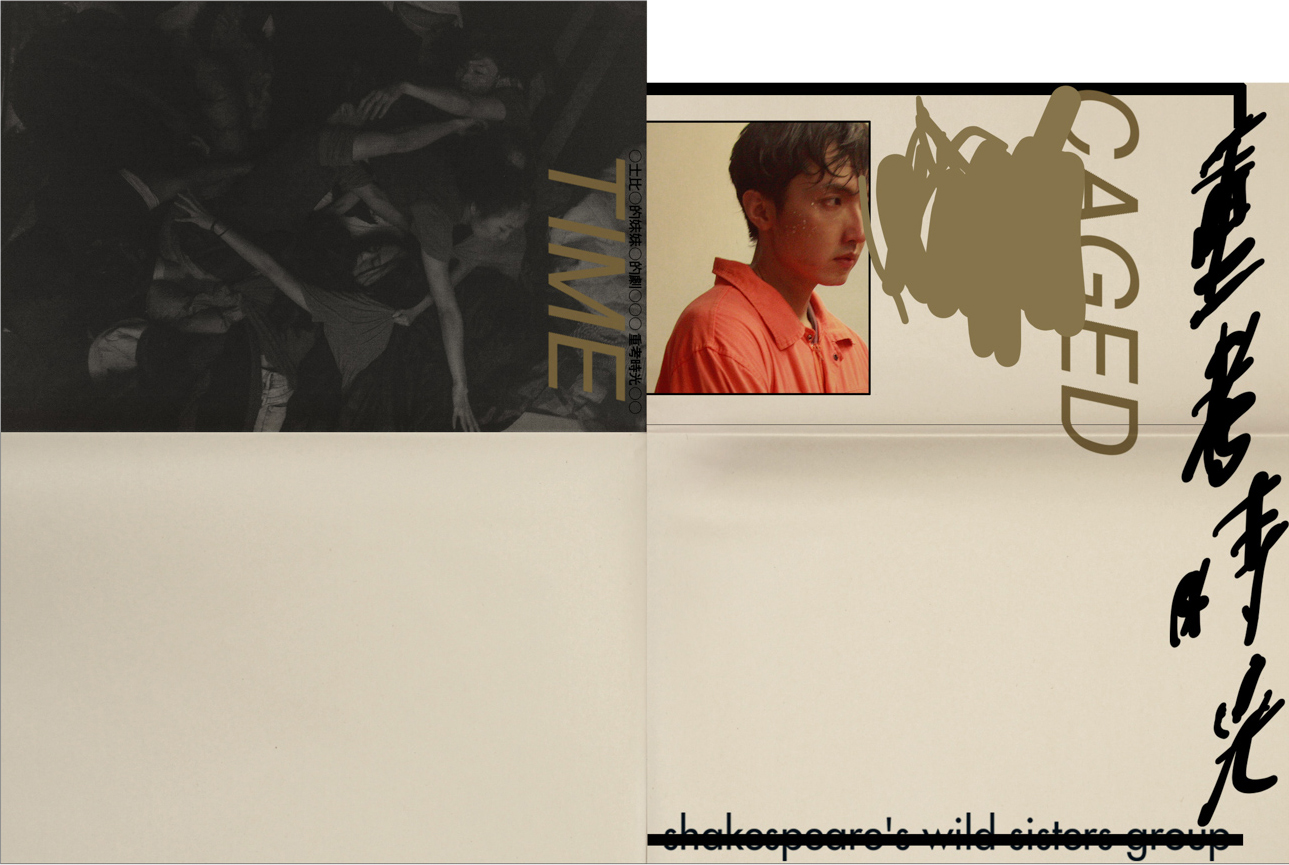
Caged Time
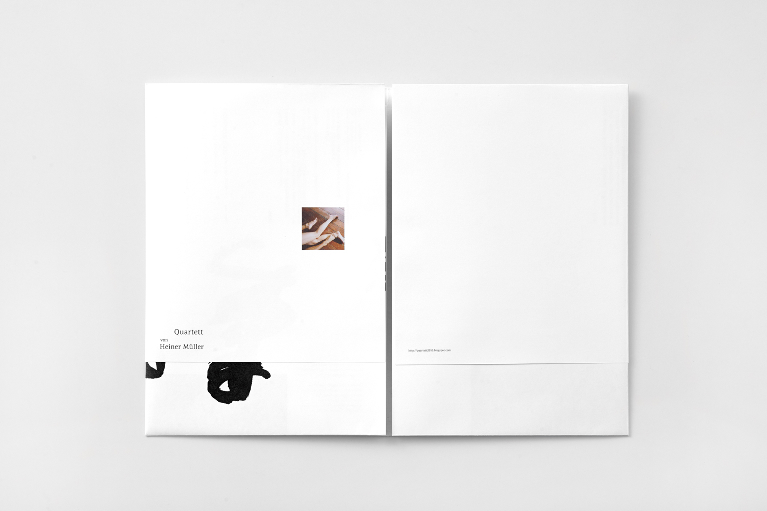
Quartett
For ‘Design Perspectives x Golden Pin Salon Bangkok 2026’ last May, which was held in The Standard, Bangkok Mahanakhon, Aaron became one of the key speakers to share his experiences as an awarded-veteran. aaronniehworkshop (ANW), led by him and Even Chen, is actively involved in brand identity, with a strong presence in the music, publishing, art, and public project sectors. With its unique approach, their works gain various interpretive depths, delivering clear and accessible insights regarding graphic design.
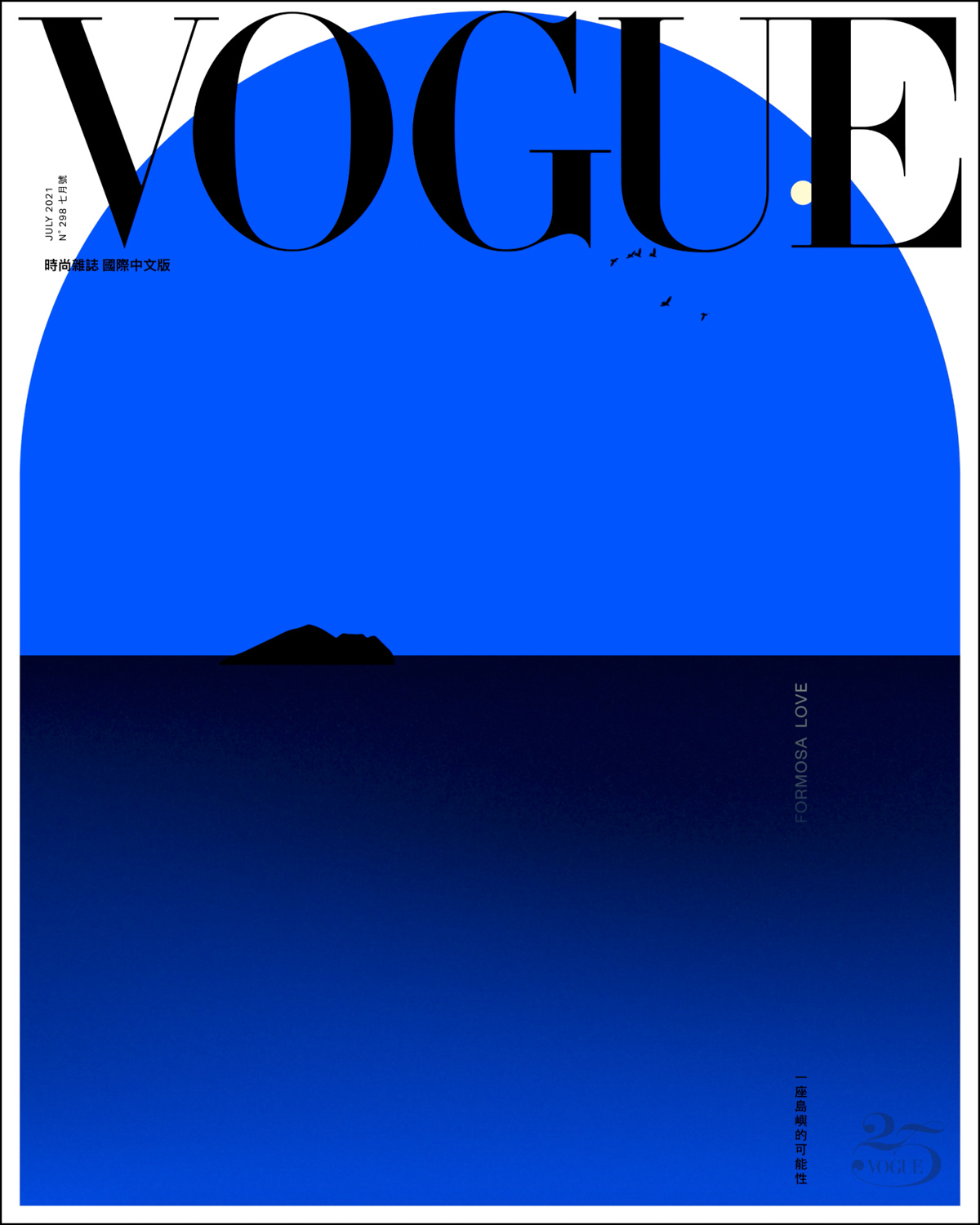
Formosa Love
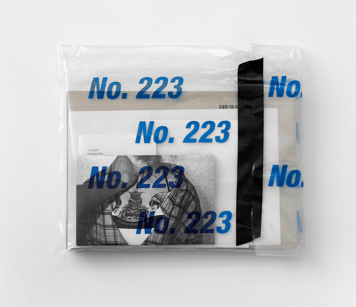
No. 223
art4d: We see aaronniehworkshop do a lot of things. Please tell us about the boundaries of your works.
Aaron Nieh: I specially focus on graphic design and visual communication. But I think we’ve been doing a lot because we have different kinds of clients in different industries. I appreciate all of them; they give us lots of opportunities to learn.
We’ve been doing a very diverse range of designs. Looking back 20 years ago to when I started by designing albums and books, I know I could do more. Since I have broad interests across different areas of graphic design, like packaging, branding, visual identity, typography, and signage, also computational arts. I’ve been trying to prove what I can do by welcoming those new projects, which brings us back to the question about boundaries. I know where my expertise ends. We don’t take on projects that require expertise beyond what we do, such as industrial product design or spatial design. Instead, we prefer collaborating with specialists in those fields.
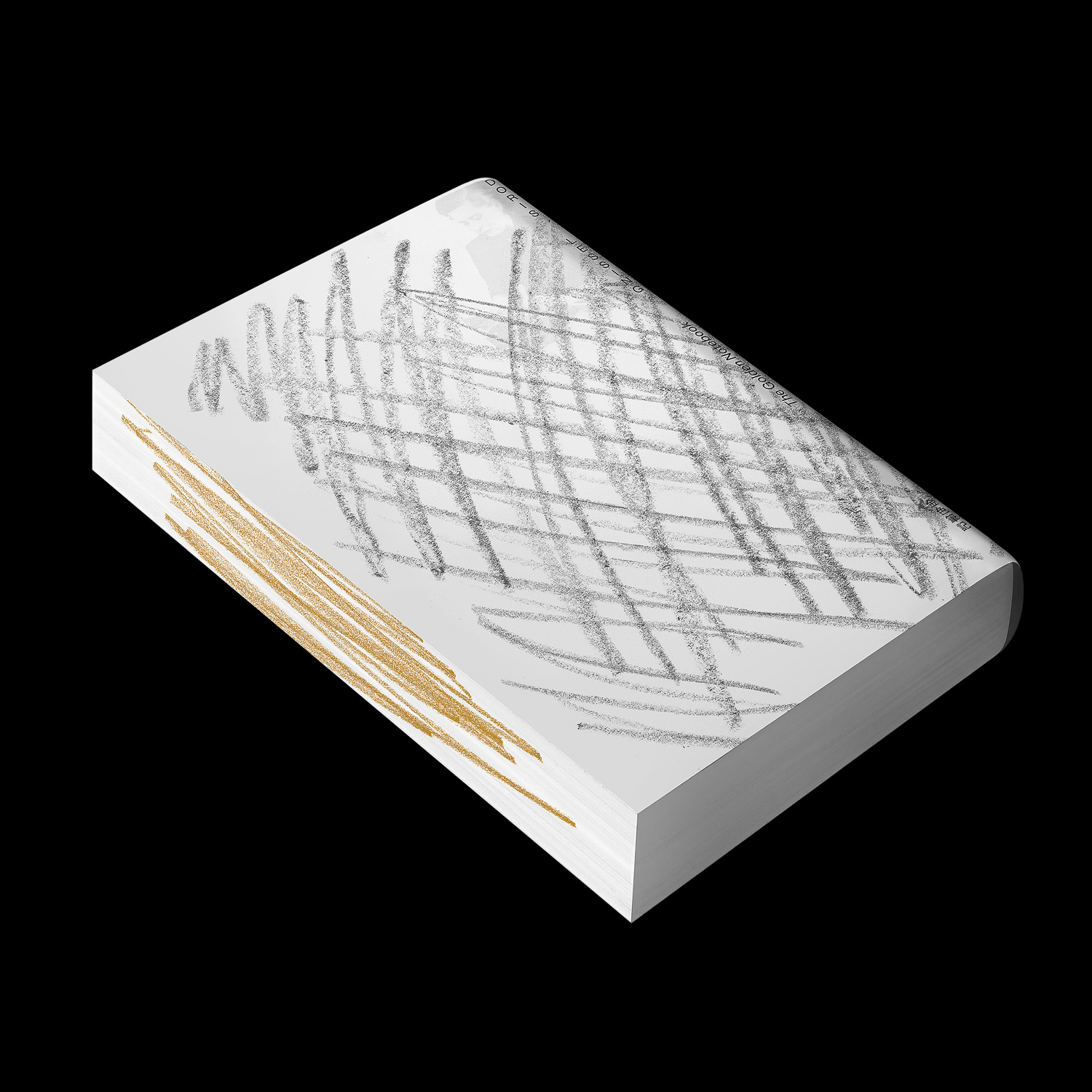 The Golden Notebook
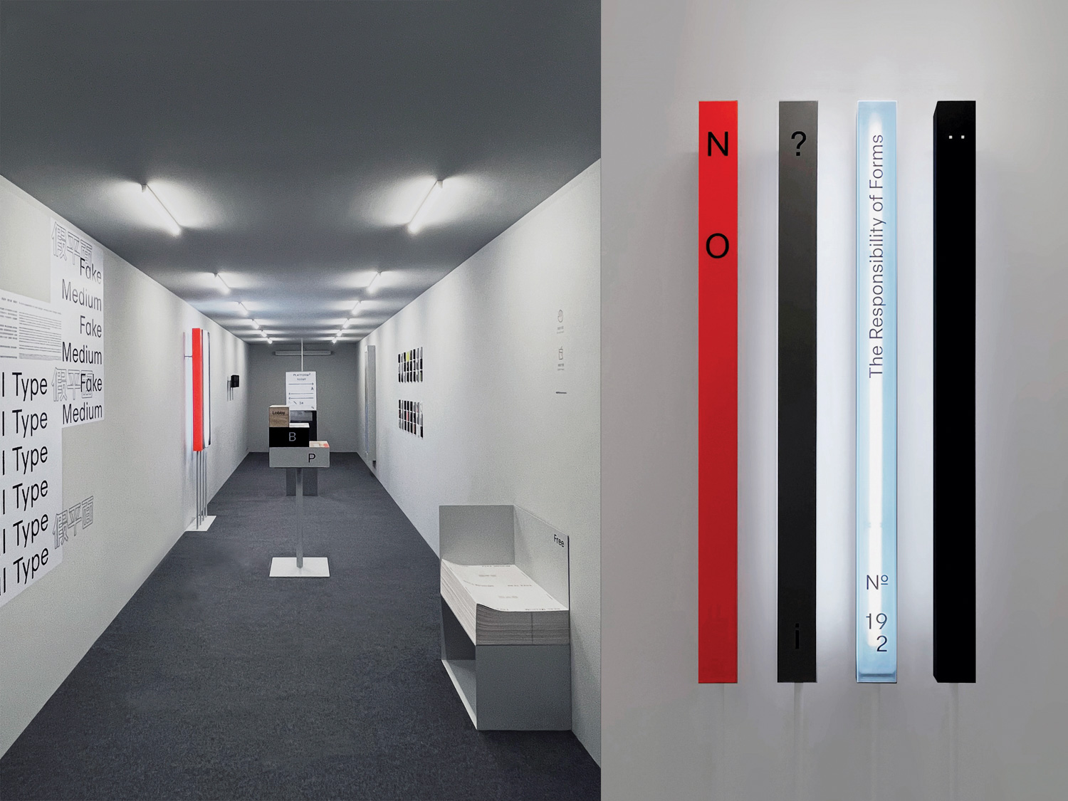
Real Type, Fake Medium (假平面)
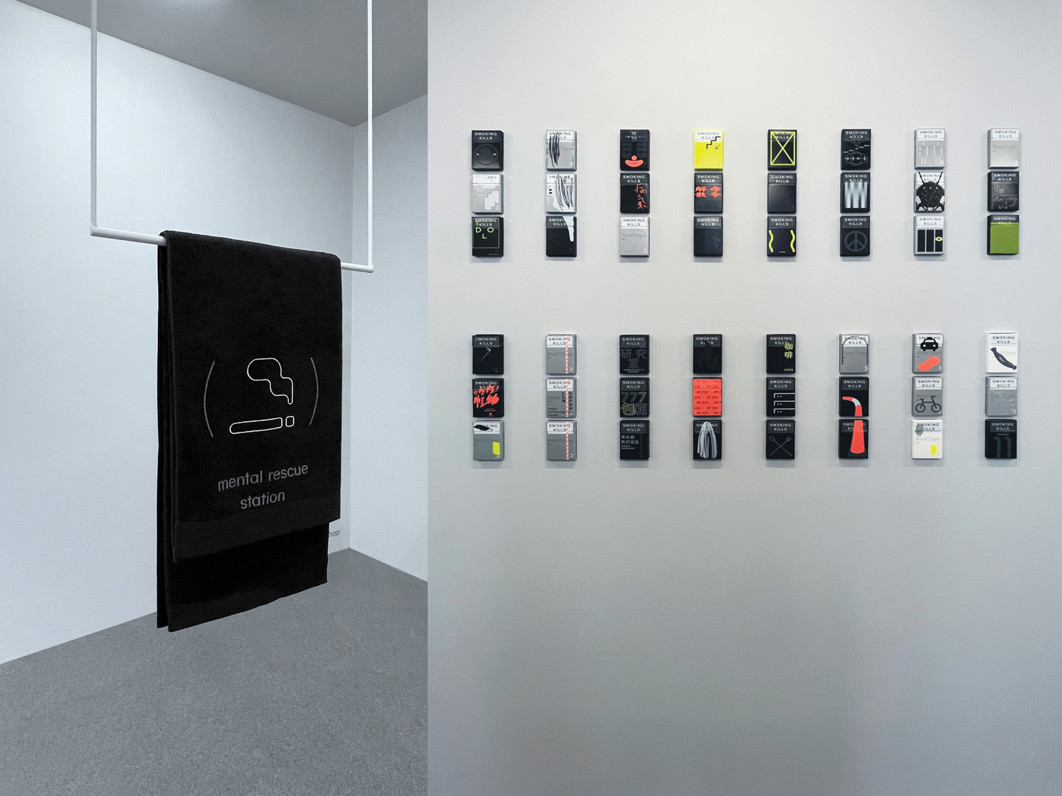
Real Type, Fake Medium (假平面)
art4d: What is your core principle that keeps you from getting lost in your diverse design/art work?
AN: Well, the first rule is, we don’t do those if we’re not sure. I’m not competent enough. And at the same time, I know the quality of that design will not be good enough either.
So even if it has a certain style on it, we clearly know the market structure, the target and curated messages, and the purpose of communication. It is beyond everything. What we’re doing actually is science to make something function better. So I think even if our works look sensational or diverse, surely, behind the cover is endless discussion, it’s rational thinking and dispatch on logic.
art4d: Do you always follow the trend or market?
AN: No, we follow the strategy. The marketing will tell who is our target, but we don’t really follow the trends. Our work just changed from time to time because the environment changed and also our taste. I’ll always be changing, 2 years ago, 10 years ago, 5 years ago.
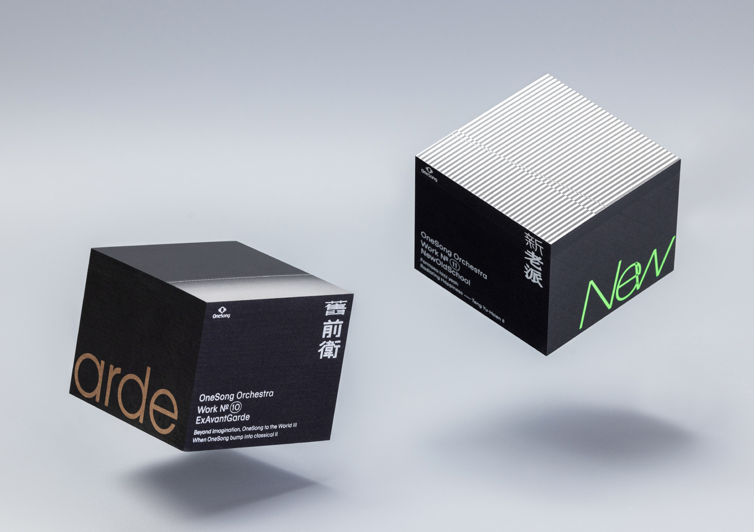 ExAvantGarde & NewOldSchool, album series packaging design for One Song Orchestra
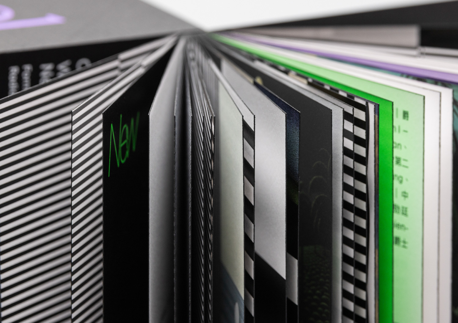
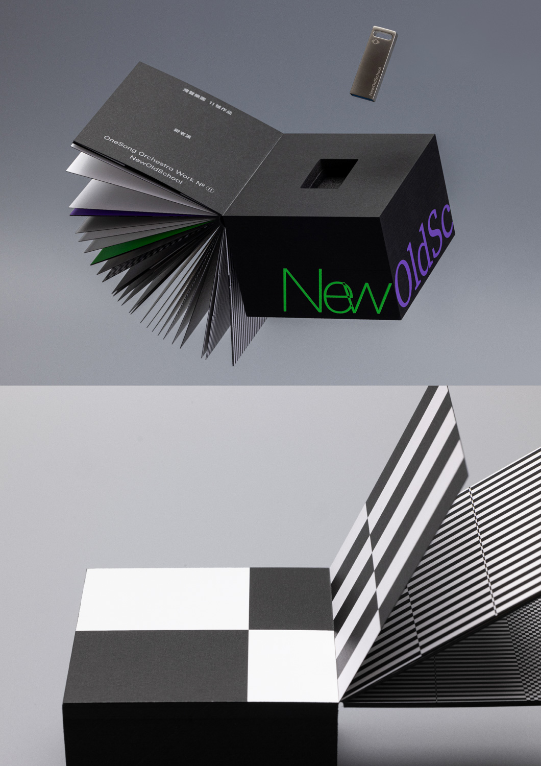
ExAvantGarde & NewOldSchool, album series packaging design for One Song Orchestra
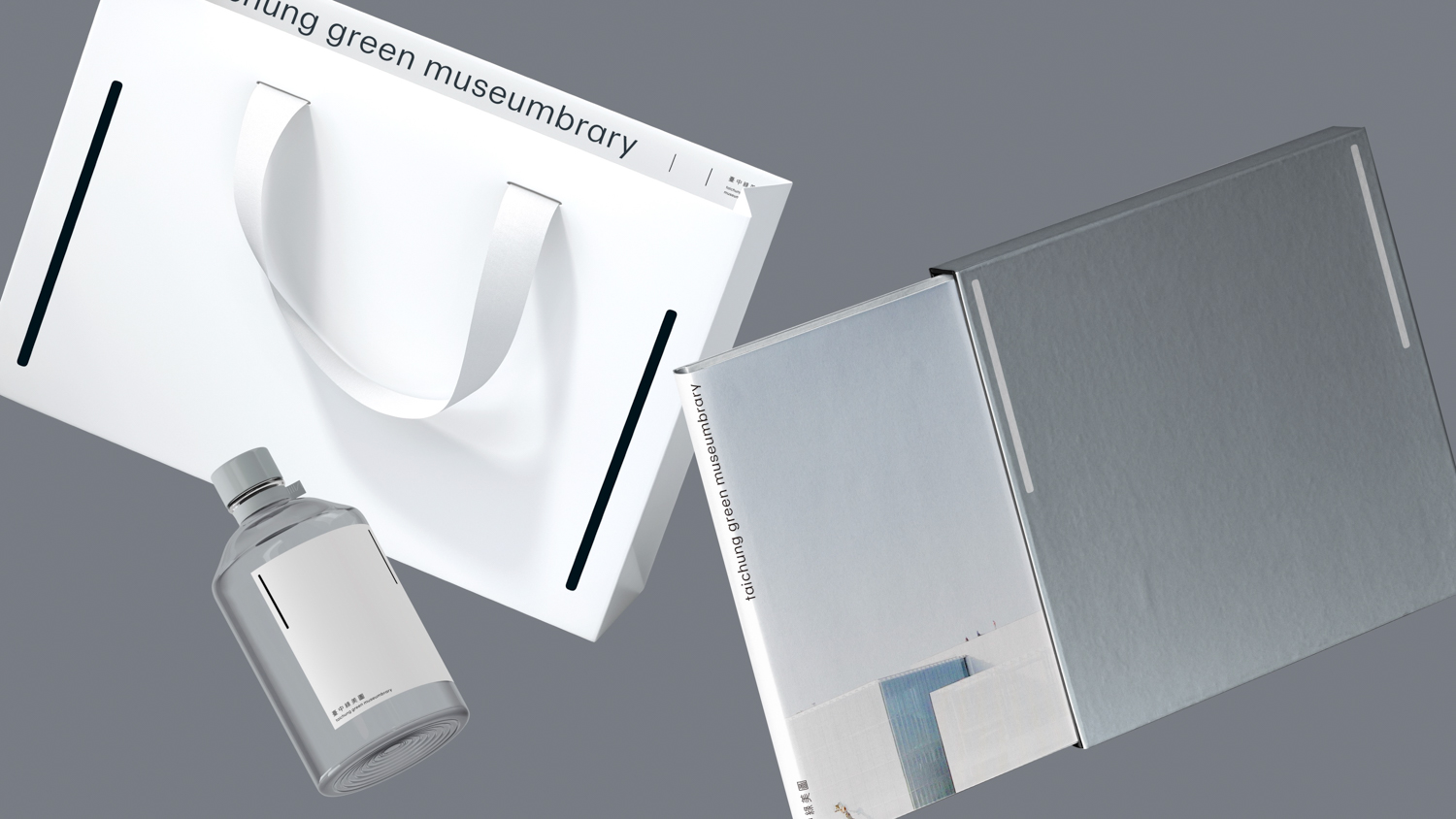
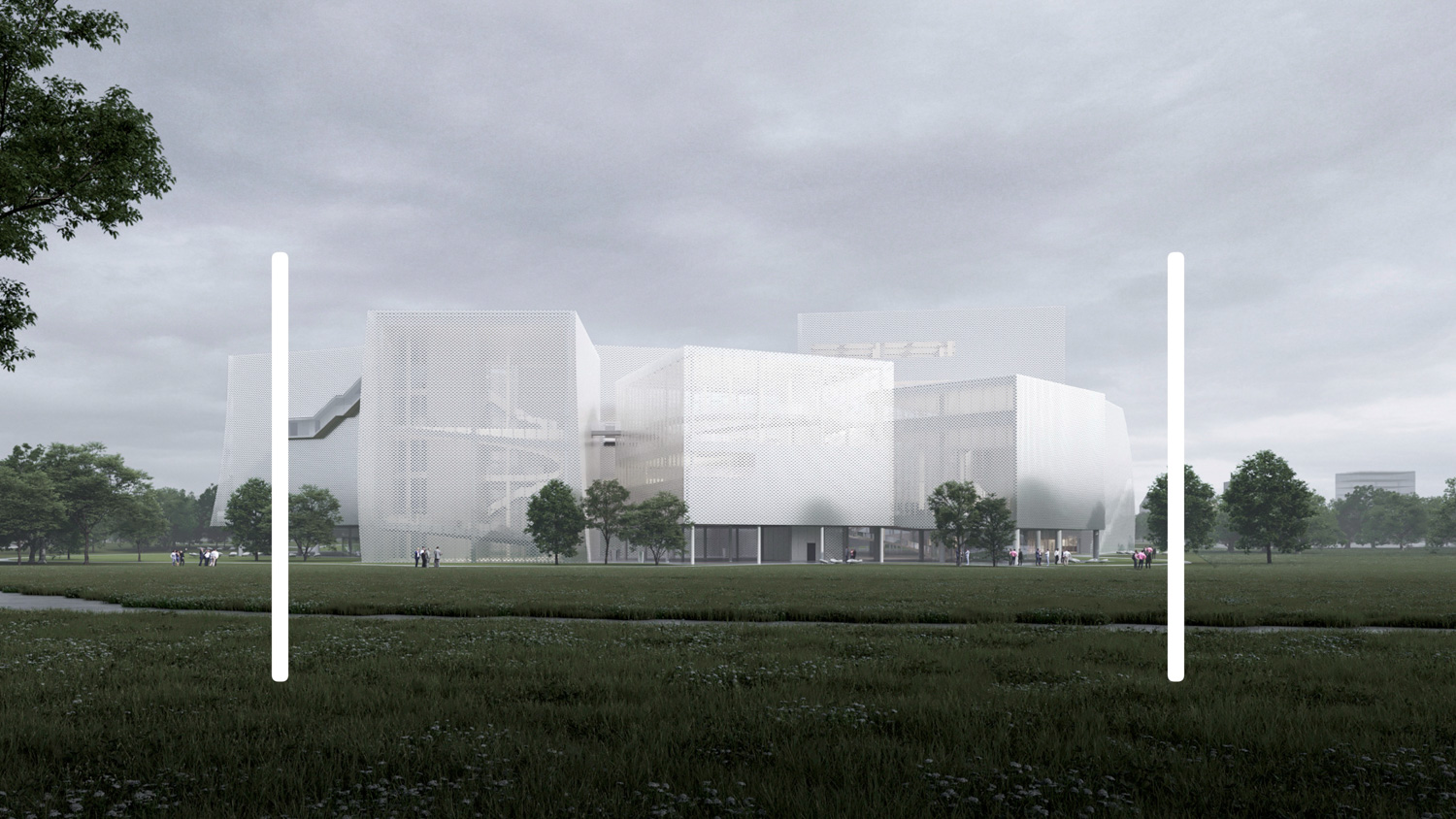
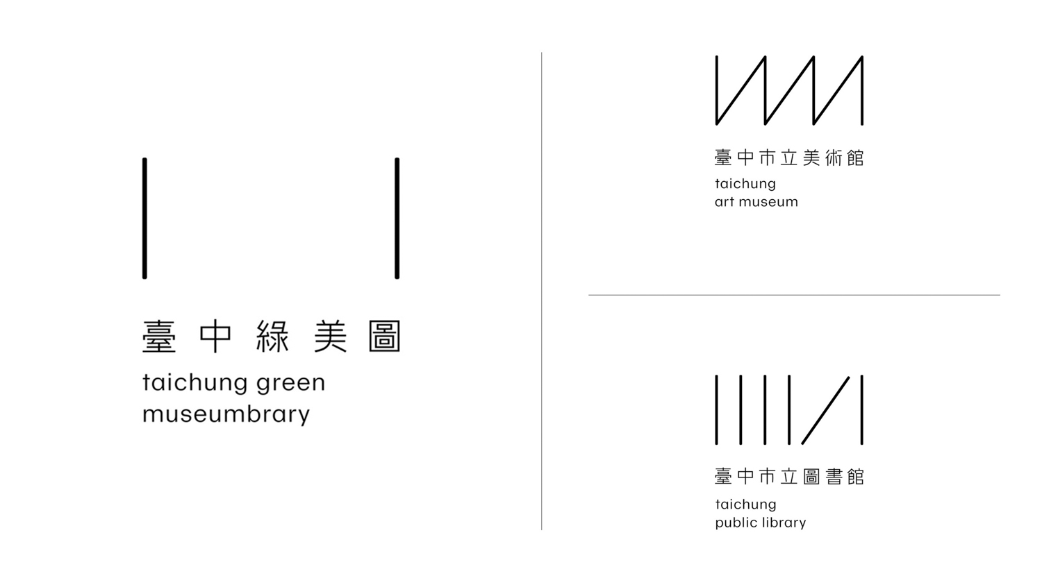
art4d: One of your standout recent projects is designing the visual identity for the Taichung Green Museumbrary, designed by world-renowned architects SANAA. How do you reinterpret unconventional architectural concepts, like integrating a library with a museum, to create its visual identity?
AN: It’s almost impossible to combine the nature of a museum and library into a single piece, if we did this, the graphics will become too complicated, or too conventional, it is not what we do. But in fact, this limitation gives us an opportunity to create a new inclusive and objective symbol mark, allowing the public to form their own interpretation and their imagination on it. So as a result, its simplicity echoes SANAA’s concise language. But more importantly, it represents a contemporary and non-typical theory of logo.
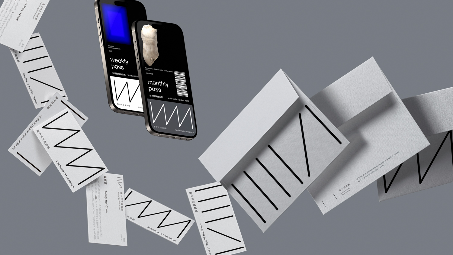 Taichung Green Museumbrary’s visual identity
art4d: You seem to enjoy using black with those eye-catching colors in your works. Does black have a specific meaning to you?
AN: I never noticed that (laugh). But I guess I do love black. It makes me feel I could stabilize anything. And black also could become more charming and vibrant. Maybe for me, it has been internalized. I’m never aware of it.
art4d: Are there any projects you’d like to try in the future?
AN: I don’t have any specific project in mind. I would like to do any kind of work in the field of graphic design. But I want to try designing a piece of furniture or a simple object in a minimalized style for my own home—not as an industrial designer, but as a personal exploration. even though it’s not anything to do with graphics. It would be a way of stepping beyond my own boundaries.
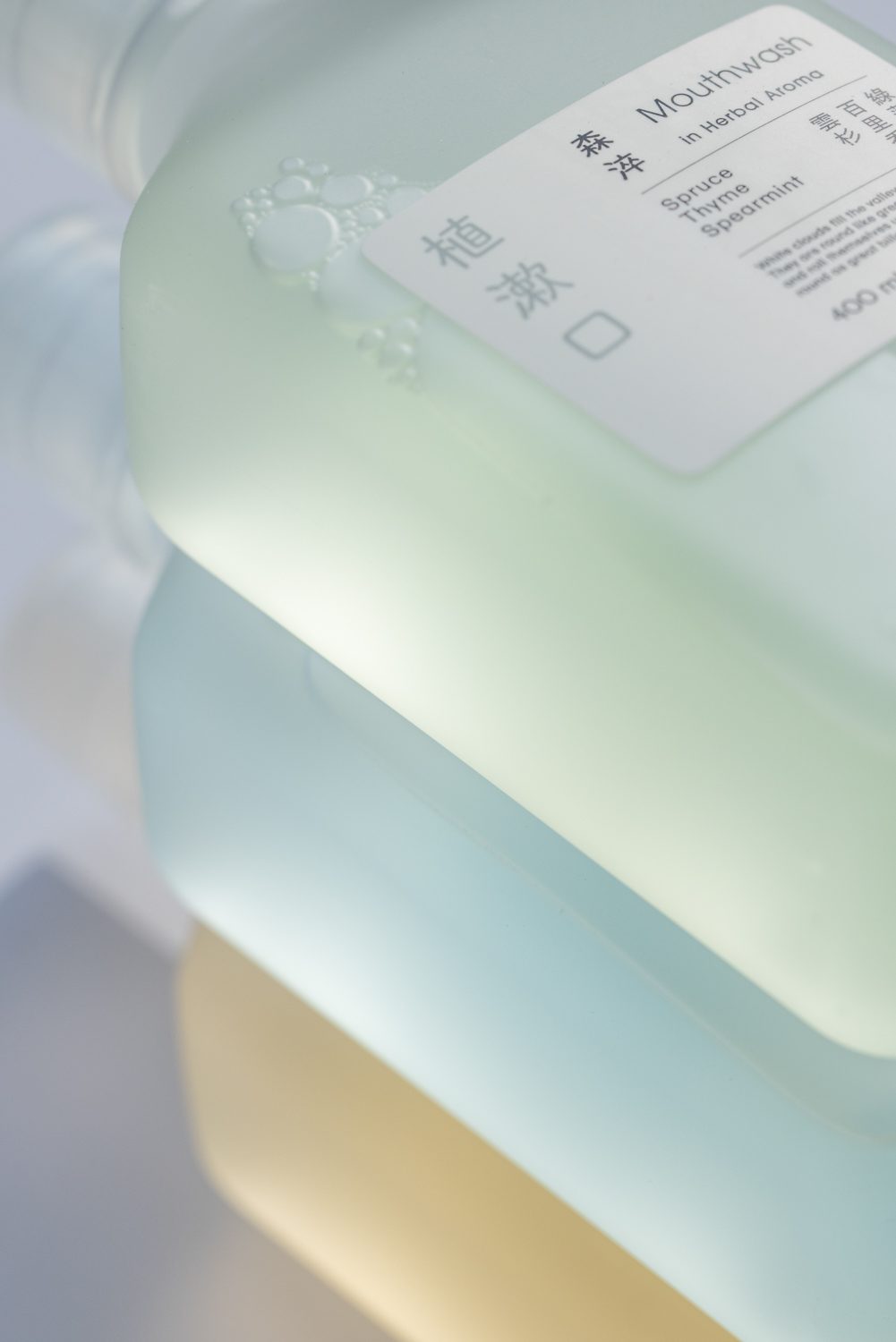
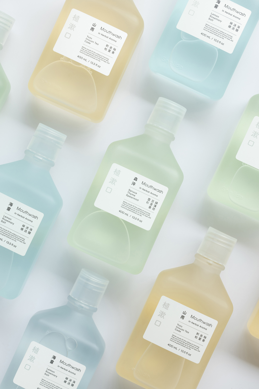 Shallop Mouthwash in Herbal Aroma