AFTER TALKING WITH THIS YOUNG BLOOD ARCHITECT, TIDTANG STUDIO, WE FOUND OUT THAT EVERY HERITAGE BUILDING IN THIS CAPITAL CITY CAN BE TRANSFORMED INTO A HOSTEL
TEXT: WICHIT HORYINGSAWAD
PORTRAIT: KETSIREE WONGWAN
PHOTO CREDIT AS NOTED
(For Thai, press here)
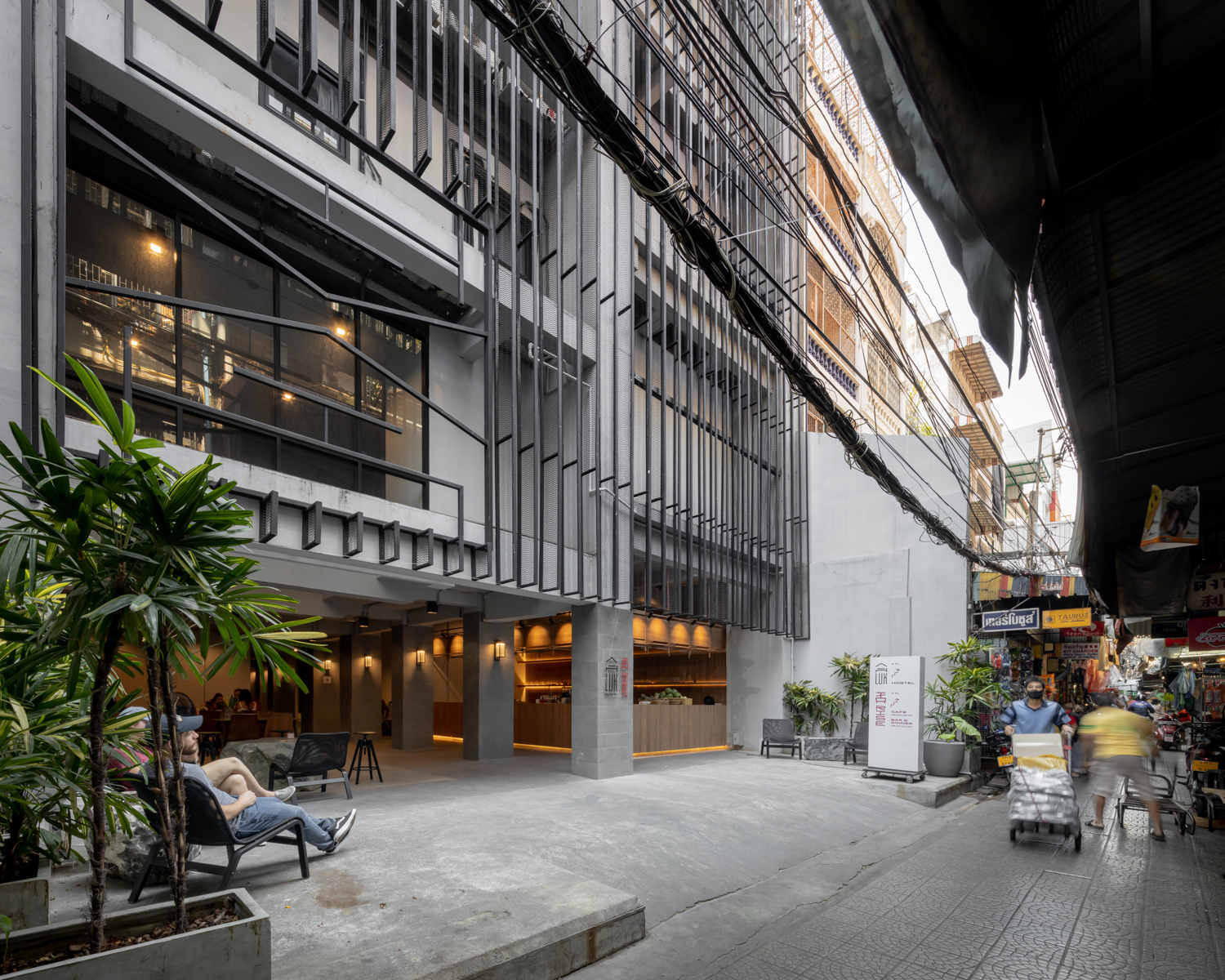
After the overwhelming success of Once Again Hostel (2014) that has earned the establishment incredible popularity amongst international travellers, last year, the very same business partners of the project finally kicked off their Luk Hostel (2019) at the center of a long-standing Chinese community in Sampeng area of Bangkok. In addition to the accommodation, Luk Hostel presents itself as a place that brings together vibrant cultural activities (live music performances at the hostel’s rooftop). What’s also interesting about the two hostels is the fact that they are both renovation projects by a team of architects from TIDTANG STUDIO. art4d invites the two principle architects and founders of the studio, Pattakorn Thanasanaksorn and Suppat Pornputtkul to talk about all the interesting issues surrounding the architectural renovation, including their approach and vision towards this particular style of design.
Photo: Chaovarith Poonphol“The building used to be a printing house that belonged to my family,” Thanasanaksorn recalls the beginning of the design process of Once Again Hostel, which originated from the question: What would be the most suitable business that would bring back life to this 30-year-old building? It was then the idea of a hostel came to mind
“None of the family members have a background in hospitality or hotel management but I’ve always wanted to own and run an accommodation-related business. I personally think that the space of the building is rather more special than that of other hostels. Being a former printing house, the building has significantly higher floor space of almost four meters. If the building were to be transformed into a hostel, it would grant the kind of space that would be so much more spacious than what we would normally see in hostels, mostly renovated from old houses or low-rise shophouses.”
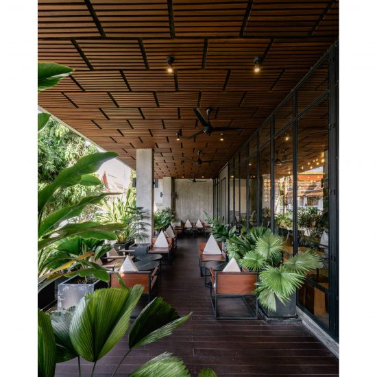
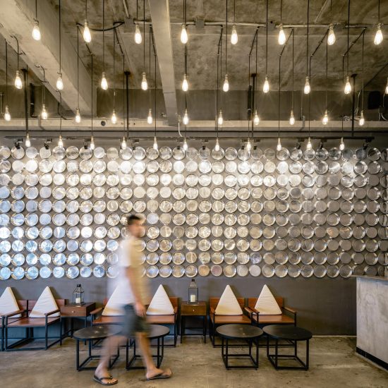
With Once Again Hostel being located on Mahachai Street in an old town district of Rattanakosin Island, ancient Thai architectural aesthetics is the main idea incorporated into the renovation. “When we think of ancient Thai architecture, we think of dark wood like Mai Daeng (Xylia xylocarpa) or old wood, or exposed concrete walls. The concrete walls are there, not because it’s a cool looking trend but it gives out this unique characteristic of old materials like one of those time-worn plastered walls.” Thanasanaksorn elaborates that other elements of the decoration make use of everyday life objects from the surrounding local neighborhoods, from the use of the covers of Bart (monk’s alms-bowl) for the decoration of the lobby with reference to the nearby Baan Bart Community, home to local establishments where artisans make monk’s alms bowl for a living. There are also details that take inspirations from Thai people’s behaviors, for example, the hostel’s small community space is designed for everyone to sit on the floor. The space is similar to a porch in traditional Thai houses with openings that welcome a great amount of light. Such approaches can also be found in the details of each room such as the door grills, commonly found in shophouses in Thailand, which are used to partition sleeping units, offering an extra level of privacy and security to the guests at the same time.
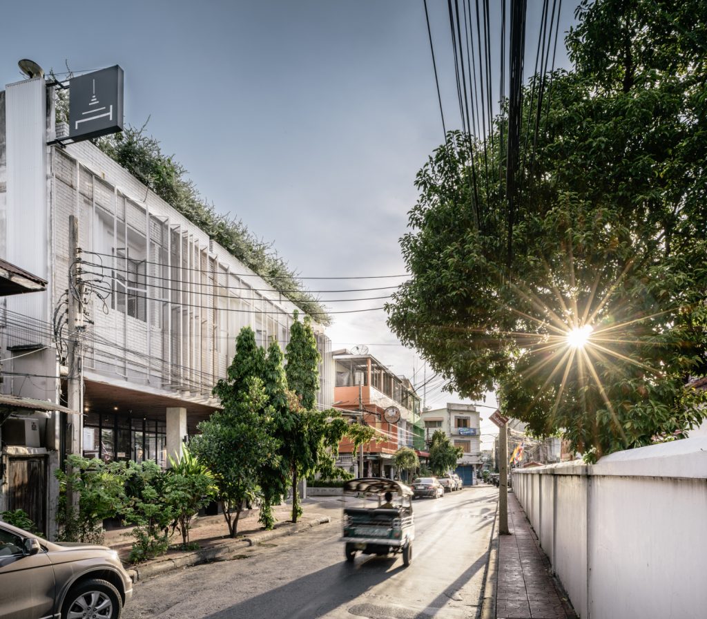
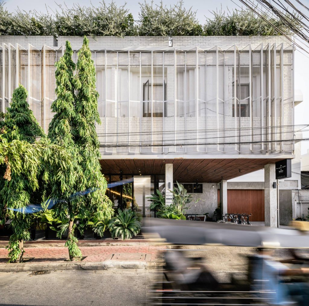
Photo: Ketsiree Wongwan“Before the renovation, the hallway at the front was this completely enclosed room, so we readjusted the space to accommodate the new functionality by opening and turning the entire left side of the building into the lobby. The entire fence was taken out because we want the hostel to feel like this friendly public space for people who walk by.” The design of the façade is elaborated with Pornputtkul telling art4d that the renovation of the old printing house into a hostel required them to rightly adjust and control openings to suit the new functionalities. “We couldn’t really do big openings due to the limitation of the floor plan and the location of the beds, so some of the openings need to be smaller to maximize the guests’ privacy. The façade is redesigned to have recessed corners inspired by the architecture of Wat Thepthidaram temple across the street from the hostel. There is also another layer of the façade, a series of folding steel grate panels that can be extended to create dynamic movements. The façade also serves as a blind that blocks outsiders from visually accessing the rooms while keeping the rooms from disturbing the monks in the temple across the street.
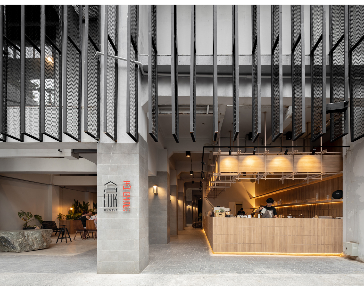
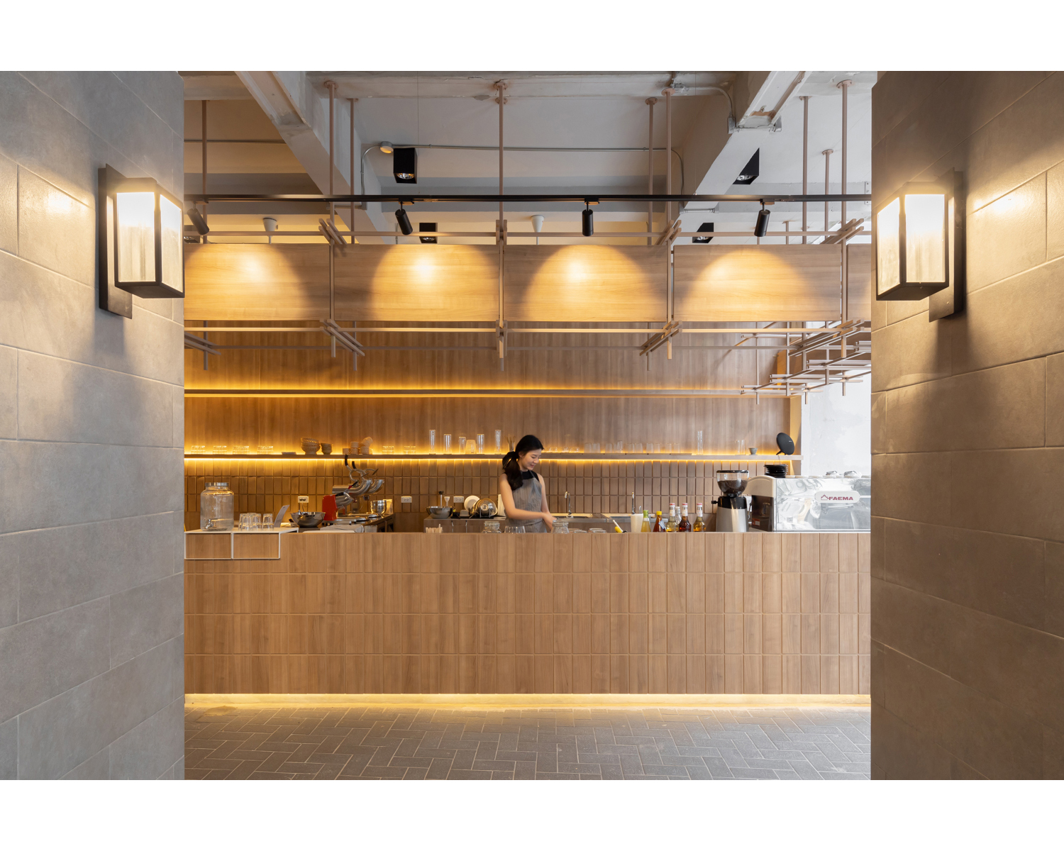
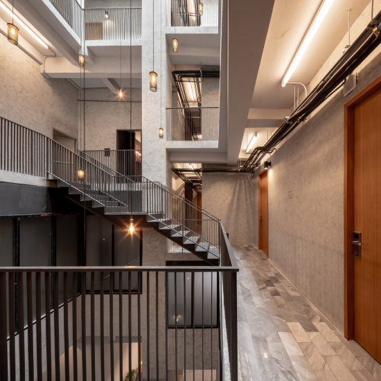
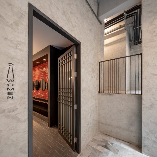
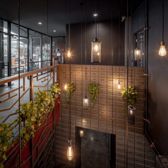
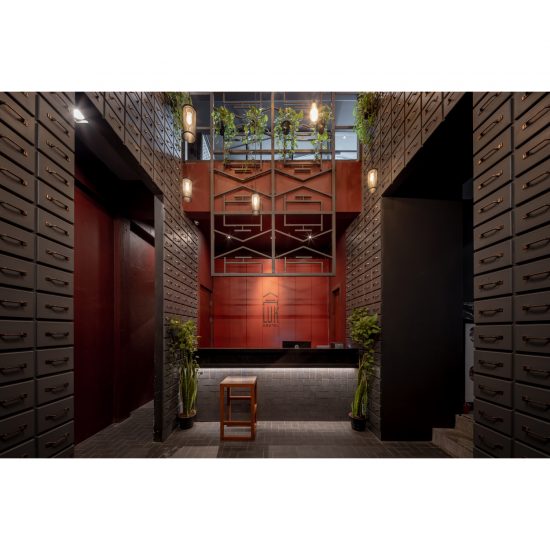
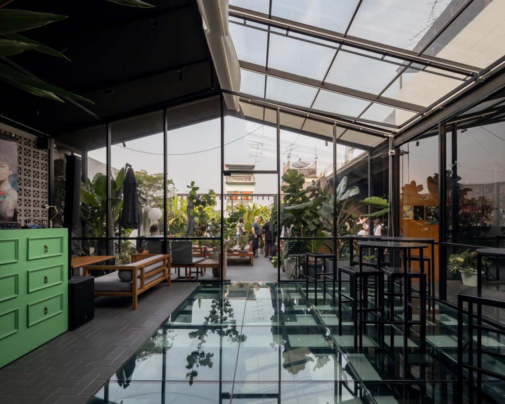
Photo: Ketsiree WongwanLuk Hostel is a two-unit shophouse with an approximate depth of 30 meters, formerly an old shopping mall named Sampeng Plaza. The building comes with a massive opening (originally the mall’s escalator hall), so the difficulty of the renovation lies in the two buildings having a different number of floors despite their rooftop floors being of the same height. The use of steel staircase to connect different functional spaces at different floor levels helps resolve the issue. “We designed the ground floor to have these retail spaces for rent. Our idea was to locate the reception area up on the 5th floor because guests would normally have to take an elevator to the upper floors to get to their rooms anyway. So, after the check-in, they could just walk down the stairs to their rooms on the lower floors.” The space on the 5th floor is also designed to be a double space to optimize the spaciousness and facilitate access to the 6th floor (rooftop). From the lobby, guests can also hear noise from activities on the rooftop.
Photo: Ketsiree WongwanThanasanaksorn shares some of his views about the hostel business with us. “We’ve been trying to analyze why Once Again Hostel has received positive feedbacks and found out that most hostels overseas with high ratings and positive reviews often have common areas that are somewhat more special than other establishments of similar nature.” This became the reason for the architects to put the hostel’s common area on the rooftop. What they also learnt from Once Again Hostel is the number of beds in dormitory rooms. “Once Again Hostel made us realize that the more number of beds in a room, the cheaper the price. At the same time, we also discovered that if the prices listed in the online ad were too high, people wouldn’t click on them at all. With Luk Hostel, we tested the market with the 24-bed room with the cheaper price to get people to click on the ad and check out our website, but we also have the private rooms with prices way more expensive. They’re different groups of customers but everyone is granted access to the rooftop common area.”
Pornputtkul sums up TIDTANG STUDIO’s experiences of working on the two renovation projects. “We need to analyze and find the identity of that particular building. The heart of the renovation is choosing what to keep, not tearing everything down and shoving the entire 100% of who we are into the design because keeping the building’s original identity is equally as important. For example, filling a void could end up giving you more space that can be turned into rooms. That’s functionally understandable but it wouldn’t worth losing the identity of the building. Our approach to design is trying to find a new functionality that can help us keep a certain element as a part of the building because it’s related to the way the work impacts people, not to mention the aspect of budget management it involves.” Thanasanaksorn further adds, “I think having an impression is seeing something and feeling impressed by it. The word impressive is rather abstract and subjective and everybody has a different opinion about it; but for me a building that impresses people is created from spaces and lines materialized during the design process. When we work on a project, it isn’t about creating a beautiful-looking decoration. A good work of architecture should have its own, clear and distinctive identity.”


