A 90 YEARS SHOPHOUSE THAT STU/D/O ARCHITECTS PARTIALLY REPLACES THE STRUCTURE AND ADJUSTS THE SPACE TO MAKE IT FUNCTIONAL WHILE ENCAPSULATING A SENSE OF NOSTALGIA THROUGH ITS TRACE WITHIN
TEXT: PRATCHAYAPOL LERTWICHA
PHOTO: STU/D/O ARCHITECTS AND KUKKONG THIRATHOMRONGKIAT
(For Thai, press here)
When a person reaches the age of 90, they undeniably become designated as a senior citizen. Yet for Baan Trok Tua Ngork, a building with over 90 years of history located in Trok Tua Ngork alley in Bangkok’s Pom Prap Sattru Phai district, the journey to its 100-year milestone is the start of a new, exciting chapter.
From a family home to a chili paste factory, an office, and at one point in time, a built structure with a majority of space left unused, Baan Trok Tua Ngork has stood the test of time, having been lived in by people from different generations. Today, after having Stu/D/O Architects at the helm of the renovation, the home has been given new life as a venue with rental spaces ideal for exhibitions, activities, and other potential functions.
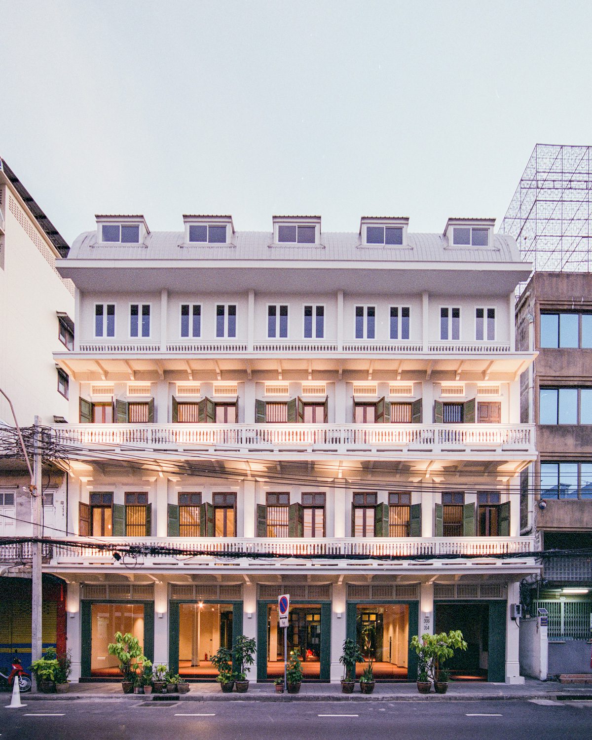
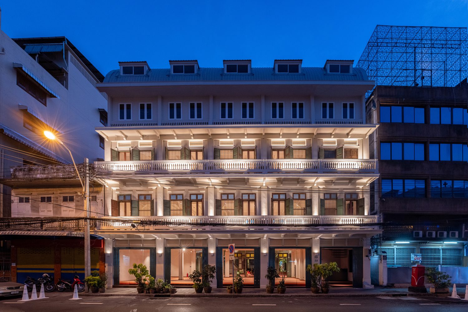
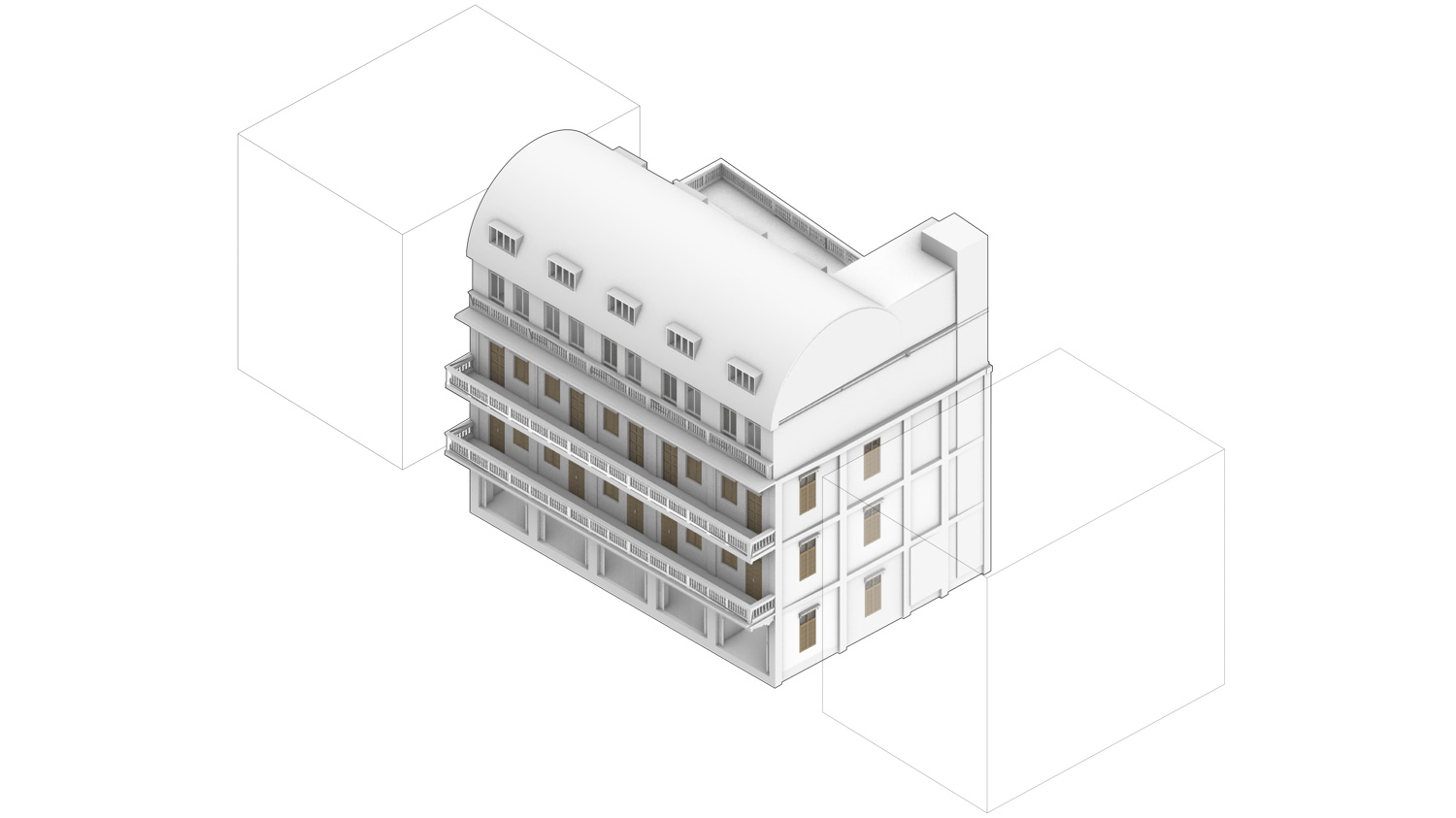
Baan Trok Tua Ngork is a five-story building made up of five units of shophouse. At the back of the building sits a trapezoidal-shaped courtyard whose widest size measures up to 5 meters. Behind the area is a small building that was once used as accommodations for workers. The building’s front was originally four stories high before the rooftop floor was converted into the top floor and used as the room where ancestral rites were performed.
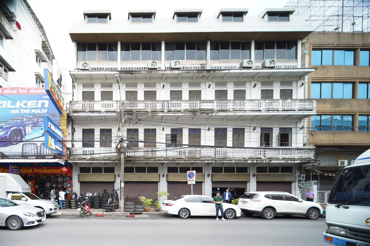
“Baan Trok Tua Ngork was initially the home of a family of Chinese immigrants who settled down in Thailand,” Apichart Srirojanapinyo, architect of Stu/D/O Architects, explained the building’s history. “It was originally a multigenerational home where five extended families lived together. It was also used as a chili paste shop and production base, as well as an insurance company’s office, which were also businesses run by family members. As time passed, the space became too small to accommodate everyone. Each family began to move out, leaving the building empty except for the time of ancestor worships, when relatives gathered in the room on the top floor to pay respect to deceased family members and ancestors.
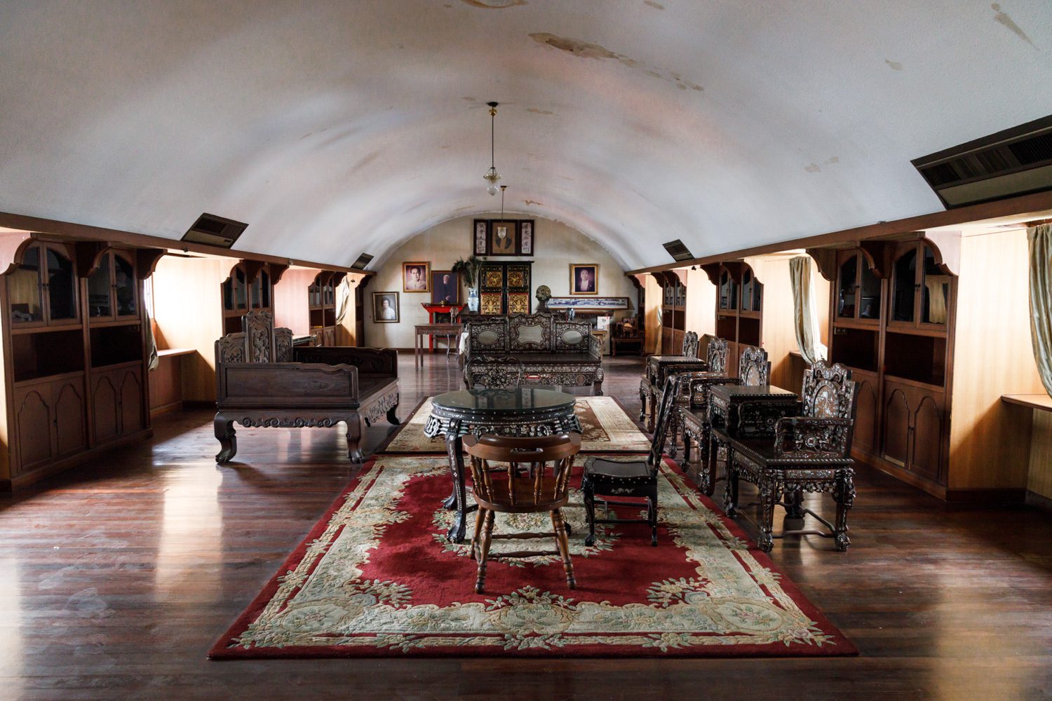
The ancestor room before renovation
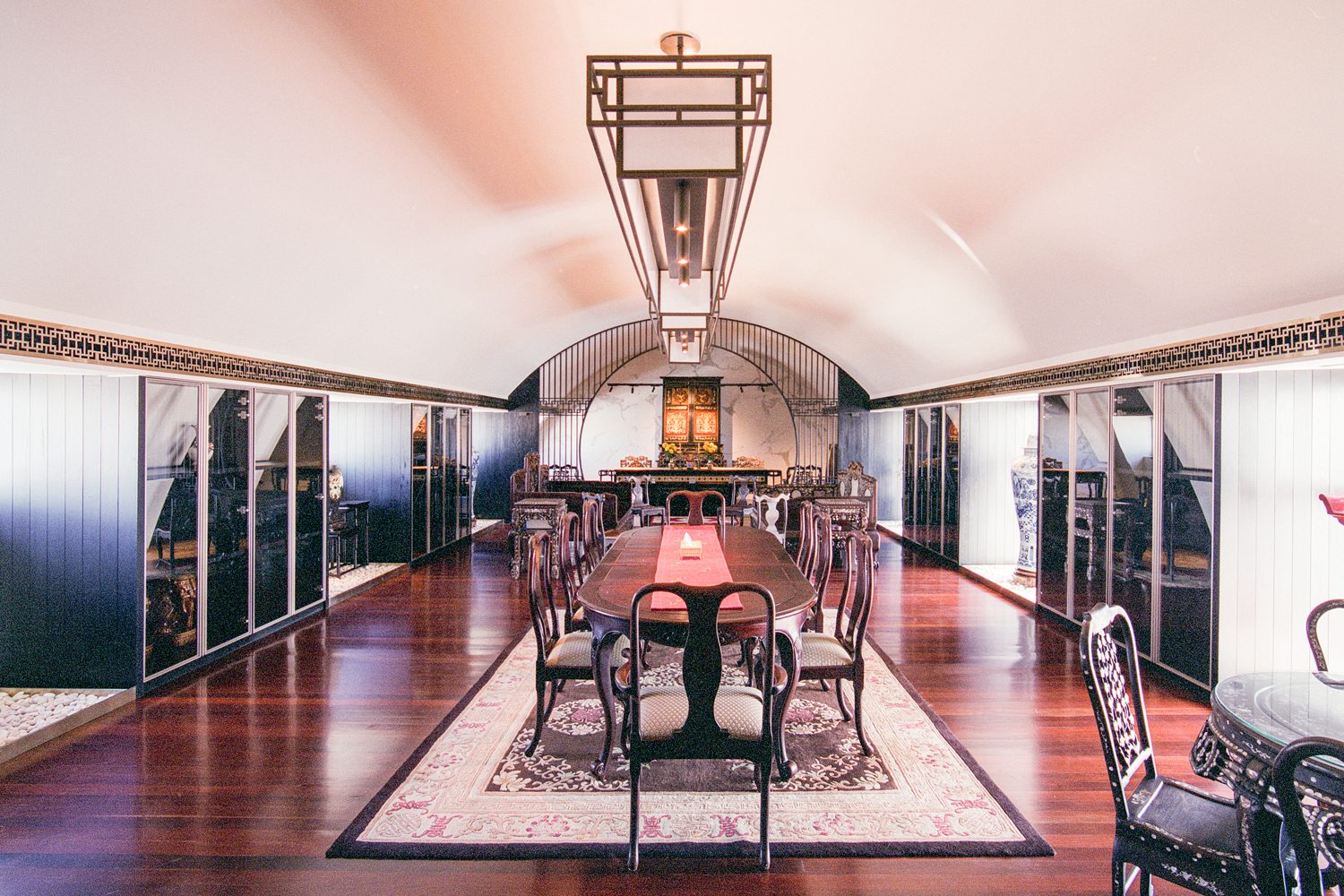
The ancestor room after renovation
After seeing the building neglected for a great many years, the fourth-generation members of the family were seeking ways to bring it back to life. The initial thought was to build a café, a restaurant, and a small hotel. Everyone debated the idea and eventually agreed on renting out the spaces with the demand for additional system works to be done to prepare the building for future expansion.

Converting an old building into rental spaces didn’t sound like a difficult task, given that they would be developing a layout with empty spaces for people to use for whatever purposes they desired. As it turned out, the new program was the most challenging task for the design team. For the rental spaces to be used for different kinds of activities, the building would have to be able to hold the weight of hundreds of people. This means that any extra functionalities added to the building in the future would burden its structural framework with more weight.
“One of the first ideas we came up with was incorporating reinforced concrete into the structure of the building,” explained Chanasit Cholasuek, another architect at Stu/D/O Architects. “We experimented on many designs of reinforced structures, from the one that blended every structural component together to the one that emphasized the distinct contrast between the old and new frameworks. The end result was relatively decent, but we felt that the procedure would end up removing the true spirit of the building.”

When the idea of using reinforced structures to merge the new and old structural elements didn’t work out as planned, Stu/D/O Architects and the engineering team brainstormed for alternative solutions before arriving at the method that delivered the intended final outcome. They took down the building’s first floor so that less weight would be put on the existing base. The first floor was then rebuilt on a new foundation with new foundation piles. “We excavated the entire first level of the building so that the rest of the building could support more weight because the weight of the first floor was removed,” Apichart revealed. “Then we incorporated a new first-floor structure into the existing building fabric, as well as new structural components for the elevator shaft and a new set of stairs.”
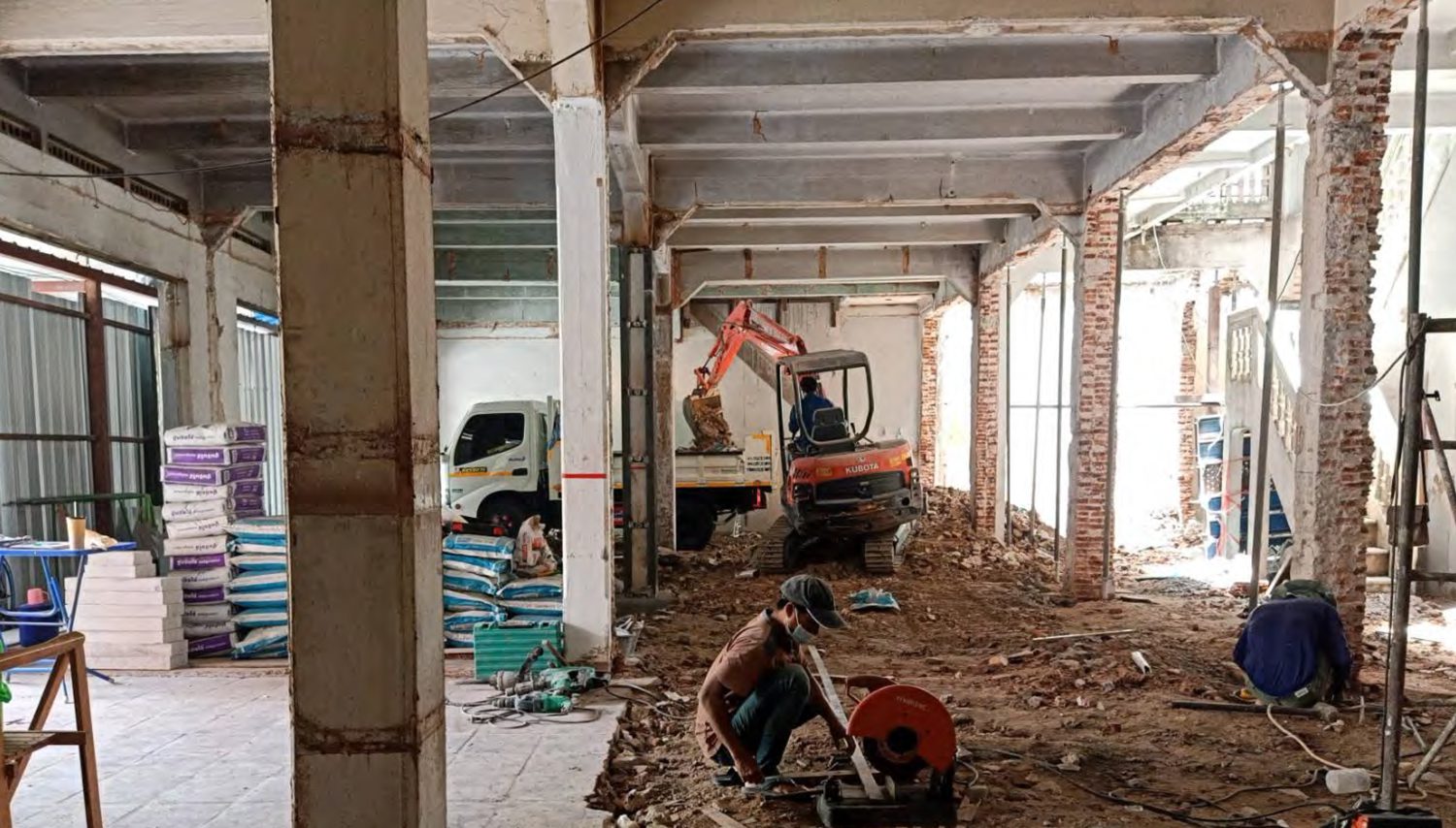

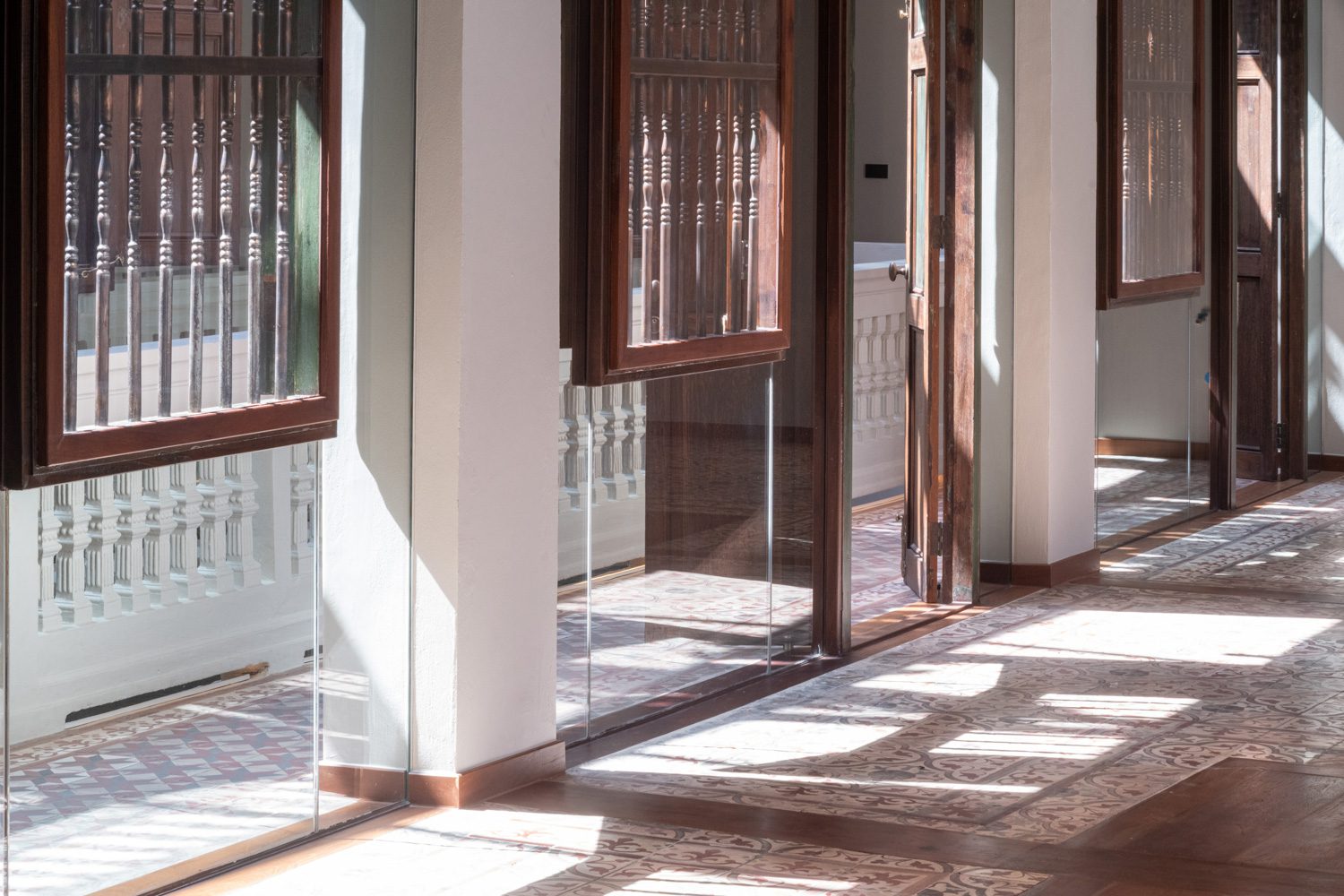
What would be inevitable when the old and new structures coexisted was the varied degrees of consolidation. To mitigate that, the design leaves calculated spaces between the points where the old and new structures merged. Not only that, the architect designed the glass walls of the central court next to the original building to overlap with the walls adjacent to the new building. These walls contain a red gradient that matches the tone of the tiles on the first floor. Should the first floor structure ever consolidate, the gradient detail of the glass wall will help hide it from being visible from the outside.

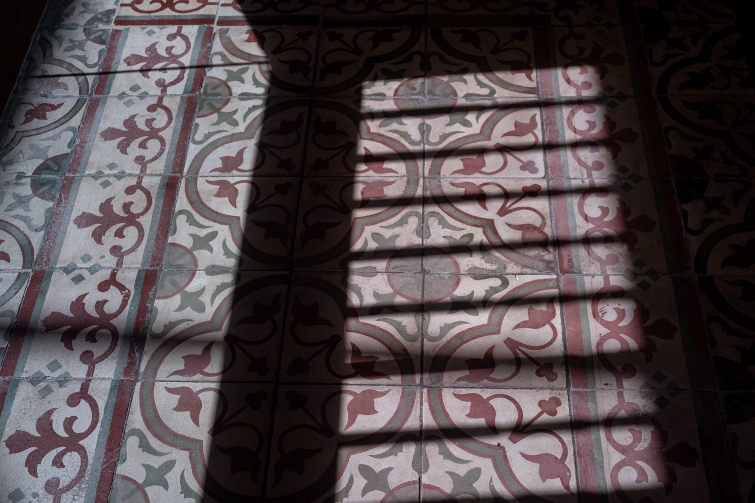
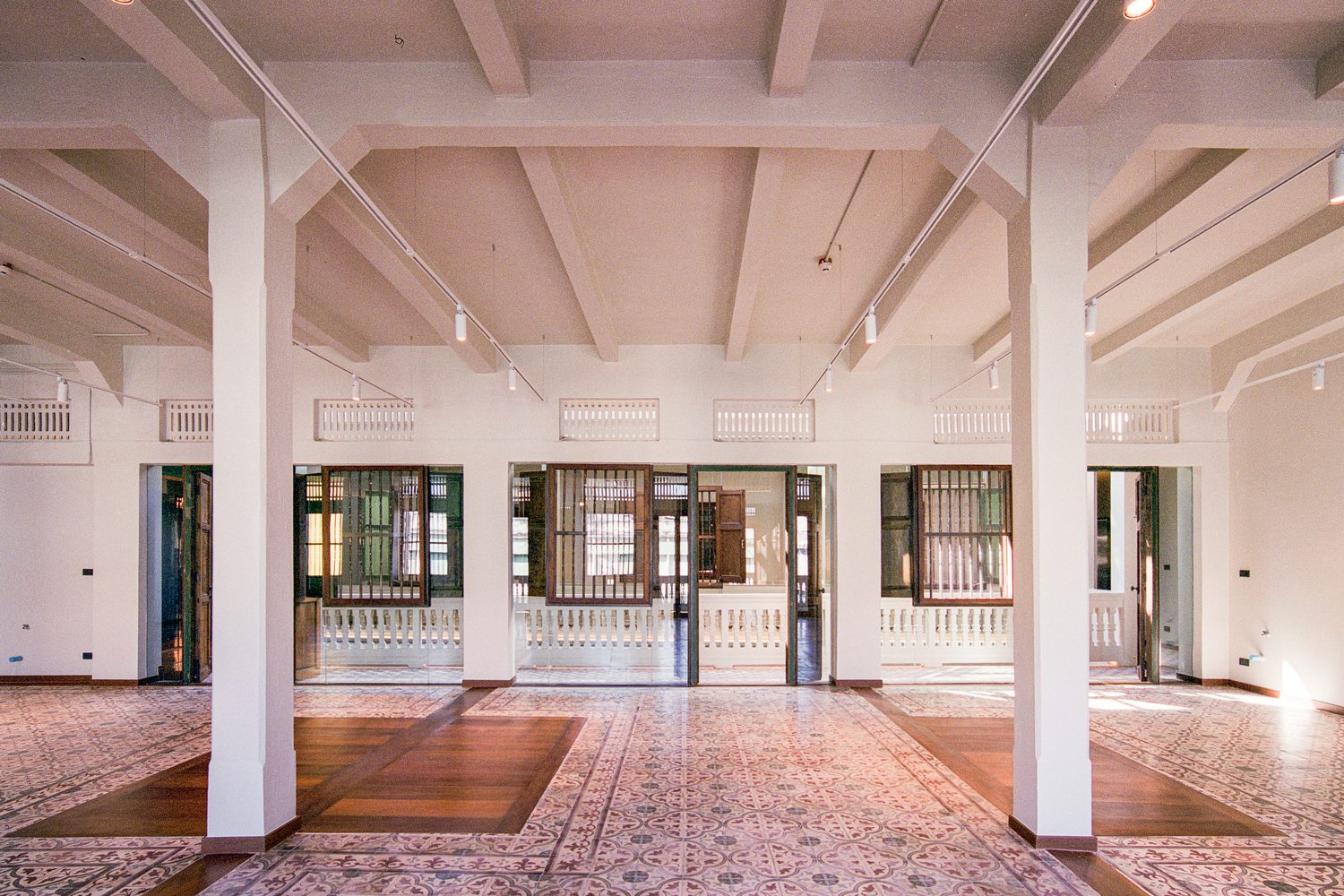
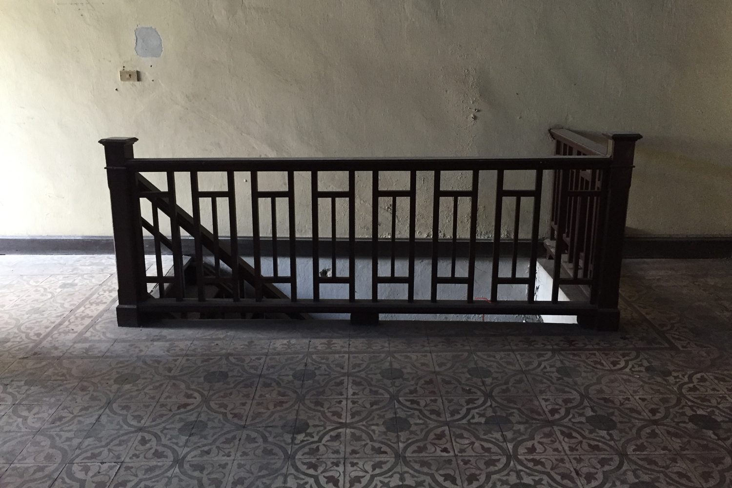
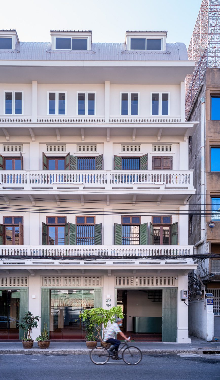
The façade is one of the aspects of the building’s design that the architects chose to keep as many of the original attributes as possible. The added component is the transparent glass walls on the first floor, which promote connectivity between the building’s first floor and the outside world. The architecture team opted to eliminate the walls that separated each area in order to unite the spaces, with the new wood borders on the floor indicating the locations of the original walls. Each unit’s stairs and railing were also dismantled. The treads are then employed as floor panels in the area where the old staircase was placed, adding to the list of traces from the old building’s memories. Numerous original structural details have also been carefully kept, such as the incised corners of the columns, concrete beams, and floor tiles, all of which demonstrate the taste and craftsmanship skills of builders in the past.
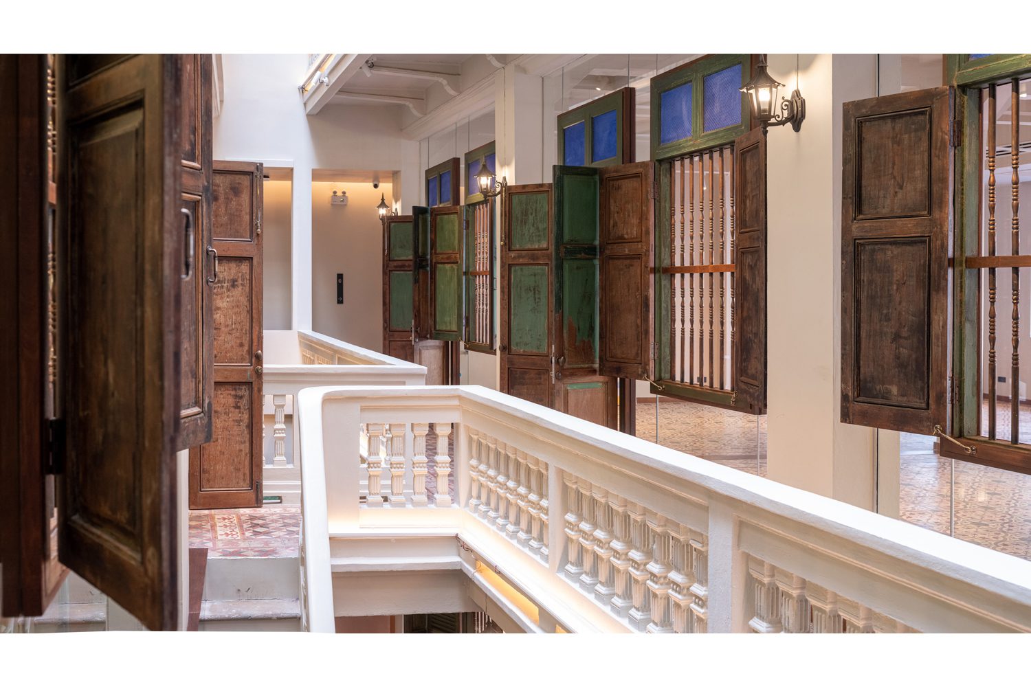
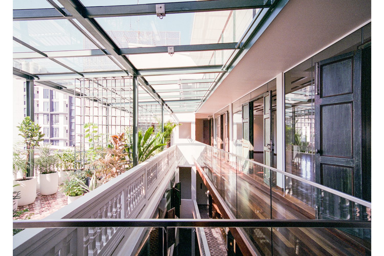
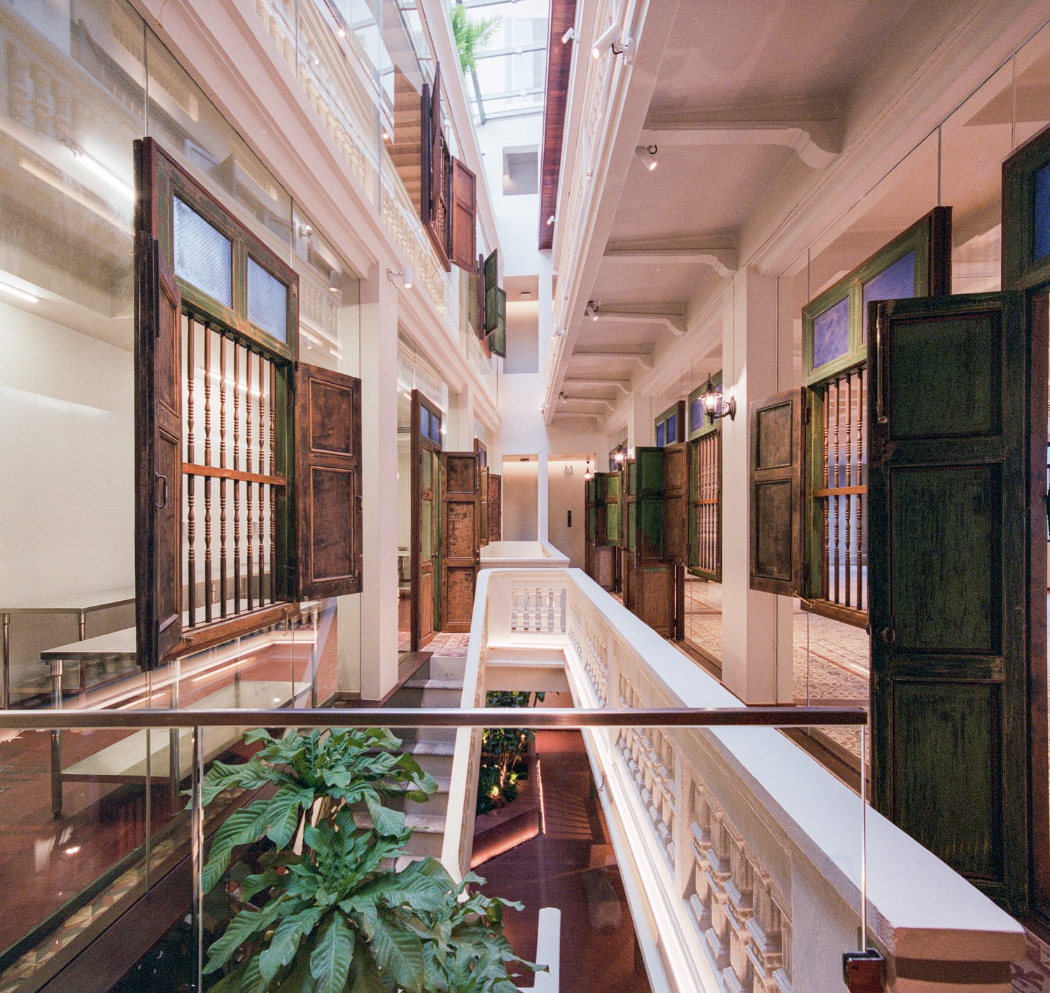
The inner court might be considered the building’s heart. While the court isn’t particularly large (the widest side is five meters, while the narrowest side is only three meters), when the light cast’s through it, along with the mirrors and glass panels cladding the rooms, these elements collectively make the court appear more spacious—an impressive improvement over the previous dimly lit space that didn’t have any use, rather than being the surplus space at the back of the building.

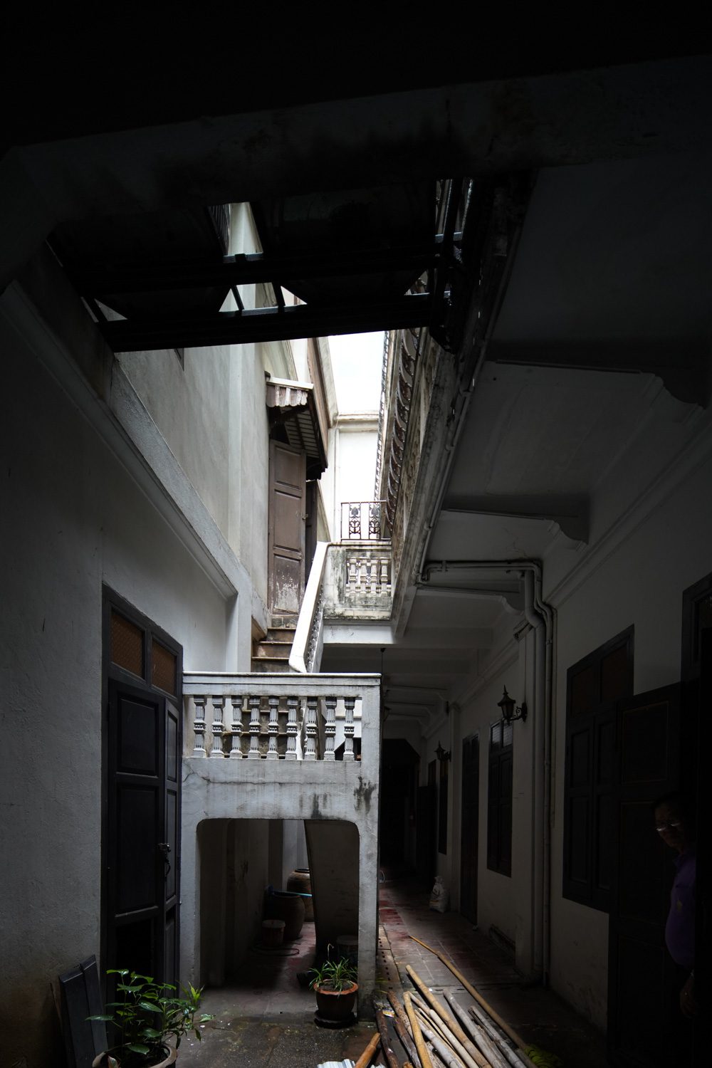
The main court before renovation
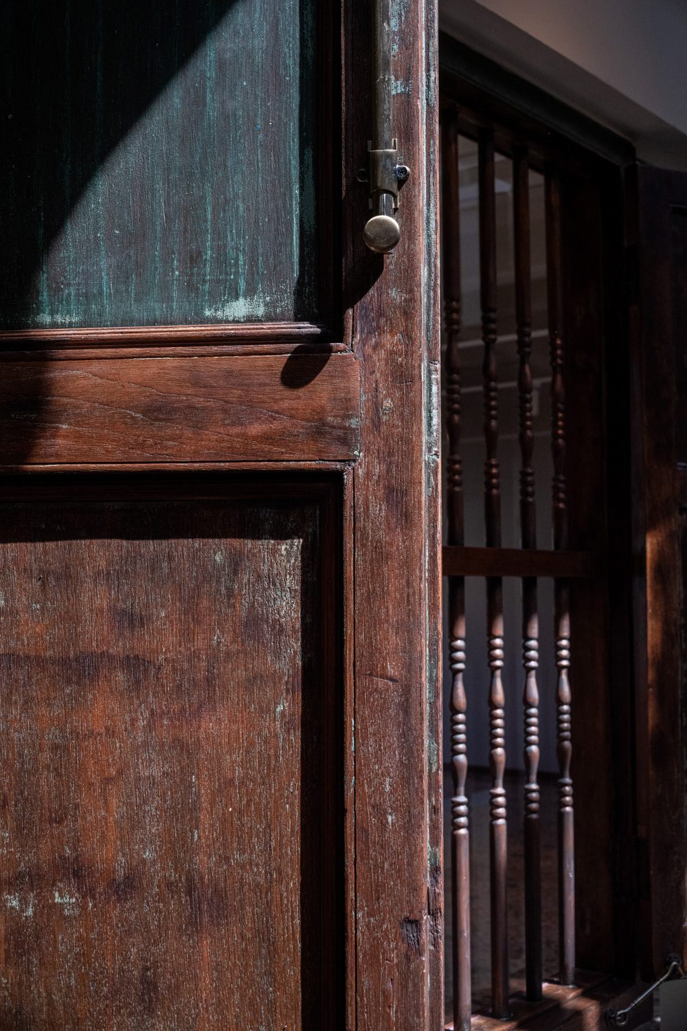
The new court also serves as a communal space, with users having visible access to what’s going on within the building through the translucent glass walls of the rooms. Old, colorful door and window frames border the glass panels, showing their original positions before being replaced by the new glass features. Tempered laminated glass panels are weight-bearing, allowing window and door frames to be securely mounted to them. Doors and windows that once let in natural light and air have been transformed into a nostalgic detail that transports visitors back to the building’s yesteryear.
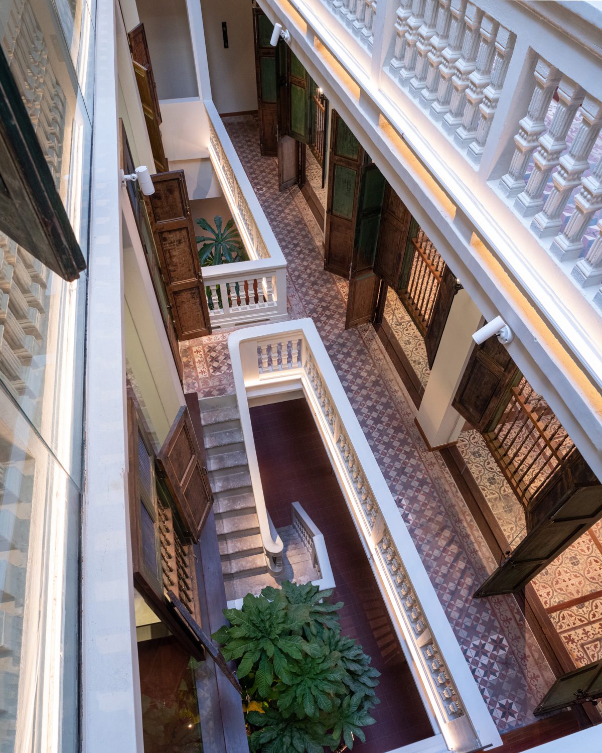
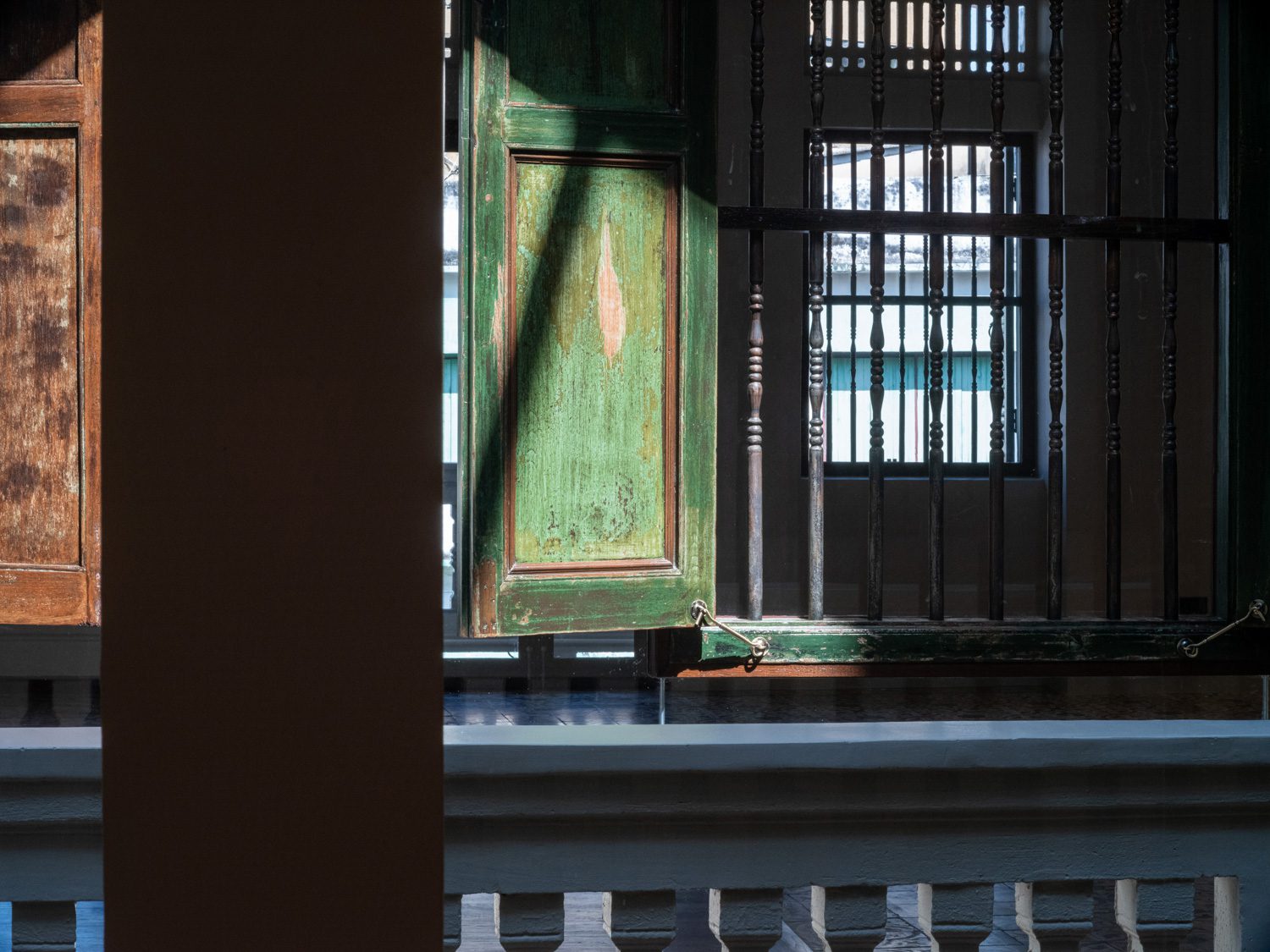
Aside from the endeavor to encapsulate a sense of nostalgia, Stu/D/O Architects included new amenities to help increase functional convenience and a better and safer user experience, such as an elevator and a new fire exit, both built to synchronize with the building’s internal circulation. The construction of the translucent roof on the fourth story transforms the rooftop area into a well-shaded terrace that is great for lounging even while it’s raining. An additional walkway is built to connect the existing elevator core to the new one on the fifth floor.

Despite its recent official opening, Baan Trok Tua Ngork has already hosted a variety of events, including the art exhibition Ghost 2565: Live Without Dead Time, Baan Soho, an experimental space run by Soho House prior to the official opening of the clubhouse, and LOUIS VUITTON’s private dinner. Today, a new chapter of Baan Trok Tua Ngork has begun as the building welcomes new people and visitors to create new stories that will leave more traces to be inherited through time. Just like how those scratches on wooden windows or stains caused by incense papers that were burned during ancestral worships have now become an inherent part of the house.
