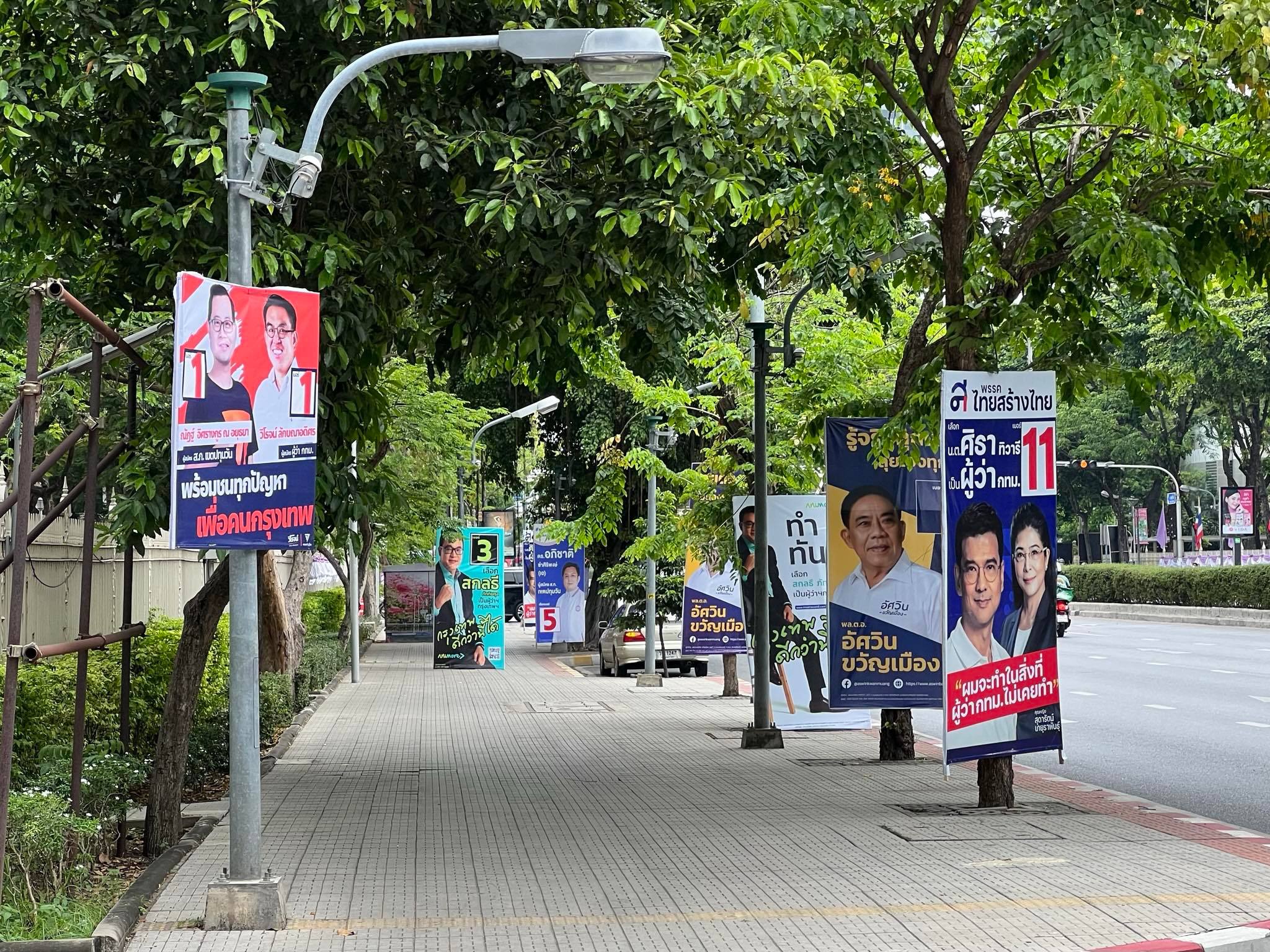
BESIDES A DISTINCTIVE DESIGN OF CAMPAIGN SIGNS IN THE 2022 BANGKOK GOVERNOR RACE, MOST CANDIDATES ARE ALSO WORKING ON THE SMALLER CAMPAIGN SIGNS TO AVOID PATH BLOCKING. WEE VIRAPORN INVITES US TO CONTEMPLATE A DEEP-ROOTED ISSUE – THE PLACEMENT OF CAMPAIGN SIGNS ON THE PUBLIC PAVEMENT
TEXT & PHOTO: WEE VIRAPORN
(For Thai, press here)
The vibe of the forthcoming Bangkok Governor election is getting more exciting by the day as banners occupy the city’s sidewalks once again.
Throughout the entirety of my life, I have witnessed the changes in Thailand’s political campaigns through these election signs, posters and banners. From a straightforward presentation using a photograph that clearly shows a candidate’s face and a big display of the candidate’s number, to a more sophisticated design that follows the advertising principles, accompanied by catchphrases and slogans. These new elements make a poster or banner more than just an introduction of a candidate’s appearance to potential voters for there are hidden, connotative meanings in the candidate’s posture to the layout and carefully selected photograph. Everything is thought out and executed for the public to know a little bit more about the person’s personality, ideas and working styles without the need for elaborate explanation. There are candidates who present themselves as someone who wants to work, or a member of the younger generation who isn’t afraid to tackle problems, an honest person with clean track records and a nice profile who is eager to serve the public, and so on.
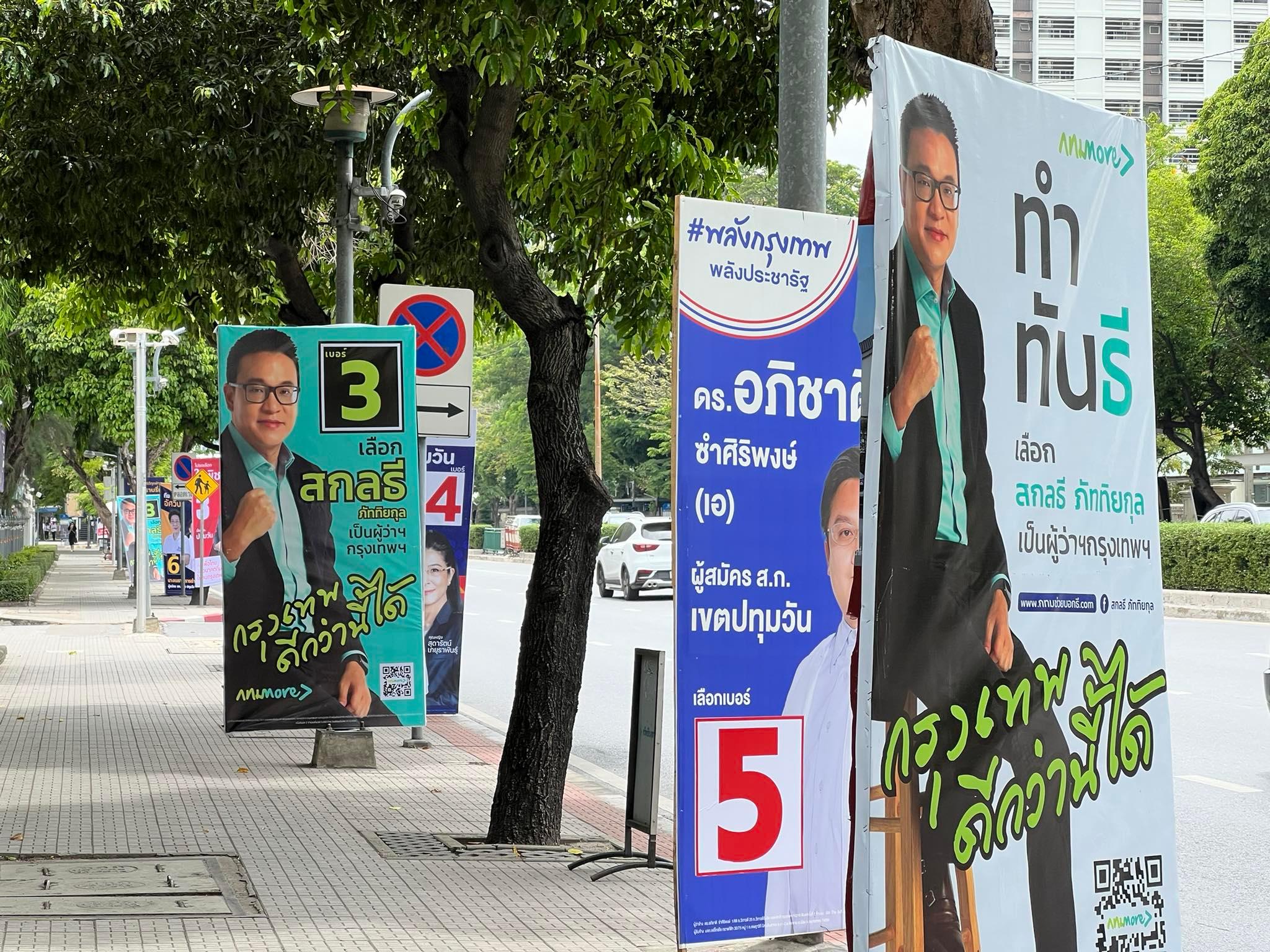
Thanks to the more advanced technologies, banners and posters can be made at a much cheaper price. With the public’s familiarity with outdoor or out-of-home advertising, these mediums are meticulously designed with thoughtful use of colors and fonts like a branding bible would suggest. A new standard has been set and each candidate follows it almost religiously in hope of creating the best possible and most memorable impression among voters.
Apart from my own personal observation, I was able to talk with two world-renowned graphic designers about election signs and banners in Bangkok.
One was with Mark Farrow during an interview back in 2008. He pointed out that the sign where a candidate makes a serious face while pointing his finger out to the viewers was particularly interesting and distinctive (that sign reminds me of the ‘I want YOU for U.S. Army’ poster with Uncle Sam encouraging young American men to join the army for the first World War).
I asked for Jonathan Barnbrook’s opinion about the matter when I interviewed him back in 2011. His thought was that politicians around the world are the same when it comes to their love of photoshop. People sleep on elections because they don’t think of them as relevant and an image of a stern-looking politician in a suit has nothing to do with them or their lives.”
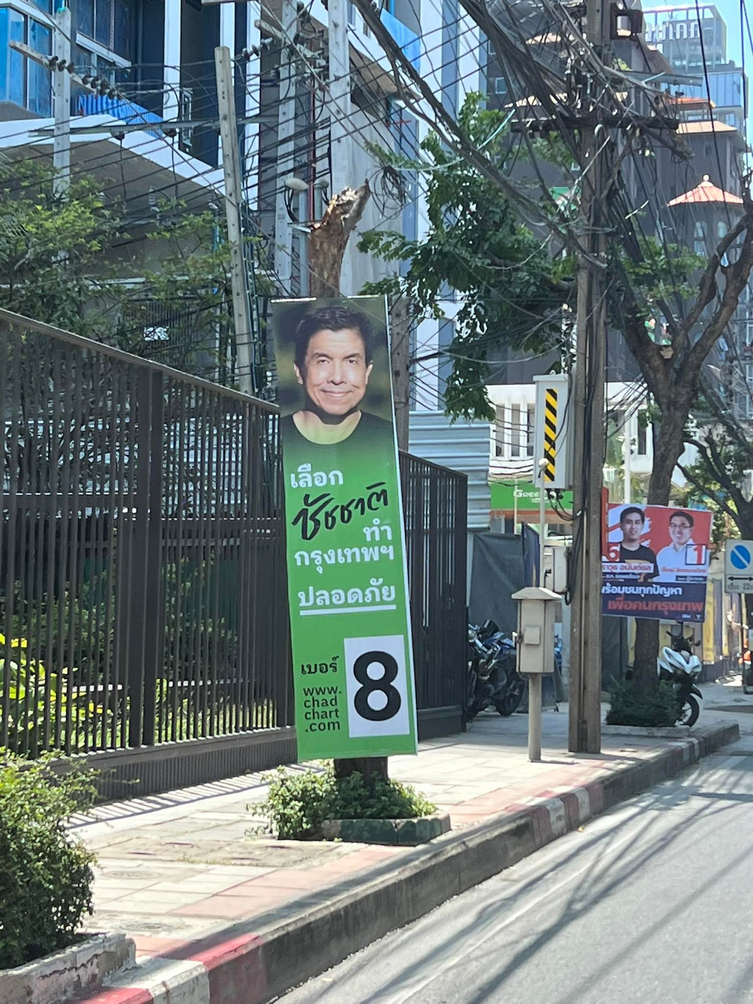
Perhaps my observation in the changes of how these signs were designed and communicated comes from the nature of my profession and personal interest. Even the media had always focused on this particular aspect of campaign signs and posters whenever there’s a big election. But with the 2022 Bangkok Gubernatorial Election, the conversation and criticism have been more on the effects of these signs on pedestrians’ everyday life. While the bigger signs are criticised for their inconsiderate takeover of the sidewalks, slimmer and smaller signs were praised (followed by a claim over who thought of it first). Some candidates made a swift move and readjusted the size of their signs to grab the media’s attention and rectify their unthoughtful actions. I cannot help but ask myself why election signs, particularly in Bangkok, have to be designed in such a way. What makes our society become more interested in the physical attributes of a sign rather than the content that is put on it?
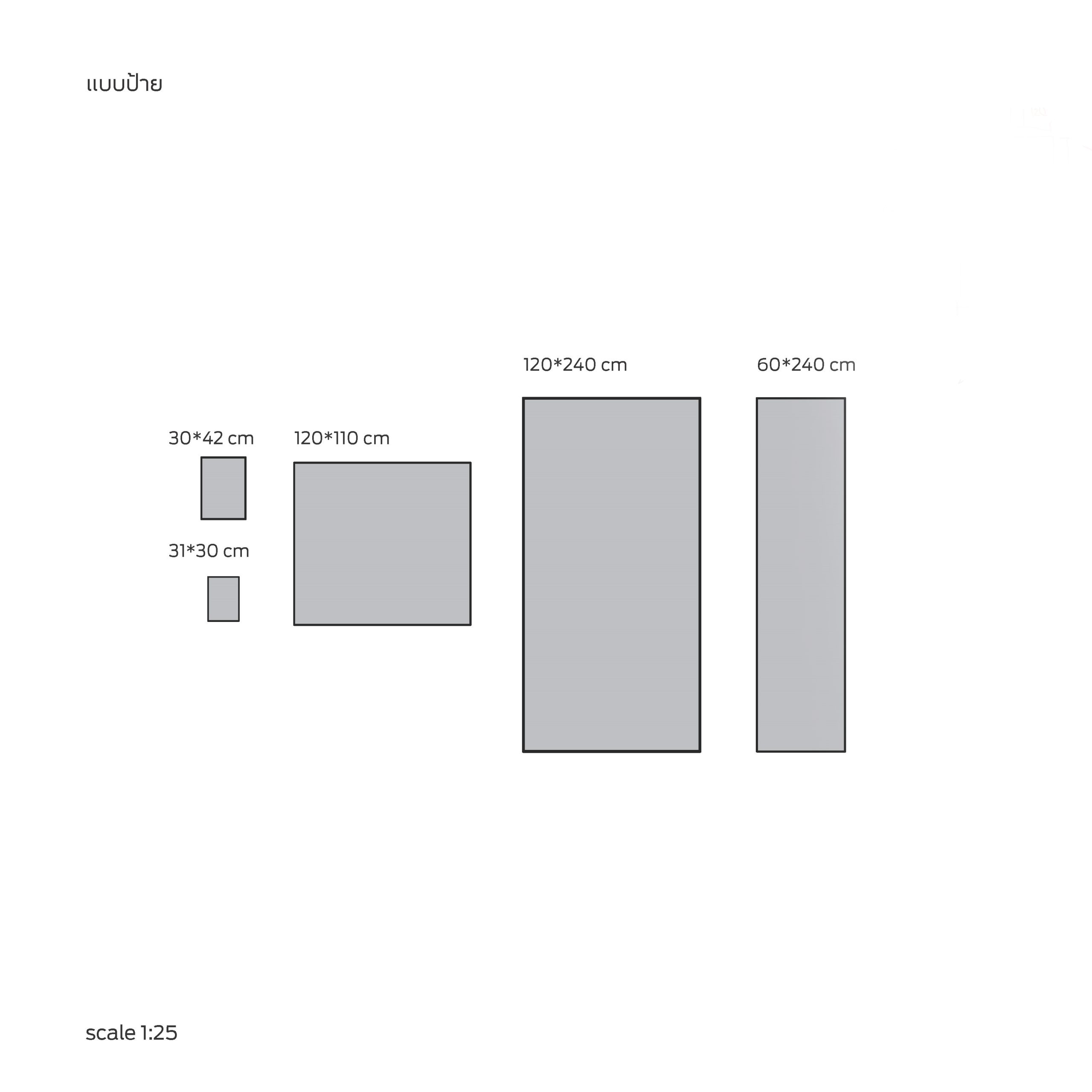
After some research on the rules and regulations of election signs, posters and banners, the indicated size of a poster is close to that of an A3 paper, while the sign’s dimension is around 120×240 cm., which is almost the same dimension of a standard plywood panel. It’s safe to say that the standard size for election signs, which are mostly made in the form of printed vinyl stretched over a wooden frame, is a product of the manufacturer’s perspective, aiming to maximize usable space while minimising leftover materials. It’s reasonable enough.
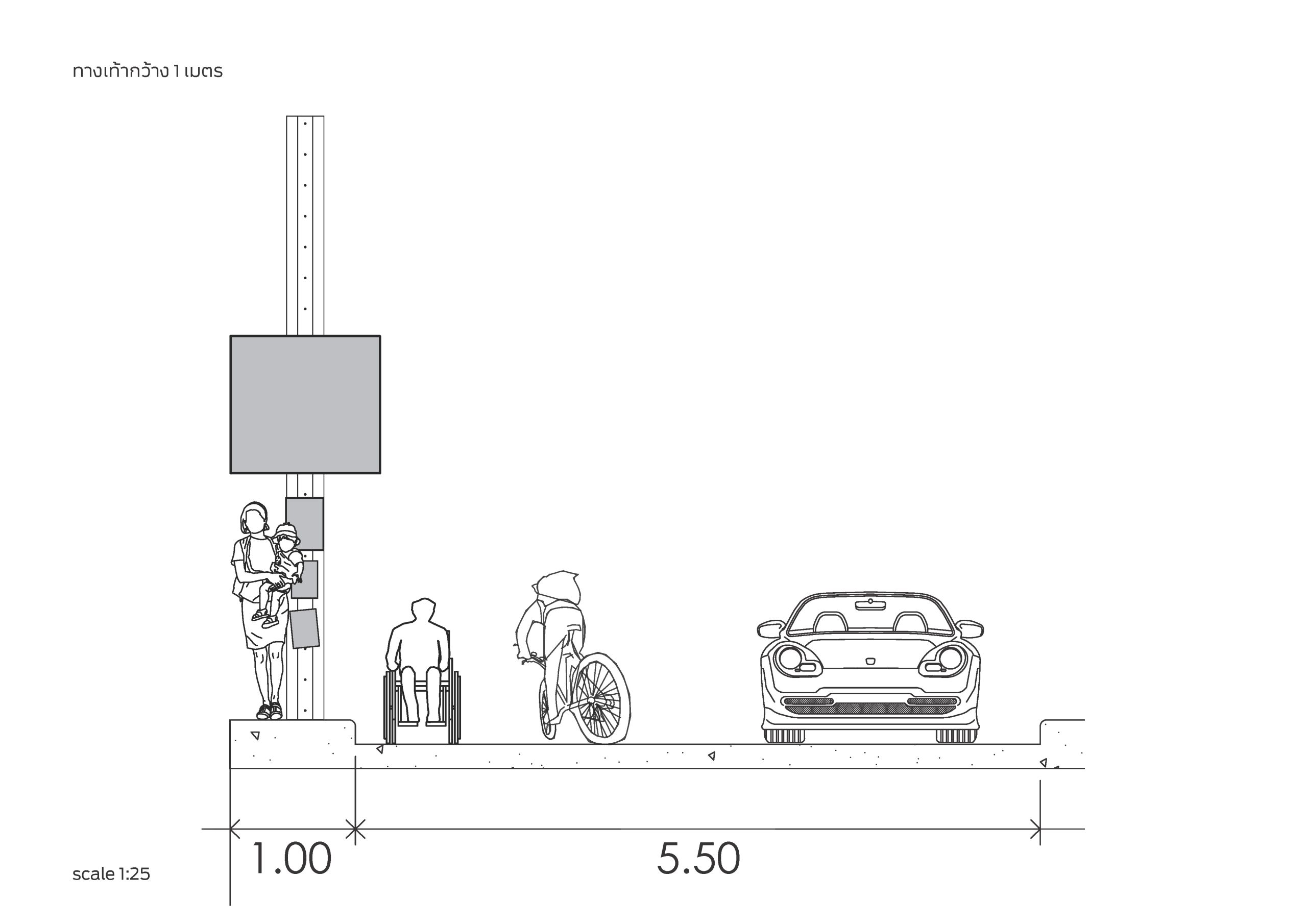
The problem is, though, while the 2006 Bangkok Comprehensive Plan indicates that the sidewalks in residential areas need to be at least 1.5 meter wide for pedestrians to walk past in both directions, the survey done by the Bangkok Good Walk project in 2006 found that the average width of 34 sidewalks in Bangkok metropolitan area was merely 1.03 meters (which means the widest election sign the law allows is even wider than the average width of the city’s sidewalks). This doesn’t include all sorts of obstacles and damaged surfaces that make the sidewalks even more difficult to walk on, and that’s on a normal day, not during the campaigning period of an election. With the campaign signs with the size that is bigger than the sidewalks’ average width, it isn’t at all surprising to see videos surfacing on the Internet recording the predicaments brought upon pedestrians who now have to find a way to dodge the imposing presence of election signs. Even wheelchair users were forced to go around the signs and ride on the road surface.
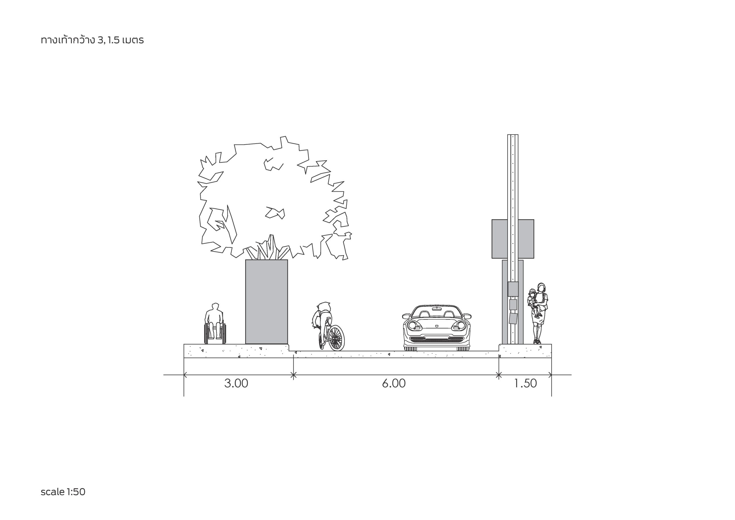
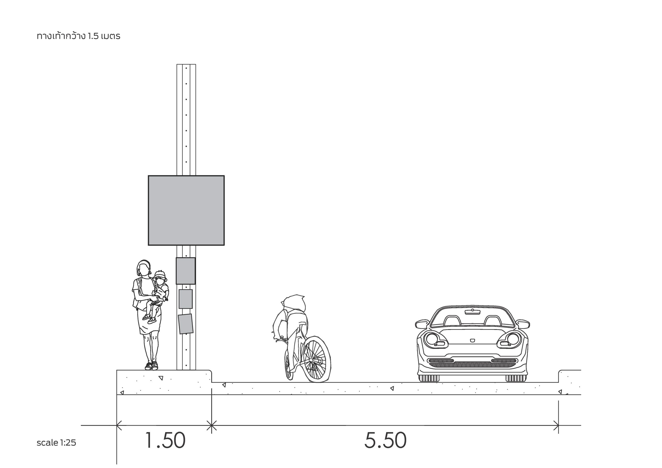
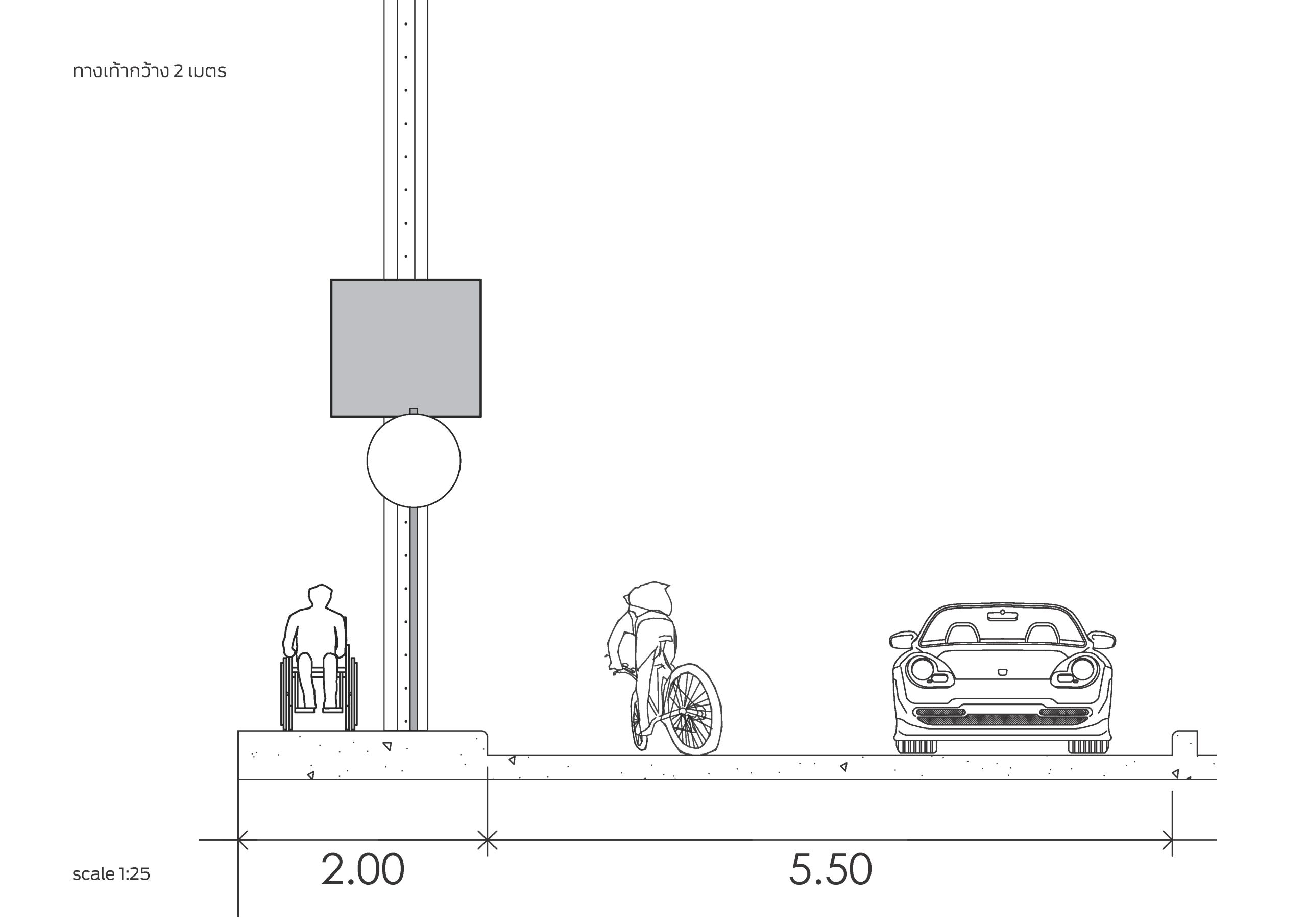
Then I remember something, vaguely from my childhood memory. There was a Bangkok governor candidate with a humble, down-to-earth image (he would always wear a Mauhom shirt in photographs) who used a scarecrow wearing the Mauhom shirt that he would usually wear as an election sign, claiming that the scarecrow produced zero waste and could be put into use later. So that means a sign can be designed without having to consider the indicated sizes and dimensions despite it taking up a relatively larger space.
In the past, the Thai state has always dismissed the problems related to public utilities and infrastructure as individual issues, and failed miserably to prioritize the public interests. The state chooses to put up signs warning people to drive carefully in accident-prone areas. Over time, people have stopped questioning whether a specific part of the road is designed with a good enough standard for everyone to drive past without having to be overly cautious about their own safety. We blame motorcycle riders when they ride on the wrong side of the road, but rarely question why the state didn’t provide reasonable u-turn points so that people don’t have to risk their lives for a small convenience.
Bangkok has always been designed for the convenience of car users. That’s why we have a bunch of overpasses at intersections, and we blame people for not using them, forgetting that not everyone has the strength to walk up and down an overpass. Resources have been used on road expansions yet pedestrians find it harder to walk in this city. Is this the way things are supposed to be? Election signs that most of us are familiar with are designed to communicate with car drivers. Is that why they seem to neglect the people who walk the streets of Bangkok?
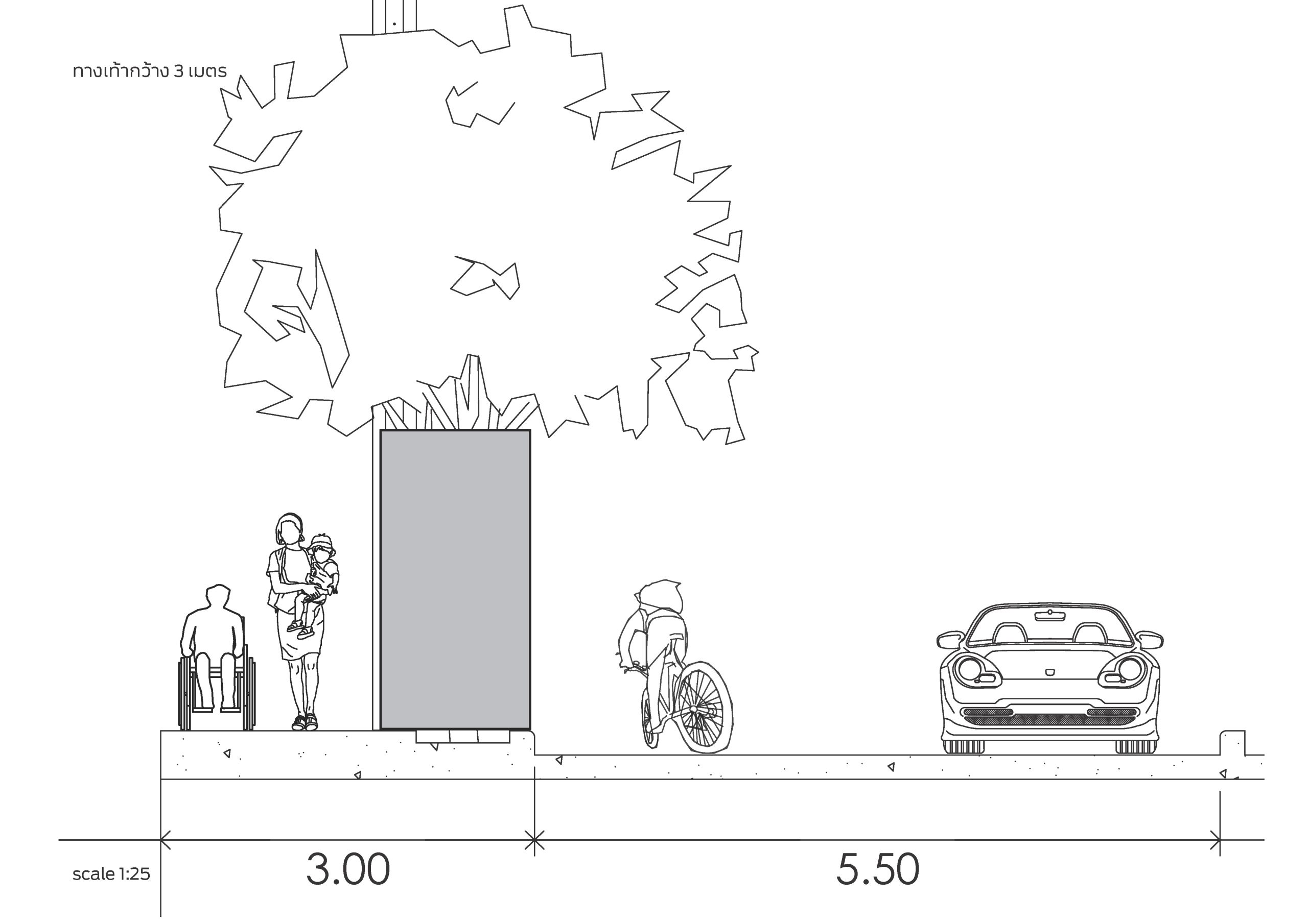
These questions reflect the unordinary things we see and have become indifferent to, and how the country’s or the city’s structural problems have been wrongly appropriated. It is this current social milieu that is being felt in every sector, as if an entire generation of people are finally starting to realise something, collectively.
Perhaps this phenomenon where the candidates for Bangkok Governor are becoming more aware of how their election signs should be more considerate of the lives of pedestrians, or care enough to redesign their signs to be less wide with the same height, or shorter signs that are put up higher so that they stay above people’s head, are all promising signs that the people walking the streets of Bangkok are being factored into the equation more. Perhaps the candidates are looking at the problems from a different conceptual framework that is actually based on the public interest (not to mention that new designs may actually cost less so it’s a win-win situation for everyone). While this matter may seem trivial, it is the attention to these details that reflect the mindset of each individual who is asking the people of Bangkok for permission to run their city.

