Photo: Riken Yamamoto & FIELDSHOP
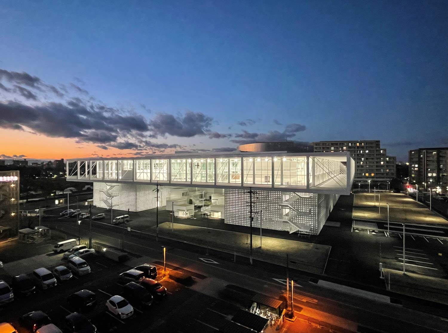
RIKEN YAMAMOTO DESIGNED THIS BUILDING WITH THE IDEA OF NOT ISOLATING PEOPLE FROM THE OUTSIDE. THE MAIN FUNCTIONS WERE PUSHED TO THE PERIPHERY AND THE VERANDA WAS LOCATED INSIDE INSTEAD TO CONNECT DIFFERENT FUNCTIONAL SPACES
TEXT: KARN PONKIRD
PHOTO CREDIT AS NOTED
(For Thai, press here)
The intention to relocate Nagoya University of Art and Design from its rather remote location in Komaki to the center of Aichi prefecture’s capital, in Nagoya was initiated by Doho Gakuen Collective. The process began to take shape in 2018 with the purchase of 4.47 acres of land to the east of Meijo Koen Garden, which conveniently sits atop the Nagoya Meijo Line’s Keijo Koen Station. The plan to relocate Nagoya University of Art and Design, now renamed Nagoya ZOKEI University, was devised under a number of constraints, ranging from the sensitive condition of the site to rebranding the institution with a more than half-century history into a university with a fresh, modern, and community-oriented image.
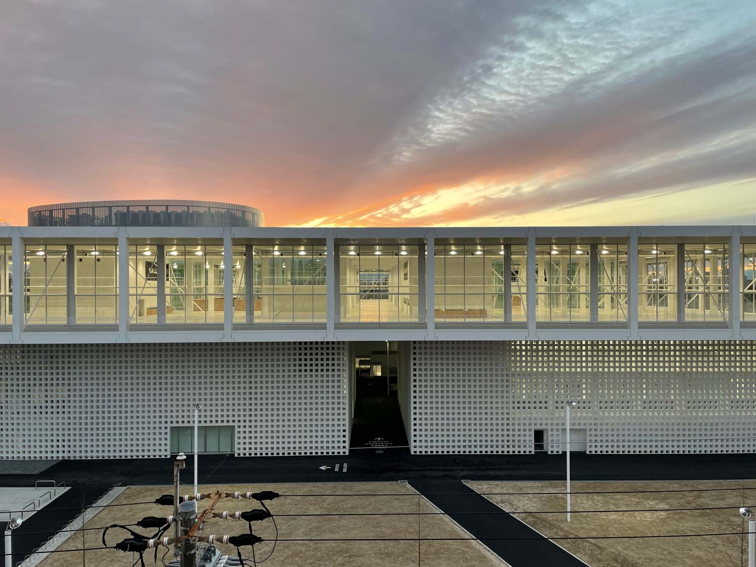
Photo: Riken Yamamoto & FIELDSHOP
On top of his job as Dean of Nagoya ZOKEI during its transition period, architect Riken Yamamoto accepted responsibility for the complete architectural design of the project, along with the objective of designing a new curricular system that would correspond with the architecture. As a result, the architectural spaces in the new university building have been purposefully designed and constructed to support the curriculum as well as teaching styles and learning experiences.
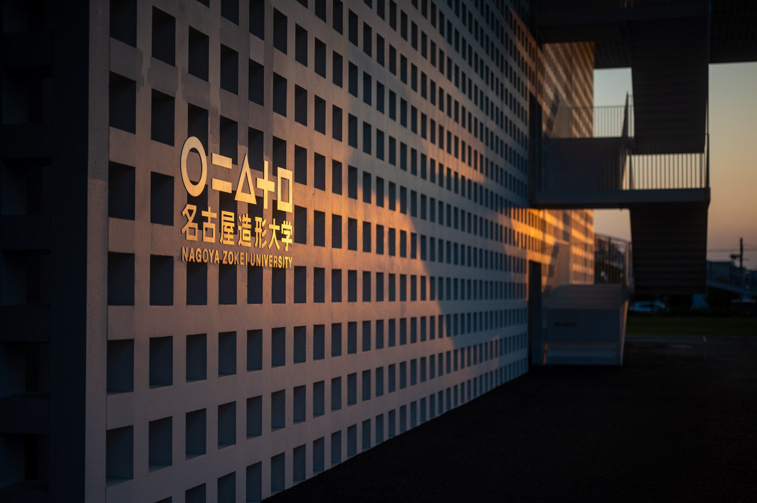
Photo: Mohei Oigawa
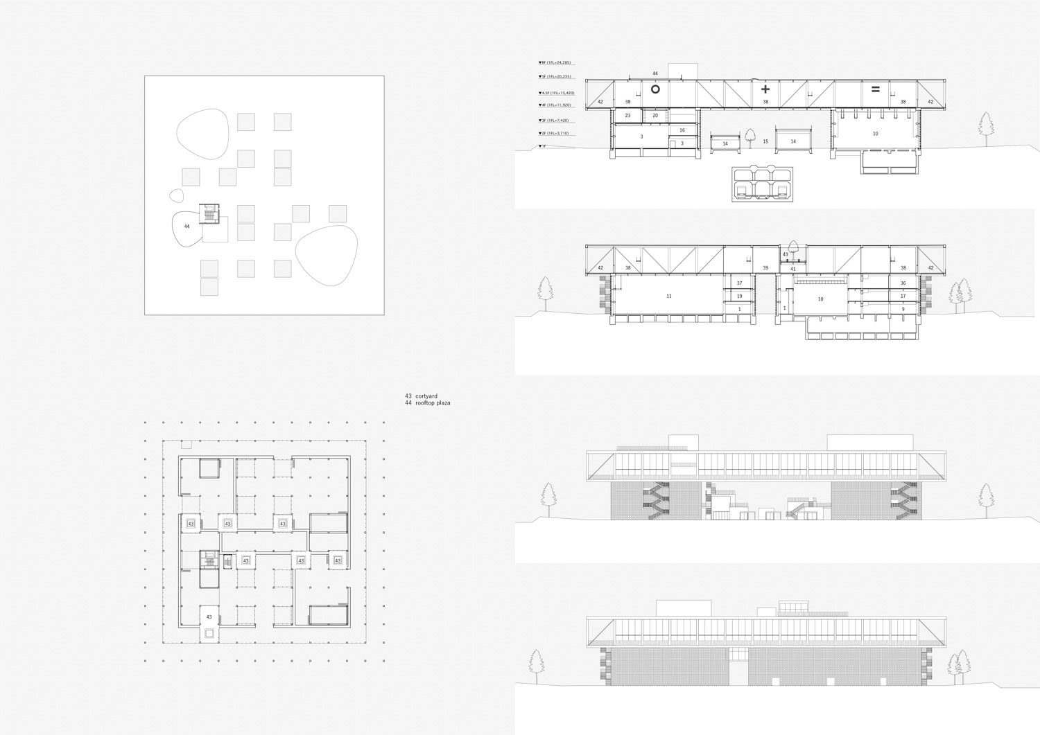
Yamamoto’s architectural theory is founded on the concept that dwellings and residential structures shouldn’t include amenities or factors within the constructed “frame,” since it would lead people to isolate themselves from the outside world. In other words, a building’s interior space should allow users to engage with the outside world, whether through visibility, hearing, or even the circulation of people coming in and out of a space. Yamamoto’s idea of a complete and comprehensive work of architecture is based on the way it encourages people’s ability to physically connect to their surroundings. This approach may be observed in Yamakawa Villa, a 1977 project in which he pushed the house’s main functions to the periphery and instead located the veranda inside to connect the different functional spaces of the house. The traces of the architectural language he utilized 45 years ago are unmistakably recognizable in the design of Nagoya ZOKEI’s architecture. Because the location is on top of a subway station, a different approach was adopted to design the building foundation. The load-bearing capability of the building is designed to transfer weight to the four massive architectural masses, accompanied by the use of a relatively light-weight steel structure and precast structural components, resulting in a shorter construction period.
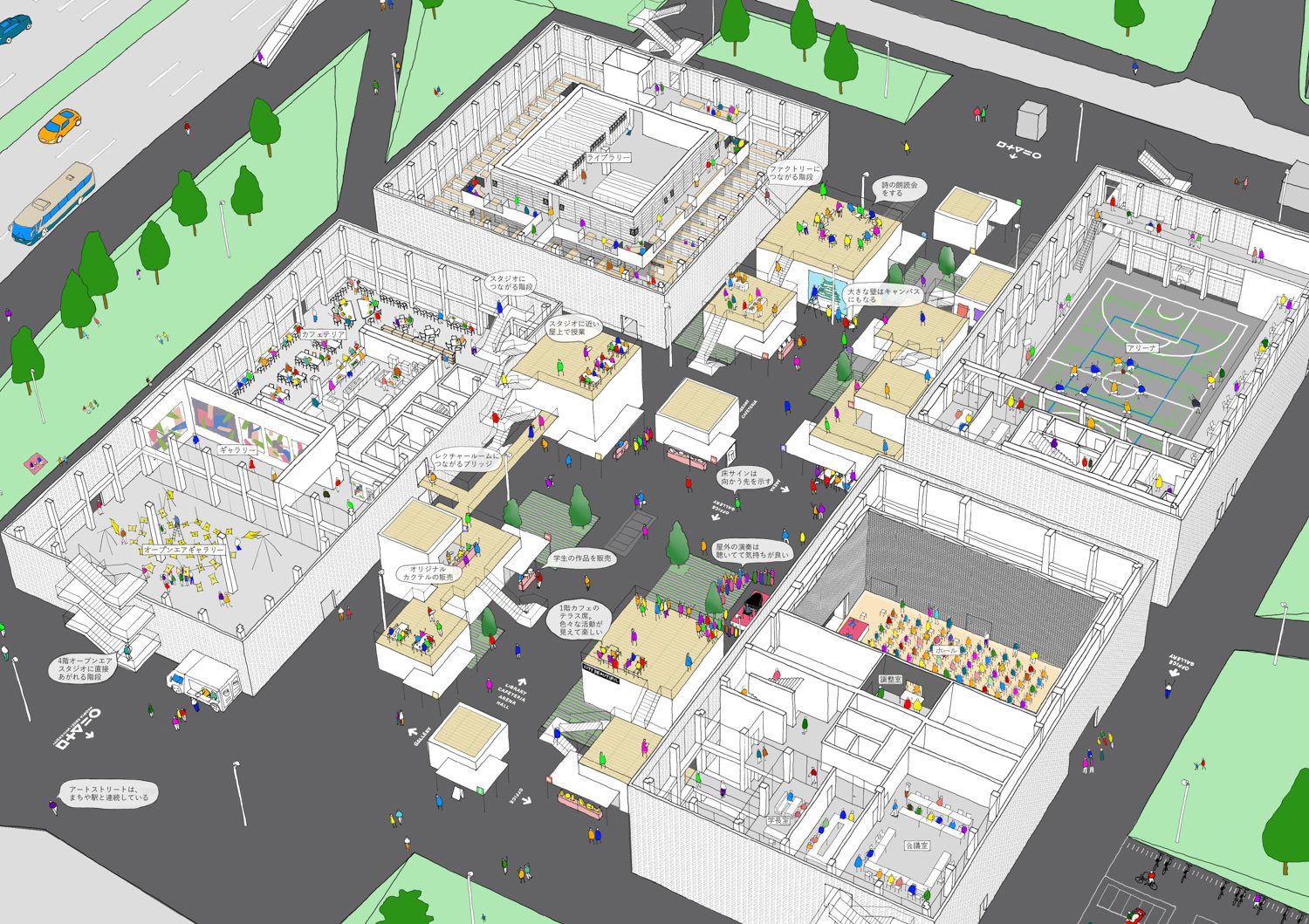
©Riken Yamamoto & FIELDSHOP
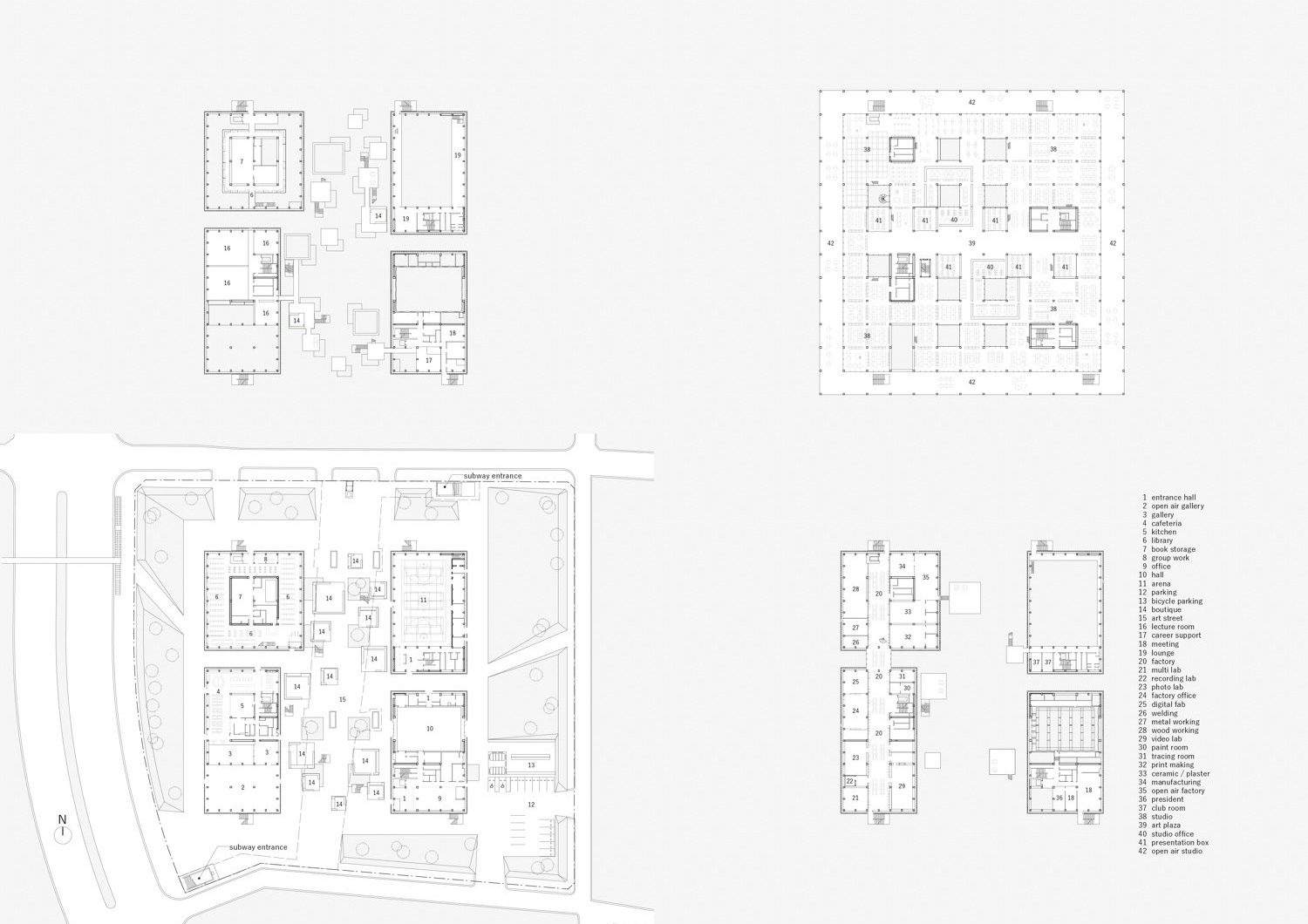
With the Yamakawa Villa, Yamamoto designed a cluster of architectural masses containing bedrooms, bathrooms, and a living area. Meanwhile, he expanded the masses in the new university building, to house a library, lecture halls, a cafeteria, a gym, a gallery, and workshop facilities. Each mass is three stories tall, with a cross-layer steel truss adopted for the construction of the fourth story, which houses design studios and a terrace for students to work outside on good weather days. The most prominent aspect of the structures are the walls built of ventilation blocks that envelop the four buildings, presenting themselves like four pillars supporting the entire architectural mass. The precast ventilation walls are not only for show but also function as shear walls, a prevalent component in high-rise architecture. The dimension of the precast block used for the casting of each wall slab was finalized after multiple trials at 8 meters long, 12 meters high, and 15 centimeters thick, totaling 310 precast members made with 6,300 joints. The structural components and construction methods utilized for the building were developed collaboratively by Riken Yamamoto and Obayashi Corporation. As a result, the architectural structure achieves its intended effect of creating a sense of airiness and visual connection by linking the interior and exterior spaces.
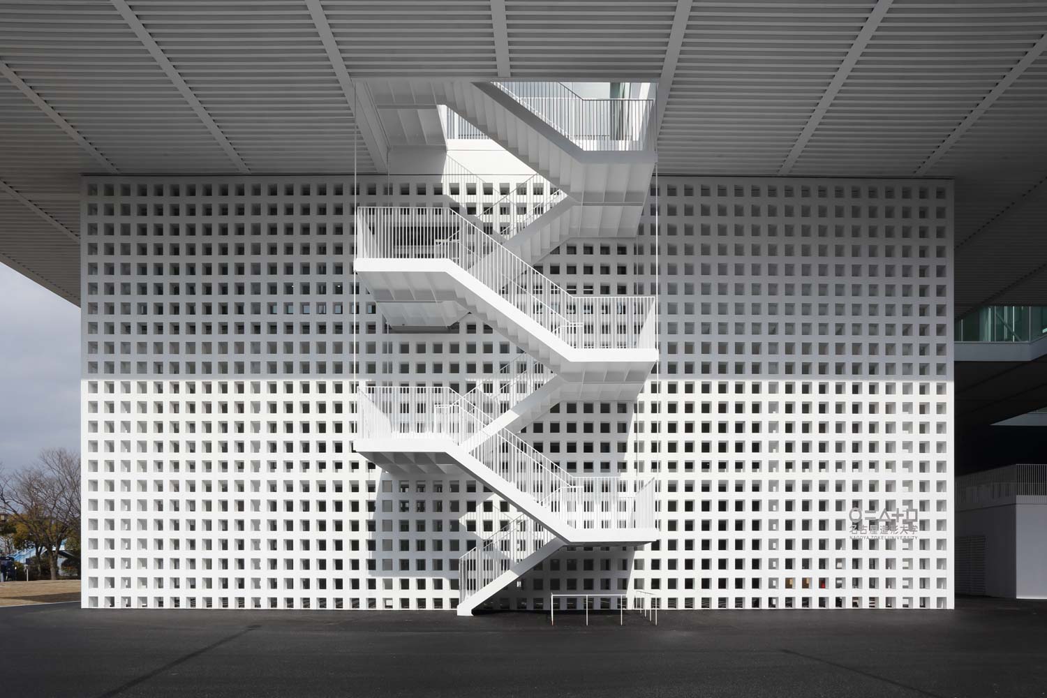
Photo: Shigeru Ono
The functional spaces designated for students’ academic activities are pushed to the four corners, while the fourth floor area serves as the roof, creating another portion of space beneath, comparable to the Yamakawa Villa’s veranda. Only this time, the veranda is enlarged in accordance with Yamamoto’s idea. The structure is linked to its surroundings not just via the carefully selected building materials but also through its actual spatial functions. The building’s location atop the subway station provides an opportunity for the public to access and use the area. According to Yamamoto, the building’s connections with the neighborhood and people will help broaden the imaginations of the students while providing an opportunity for them to go out of the enclosed space of a design studio. The library, cafeteria, and shops are also open to the public as a means of giving back to the community and manifesting the university’s presence as a part of it. The open court and walkways serve as exhibition spaces for students to use, while passersby and students from other faculties using the common area can easily observe and learn about the displayed works by their peers.
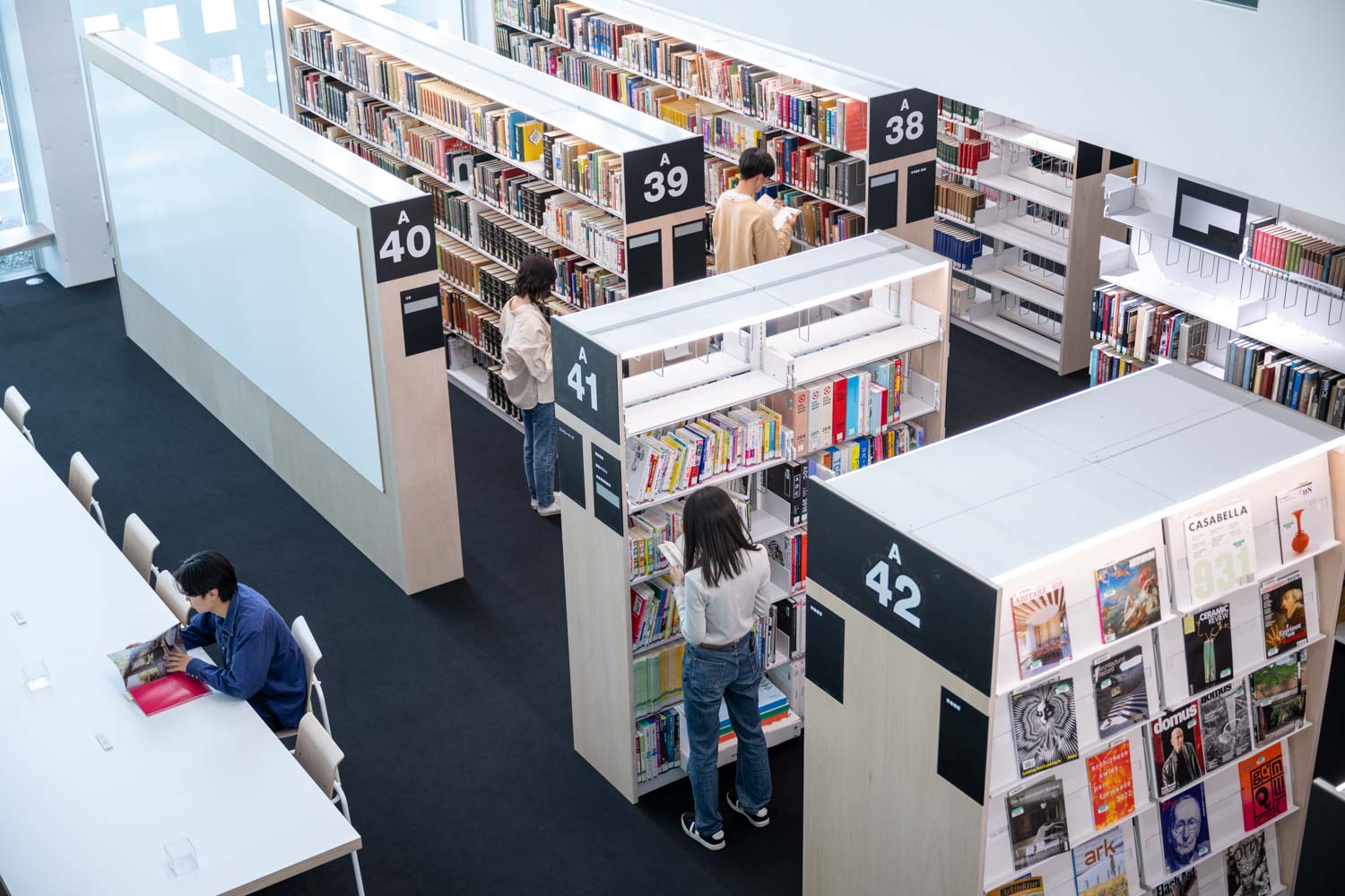
Photo: Mohei Oigawa
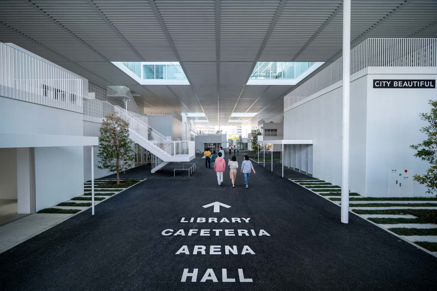
Photo: Mohei Oigawa
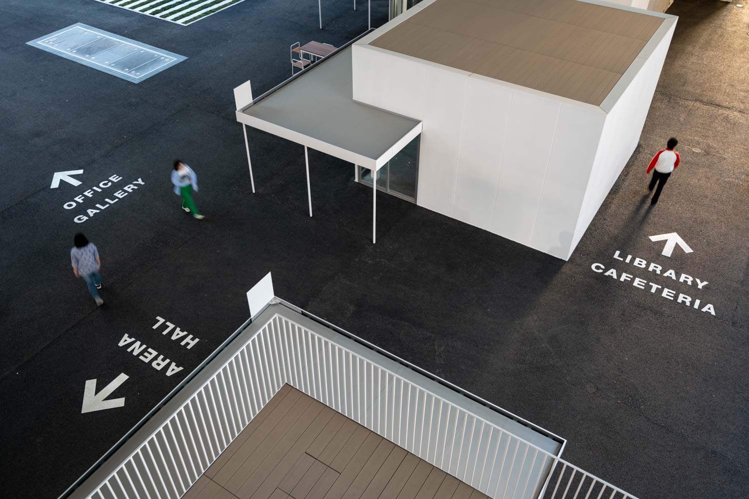
Photo: Mohei Oigawa
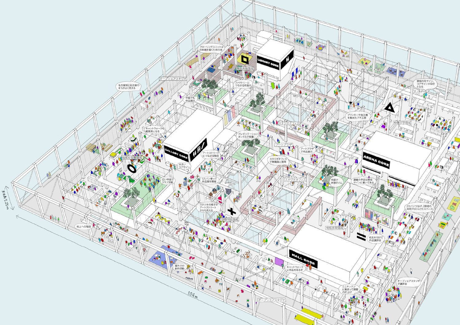
In addition to designing architectural spaces, Yamamoto changed the academic structure of the university’s faculties from one department with nine different disciplines to ‘domains,’ based on architectural conceptualization. Yamamoto views the inception of architecture as a synthesis of several fields of design. With this vision, he designed a comprehensive art and design department that consists of five distinct domains: Art Expression, Visual Literature, Community Area Design, Community Area Design, and Design of Community Sense and Representation. The five domains’ learning spaces and studios are spread across the fourth floor, with flexible layouts that allow functions to be shifted around to accommodate different teaching styles and learning methodologies. The five emblems placed on the ceiling help the students find their studios, while Art Plaza is designed as a common area in the center of the floor where students and professors can meet to discuss and exchange ideas. Students and faculty members from various studios and domains can walk by and see each other’s studios. The design flawlessly expresses the architect’s vision of how humans interact through architectural spaces.
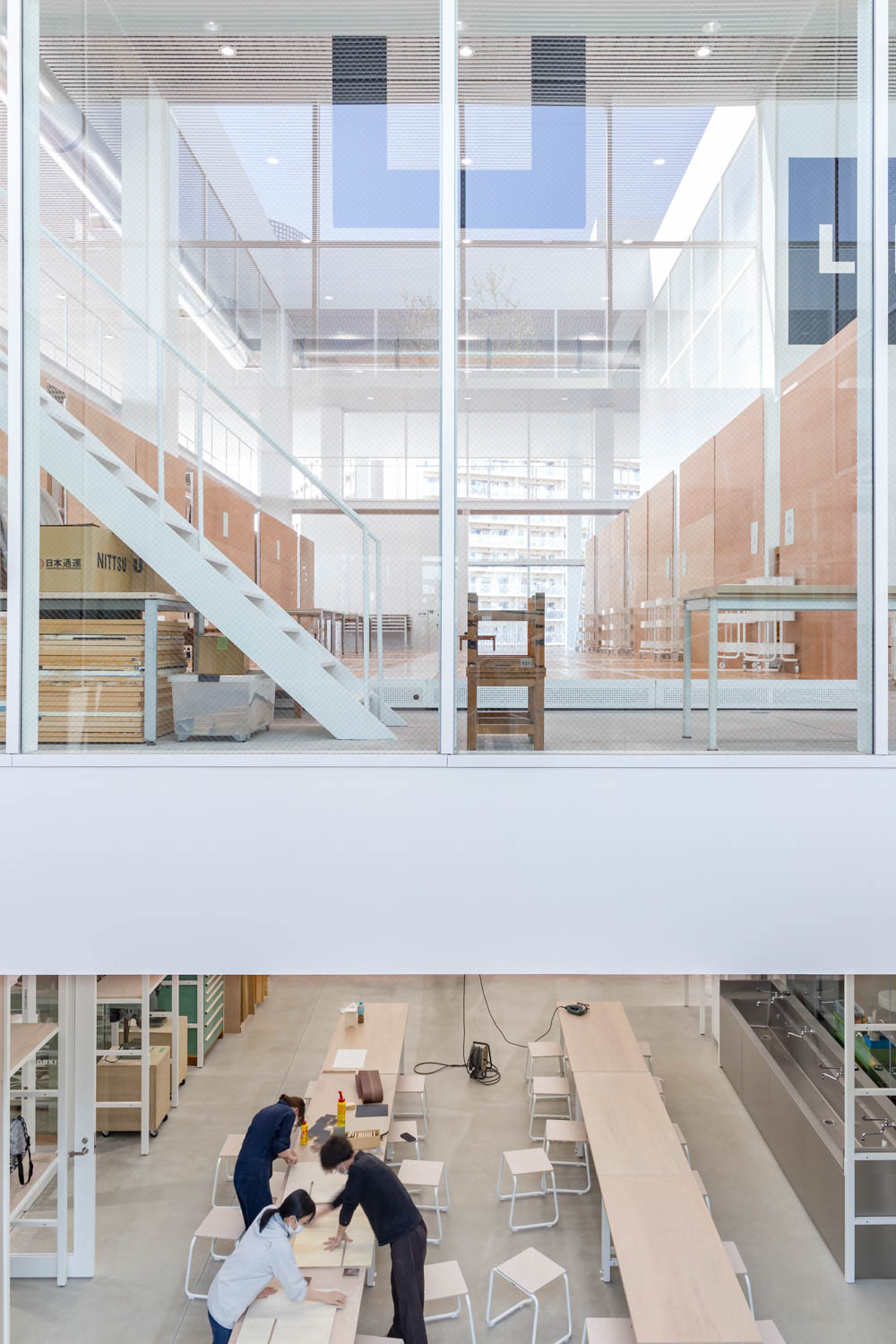
Photo: axona AICHI
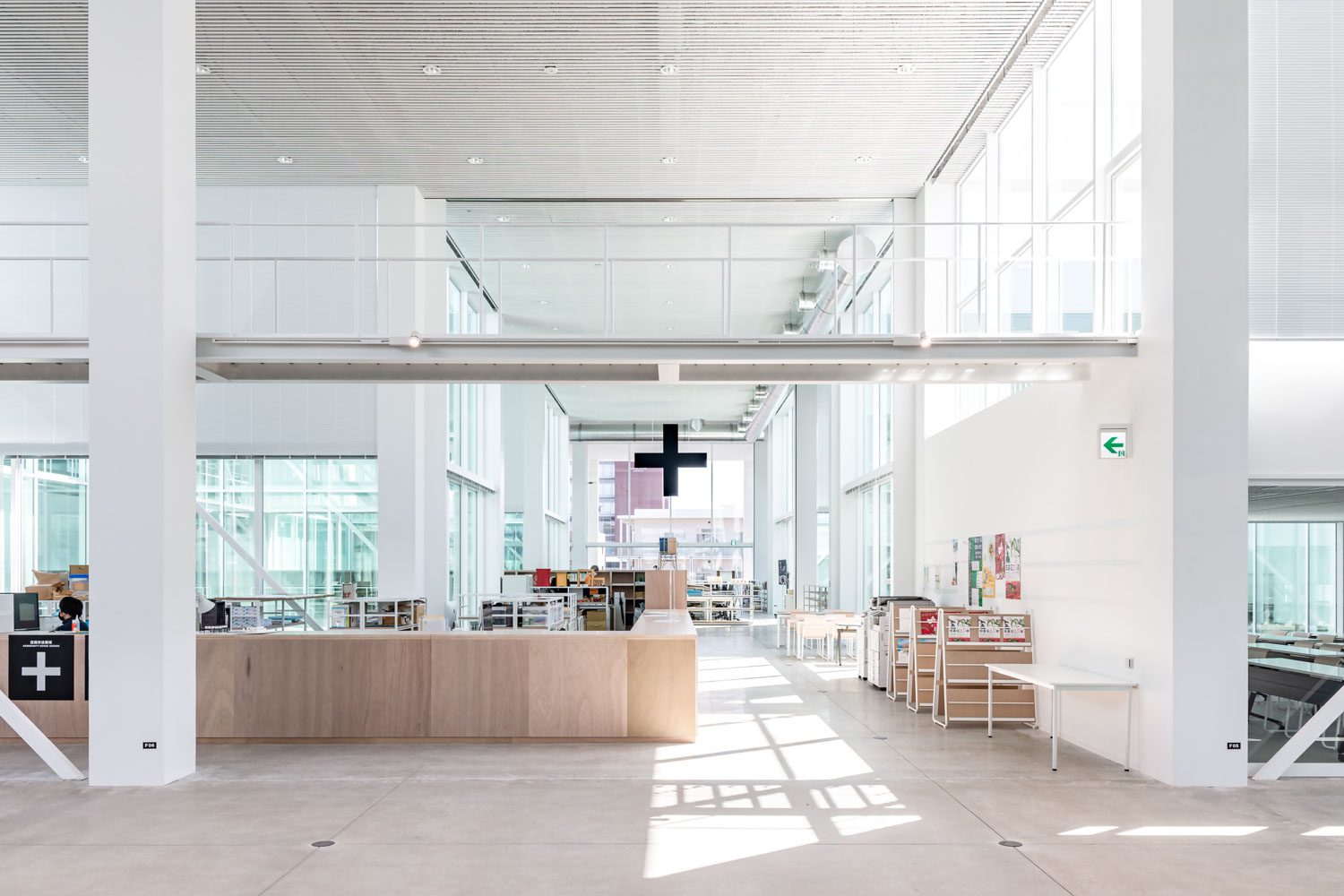
Photo: axona AICHI
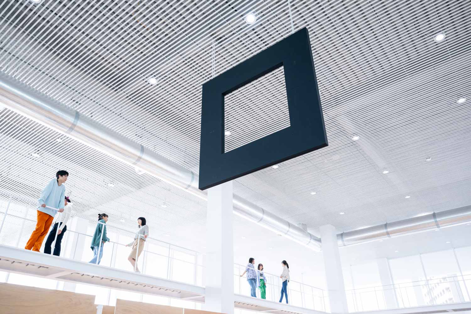
Photo: Mohei Oigawa
Nagoya ZOKEI University houses a total functional space of 17,600 square meters, including one basement level and four above ground floors, and was formally opened on April 4th, 2022.

