EXPLORE THE DISTINCTIVE CHARACTERS OF JAPANESE GRAPHIC DESIGNS IN THIS BOOK FROM COUNTER-PRINT
TEXT: PRATARN TEERATADA
PHOTO: KETSIREE WONGWAN
(For Thai, press here)
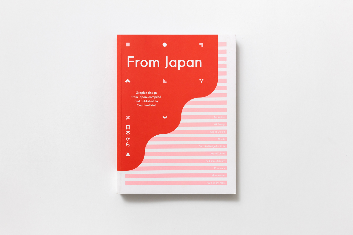
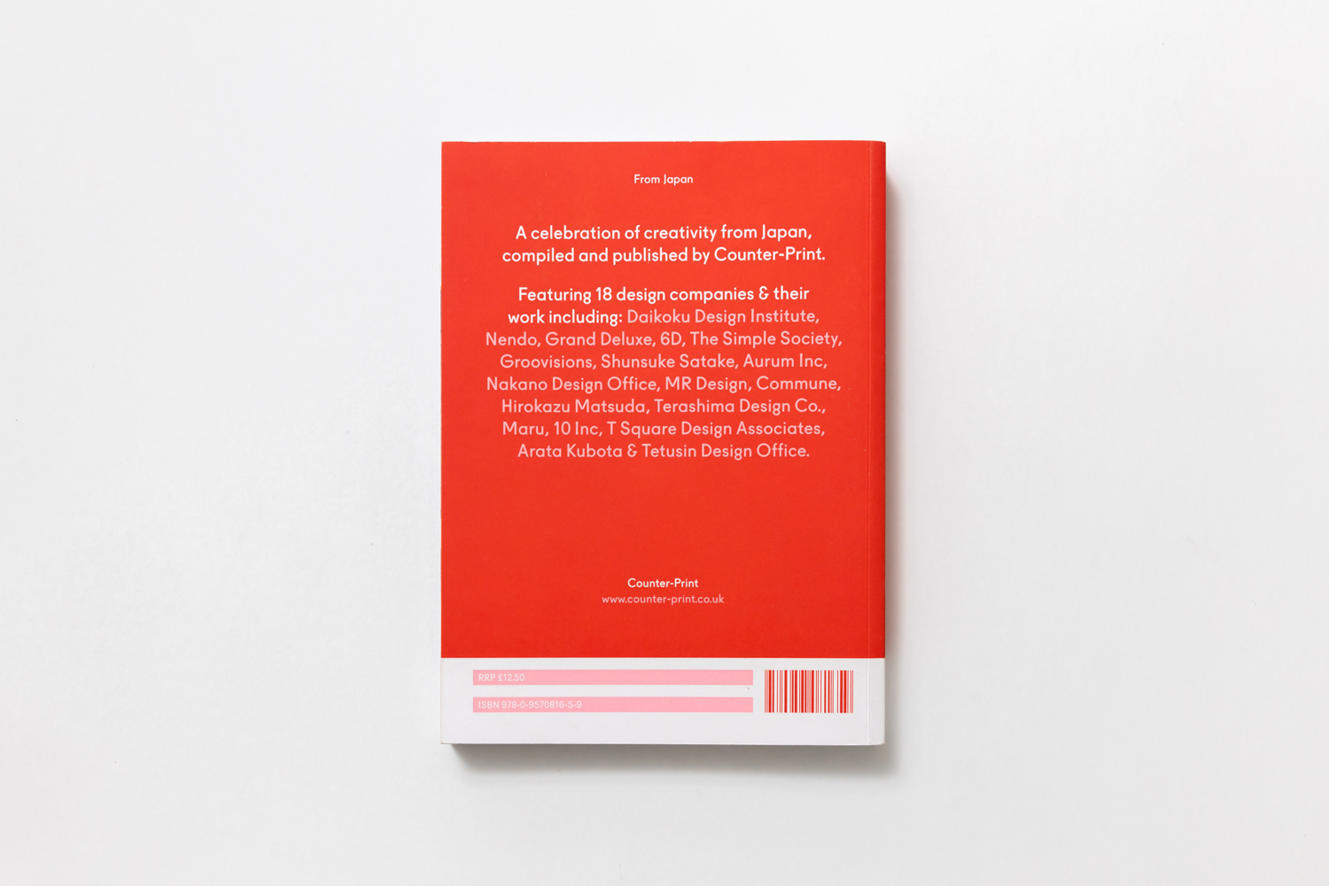
Counter-print
Counter-print, 2020
6.69 x 8.78 inches
168 pages
Paperback
ISBN 978-0-957-08165-9
The From Series book set published by Counter-Print brings together distinctive works of graphic design from Japan, Scandinavia and Eastern Europe categorised and featured as one area for each book. The three publications in the series are all collectible-worthy for graphic design enthusiasts, with projects that also include some memorable corporate identities. From Japan is a collection of work from some of the most talented designers, agencies and illustrators in Japan, particularly distinctive for its meticulously balanced elements and immaculately stunning and thoughtful visuals.
Japan is one the countries that has the world’s largest, developed and strongest economies, and that directly impacts the development of different disciplines of design, including graphic design. In the Post- World War II period, many industries in Japan saw rapid expansion, causing the country to be heavily influenced by the Western culture. It was the time when graphic designers were searching for ways to form the country’s own identity. Some of the leading graphic designers at the time such as Ryuichi Yamashiro, Yusaku Kamekura and Tadanori Yokoo were trying to find the balance between tradition and modernity. Such an attempt led to what would later become a significant benchmark for Japanese graphic design today.

Since then, the country’s graphic design style has evolved and developed its own unique characteristics, especially the interesting balance between cultures, traditions and contemporariness that encompasses both; ancientness + modernness, simplicity + splendour, eastern + western, handcrafted + mass produced, printed + pixelation. As well as the ability to demonstrate how the past, present and future characteristically collide. Such an idiosyncratic combination is a visual mix, which holds incredible communication abilities and, surprisingly, a sense of deliberation. In addition, with the help of modern technologies, the country’s cultural horizon has been expanded and merged to other disciplines almost seamlessly.


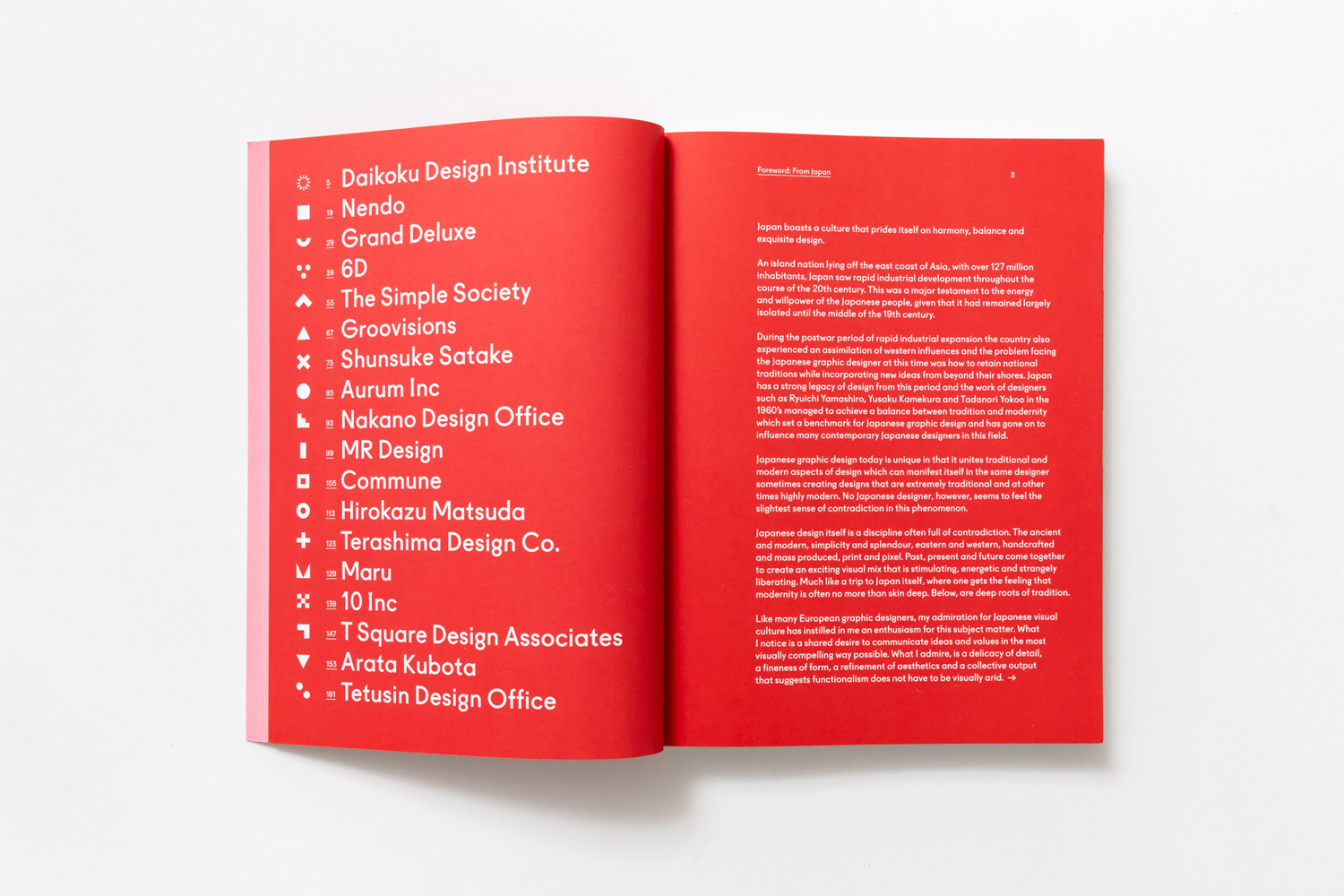
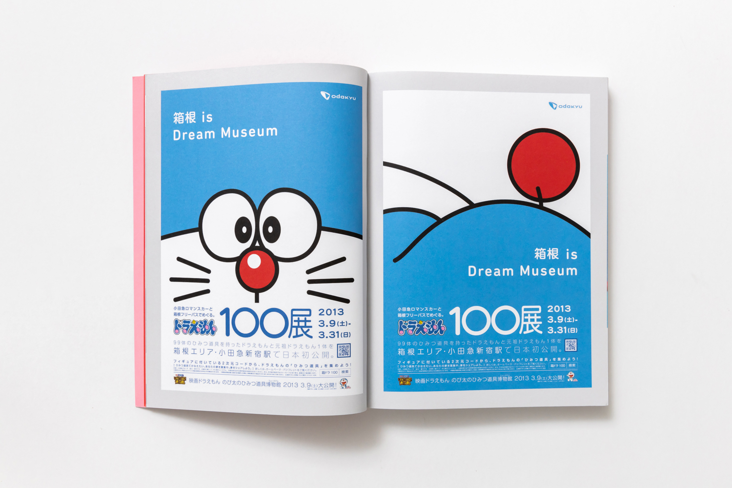
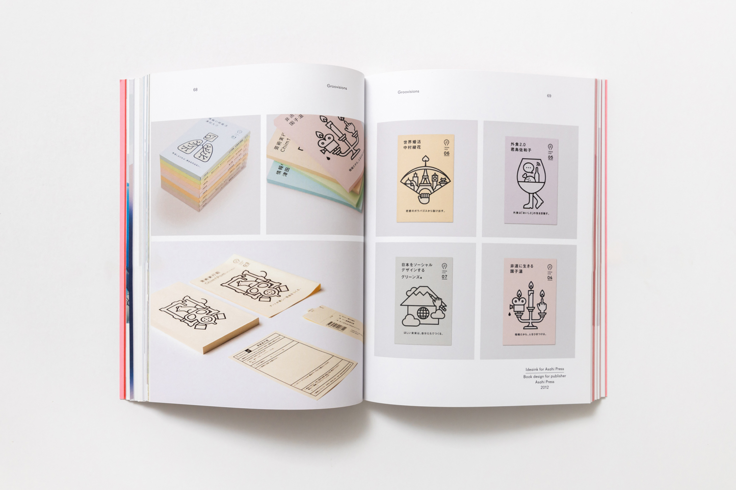
This book celebrates some amazing and noteworthy corporate identities and communication projects by the country’s leading designers and agencies such as Nendo, MR Design, Grand Deluxe, Daikoku, Design Institute, The Simple Society, to name a few. These talented designers produce the work that is particularly outstanding for its minimalist, meticulous and thoughtful elements, while the use of colors is always masterful. Some interesting projects featured in the book include:
– The bag designed for use at the ZENGOTEN exhibition (The Simple Society)
– The trash bag designed for Fuji Television Network (MR Design)
– Sushi Memo Block and Home Memo Block by Nico Range (MR Design)
– MILKRAFT (paper factory) (Commune)
– Day by Day, the poster for a jazz concert held at Shin Yakushiji (Terashima Design Co.)
– Branding design for Luce farm in Nagano (6D)
– The coffee-flavored beer bottle for Sekinochi (Nendo)
Most of the works in the book are pleasant and fun to look at. Collectively, they work like a cognitive stimulation as one looks through the pages and learns about the progresses of creative processes that keep, not just Japanese, but the global industry and cultures alive.