FARMGROUP LAUNCHED THE NEW BANGKOK METROPOLITAN ADMINISTRATION LOGO AND IDENTITY SYSTEM IN NOVEMBER. GET TO KNOW THE PROCESS AND SEE WHAT FARMGROUP HAS BEEN THROUGH IN DESIGNING THIS IDENTITY SYSTEM
TEXT: PRATCHAYAPOL LERTWICHA
IMAGE COURTESY OF FARMGROUP
(For Thai, press here)
After Farmgroup shared Bangkok Metropolitan Administration’s identity system design and revamped logo on their social network platform, it quickly gained widespread attention and was shared at an impressive speed. Many netizens have expressed excitement for the news that Bangkok will soon have its own identity system, similar to other major cities around the world. Considering how Milton Glaser’s iconic I ❤ NY logo has reshaped New York City’s reputation from a crime-ridden metropolis to one of the most popular global travel destinations, it is understandable how Bangkok’s new identity is expected to generate positive impressions about Thailand’s capital city among visitors from around the world. On top of that, it can become a symbol that the people of Bangkok can truly be proud of.
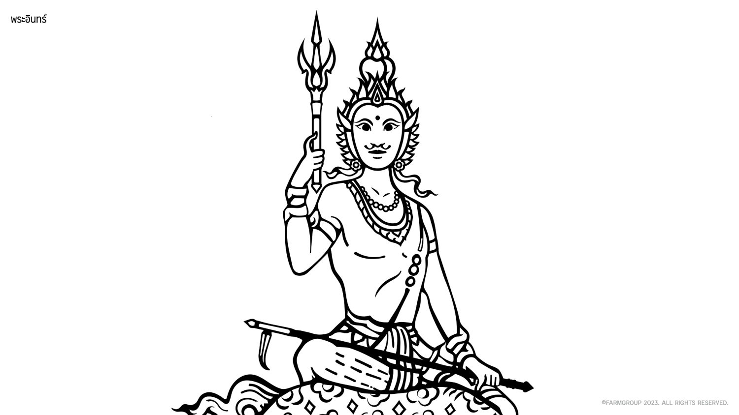
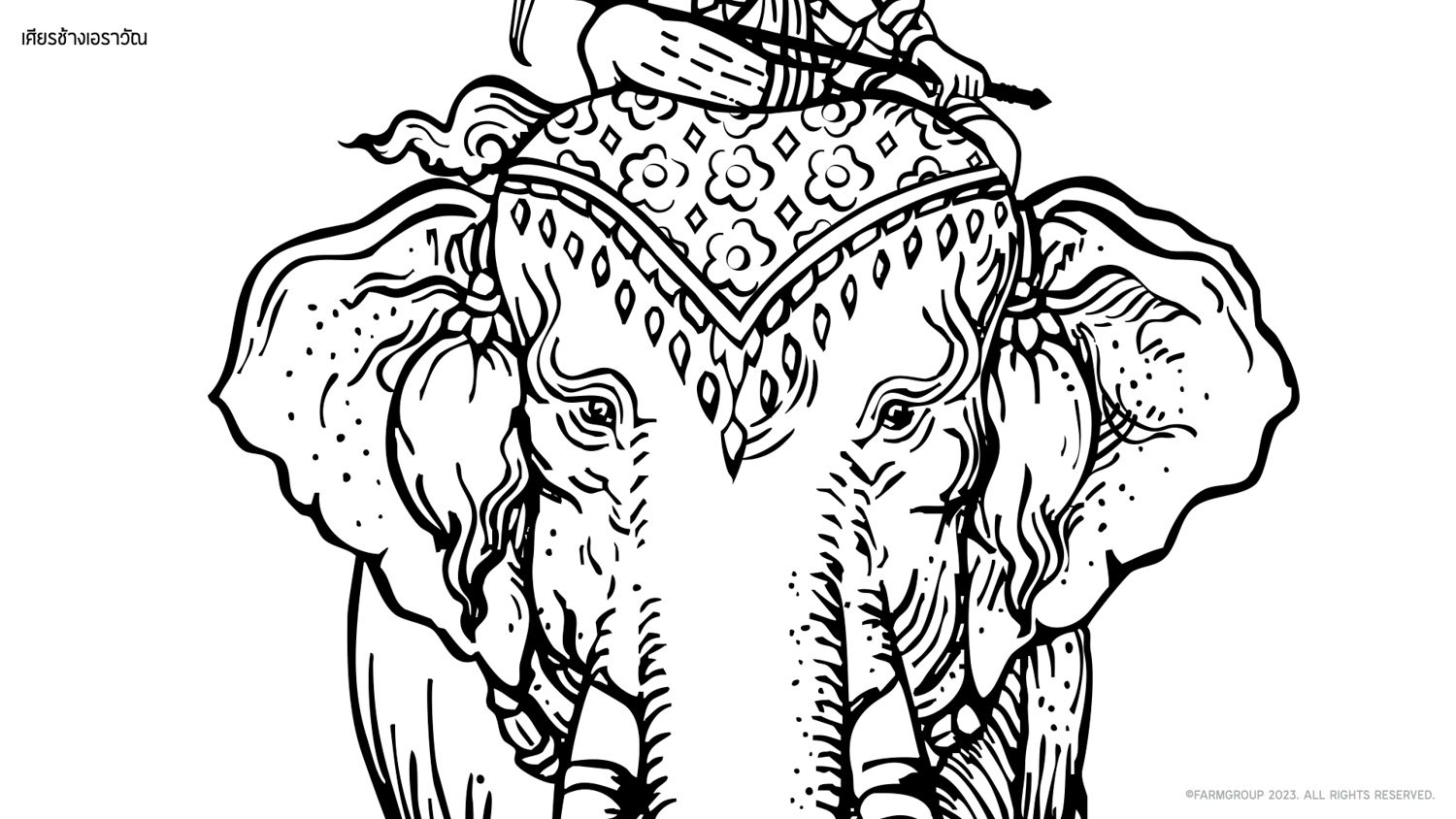
But the criticism has been a mix of flowers and bricks. A lot of people have voiced their skepticism about the design, specifically the alterations made to the image of Indra riding on the Earwax elephant on the city’s emblem. The debate revolves around concerns raised about the distorted proportions and the excess fingers of the Hindu god.
It doesn’t seem fair to hop on the bandwagon of online criticism without taking into account the design team’s perspective. We made the decision to meet with Farmgroup in order to discuss the project’s ideas and the challenges faced by the design team responsible for creating the identity system for the capital city of Thailand.
When the Bangkok Metropolitan Administration (BMA) announced that they were seeking a team to design the city’s identity system, Farmgroup initially considered passing up on the opportunity. Not due to lack of experience, but the prospect of working with a governmental agency in Thailand was what made them hesitant. They doubted the selection process of a project of this nature, which is usually based on price rather than actual quality and often leads to disappointing outcomes. However, their minds were changed upon discovering that the project’s consultants would include Siam Attariya, Wee Viraporn, and Supichan Rojvanich, renowned figures in the design industry, as well as other individuals with expertise in the design and creative fields. After their concerns were alleviated, they decided to participate in the pitching competition and were chosen as the winners.
“The project was initiated before the current governor, Chadchart Sittipunt, took office with a properly allocated budget and everything. Chadchart, as the new governor, brought the project back to the table, having recognized the significance of Bangkok having its own identity system before the BMA team went on to invite a number of experienced designers to be the project’s consultants,” Vorathit Kruavanichkit, Chief Creative Officer of Farmgroup, recalled.
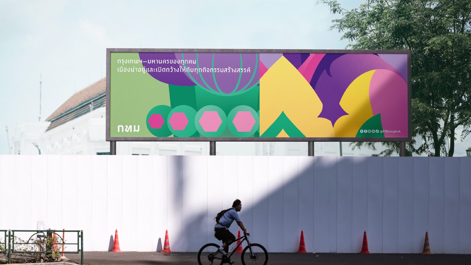
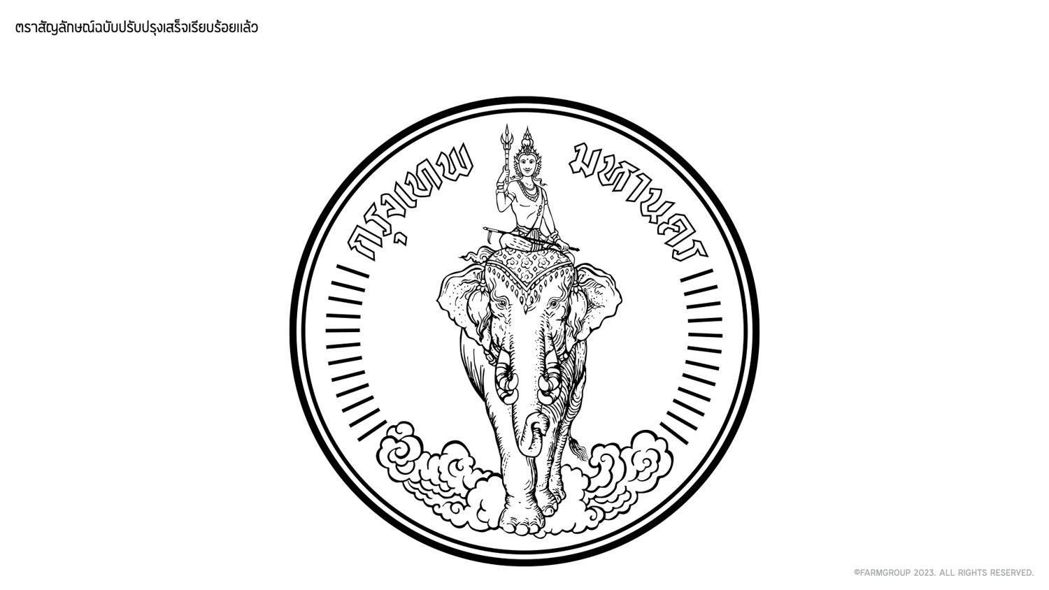
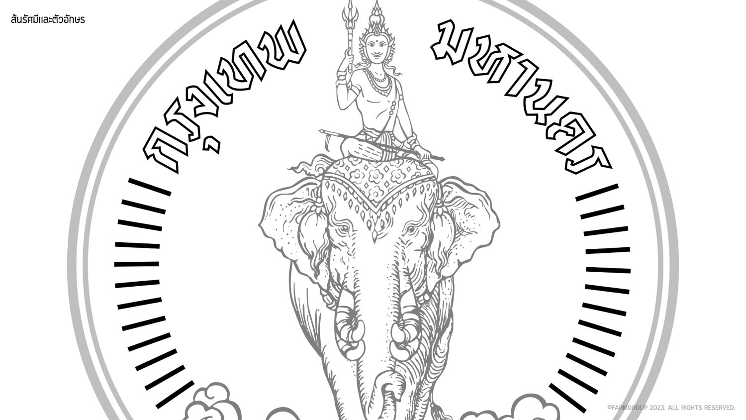
The project comprises two main briefs. The first redesign was of the Indra riding Erawan elephant emblem.
“The reason for the redesign of the long-standing emblem was that the BMA did not possess any original files of it. Each department was using different versions and files, and there had not been a proper archive of the original and official emblem’s file,” Vararin Sinchai, the Chief Operating Officer of Farmgroup, explained.
Farmgroup was assigned the task of finding the appropriate reference in order to create a new and original digital file. After conducting their research, they came to the conclusion that the version they would use with the design would be the Bangkok Metropolitan Administration published in the 1973 Royal Gazette.
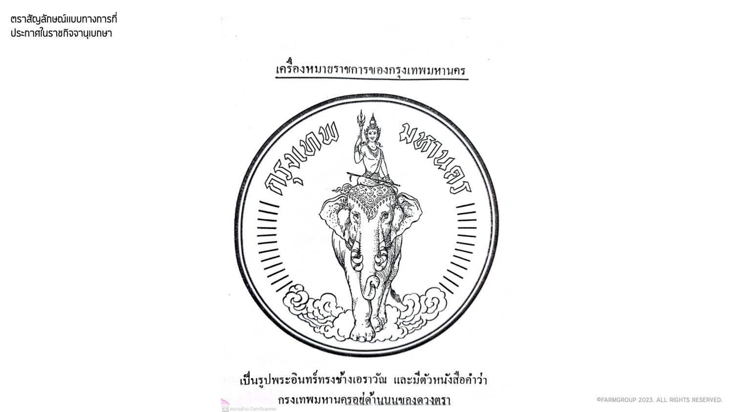
The Bangkok Metropolitan Administration published in the 1973 Royal Gazette.
“The origin of the Indra riding the Erawan elephant emblem can be traced back to the request made by the BMA to use a hand-drawn image created by Prince Narisara Nuwattiwong. This initial hand-drawn version was then sent to the Department of Fine Arts for some touch-ups, eventually resulting in the creation of the complete official version of the emblem,” Meekit Supyen, Senior Graphic Designer, told us about the origin of the symbol.
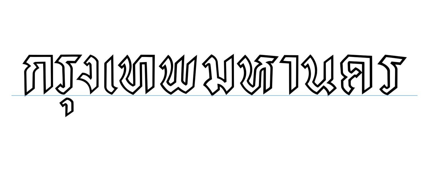
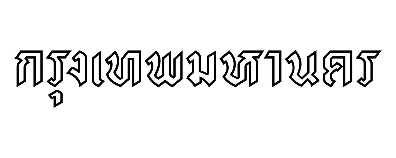
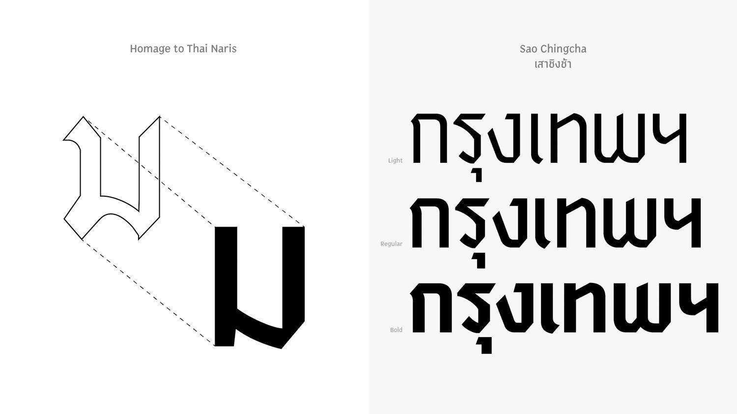
The official version used in the 1973 Royal Gazette was one of several versions available. The Department of Fine Arts incorporated 24 lines around the elephant, symbolizing the 24 districts of Bangkok during that period. Prince Narisara Nuwattiwong also created the ‘Ribbon font,’ which has design elements that are present in the new lettering of the city’s official Thai name, ‘กรุงเทพมหานคร.‘
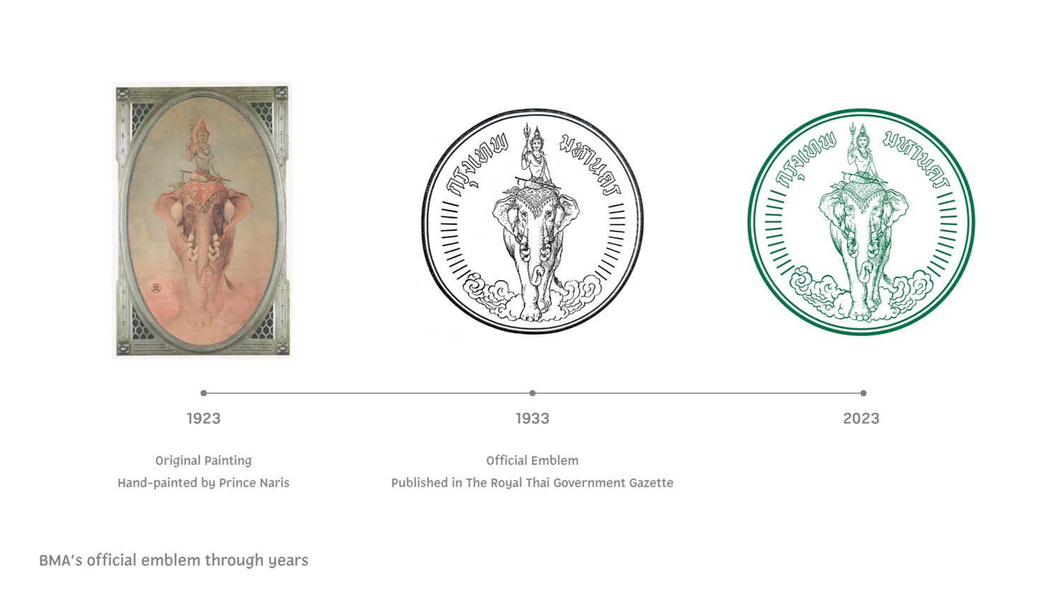
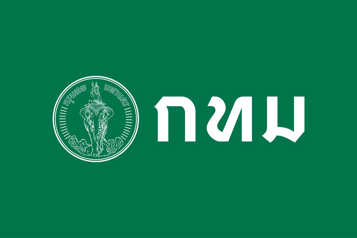
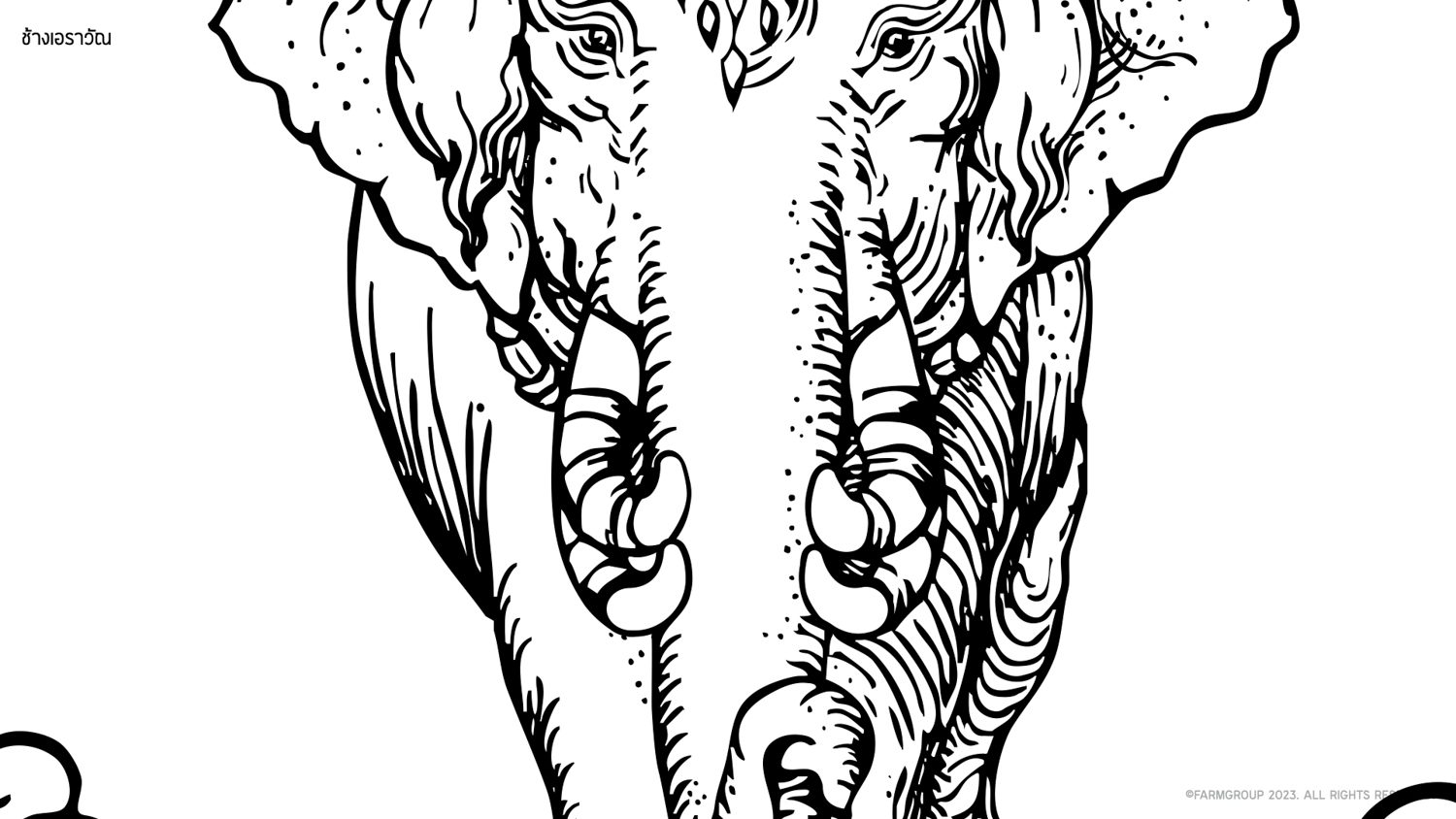
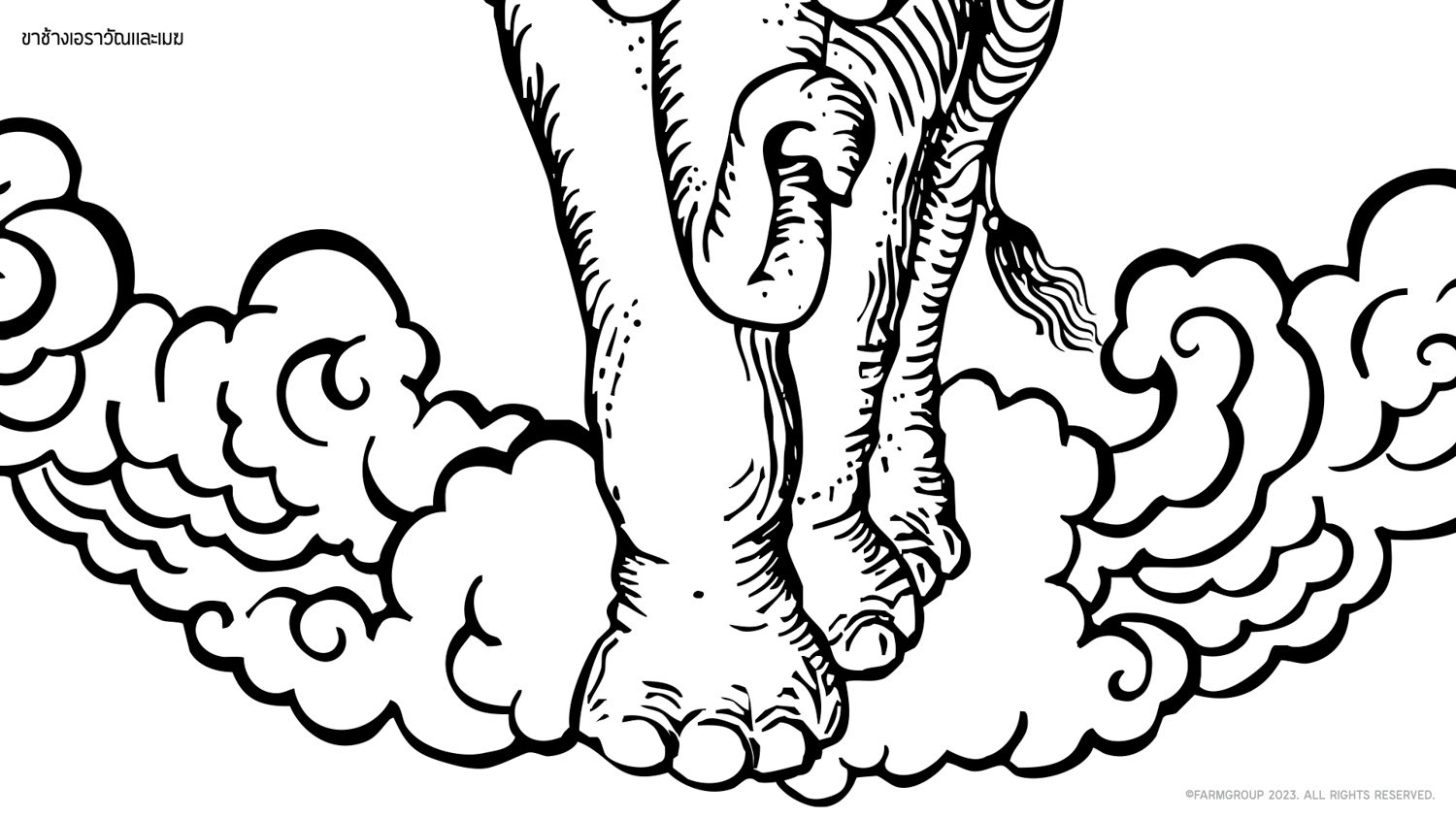
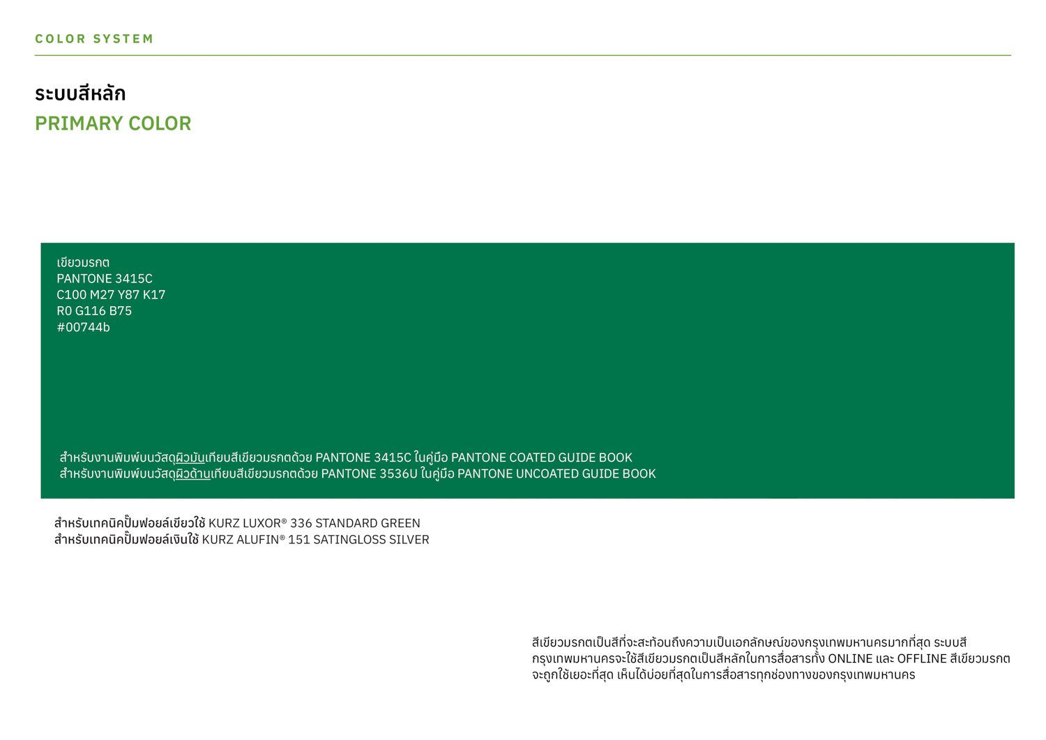
The Farmgroup team adjusted the proportions of the symbol to fit the new applications and contemporary context, while also sharpening the lines, in order to convert it into a digital form. The changes pertain to the symbol utilized in the Royal Gazette as well as the hand-drawn rendition created by Prince Narisara Nuwattiwong. The lettering of ‘กรุงเทพมหานคร‘ was rearranged, ensuring that the proportions, spacing, and boldness of each letter were appropriately adjusted. The principal color, emerald green, is a reference to the color of Indra’s body. The chosen shade is carefully considered for its suitability across different mediums, including on-screen, in print, and street art on walls.
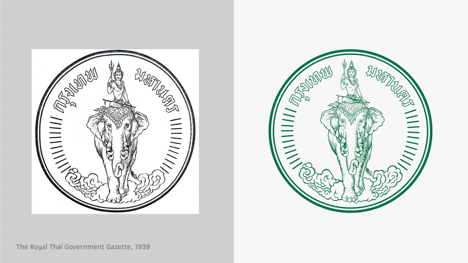
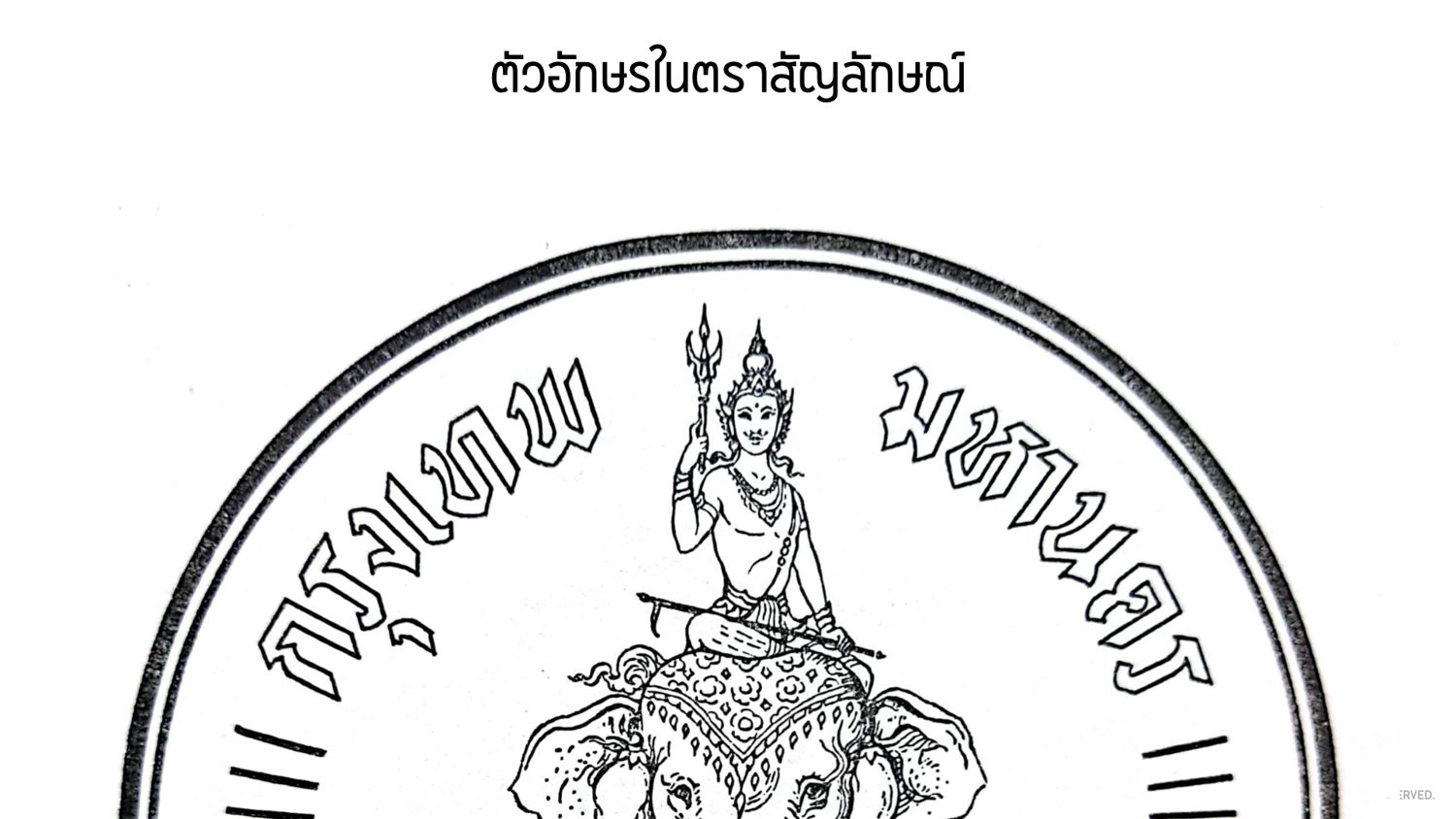
The original lettering of ‘กรุงเทพมหานคร’ on the emblem
One of the challenges they encountered while working with the symbol was its low resolution and the unclear details in the royal gazette version. The design team’s interpretation of various elements, based on the references they had, gave birth to the design that has attracted widespread criticism. One particular aspect that received attention was the accuracy of Indra’s fingers. “There are numerous ways to interpret the accuracy of fingers. There is a debate about whether it’s the index finger or the thumb. In traditional Thai art, painters often depicted a thumb that was longer than usual. So, we interpreted the symbol as Indra, the god and his four fingers facing forward,” Vararin explained.
“Then there was an issue over the Sangwan (a type of cross-body chain). Our team did some research and found out that the jewelry adorning the chain is actually in a diamond shape, not a round one. A concern arose when we presented the information during one of the meetings. The BMA team, who have been accustomed to the round shape for a considerable period of time, expressed what they’re worried about. They mentioned that if we were to change it to a diamond shape, they would need to write a proposal for a new emblem and issue a new royal gazette. This process would be overly complicated. Consequently, we collectively decided to keep the round shape as it was.”
![[metaBangkok Metropolitan Administration's identity systemslider id="86000"]](https://art4d.com/wp-content/uploads/2023/12/231117_BMA.027_low-res.jpg)
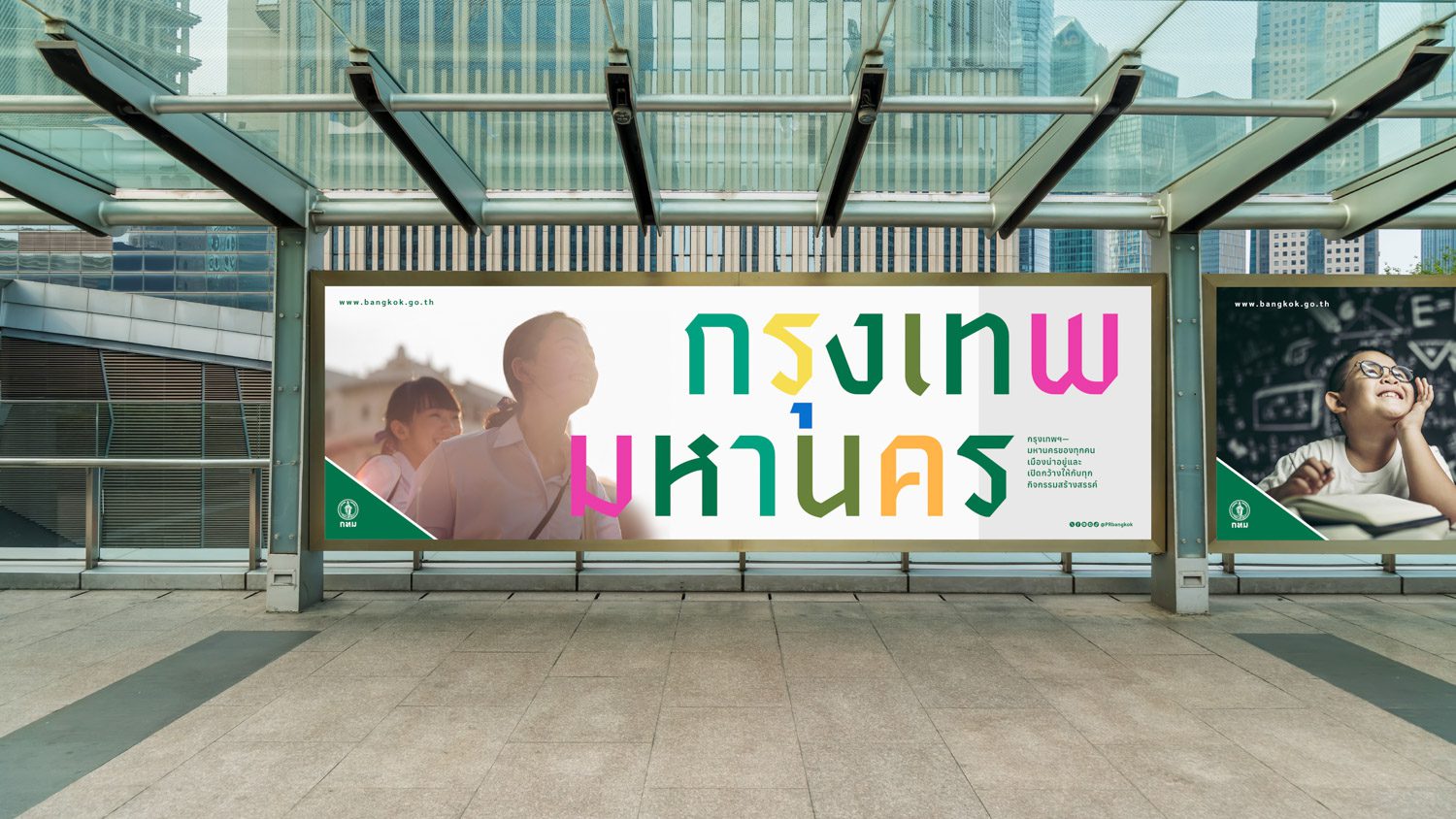
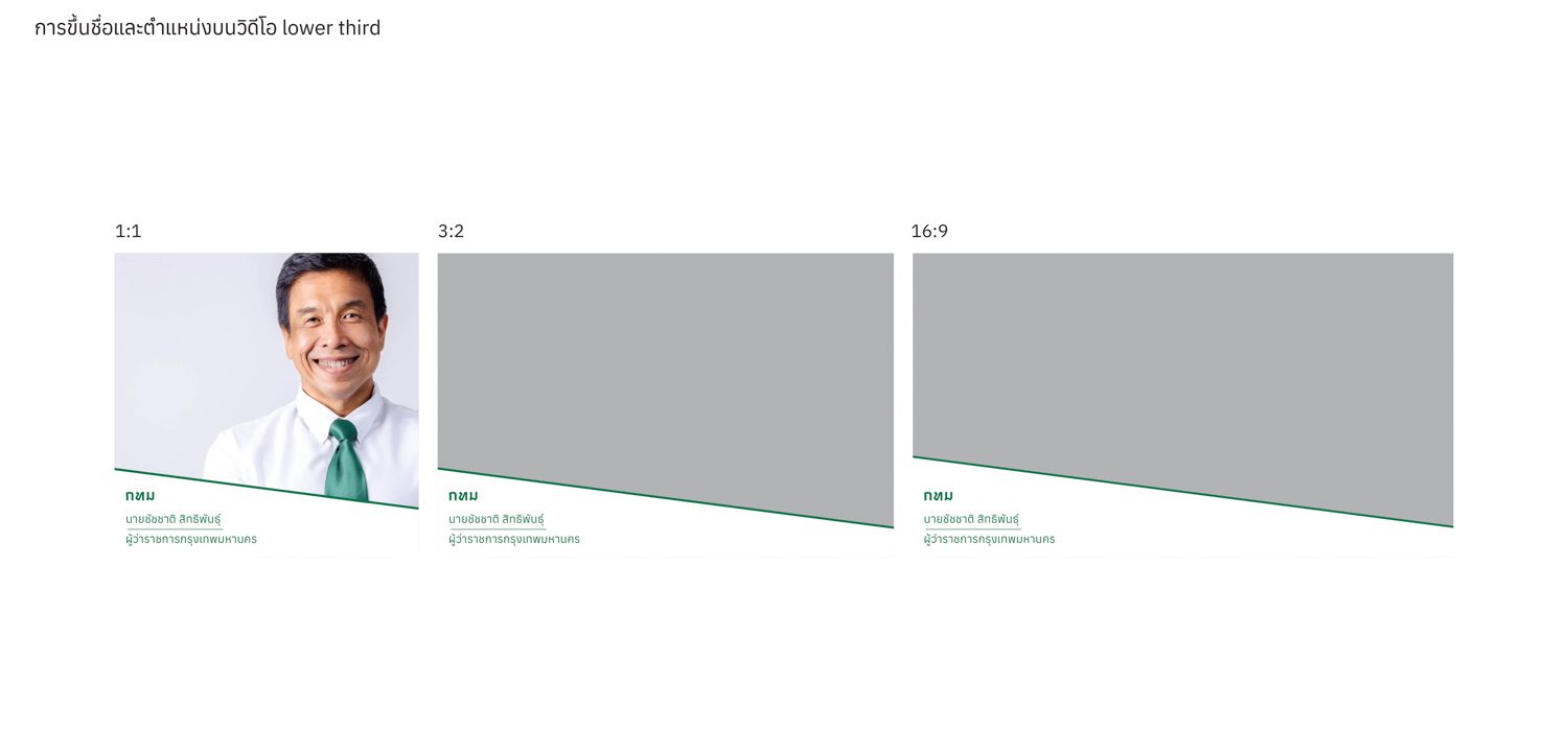
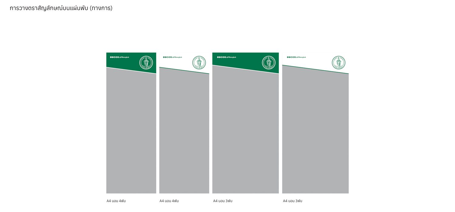
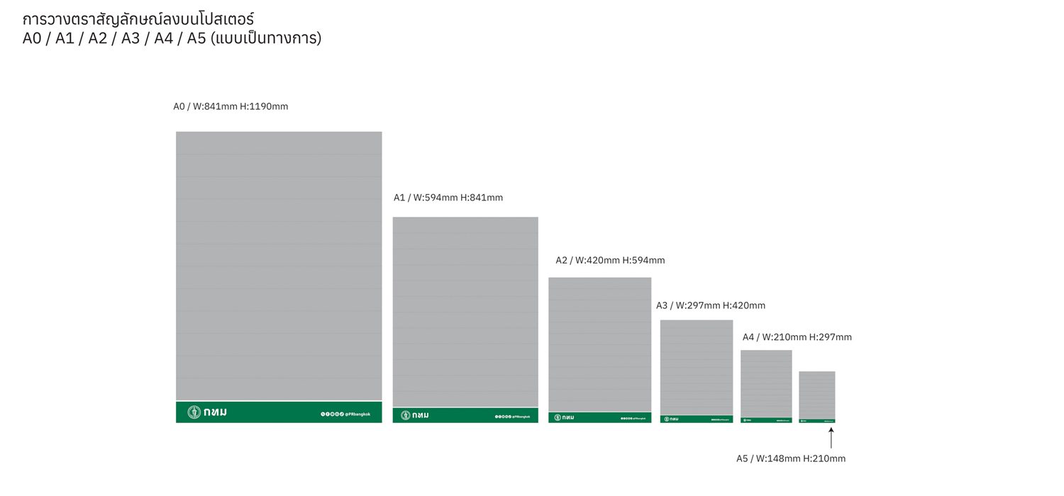
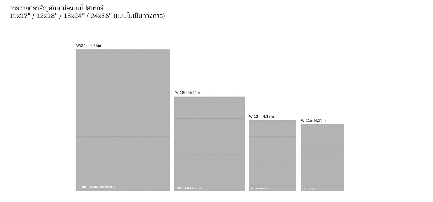
The design of the actual identity system was the next significant challenge that Farmgroup needs to overcome. Due to the large and complex nature of the BMA, which is a governmental organization with diverse communication styles, the design team ends up developing two identity systems.
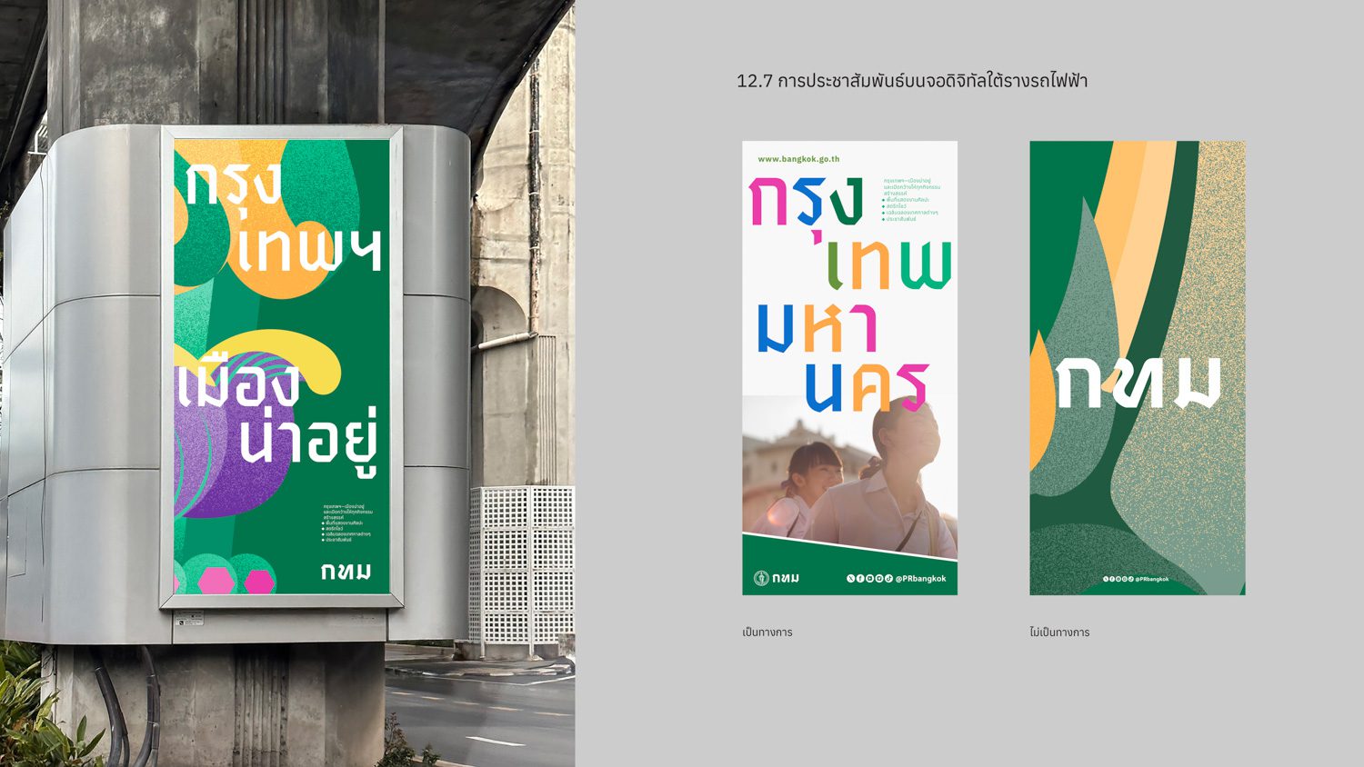
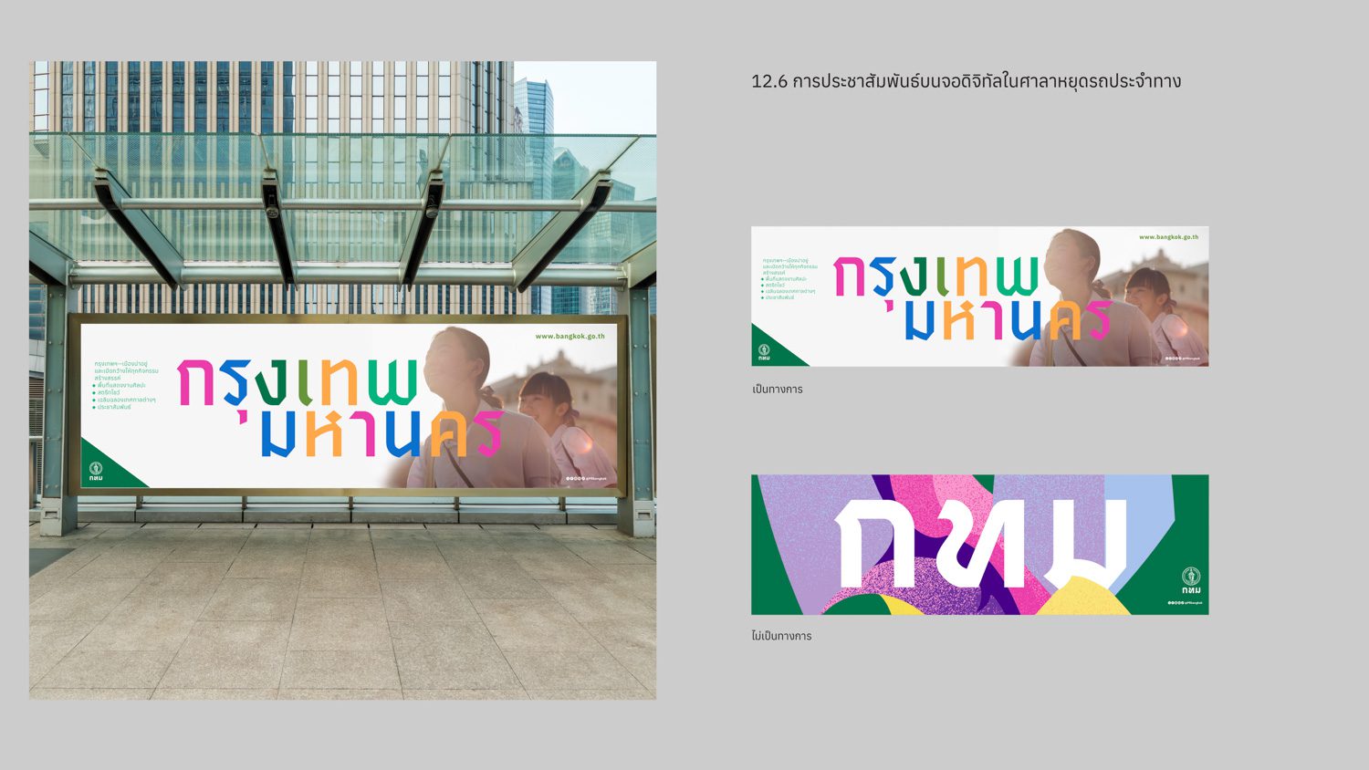
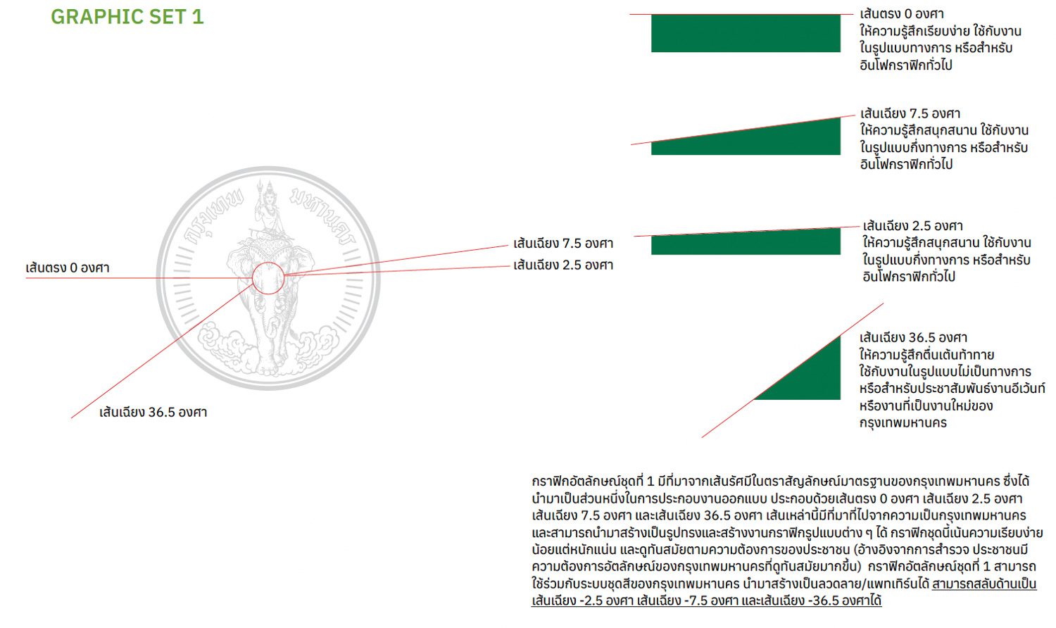
The first option features a formal design that is understated yet firm. It strikes a balance between being contemporary and approachable without being overly modernized. The main components consist of stripes that feature multiple angles. The 24 lines in the original symbol inspired the stripe details. With Bangkok now having 50 districts, the new design breathes new life into the original symbol.
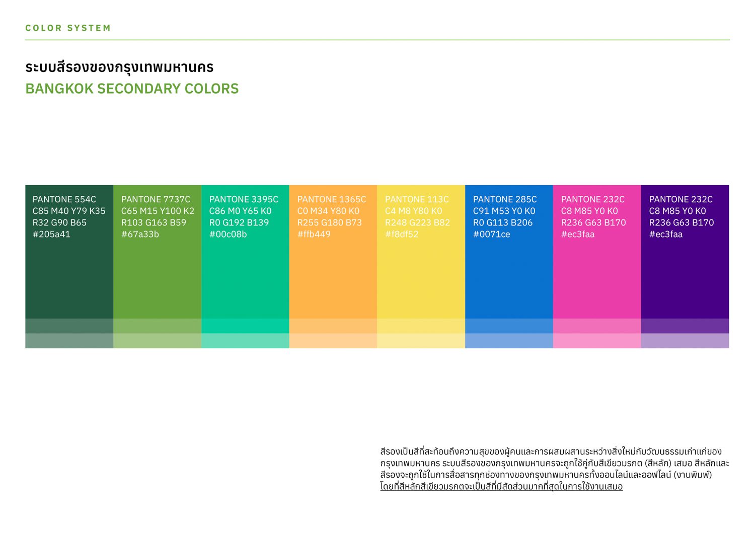
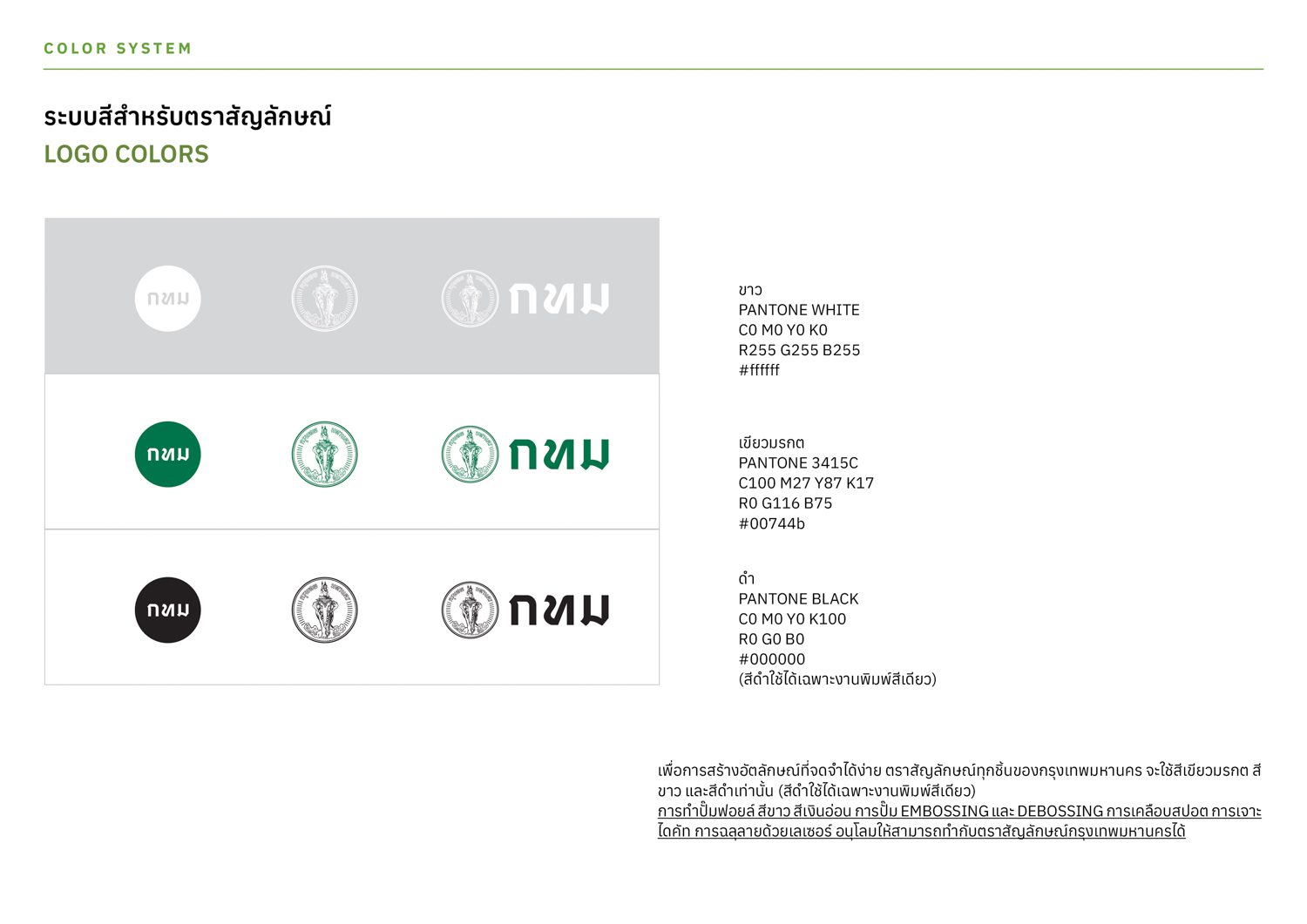
Meanwhile, the secondary colors reflect the concept of ‘diversity,’ which was derived from the survey where people were asked about their perception of Bangkok. The color scheme draws inspiration from everyday objects found on the streets of Bangkok, as well as the colors of the city’s significant landmarks. This choice of colors represents the diverse ways of life, vibrant culture, and unique character of Bangkok.
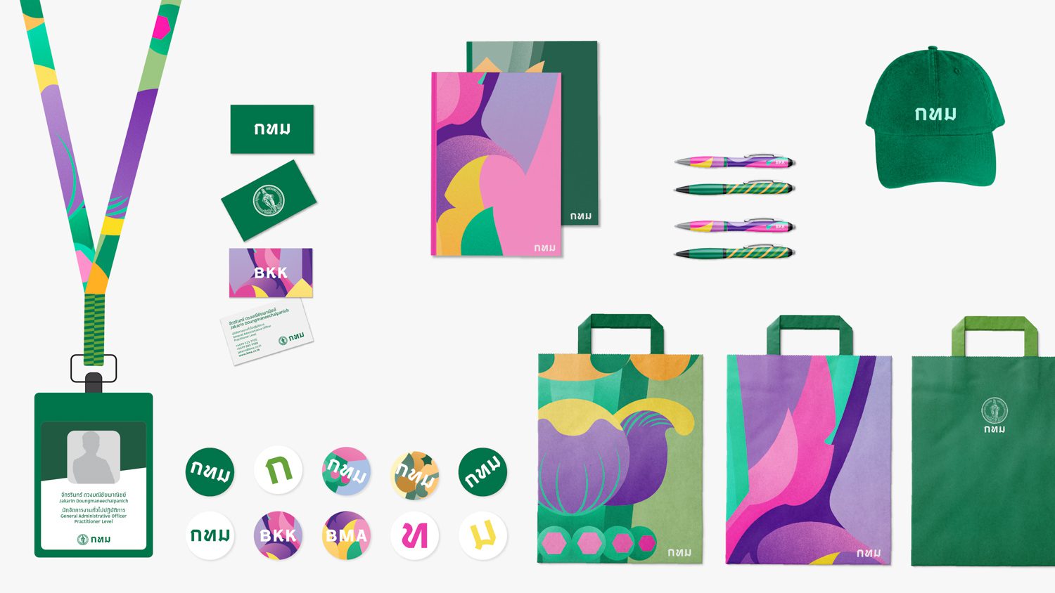
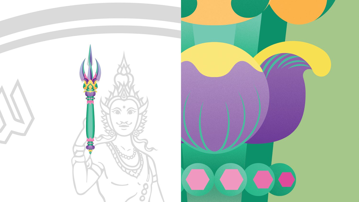
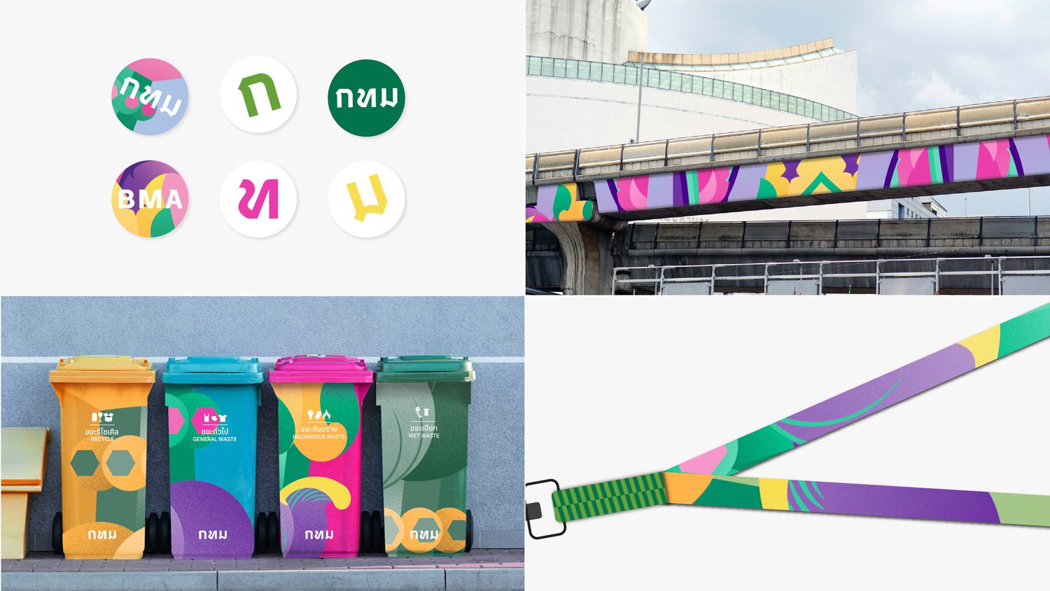
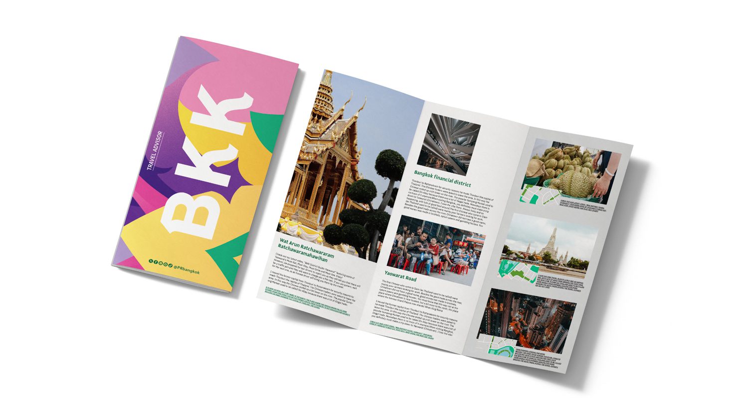
Another identity system is less formal and more fun. Wachara, the sword that the god, Indra always carries with him, served as inspiration for the illustration’s main element. When placed on official items such as bags, caps, and hats, as well as posters used for various promotional purposes, the vibrant illustration is zoomed and cropped. Farmgroup devotes special attention to designing two identity systems that will be easier for the BMA team to use in future projects.
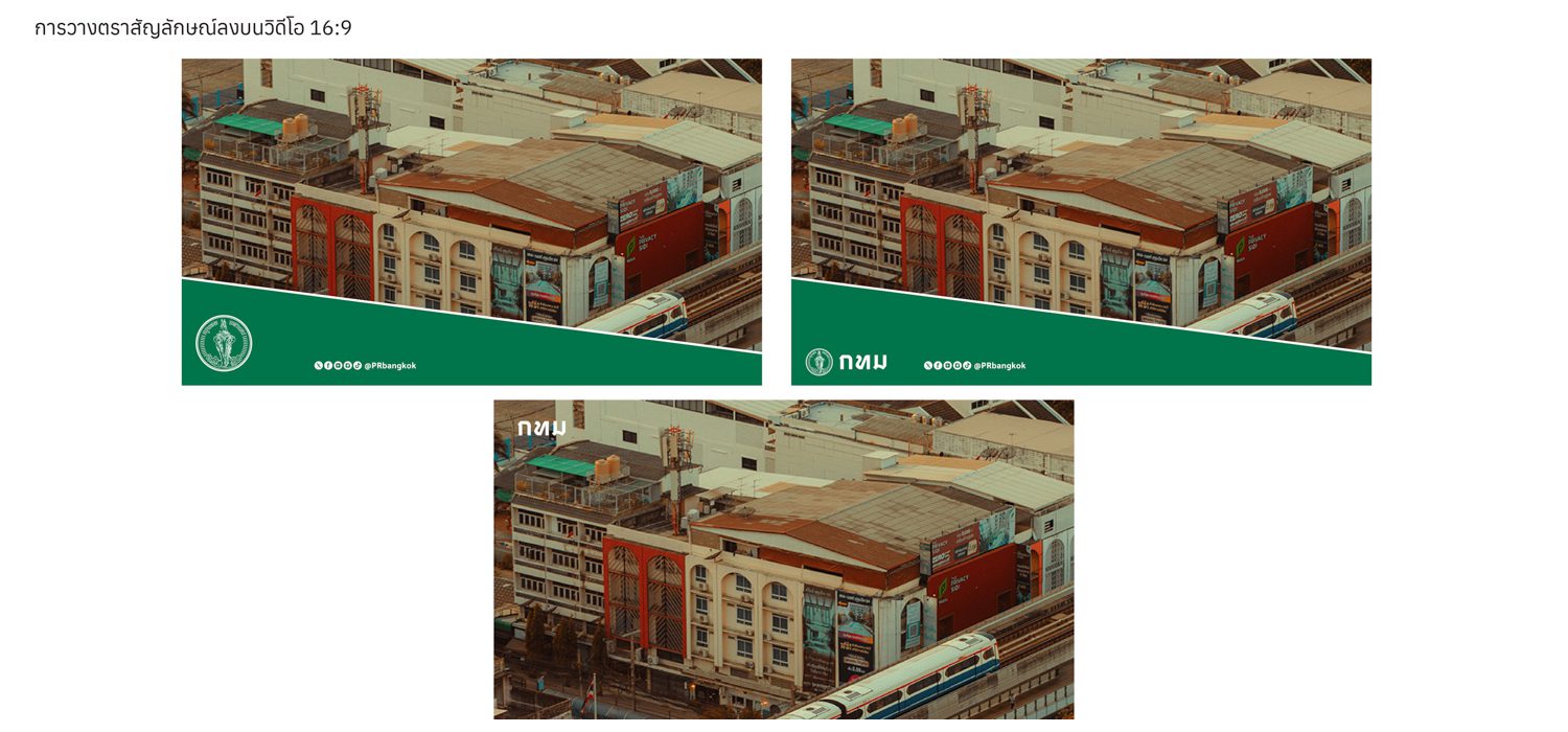
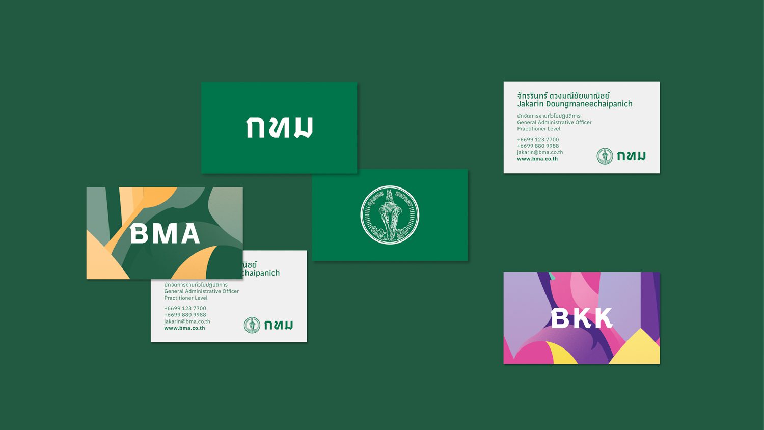
Farmgroup designed the, ‘BMA’, and ‘BKK’ logotypes, which are meant to become iconic symbols for Bangkok alongside the emblem. The design team felt that the detailed elements of the emblem might not be appropriate when used in a smaller scale, so the logotypes were created for such purposes. Stylistically, the logotypes precisely preserve the graphic components and aesthetics of the official ‘กรุงเทพมหานคร‘ lettering.
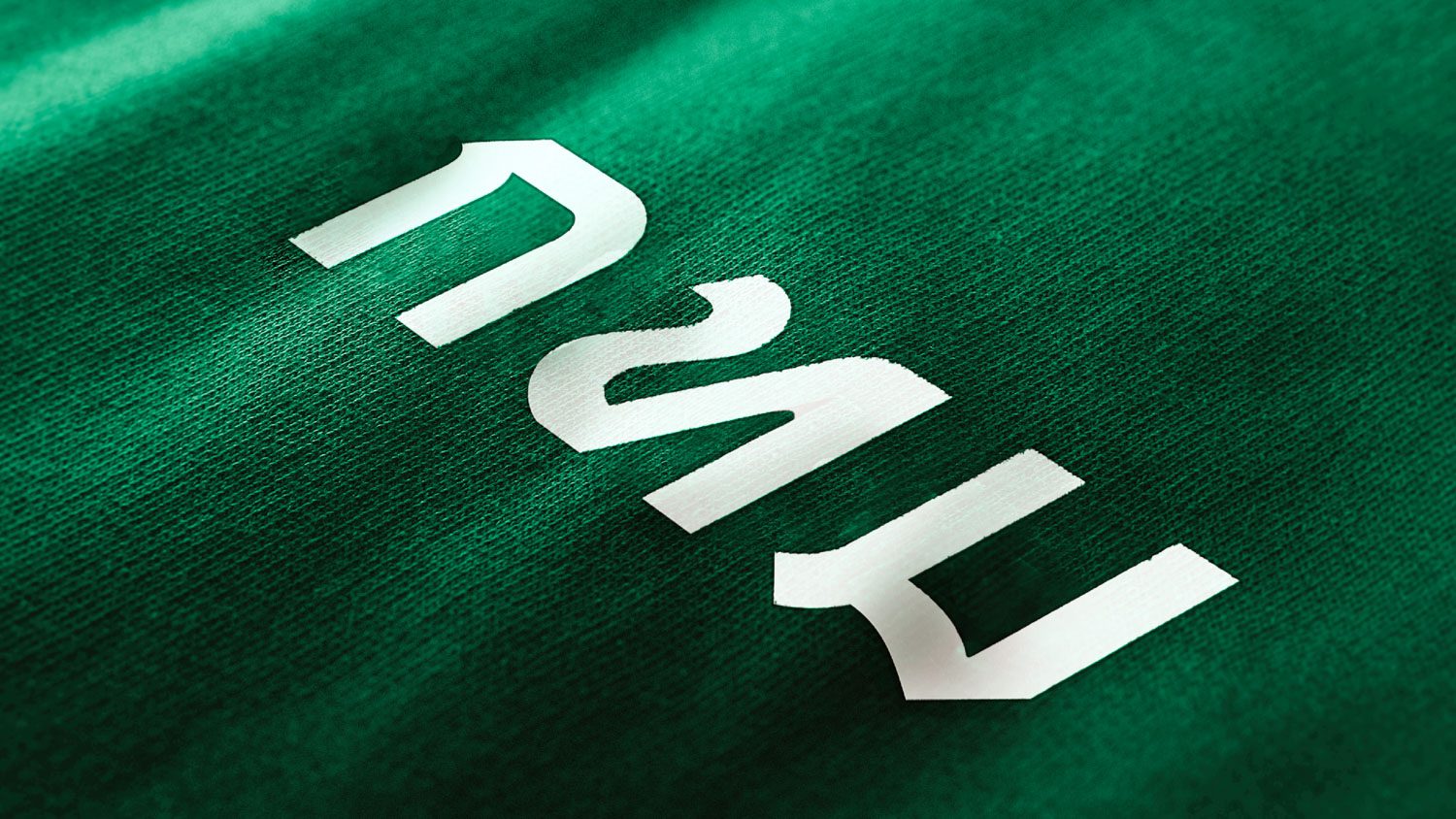
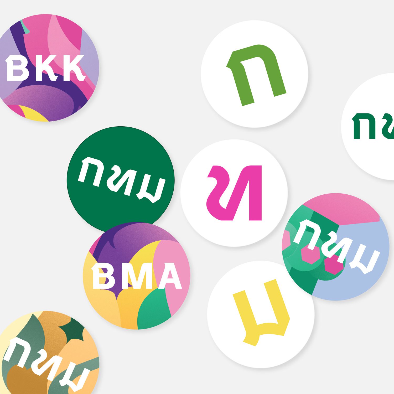
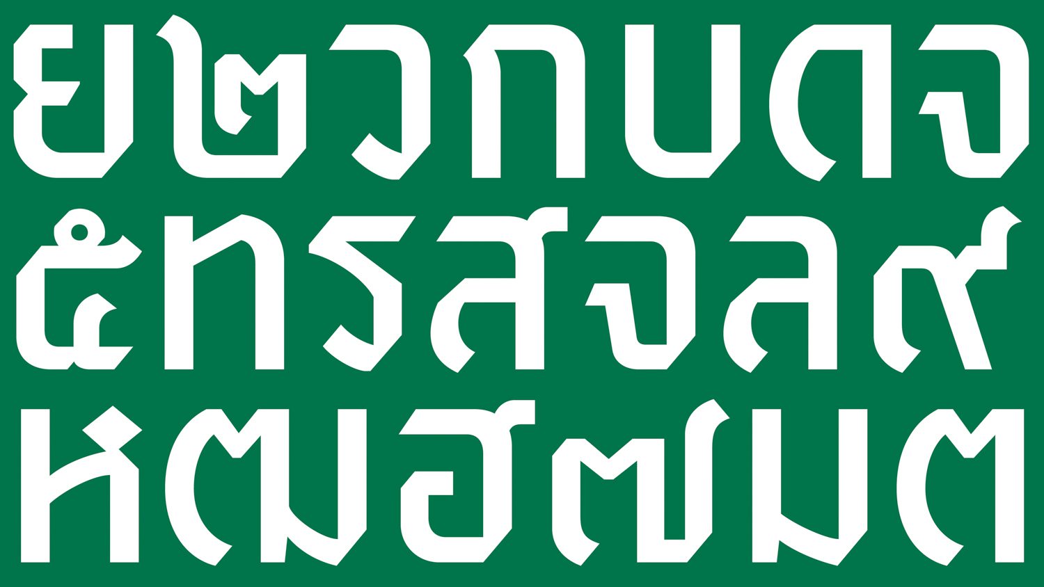
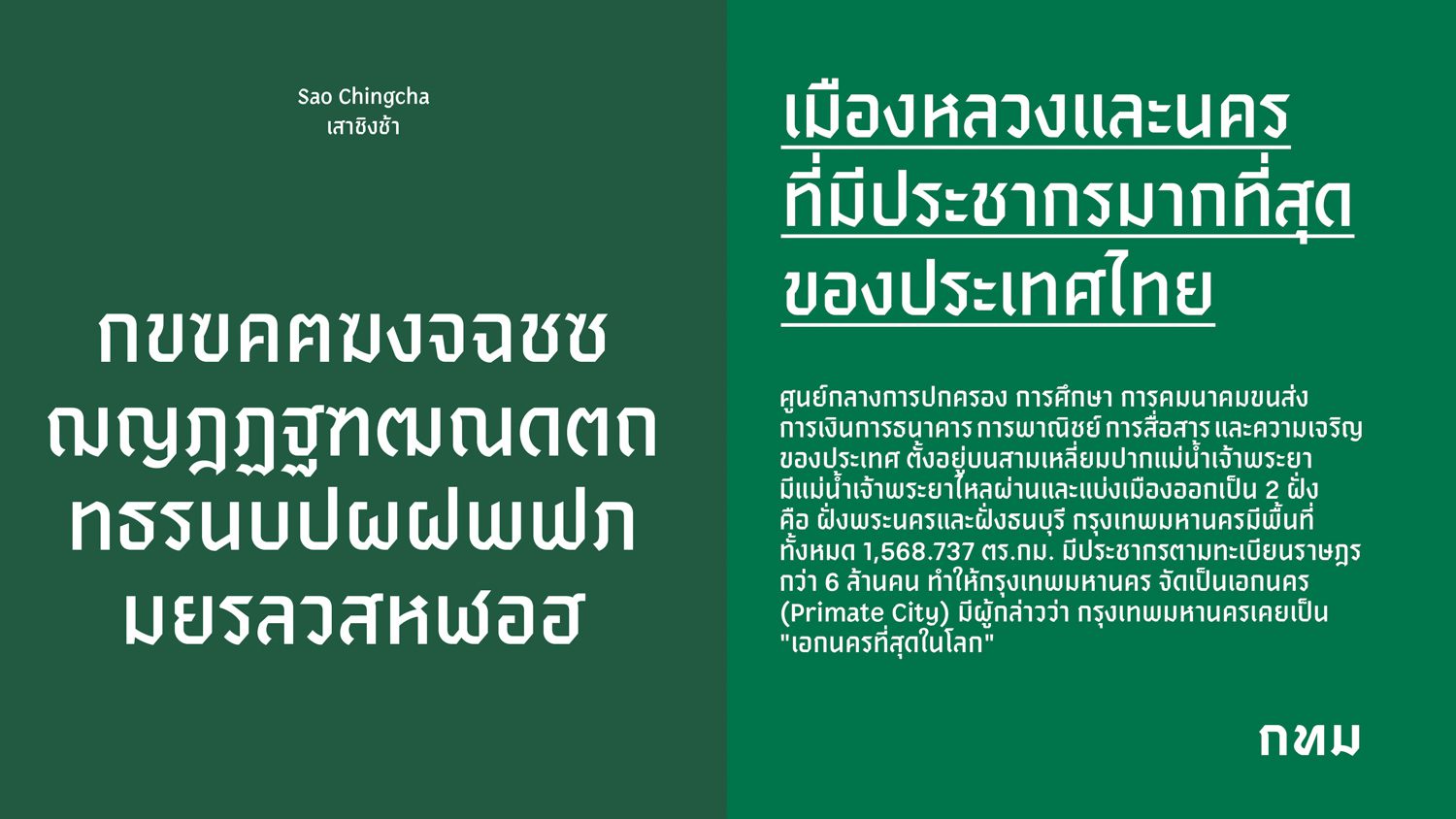
Farmgroup also created a new font named ‘Sao Chingcha,’ which is a display-type font designed for communication purposes. Another graphic designer on the team, Suppalak Tantiwanitchakorn, stated that the most difficult aspect of designing the font is expressing the font’s distinct personality while making it applicable for a variety of uses. “The challenge lies in how to make the font possess its own unique character, express its root, and still be used comprehensively, whether for promoting the Songkran festival at Silom or in the city’s public announcement about a natural disaster such as a flood.”
The design team worked out such specific requirements by referencing the ‘กรุงเทพมหานคร’ lettering that the Department of Fine Art recreated from Prince Narisara Nuwattiwong’s handwriting. They studied various font designs produced by Prince Narisara Nuwattiwong, as well as components found in the prince’s unique handwriting created with his use of a fountain pen. The details have been refined to be more polished, contemporary, and effective.
The crucial question that Chadchart Sittipunt asked the design team was, “What will people get out of this?”
“Some might say, Why don’t you try to fix the traffic jam or the polluted air before doing a design-related project? But I believe the new identity will lift people’s spirits and energy. It has the ability to generate economic values, including how people from all over the world who visit Bangkok can take these items home as souvenirs, similar to how people buy products with the I ❤ NY logo,” was Vorathit’s response to the governor’s tough question.
“The identity system is highly useful to all BMA agencies because the organization has never had an official, proper identity system before. Using the logo used to feel like a merry-go-round where you had to ask a bunch of individuals and departments for it. It was an unnecessarily time-consuming process, and there was no consistency in the way the image symbol was used. The newly designed identity system will be a reference for everyone to know where they can get the official files and what the right colors are,” stated Vararin.
“We finished the project in just four months. We went through a temporary bubble stage while waiting for the survey team to collect information. It was a relatively short period of time for a project of this size. It was like running a marathon at the speed of a 100-meter sprint,” Vorathit explained. “We wanted the procurement process to be completely transparent if we had the power to revamp the entire system. We want BMA to have a clear brand strategy and a proper definition of how Bangkok strategizes itself, so that designers like ourselves and others can create designs that correspond to the brief. And we should have had at least six months to complete everything. The font alone took us 4-5 months to develop. A café’s branding normally takes us four months.”
“We’re always open for comments and feedback. We understand that the project was not finished when we handed over the design. It will undoubtedly require test runs. Farmgroup never stops looking for new ways to grow and improve. We have no plans to leave. We’re still here, and we’ll keep working on it until we create the best identity system for Bangkok,” Vorathit concluded.
