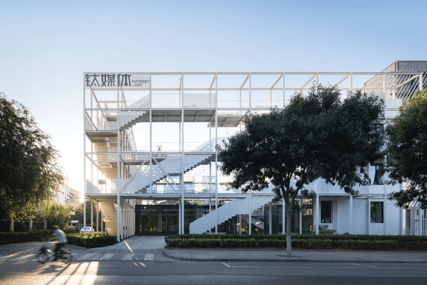
TMT FOLDING PARK


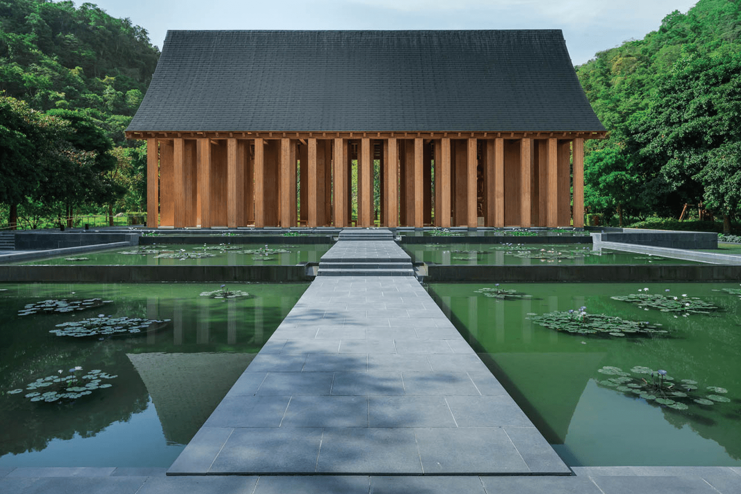
KHAO YAI PRIVATE MEDITATION CENTRE, SITUATED IN EXPANSIVE FORESTED TERRAIN OF KHAO YAI, WAS EMERGED FROM THE QUESTION ‘ HOW TRADITIONAL THAI ARCHITECTURE COULD HARMONIZE WITH THE UNIVERSAL CHARACTERISTICS OF ARCHITECTURE ’
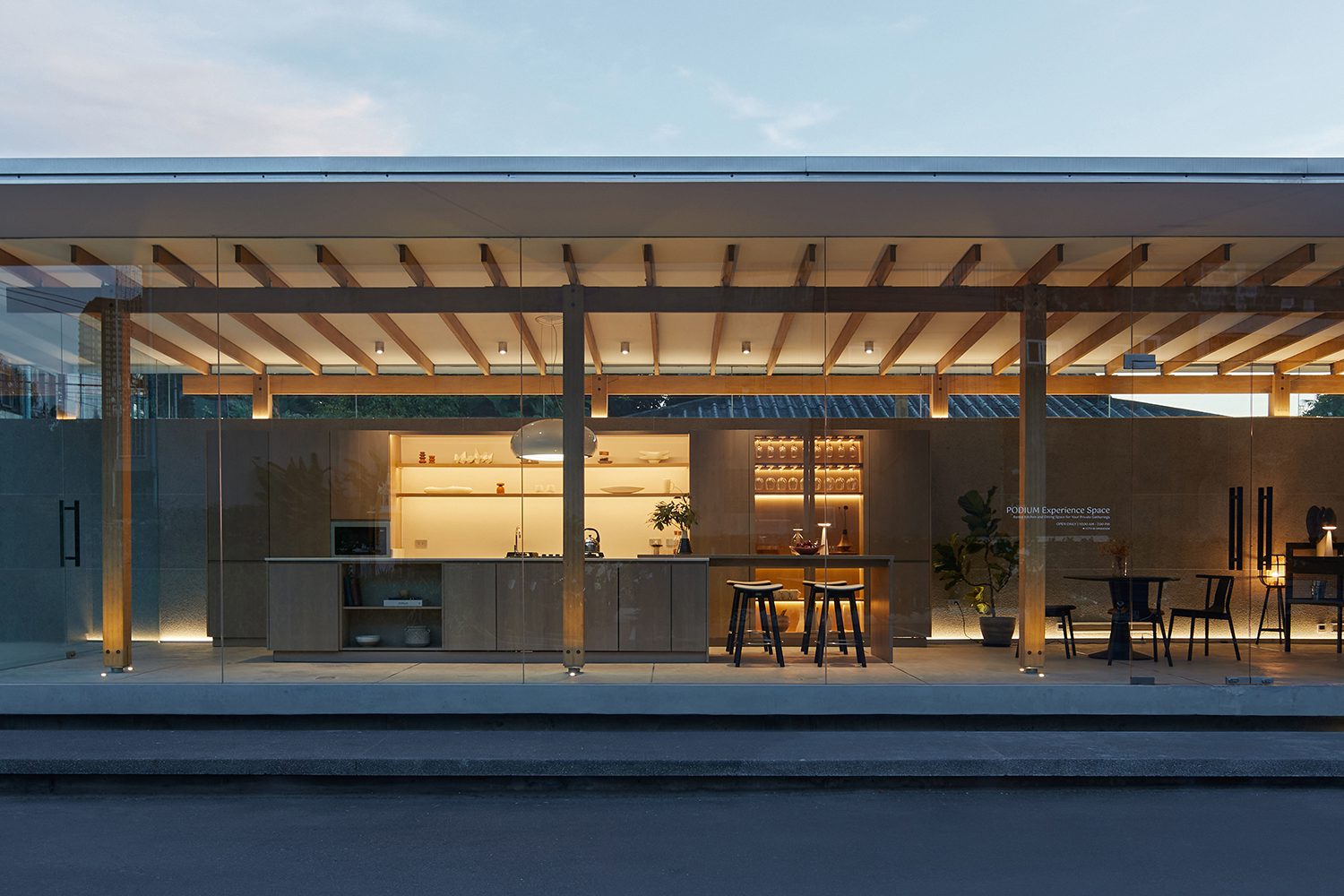
WITH LESS IS MORE DESIGN CONCEPT, PODIUM’S BRAND-NEW BUILDING LETS EVERYONE COME AND EXPERIENCE THE DINING AREA AND WOOD MODULAR KITCHEN FURNISHED WITH THE BRAND’S FURNITURE COLLECTION
MEKA RAMINTRA | Type A
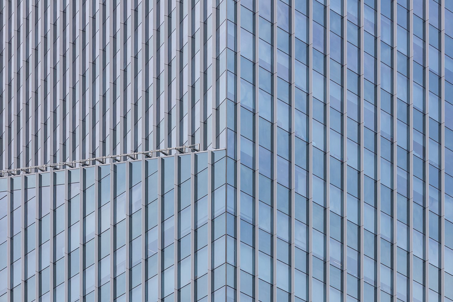
GUARDIAN GLASS, ONE OF THE LARGEST GLASS PRODUCERS AND INNOVATORS IN THE WORLD, WILL SHOW US THE DESIGN AND CONSTRUCTION OF HIGH-RISE BUILDINGS IN CENTRAL BUSINESS DISTRICTS IN APAC DURING THE PAST 30 YEARS AS A BUSINESS PARTNER
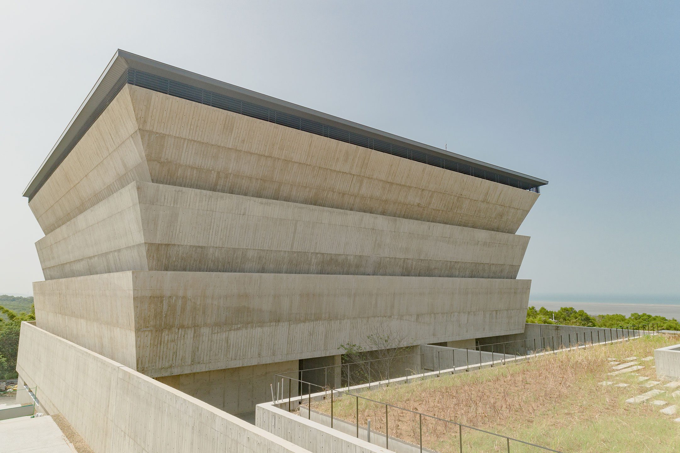
THE COLUMBARIUM WITH THE GOAL TO DESIGN A FUNERAL SPACE THAT ALSO PROVIDES VALUE AS A PUBLIC SERVICE AND THE PESSIMISTIC PERCEPTION OF TRADITIONAL OUTDOOR CEMETERIES

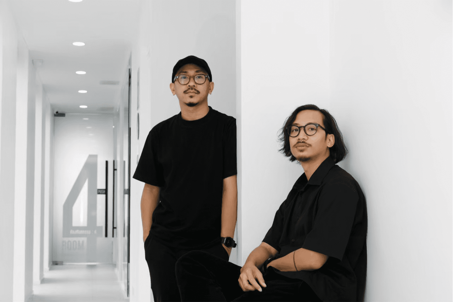
(Left) ฺBall – Tanachat Sooksawasd, (Right) Pomm – Karn Khamhaeng | Photo courtesy of pommballstudio
JOIN IN A CONVERSATION WITH THE STUDIO WHO DESIGNED AN IMPRESSIVE NUMBER OF CAFÉS IN CHIANG MAI, AND DID NOT WANT THEMSELVES TO RELENTLESSLY STRIVE TO GROW