THE RESIDENTIAL DEVELOPMENT IN BANG YAI BY SC ASSET IS INSPIRED BY LAKE COMO AND APPLIES COLONNADE ELEMENTS IN A CONTEMPORARY MANNER, FORMING A HARMONIOUS BLEND OF SOPHISTICATION, AND MODERNITY
BANGKOK BOULEVARD SIGNATURE WESTGATE
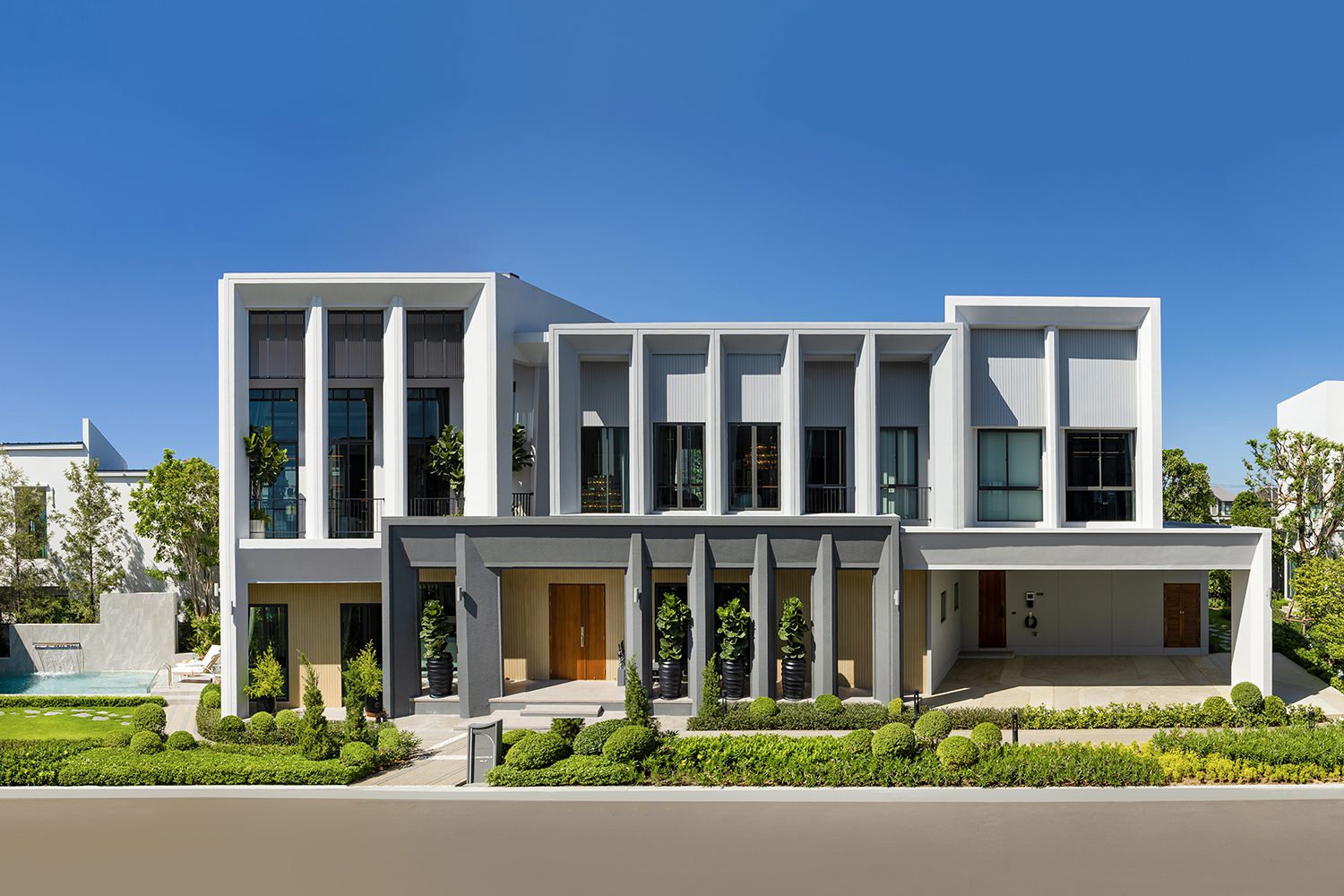
THE RESIDENTIAL DEVELOPMENT IN BANG YAI BY SC ASSET IS INSPIRED BY LAKE COMO AND APPLIES COLONNADE ELEMENTS IN A CONTEMPORARY MANNER, FORMING A HARMONIOUS BLEND OF SOPHISTICATION, AND MODERNITY


THE EXHIBITION IN BACC PRESENTS CONTEMPORARY ARCHITECTURAL WORKS BY 8 DESIGN STUDIOS FROM THAILAND AND TAIWAN, UNRAVELING THE CONNECTION BETWEEN ARCHITECTURE AND THE EARTH ON WHICH IT IS SITUATED

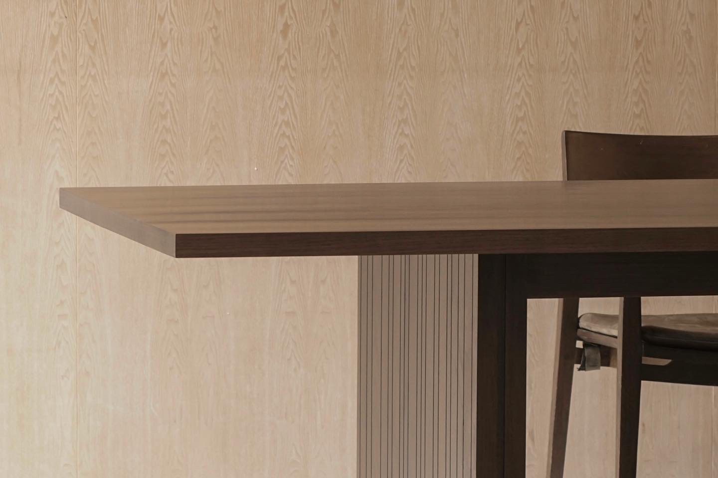
SPEAKING WITH TARITH THAIYANONT FROM ABOUT HOME ABOUT THE WOOD, THE MATERIAL THAT HOLDS A SPECIAL PLACE IN HIS HEART, AND HIS REVIVAL OF FINE AMERICAN HARDWOOD SCRAPS INTO FURNITURE
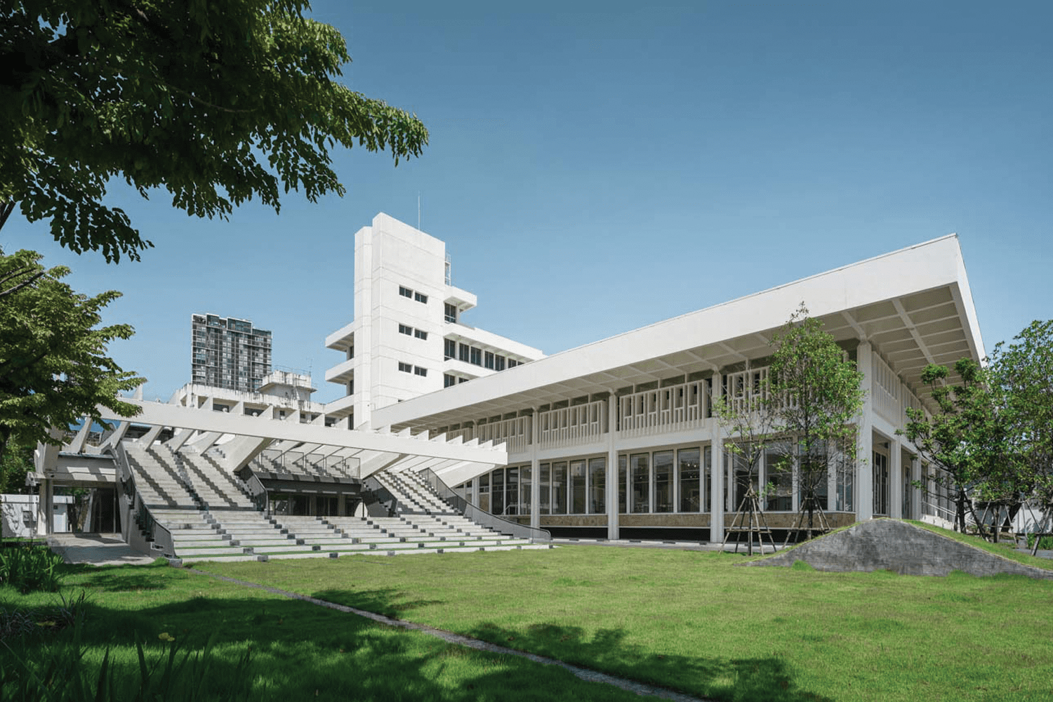
PLAN ARCHITECT, ALONG WITH GLA DESIGN STUDIO AND PLAN MOTIF TRANSFORMED THE OLD BUILDING OF THE BANK OF THAILAND’S NORTHEASTERN REGION OFFICE INTO AN APPROACHABLE LEARNING SPACE IN KHONKAEN’S DOWNTOWN
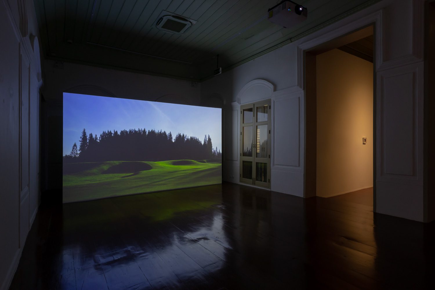
MITI RUANGKRITYA PROBES INTO THE BIRTH, DEATH, AND RESURRECTION OF IMAGES FROM THE HAND OF HUMAN BEINGS OR AI, TAINTED WITH BIASES ALIKE
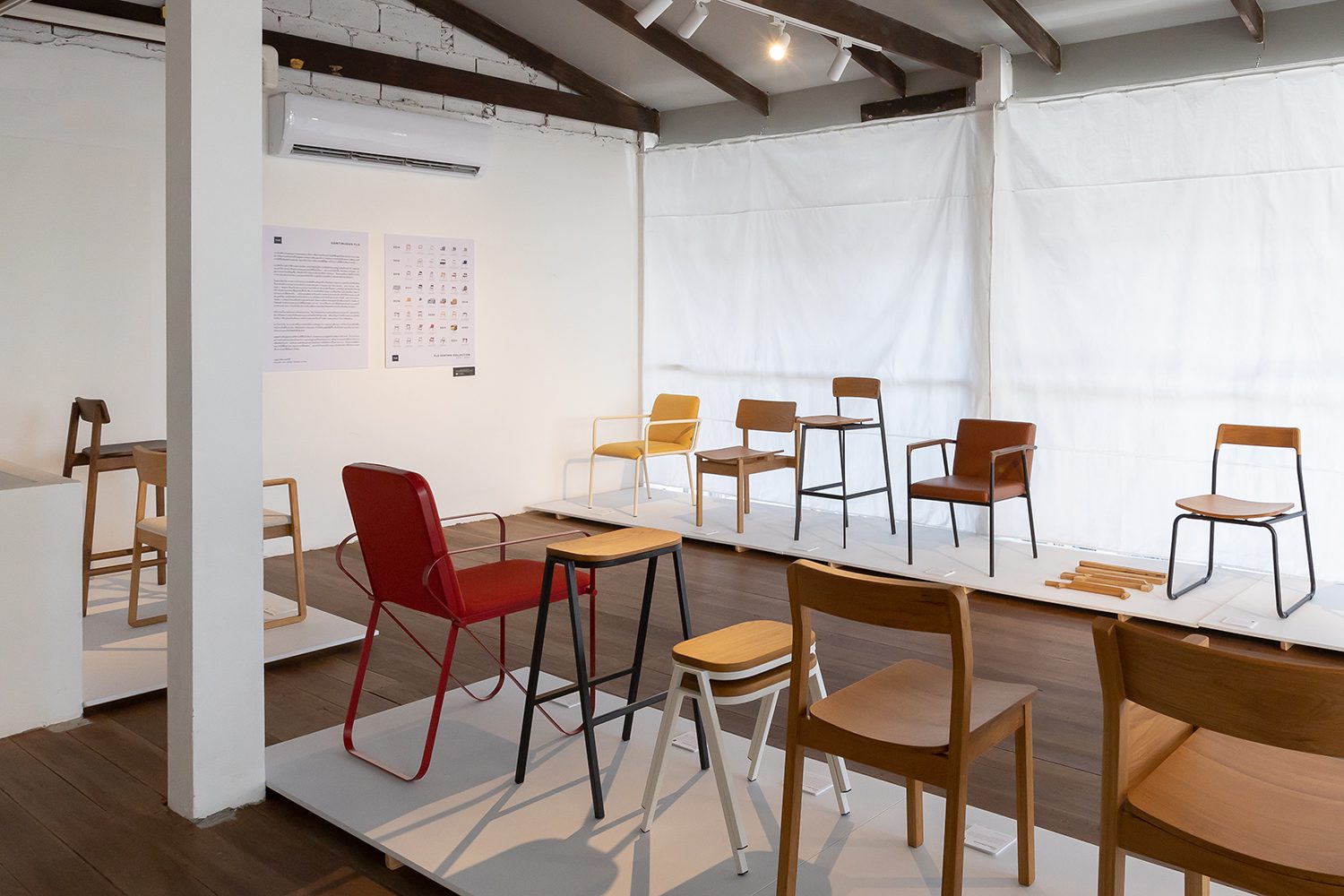
FLO, THE THAI FURNITURE BRAND, IS CELEBRATING ITS NINTH ANNIVERSARY WITH A DESIGN SHOWCASE FEATURING THE EVOLUTION OF CONCEPTS AND FURNITURE OVER THE YEARS
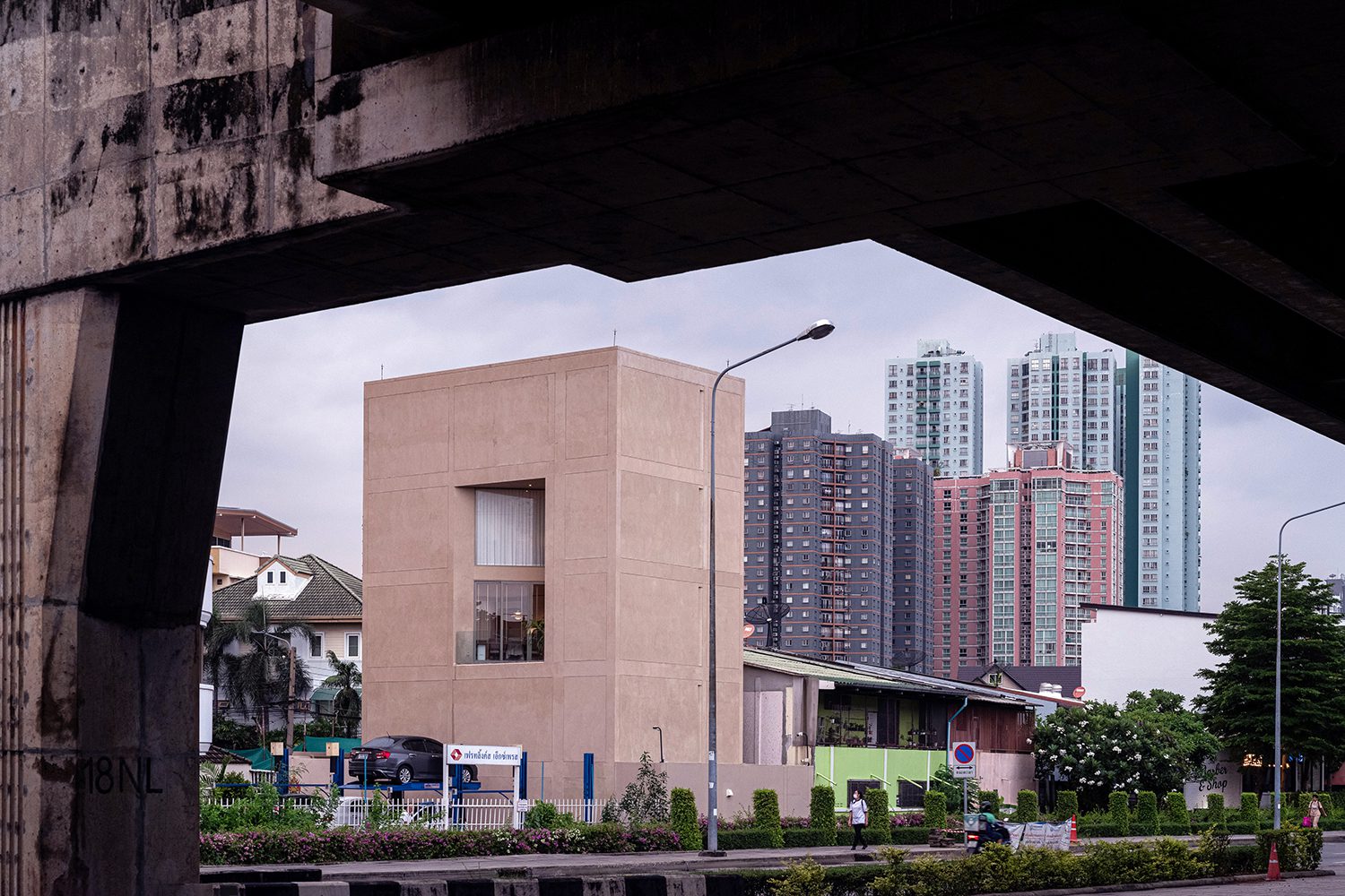
LAWS AND REGULATIONS WOULD BE THE STRONGEST LIMITATION FOR ARCHITECTS, BUT THE DESIGN UNDER THE LIMITATION DOES NOT HAVE TO BE BORING. THIS SQUARE-SHAPED HOUSE DESIGNED BY PHTAA LIVING DESIGN MANAGES TO SHOW OFF THE OWNER’S IDENTITY
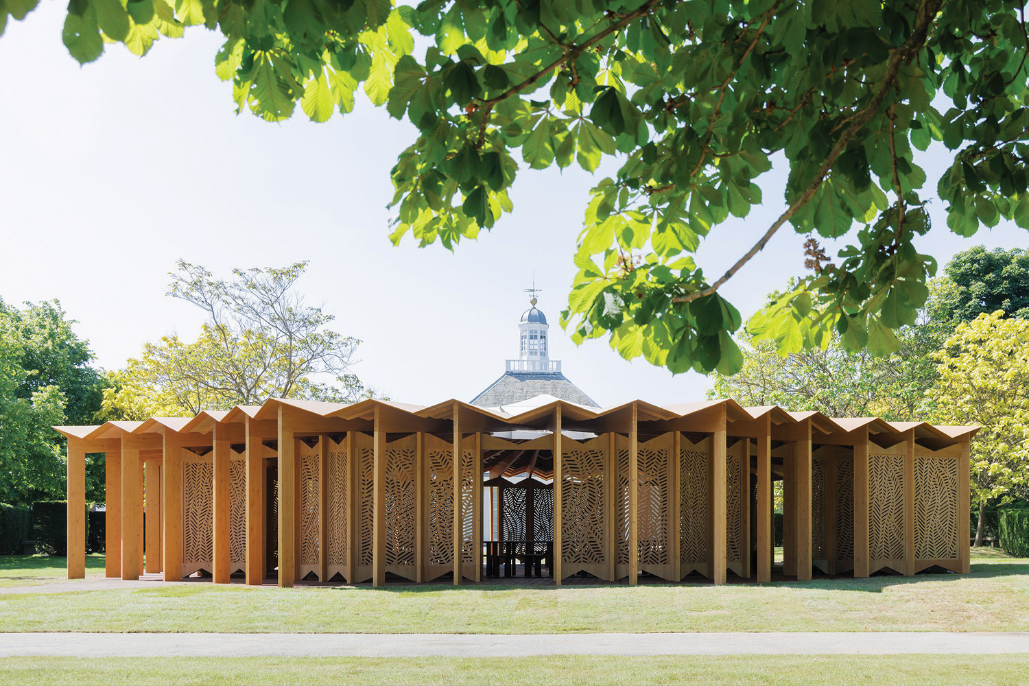
SERPENTINE PAVILION 2023 ‘À TABLE’ WAS INSPIRED BY HAVING MEALS TOGETHER WITH SPACES AND MOST OF THE TABLES IN A CIRCULAR ARRANGEMENT, CREATING A SENSE OF ‘INTIMACY’ THAT EXTENDS BEYOND HUMAN RELATIONSHIPS
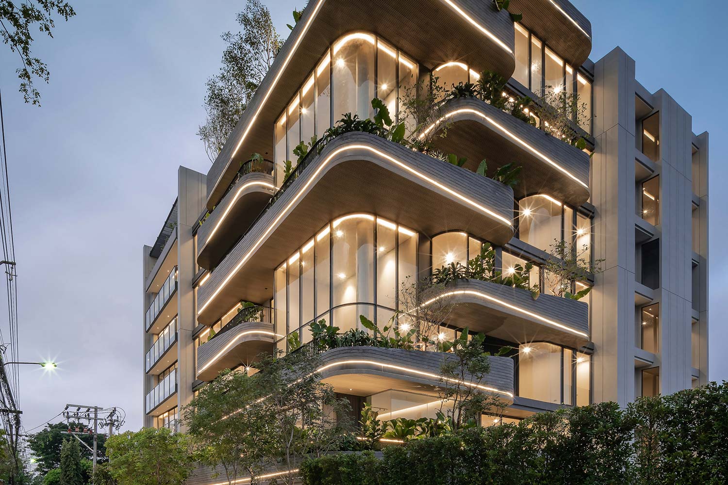
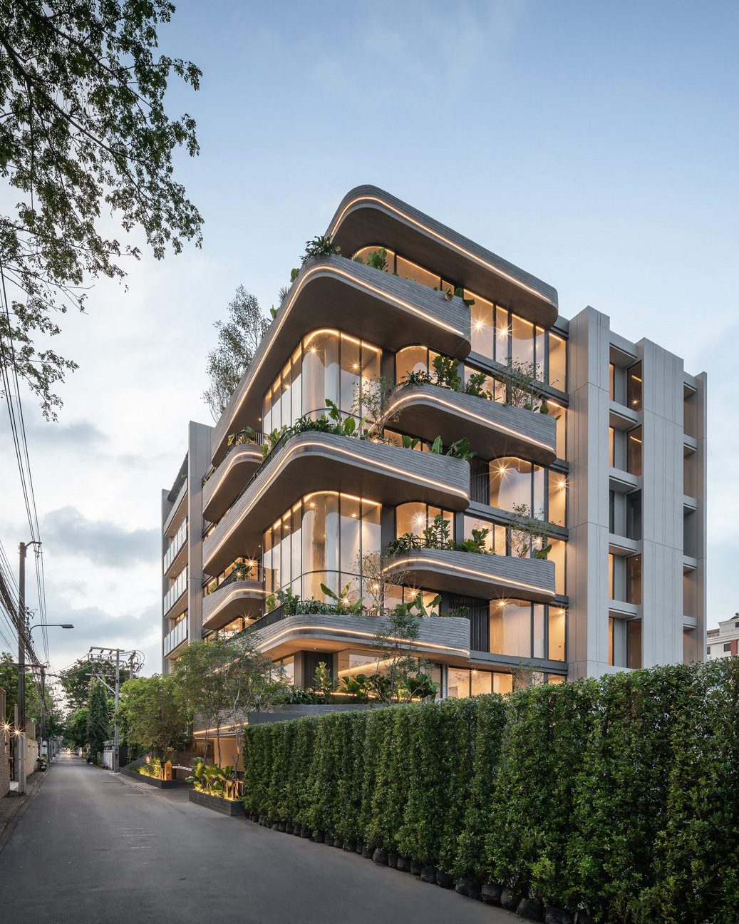
THE HIGH-END LOW-RISE CONDOMINIUM DISTINGUISHES ITSELF BY FOCUSING ON DESIGN QUALITY. THE DEVELOPER AND THE DESIGNER, PAON ARCHITECTS, BELIEVE THAT THE ‘PRODUCT-LED DEVELOPMENT’ APPROACH CAN LEAD TO HIGH-QUALITY SPACES AND THE PROJECT WILL BE ABLE TO SELL ITSELF Read More

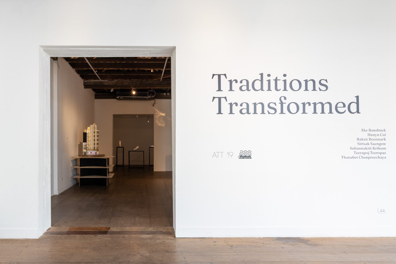
THE ART EXHIBITION FEATURING ARTWORKS FROM SEVEN ARTISTS MADE WITH DEDICATION, HARD WORK, AND PERSEVERANCE, REVEALING THE PLEASURE OF CREATING SOMETHING TANGIBLE