ECHO YANG DESCRIBES HER WORK AS “SILENT, DETAILED, STRUCTURAL, SENSORIAL AND EXPERIMENTAL.” ART4D SPOKE WITH THE TAIPEI-BASED GRAPHIC DESIGNER ABOUT A FEW RECENT PACKAGE DESIGNS, BOTH OF WHICH DRAW FROM THE MUSIC THEY ENCLOSE TO STEER THE DIRECTION OF THEIR DESIGN.
With your recent album packaging design for Taiwanese singer Waa Wei, were there specific qualities of her music or character that you referenced through the visuals, colors and design?
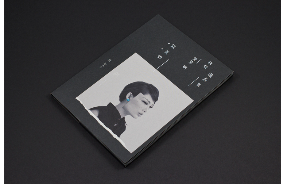
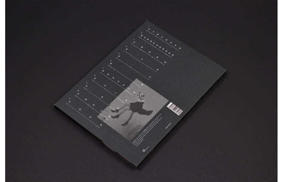
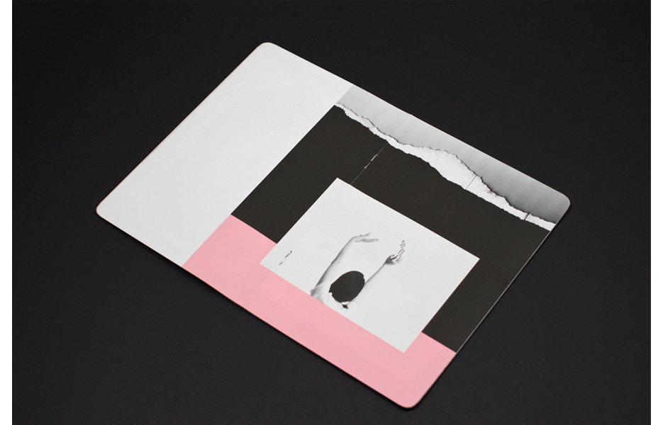
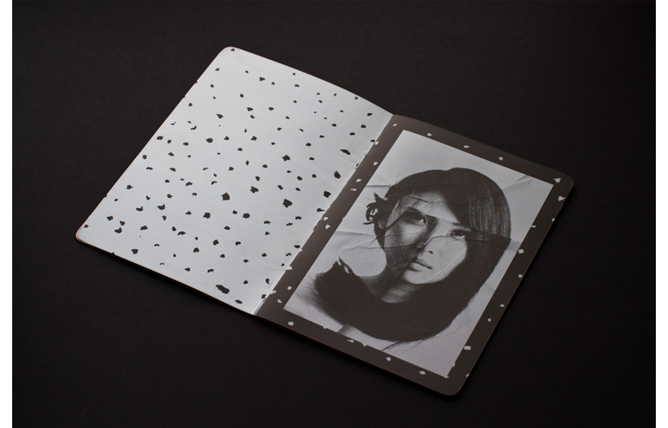
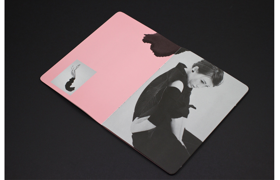
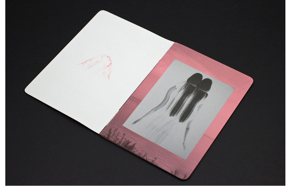
Echo Yang: Waa Wei is a very interesting Taiwanese female singer. Her voice can expand and penetrate as well as be light and soothing. She has lots of thoughts about music and it seems that the sky is the limit. And she also has many ideas about aesthetics herself. The design of the album is the result of co-working and collaboration between the record company, singer, photographer as well as the designer all together. The style and design of the album were based on the experimental play of the photography.
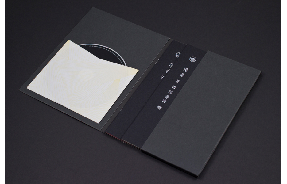
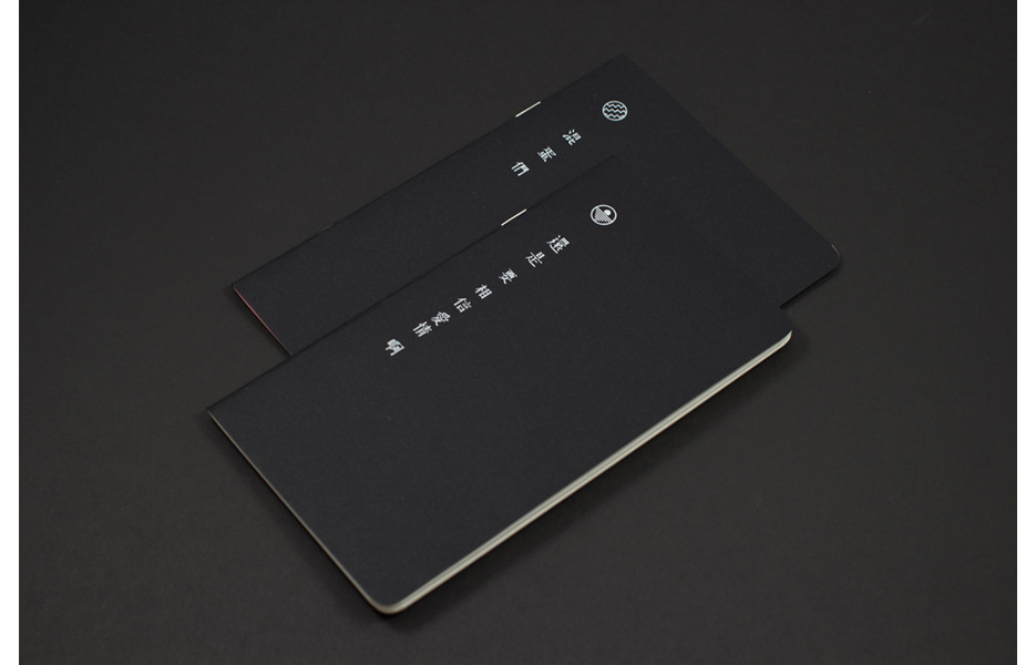
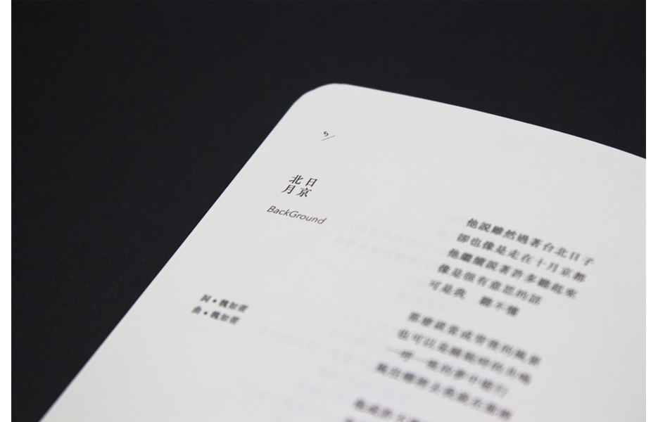
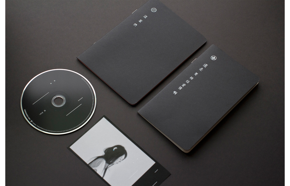
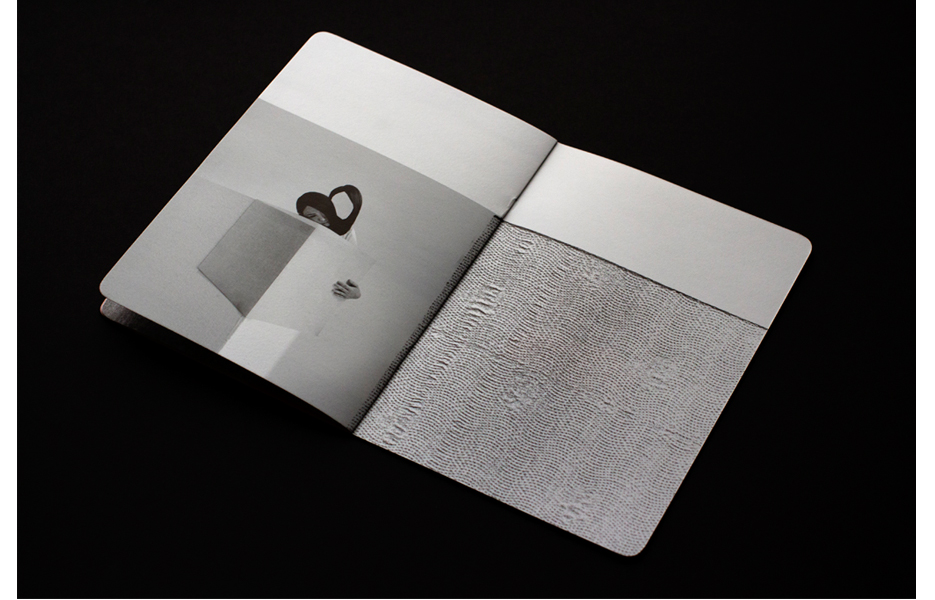
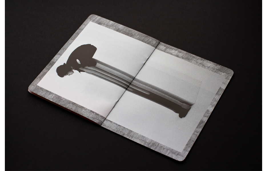
Ting Cheng, who deals with the images, has created many impressive effects, and with these images I then designed the whole album and overall package. Black, as the base, communicates calm while the ever-mysterious pink on the other hand reflects the album’s theme of love. Both colors work well to reflect Waa Wei’s rich but contained talent for music. The theme of the album is “we should still believe in love, you bastards.” Inside the package there are two booklets, the lyrics booklet “We should still believe in love,” and “Bastards” which is a collection of all the experimental images.
And how about the album packaging design you created for Taiwanese musical duo, Light Engine? I understand that the concept is related to themes of weather and travel?
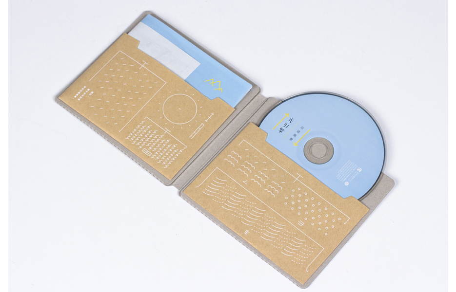
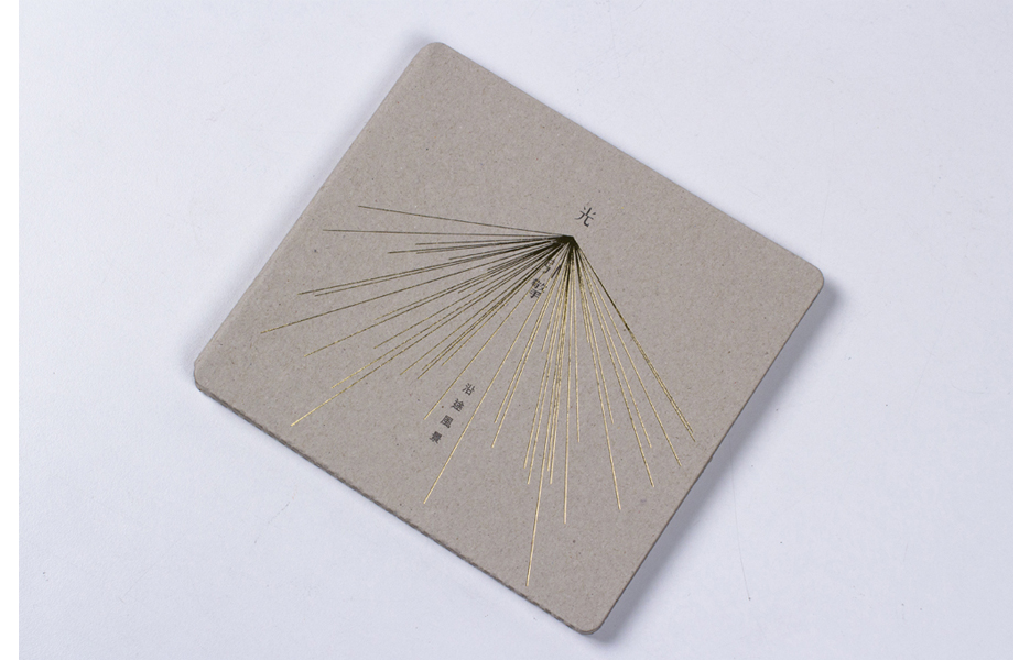
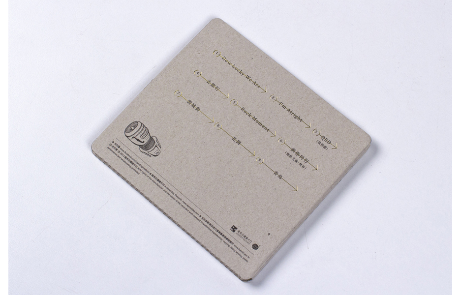
EY: This is Light Engine’s first album, which includes their works from the past few years. The title is called Along the Road, which is like a diary and record of their thoughts and feelings along the way.
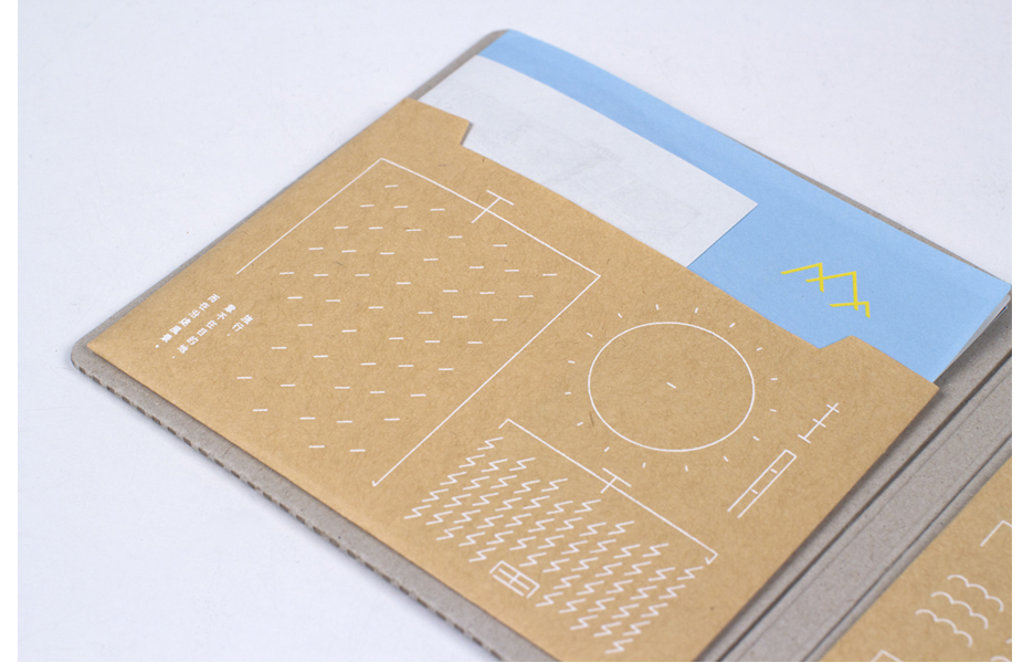
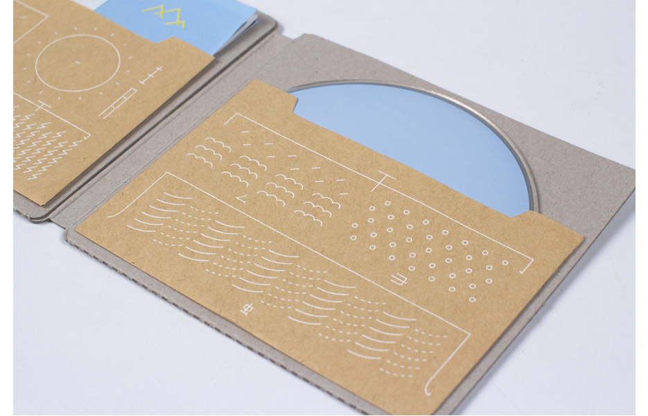
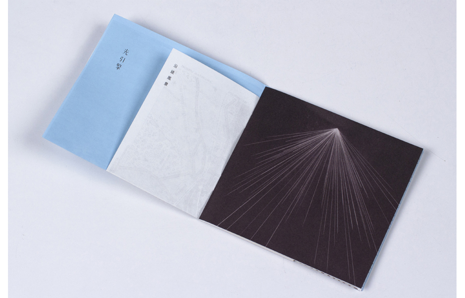
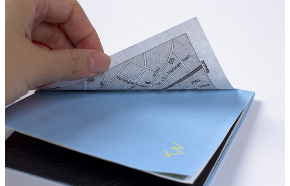
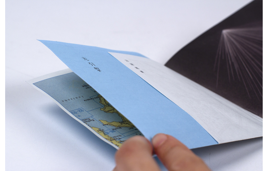
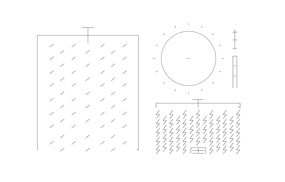
Like a journey, I incorporated the weather elements (sun, rain, cloud, thunder, snow and wind) in the package design, as what they might have experienced over the period of time. The Chinese characters of the six elements can be found inside the album. Their typeface is designed based on Chinese characteristics and partially visualized as lines to symbolize sun, rain, thunder, snow and wind as how the weather changes are strongly felt during the journey.
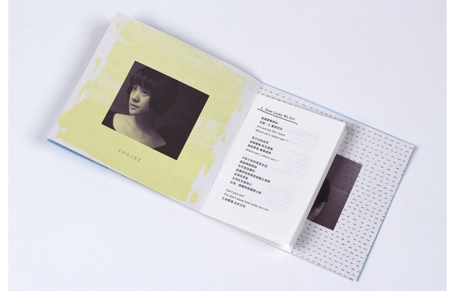
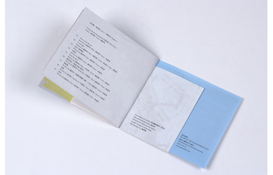
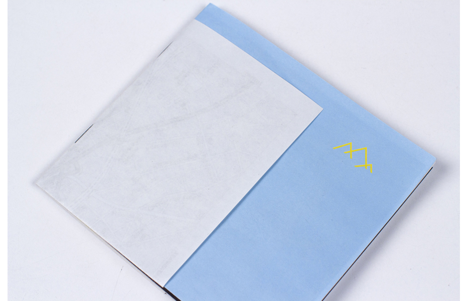
The concept of the lyrics booklet is how miscellaneous information and papers are often collected during the trip, such as a map, leaflet and others, which can be used freely to write down inspirations when they come out all of a sudden, and finally be stapled and put together like a booklet. This is why the size and material of each page is different. Inside the booklet, one can also take a peek at the melody and lyrics that Engine, the vocal of the band, wrote down from time to time. The icon of the mountain on the cover of the lyrics booklet symbolizes the beginning of the journey and the icon of the house on the back is to say ‘welcome home.’
Echo Yang received her MA in Information Design from Design Academy Eindhoven and is currently working as a freelance graphic designer in Taipei, Taiwan.


