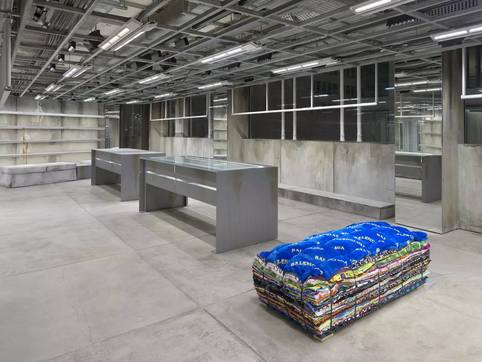
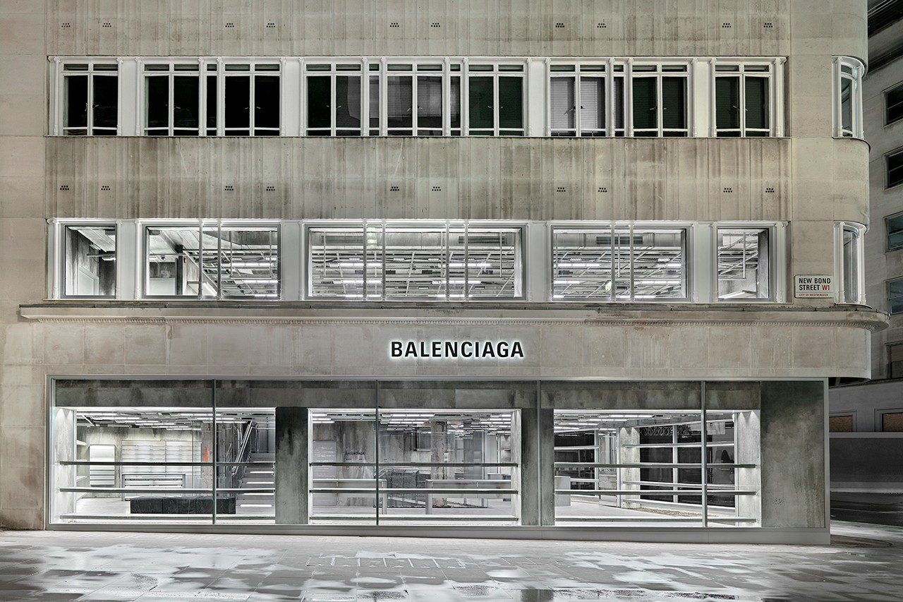
WHAT IS CONSIDERED AS LUXURY? BALENCIAGA NEW BOND STREET OUTPOST IN LONDON DELIBERATELY IMPRINTS RAW MATERIALS, CRACKS, STAINS ON THE BUILDING, AND CONVEYS BRAND IDENTITY THROUGH THE CONCEPT OF ‘RAW ARCHITECTURE’
TEXT : PRATCHAYAPOL LERTWICHA
PHOTO COURTESY OF BALENCIAGA
(For Thai, press here)
It wouldn’t be hard to believe if someone were to say that the New Bond Street branch of Balenciaga in London had to rush its opening despite still being under construction. That is because the interior and exterior of this ‘store’ is so raw and unfinished that the brand sets itself apart from its neighboring shops of luxury brands. But this extreme visual is exactly what Balenciaga intends for its latest flagship.
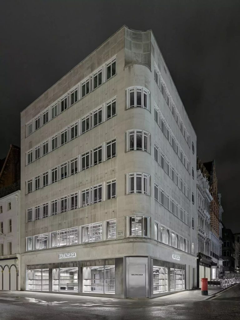
The three-story building houses 710-square meters of space retailing Balenciaga’s ready-to-wear clothes and accessories. The flagship has Niklas Bildstein Zaar and Andrea Faraguna, architects from Berlin-based studio, Sub, as the art directors, working alongside Demna, the Creative Director currently helming Balenciaga, who supervises the overall concept and ideas.
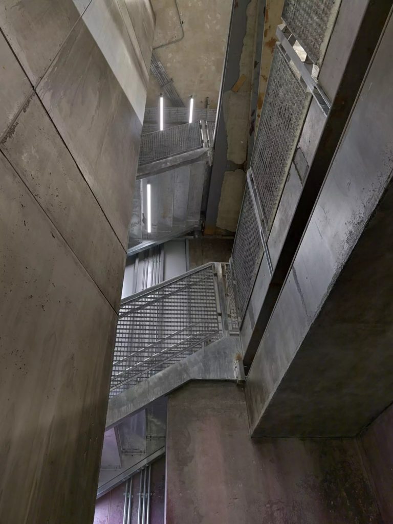
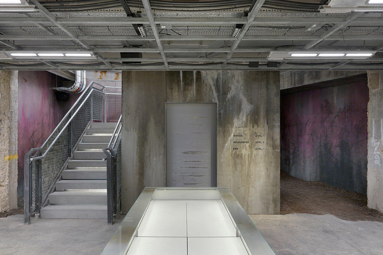
The look of the shop deliberately reveals cracks, stains, and smudges. Such an incomplete, unrefined stage originates from the brand’s ‘Raw Architecture’ concept, which is inspired by deserted places such as rundown parking lots and old factories, proposing the existence of space during its moment of transition. Depicted is an image of momentariness, rather than the complete, final form of the shop. This particular flagship marks Balenciaga’s fourth shop that follows the brand’s ‘Raw Architecture’ concept, following the ones on Sloane Street in London, and the Berlin and Shanghai branches.
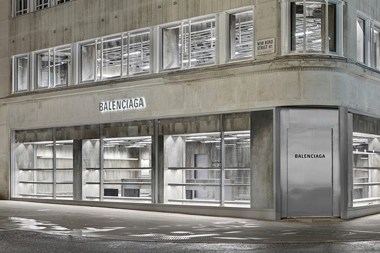
The building’s exterior is clad with a layer of exposed concrete with unabashed displays of dark stains and spots. On the first floor, the curtain walls disclose the inside of the store without trying to hide anything. Contrasting the glass’ openness and transparency, a solid, rigid polished stainless steel door is located at the corner of the building.
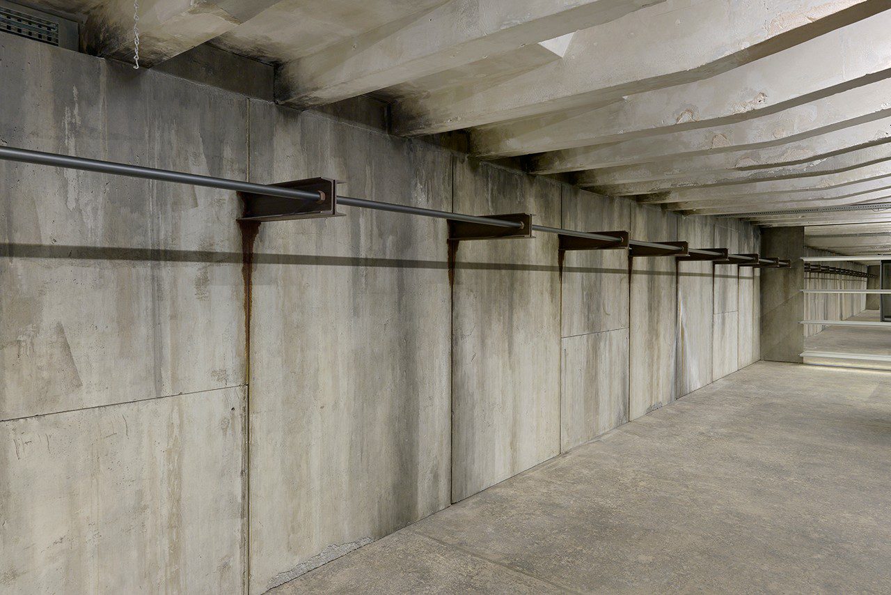
The interiors give off a similar mood with cracks and blotches boldly left on the exposed concrete walls. The steel furniture shows a sporadically rusty surface while the floor has mud stains scattered here and there. Looking in, one can see the ceiling with all the system works in full display. Light bulbs with the look and feel similar to the ones used in industrial plants accentuate the rawness of the space. Despite everything, the retail space isn’t all rough and raw, with glossy and sharp details of materials such as polished aluminum components and mirrors.
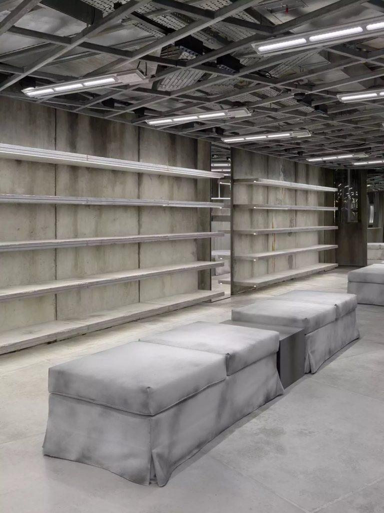
What’s surprising about the design is how not all the raw details are original but meticulously made by experienced specialists. Even the mud stains on the floor are synthetic while some of the thick, solid concrete posts are built using thin cast concrete sheets. The ambiguity between what’s real and what isn’t seems to be consistent with Balenciaga’s recent fashion items that have many contemplating what actually constitutes as luxury. From a tote bag that looks like a garbage bag, a skirt that resembles a rubber mat of a car, or the ridiculously pricey shoes that look beyond distressed. What this Spanish fashion house is doing kind of resonates with the era of the virtual universe we are now living in where borders between the real world and the virtual world, truths and untruths are becoming blurrier by the day. Are the pictures we’re seeing in this article real or rendered, you may wonder?
