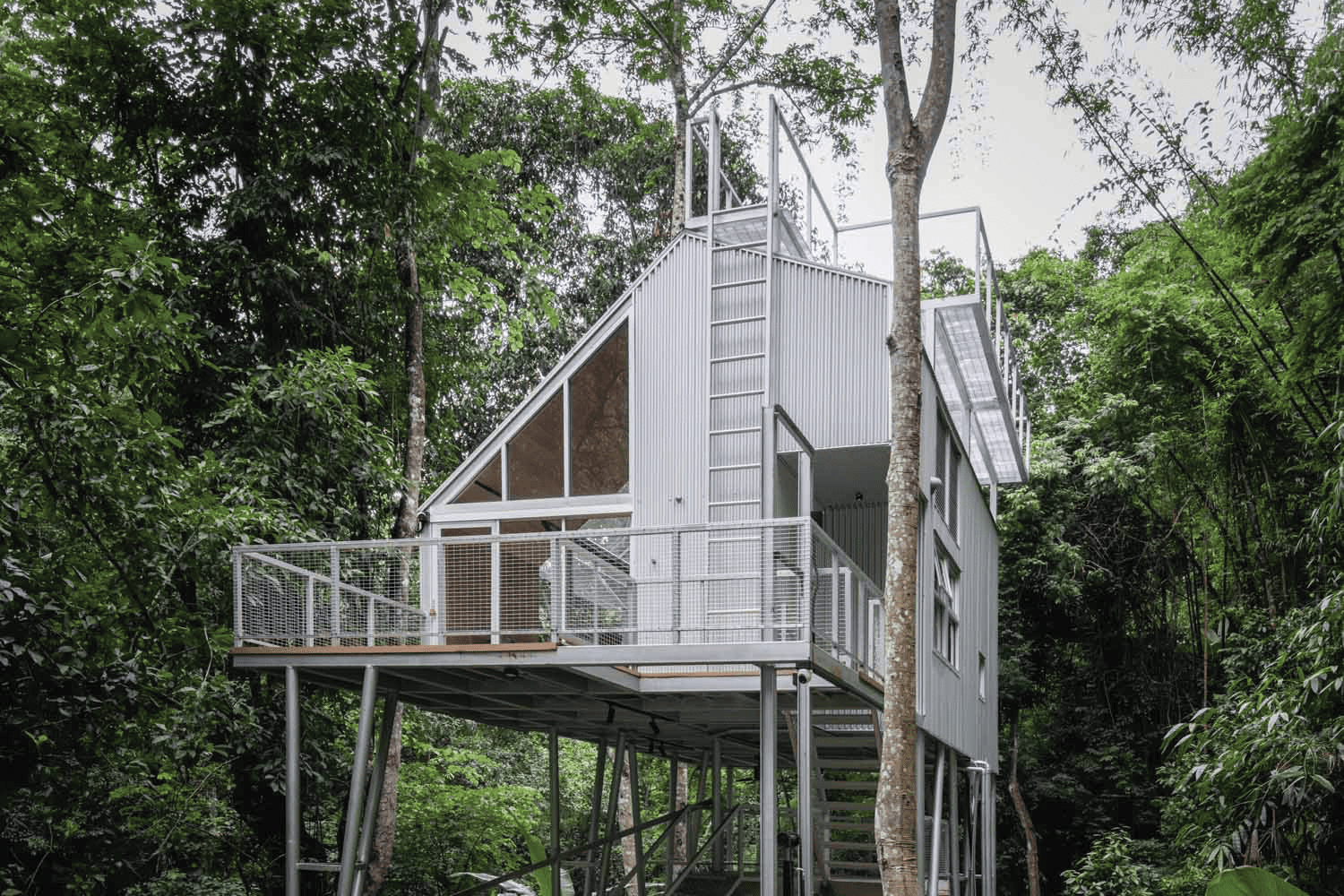
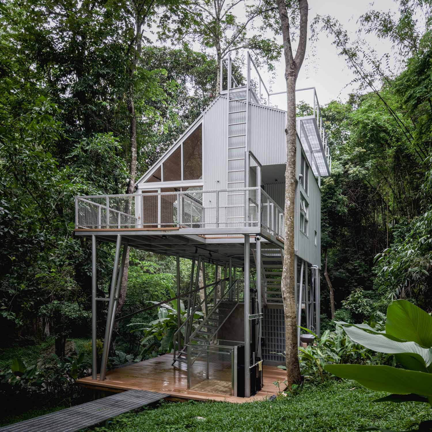
WITH A SHARED LOVE OF AND INTEREST IN THE OUTDOOR LIFESTYLE AND CAMPING WITH THE PROJECT OWNER, THIS LITTLE LODGE, SITUATED DEEP IN THE MOUNTAIN IN CHIANG MAI, WAS DESIGNED BY PLANK RICH
INTRODUCING THE OTHER ‘TASTE’ OF CAFÉ AMAZON ASIDE FROM A CUP OF DRINKS BUT DESIGNS. GETTING TO KNOW THE ‘TASTE OF NATURE’ CONCEPT THAT UNIFIES THE DESIGN OF ALL STORES
ARCHIDEX 2023 MADE A GREAT COMEBACK THIS YEAR WITH OVER 1,400 EXHIBITION BOOTHS, PAVILIONS, AND AN INTERNATIONAL ARCHITECTURAL FORUM. LET US HAVE A LOOK
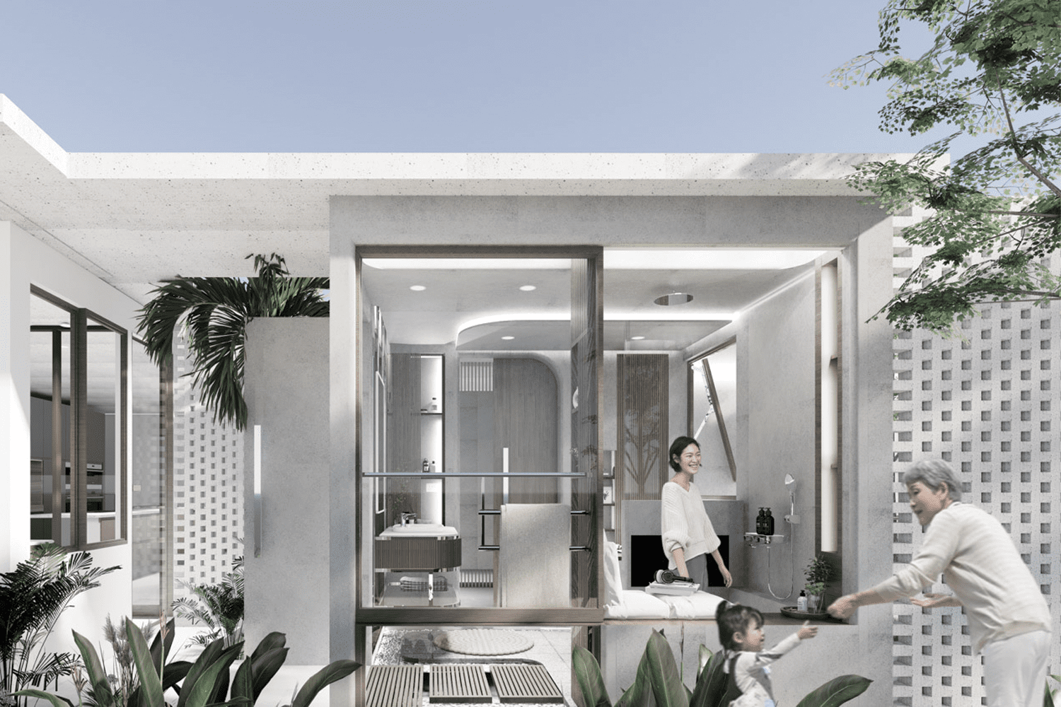
AS THE RESIDENTIAL SPACE BECOMES SMALLER AND PEOPLE START TO LIVE IN EXTENDED FAMILIES, WHAT SHOULD THE RESIDENTIAL BATHROOM IN THE FUTURE BE? FIND THE IDEAS FROM 3 DESIGN PROJECTS FROM THAILAND WINNERS OF ASDA 2023
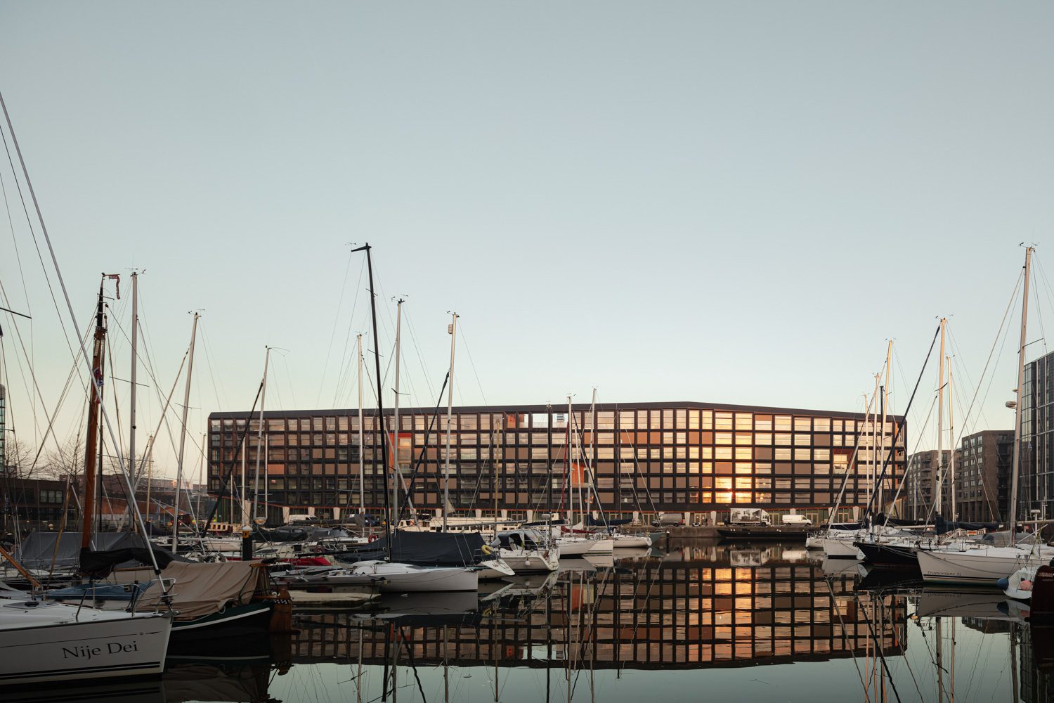
AS ONE OF THE MIXED-USE BUILDINGS IN A LARGE-SCALE URBAN EXPANSION PROJECT IN AMSTERDAM, THE PROJECT WAS DESIGNED TO COMBINE VISUALLY APPEALING ARCHITECTURE WITH SUSTAINABLE LIVING THAT WAS INTENDED TO BE THE TOWN’S ‘LIVING ROOM’
NOBLE TERRA OFFERS THE OPPORTUNITY TO LIVE A HAPPY LIFE WITHIN THE NATURAL SURROUNDINGS, WHERE EACH PASSING DAY IS IMBUED WITH THE CAREFULLY CHOSEN DESIGN, LOCATION, AND EXPERIENCES THAT EMCOMPASS THE THEME OF ‘ONENESS WITH NATURE’Read More
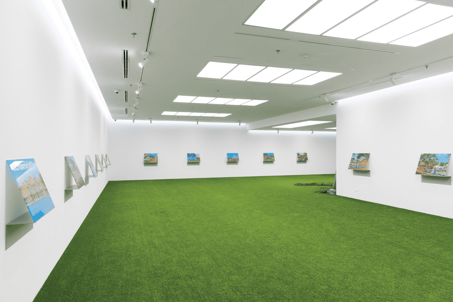
IN THE ROOM WITH THE ILLUSIONARY SCENERY OF GREEN GRASS THRIVING UNDER THE SCORCHING SUN, THE PHOTO EXHIBITION HIGHLIGHTS HOW THE IMAGE OF THAILAND IS AND WAS CONSTRUCTED
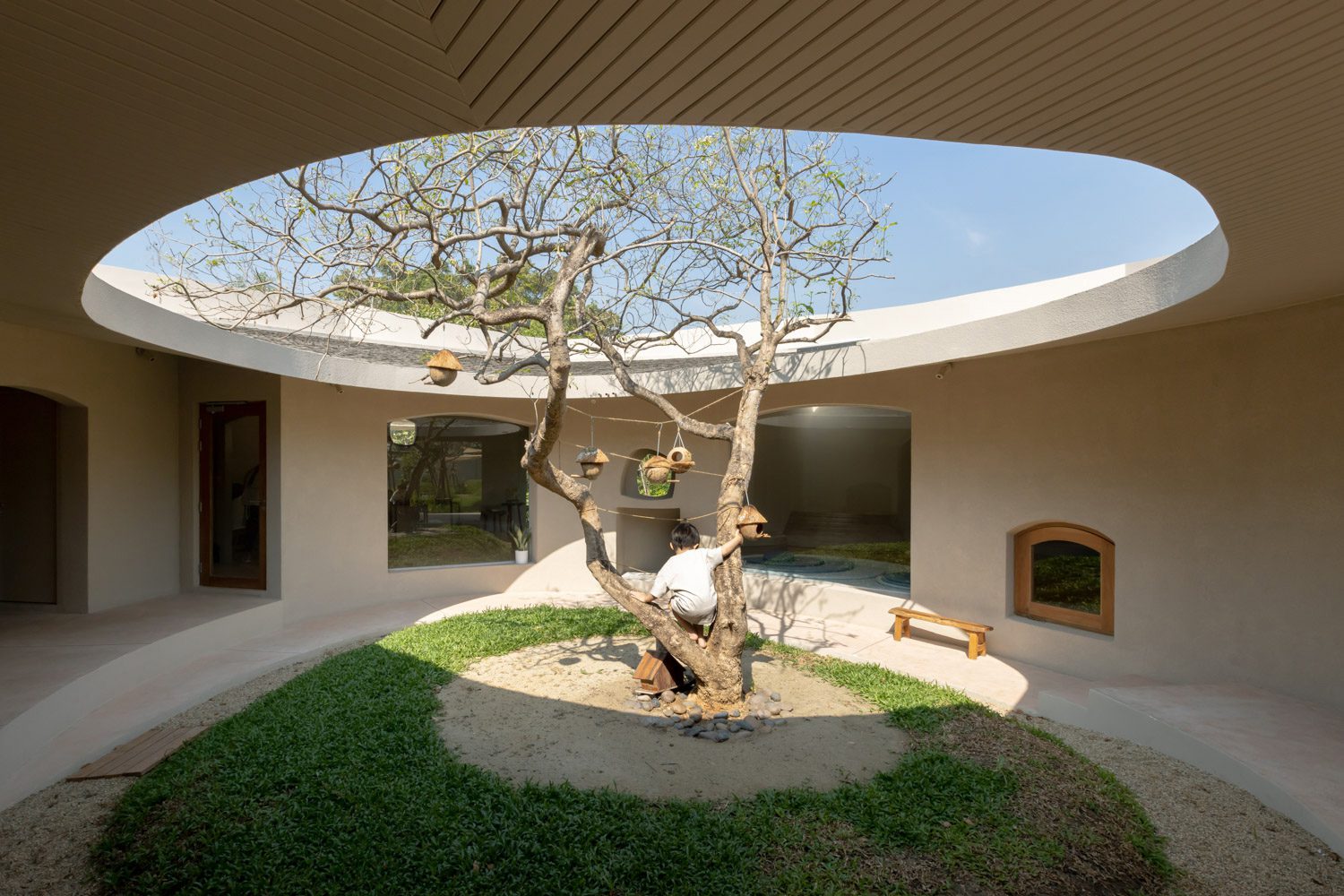
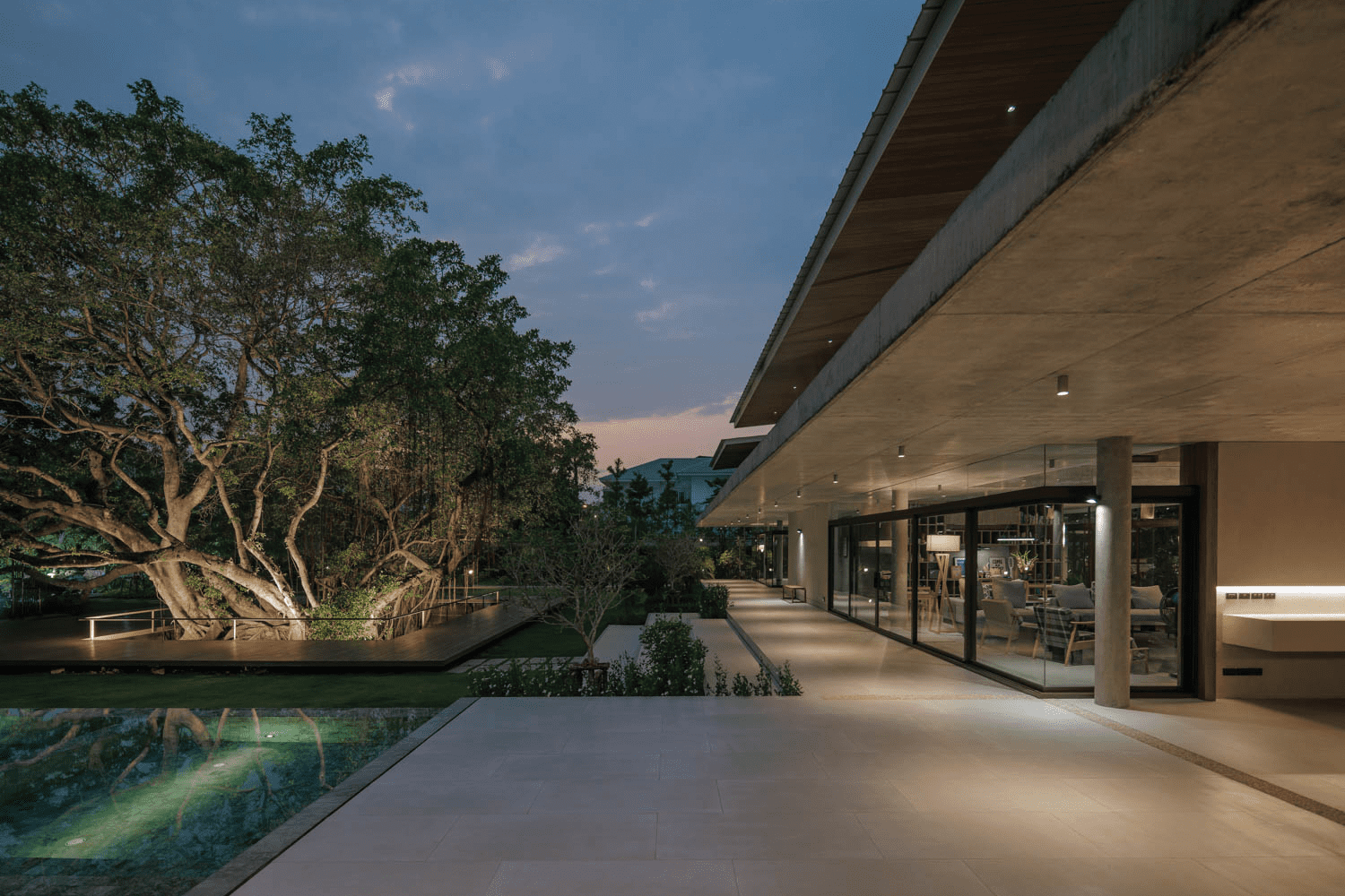
THE COURTYARDS CONNECTING PEOPLE TO NATURE ARE NOT ONLY THE UNIQUE FEATURE OF THIS HOUSE. THERE ARE ALSO SEMI-OUTDOOR SPACES DESIGNED TO MEET THE OWNER’S LIFESTYLE
THE PHOTOBOOK COMPILED PHOTOGRAPHS RECORDED PROTESTS MOMENTS THAT ERUPTED BETWEEN 2020 AND 2022 IN THAILAND, GRADUALLY REVEALING THE EMOTIONS AND MILIEU FROM GOVERNMENTAL OFFICIALS SURROUNDING THE PEOPLE’S BATTLES
This website uses cookies to improve your experience. We'll assume you're ok with this, but you can opt-out if you wish. Cookie settingsACCEPT
Privacy & Cookies Policy
Privacy Overview
This website uses cookies to improve your experience while you navigate through the website. Out of these cookies, the cookies that are categorized as necessary are stored on your browser as they are essential for the working of basic functionalities of the website. We also use third-party cookies that help us analyze and understand how you use this website. These cookies will be stored in your browser only with your consent. You also have the option to opt-out of these cookies. But opting out of some of these cookies may have an effect on your browsing experience.
Necessary cookies are absolutely essential for the website to function properly. This category only includes cookies that ensures basic functionalities and security features of the website. These cookies do not store any personal information.
Any cookies that may not be particularly necessary for the website to function and is used specifically to collect user personal data via analytics, ads, other embedded contents are termed as non-necessary cookies. It is mandatory to procure user consent prior to running these cookies on your website.