LOOKING BACK AT CHIANG MAI DESIGN WEEK 2023, THE END-OF-THE-YEAR FESTIVAL FOR THE CHIANG MAI AND NORTHERN DESIGN COMMUNITY WITH TCDC IN CHANG MOI AS THE MAIN VENUE
FARMGROUP LAUNCHED THE NEW BANGKOK METROPOLITAN ADMINISTRATION LOGO AND IDENTITY SYSTEM IN NOVEMBER. GET TO KNOW THE PROCESS AND SEE WHAT FARMGROUP HAS BEEN THROUGH IN DESIGNING THIS IDENTITY SYSTEM
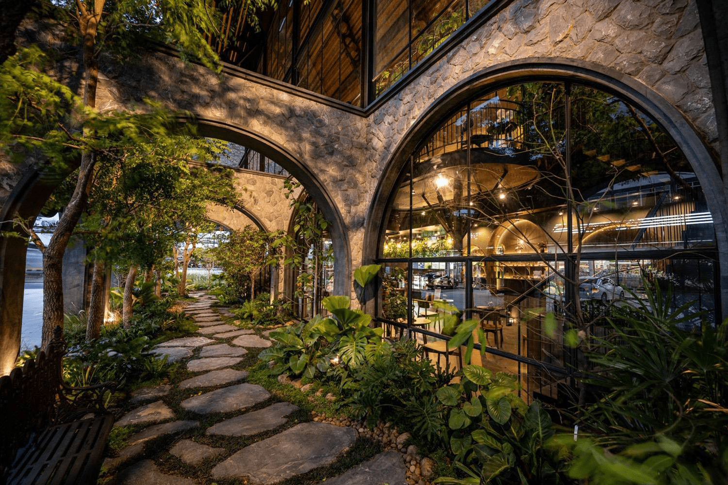
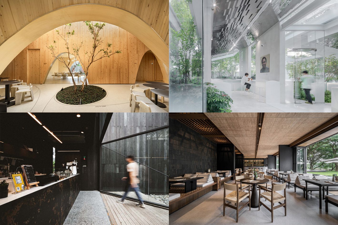
THE CAFÉ AMAZON ARTICLE SERIES CONCLUDES WITH THE STORY OF TWO OF THE BRAND’S CONCEPT STORES WHICH CENTER AROUND ITS OWN DISTINCT ARCHITECTURAL DESIGN AND INTERIOR DECORATION CONCEPT
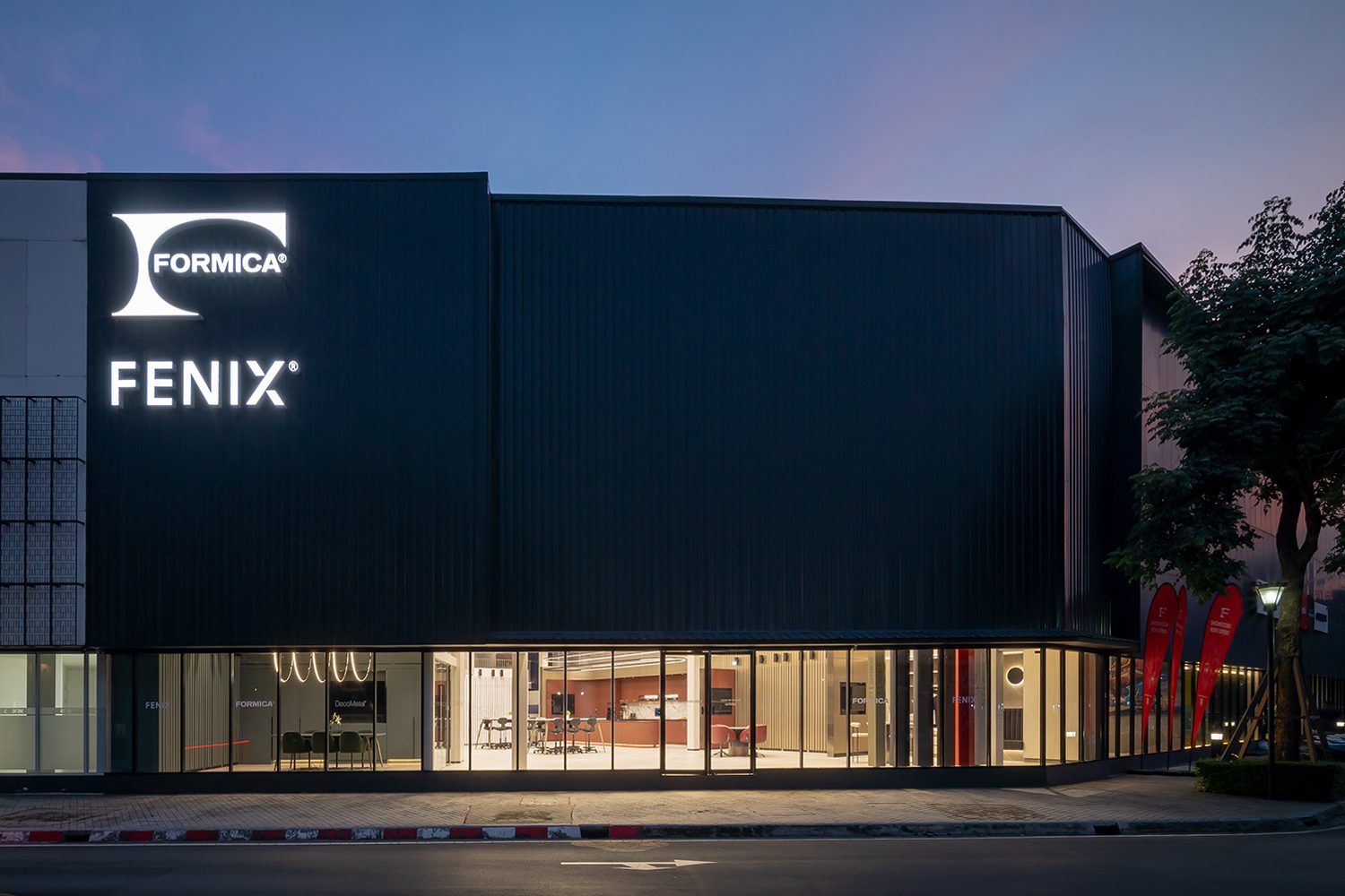
ART4D BROUGHT YOU TO THE SHOWROOM OF FORMICA, A LEADING INNOVATOR IN THE LAMINATE AND FINISHING MATERIAL. THAT’S ITH TRANSFORMED THE OLD STORAGE SPACE INTO A CONTEMPORARY SHOWROOM FEATURING ACTUAL PRODUCTS IN USE
THE EXHIBITION BY THE SINGAPOREDESIGN COUNCIL (DSG) BROUGHT WORKS FROM SIX TEAMS OF PROMINENT SINGAPOREAN DESIGNERS SEEKING FOR THE IDEAL BALANCE OF AESTHETICS AND SUSTAINABLE INNOVATION
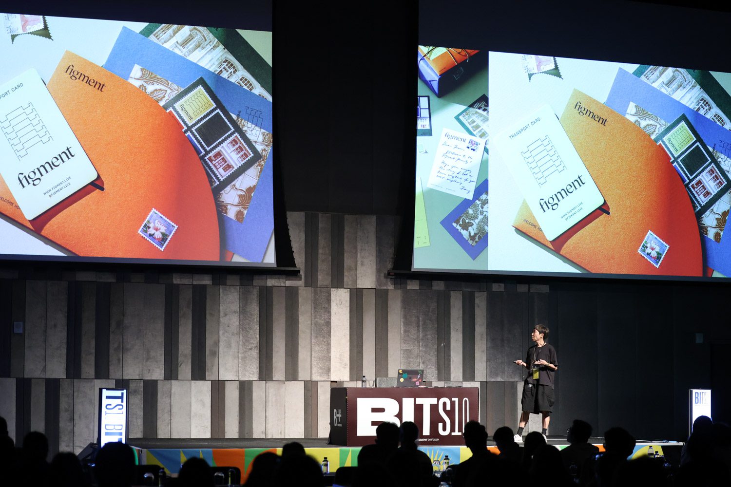
LOOKING BACK TO THE SHOWCASE ‘EMERGE @ FIND – DESIGN FAIR ASIA’ HELD AT MARINA BAY SANDS EXPLORING DESIGNS FROM DESIGNERS OF VARIOUS NATIONS, INCLUDING THAILAND
EXPLORING CONSTRUCTION TECHNIQUES UTILIZED BY CAFÉ AMAZON FROM MODULAR SYSTEMS, 3D CONCRETE PRINTING, AND THE ENVIRONMENTALLY-FRIENDLY STRATEGY OF CIRCULAR ECONOMY
TALK WITH THE FOUNDER OF IDIN ARCHITECTS ABOUT THE CREATIVE FORCE BEHIND THE STUDIO’S ICONIC DESIGNS, WITH 4 PROJECTS THAT HAVE EMERGED FROM THEIR CONTINUOUS EXPLORATION, REFINEMENT, AND ADAPTATION WITH TERRAZZO AND PROVIDED UNEXPECTED EXPERIENCES, SURPRISING CUSTOMERS
This website uses cookies to improve your experience. We'll assume you're ok with this, but you can opt-out if you wish. Cookie settingsACCEPT
Privacy & Cookies Policy
Privacy Overview
This website uses cookies to improve your experience while you navigate through the website. Out of these cookies, the cookies that are categorized as necessary are stored on your browser as they are essential for the working of basic functionalities of the website. We also use third-party cookies that help us analyze and understand how you use this website. These cookies will be stored in your browser only with your consent. You also have the option to opt-out of these cookies. But opting out of some of these cookies may have an effect on your browsing experience.
Necessary cookies are absolutely essential for the website to function properly. This category only includes cookies that ensures basic functionalities and security features of the website. These cookies do not store any personal information.
Any cookies that may not be particularly necessary for the website to function and is used specifically to collect user personal data via analytics, ads, other embedded contents are termed as non-necessary cookies. It is mandatory to procure user consent prior to running these cookies on your website.