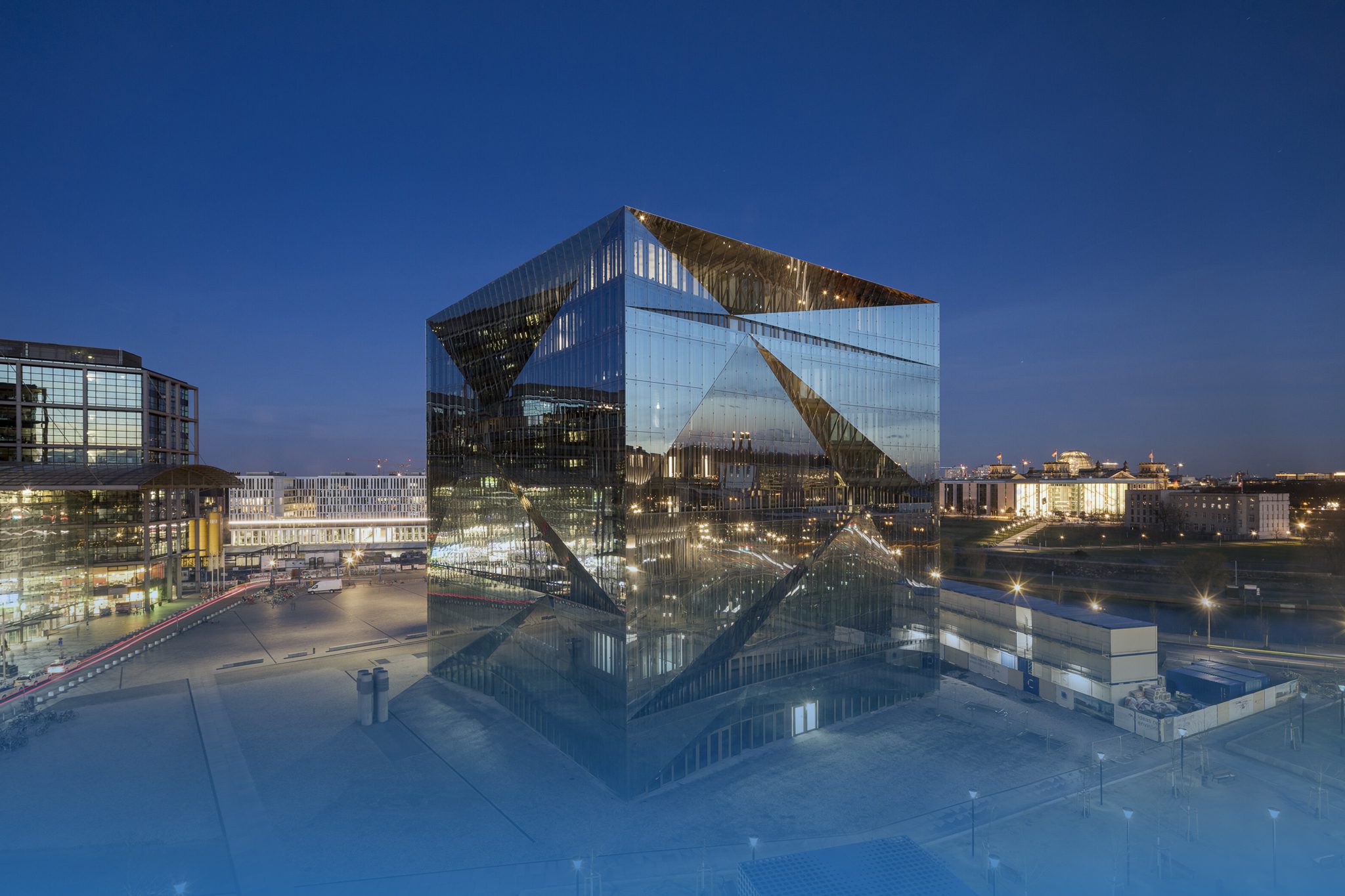
Cube Berlin | Photo: Adam Mørk

Cube Berlin | Photo: Adam Mørk
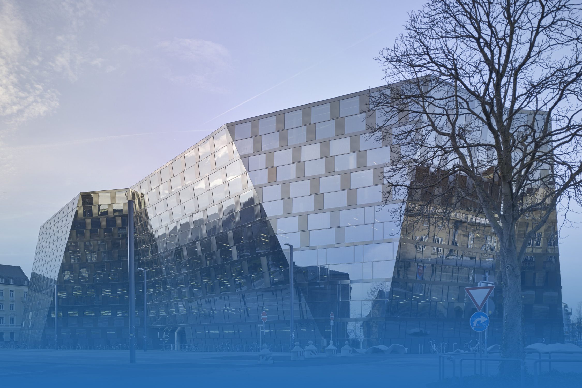
EDUCATIONAL | GUARDIAN GLASS
DISCOVER THREE EDUCATIONAL BUILDINGS THAT UTILIZE GLASS TO CATER VARIOUS ARCHITECTURAL NEEDS, SUCH AS CREATING VISUAL APPEARANCE OR PROMOTING ENERGY EFFICIENCY, ALL WHILE SUPPORTING THE MAIN PURPOSE OF THESE BUILDINGS: EDUCATION
Read More

CURVED GLASS | GUARDIAN GLASS
EXAMINE THREE BUILDINGS THAT INCORPORATE CURVED GLASS TO CATER DESIGNER’S OBJECTIVES. THESE CURVED GLASSES SHOWCASE BOTH EXCEPTIONAL FORM AND A CREATIVE BLEND OF ENGINEERING, RESULTING IN EXPANDED DESIGN POSSIBILITIES THAT CAN DIVERSIFY A DESIGN’S PHYSICAL CHARACTERISTICS

MUSEUM 02 | GUARDIAN GLASS
EXPLORE THREE EXAMPLES OF MUSEUM DESIGNS THAT USE GLASS TO BRING VIEWERS, CURATED SPACES, AND OBJECTS TOGETHER WHILE ALSO MEETING THE AESTHETIC AND SECURITY REQUIREMENTS THAT EVERY MUSEUM REQUIRES
 MUSEUM 01 | GUARDIAN GLASS
WHEN IT COMES TO MUSEUMS, IMPRESSIVE SPACES, FORM, AND LIGHTING QUALITY ARE ALL INCORPORATED IN ACCOMPANYING WORKS OF ART OR OBJECTS IN WHICH THEY EXHIBIT. ACCORDINGLY, MATERIALS SUCH AS GLASS THAT CAN MEET THE BUILDING NEED ARE BECOMING AN IMPORTANT MATERIAL THAT APPEARS IN THE WORLD’S LEADING MUSEUMS
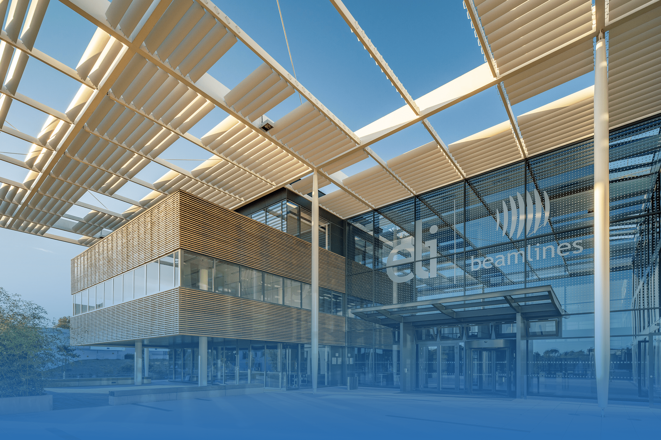 OFFICE 03 | GUARDIAN GLASS
EXPLORE WHY THE LEADING OFFICE BUILDING USED ‘GLASS’ TO EMPHASIZE THE SIGNIFICANCE OF THE ENTRANCE HALL AS A PLACE FOR VISITORS’ FIRST IMPRESSION
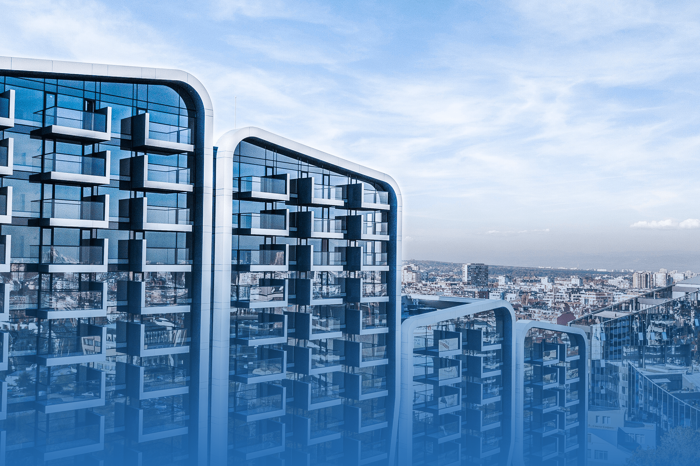 CONDOMINIUM | GUARDIAN GLASS
APART FROM BEAUTY, THE USE OF GLASS IS DEFINITELY IMPROVE THE DWELLER’S QUALITY OF LIFE. EXPLORE THE USE OF GLASSES IN HIGH-RISE BUILDING, ESPECIALLY CONDOMINIUM, THAT NEED TO BE OUTSTANDING AND CATERS ITS LIMITED SPACE OF EACH ROOMS AS WELL
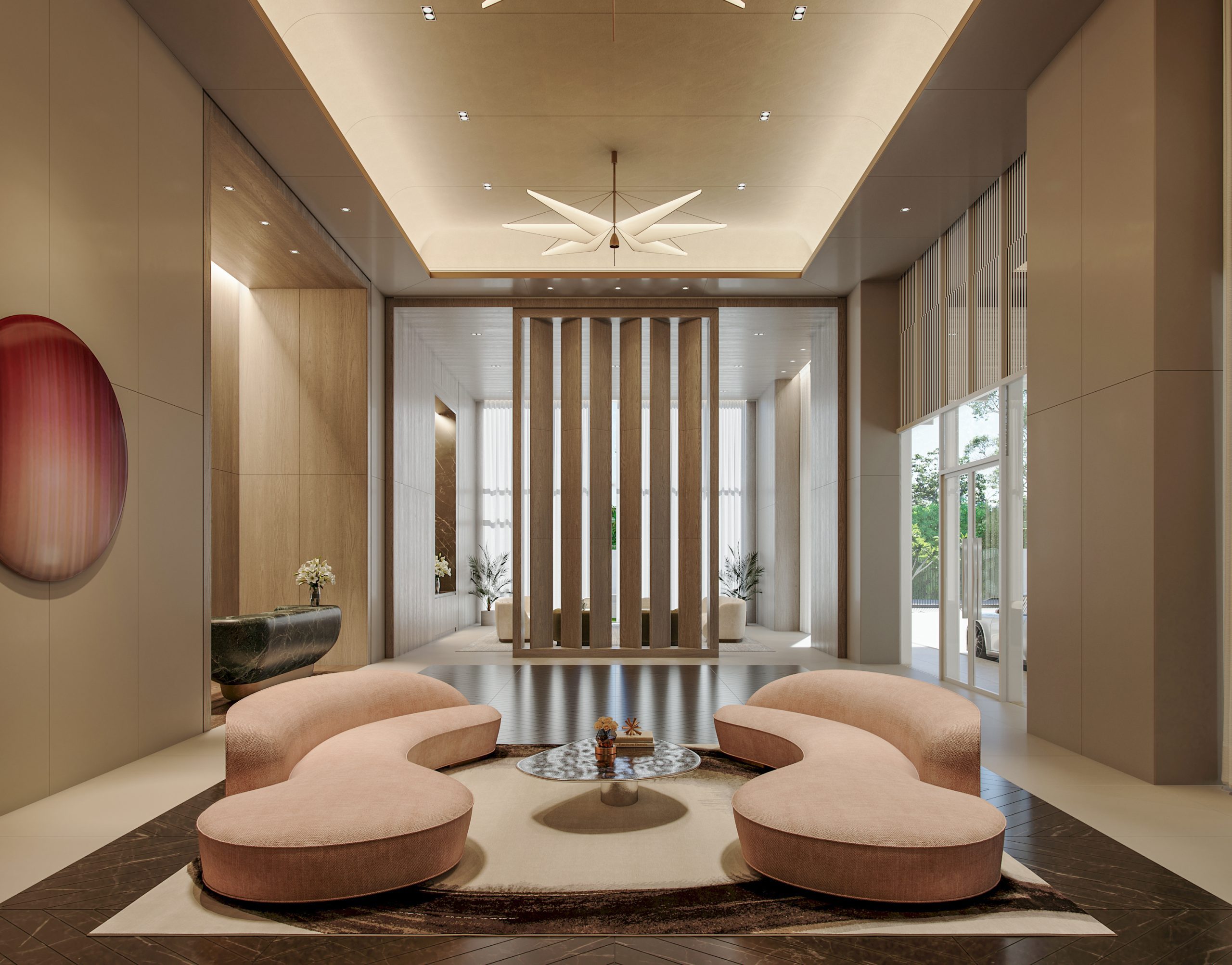
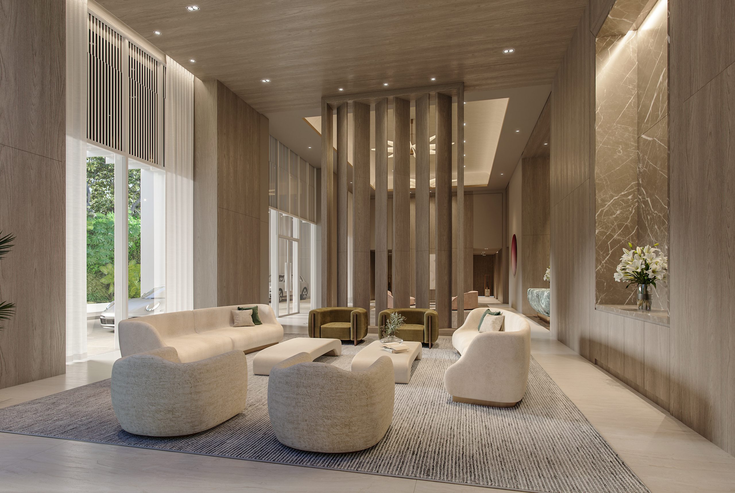
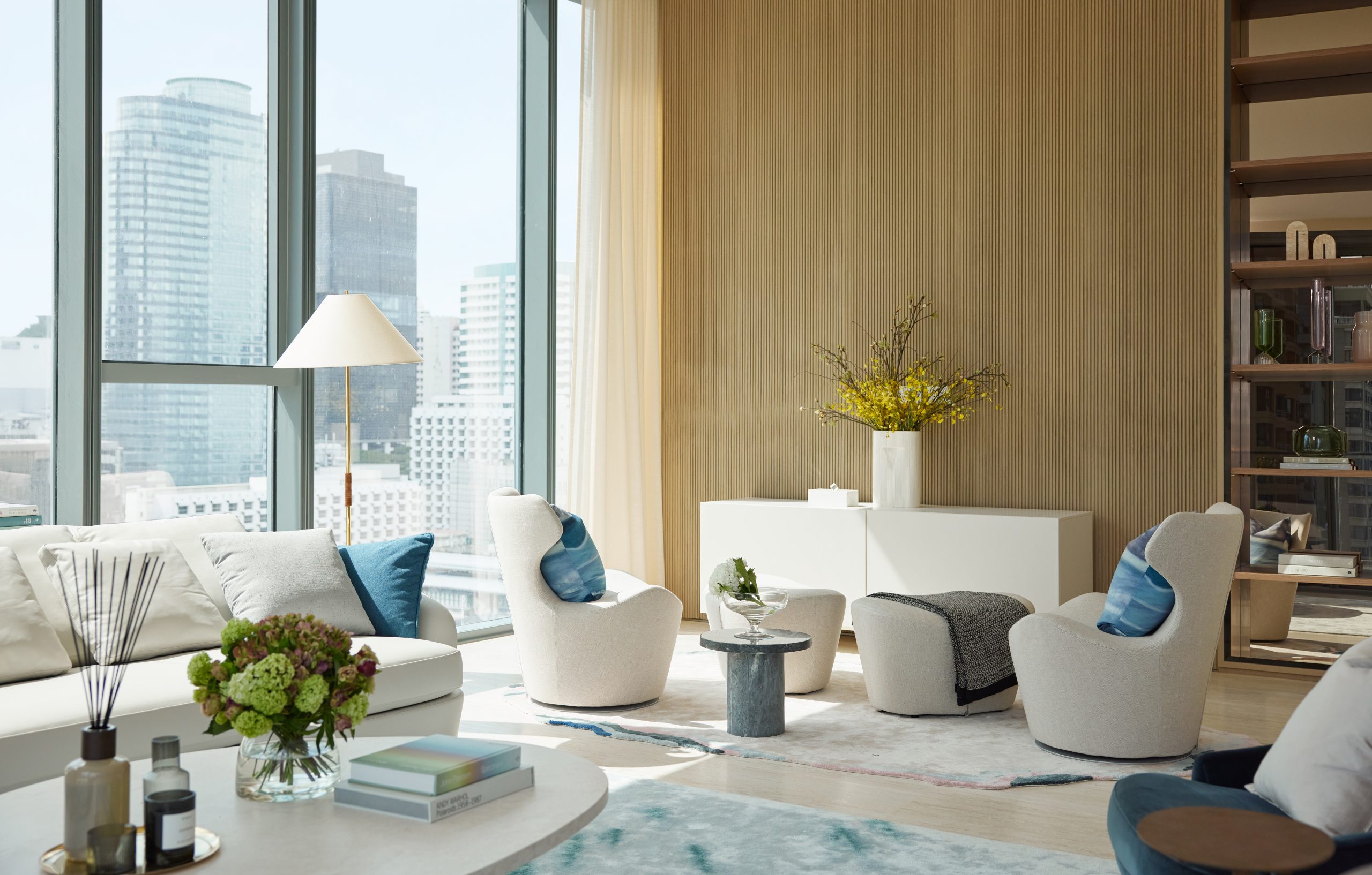 DESIGNED BY THOMAS JUUL-HANSEN, THE INTERIOR DESIGN OF SCOPE LANGSUAN IS A PLACE WHERE PEOPLE CAN ACHIEVE A NEW PARADIGM OF LUXURY THROUGH ITS EXQUISITE AND MISCELLANEOUS DETAILS
TEXT: JINTAWACH TASANAVITES
PHOTO COURTESY OF SCOPE LANGSUAN EXCEPT AS NOTED
(For Thai, press here)
To further reflect the ambition to achieve Bangkok’s elevated living standards in the modern era, SCOPE Langsuan initially gathered a selected group of world-renowned designers for this ambitious project. Ultimately, the team has specifically handpicked Thomas Juul-Hansen, a New York-based Danish architect, as the most fitting interior designer for this project. Although this is his first project in Asia, Thomas Juul-Hansen is no stranger to the world of luxury interior design projects in the west and has masterminded interiors for New York and London’s most buzzed-about developments. One example is the 75-story One57, home to New York City’s most expensive residence. His firm has also developed a diverse body of design works not just in residential projects but also in hospitality, retail and commercial interiors.

SCOPE LANGSUAN 2 Bed Unit
For each project, the firm designs a unique and innovative formal option to create a notion of timeless manifesto through thoughtful investigations of contextual sensitivity, materiality, and customization. “I believe that luxury is a universal language. And it is about the harmony between quality of light, space, functionality, and material.” Thomas told art4d with confidence when approached with a question regarding the definition of luxury. “In that way, the epitome of luxury in Bangkok is not that different from that of New York or London.”
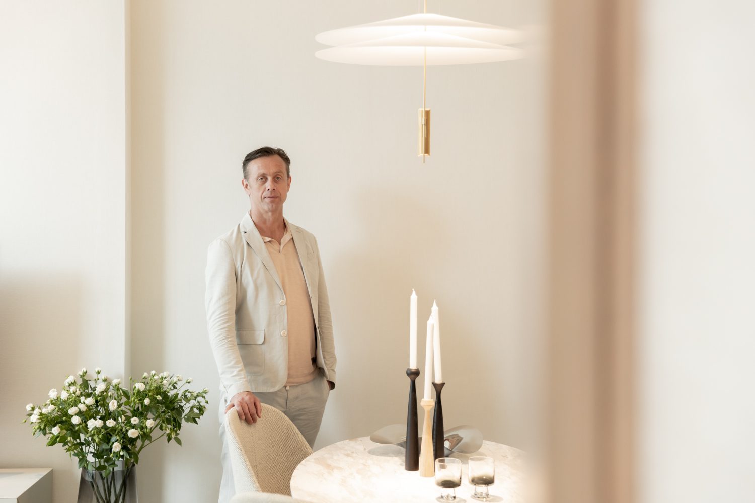
Thomas Juul-Hansen | Photo: Ketsiree Wongwan
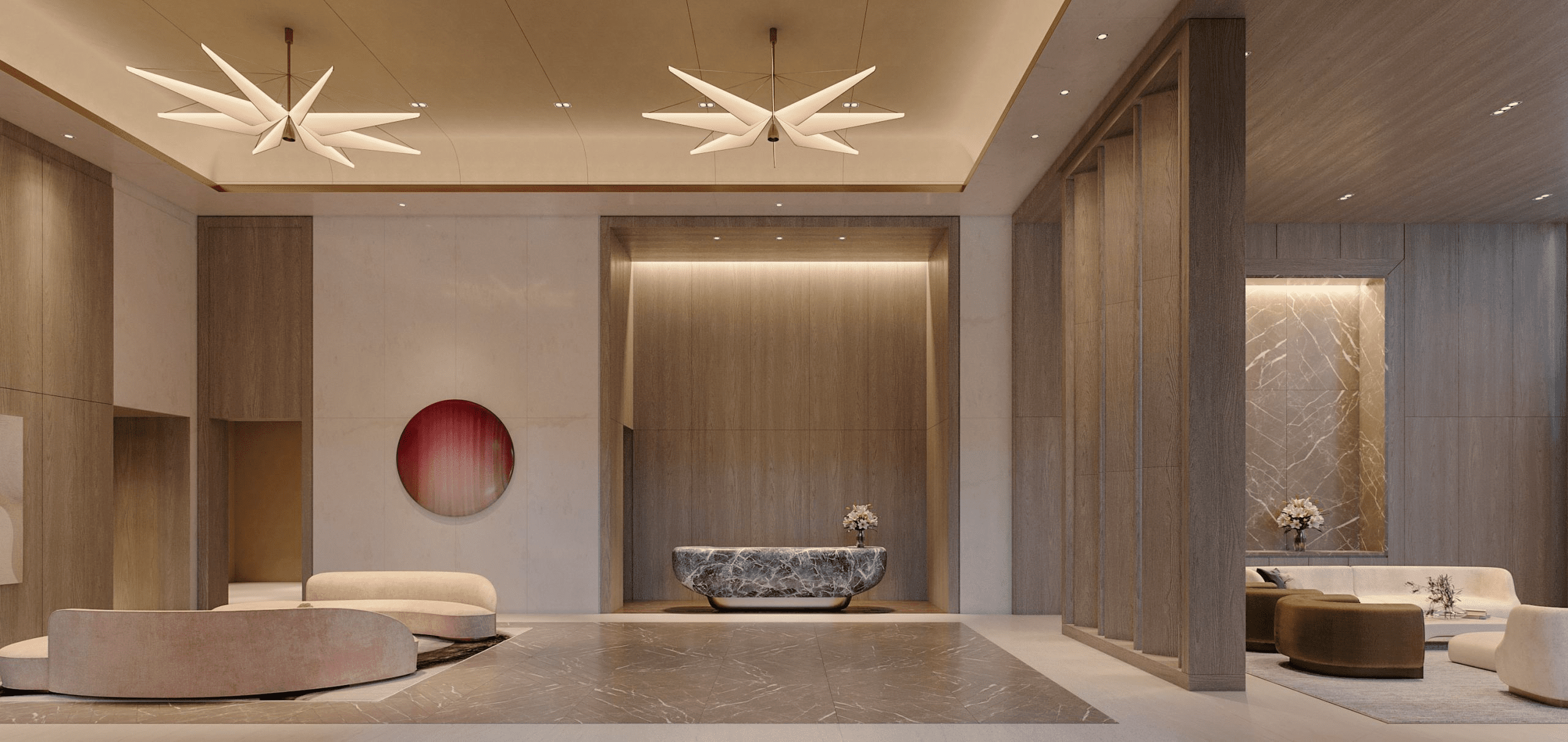
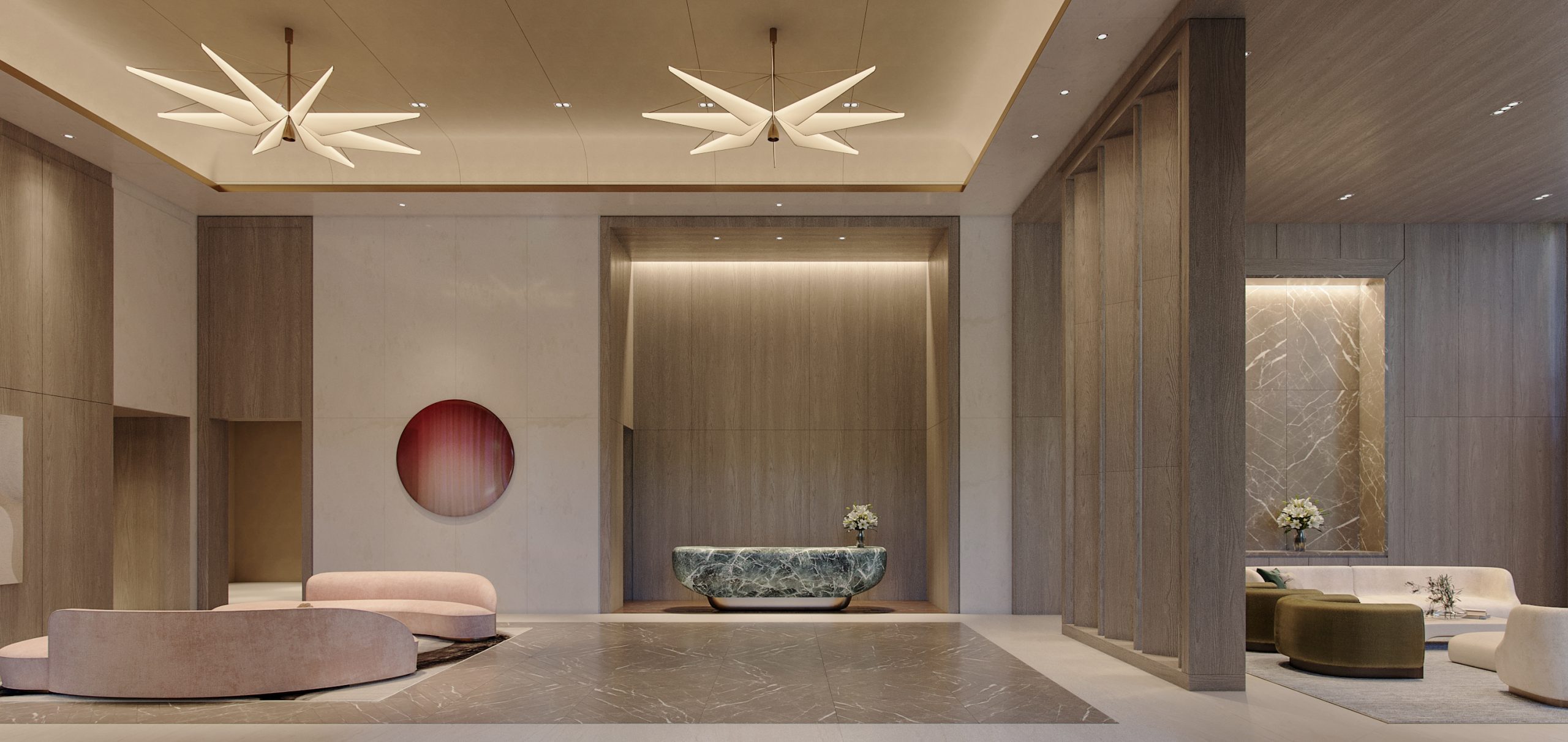
The interior planning design is sequenced and sectioned in consideration of residents routing from lobby entrance to their door home. On the ground floor, residents will first enter a pristine lobby greeted with a sculptural green marble concierge and light fixtures made with pink onyx hanging from the ceiling, designed to fit the space by Thomas himself. Exclusivity and privacy are also part of the planning. In the lobby area, each area of the services, circulating between the residents and the staffs are designed to avoid an unnecessarily overcrowding space. Moving forward from the lobby, private elevator will simply take you directly home. Each room’s specifications are restricted beyond specific dimensions to ensure that all residents experience the best possible atmosphere. This space design has been decoded to be the ideal ratio of ‘good size’ between 83-436 sq.m. and ‘good floor to ceiling height’ at 3.5 and 4 meters. This uncompromising composition of size and height also provide the feeling of living inside a single-unit house.

In terms of the look and feel, Thomas further described the inspiration he obtained from his visit to the city as, “Bangkok is the city of light and air. It has a very bright quality and an airy, warm tropical climate. So I wanted to showcase the light and airy palette to reflect that quality of Bangkok.” Upon entering the room, residents can undoubtedly feel a sense of those qualities, not only from the spacious dimensions but also attained by the full floor-to-ceiling window that illuminated the space with natural light. The bright material selection and color palette accentuates the interior and embraces its inhabitants with soothing warmth and refined serenity.
With a synergy of form and function, SCOPE’s decision to use German appliance brands like Gaggenau and Bulthaup was a no-brainer. From the highest quality and aesthetic of the appliances to how they blend perfectly, every aspect has been rigorously thought out. The level of attention applied to the details comes as little surprise when you consider the uncompromising functions of each element in the kitchen. Take one example of the material used for both countertops, the ivory and creamy off-white Taj Mahal quartzite. This single slab of stone serves both aesthetic functions and also protects from any absorption of water so residents can use it without any worries of color change over time caused by spillage and extreme usage. There is an abundant row of storage spaces in the entrance room through to the living area to assist residents in decluttering. These cabinets are designed to up to hundred pairs of shoes and other electronic appliances like washing and drying machines. Beside the entrance cabinets are the walk-in closet from an Italian brand, LEMA. This open structure U-shaped closet sits next to an all-white marble-covered voluminous bathroom. Adding to the high level of attention to detail and concern for its luxurious functionality, there are many custom pieces of furniture personally designed by Thomas himself. “It’s something I learned long, long time ago that handcrafting a bespoke furniture that fits with the setting of the space, the whole experience changes.” The furniture pieces in the room, such as working tables, TV consoles, and other built-ins, are made by Thomas down to the detailing level to work best with the space and the program in each room. This further adds to the level of careful craftsmanship, and attention to design that the project feels is essential for achieving a new paradigm of luxury
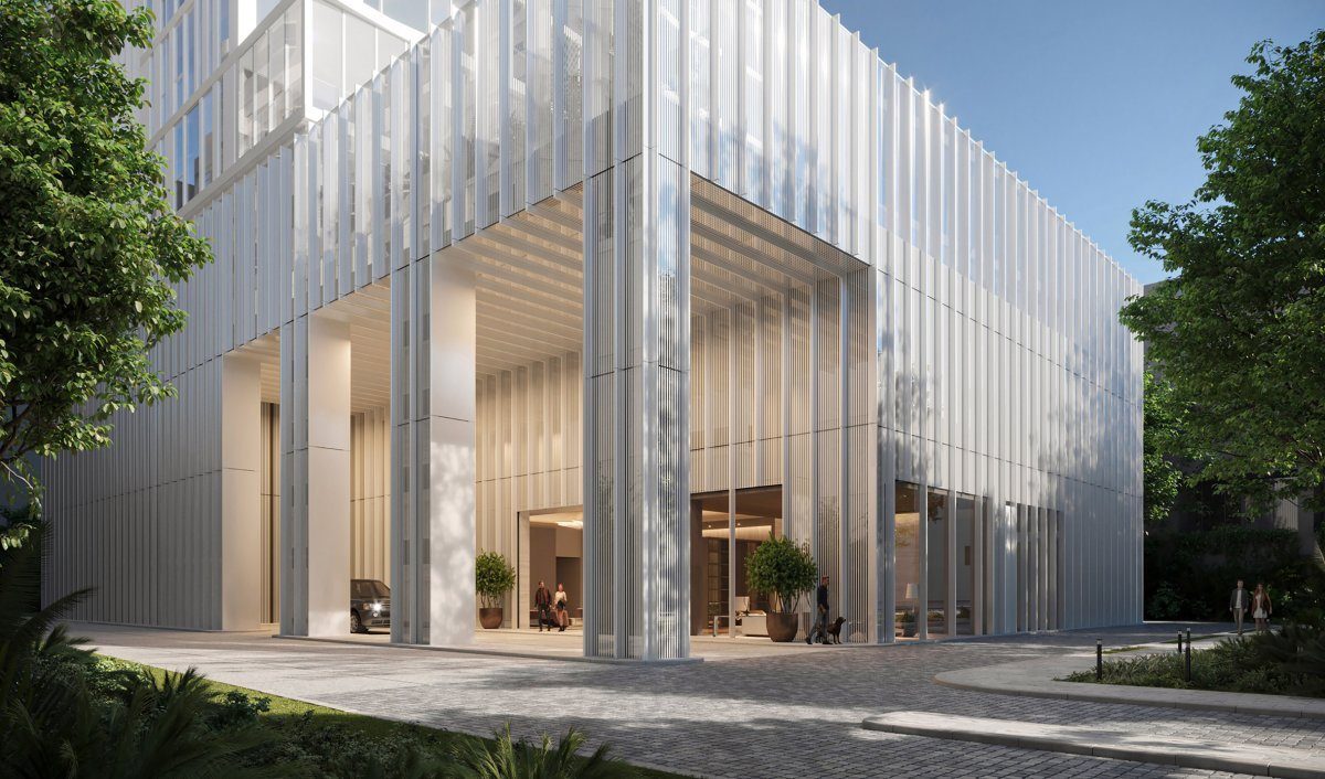
EXPERIENCE THE FEELING OF BANGKOK-ONLY KIND OF LUXURY IN THE SCOPE LANGSUAN EXTERIOR DESIGN BY KOHN PEDERSON FOX ASSOCIATES (KPF) WHICH RESONATED WITH THE THAI ATTITUDE OF HUMILITY AND HOSPITALITY TOWARDS ITS CONTEXT
TEXT: JINTAWACH TASANAVITES
PHOTO COURTESY OF SCOPE LANGSUAN EXCEPT AS NOTED
(For Thai, press here)
Kohn Pederson Fox Associates (KPF) is one of the world’s preeminent architecture firms and one of the first name that comes to mind when clients think of the most innovative, tallest buildings in all geographic regions. KPF is often known for its cutting-edge design with an inventive form that contributes to being a landmark for over 35 major cities worldwide. Although, with the firm’s diverse portfolio, one characteristic is shared among all projects designed by KPF, which is to ensure the programmatic functions are fully optimized and the most innovative solution is pursued in the master planning while offering a visually stunning exterior. This characteristic is also clearly apparent in the proposed design for SCOPE Langsuan that KPF has stepped in as an architectural design consultant for this ambitious luxury project.
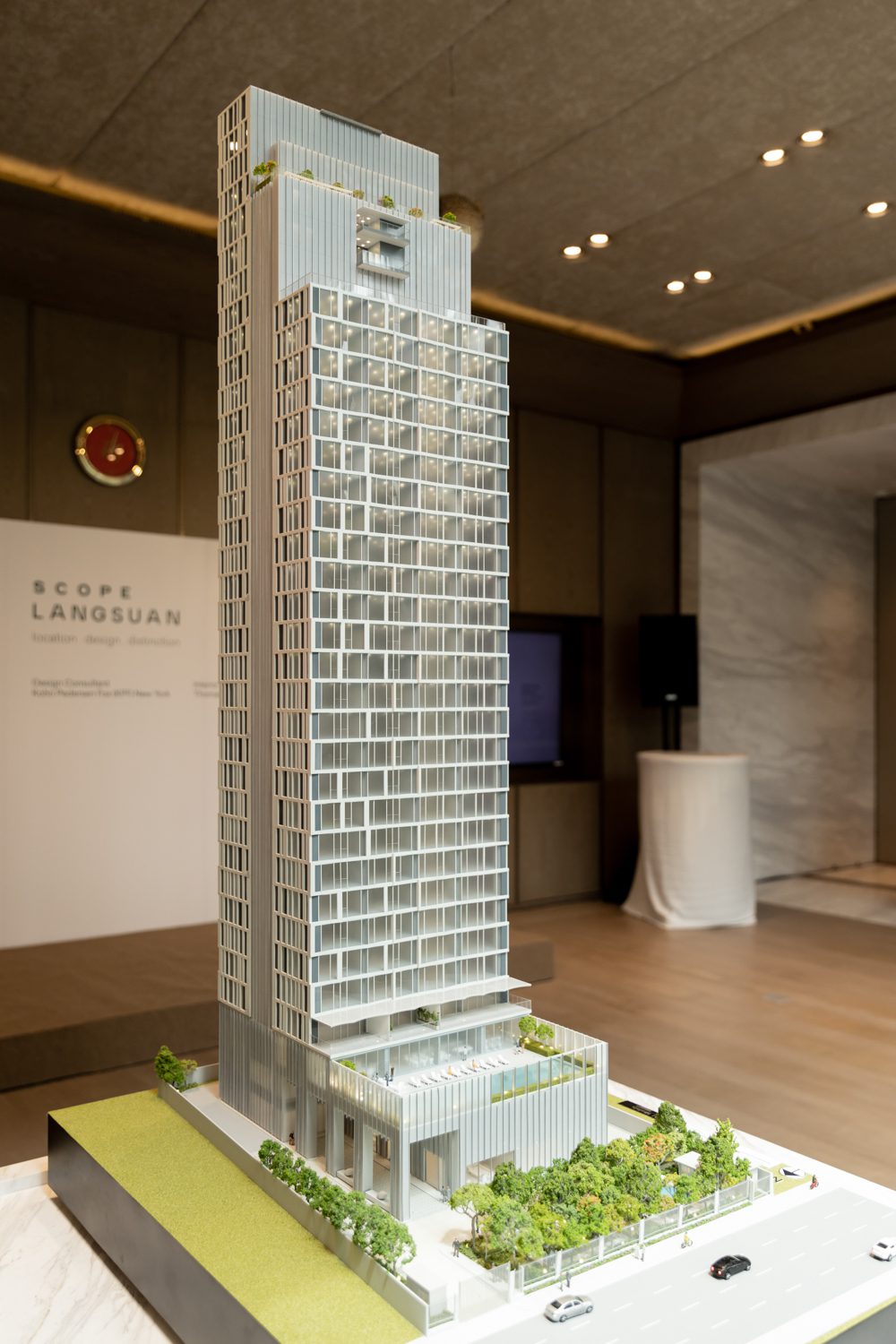
Photo: Ketsiree Wongwan
Externally, the condominium carries a unique, contemporary aesthetics that is the signature of KPF’s residential high-rise projects, yet SCOPE Langsuan stands out among those lavish buildings with its distinct simplicity and sleek composure. “We could have made a much more extravagant design to the building, but it would have defeated the purpose. This building is representative of the shift in luxury from a very loud, in-your-face luxury into a more minimal, no fuss, no guilt kind of luxury that we’re starting to see around the world and so we wanted to keep everything simple and calm”, Trent Tesch, a design principal also responsible for the project, told art4d. With this tranquility mindset, the SCOPE Langsuan aims to be a more understated type of luxury by adopting a humble approach with its design. The textured façade of the condominium features gently slanted windows and aluminum frames to create a ripple effect across the building’s surface, giving the structure an organic and natural motion. “Human scale and relationship that a person has to the scale of the building play an important role. The fold shape facade would allow people to feel more connected to the building rather than having a flat surface that may resemble more to an office building”, Trent added.
Architecturally, the construction of the building is visibly separated into three main volumes with stepped heights, emphasizing the structure’s graceful verticality. Variations in the glass surface distinguish the building’s components: the two outermost volumes, ornamented with creased windows, house the residential units, while a fritted glass wall distinguishes the central core. These glasses are made with an 8 mm high-quality, double-glazed insulated Low-E coating so that the residents can ensure their privacy from external viewers even at night and offer a clear internal observation through to the capital’s spectacular view. Furthermore, this special Low-E coating acts as a threshold to protect its inhabitant from Bangkok’s harsh weather and intense heat. It is undeniable that the rhythm between these extensive use of undulated glass and the private balconies of the exterior of this building allowed for a more sleek and dramatic visual experience that homeowners can take pride in.
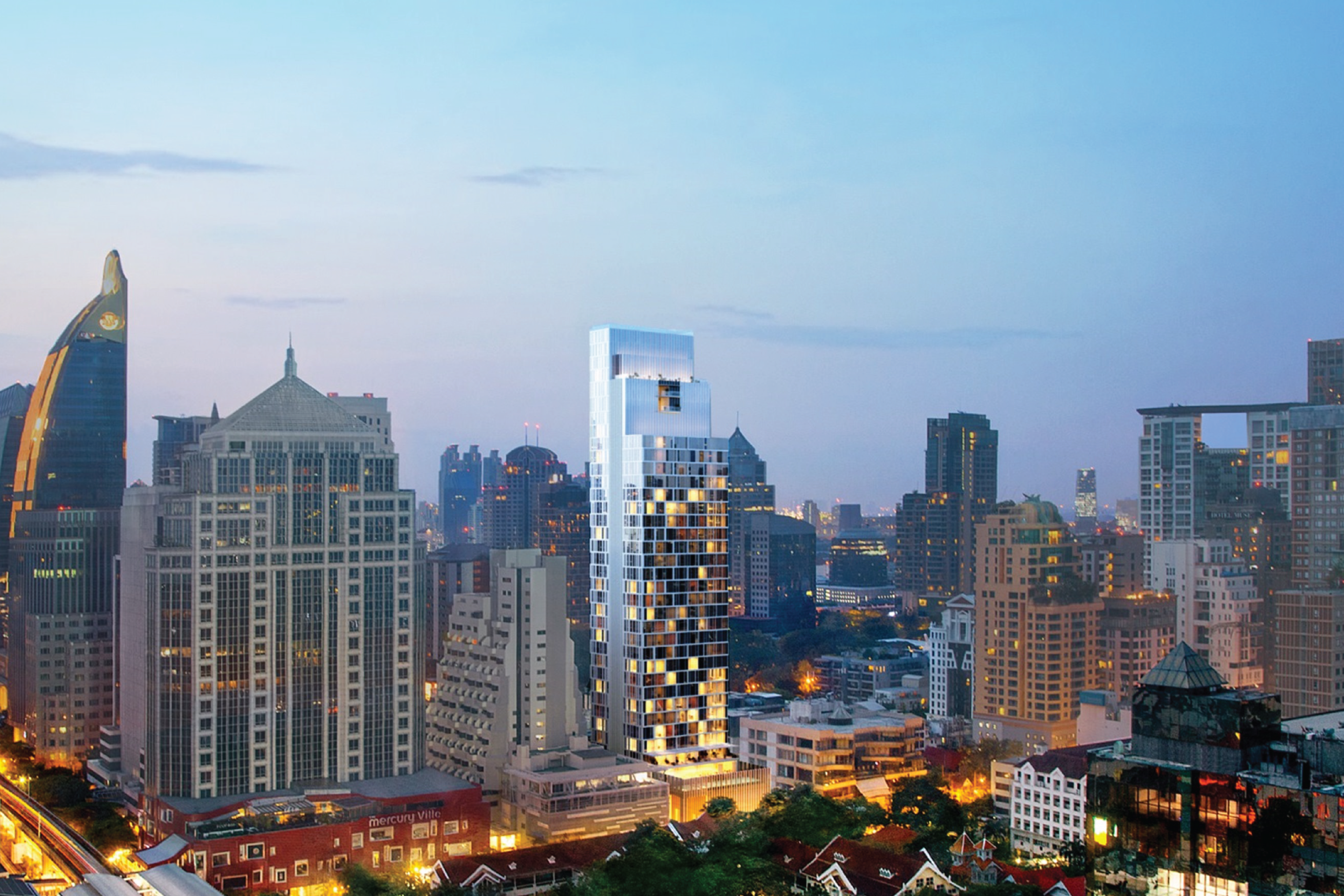
Overall, the exterior perfectly captures the design ethos of the building with its inside-out thinking that KPF executed explicitly for this project. Its tripartite design is derived from the desire to reflect the internal program, segregating the service core with the living space to the outside. This simplistic, straightforward rationales results in a beautifully crafted verticality of its exterior and claim SCOPE Langsuan a sight to behold for the city with its modern and expressive elements. Finally, pursuing an understated approach also allows the building to resonate with the Thai attitude of humility and hospitality towards its context. “I couldn’t imagine this building anywhere else in the world. This is site-specific to Bangkok-only kind of luxury,” Trent ended.
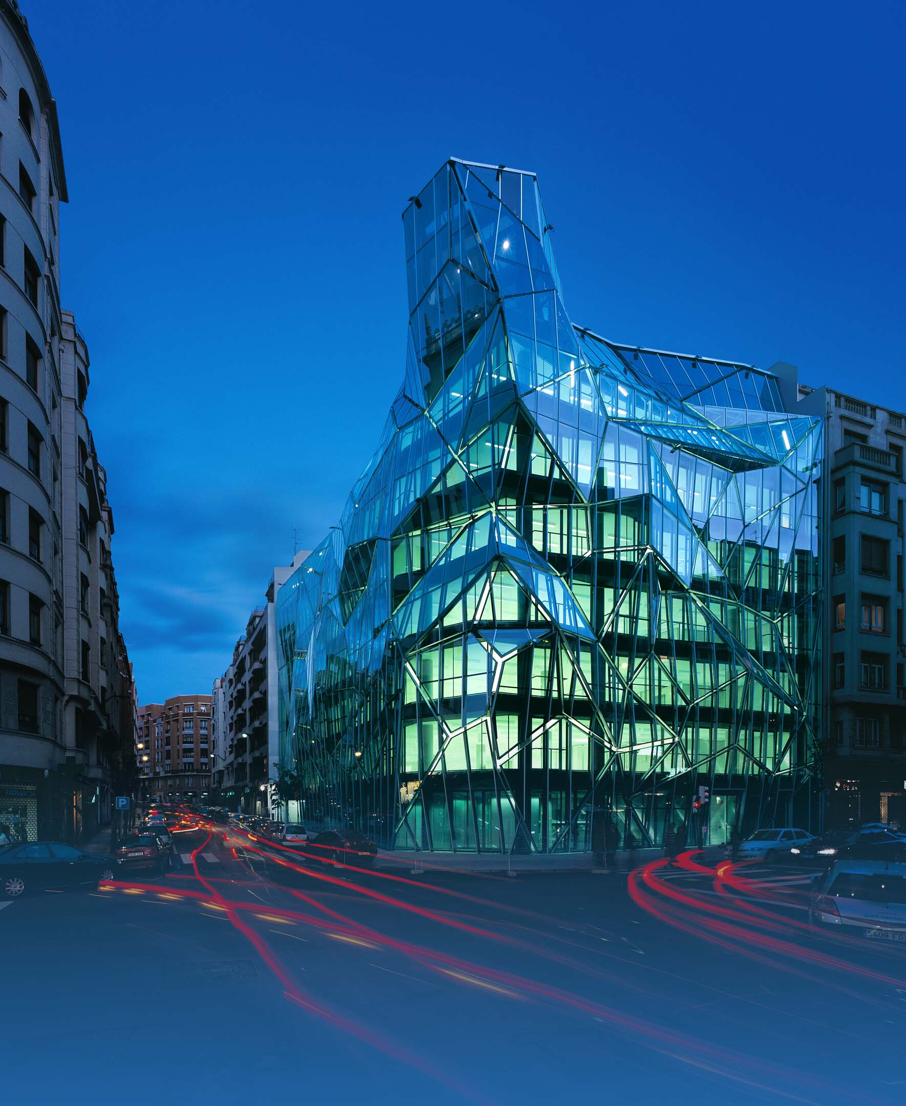
OFFICE BUILDING 02 | GUARDIAN GLASS
IN CONTINUATION TO OUR PREVIOUS ARTICLE, ANOTHER THREE BUILDINGS WILL BE CITED FOR THEIR OUTSTANDING APPLICATIONS OF GLASS TO THE DESIGNS OF THEIR FAÇADES. IN ADDITION TO THE AESTHETIC MERITS, THE MATERIAL ALSO OFFERS OUTSTANDING PHYSICAL QUALITIES THAT ENHANCE ENERGY SAVING EFFICIENCY OF INTERIOR FUNCTIONAL SPACES